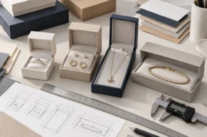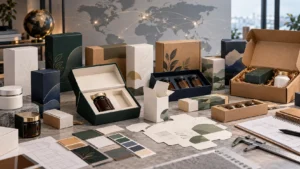
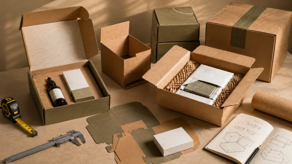

When I work on custom mailer box projects, I never see the box as only a printed container for shipping products. A mailer box has to do several jobs at the same time. It needs to fit the real product, protect it during delivery, support the brand image, remain practical for daily packing, and arrive in the customer’s hands with a clean and reliable first impression. If one of these areas is ignored, the box may still look good in a mockup, but it may not perform well in real e-commerce use.
E-commerce brands should choose custom mailer boxes by checking product size, material strength, box structure, printing needs, shipping cost, product protection, packing efficiency, and sample testing before bulk orders.
I often see packaging decisions start from appearance. The logo looks attractive, the color feels on-brand, the dieline seems simple, and the box style looks similar to what other brands are using. But in real production and fulfillment, appearance is only one part of the decision. A custom mailer box that is too large can increase shipping cost and make the product look poorly presented. A box that is too tight can press against the product, damage surfaces, or make the opening experience uncomfortable. A material that looks natural may not print brand colors clearly. A structure that looks premium may slow down packing if it has too many folding steps.
That is why I prefer to choose custom mailer boxes by looking at four key factors together: size, materials, structure, and printing. These four factors affect each other. The product size influences the box size. The product weight and shipping risk influence the material. The structure affects protection, opening experience, and packing speed. The printing affects brand recognition, color consistency, production cost, and how the package feels when it arrives. A good mailer box is not created by making one of these decisions well. It is created when all of them work together.
I also believe the real product should guide the packaging decision from the beginning. Product photos, standard size charts, and digital artwork are helpful, but they cannot fully show filled weight, widest point, cap clearance, insert space, product movement, or the final packed arrangement. A mailer box should be chosen around how the product will actually be packed, shipped, handled, opened, and experienced. This practical approach helps reduce wrong sizing, weak protection, wasted space, poor printing results, and unnecessary cost before bulk production.
In this guide, I will explain how I think about custom mailer box size, material choice, structural design, printing planning, and sample testing before bulk orders. The goal is not to choose the most expensive box or the most decorative design. The goal is to choose a mailer box that fits the product securely, protects it during shipping, supports the brand presentation, works efficiently in packing, and creates a better customer experience from delivery to unboxing.
Quick Decision Table
Before I choose a custom mailer box for an e-commerce brand, I use this table to review the most important decisions together. I do this because a mailer box should not be selected only by appearance, standard size, or unit price. The right box should fit the real product, protect it during delivery, support the brand image, work smoothly in warehouse packing, and avoid unnecessary shipping cost.
| Key Factor | What I Check | Why It Matters |
| Mailer box size | I check the real product dimensions, filled product weight, widest point, total height, empty space, insert space, tissue paper, product cards, padding, and the final packed arrangement before confirming the box size. | Mailer box size affects product fit, movement control, protection, shipping cost, storage space, and the customer’s first impression. If the box is too tight, the product may be scratched, compressed, or difficult to remove. If the box is too large, the product may move during delivery, require more filler, increase dimensional weight, and make the packaging feel wasteful. |
| Mailer box materials | I compare E-flute corrugated board, B-flute corrugated board, kraft board, white corrugated board, recycled paper, and FSC paper options based on product weight, shipping distance, printing needs, sustainability goals, and brand positioning. | The material affects strength, surface appearance, print quality, folding performance, customer touch, and perceived value. E-flute can work well for refined printed mailer boxes, B-flute can support heavier products, kraft board gives a natural look, white corrugated board usually gives cleaner color results, and recycled or FSC paper options should be supported by clear material documentation. |
| Mailer box structure | I review the roll-end style, locking tabs, side walls, tear strip, easy-open design, inserts, internal dividers, folding steps, and flat shipping design before approving the structure. | The structure affects protection, opening experience, closure security, product stability, warehouse packing speed, and labor efficiency. Two boxes can use similar material but perform differently because of structure. A good structure should hold the product securely, stay closed during shipping, open naturally for the customer, and remain practical for repeated packing. |
| Mailer box printing | I check outside printing, inside printing, logo position, shipping label space, color accuracy, CMYK or Pantone needs, kraft or white board printing results, matte or gloss lamination, foil stamping, spot UV, and repeat order consistency. | Printing affects brand recognition, unboxing experience, production cost, material performance, color consistency, and the final professional look of the package. Outside printing should not interfere with shipping labels or courier scanning. Inside printing can improve the opening experience, but it should match the box structure, material surface, and product layout. |
| Sample testing | I test the physical sample with the real product by checking product fit, movement after gentle shaking, lid closure, opening experience, locking tabs, material strength, printed color, surface finish, folding difficulty, packing speed, and master carton packing. | Sample testing reduces mistakes before bulk orders. Digital artwork and dielines cannot fully confirm real fit, folding performance, color result, surface feel, insert stability, or packing efficiency. A physical sample helps me find problems early, such as loose product fit, tight closure, weak structure, poor print color, scratches, slow packing, or unstable inserts. |
This quick decision table helps me review custom mailer boxes as a complete packaging system. The best choice is not only the most attractive design or the lowest-cost option. It is the box that fits the product, protects it during shipping, supports the brand, works for packing, and stays consistent before bulk production.
Choose the Right Mailer Box Size for Product Fit, Protection, and Shipping Cost
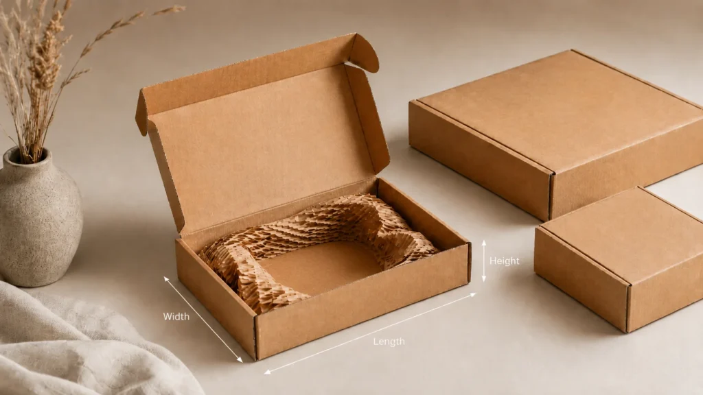
Choosing the right mailer box size is the first step I focus on when I evaluate custom mailer boxes for an e-commerce brand. I do this because size affects almost everything that happens after the box is produced. It affects whether the product fits naturally, whether it moves during delivery, whether the box needs inserts or padding, whether the customer can open the package smoothly, and whether the brand pays more than necessary for shipping. A mailer box may look simple from the outside, but the wrong size can create product damage, poor presentation, slow packing, unnecessary filler use, and higher long-term logistics costs.
I never treat mailer box size as a simple matter of choosing the nearest standard size. Standard sizes can be useful for simple products, but custom mailer boxes are usually chosen because the brand wants better product fit, better protection, better presentation, or better control over the customer experience. If the product is fragile, high value, heavy, unusually shaped, part of a set, or supported by inserts, tissue paper, cards, or padding, the final size should be based on the real packed product, not just the product category.
Start with the Real Product Instead of a Standard Box Size
When I begin thinking about a mailer box size, I always start with the real product. I do not rely only on a product photo, 3D rendering, product volume, or general product description. These details are useful, but they are not enough to confirm the box size. A product photo may hide the actual thickness. A digital design file may not show the real cap height. A product volume such as 30 ml or 50 ml does not tell me the bottle shape, pump clearance, shoulder width, or base thickness. A folded item may look thin in a picture but become much thicker after tissue wrapping or bundle packing.
I like to see the product in the same condition in which the customer will receive it. If a skincare bottle will be packed with a dropper, outer carton, product card, tissue paper, and paper insert, then I need to consider the full packed arrangement. If a jewelry piece will be placed on a card, inside a pouch, and then fixed inside a mailer box, the jewelry alone is not the real sizing reference. If a subscription box contains several items, I need to understand the arrangement of the full set, not only the largest item.
This matters because many sizing problems begin when the box is designed around the product alone, while the final order contains more than the product. After cards, inserts, padding, and branded materials are added, the internal space may become too tight. The lid may press down on the item. The insert may bend. The product may sit too high. The customer may open the box and see a layout that feels forced. Starting with the real packed product helps avoid these problems early.
Measure the Longest Side, Widest Point, Total Height, and Filled Weight
When I measure a product for a custom mailer box, I check more than simple length, width, and height. I look for the longest side, the widest point, the total height, and the filled weight. This gives me a more realistic understanding of how the product will behave inside the box.
The longest side helps me understand the minimum internal length the box may need. The widest point matters because many products are not perfectly rectangular. A jar lid may be wider than the jar body. A pump bottle may have a pump head that extends beyond the bottle shoulder. A pouch may become wider after filling. A folded apparel accessory may spread slightly during packing. A product with a handle, curved edge, clasp, cap, or raised feature may need more space than its basic body size suggests.
The total height is especially important for mailer boxes because the lid needs to close without pressing the product. If the product sits too high, the box may close with pressure, the lid may curve upward, the locking tabs may not hold properly, or the product may be compressed during shipping. I also check the filled weight because an empty product container can feel completely different from a filled product. A small glass jar, candle item, or cosmetic bottle may not look large, but once filled, it can create pressure on the bottom panel, corners, and side walls of the mailer box.
I also pay attention to weight distribution. If the weight is concentrated on one side, the product may shift more easily during delivery. If a set contains one heavy item and several light items, the internal layout needs to control the heavy item first. If the product is tall and narrow, it may tip inside the box unless the size and insert are planned correctly. These small details can make the difference between a box that only fits and a box that actually protects.
Understand Product Size, Inner Box Size, and Outer Box Size
One of the most important sizing details I explain to e-commerce brands is the difference between product size, inner box size, and outer box size. Product size is the size of the item itself. Inner box size is the usable space inside the mailer box after the board is folded. Outer box size is the full external size of the finished package.
These three sizes are connected, but they are not the same. This difference matters because custom mailer boxes are usually made from corrugated board, and corrugated board has thickness. If the board is thicker, stronger, or built with side walls and roll-end panels, the internal space can become smaller than the outside measurement suggests. A brand may think the box is large enough based on the outer size, but the product may still feel tight inside.
The inner size is what controls the product fit. The outer size affects shipping, storage, master carton packing, and courier cost. I always think about both. If I only focus on inner space, the final package may become larger than necessary. If I only focus on outer size, the product may not have enough protective room. The best mailer box size balances both sides. It gives the product enough usable internal space while keeping the outside size controlled for storage and shipping.
This is also why I do not like confirming mailer box size too early based on one number. A box may be described by outside dimensions, but the product lives inside the box. For accurate sizing, the usable internal space, board thickness, folding panels, insert space, and closure style all need to be considered together.
Allow Space for Corrugated Board Thickness and Folding Panels
A custom mailer box is not an empty shell with paper-thin walls. The corrugated board has thickness, and the folding structure takes up space. The side walls, front tuck, locking tabs, roll-end panels, and lid folds all affect the final internal layout. If these details are ignored, the product may fit in theory but feel uncomfortable in the real box.
When I check the size, I consider where the folded panels sit. Some areas of the box may have double layers because the board folds over itself. These layers can improve strength, but they can also reduce usable space. If the product is placed too close to these folded areas, it may rub against the board, press against the side wall, or make the box hard to close.
This is especially important for products with delicate packaging surfaces. A printed cosmetic carton, jewelry card, coated box, glass bottle label, or soft-touch product surface can be affected by friction. If the mailer box is too tight around folded panels, the product may arrive with marks or pressure points. I prefer to allow enough clearance for the board structure itself, not only for the product.
Plan the Size Around the Final Packing Layout
A mailer box is not only about whether the product can go inside. It is about how the product sits inside. I always think about the final packing layout because the same product can require different box sizes depending on how it is positioned.
For example, a skincare bottle may be packed standing upright, lying flat, or placed in a paper insert. A jewelry item may be centered on a card, wrapped in tissue, or placed in a small inner box. A subscription box may show products in a layered arrangement, with one main product visible first. A folded apparel product may need a flat presentation rather than being pushed into a tight space. Each layout changes the box size.
If the brand wants a clean first impression, the box should be sized around the opening view. The product should not look squeezed into the box, hidden too deep, or floating in a space that feels too large. The layout should feel intentional when the lid opens. This is one of the reasons I see mailer box sizing as part of customer experience, not only logistics.
Leave Enough Internal Space for Protection
The mailer box should leave enough internal space for protection. This does not mean making the box large. It means allowing controlled space for the product and any protective elements it needs. If the product is fragile, has sharp edges, includes glass, contains liquid, has a printed surface, or needs to stay in a fixed position, the box should allow the right level of protection.
Protection may come from a paper insert, corrugated divider, tissue wrap, molded paper support, inner sleeve, paper filler, or simple positioning space. These elements need room to work properly. If the box is too tight, an insert may bend, a divider may press against the product, or padding may become decorative rather than protective. If the protective material is compressed too much, it cannot absorb movement or pressure properly.
I prefer to plan protection and size together. I do not like choosing a mailer box first and then trying to fix movement with extra filler later. That often leads to messy packing, inconsistent presentation, and higher material use. A better approach is to choose a size that gives protective elements the space they need while still keeping the product controlled.
Control Empty Space Instead of Simply Adding More Room
I often think of internal space as controlled space. A good mailer box needs room, but it should not have uncontrolled empty space. Too much empty space allows the product to move, and product movement is one of the most common causes of poor e-commerce packaging performance.
During delivery, the box may be turned upside down, shaken, stacked, squeezed, dropped, or pushed against other parcels. If the product can move freely inside, it may hit the side walls, collide with another item, rub against the surface, or arrive in the wrong position. The customer may still receive the product, but the opening experience can feel careless.
For premium e-commerce products, this matters a lot. A customer may not know the technical reason behind the poor presentation, but they can feel when the box is too large or when the product was not held properly. A product that moves inside the box can make the brand feel less thoughtful. This is why I always try to control internal space rather than simply increase it.
Avoid a Mailer Box That Is Too Tight
A mailer box that is too tight can create damage even before shipping begins. If the product is forced into the box, the surface may be scratched, the label may rub, the product carton may dent, or the insert may deform. If the lid needs pressure to close, the product may be too high, the closure may be unstable, or the structure may be stressed.
A tight box also affects packing speed. If warehouse staff need to push the product into place, adjust the insert repeatedly, or close the lid with extra force, the packing process becomes slower. This may not seem serious for a small number of orders, but it becomes a real operational issue when the brand packs hundreds or thousands of packages.
The customer experience is another concern. A product should be easy to remove from the mailer box. If the customer has to pull hard, shake the box, or damage the packaging to take out the product, the unboxing experience feels less refined. A good fit should hold the product securely without making the product feel trapped.
Avoid a Mailer Box That Is Too Large
A mailer box that is too large creates a different set of problems. At first, it may feel safer because there is more space. But extra space often leads to more movement, more filler, more shipping volume, and weaker product presentation. The product may look small inside the box, and the customer may feel that the packaging is wasteful.
This is especially important for brands that want a premium or sustainable image. If a small product arrives inside a large box filled with unnecessary paper, the customer may question the packaging decision. Even if the box is beautifully printed, the oversized space can reduce the perceived value of the product.
An oversized mailer box also increases cost in hidden ways. It may require more filler, take more warehouse space, reduce the number of boxes that fit into a master carton, and increase shipping volume. The unit price of the box may not look high, but the long-term logistics cost can become much higher than expected.
Think About Dimensional Weight and Shipping Volume
Shipping cost is one reason I pay close attention to mailer box size. Many e-commerce brands compare box costs by unit price, but the package size can affect shipping cost again and again after production. If a box is larger than necessary, the brand may pay more for every shipment.
Many carriers consider dimensional weight, which means shipping cost can be affected by package volume as well as actual weight. A light product inside a large mailer box may still cost more to ship because the package takes up more space. This is especially important for e-commerce brands with repeated orders, because a small size difference can become a large cost difference over time.
I always try to balance protection and shipping efficiency. A box should not be reduced so much that the product becomes unsafe. But it should also not be enlarged without reason. The right mailer box size should protect the product while keeping shipping volume as efficient as possible.
Consider How the Box Will Fit Into Master Cartons
Mailer box size also affects how finished boxes are packed into master cartons for bulk shipping or warehouse storage. This detail is easy to overlook, but it can influence storage efficiency, transportation cost, and handling safety before the product even reaches the final customer.
If the outer size of the mailer box is poorly controlled, fewer units may fit into each master carton. This can increase carton count, warehouse space, and freight volume. If the mailer boxes do not stack well inside the master carton, the boxes may be compressed or damaged before they are used. If the box is designed only for the individual customer package and not for bulk handling, the brand may face operational problems later.
When I think about mailer box size, I consider both the single customer shipment and the larger packing flow. The box should work as an individual e-commerce package, but it should also be practical when stored flat, assembled, packed with products, and placed into larger cartons.
Decide Whether One Size Can Work for Multiple SKUs
Many e-commerce brands want one mailer box size to work for multiple SKUs. I understand this because it reduces packaging inventory, simplifies ordering, and makes warehouse management easier. But one size only works well when the products have similar dimensions, weights, and protection needs.
If the product range is too wide, one box size can create poor fit for many orders. Smaller items may look lost inside the box. Larger items may be squeezed. A soft item may not need the same space control as a fragile jar. A single product may fit well, but a bundle may require more space for inserts, cards, or protective wrapping.
When one box size is intended for several products, I like to think about the most common order combinations. The box should be sized around real purchase behavior, not only the largest possible product. If most customers buy one small item, the box should not feel oversized for that order. If bundles are common, the box should support that layout without forcing the products together. Sometimes one flexible size works well. Other times, two or three mailer box sizes give a better balance between cost, protection, and presentation.
Include Inserts, Tissue Paper, Cards, and Padding in the Size Plan
A custom mailer box is often part of a full packaging experience. The product may be packed with paper inserts, tissue paper, paper filler, thank-you cards, instruction cards, stickers, wrapping sleeves, or protective padding. These items are small, but they can change the final internal space.
I always prefer to include these elements in the sizing plan early. If an insert is used, its thickness and height matter. If tissue paper wraps around the product, the wrapped product may need more space than the bare product. If a card sits on top, the box should close without bending it. If paper filler is added, it should protect the product without making the box look crowded.
When these elements are planned together, the final package feels more organized. The product sits properly, the inserts support the product, the cards remain flat, and the customer sees a clean layout when opening the box. When these elements are added after the box size is fixed, the packaging often feels improvised.
Match the Size to the Opening Experience
The right mailer box size should support the opening experience. When the customer opens the lid, the product should appear in a way that feels clean, balanced, and intentional. If the box is too deep, the product may feel hidden. If the box is too wide, the product may look small. If the box is too tight, the experience may feel forced.
This is especially important for beauty products, jewelry, PR kits, subscription boxes, gifts, and premium e-commerce items. These products often depend on emotional presentation. The customer is not only receiving an item. They are experiencing the brand for the first time in physical form.
I think of mailer box size as part of visual design. Even without complicated printing, a well-sized box can make the product feel more valuable. The space around the product should help the customer focus on the product, not make them wonder why the package feels too empty or too crowded.
Test Product Movement Before Confirming the Size
Before confirming a mailer box size, I like to test how the product moves inside the box. It is not enough to place the product inside and see that it fits. The package should be gently tilted, moved, and handled to see whether the product shifts. If the item slides too much, hits the side wall, or changes position easily, the size or internal support may need adjustment.
This test is especially useful for product sets. Multiple items can collide during shipping if the internal space is not controlled. A bottle may hit a jar. A card may bend. A small item may slip under tissue paper. A product may arrive in a completely different position from the intended presentation. These problems are easier to solve during sizing than after bulk production.
I see movement testing as a practical way to connect size, structure, and protection. The right size should reduce movement naturally, while inserts or padding provide extra control where needed.
Test the Size with the Real Packing Process
A good mailer box size should work during real packing, not only during product placement. I like to test how the warehouse team would fold the box, place the product, add any insert or card, close the lid, and prepare the package for shipping. This reveals issues that a simple product fit check may miss.
If the box is too tight, packing may slow down. If the box is too large, staff may need extra filler. If the insert moves while packing, the presentation may become inconsistent. If the lid does not close smoothly, workers may use extra force, which can damage the structure or product. If the product needs too much adjustment before closing, the packaging may not be practical for daily fulfillment.
For e-commerce brands, packing speed matters. A beautiful mailer box that is difficult to assemble can create hidden labor costs. A right-sized box should support efficient packing while still protecting the product and creating a good customer experience.
Choose a Size That Balances Fit, Protection, Cost, and Experience
The best custom mailer box size is not simply the smallest box that can hold the product. It is also not the largest box that gives the product more room. The best size is the one that balances fit, protection, cost, and customer experience.
When I choose a mailer box size, I think about the full journey of the package. The box must be stored, folded, packed, shipped, handled, opened, and sometimes returned. It must protect the product during movement, control shipping volume, support the brand presentation, and feel natural in the customer’s hands.
For e-commerce brands, this is why size should be decided before material, structure, and printing. Once the size is correct, the material can be selected more accurately, the structure can be designed more practically, the insert can be planned more clearly, and the printing layout can be placed with fewer risks. A custom mailer box starts with size because size is the foundation of fit, protection, shipping cost, and the final customer experience.
Choose Mailer Box Materials Based on Product Weight, Shipping Risk, and Brand Positioning
When I choose materials for custom mailer boxes, I do not treat the decision as simply choosing a thicker or cheaper board. The material affects how the mailer box protects the product, how it folds during packing, how it performs during delivery, how the printed design appears, how the customer feels when holding it, and how the brand is judged before the product is even used. For an e-commerce brand, the mailer box is not only a shipping container. It is often the first physical contact between the brand and the customer after an online order.
This is why I always connect mailer box material with the real product. A lightweight accessory, a skincare bottle set, a jewelry item, a subscription box, and a heavier gift product should not automatically use the same board. Each product creates different pressure inside the box. Each product has a different risk during shipping. Each product also creates a different expectation in the customer’s mind. The right material should protect the product, support the printed design, match the brand image, and remain practical for packing and delivery.
Mailer Box Material Is More Than Board Thickness
When people compare mailer box materials, they often start by asking whether the board is thick enough. I understand why this happens because thickness is easy to see and feel. However, in real packaging decisions, thickness alone does not tell the full story. A thicker board can still perform poorly if the product moves too much inside the box, if the structure is weak, or if the fold lines are not suitable. A thinner board can still work well if the product is lightweight, the structure is stable, and the internal space is controlled.
When I look at a mailer box material, I think about several things at the same time. I think about the flute type, paper surface, board stiffness, folding performance, print result, product weight, box size, and shipping route. I also think about how the material feels after the box is assembled, not just how the flat board feels before production. A material may feel acceptable as a sample sheet, but once it is folded into a roll-end mailer box, locked, packed, and handled, its real performance becomes much clearer.
This is why I prefer to judge material in context. The question is not simply whether the board is strong. The better question is whether the board is suitable for this product, this shipping method, this printing design, and this brand positioning. A good mailer box material should feel natural for the product it protects.
Product Weight Should Be the First Material Signal
Product weight is one of the first signals I use when choosing mailer box material. A lightweight item and a heavy compact item can need very different packaging even if the box size looks similar. A small glass jar, candle product, metal accessory, or electronic item can create more pressure than expected because the weight is concentrated in a small area. If the board is not strong enough, the bottom panel may feel weak, the corners may soften, or the box may lose its clean shape during shipping.
I also pay attention to weight distribution. Some products sit evenly inside a mailer box, while others put pressure on one side or one corner. A skincare set with one heavy bottle and several lighter tubes can shift during delivery if the material and insert do not support the heavier item. A jewelry item may be light, but if it is packed with a rigid gift box or a display card, the final packed weight and shape may change. A subscription box may include multiple products with different sizes and weights, which makes the material decision more complex.
For lightweight products such as fabric accessories, stationery, small paper goods, or soft lifestyle items, the material can often focus more on neat presentation and efficient shipping. For heavier or fragile products, I become more careful about board strength, side wall support, and compression resistance. I do not want the customer to receive a box that looks tired, crushed, or unstable, even if the product inside survives. The condition of the box affects how the customer judges the brand.
Shipping Risk Changes the Material Decision
I never choose mailer box material only by looking at the product on a table. I imagine the full delivery journey. The box may be stacked under other parcels, dropped during sorting, pressed inside a courier bag, exposed to humidity, or handled several times before it reaches the customer. A material that looks fine in a clean sample room may behave differently after real courier handling.
The longer the shipping distance, the more important material performance becomes. A mailer box used for local delivery may not need the same strength as a box used for cross-border e-commerce shipping. If the product is lightweight and not fragile, a moderate board may be enough. If the product is fragile, heavy, high value, liquid-filled, glass-based, or part of a gift set, I would look more carefully at material strength and internal support.
Shipping risk also depends on how the box is shipped. Some mailer boxes are shipped directly as the outer package. Some are placed inside a larger shipping carton. Some are used for PR kits or subscription boxes where the box itself must arrive looking clean. If the mailer box is the first thing the customer sees, the material has to protect both the product and the presentation. In that case, I think about not only whether the box can survive delivery, but also whether it can still look presentable when it arrives.
E-flute Corrugated Board for Branded Mailer Boxes with a Cleaner Surface
E-flute corrugated board is one of the materials I often consider for custom mailer boxes used by e-commerce brands. I usually think of E-flute when the product is light to medium in weight and the brand wants a cleaner printed appearance. Because E-flute has a finer profile than some thicker corrugated options, it often provides a smoother surface for logos, color blocks, patterns, and inside printing.
I find E-flute especially useful for beauty products, skincare items, small gifts, jewelry accessories, wellness products, and subscription boxes. These products usually need a balance between protection and presentation. The box should feel structured enough for delivery, but it should also look refined enough for a branded customer experience. E-flute can often support that balance well when the product weight and shipping risk are controlled.
However, I do not choose E-flute only because it looks good for printing. I still check whether the product is too heavy, whether the box size is too large, whether the product needs an insert, and whether the shipping route creates extra risk. If a product is heavy or fragile, E-flute may still work, but it may need a stronger structure, better internal support, or more controlled empty space. A clean print surface is valuable, but it should never replace real product protection.
B-flute Corrugated Board When Protection and Strength Matter More
B-flute corrugated board is more suitable when strength, cushioning, and compression resistance are more important than a very refined surface. I would consider B-flute for heavier products, larger product sets, higher-risk delivery routes, or mailer boxes that may face more stacking pressure during shipping. It can give the box a stronger and more protective feeling, which can be important when the customer needs to feel confidence in the package.
The trade-off is that B-flute may not look as delicate as E-flute for detailed printing. Fine artwork, small text, soft gradients, or very refined patterns may not appear as smooth on a stronger corrugated surface. This does not mean B-flute cannot be used for branded packaging. It simply means the artwork should match the material. A bold logo, simple layout, kraft-style design, or practical shipping-focused visual direction may work better than highly delicate graphics.
When I choose B-flute, I usually do it because the product or shipping situation needs more protection. A heavier gift item, a dense product bundle, or a subscription box with several items may need material that holds its shape better during handling. In these cases, I would rather choose a material that supports safe delivery than choose a smoother-looking board that may not protect the product well enough.
Kraft Corrugated Board for Natural, Minimal, and Eco-conscious Brands
Kraft corrugated board is often chosen when a brand wants a natural, simple, minimal, handmade, or eco-conscious look. I like kraft mailer boxes when the product and brand story match that honest paper texture. The brown surface can make the packaging feel warm, practical, and less artificial. For wellness products, natural skincare, handmade goods, outdoor accessories, organic products, and simple subscription boxes, kraft can create the right emotional tone.
However, kraft material has a very important printing characteristic. The brown surface affects color brightness. Printed colors usually appear darker, warmer, and less vibrant than they would on a white surface. A black logo or dark green design can look strong on kraft, but pastel colors, light beige, soft pink, bright blue, or precise brand colors may not appear as expected. If the brand depends on exact color matching, kraft should be tested carefully before bulk production.
I do not see this as a weakness. I see it as part of the material’s character. Kraft works best when the design respects the natural base color. It is not ideal when the brand wants a very clean, bright, luxury, or color-accurate appearance. The material should support the visual message instead of forcing the artwork to fight against the paper surface.
White Corrugated Board for Cleaner Printing and Premium Presentation
White corrugated board is often a better choice when the brand wants a cleaner look, brighter printed colors, and a more polished presentation. I usually consider white mailer boxes for beauty brands, jewelry products, PR boxes, gift-style packaging, premium subscription boxes, and e-commerce products that rely heavily on visual consistency.
A white surface gives artwork more clarity. Colors usually appear brighter and closer to the digital design. Logos, patterns, inside printing, and brand messages can look more controlled. For beauty and jewelry products, this can be important because customers often expect clean packaging that feels precise and intentional. A white printed mailer box can make the opening experience feel more refined, especially when the product is positioned neatly inside.
At the same time, white board needs practical consideration. It can show dirt, rubbing marks, fingerprints, or courier handling marks more easily than kraft. If the mailer box is used as the outer shipping package, the surface may face more friction during delivery. In that case, I think about whether the surface finish, print coverage, and shipping method can protect the final appearance. A white mailer box can look premium, but it needs to arrive in a condition that still supports that premium feeling.
Recycled and FSC Paper Options for Responsible Packaging Claims
Many e-commerce brands want their mailer boxes to support sustainability goals. Recycled paper options and FSC paper options can help with this, but I always treat these claims carefully. A box that looks natural is not automatically sustainable. A brown kraft surface does not automatically mean the paper is certified. If a brand wants to communicate recycled content or responsible sourcing, the material choice should be supported by real documentation.
Recycled materials can be a good option, but their surface appearance, strength, and print performance may vary depending on the paper quality. Some recycled boards may have more visible fiber texture or slight color variation. That can work well for natural brands, but it may not be ideal for brands that need very clean printing. FSC paper options can support responsible sourcing, but the certification scope and material chain should be confirmed if the brand plans to use FSC-related claims or labels.
I also think sustainability should not only depend on the material name. A right-sized mailer box uses less unnecessary material. A suitable board reduces damage and replacement shipments. A box that protects the product well avoids waste caused by returns. A material that matches the print design reduces rejected production. To me, responsible packaging means the material, size, structure, protection, and communication all work honestly together.
Material Choice Affects Printing Quality and Color Consistency
Mailer box material and printing cannot be separated. I always think about them together because the same artwork can look very different on different materials. The color, texture, absorbency, and smoothness of the paper all affect the final print result. A design that looks clean on screen may become dull on kraft board, sharper on white board, or slightly uneven on recycled paper.
If the brand uses a simple one-color logo, kraft board may work very well. If the brand uses full-color artwork, soft gradients, delicate patterns, or strict brand colors, white corrugated board may be safer. If the design includes small text or detailed graphics, the surface smoothness becomes more important. If the box includes inside printing, the inside paper surface should also be checked, not only the outside.
Color consistency matters even more for brands that reorder packaging regularly. If the paper material changes between batches, the printed color may change too. This can make the brand look inconsistent to repeat customers. When I evaluate mailer box material, I think about not only the first order but also future repeat orders. The approved material, print method, color standard, and physical sample should work together as one production reference.
Material Choice Changes the Customer’s First Physical Impression
The customer may not know the technical name of the material, but they will immediately feel whether the box matches the product. A weak box can make the product feel cheaper. A stable box can make the brand feel more reliable. A natural kraft surface can make the brand feel honest and simple. A clean white printed surface can make the product feel more refined. The material becomes part of the first impression.
This is especially important for e-commerce because the customer has already made the purchase before touching the product. The mailer box becomes the first physical proof of the brand’s promise. If the packaging feels careless, the customer may start to question the product before opening it. If the packaging feels appropriate, the customer may feel more confident and more satisfied.
I do not believe every brand needs the most premium material. The material should feel right for the product. A minimal handmade product may feel more authentic in kraft. A skincare set may feel more trustworthy in a clean white printed box. A heavier gift item may feel better in a stronger board. A practical low-risk product may not need an expensive surface. The best material supports the customer’s expectation without overdoing it.
Match Mailer Box Material to Product Category
Different product categories need different material decisions. A soft apparel accessory may not need the same board as a glass skincare set. A jewelry item may be light, but it often needs a refined presentation because the product is small and value is partly emotional. A subscription box may need a material that balances strength, print appearance, and repeated packing efficiency. A heavier gift product may need stronger corrugated support because the customer expects the package to feel secure.
For beauty and skincare products, I usually pay attention to both protection and surface cleanliness. Bottles, jars, pumps, and caps can create pressure inside the box, while the customer also expects the packaging to look clean. For jewelry and accessories, I think more about presentation and controlled space because small products can look lost if the box feels too large or rough. For apparel and soft goods, I think more about efficient sizing, folding, and brand impression. For subscription boxes, I think about material performance across repeated monthly or seasonal orders.
This is why I avoid choosing material only by copying another brand’s packaging. A mailer box that works for one product may not work for another. The material should be matched to product weight, fragility, surface sensitivity, shipping route, price point, and customer expectation.
Material and Structure Need to Work Together
Material does not work alone. The same board can perform differently depending on the mailer box structure. A strong material with a weak structure may still fail. A lighter material with a well-designed structure may perform better than expected. Side walls, locking tabs, roll-end panels, fold lines, inserts, and internal dividers all affect how the material supports the product.
When I choose mailer box material, I also imagine the structure that will be used. If the box has strong side walls and a stable roll-end construction, the material may hold the product better. If the product is loose inside the box, even a stronger board may not prevent movement or poor presentation. If the locking tabs are weak, a strong board will not solve the closure problem by itself.
For this reason, I do not like making material decisions separately from structure decisions. The material should support the structure, and the structure should help the material perform. When these two parts work together, the box feels more stable, packs more consistently, and protects the product more effectively.
Material Should Also Support Warehouse Packing
Material affects the warehouse packing process. This is easy to overlook, but it matters for e-commerce brands that pack many orders. Some boards fold smoothly and hold shape well. Some boards feel too stiff and slow down assembly. Some boards are too soft and do not keep the box stable after folding. Some surfaces scratch or crease more easily during handling.
When I evaluate a mailer box material, I imagine the person folding the box at a packing table. The box should fold cleanly along the creases, close without excessive force, and keep its shape after the product is placed inside. If the material makes the box difficult to assemble, the brand may face hidden labor costs. If the material cracks at the fold lines, the customer may receive a box that looks poorly made. If the surface shows marks easily, the package may look used before it is even shipped.
A good mailer box material should be practical for daily operations. It should protect the product, support the printed design, and remain easy enough to pack repeatedly. Beautiful packaging that slows down fulfillment can create problems for growing e-commerce brands.
Do Not Choose the Strongest Material Without a Clear Reason
It may seem safe to choose the strongest material available, but I do not always see that as the best decision. Stronger material can increase cost, add weight, make folding harder, and create a package that feels heavier than the product requires. If the product is light, soft, or low-risk, an overly strong board may not improve the customer experience enough to justify the extra cost.
At the same time, choosing the lightest material only to reduce cost can also be risky. If the board is too weak, the box may lose shape, the product may move too much, or the package may arrive looking damaged. A small saving on material can create larger costs through returns, replacements, customer complaints, or weaker brand trust.
I prefer to choose the most suitable material rather than the strongest or cheapest one. The material should be strong enough for the product, suitable for the shipping route, compatible with the print design, practical for packing, and aligned with the brand image. When the material is right, it does not call attention to itself. It simply makes the whole package feel correct.
Test the Mailer Box Material with the Real Product
Before confirming a material for bulk production, I always think a physical sample is important. A material sample sheet is helpful, but a finished mailer box sample gives much more useful information. It shows how the material folds, how the structure holds, how the product weight feels inside the box, how the printing appears, and how the surface responds to handling.
When testing, I would check whether the box keeps its shape with the real product inside. I would check whether the lid closes smoothly, whether the locking areas feel stable, whether the corners stay firm, whether the product creates pressure marks, and whether the printed color matches the brand expectation. For kraft board, I would pay close attention to color brightness. For white board, I would check marks and surface cleanliness. For recycled paper, I would check texture and print consistency. For stronger flute options, I would check whether the appearance still matches the brand image.
This kind of testing helps avoid assumptions. A material may sound right in theory but feel wrong in the finished box. A board may look strong but fold poorly. A printed design may look great on screen but become dull on the chosen surface. A sample helps connect the material decision with real product use.
The Best Mailer Box Material Balances Protection, Printing, and Brand Image
The best mailer box material is not always the thickest, strongest, most expensive, or most premium-looking option. It is the material that fits the full packaging situation. It should match the product weight, handle the delivery risk, support the printing design, feel appropriate in the customer’s hand, and communicate the right brand message.
When I choose material, I think about the full journey of the mailer box. It starts as flat material, becomes a folded structure, holds the product, goes through warehouse packing, enters delivery, reaches the customer, and finally becomes part of the opening experience. The material needs to perform across all of these steps.
For e-commerce brands, this balance is the real goal. E-flute may be the right choice for light to medium branded mailer boxes with clean printing needs. B-flute may be better when the product is heavier or shipping risk is higher. Kraft corrugated board may support natural and minimal brands. White corrugated board may support beauty, jewelry, PR boxes, and premium presentation. Recycled or FSC paper options may support sustainability goals when the claims are properly documented. The right material should make the custom mailer box feel protective, intentional, and aligned with the brand.
Choose a Mailer Box Structure That Supports Protection and Packing Efficiency
When I choose a mailer box structure, I do not treat it as only a visual design decision. The structure decides how the box folds, how it closes, how it protects the product, how quickly a warehouse team can pack it, how stable it feels during shipping, and how the customer experiences the package when opening it. A custom mailer box may use a good material and have attractive printing, but if the structure is not suitable, the package can still feel weak, difficult to use, or unreliable during delivery.
I often see brands pay close attention to the outside artwork, but the structure is what makes the mailer box work in real life. Two mailer boxes can use similar corrugated board, similar size, and similar printing, but they may perform very differently because of how the panels fold, how the tabs lock, how the side walls support the box, and how the product is held inside. This is why I always evaluate structure together with the product, the packing process, and the customer’s opening experience.
Mailer Box Structure Affects More Than Appearance
A mailer box structure is not just the shape of the box. It is the way the box is engineered to fold, close, support weight, control movement, and present the product. When I look at a mailer box dieline, I pay attention to the fold lines, front panel, side walls, lid shape, locking tabs, internal flaps, and any insert areas. These details may look technical, but they directly affect how the box performs after it is produced.
If the structure is weak, the box may lose shape during shipping. If the closure is loose, the lid may lift or open slightly during handling. If the side walls are not supportive enough, the box may feel soft or unstable. If the folding steps are too complicated, warehouse staff may spend more time assembling each box. If the insert does not match the structure, the product may move inside even when the box size looks correct.
This is why I think of mailer box structure as the bridge between packaging design and real use. The structure has to satisfy the brand’s visual expectations, but it also has to survive packing, shipping, handling, and opening. A good structure should make the box feel natural to assemble, secure during delivery, and pleasant for the customer to open.
Start with the Product Before Choosing the Structure
Before I choose a structure, I first look at the product that will go inside the mailer box. A soft apparel accessory, a skincare set, a jewelry item, a subscription box, a PR kit, and a heavier gift item should not always use the same structure. Each product has its own weight, shape, fragility, and presentation requirement.
If the product is soft and low-risk, the structure may not need many internal supports. A simple roll-end mailer box may be enough if the product fits well and the customer experience is clean. If the product includes bottles, jars, fragile surfaces, or multiple items, the structure may need stronger side walls, internal dividers, or inserts. If the product is a gift set or subscription box, the structure may also need to guide the customer’s view when the lid opens.
I also think about how the product behaves inside the box during shipping. A product that sits flat may be easier to control. A tall bottle may need support so it does not tip. Several small items may need compartments so they do not collide. A heavier item may need a stronger base or a more stable insert. The structure should be chosen based on the product’s real behavior, not only based on what looks attractive in a mockup.
Roll-end Structure Creates a Clean and Familiar E-commerce Experience
The roll-end structure is one of the most common structures used for custom mailer boxes, and I understand why. It creates a clean front opening, gives the box a more finished look, and works well for many e-commerce products. When the lid opens, the customer sees the inside of the box in a controlled way, which makes it suitable for beauty products, jewelry, accessories, subscription products, gift items, and branded e-commerce orders.
I like roll-end mailer boxes because they can feel more intentional than a plain shipping carton. The structure allows the box to open like a small presentation package while still being practical for delivery. This is why many brands use this style when they want the package to function as both a shipping box and a brand experience box.
However, a roll-end structure still needs accurate design. If the side panels are not balanced, the box may be difficult to fold. If the lid is too loose, the box may not close securely. If the front locking area is not designed well, the box may open during handling. If the material is too stiff or too soft for the structure, assembly can become slow or the final box may not hold its shape properly. A roll-end box looks simple, but it depends on good proportions, accurate fold lines, and suitable board strength.
Locking Tabs Help Keep the Mailer Box Secure
Locking tabs are small structural details, but I take them seriously because they help the mailer box stay closed during handling and shipping. A good locking tab should slide into place smoothly, hold the lid securely, and allow the customer to open the box without frustration. If the tabs are too loose, the box may not feel safe. If they are too tight, the packing team may need to force the box closed, and the customer may find the box difficult to open.
When I test locking tabs, I usually check how the box feels after the real product is placed inside. A box may close well when empty, but behave differently once product weight and internal pressure are added. If the product is tall, heavy, or supported by an insert, it may create pressure against the lid. In that situation, the locking tabs need to hold properly without bending the structure or making the lid lift.
For e-commerce brands, closure stability affects customer trust. If a package arrives with the lid slightly open or the front panel loose, the customer may feel the box was not secure, even if the product is still safe. A stable locking structure makes the package feel more reliable. It also reduces the chance of the box opening during sorting, handling, or delivery.
Side Walls Add Strength and Shape Stability
Side walls are one of the most important parts of a mailer box structure because they help the box keep its shape. When I evaluate a mailer box, I check whether the side walls provide enough support for the product and whether they help the box resist pressure from handling and stacking. Strong side walls can make the package feel more stable, especially when the box is held in the hand or placed under other parcels.
A mailer box with weak side walls may look fine when empty, but after product packing and delivery, it may become soft, dented, or uneven. This can be a problem for products with premium positioning because the customer may judge the brand by the condition of the package. A box that arrives crushed or weak-looking can reduce confidence before the product is even opened.
The side walls also influence internal protection. If the product sits close to the edge of the box, stronger side walls help reduce direct pressure from outside handling. If the product is centered with an insert, the side walls support the overall structure around it. In my view, side walls are not only a structural feature. They also affect perceived quality because a well-supported box feels more controlled and more professional.
Tear Strips Can Improve Opening but Should Not Be Added Carelessly
A tear strip can make a mailer box easier and more enjoyable to open. I often see tear strips used for subscription boxes, PR kits, product launch boxes, and gift-style e-commerce packaging because they create a clear opening path for the customer. Instead of struggling with tape, tabs, or tight folds, the customer can open the box in a more guided way.
However, I do not think every mailer box needs a tear strip. A tear strip can add cost, structural complexity, and production requirements. It also needs to be tested carefully. If the tear strip is too weak, it may tear unevenly. If it is too strong, the customer may need too much force. If it is placed in the wrong area, it may weaken the front panel or interfere with the artwork.
I usually think about whether the tear strip solves a real experience problem. For a subscription box, it can make the package feel more polished. For a PR kit, it can make the opening moment more memorable. For a simple low-cost product, it may not be necessary. A tear strip should support the package purpose, not just be added because it looks premium.
Easy-open Design Should Balance Convenience and Security
Easy-open design is useful when the brand wants the customer to open the mailer box smoothly and naturally. This is especially valuable for subscription boxes, gift boxes, influencer packages, beauty launches, and premium e-commerce packaging. The customer should immediately understand how to open the package without damaging the box or the product.
At the same time, easy-open design must be balanced with shipping security. If the box opens too easily, it may not stay secure during transit. If it is too difficult to open, the customer experience becomes frustrating. I look for a structure that protects the product during delivery but still feels intuitive when the customer receives it.
A good easy-open structure should feel intentional. The customer should not need to guess where to pull, where to lift, or how much force to use. The box should guide the opening moment. This may sound like a small detail, but it can strongly affect the emotional side of e-commerce packaging. When the opening feels smooth, the brand feels more thoughtful.
Internal Inserts Help Hold the Product in the Right Position
Internal inserts are one of the most useful ways to improve a mailer box structure. They help control product movement, improve presentation, and protect items from hitting each other during shipping. I usually consider inserts when the product is fragile, valuable, small, irregularly shaped, or part of a set.
An insert does not always need to be complicated. It can be a simple folded paper support, a corrugated holder, a paperboard tray, a divider, or a structure that creates a fixed product position. The purpose is not only to fill space. The purpose is to make sure the product sits where it should sit and stays there during handling.
When I plan inserts, I always think about the mailer box structure at the same time. If the insert is too high, the lid may press against the product. If the insert is too loose, it may move inside the box. If the insert is too complicated, packing time may increase. If the insert does not match the product shape, the product may still shift during delivery. The best insert should feel like part of the box, not a separate piece added at the end.
Internal Dividers Are Important for Product Sets
Internal dividers become especially important when a mailer box holds multiple items. In a skincare set, bottles, jars, tubes, and tools may collide if they are not separated. In a subscription box, products with different shapes and weights may shift during shipping. In a gift set, the customer expects the products to appear organized when the box opens. Dividers help create order inside the box.
When I design around product sets, I think about both protection and visual sequence. The heaviest product should be controlled first. Fragile products should not touch each other directly. Smaller items should not disappear under larger items. If the customer opens the box and sees products arranged clearly, the package feels more thoughtful.
A divider should not only separate products. It should support the way the products are seen and removed. If a divider is too tight, packing becomes slower and the customer may struggle to take products out. If it is too loose, it does not protect well. A good divider gives each product its own place while keeping the full box easy to pack and open.
Folding Complexity Affects Packing Speed and Labor Efficiency
A custom mailer box must be practical for warehouse packing. I always think about the person who will fold and pack the box repeatedly. A structure may look impressive in a sample, but if it takes too long to assemble, it can create hidden labor costs. For e-commerce brands, packing speed matters because the same box may need to be folded hundreds or thousands of times.
If the structure has too many steps, too many tabs, or confusing fold directions, packing mistakes become more likely. Staff may fold panels in the wrong order, damage the corners, misalign inserts, or spend extra time closing the lid. These small delays may not matter for ten boxes, but they become important for daily fulfillment.
I prefer structures that guide the packing process naturally. The crease lines should fold cleanly. The tabs should lock without force. The product should be easy to place. The lid should close smoothly. A good mailer box structure should not require too much explanation. It should feel logical in the hands of the packing team.
Flat Shipping Design Helps with Storage Before Packing
Most mailer boxes are stored and delivered flat before they are assembled. This flat shipping design is practical, but it also needs to be considered as part of the structure. A box that stores well flat can save warehouse space, reduce handling difficulty, and make inventory management easier.
When I look at flat shipping design, I think about how the boxes will be stacked, stored, counted, and moved before use. If the flat box is too bulky, it may take more warehouse space. If the fold lines are easily damaged, the assembled box may not look clean. If the printed surface is exposed and easily scratched, the box may show marks before it reaches the customer.
For e-commerce brands, packaging inventory can take up more space than expected. A well-designed mailer box should not only look good after assembly. It should also be practical when stored flat in bulk. This is especially important for brands that reorder often or keep several box sizes in stock.
Structure Should Match the Product’s Risk Level
I do not believe one mailer box structure is suitable for every product. The structure should match the product’s risk level. A soft, lightweight product may only need a simple mailer structure. A fragile product may need inserts, stronger side walls, and better movement control. A heavy product may need stronger closure and more supportive panels. A premium product may need a cleaner opening experience.
For skincare products, I often think about bottle movement, cap clearance, and whether the product can hit another item during shipping. For jewelry, I think about small product positioning and whether the item looks secure inside the package. For subscription boxes, I think about product arrangement and repeated packing efficiency. For PR kits, I think about the opening sequence and how the structure supports presentation.
The structure should solve the product’s real problems. It should not be chosen only because another brand used it. A structure that works beautifully for apparel accessories may not protect glass products well. A structure that works for a gift set may be too complex for a simple single-item order. Structure should follow product behavior.
Structure Should Support the Customer’s First View
A mailer box structure affects what the customer sees first after opening the lid. This first view matters because it shapes the emotional response to the package. If the product is centered, stable, and easy to understand, the box feels intentional. If the product has shifted, the insert has moved, or the items are scattered, the brand experience becomes weaker.
When I evaluate structure, I imagine the unboxing moment. Does the lid open smoothly? Does the product appear in the right position? Does the structure hide or support the product? Does the customer know what to remove first? Does the box feel neat after shipping? These questions help me judge whether the structure supports presentation.
For gift-style packaging, subscription boxes, beauty products, and PR kits, this first view can be very important. The box does not need to be overly complex, but the structure should help the product look cared for. A simple structure can feel premium if it controls the product well and creates a clean opening experience.
Structure Should Work with Material and Size
Mailer box structure does not work alone. It must work with the chosen material and box size. A strong structure may still feel weak if the material is not suitable. A good material may not perform well if the structure allows too much movement. A well-sized box may still fail if the closure is unstable or the side walls are weak.
I always think of size, material, and structure as connected decisions. If the box size is tight, the structure must allow the lid to close without pressure. If the material is thick, the fold lines and internal space need to account for board thickness. If the product is heavy, the structure may need stronger side walls or a more stable base. If the design includes inside printing, the structure should show the printed area cleanly when the box opens.
This connection is one reason I avoid making structure decisions too late. If the structure is only adjusted after size, material, and artwork are already fixed, the box may become difficult to optimize. A good mailer box should be designed as a complete system from the beginning.
Test the Structure with the Real Product and Packing Process
I always believe that structure should be tested with the real product before bulk production. A digital dieline can show the shape, but it cannot fully show how the box folds, closes, holds weight, or feels during opening. A physical sample reveals issues that are easy to miss on screen.
When I test a structure, I fold the box, place the product inside, add any insert or divider, close the lid, move the box, open it again, and check how the product sits. I want to see whether the locking tabs hold, whether the lid closes smoothly, whether the side walls stay firm, whether the product moves, and whether the opening experience feels natural. I also think about whether the packing process can be repeated efficiently.
This type of testing helps prevent expensive mistakes. If the tabs are too tight, the warehouse team will struggle. If the closure is loose, the box may open during shipping. If the insert shifts, the product presentation will not be consistent. If the side walls collapse, the box will not feel reliable. These issues are much easier to solve during sampling than after bulk production.
The Best Mailer Box Structure Balances Protection, Efficiency, and Experience
The best mailer box structure is not always the most complex structure. It is the structure that protects the product, supports efficient packing, stays secure during shipping, and creates a clean customer experience. Sometimes a simple roll-end mailer box is enough. Sometimes internal inserts, locking tabs, tear strips, or dividers add real value. The key is to use structure to solve real packaging needs.
When I choose a structure, I think about the full journey of the box. It starts flat in storage, gets folded by the packing team, holds the product, travels through delivery, reaches the customer, and becomes the first physical brand experience after purchase. The structure needs to perform across all of these stages.
For e-commerce brands, a well-chosen mailer box structure can reduce product movement, improve protection, speed up packing, support the unboxing moment, and make the package feel more reliable. A good structure does not just make the box look better. It makes the box work better.
Plan Mailer Box Printing for Branding, Cost, and Color Consistency
When I plan printing for a custom mailer box, I do not think of it as simply placing a logo on a box. A printed mailer box has to do more than look attractive in a mockup. It needs to help the customer recognize the brand, support the unboxing experience, work with the selected material, stay readable after folding, leave space for shipping labels, control production cost, and remain consistent when the brand reorders the same packaging later.
For e-commerce brands, printing is especially important because the mailer box is often the first physical brand touchpoint after an online purchase. The customer may have seen the product on a website, marketplace, or social media page, but the mailer box is usually the first thing they touch in real life. If the printing feels clean, aligned, and intentional, the product feels more trustworthy before the customer even opens the package. If the printing looks dull, misplaced, scratched, or inconsistent, the customer may start questioning the brand before they see the product inside.
Mailer Box Printing Is Not Just About Adding a Logo
Many brands start by saying, “I only need my logo printed on the mailer box.” I understand that because the logo is the most visible brand element. But when I look at mailer box printing from a packaging development point of view, the logo is only one part of the full printing decision. I also need to consider the box material, the print surface, the folding structure, the shipping label area, the courier handling process, the opening view, and the expected color standard.
A logo can look perfect on a flat design file but become less effective after the box is folded. It may cross a crease line, sit too close to a locking tab, appear too low after assembly, or become partly covered by a shipping label. The design may also look different once it is printed on kraft corrugated board, white corrugated board, recycled paper, or a laminated surface. This is why I always think about the actual finished box, not only the artwork file.
A good printed mailer box should feel intentional from every angle that matters. The outside should help the brand look recognizable without disrupting shipping. The inside should support the customer’s opening experience if the brand wants a more emotional moment. The logo should sit in a safe and visible position. The colors should be realistic for the selected material. The finish should match both the product value and the shipping conditions. Printing is not decoration alone; it is part of the full packaging system.
Outside Printing Helps Brand Recognition but Must Respect Shipping Needs
Outside printing is usually the most direct way to make a mailer box recognizable. A logo, brand color, simple pattern, or short message on the outside can make the package feel more professional than a plain box. For e-commerce brands, this can be useful because the package may appear at the customer’s doorstep, in an unboxing video, in a social media photo, or in the customer’s memory when they receive another order later.
However, I always plan outside printing together with shipping requirements. A mailer box usually needs a shipping label, barcode, tracking sticker, courier label, or return information. If the artwork covers the area where the shipping label needs to be placed, the final package may look messy or create scanning problems. If the brand design is too busy across the entire surface, the label may look like an afterthought, and the package can feel less organized.
I prefer to leave a clean and practical label area, especially on boxes that ship directly to customers. The outside design can still be branded, but it should not fight with the logistics information. For example, a logo on the lid, a brand pattern on the side panels, or a simple outside message can work well while still keeping the label zone clear. The best outside printing supports brand recognition and shipping function at the same time.
Outside Printing Should Match How the Box Will Travel
When I plan outside printing, I also ask how the mailer box will actually travel. Some mailer boxes are used as the final outer shipping package. Some are placed inside a larger shipping carton. Some are used for PR kits where appearance matters more because the package may be photographed. These situations need different printing decisions.
If the printed mailer box is shipped directly as the outer package, the printed surface may face rubbing, stacking, dust, courier stickers, tape, and handling marks. In this case, I become more careful with large dark color areas, delicate finishes, full white surfaces, or artwork placed in high-friction areas. The box may look beautiful before shipping, but the real question is whether it still looks acceptable when the customer receives it.
If the mailer box is protected inside another carton, the outside printing can be more refined because it is less exposed to courier handling. This may be suitable for premium gift sets, PR packaging, influencer kits, or high-value product launches. I always connect outside printing with the shipping method because the same design can perform differently depending on how the box is handled.
Inside Printing Can Create a Stronger Unboxing Experience
Inside printing is one of the most useful ways to improve the customer’s opening experience. The outside of the mailer box may need to stay simple for shipping, but the inside can become a more controlled brand space. When the customer opens the lid, they can see a printed message, brand pattern, product story, instruction note, campaign line, or simple visual detail that makes the package feel more complete.
I think inside printing is especially valuable for DTC brands, subscription boxes, PR kits, beauty products, jewelry packaging, wellness products, and gift-style e-commerce packaging. These products often depend on emotional connection. A simple message printed inside the lid can make the customer feel welcomed. A subtle pattern can make the package feel more designed. A brand color inside the box can make the unboxing moment feel more memorable without making the outside package too busy.
But inside printing should still be planned carefully. It increases the print area, which may increase cost. It also needs to fit the structure of the mailer box. Some inside panels may be hidden after folding. Some printed areas may be covered by inserts. Some messages may be too close to creases or locking tabs. I prefer inside printing to be simple, clear, and placed where the customer naturally looks first after opening the box.
Inside Printing Should Support the First View After Opening
When I design or review inside printing, I imagine the exact moment when the customer opens the mailer box. The lid opens, the inside panel becomes visible, and the customer sees the product arrangement. That first view should feel clean and intentional. If the inside print is too loud, it may compete with the product. If it is too small or placed in a hidden area, it may not add much value. If it crosses fold lines or is blocked by an insert, it can look poorly planned.
For many e-commerce brands, the inside print does not need to be complicated. A short message, a brand pattern, a single color area, or a simple thank-you line can be enough. What matters is that it supports the product and the brand tone. A skincare brand may want calm and clean inside printing. A jewelry brand may prefer subtle elegance. A subscription box may use a more playful or seasonal message. A PR kit may use a stronger visual impact because the box may be photographed.
I always think inside printing should make the unboxing experience feel more deliberate, not more crowded. The printed interior should guide the customer’s attention toward the product, not distract from it.
Logo Position Should Avoid Fold Lines, Cutting Edges, and Locking Tabs
Logo position is one of the details I check most carefully. A logo should not be placed only where it looks good on a flat artwork file. It should be placed where it will look good after the mailer box is folded, closed, handled, and opened. Fold lines, cutting edges, locking tabs, lid creases, and front tuck areas can all affect the final appearance.
If a logo crosses a fold line, the crease may break the artwork visually. If it sits too close to the cutting edge, normal production tolerance may make the placement look uneven. If it is too close to a locking tab, the tab may interrupt the design or create pressure marks. If the logo is placed in the expected shipping label area, the label may cover the most important brand element.
I usually prefer to give logos enough safe space. A logo should sit on a stable panel where it remains visible and clean after assembly. On the outside, the lid panel or a main front-facing panel often works well, depending on the box structure. On the inside, the inner lid is often a strong location because the customer sees it immediately after opening. The logo should feel integrated into the box structure, not simply pasted onto a random surface.
Artwork Should Be Designed Around the Mailer Box Dieline
A mailer box is not a flat poster. It has panels, folds, side walls, closure areas, and hidden sections. This is why the artwork should be designed around the actual dieline. I always think about how each part of the artwork will appear after the box is assembled.
If a pattern continues across several panels, the alignment needs to be realistic. If a design element sits on a side wall, it may appear differently after folding. If important text crosses a crease, it may become harder to read. If a large color area covers fold lines, any cracking or pressure marks may become more visible. If the inside artwork is partly hidden by inserts, the customer may not see the message as intended.
Good mailer box printing respects the box structure. Important artwork should be placed on visible and stable panels. Background patterns can be more flexible, but logos, messages, QR codes, icons, and product claims should avoid risky structural areas. When the artwork follows the structure, the finished box looks much more professional.
CMYK Printing Is Practical for Many Full-color Mailer Box Designs
CMYK printing is commonly used for full-color mailer box designs. I see it as a practical choice when the artwork includes multiple colors, images, patterns, gradients, or seasonal designs. Many e-commerce brands choose CMYK because it gives them flexibility and can reproduce a wide range of visual styles.
However, I do not treat CMYK as exact color matching. A color on screen is created by light, while a printed color is created by ink on paper. The final result depends on the material surface, the base paper color, ink absorption, printing method, and finish. A bright color in a digital mockup may appear softer on corrugated board. A gradient may look less smooth on a rougher surface. A color block may look different on kraft paper compared with white board.
CMYK works well when the brand can accept normal print variation or when the design is not dependent on one exact brand color. It can be suitable for colorful patterns, lifestyle graphics, promotional packaging, and many branded mailer box designs. But when a brand color must be highly accurate, I usually suggest checking whether a Pantone color or a printed proof is needed.
Pantone Color Helps When Brand Color Accuracy Is Important
Pantone color is useful when the brand needs stronger color control. If a brand has a signature color that appears across its website, product labels, packaging, retail displays, and marketing materials, color inconsistency can make the brand feel less professional. In that case, I pay closer attention to Pantone matching.
For example, a beauty brand may rely on a very specific soft pink. A wellness brand may use a calm green. A jewelry brand may have a precise beige, black, or warm gray. If that color shifts too much between packaging batches, customers may not consciously know why, but the brand can feel less consistent. Pantone color can help reduce this problem when used correctly.
Still, Pantone color should be tested on the actual material. A Pantone color printed on white corrugated board may look different from the same color printed on kraft board. A coated surface may reflect color differently from an uncoated surface. Recycled paper may have natural color variation. I never rely only on the color book or screen view when the final material can change the result.
Kraft Board Printing Creates a Natural Look but Affects Color Brightness
Kraft board printing has a very specific character. I like kraft mailer boxes when the brand wants a natural, minimal, handmade, organic, or eco-conscious feeling. The brown surface gives the packaging warmth and honesty. A black logo, dark green artwork, simple typography, or one-color design can look very strong on kraft board.
But kraft board changes color brightness. Because the base paper is brown, printed colors usually appear darker, warmer, and less vivid. Light colors may become weak. Pastel colors may lose clarity. Soft gradients may not show well. Bright blue, pink, yellow, or beige may not appear as expected. If a brand wants very clean or accurate color presentation, kraft board should be tested before the design is confirmed.
I do not see kraft printing as a lower-quality option. I see it as a different visual language. Kraft works best when the artwork is designed for the material. It is excellent for simple, natural, and grounded branding. It is less suitable when the brand wants bright, crisp, luxury, or highly color-accurate printing. The material and artwork should support each other.
White Board Printing Gives Cleaner and Brighter Color Results
White corrugated board usually gives cleaner and brighter printing results. I often consider it for beauty brands, jewelry brands, PR boxes, gift-style mailer boxes, premium subscription boxes, and e-commerce products that need a more polished appearance. A white surface makes colors appear closer to the digital design and gives logos, patterns, and inside printing more clarity.
White board is especially useful when the brand uses soft colors, detailed artwork, full-color graphics, or clean typography. It can make the mailer box feel more refined and more controlled. For products that depend on visual trust, such as skincare, cosmetics, jewelry, and premium gifts, this can matter a lot.
However, white board also needs to be judged under shipping conditions. It can show dirt, scratches, fingerprints, or rubbing marks more easily than kraft. If the box is used as the direct shipping package, the brand should think about whether the surface will still look good after handling. Sometimes a finish, a more protected shipping method, or a more practical artwork layout can help reduce this risk.
Matte Lamination Can Create a Soft and Premium Feel
Matte lamination can give a mailer box a calm, soft, and refined appearance. I often associate it with beauty, wellness, gift, and premium e-commerce packaging. It can reduce shine and make the box feel more understated. When used well, matte lamination can make a simple printed design feel more elegant.
However, matte surfaces can sometimes show fingerprints, scuffs, or rubbing marks depending on the material and handling conditions. A dark matte surface, for example, may show scratches more clearly than expected. This is why I do not choose matte lamination only because it looks premium in a sample photo. I also think about how the box will be stacked, folded, touched, labeled, and shipped.
Matte lamination should match the product category and the shipping method. If the mailer box needs to arrive looking very clean, the surface performance should be tested. A matte finish can be beautiful, but it should still be practical for the way the box will be used.
Gloss Lamination Can Make Colors More Vivid but May Feel Different
Gloss lamination can make printed colors look brighter and more vivid. It can give the mailer box a more polished, energetic, or retail-like appearance. I may consider gloss when the brand uses bold colors, high-contrast graphics, or a more vibrant design style.
At the same time, gloss has a different feeling from matte. It can reflect light more strongly, which may not suit every brand. A luxury wellness brand may prefer a softer matte surface, while a colorful lifestyle brand may benefit from gloss. The choice should follow the brand personality, not just the desire to make colors brighter.
Gloss surfaces may also show scratches or rubbing in certain conditions. If the box will be handled heavily during delivery, the finish should be tested. Like matte lamination, gloss should be chosen based on both visual effect and practical durability.
Foil Stamping Can Improve Perceived Value When Used Carefully
Foil stamping can add perceived value to a mailer box, especially when used on a logo, brand mark, or small highlight area. I often see it work well for jewelry, beauty, gift, PR, and premium product packaging. A small foil detail can create contrast and make the box feel more special.
But foil stamping should be used carefully. If it is placed across a fold line, it may crack or distort. If it is placed in a high-friction area, it may rub during handling. If the foil area is too large, it can increase cost and may make the design feel heavy. I usually prefer foil stamping as a controlled detail rather than covering too much of the mailer box.
Foil should also be tested on the selected material. Foil on kraft board creates a different feeling from foil on white board. Gold foil, silver foil, black foil, and holographic foil all communicate different brand messages. The finish should support the product value and the brand tone, not simply be added because it looks premium.
Spot UV Can Highlight Details but Needs the Right Surface
Spot UV can create contrast by adding shine to selected areas of the box. It can highlight a logo, pattern, icon, or design detail. When used well, it gives the packaging a more layered visual effect without making the full box glossy.
However, spot UV needs the right surface and placement. It works best when the contrast between the base surface and the glossy area is visible. If the design is too subtle or the material does not support the effect well, the added cost may not create much value. Spot UV should also avoid fold lines, high-rub areas, and places where it may be damaged during packing or shipping.
I see spot UV as a finishing detail that should be used with purpose. It can improve perceived value, but it should not distract from the product or complicate production unnecessarily. The effect should be tested on the final material before the brand relies on it for a premium presentation.
Printing Area Has a Direct Impact on Cost
Printing cost is affected by much more than whether the box has a logo. The amount of printed area, number of colors, inside printing, outside printing, full coverage, special finishes, and production method all influence cost. A small outside logo is very different from full inside and outside printing with large color blocks and foil details.
When I plan mailer box printing, I think about which areas truly need printing. Sometimes a clean outside logo and a simple inside message can create enough brand impact. Sometimes a full printed interior is worth the cost because the product depends on unboxing experience. Sometimes kraft board with one-color printing creates a stronger brand identity than a more expensive full-color design.
More printing does not always mean better branding. A good printing plan should create the right impression without adding unnecessary cost. This is especially important for e-commerce brands because every box is part of the cost of fulfilling an order.
Printing Must Leave Space for Shipping Labels and Scanning
For mailer boxes that ship directly to customers, shipping labels are part of the final package. I always think about label placement before finalizing outside printing. If the artwork is too busy or if the logo is placed where the shipping label will go, the final package may look messy or less professional.
Courier scanning also matters. Barcodes and tracking information need clean, readable space. If the printed surface is too dark, too glossy, or too visually complex under the label, it may not be ideal. The goal is to make the package both branded and functional.
A practical mailer box design should accept the reality of shipping. The label should not destroy the design, and the design should not interfere with shipping. This balance is part of good e-commerce packaging planning.
Printing Should Be Tested After Folding and Handling
I do not judge mailer box printing only when the sheet is flat. I want to see how the printing looks after folding, closing, handling, and basic movement. Some issues only appear after the box becomes a real structure. A large color area may crack slightly at fold lines. A logo may look different after the lid closes. A matte surface may show fingerprints. A dark print may show scuffs. A foil detail may look beautiful at first but sit too close to a friction area.
Testing after folding gives a more realistic view of the final customer experience. The customer receives a finished box, not a flat printed sheet. If the printed result only looks good before assembly, the design still needs adjustment.
This is especially important for mailer boxes because they are folded, locked, stacked, shipped, opened, and sometimes reused. The printing should support that full journey.
Repeat Order Consistency Should Be Planned from the First Production Run
Many e-commerce brands reorder the same mailer box many times. This is why I think about repeat order consistency from the beginning. If the first batch looks good but the second batch uses a slightly different board, ink, finish, or color standard, the packaging may look inconsistent.
The approved sample should become the reference for future orders. The material, color standard, logo position, print method, finish, and dieline should be clearly recorded. If the brand uses Pantone color, the printed result on the final material should be used as the real reference. If the brand uses kraft paper, natural color variation should be understood and controlled as much as possible. If the brand uses inside printing, the layout should stay consistent with the customer experience.
Consistency matters because repeat customers notice packaging changes, even when the changes are small. Consistent packaging makes the brand feel more stable and professional. Inconsistent printing can make the brand feel less controlled.
The Best Mailer Box Printing Balances Brand Impact with Practical Limits
The best mailer box printing is not always the most colorful, most expensive, or most complex design. It is the printing plan that supports the brand while respecting material limits, box structure, cost, color consistency, and real shipping conditions.
When I plan printing, I think about the full package journey. The box is printed, folded, packed, labeled, shipped, handled, opened, and judged by the customer. The outside design should help recognition without interfering with delivery. The inside design should improve the opening experience without adding unnecessary cost. The logo should avoid risky structural areas. The color should match the material. The finish should survive handling. Repeat orders should stay consistent.
For e-commerce brands, good mailer box printing should make the package feel intentional and reliable. It should help the customer recognize the brand, enjoy the opening moment, and feel that the product was packed with care. When branding, cost, material behavior, color accuracy, and shipping reality are planned together, the printed mailer box becomes much more than a decorated shipping package. It becomes part of the customer experience.
How These 4 Mailer Box Factors Work Together
When I choose a custom mailer box, I never look at size, material, structure, and printing as four separate decisions. In a real e-commerce packaging project, these four factors are connected from the beginning. If the size changes, the material requirement may change. If the material changes, the printing result may change. If the structure changes, the packing speed and opening experience may change. If the printing plan changes, the cost, surface finish, and layout risk may also change.
This is why I always treat a mailer box as one complete packaging system. A good mailer box is not created by choosing the smallest size, the strongest material, the most complex structure, or the most beautiful printing separately. It works well only when all four decisions support the same goal: holding the product securely, reducing movement, protecting the product during delivery, controlling packaging and shipping cost, supporting warehouse packing, and giving the customer a clear brand experience when the box is opened.
A Custom Mailer Box Should Be Planned as One Complete System
When I review a mailer box project, I usually start by asking how the box will perform through its full journey. The box will not stay as a clean digital mockup. It will be produced, stacked flat, stored in a warehouse, folded by packing staff, filled with the product, closed, labeled, shipped, handled by couriers, opened by the customer, and judged within a few seconds. Size, material, structure, and printing all affect that journey.
If these decisions are made separately, the final package can easily become unbalanced. A box may have a beautiful printed design but leave too much empty space inside. A box may use strong corrugated board but still allow the product to move because the structure is too simple. A box may have a compact size but not enough room for inserts, tissue paper, or product cards. A box may use inside printing to improve branding, but the printed area may be hidden by the insert or damaged by folding.
I prefer to think about the mailer box as a working system because every choice creates a reaction. A small change in one area can create a problem or improvement in another area. This is why I do not confirm the final size before checking the product layout. I do not confirm the material before understanding the shipping risk. I do not confirm the printing before checking the structure and material surface. I do not confirm the structure before thinking about packing efficiency and customer opening experience.
Size Controls the Starting Point, but It Also Affects Every Other Decision
Size is usually the first factor I check because it sets the basic shape of the whole mailer box. The box must fit the real product, but it also needs enough space for protection, inserts, tissue paper, cards, or padding. If the size is too small, the material and structure may be forced to solve problems that should have been solved by proper space planning. If the size is too large, the product may move, the brand may need more filler, and shipping cost may increase.
A smaller mailer box can help reduce shipping volume and material usage, but it may also limit protection. If a skincare bottle needs a paper insert and there is no space for the insert to hold the bottle properly, the compact box becomes risky. If a jewelry item needs to sit on a card but the box depth is too shallow, the lid may press against the product. If a fragile gift item needs paper cushioning but the box is too tight, the cushioning cannot absorb movement.
A larger mailer box can give more room for product display and inside printing, but it can also create waste and movement if the internal structure is not controlled. I have seen cases where a larger box made the product look more premium in a mockup, but after shipping, the product shifted to one side and the opening view became messy. This is why I always connect size with internal support. Size gives the product space, but structure controls how that space is used.
Material Should Follow Product Weight, Shipping Risk, and Print Expectations
After size, I think about material. But I do not choose material only by asking whether the board is thick enough. The material must match the product weight, shipping distance, handling risk, and brand image. At the same time, it must also support the printing result the brand expects.
A heavier product usually needs stronger material, but stronger material may affect surface smoothness and print detail. If the brand wants a refined beauty package with soft colors and delicate artwork, I need to check whether the selected board can reproduce those details clearly. If the product is heavier and needs stronger support, I may need to adjust the artwork style, simplify the design, or test the print result on the final board before production.
A lighter product may not need a heavy board, but it still needs the material to feel appropriate for the brand. A small accessory inside a weak-feeling box may make the product feel less valuable. A premium skincare item inside an overly rough material may feel inconsistent with the product positioning. A natural wellness product may feel more authentic in kraft corrugated board, while a jewelry or beauty PR box may need a cleaner white board surface for a more polished impression.
Material also affects how printing behaves. Kraft board gives a natural look, but colors usually appear darker and less bright. White corrugated board gives cleaner color presentation, but it may show handling marks more easily if shipped directly. E-flute can support a refined printed mailer box for light to medium products, while B-flute may be better when strength matters more. These are not isolated material choices. They affect product protection, print quality, surface feel, customer perception, and total cost.
Structure Turns Size and Material into Real Protection
The structure is what makes the selected size and material work in real use. A good material alone cannot protect the product if the structure is weak. A good size alone cannot stop movement if the internal layout is not controlled. The structure turns the flat board into a functional package.
When I look at structure, I think about roll-end construction, locking tabs, side walls, tear strips, easy-open design, inserts, dividers, folding steps, and how the box ships flat before packing. These details decide whether the product stays in position, whether the box stays closed, whether the corners feel strong, whether the lid opens cleanly, and whether warehouse staff can fold the box quickly.
For example, a compact mailer box may protect a product well only if the locking tabs are stable and the side walls hold their shape. A larger subscription box may need dividers because multiple products can collide during delivery. A fragile gift item may need an insert to prevent movement, even if the material is strong. A tear strip may make the customer opening experience better, but it also adds structure complexity and cost. If the tear strip weakens the front panel or makes production more difficult, it must be tested carefully.
Structure also affects packing efficiency. A complicated structure may look impressive in a sample, but if warehouse staff need too much time to fold it, the real cost increases. For e-commerce brands, a mailer box needs to work repeatedly. It should be easy to fold, easy to fill, easy to close, and consistent after many packing cycles. This is why I always connect structure with both protection and operations.
Printing Should Support Branding Without Fighting the Box Function
Printing is the part customers often notice first, but it should not fight against the size, material, or structure. A good print design should respect the box dieline, avoid risky fold areas, leave room for shipping labels, match the material surface, and support the opening experience.
Outside printing can help brand recognition, but if the logo is placed where the shipping label goes, the final package may look messy. Inside printing can improve the unboxing experience, but if the inside artwork is covered by an insert or placed across too many fold lines, the effect becomes weaker. Foil stamping or spot UV can improve perceived value, but if placed near locking tabs or high-friction areas, the finish may not stay clean during handling.
I always think about how the customer will see the printing after the box is assembled and shipped. The customer does not see the flat artwork file. They see the finished package with folds, panels, labels, corners, and real handling marks. This means important artwork should sit on stable visible panels. Brand colors should be tested on the selected material. Inside printing should appear where the customer naturally looks after opening the lid. The printing should make the box feel more intentional, not more complicated.
A Heavier Product May Need Stronger Material and a More Supportive Structure
When the product is heavier, all four factors become more sensitive. A heavy product may need a stronger board, but the stronger board may affect how the printing looks. The box may need stronger side walls, a more stable bottom, or a better locking structure. The internal space may need to be controlled more carefully because a heavy item can move with more force during delivery.
In this situation, I would not solve the problem by material alone. If the product is a small but heavy gift item, using stronger corrugated board helps, but the structure still needs to hold the item in place. If the item can slide inside the box, the corners and panels may receive repeated impact. If the lid closes loosely, the product may push against the top during handling. If the box is too large, more filler may be needed, but filler alone may not give a clean customer experience.
Printing also needs to stay realistic. A stronger board may have a less refined surface, so delicate artwork may need adjustment. If the brand wants a premium look, I may prefer a cleaner design with strong logo placement instead of overly detailed printing. For heavier products, I usually think protection first, then presentation. But presentation still matters because the customer will judge the product through the condition and feel of the box.
A Smaller Box Can Save Cost, but It Must Still Allow Protection
Many e-commerce brands want a smaller mailer box because it can reduce packaging cost, save storage space, and lower shipping volume. I understand this completely. But I always remind myself that smaller is only better when the product still has enough controlled space.
If the box is too tight, the product may be difficult to pack and remove. The lid may press against the product. The insert may bend. The tissue paper may wrinkle badly. The product card may curve. The locking tabs may not close smoothly. These issues can make the package feel cheap or forced, even if the box size looks efficient on paper.
A smaller box also leaves less room for error. If the product dimensions vary slightly between batches, or if the packing team adds a thicker card or extra tissue paper, the box may become too tight. This is why I think compact mailer box design requires careful testing. The goal is not to make the smallest possible box. The goal is to make the most efficient box that still protects the product, supports packing, and opens naturally for the customer.
A Larger Box Can Improve Presentation, but It Needs Internal Control
Sometimes a larger mailer box makes sense. A subscription box may need space for multiple items. A PR kit may need a stronger opening view. A gift set may need a more generous layout. A larger box can give the brand more room for inside printing, product arrangement, and customer experience.
But extra space must be controlled. If the product moves around inside the box, the larger size becomes a weakness. The customer may open the box and find items shifted, cards bent, filler scattered, or the product sitting in the wrong position. This weakens the brand impression immediately.
When I use a larger mailer box for presentation, I usually think about inserts, dividers, compartments, or layout control. The product should appear as if it belongs in that space. The box should not feel oversized simply because there is more room. A larger box should create a better opening experience, not just more empty space.
A Tear Strip Can Improve Experience, but It Should Match Cost and Structure
A tear strip can make a mailer box feel easier and more satisfying to open. For subscription boxes, PR kits, and gift-style e-commerce packaging, this can be valuable because the opening moment is part of the brand experience. A clear tear strip can guide the customer and make the package feel more designed.
However, I do not add a tear strip automatically. It can increase production cost and structural complexity. It may also affect panel strength if not designed correctly. If the tear strip is too weak, it may tear unevenly. If it is too strong, the customer may struggle to open it. If the product is simple and low-risk, the added feature may not create enough value.
This is where structure, cost, and experience need to be balanced. If the customer opening experience is important, the tear strip may be worth testing. If the box is mainly used for practical shipping and cost control, a simpler closure may be better. I always ask whether the feature solves a real need before adding it to the structure.
Inside Printing Can Improve Branding, but It Must Match the Layout
Inside printing can make a mailer box feel more branded and memorable. I like inside printing when the customer experience matters, especially for DTC brands, subscription boxes, beauty products, jewelry products, PR kits, and gift packaging. A simple message inside the lid can make the opening moment feel warmer and more intentional.
But inside printing must match the structure and internal layout. If the box has an insert, the insert may cover part of the printed area. If the inside message crosses a fold line, it may not look clean. If the product fills most of the space, the inside print may not be visible enough to justify the added cost. If the material is kraft board, the inside colors may look darker than expected.
I prefer inside printing to be planned after the product layout is clear. I want to know what the customer sees first, where the product sits, where the insert sits, and which panel remains visible after opening. Inside printing should support the first view. It should not compete with the product or disappear behind structure.
Lightweight Beauty Products Need Compact Fit and Clean Color Presentation
For a lightweight beauty product, I usually focus on a compact fit with controlled internal space. Beauty products often depend on clean presentation, so the product should not look lost inside a large box. At the same time, the box should not be so tight that the product, label, cap, or outer carton is scratched or compressed.
E-flute or white corrugated board may be suitable because many beauty brands need a cleaner print surface and a more refined look. If the product is a small skincare bottle or cosmetic item, a simple roll-end mailer box can work well, but an insert may be needed if the product should stay centered. The insert does not need to be complicated. It just needs to keep the product from sliding and help the opening view look organized.
For printing, an outside logo and optional inside print can create enough branding. I would be careful not to overprint the outside if the box ships directly and needs label space. If the brand uses soft colors, I would test the print on the final material because beauty packaging often depends on subtle color accuracy. In this case, the four factors work together around a clean, compact, protective, and visually controlled experience.
Subscription Boxes Need Space, Organization, and Repeat Packing Efficiency
For a subscription box, the four factors become more complex because the package may contain multiple items. The size needs to allow enough space for the product mix, but it should not create loose movement. The material may need to be stronger if the total weight changes from month to month. The structure may need dividers or compartments to organize the products. The printing often matters because subscription boxes usually rely on unboxing experience and repeat brand recognition.
I also think about repeat packing efficiency. A subscription box may be packed in larger quantities on a regular schedule. If the structure is too complicated, the packing team may lose time. If the layout changes too often, the same box size may not fit every monthly product mix. If the inside printing is beautiful but hidden by products, the cost may not create much value.
For subscription boxes, I usually try to find a structure that can handle different product combinations while still keeping the opening experience neat. E-flute may work when the products are light to medium, while B-flute may be better for heavier sets. Inside printing can be valuable, but it should be placed where the customer actually sees it. A subscription box succeeds when size, material, structure, and printing support both the customer experience and the operational workflow.
Apparel Accessories Often Need Simple Structure and Flexible Brand Presentation
For apparel accessories, I usually think about simplicity and efficiency. Many apparel accessories are soft, flexible, and less fragile, so the mailer box may not need heavy material or complex dividers. The size should control the folded product without creating too much empty space. The structure should make packing fast and consistent. The printing can often be minimal and still feel branded.
Kraft corrugated board can work well for casual, natural, or sustainable brand positioning. White corrugated board can work better when the brand wants a cleaner or more premium look. A simple roll-end structure is often enough because the product may not need rigid compartments. If tissue paper, sticker seals, cards, or wrapping are used, they should be considered in the size and opening experience.
For apparel accessories, I would avoid adding unnecessary structure just because it looks more premium. If the product is soft and low-risk, a simple box with good proportions and clean branding may work better than a complicated design. The best choice is often the one that supports efficient packing, neat presentation, and brand consistency without increasing cost unnecessarily.
Fragile Gift Items Need Protection Before Decoration
For fragile gift items, I always place protection before decoration. The product may need more controlled internal space, stronger corrugated board, reinforced side walls, and an insert or divider. If the item is glass, ceramic, rigid, heavy, or high-value, the box must reduce movement and absorb handling pressure.
This does not mean printing becomes unimportant. Gift items still need good presentation, but the printing should not weaken the structure or create surface issues in areas that receive pressure. If foil stamping or spot UV is added, I would avoid placing it across fold lines or high-friction areas. If inside printing is used, I would make sure it does not interfere with the insert or product layout.
For fragile gift items, a beautiful box that fails during shipping is not successful. I prefer a structure that protects first, then printing that supports the premium feeling. The product should arrive safely, the box should keep its shape, and the opening experience should feel stable and thoughtful. This is where all four factors must work together very carefully.
The Packing Workflow Should Be Considered Before Final Approval
A custom mailer box must be practical for the people who use it every day. I always think about warehouse packing before final approval. A box may look excellent in one sample, but if it is slow to fold, difficult to close, or easy to assemble incorrectly, it can create real operational problems.
The size affects how quickly the product can be placed inside. The material affects how smoothly the box folds. The structure affects how many steps the packing team needs to complete. The printing and finish affect whether the surface scratches or shows marks during handling. Even the shipping label area affects packing speed because staff need a clear place to apply the label.
A good mailer box should make packing feel natural. The product should fit without repeated adjustment. The insert should stay in place. The lid should close smoothly. The label should have a clear area. The printed surface should not be too delicate for normal handling. When these details work together, the box becomes easier to use at scale.
True Cost Control Comes from the Whole Mailer Box System
When brands think about cost, they often focus on the unit price of the box. I understand that because unit price is easy to compare. But in real e-commerce packaging, total cost includes material cost, printing cost, structure complexity, packing labor, storage space, shipping volume, damage risk, and customer experience.
A cheaper material may reduce box cost but increase damage risk. A smaller size may reduce shipping cost but make packing slower if the product barely fits. A complex structure may improve presentation but increase labor time. Full inside and outside printing may look impressive but may not be necessary for every product. A stronger board may cost more but reduce product damage and improve customer trust.
This is why I look at cost as part of the full system. The lowest unit price is not always the best value. The best value comes from a box that protects the product, packs efficiently, ships reasonably, looks aligned with the brand, and reduces problems after delivery. A balanced mailer box can save money in ways that are not always visible on the quotation.
A Good Mailer Box Feels Intentional Because Every Decision Supports the Next
When size, material, structure, and printing work together, the mailer box feels intentional. The product fits naturally. The material feels suitable for the weight and brand. The structure holds the product and opens cleanly. The printing appears in the right place and supports the customer experience. Nothing feels accidental.
This is the kind of packaging I trust most. It does not need to be the most expensive or the most complicated. It simply needs to make sense. A lightweight beauty product should feel neat and refined. A subscription box should feel organized and repeatable. An apparel accessory should feel efficient and on-brand. A fragile gift item should feel protected and valuable.
For e-commerce brands, this system thinking is what turns a custom mailer box from a printed container into a reliable packaging solution. The best choice depends on product fit, shipping risk, brand expectations, cost control, and packing workflow. When these decisions support each other, the mailer box protects the product, saves operational effort, improves the opening experience, and helps the brand feel more professional in the customer’s hands.
Test a Mailer Box Sample Before Bulk Orders
When I reach the sample stage of a custom mailer box project, I always treat it as the moment where the packaging idea becomes real. Before this stage, everything may look correct in a digital file. The dieline may look accurate, the artwork may look balanced, the material description may sound suitable, and the quotation may look reasonable. But a mailer box is not used as a digital file. It is folded, packed, closed, labeled, shipped, handled, opened, and judged by the customer as a physical product.
This is why I never rely only on artwork, dielines, 3D mockups, or material specifications before bulk orders. These documents are necessary, but they cannot fully show product fit, box strength, opening feeling, color accuracy, surface durability, folding difficulty, or real packing efficiency. A physical sample helps confirm whether the chosen size, material, structure, printing, and finish truly work together with the real product.
A Sample Turns the Mailer Box from an Idea into a Real Packaging Test
When I review a mailer box sample, I am not only checking whether the box looks attractive. I am checking whether the box works. This difference is important because many packaging mistakes happen when a brand approves the visual design but does not fully test the physical function.
A digital mockup can show the outside artwork beautifully, but it cannot show whether the product moves inside the box. A dieline can show the folding structure, but it cannot show whether the locking tabs feel too loose or too tight. A material description can say E-flute, B-flute, kraft board, or white corrugated board, but it cannot show how the finished box feels when the real product is placed inside. A color file can show the intended brand color, but it cannot show how that color appears on kraft paper, recycled paper, or a laminated surface.
I see sample testing as the safest stage to discover problems. If something is wrong at the sample stage, the box can still be adjusted. The size can be changed, the insert can be improved, the material can be upgraded, the print color can be corrected, or the structure can be simplified. After bulk production, the same problem becomes much more expensive because it repeats across every box.
Test the Sample with the Complete Packed Product, Not Only the Bare Product
The first thing I check is whether the real product fits inside the mailer box in the same way the customer will receive it. I do not like testing only the bare product because the final package usually includes more than the product itself. It may include tissue paper, a thank-you card, an instruction card, a product sleeve, a protective wrap, an insert, a divider, paper filler, stickers, or a printed promotional card.
These extra elements may look small, but they can change the real fit. Tissue paper adds thickness. A card may need to stay flat on top. A paper insert may raise the product height. A divider may reduce usable internal space. A protective sleeve may increase the product’s widest point. If these details are ignored during sample testing, the box may seem correct at first but become too tight during real packing.
I always prefer to test the sample as a full packed experience. If the product will ship with a card, I place the card inside. If the product will be wrapped, I test it after wrapping. If the brand wants a clean opening view, I arrange the product exactly as the customer should see it. This gives a more honest result because the sample should reflect real use, not an ideal condition created only for approval.
Check Whether the Product Sits Securely Inside the Box
Product fit is the first practical detail I review. I want the product to sit securely inside the mailer box without feeling squeezed. A good fit should give the product enough room for protection, but not so much room that the product slides freely. This balance matters because both extremes can create problems.
If the product is too tight, the box may press against the product surface, outer carton, label, cap, or lid. A skincare bottle may rub against the side wall. A printed product carton may dent at the corners. A jewelry card may bend. A small glass jar may press against the lid. The warehouse team may also need to force the product into position, which can slow packing and increase handling damage.
If the product is too loose, the box may look more spacious, but the product can move during shipping. Movement can cause scratches, dents, broken corners, shifted cards, or poor presentation. The customer may open the box and see the product sitting in the wrong position. Even if the product is not damaged, the package may feel less careful and less professional.
Pay Attention to Clearance Around the Product
When I test product fit, I look closely at clearance. I check the space on the left, right, front, back, top, and bottom of the product. This helps me understand whether the product is protected evenly or whether one area is too close to the box wall.
Top clearance is especially important in mailer boxes. If the product is too high, the lid may press down when closed. This can damage caps, pumps, bottle tops, product cartons, or delicate packaging surfaces. It can also cause the lid to lift slightly, making the closure feel unstable. I want the lid to close smoothly without pushing the product.
Side clearance is also important. If the product sits too close to the side wall, side impact during shipping can transfer directly to the product. If the box uses an insert, I check whether the insert creates a protective gap or simply holds the product tightly against one side. Good clearance should support protection, not just make the product appear centered.
Test Product Movement by Tilting and Gently Shaking the Box
After checking fit, I always test product movement. I gently tilt the mailer box forward, backward, and sideways. I also move it carefully to see whether the product slides, rotates, lifts, or hits the side walls. This type of simple test often reveals problems that cannot be seen when the box is sitting still on a table.
A product can look stable when the box is open, but once the lid is closed and the package is moved, the product may behave differently. During delivery, the box may be turned upside down, stacked under other parcels, placed on its side, or shaken during courier sorting. If the product moves too much in a simple sample test, it will likely move more during real shipping.
When I see movement, I do not immediately assume the box is wrong. I first look at the cause. The internal space may be too large. The insert may be too loose. The product may need a divider. The box may need a more controlled layout. Sometimes a small size adjustment solves the issue. Sometimes the box size is fine, but the internal support needs improvement.
Test Movement Again After Adding Inserts, Dividers, or Filler
If the mailer box uses inserts, dividers, or filler, I test movement again after those elements are added. I do this because internal support can look correct when first placed inside the box but still fail during handling.
An insert may shift inside the box if it is not tight enough. A divider may bend if the product pushes against it. Paper filler may compress during movement and stop controlling the product. Tissue paper may make the product look neat at first but may not stop it from sliding. I always want to know whether the internal support continues to work after the box is moved.
For product sets, this test becomes even more important. Multiple products can collide during shipping if the internal layout is not stable. A bottle may hit a jar. A small accessory may slip under a card. A product card may bend between two items. A divider should not only separate products visually; it should control them during movement.
Confirm the Lid Closes Smoothly Without Pressure
The lid closure is one of the most important parts of sample testing. I want the lid to close naturally, without pressure, forcing, bending, or visible strain. If the lid does not close smoothly, it usually means something inside the box is too high, too tight, or not positioned correctly.
I check whether the lid sits flat after closing. I also check whether the front panel aligns properly and whether the locking tabs stay in place. If the lid curves upward, if the front edge does not sit cleanly, or if the tabs keep pushing out, the box may not be ready for bulk production. These small issues can become serious when the warehouse team packs many boxes.
A lid that closes under pressure can damage the product. It can also make packing slower because staff may need to press the box closed by hand. In bulk operations, this can create inconsistent results. Some boxes may close, some may not, and some products may be compressed. I prefer to solve this during sample testing rather than leave it to the packing team later.
Check the Locking Tabs Under Real Product Pressure
Locking tabs often behave differently when the box is empty compared with when the product is inside. An empty sample may close neatly, but after the product, insert, card, and filler are added, the internal pressure may change. This is why I always test locking tabs with the full packed sample.
I check whether the tabs insert easily and whether they hold securely. If the tabs are too loose, the lid may open slightly during handling. If they are too tight, the warehouse team may need extra time to close each box, and the customer may struggle when opening it. A good locking tab should feel secure but not difficult.
I also check whether the locking area creates pressure marks or deforms after closing. If the front panel bends or the tab area looks strained, the structure may need adjustment. A secure closure is important because the customer expects the package to arrive safely closed. Even a slightly loose lid can make the package feel unreliable.
Test the Opening Experience Like a Real Customer
When I open a mailer box sample, I try to experience it like a customer receiving the package for the first time. I do not want to open it like a packaging technician who already understands the structure. I want to see whether the opening feels natural, clear, and pleasant.
If the box has a standard roll-end structure, I check whether the customer can open the lid without damaging the front panel. If it has a tear strip, I check whether the tear strip pulls smoothly and evenly. If it has an easy-open feature, I check whether the customer can understand where to pull or lift without instructions. If the box has inside printing, I check whether the message appears at the right moment.
The opening experience matters because it is part of the customer’s first physical interaction with the brand. A box that protects the product but opens awkwardly can still feel disappointing. A box that opens smoothly and reveals the product cleanly can make the product feel more valuable.
Review the First View After Opening the Box
After opening the mailer box, I look at the first view. This is the moment when the customer sees the product arrangement, inside printing, insert, filler, and cards together. I ask myself whether the package feels intentional or improvised.
If the product is centered and stable, the opening feels more professional. If the product has shifted to one side, the package feels less controlled. If the inside message is hidden by the product, the printing may not be adding value. If the insert looks bent or crowded, the structure may need improvement. If the box is too deep, the product may feel hidden. If the box is too wide, the product may look small.
This first view is especially important for beauty, jewelry, gift items, PR kits, and subscription boxes. These products often rely on emotion and presentation. The sample should help the brand see whether the customer’s first impression matches the intended brand experience.
Evaluate Whether the Board Feels Strong Enough for the Product Weight
Material strength should always be tested with the real product inside the mailer box. A board may feel strong as a flat sheet, but the real test happens after it is folded into the final structure and loaded with product weight.
I lift the packed sample, hold it from different sides, and check whether the box feels stable. I pay attention to the bottom panel, corners, side walls, front locking area, and lid. If the product is small but heavy, I check whether the weight creates pressure in one area. If the product set includes several items, I check whether the total weight makes the box feel soft or unstable.
I also think about perceived quality. If the product is premium but the mailer box feels weak in the hand, the packaging may reduce the customer’s trust. If the board feels stable and appropriate, the customer is more likely to feel that the brand has packed the product responsibly. Material strength is not only a protection issue; it also affects confidence.
Check Whether the Side Walls and Corners Stay Firm
Side walls and corners often show the real strength of a mailer box. When I test a sample, I check whether the side walls stay upright, whether the corners remain clean, and whether the box keeps its shape after the product is packed. If the side walls collapse inward or the corners soften too easily, the box may not handle delivery well.
This is especially important when the box is stacked, placed under other parcels, or packed into a master carton. Weak corners can make the box look damaged even if the product is safe. For premium e-commerce products, a crushed corner can weaken the whole brand impression.
I also check whether the corners remain clean after folding. If the material cracks, if the fold lines look rough, or if the printed surface breaks at the edges, the box may not meet the expected presentation standard. A sample helps reveal whether the chosen material and structure work together at these stress points.
Compare the Printed Color with the Approved Brand Expectation
Printed color should be checked on the actual sample, not only on screen. Digital colors are created by light, while printed colors depend on paper color, ink, material texture, coating, and production method. This difference is especially noticeable on kraft board, recycled paper, and textured surfaces.
If the brand expects a specific color, I compare the sample with the approved color reference. If CMYK printing is used, I expect normal print variation, but the result should still feel acceptable for the brand. If Pantone color is used, I still check the color on the final material because the same color can look different on different paper surfaces. Kraft board can make colors darker and warmer. White board usually makes colors cleaner and brighter.
Color matters because it affects brand consistency. A small color difference may be acceptable for some natural or minimal brands, but it may be unacceptable for beauty, jewelry, or premium brands with strict visual identity. The sample helps decide whether the color is close enough before bulk production begins.
Check Artwork Position After the Box Is Folded
Artwork should be judged after the box is folded, not only when the dieline is flat. When I review a printed sample, I check whether the logo sits in the right position, whether important text is readable, whether the design avoids fold lines, and whether the artwork is not interrupted by locking tabs or cutting edges.
Sometimes artwork looks perfect on a flat file, but after folding, the logo may appear too close to the edge, too low on the front panel, or partly hidden by the closure. Inside printing may look good in the file but be covered by an insert or product after packing. Patterns that cross panels may not align perfectly after assembly.
This is why the physical sample is so useful. It shows the real relationship between artwork and structure. If the logo position, inside message, or print alignment does not feel right, the dieline or artwork can still be adjusted before bulk orders.
Test Surface Finish for Real Handling, Not Only Appearance
Surface finish can make a mailer box look more premium, but it must also survive handling. I test whether the finish scratches, cracks, shows fingerprints, or reveals rubbing marks. A finish that looks beautiful in a sample photo may not perform well during folding, packing, stacking, labeling, or courier delivery.
Matte lamination can feel soft and refined, but it may show fingerprints or scuffs depending on the material and ink coverage. Gloss lamination can make colors look brighter, but it may show scratches under certain lighting. Foil stamping can add perceived value, but it should not be placed where it will rub heavily or cross fold lines. Spot UV can create a nice highlight, but it needs the right surface and placement to stay clean.
I also test fold areas carefully. If ink cracks along the crease or the finish breaks at the edge, the final box may look less professional. This is especially important when the box uses large color blocks or dark printing. A physical sample helps show whether the surface finish is suitable for real use.
Check Whether the Sample Is Easy to Fold Repeatedly
A mailer box should not only look good after one careful assembly. It should be easy to fold repeatedly in a real packing environment. I test how the panels fold, whether the crease lines guide the structure naturally, and whether the box can be assembled without confusion.
If the structure is too complicated, packing staff may fold it incorrectly. If the board is too stiff, assembly may be slow. If the tabs are not intuitive, workers may need extra time for each box. If the insert is difficult to place, packing consistency may suffer. These issues create hidden costs in e-commerce operations.
I like to fold and close the sample more than once. A good mailer box should feel easier after the first try, not more frustrating. If a sample already feels difficult during testing, it may create bigger problems during bulk packing.
Test Packing Speed with the Real Workflow
Packing speed is an important part of sample testing because e-commerce brands often pack many orders. A mailer box can be beautiful but still inefficient if it slows down the warehouse team. I test the full workflow: folding the box, placing the product, adding the insert or filler, placing cards, closing the lid, and preparing the package for shipping.
If the product needs too much adjustment before closing, the size or insert may need improvement. If the lid does not close easily, packing will slow down. If the printed surface scratches during normal handling, the finish may not be practical. If the shipping label area is unclear, the final package may look messy or create operational confusion.
A good sample should help the brand understand whether the box is practical for repeated use. This matters because the cost of packaging is not only the unit price of the box. It also includes the time needed to pack each order.
Confirm the Shipping Label Area and Courier Practicality
For mailer boxes that ship directly to customers, I always check where the shipping label will go. A beautiful outside print can be ruined if the label covers the logo, main message, or key design area. The label also needs to be placed where it can be scanned easily.
I check whether there is a clean area for the label, whether the surface is suitable for label adhesion, and whether the label placement affects the overall appearance. If the box uses a dark or busy outside pattern, I want to make sure the label still looks organized. If the surface finish is very smooth or textured, I consider whether labels will stick properly.
This is a practical detail, but it matters in real shipping. A mailer box should look branded, but it also needs to move through courier systems without problems. Sample testing helps confirm that the design supports both branding and delivery.
Test How Multiple Mailer Boxes Fit into a Master Carton
A single mailer box sample may work well, but bulk shipping and warehouse storage also matter. I check how multiple packed mailer boxes fit into a master carton. This helps confirm whether the outer box size is practical, whether the mailer boxes stack well, and whether they can be protected during larger shipment handling.
If the mailer boxes do not fit efficiently into a master carton, the brand may pay more for storage or transportation. If the boxes are squeezed too tightly, corners or printed surfaces may be damaged. If there is too much space inside the master carton, the boxes may shift and get crushed. A good mailer box should work not only as a customer package but also as part of the larger logistics flow.
I also think about whether the mailer boxes will be stored flat before packing or shipped after being filled with products. Flat storage and filled-product shipping create different risks. The sample stage is a good time to check both if they are relevant to the brand’s operation.
Check Whether the Sample Matches the Real Shipping Risk
Not every mailer box needs the same level of testing. A lightweight domestic product may only need basic fit, closure, movement, and surface checks. A fragile, heavy, high-value, or cross-border product needs more careful testing. I always match the sample test to the real shipping risk.
If the product is fragile, I pay more attention to movement, side wall strength, insert stability, and master carton protection. If the product is heavy, I check bottom support and closure strength. If the product has a premium printed surface, I check scratches, scuffs, and courier handling marks. If the product ships internationally, I think about longer handling routes and more stacking pressure.
The sample should not be tested in a perfect display condition only. It should be tested with realistic handling in mind. The goal is not to damage the sample unnecessarily. The goal is to understand whether the package can handle the journey it will actually face.
Use the Sample to Decide What Needs to Change Before Bulk Production
A sample is not only for approval. It is also for correction. When I find a problem in a sample, I see it as useful information. If the product moves, the internal support can be changed. If the lid is tight, the height or insert can be adjusted. If the board feels weak, the material can be improved. If the print color is wrong, the color standard can be corrected. If the opening is awkward, the structure can be refined.
This is why I prefer honest sample testing. It is better to discover problems early than to approve a box that only looks good in photos. Bulk production repeats the approved design. If the sample has a problem, bulk production will likely repeat that problem many times. The sample stage is the right time to be careful.
I also believe that a sample should be reviewed by more than one perspective if possible. The brand team may focus on appearance. The operations team may focus on packing speed. The product team may focus on fit and protection. The customer experience team may focus on opening and presentation. A good sample should satisfy all of these practical needs as much as possible.
Lock the Approved Sample as the Bulk Production Standard
Once the sample is approved, I believe it should become the physical production standard. The approved sample should represent the final size, material, structure, printing color, surface finish, insert style, logo position, closure feel, and packing method. This is important because words and files can still leave room for misunderstanding.
If the brand approves a sample, the key details should be recorded clearly. The final internal and external dimensions should be confirmed. The material and flute type should be noted. The print method, color reference, finish, and logo position should be fixed. The insert and product layout should be documented. Photos of the approved packed sample can also help future communication.
This matters even more for repeat orders. E-commerce brands often reorder mailer boxes many times. If the approved sample is treated as the reference, future production can stay more consistent. Without a clear sample standard, small changes in material, color, structure, or finish may appear over time.
Sample Testing Protects the Brand from Bulk Order Mistakes
Testing a mailer box sample before bulk orders helps reduce wrong sizing, weak structure, poor printing, surface problems, product movement, slow packing, and master carton issues. More importantly, it helps the brand understand whether the package is truly ready for real e-commerce use.
When I approve a sample, I want to know that the real product sits securely, the box controls movement, the lid closes smoothly, the opening feels natural, the material supports the product weight, the printing matches the brand expectation, the surface finish can handle normal use, the warehouse team can pack efficiently, and multiple boxes can be packed safely for shipping.
A physical sample gives the brand confidence before committing to quantity. It does not only show what the custom mailer box looks like. It shows how the box behaves. For e-commerce brands, that behavior matters because the package has to protect the product, support the brand image, and arrive in the customer’s hands with the right first impression.
Common Mistakes When Choosing Custom Mailer Boxes
When I look at custom mailer box projects, I often find that the most expensive mistakes do not happen because a brand ignored packaging completely. They usually happen because the brand made one early decision too quickly. The product photo looked clear, so the box size was estimated. Kraft board looked natural, so the artwork was approved without testing the print color. A premium finish looked beautiful in a sample image, so it was added before checking whether it could survive handling. A complex structure looked impressive, but no one tested how long it would take the warehouse team to fold and pack it.
For e-commerce brands, these small mistakes can become repeated problems. A wrong box size does not affect only one order. It affects every shipment. A weak locking tab does not fail only once. It creates risk across the full bulk order. A color that prints incorrectly does not appear on one sample only. It appears on every customer package. This is why I always prefer to slow down at the decision stage and check the mailer box as a full packaging system before moving into bulk production.
Choosing Mailer Box Size Based Only on Product Photos
One of the most common mistakes I see is choosing the mailer box size based only on product photos. I understand why this happens. A photo seems easy to understand, especially when the product looks simple. But a product photo cannot show the real height, filled weight, widest point, surface sensitivity, or packing space. It also cannot show how much extra room is needed for inserts, tissue paper, thank-you cards, dividers, paper filler, product sleeves, or protective wrapping.
A product may look compact in a photo but behave very differently inside a box. A skincare bottle may look slim from the front, but the pump may increase the total height. A jar may look small, but the lid may be wider than the body. A folded apparel accessory may look flat, but once it is wrapped, it may become thicker. A jewelry item may look light, but if it is placed on a display card or inside a small inner box, the packed size changes completely.
When a box size is chosen from photos alone, the final mailer box may become too tight, too loose, too deep, or too wide. If the box is too tight, the product may be compressed or difficult to remove. If the box is too loose, the product may move during shipping and arrive in a messy position. I always prefer to measure the real product and test the final packed arrangement before confirming the size.
Measuring the Product but Forgetting the Final Packed Size
Another mistake is measuring the product itself but forgetting the final packed size. In e-commerce packaging, the customer usually receives more than the bare product. The product may be inside an individual carton, wrapped with tissue paper, fixed by a paper insert, placed with a card, or protected by paper filler. These details can change the real space required inside the mailer box.
I often separate the product size from the packed size because they are not always close. A product that fits perfectly when placed alone may become too high after it is placed into an insert. A product that looks stable without wrapping may become tight after tissue paper is added. A card placed above the product may bend if the lid clearance is not enough. A small accessory may need extra space if it is packed inside a pouch or sleeve.
This mistake creates practical problems during fulfillment. The packing team may need to remove some brand materials, force the lid closed, reduce filler, or adjust every order by hand. The customer may receive a package that feels crowded or poorly arranged. I always think the mailer box should be tested with the complete packed product because that is the real package the customer will open.
Using One Mailer Box Size for Too Many SKUs
Many e-commerce brands want to use one mailer box size for many SKUs. I understand the business reason behind this. Fewer box sizes can simplify purchasing, reduce packaging inventory, make warehouse management easier, and sometimes reduce unit cost. But one box size only works well when the products have similar dimensions, weight, protection needs, and presentation requirements.
If one mailer box is used for too many different products, smaller products may look lost inside the box. The customer may open the package and feel that the box is too large for the item. This can make the packaging feel wasteful and reduce the perceived value of the product. Larger products may have the opposite problem. They may be squeezed too tightly, sit too close to the lid, or become difficult to remove.
I prefer to look at real order combinations before deciding whether one size is enough. If most customers buy similar products, one flexible mailer box may work. If the brand sells single items, bundles, sets, accessories, and heavier products together, one box may not be enough. In many cases, two or three carefully chosen mailer box sizes can create better protection, better presentation, and better shipping efficiency than forcing every product into one universal size.
Choosing the Smallest Possible Box to Save Cost
A smaller box can reduce material use, storage space, and shipping volume, so I understand why many brands want the smallest possible mailer box. But a box should not be reduced to the point where it creates product pressure, slow packing, or poor opening experience. The smallest box is not always the most efficient box if it increases damage risk or labor time.
If the box is too tight, the product may press against the lid, corners, or side walls. A cap, pump, label, printed carton, or delicate surface may rub during shipping. Inserts may bend because they do not have enough space to work properly. The packing team may need to push the product into position, which slows fulfillment and increases inconsistency.
I like compact mailer boxes, but only when the fit is controlled and practical. A good compact box should still allow the product to sit naturally, the lid to close smoothly, and the customer to remove the product without struggle. The goal is not to remove every bit of space. The goal is to remove unnecessary space while keeping enough room for protection and presentation.
Choosing a Larger Box to Make the Package Feel Premium
Some brands choose a larger mailer box because they want the package to feel more premium. A larger box can help with product display, PR kits, subscription boxes, gift sets, and inside printing. It can give the brand more room to create a stronger opening moment. But larger does not automatically mean better.
If the extra space is not controlled, the product may move during delivery. The customer may open the box and see the product shifted to one side, tissue paper pushed out of place, cards bent, or small items hidden under filler. Instead of feeling premium, the package may feel careless or wasteful. This is especially damaging when the product itself is small, delicate, or high value.
When I use a larger mailer box for presentation, I always think about internal control. The product should be held by an insert, divider, paper support, or planned layout. The space should make the product look intentional, not lonely. Premium packaging is not created by empty space. It is created by controlled space, stable product placement, and a clean opening experience.
Choosing Kraft Board Without Testing the Print Color
Kraft board can be a strong choice for natural, minimal, handmade, eco-conscious, or wellness-oriented brands. I like kraft mailer boxes when the product and brand tone match the material. The brown surface can feel warm, honest, practical, and less artificial. But kraft board also changes the way printed colors appear.
One mistake I see is approving artwork on screen and assuming it will look the same on kraft board. It usually will not. Because kraft paper has a brown base, printed colors often appear darker, warmer, and less bright. Light colors may become weak. Pastel shades may lose clarity. Bright colors may not appear as clean. A soft pink, light beige, pale blue, or delicate gradient may look very different from the digital file.
I always recommend testing the real artwork on the actual kraft material before bulk production. Kraft printing can look excellent when the design is created for the surface. A black logo, dark green print, simple typography, or one-color artwork can work beautifully. But if the brand needs very clean or accurate color, kraft should be tested carefully before approval.
Choosing White Board Without Considering Surface Marks
White corrugated board can create a clean and polished look, which is useful for beauty, jewelry, PR boxes, subscription packaging, and premium e-commerce products. It usually gives brighter color results than kraft board and can make artwork look more refined. But white board also has a practical weakness: it can show handling marks more easily.
If the mailer box is shipped directly as the outer package, the white surface may face courier handling, rubbing, stacking, labels, tape, dirt, or fingerprints. A clean white box may look beautiful in a sample room but arrive with visible marks after delivery. This can weaken the premium feeling the brand wanted to create.
When I choose white board, I think about how the box will travel. If the box is placed inside another shipping carton, the surface is more protected. If it ships directly, the artwork layout, finish, exposed white areas, and handling risk should be tested. White board can be excellent, but the brand should not judge it only by the clean sample photo.
Ignoring Dimensional Weight and Long-term Shipping Cost
Many brands compare mailer boxes by unit price but forget the long-term effect of package size on shipping cost. This is a serious mistake for e-commerce brands because shipping cost repeats with every order. A box that is slightly oversized may not seem expensive in one shipment, but it can become costly across hundreds or thousands of orders.
Dimensional weight matters because carriers may calculate shipping cost based on package volume, not only actual weight. A lightweight product placed in a large box can still cost more to ship because the package takes up more space. The brand may also need more filler, more storage space, and larger master cartons.
I always look at the outer size of the finished mailer box, not only the product fit inside. A good custom mailer box should control movement, protect the product, and avoid unnecessary shipping volume. If a box is larger than needed, the brand may pay for that extra space again and again.
Adding Premium Finishes Without Testing Durability
Premium finishes can make a mailer box feel more valuable. Matte lamination can feel soft and refined. Gloss lamination can make colors look brighter. Foil stamping can highlight a logo. Spot UV can add contrast and texture. I understand why brands like these options, especially for beauty, jewelry, gift, and PR packaging.
The mistake is adding these finishes without testing how they perform during folding, packing, handling, and shipping. A matte surface may show fingerprints or scuffs. A dark printed area may show scratches. Foil may rub if placed in a high-contact area. Spot UV may not create enough contrast on the selected material. A finish placed across fold lines may crack or distort after folding.
I always prefer to test finishes on the final material and actual box structure. A finish should not only look good when the box is flat and untouched. It should still support the brand after the box is folded, packed, labeled, handled, and delivered. Premium details should improve the customer experience, not create new quality concerns.
Placing Important Artwork Too Close to Fold Lines or Locking Tabs
Artwork placement is another common issue. A logo or message may look centered on a flat dieline, but after the box is folded, it may sit too close to a crease, cutting edge, locking tab, or closure area. This can make the finished box look less accurate than the digital design.
Fold lines can affect printing because the ink or finish may crack slightly when the board bends. Cutting edges have production tolerance, so artwork placed too close to the edge can look uneven. Locking tabs can interrupt the design or create pressure marks. Shipping labels can cover important artwork if label space was not planned.
When I check artwork, I imagine the assembled and shipped box. I want important logos, QR codes, messages, and brand elements to sit on stable, visible panels. Good printing is not only about attractive design. It is about design that respects the real structure of the mailer box.
Ignoring the Shipping Label Area
A custom mailer box may have beautiful outside printing, but if the shipping label covers the logo or main design, the final package can look messy. This is a very practical mistake, and it happens often when artwork is designed without thinking about the shipping process.
For direct-to-customer shipments, the box usually needs a shipping label, barcode, tracking sticker, return label, or courier information. These elements are part of the final appearance. If the brand does not reserve a clean label area, warehouse staff may place the label wherever it fits, and it may cover the most important printed area.
I always like to plan the shipping label area before approving outside printing. The outside design should help customers recognize the brand, but it should also allow the package to move through courier systems smoothly. A branded box still needs to function as a shipping package.
Ignoring Warehouse Packing Speed
A mailer box can look beautiful in a sample, but it still needs to be practical for daily fulfillment. Ignoring packing speed is one of the mistakes that can create hidden cost. If the structure is too complex, the warehouse team may spend extra time folding, inserting, adjusting, and closing each box.
A box with many folds, tight locking tabs, complicated inserts, or unclear assembly steps may slow down packing. It may also create inconsistency because different workers may fold or pack the box differently. In a small sample review, this may not seem serious. In real e-commerce operations, every extra step adds up.
I always think about the person packing the order. The box should fold naturally, hold its shape, accept the product easily, close smoothly, and keep the presentation consistent. A custom mailer box is not only for the customer who opens it. It also has to work for the team that packs it every day.
Choosing Inserts That Look Good but Do Not Control Movement
Inserts are often used to make the inside of a mailer box look organized, but they also need to control product movement. A common mistake is choosing an insert that looks good in a photo but does not hold the product securely during shipping.
If the insert is too loose, the product may still move. If it is too tight, the product may be hard to place or remove. If it sits too high, the lid may press on the product. If it bends easily, it may lose support during handling. If the compartments are not designed for the actual product shape, the insert may look neat but fail functionally.
When I test an insert, I do not only look at the open box. I close the box, move it gently, and check whether the product stays in place. The insert should support both protection and presentation. If it only improves the sample photo but does not reduce shipping risk, it is not doing enough.
Approving Only Digital Artwork Before Bulk Orders
Approving only digital artwork is one of the biggest mistakes in custom mailer box production. Digital files are important, but they cannot confirm real product fit, folding performance, material feel, color accuracy, surface durability, locking strength, or packing speed.
A box can look perfect on screen and still fail physically. The lid may be tight. The color may print darker than expected. The product may move. The fold lines may affect the artwork. The surface may scratch easily. The insert may not stay stable. The locking tabs may not feel secure. These issues only become clear when the box is produced as a physical sample.
I always prefer to approve a physical sample before bulk production. The sample allows the brand to test the product, structure, material, printing, finish, and packing workflow together. It reduces the risk of repeating the same mistake across the full order.
Not Testing the Box Under Real Handling Conditions
Some brands test a sample only by placing the product inside and taking a photo. I do not think that is enough for e-commerce packaging. A mailer box needs to survive real handling. It may be turned upside down, shaken, stacked, squeezed, labeled, and handled by couriers before it reaches the customer.
I like to test the packed sample in a realistic but controlled way. I gently tilt it, move it, open and close it several times, press the side walls lightly, and inspect the surface after handling. If the product is fragile, heavy, high value, or shipped long distance, the testing should be more careful.
A box that looks good in a quiet sample room may not be ready for real delivery. The goal of testing is to see whether the box protects the product, keeps its shape, controls movement, and still gives the customer a clean opening experience after handling.
Forgetting About Returns and Reuse
Many e-commerce brands focus only on the first delivery, but returns can also affect mailer box decisions. This is especially relevant for apparel, accessories, subscription products, and categories where customers may need to send products back. If the box tears badly when opened or cannot be reclosed, the return experience may become inconvenient.
I do not think every mailer box needs to be return-friendly, but I do think the return journey should be considered when it matters. A tear strip may create a better first opening, but the brand should think about what happens after the strip is used. A structure that opens beautifully may not be easy to reseal. A box that gets damaged during opening may not protect a returned product well.
If returns are common in the product category, the structure, closure, label area, and material strength should be reviewed from that perspective. Good e-commerce packaging should consider the full customer journey, not only the outbound shipment.
Not Locking the Approved Sample as the Production Standard
Even when a brand approves a good sample, another mistake is failing to lock that sample as the production standard. If the final material, size, structure, print color, finish, insert, logo position, and packing method are not recorded clearly, future production can drift.
Small changes may seem harmless, but they can affect the final box. A slightly different board can change strength and color. A small color shift can affect brand consistency. A minor structural adjustment can change how the lid closes. A different finish can change surface durability. These changes may become noticeable to repeat customers.
I see the approved sample as a physical reference. It should represent what the bulk production should match. For brands that reorder mailer boxes regularly, this is especially important. A locked sample helps maintain consistency across batches and reduces misunderstanding between design, purchasing, production, and packing teams.
Treating the Mailer Box as Only a Branded Shipping Container
A final mistake is thinking of the custom mailer box as only a branded shipping container. In reality, the box affects product protection, shipping cost, warehouse efficiency, customer perception, unboxing experience, sustainability communication, and repeat order consistency. If the brand only focuses on the printed appearance, many practical issues can be missed.
A good custom mailer box should fit the real product, support the shipping route, fold efficiently, hold the product securely, accept labels cleanly, protect the printed surface, open naturally, and present the product well. This means the box should be evaluated as a complete packaging solution, not just as a printed carton.
When I choose a custom mailer box, I always think about the full journey from warehouse to customer. The box has to work before the customer sees it, during delivery, and at the opening moment. Avoiding these common mistakes helps the brand choose packaging that is not only attractive, but also practical, protective, cost-aware, and consistent.
Final Checklist for Choosing Custom Mailer Boxes
Before I move from research to quotation, sample approval, or bulk ordering, I like to slow down and review the custom mailer box as a complete packaging decision. At this stage, I am not only asking whether the box looks attractive. I am checking whether the box fits the real product, protects it during shipping, supports the brand image, works for warehouse packing, controls total cost, and can be produced consistently.
A final checklist is important because custom mailer box decisions are easy to separate in the wrong way. A brand may discuss size with one person, material with another person, printing with a designer, cost with purchasing, and packing with the warehouse team. But the customer receives one finished package. If these decisions do not work together, the final mailer box may look good in a mockup but fail during real packing, delivery, or unboxing.
Confirm the Real Product Before Confirming Any Box Detail
The first question I ask is always about the product itself. Has the real product been measured, or is the decision still based on a photo, product listing, or estimated size? I do not like confirming a mailer box based only on images because images rarely show the full packaging risk. A product may look slim from the front but have a wide cap, raised pump, thick base, curved edge, or fragile surface that changes the box requirement.
I want to know the real length, width, height, widest point, total height, and filled weight. Filled weight matters because an empty bottle, jar, candle container, or small gift item can feel very different after it contains the real product. A small item can still be heavy, and a heavy product creates more pressure on the bottom panel, side walls, locking tabs, and master carton packing.
I also check whether the product has any sensitive areas. A pump head may need top clearance. A glass bottle may need movement control. A printed retail carton may need protection from rubbing. A jewelry card may need to stay flat. A delicate surface may need to avoid direct contact with rough board. This is why I always start from the real product rather than the outside box appearance.
Measure the Final Packed Product, Not Only the Bare Product
After measuring the real product, I ask one more important question: what will the customer actually receive inside the mailer box? The bare product is often not the same as the final packed product. Many e-commerce brands include tissue paper, product cards, instruction sheets, stickers, paper filler, protective sleeves, inserts, dividers, or inner cartons.
These details may look small, but they can change the final size requirement. Tissue paper adds thickness. A paper insert may raise the product height. A thank-you card may need to stay flat on top. A divider may reduce the usable internal space. A protective sleeve may increase the widest point. If these elements are ignored, the sample may look correct when tested with the product alone but become too tight during real packing.
I always prefer to measure and test the full packed arrangement. If the product will be wrapped, I test it wrapped. If the product will sit inside an insert, I test it with the insert. If the brand wants a card on top, I check whether the lid closes without bending the card. This gives a more honest answer because the mailer box should be designed around the real customer package, not an incomplete version of it.
Check Whether the Mailer Box Size Controls Movement Without Wasting Space
Once the product and packed arrangement are clear, I review the mailer box size. The right size should control product movement without creating unnecessary empty space. I do not want the product to be squeezed, but I also do not want it floating inside the box.
A box that is too tight can cause pressure during packing and shipping. The lid may press against the product, the insert may bend, the product carton may dent, or the customer may struggle to remove the item. These problems often become worse in bulk production because small variations in product size, paper thickness, or packing method can make a tight box even harder to use.
A box that is too large creates a different problem. The product may slide, rotate, or hit the side walls during delivery. The brand may need more filler to control movement. The customer may open the box and feel that the product looks small or poorly presented. Extra space can also increase shipping volume, storage space, and material use. In my view, the best mailer box size is not the smallest or largest option. It is the size that makes the product feel secure, intentional, and practical to ship.
Review the Inner Size and Outer Size Separately
I always separate inner size from outer size when reviewing a mailer box. The inner size decides whether the product fits and whether there is enough room for inserts, dividers, tissue paper, or protection. The outer size affects shipping cost, storage space, label placement, and master carton packing.
This distinction is important because mailer boxes are usually made from corrugated board, and the board thickness affects usable space. A box may look large enough from the outside, but the inner space may be reduced by folded panels, side walls, and material thickness. If the product is measured correctly but the inner box size is not checked carefully, the final fit may still be wrong.
The outer size matters just as much. A small increase in outside dimensions can affect dimensional weight, courier cost, and how many boxes fit into a master carton. I like to check both sides before confirming the design. The product lives inside the box, but the business pays for the outside volume during storage and shipping.
Make Sure the Material Matches Product Weight and Shipping Risk
After size, I review material. I ask whether the selected mailer box material is strong enough for the product weight and shipping route. I do not choose material only because it feels thick, looks natural, or appears premium. The material should match the real product risk.
For light to medium products, E-flute corrugated board may work well because it can offer a clean balance between structure and printing quality. For heavier products or higher-risk shipping, stronger corrugated options may be needed to support compression resistance and handling pressure. For natural or minimal brands, kraft corrugated board can support a simple and eco-conscious appearance, but the brand should understand how the brown surface affects printed color. For beauty, jewelry, PR boxes, or premium e-commerce packaging, white corrugated board may support cleaner printing and a more polished presentation.
I also think about shipping distance. A box used for local delivery may not need the same strength as a box used for cross-border e-commerce. A fragile or high-value product needs more careful material testing than a soft apparel accessory. The material should not be overbuilt without reason, but it should not be too weak just to reduce cost. It should feel suitable for the product, delivery risk, and customer expectation.
Check Whether the Material Supports the Brand Positioning
Material is not only about strength. It also affects how the customer feels when holding the box. A kraft mailer box can feel natural, practical, and honest. A white printed mailer box can feel cleaner and more refined. A stronger board can make the package feel more secure. A weak board can make even a good product feel less reliable.
I always ask whether the material matches the product value and brand image. A premium skincare product may need a cleaner, more stable material because the customer expects care and precision. A handmade lifestyle product may feel more authentic in kraft board. A subscription box may need a material that balances presentation, strength, and repeated packing efficiency. A simple low-risk accessory may not need an expensive material if the brand style is minimal and practical.
The material should not create a conflict with the product. If the product is delicate and premium but the box feels soft and unstable, the packaging weakens trust. If the product is simple but the box feels overly heavy and expensive, the packaging may feel excessive. A good material decision should feel natural to the product category.
Make Sure the Structure Protects the Product and Supports Packing Speed
A custom mailer box structure should be reviewed as both a protection feature and an operation feature. I ask whether the structure helps the product stay in place, whether the lid closes securely, whether the side walls support the box shape, and whether the warehouse team can fold and pack it efficiently.
A roll-end structure may create a clean opening experience. Locking tabs may help the box stay closed during handling. Side walls may improve strength and product protection. A tear strip may improve the opening experience, but it may also increase cost and structural complexity. Inserts and dividers may control product movement, but they can also slow packing if they are too complicated.
I always check whether each structural feature has a real reason. A simple structure is often better for low-risk products and high-volume fulfillment. A more controlled structure may be necessary for fragile products, gift sets, PR kits, or subscription boxes. The right structure should not only look good in a sample photo. It should protect the product, fold naturally, close smoothly, and repeat well in daily warehouse use.
Confirm Whether Inserts or Dividers Are Truly Needed
Not every mailer box needs an insert, but many products benefit from one. I ask whether the product can stay stable with the box size alone, or whether it needs extra internal support. If the product is fragile, heavy, small, irregularly shaped, or part of a set, an insert or divider may be important.
An insert should not only improve the first view. It should also reduce product movement. If the insert looks neat when the box is open but fails when the box is shaken or tilted, it is not doing enough. If it is too tight, the packing team may struggle to place the product. If it is too loose, the product may still move. If it sits too high, the lid may press against the product.
I like to test inserts together with the box, not separately. The insert, box size, material, and product layout should work as one system. A good insert helps the product arrive in the intended position and makes the opening experience feel more organized.
Review Whether the Printing Fits the Structure and Material Surface
Printing should be checked only after the size, material, and structure are clear. I do not approve artwork only from a flat file because a mailer box is folded into a three-dimensional structure. A logo, pattern, message, or inside print may look good on a dieline but appear differently after the box is assembled.
I check whether important artwork avoids fold lines, cutting edges, locking tabs, tear strips, and shipping label areas. A logo across a crease may not look clean after folding. A message near a cutting edge may appear uneven because of normal production tolerance. A printed area near a locking tab may receive pressure marks. Inside printing may be covered by inserts or products if the layout is not planned carefully.
I also review how the material affects color. Kraft board can make colors darker and warmer. White board usually gives cleaner and brighter results. Recycled paper may show more texture or color variation. Matte, gloss, foil stamping, and spot UV can improve appearance, but they should be tested on the final material and real structure. Good printing should support the brand while respecting the box’s physical limits.
Confirm the Shipping Label Area Before Final Artwork Approval
For e-commerce mailer boxes, shipping labels are part of the real package. I always check where the label will go before approving outside printing. A beautiful design can lose its effect if the shipping label covers the logo, main message, or key pattern.
The label area should be practical, clear, and easy for the warehouse team to use. Barcodes and tracking information need to remain scannable. The label should not be forced onto a curved, folded, overly textured, or visually crowded area. If the outside design has full coverage printing, the label zone should still feel intentionally planned.
I think this detail is often missed because designers look at the box without the shipping label. But the customer receives the box with the label attached. The final artwork should respect that reality.
Balance Packaging Cost with Long-term Shipping Cost
When I review cost, I never look only at the unit price of the mailer box. The real cost includes packaging production, printing, special finishes, inserts, packing labor, storage space, shipping volume, damage risk, and possible returns or replacements.
A cheaper material may reduce the box price but increase damage risk. A larger box may look more premium but increase dimensional weight and shipping cost. A complex insert may improve presentation but slow packing. Full inside and outside printing may look attractive but may not be necessary for every product. A stronger board may cost more but protect the product better and reduce customer complaints.
I like to ask whether the box is cost-effective across the full journey. A good custom mailer box should not waste material, space, labor, or shipping cost. At the same time, it should not cut protection so much that the product experience suffers. The right choice is the one that balances unit cost with real business performance.
Check Whether Dimensional Weight Has Been Considered
Dimensional weight is one of the hidden cost areas I always review. A box may be lightweight, but if it is large, the shipping cost may still increase because the package takes up more space. This is especially important for brands that ship frequently because small differences in outer size can become large cost differences over time.
I check whether the mailer box is larger than necessary and whether the internal space is being used efficiently. If the box needs extra size for presentation, inserts, or product protection, that may be justified. But if the extra space exists only because a standard size was chosen too quickly, the brand may be paying for unused volume.
A good mailer box should protect the product while keeping outside dimensions controlled. It should not create long-term shipping costs that could have been avoided with better sizing.
Make Sure Sustainability Claims Are Realistic and Supported
If the brand wants to use recycled paper, FSC paper, kraft board, plastic-free packaging, or eco-friendly messaging, I always check whether the claim is realistic and supportable. Sustainability should not be treated as a visual style only. A brown kraft surface does not automatically mean the box is certified. A natural look does not automatically prove recycled content or responsible sourcing.
If the brand wants to communicate FSC certification, the supplier’s certification scope, material chain, and logo use should be confirmed. If the brand wants to mention recycled content, the material information should support that claim. If the brand wants to say the package is recyclable, the finishes, laminations, labels, and extra materials should be considered.
I also think sustainability includes right-sizing and damage reduction. A box that uses less unnecessary space, avoids excessive filler, and protects the product properly can support a more responsible packaging approach. A weak box that causes product damage and replacement shipments is not truly sustainable, even if the paper sounds responsible. Sustainability should be practical, honest, and connected to the full packaging design.
Test the Physical Sample with the Real Product Before Bulk Orders
Before bulk production, I always want to test a physical sample with the real product. Digital artwork and dielines are useful, but they cannot fully confirm product fit, lid closure, material strength, print color, surface finish, insert stability, or packing speed.
When I test a sample, I place the complete packed product inside the box. I check whether the product sits securely, whether it moves when the box is tilted, whether the lid closes without pressure, whether the locking tabs hold, whether the opening feels natural, and whether the first view looks clean. I also check whether the material feels strong enough and whether the printed color matches the brand expectation.
A physical sample helps reveal problems before they become bulk production mistakes. If the product moves, the insert or size can be adjusted. If the lid is tight, the box height can be corrected. If the color is wrong, the print standard can be revised. If the structure is slow to fold, it can be simplified. I see sample testing as one of the most important steps in reducing packaging risk.
Test the Sample with the Real Packing Workflow
A sample should not only be tested by the brand or design team. It should also be tested from the warehouse packing perspective. I always ask whether the box can be folded quickly, whether the product can be placed without repeated adjustment, whether the insert stays in position, whether the lid closes smoothly, and whether the label area is easy to use.
This matters because packing labor is part of the real cost. A box that is beautiful but slow to assemble can become expensive during daily fulfillment. A structure that is confusing can create packing mistakes. An insert that requires too much adjustment can create inconsistent presentation. A finish that scratches during packing can reduce the final appearance before the box even ships.
A good mailer box should be easy to use repeatedly. It should not require special care for every order unless the product is truly high-end and the packing process is designed for that level of attention. For most e-commerce brands, packaging should be both presentable and operationally practical.
Review Master Carton Packing and Storage Before Final Approval
I also like to check how the mailer boxes work beyond the single customer package. Before the box reaches the customer, it may be stored flat, assembled in the warehouse, or packed into master cartons with other boxes. If this stage is ignored, the brand may face storage pressure, damaged corners, inefficient carton packing, or higher freight costs.
If the mailer boxes are stored flat, they should stack neatly without bending fold lines or damaging printed surfaces. If filled mailer boxes are packed into master cartons, they should fit safely without too much compression or empty space. If the master carton is too large, the boxes may move during transportation. If it is too tight, the corners or finishes may be damaged.
This step may feel less visible than artwork or unboxing, but it affects the final condition of the package. A mailer box that works well individually should also work inside the larger logistics system.
Make Sure the Approved Sample Can Guide Bulk Production
Once the sample is approved, I want it to become the clear production standard. The approved sample should represent the final size, inner space, outer dimensions, material, flute type, structure, print color, logo position, finish, insert, closure feel, and product layout.
This matters because bulk production needs a reference that is more specific than general descriptions. If the standard is unclear, small changes can happen during production or repeat orders. A slightly different board may change strength and print color. A small adjustment in structure may change how the lid closes. A different finish may change surface durability. A changed insert may affect product movement.
I like to record the approved sample carefully. Photos of the packed sample, material details, color references, dimensions, and structure notes can help keep communication clear. For brands that reorder regularly, this standard becomes even more important because it helps maintain consistency across future batches.
Use the Final Checklist to Avoid Choosing Only by Appearance
The final checklist helps prevent one of the biggest mistakes: choosing a custom mailer box only because it looks good. Appearance matters, but it is not enough. A mailer box should protect the product, control movement, support packing speed, keep shipping cost reasonable, match the brand image, and arrive in good condition.
When I review the final decision, I want every part of the box to have a reason. The product measurements should be real. The size should reduce movement without wasting space. The material should match product weight and shipping risk. The structure should support protection and packing efficiency. The printing should fit the material and avoid structural risks. The cost should make sense across production and shipping. The sustainability claim should be honest. The sample should be tested. The approved sample should be clear enough for bulk production.
This gives the brand a stronger decision framework. Instead of relying only on standard sizes, supplier suggestions, or visual preference, the brand can evaluate the mailer box based on real product needs and business use. That is how a custom mailer box becomes more than a printed shipping package. It becomes a practical, protective, and brand-aligned packaging solution for e-commerce.
FAQ Section
FAQ 1. What products are custom mailer boxes best for?
Custom mailer boxes are best for light to medium e-commerce products that need both shipping protection and brand presentation. When I think about a mailer box, I do not see it as only a box for delivery. I see it as a package that protects the product while also creating the customer’s first physical impression of the brand. This is why mailer boxes are often used by e-commerce brands that want something more structured and branded than a plain shipping bag, but not as heavy or oversized as a standard shipping carton.
I usually see custom mailer boxes work well for beauty products, skincare sets, jewelry, apparel accessories, wellness products, small gifts, subscription boxes, PR kits, influencer packages, and small retail products sold online. These products often need a clean opening experience because the customer is not only receiving an item. They are receiving a brand experience after making a purchase online. A well-sized mailer box can make the product feel more secure, more organized, and more valuable when the customer opens the package.
For beauty and skincare products, a mailer box can help hold bottles, jars, tubes, or small sets in a more controlled way, especially when inserts or dividers are added. For jewelry and accessories, the box can help small items feel more carefully presented instead of looking lost inside a large shipping carton. For subscription boxes, the mailer box can organize multiple products and support a repeatable unboxing experience. For PR kits and gift-style packaging, the mailer box can create a stronger opening moment while still remaining practical for shipping.
However, I do not think every product should automatically use a custom mailer box. If the product is very heavy, very large, extremely fragile, or shipped in bulk quantities, a stronger shipping box or an additional outer carton may be necessary. If the product needs heavy cushioning, multiple protection layers, or long-distance rough handling, I would first check whether the mailer box alone can handle the shipping risk. A mailer box is best when the product weight, size, fragility, and presentation needs can be controlled through the right size, material, structure, and internal support.
FAQ 2. How do I choose the right custom mailer box size?
The right custom mailer box size should be based on the real product’s length, width, height, widest point, filled weight, insert needs, protective space, and shipping method. I do not like choosing a mailer box size only from a standard size chart because standard sizes do not always reflect the product’s real packed condition. A product may look simple in a photo, but once it is wrapped, placed in an insert, combined with cards, or protected with filler, the required internal space can change.
When I choose a mailer box size, I start with the actual product. I measure the longest side, the widest point, the total height, and the filled weight. I also check whether the product has any raised areas, such as a cap, pump, lid, handle, display card, pouch, or protective sleeve. These details matter because the product needs to fit inside the box without being squeezed. A bottle that looks narrow may have a pump that increases the total height. A jar may have a lid that is wider than the body. A folded accessory may become thicker after tissue wrapping.
I also separate product size from packed size. The bare product may fit, but the final packed product may not. If the brand will include tissue paper, inserts, product cards, instruction cards, stickers, dividers, or paper filler, those items need to be included in the sizing decision. I prefer to test the full package arrangement before confirming the final size because that is what the customer will actually receive.
A good custom mailer box size should reduce movement without creating unnecessary empty space. If the box is too tight, the product may be scratched, compressed, or difficult to remove. The lid may press against the product, the insert may bend, or the closing tabs may not hold properly. If the box is too large, the product may move during delivery, require more filler, increase shipping volume, and feel wasteful when opened. The best size is usually the one that keeps the product stable, leaves enough room for protection, supports a clean opening experience, and controls shipping cost at the same time.
FAQ 3. What material is best for custom mailer boxes?
There is no single best material for every custom mailer box. When I choose material, I first look at the product weight, shipping risk, printing expectations, brand positioning, sustainability goals, and customer experience. A lightweight accessory, a skincare set, a subscription box, and a heavier gift item should not automatically use the same board. The material should match what the product needs and what the customer expects when holding the package.
E-flute corrugated board is often a good option for light to medium products that need a cleaner printed appearance. I usually consider E-flute for beauty products, jewelry accessories, wellness items, small gifts, and branded e-commerce packaging. It can provide a good balance between structure and print surface, which makes it useful when the brand wants a refined mailer box without making the package feel too heavy.
B-flute corrugated board can be more suitable when the product is heavier or when the shipping risk is higher. It usually gives the box stronger cushioning and better compression resistance, although the surface may not feel as refined as E-flute for detailed printing. If the product is a heavier gift item, a larger subscription box, or a product that may face rougher handling, I would look more carefully at stronger corrugated options.
Kraft corrugated board is often chosen by natural, minimal, handmade, or eco-conscious brands. I like kraft when the brand’s visual language matches the brown paper surface. A simple black logo, dark green print, or one-color artwork can look very strong on kraft. But kraft board also makes printed colors darker and less bright, so it should be tested if the brand needs accurate color. White corrugated board usually gives a cleaner and brighter printing surface, which can be useful for beauty, jewelry, PR boxes, premium mailers, and gift-style e-commerce packaging. Recycled or FSC paper options can support sustainability goals, but I always believe these claims should be supported by real material documentation, not only by the natural look of the box.
FAQ 4. Should custom mailer boxes have inside printing?
Custom mailer boxes should have inside printing when the unboxing experience is important enough to justify the added print area, cost, and production complexity. I often see inside printing create value for DTC brands, subscription boxes, gift sets, PR kits, beauty packaging, jewelry products, and brands that want the customer to feel a stronger emotional connection when opening the package. The outside of the mailer box may need to stay clean for shipping labels and courier handling, but the inside can become a more controlled brand space.
Inside printing can be simple and still effective. It might be a short thank-you message, a brand pattern, a product story, a campaign line, a care instruction, or a clean brand color on the inner lid. I like inside printing most when it appears at the right moment. When the customer opens the lid and immediately sees a thoughtful message or visual detail, the package can feel more personal and more complete. This is especially useful for subscription boxes and PR kits, where the opening moment is part of the product experience.
However, inside printing is not always necessary. It increases the print area and may increase cost. It also needs to match the box structure and product layout. If an insert, product, or card covers the printed message, the customer may not see it clearly. If the artwork crosses fold lines or hidden panels, the final result may not look as clean as the mockup. If the selected material is kraft board, the inside colors may appear darker than expected.
I usually recommend deciding on inside printing after the size, material, structure, and product layout are clear. The question is not only whether inside printing looks nice. The better question is whether the customer will actually see it, whether it supports the product presentation, and whether it adds enough value compared with the extra cost. Good inside printing should make the unboxing experience feel more intentional, not just more decorated.
FAQ 5. What is the difference between a mailer box and a shipping box?
A mailer box is usually designed for smaller or medium e-commerce products that need both product protection and a better opening experience. A shipping box is usually designed for heavier items, larger products, bulk shipments, or stronger outer transportation protection. I see the difference not only in the box size, but also in the purpose of the package. A mailer box often carries the brand experience, while a shipping box is usually more focused on transport strength and logistics protection.
A custom mailer box often has a roll-end structure, locking tabs, side walls, and a cleaner opening style. It can be printed outside, inside, or both. It is commonly used for beauty products, jewelry, apparel accessories, small gifts, subscription boxes, PR kits, and other e-commerce products where the customer’s opening experience matters. When the customer opens a mailer box, the product can be presented in a more organized and branded way, especially if inserts, dividers, or inside printing are used.
A shipping box is usually more practical and protective. It is often used when the product is larger, heavier, shipped in multiple units, or needs stronger outer protection during transportation. Shipping boxes may be used for bulk orders, heavier products, wholesale shipments, or as an outer carton to protect a branded inner mailer box. In some cases, the best solution is to use both. The product can be placed inside a branded mailer box, and the mailer box can then be packed inside a shipping carton for extra protection.
When I decide between a mailer box and a shipping box, I look at product weight, fragility, shipping distance, presentation needs, and whether the branded package needs to arrive clean. If the mailer box itself is the customer-facing package, it needs to balance protection and presentation. If the shipping risk is high, a separate outer shipping box may be needed to protect the branded mailer from damage during transit.
FAQ 6. Should I test a custom mailer box sample before bulk production?
Yes, I strongly believe a custom mailer box sample should be tested before bulk production. Digital artwork, dielines, 3D renderings, and material descriptions are useful, but they cannot fully confirm how the box performs in real use. A mailer box is a physical package. It needs to be folded, packed, closed, labeled, shipped, handled, opened, and judged by the customer. A physical sample helps reveal problems that may not appear in a digital file.
When I test a sample, I place the real product inside the box in its final packed condition. I check whether the product sits securely, whether it moves when the box is gently tilted, whether the lid closes without pressure, and whether the locking tabs hold properly. I also check whether the opening experience feels natural, whether the product can be removed easily, and whether the first view after opening looks clean and intentional.
I also review material strength, printing color, surface finish, and packing efficiency. The board should feel strong enough for the product weight. The printed color should match the brand expectation as closely as possible on the final material. The surface should not scratch, crack, or show fingerprints too easily under normal handling. The structure should fold smoothly and be practical for warehouse packing. If the box uses inserts or dividers, I check whether they hold the product in place after movement.
Sample testing is important because bulk production repeats whatever has been approved. If the sample is too tight, the bulk order will likely be too tight. If the product moves in the sample, the product may move in real shipments. If the color is wrong in the sample, the color problem may appear across the full order. Testing a custom mailer box sample helps reduce wrong sizing, weak structure, poor printing, product movement, surface damage, packing inefficiency, and costly bulk order mistakes.
When I choose custom mailer boxes for e-commerce packaging, I never treat the decision as only a box style or a printing project. A mailer box has to connect product fit, shipping protection, brand presentation, packing efficiency, and cost control in one complete packaging solution. If the size is wrong, the product may move or feel squeezed. If the material is not suitable, the box may feel weak, print poorly, or fail to match the brand image. If the structure is not practical, the box may slow down packing or create a poor opening experience. If the printing is not planned around the material and dieline, the final package may look different from the approved artwork.
That is why I always start with the real product. I want to understand its actual size, filled weight, widest point, height, surface sensitivity, packing method, and shipping risk before confirming the box. A custom mailer box should not be chosen only from a standard size chart or a beautiful mockup. It should be tested as a real package that will be folded, packed, labeled, shipped, handled, opened, and judged by the customer.
The four key factors in this guide—mailer box size, materials, structure, and printing—should always work together. A compact box can reduce shipping cost, but it still needs enough room for protection. A stronger board can improve durability, but it may affect print surface and folding performance. A tear strip or insert can improve the customer experience, but it should not make packing too slow or production too expensive. Inside printing can make the unboxing moment more memorable, but it should match the material, structure, and product layout.
I also believe sample testing is the step that turns packaging assumptions into real confidence. A physical sample can show whether the product fits securely, whether the lid closes smoothly, whether the locking tabs hold, whether the printed color matches the brand expectation, and whether the surface finish can handle normal shipping conditions. Before bulk production, this kind of testing helps reduce wrong sizing, weak protection, poor printing, product movement, and costly production mistakes.
For me, the best custom mailer box is not always the most expensive or the most decorative option. It is the one that feels right for the product, works smoothly in packing, protects the item during delivery, supports the brand image, and creates a clean experience when the customer opens it. When these details are planned carefully, a mailer box becomes more than a shipping package. It becomes part of the product experience and a practical tool for building trust.
If you are looking for a long-term paper box packaging supply partner, BorhenPack can help develop custom mailer boxes and other paper packaging solutions based on real product size, material requirements, box structure, printing needs, sample testing, and bulk production standards. I believe good packaging cooperation should not stop at making a box look attractive. It should help the final package fit the product, protect it during shipping, support the brand, and remain consistent from sample approval to repeat orders.