Preparing artwork for custom paper bag manufacturing is not the same as preparing a simple flat graphic. A paper bag becomes a real three-dimensional packaging product after cutting, folding, gluing, handle installation, surface finishing, packing, and shipping. That means every design decision must work together with the physical structure of the bag. When I review paper bag artwork, I look at the custom paper bag dieline, logo placement, printing bleed, safe zones, side gusset graphics, bottom panel design, handle holes, handle position, inside printing, outside printing, Pantone color references, CMYK setup, foil stamping layers, spot UV layers, embossing or debossing areas, paper material, paper weight, handle type, reinforcement needs, and packing method before sampling begins.
In my experience, many sampling mistakes happen because the artwork looks good on screen but has not been prepared for real production. A logo may be too close to the handle hole. A background color may not have enough bleed. A side gusset pattern may break after folding. A QR code may be placed in an area that bends when the bag is opened. A foil stamping layer may not be separated clearly. These issues may seem small in the design stage, but they can create delays, extra sampling costs, and misunderstanding during production. That is why I always treat artwork preparation as a risk-control step. A good file does not only express the brand style. It also helps the paper bag manufacturer produce the bag correctly, consistently, and with fewer surprises.
Why Paper Bag Artwork Should Be Prepared for Real Manufacturing
When I review paper bag artwork, the first thing I always remind customers is that a custom paper bag is not a flat poster. It has front and back panels, side gussets, a bottom gusset, a top folded edge, handle holes, handle attachments, glue seams, folding lines, and sometimes printed inner surfaces. These areas all behave differently after the bag is formed. A design that looks perfectly balanced on a flat dieline can feel slightly wrong when the bag is opened, filled with products, carried by the handles, or displayed in a retail environment.
This is why I do not judge artwork only by whether it looks attractive in a digital mockup. I ask whether the artwork will still look professional after the bag is converted into a real product. If a logo is positioned too high, the handles may visually interfere with it. If a pattern crosses the side gusset without considering fold lines, the design may look broken when the bag opens. If a large dark background does not include enough bleed, the edge may show unwanted white lines after cutting. For brands, agencies, and procurement teams, this manufacturing perspective is very important because the final customer never sees the flat design file. They only see the finished paper bag in a real buying, gifting, or carrying moment.
Start with a Correct Custom Paper Bag Dieline
The custom paper bag dieline is the foundation of the whole project. I see the dieline as the technical map that connects design intention with production reality. It defines the front panel, back panel, side gusset, bottom gusset, top fold, handle position, handle hole area, glue seam, folding lines, cutting lines, and sometimes reinforcement zones. If the dieline is wrong, the artwork may be placed in the wrong area, even if the design itself is beautiful.
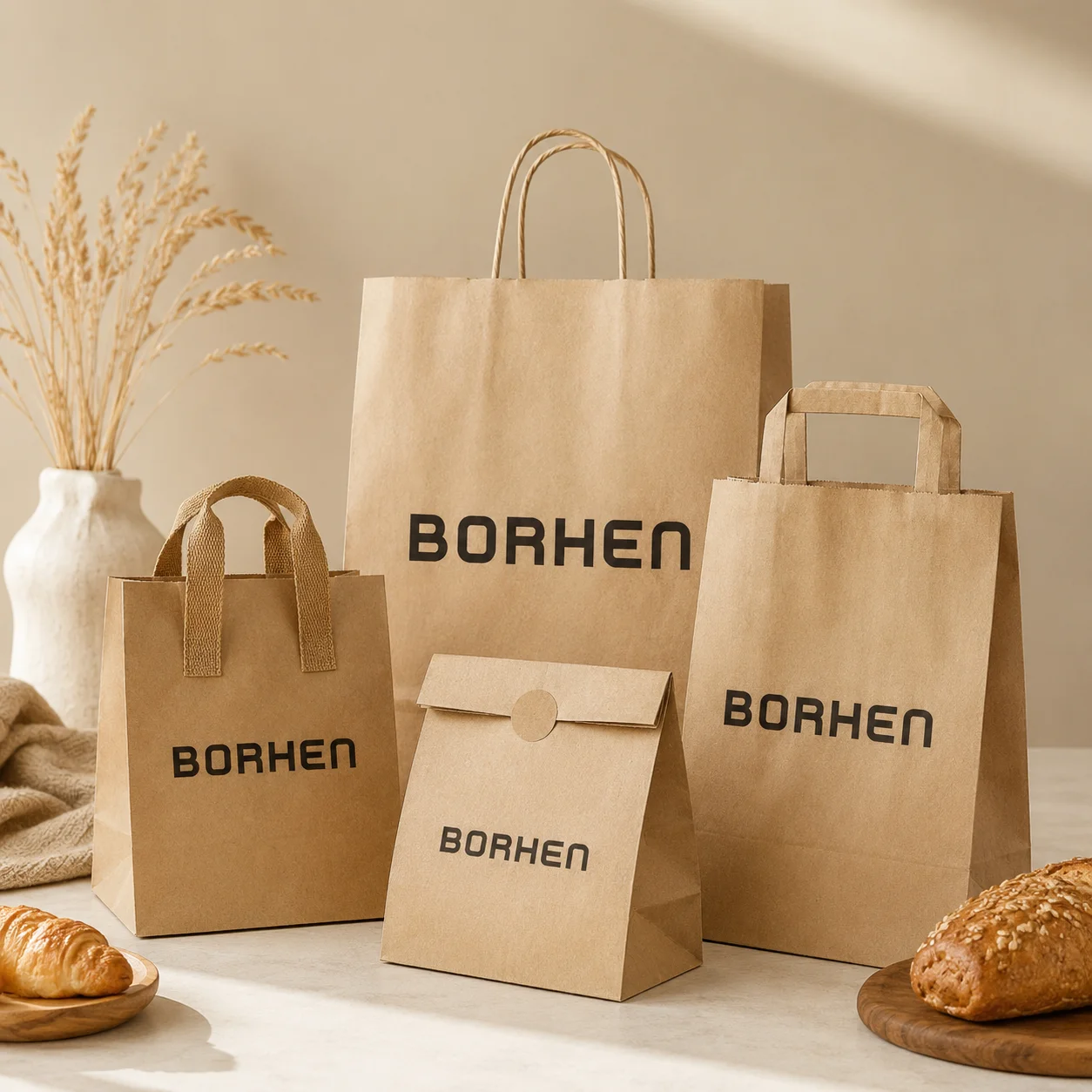
Before final artwork is prepared, I always prefer to confirm the real bag structure first. A rope handle paper bag, twisted paper handle bag, flat paper handle bag, cotton handle bag, ribbon handle bag, die-cut handle bag, and no-handle paper bag may all require different dieline details. A bag with a wide side gusset needs different visual planning from a flat merchandise bag. A luxury shopping bag with rope handles requires more attention around the top fold and handle hole area. A kraft paper takeaway bag may require more practical structure and less decorative finishing. If a designer uses a template from a previous project without checking whether it matches the actual production structure, sampling errors can happen very quickly.
Confirm the Bag Size Before Building the Final Layout
Bag size should be confirmed before the final artwork layout is locked. I often see buyers and designers start artwork early because they already have a rough bag size in mind, but even a small change in width, height, side gusset, or bottom gusset can affect the whole visual balance. A logo that feels perfectly centered on one size may look too small or too low on another size. A background pattern may need to be extended. A side design may need to shift. A bottom panel may need more bleed.
When I confirm bag size, I do not only think about the outer measurement. I also think about the product that will go inside, how much space the product needs, whether the bag should stand upright, how deep the side gusset should be, whether the bottom can support the product weight, and whether the bag size works for export carton packing. For retail brands and distributors, one bag may need to serve multiple products, so the size should feel practical without looking oversized. For gift packaging, the bag should create a sense of value without making the product look lost inside. This is why bag size is not just a technical detail. It affects visual design, product fit, cost, shipping volume, and customer experience at the same time.
Understand the Difference Between Front Panel, Back Panel, Side Gusset, and Bottom Gusset
A well-prepared paper bag artwork file should clearly respect each part of the bag. The front panel is usually the main brand display area. The back panel may repeat the logo, show a website, include a campaign message, or remain clean. The side gusset creates depth and can either be kept simple or used as a secondary brand area. The bottom gusset supports the product and often folds in a way that makes detailed artwork difficult to control. I always review these areas separately because they do not behave the same after production.
For example, a front panel logo should be placed where it remains visible when the bag is carried. A side gusset pattern should not depend on perfect alignment across fold lines unless the design allows for tolerance. A bottom panel should not carry important text because it may be hidden, folded, or rubbed during use. If the bag uses full-area printing, all panels need enough bleed and realistic color planning. If the bag uses minimal branding, the relationship between blank space and logo placement becomes even more important. A custom paper bag looks more professional when every panel has been designed with its real function in mind.
Printing Bleed Protects the Bag from White Edges and Broken Color
Printing bleed is one of the most important paper bag artwork requirements. Bleed means the artwork extends beyond the final cut or fold area so the printed color or pattern continues cleanly after production. Without enough bleed, the finished bag may show thin white lines, uneven edges, or broken background areas. This problem is especially obvious on custom printed paper bags with dark backgrounds, full-color designs, large-area printing, or repeated patterns.
When I check bleed, I do not only check the outside edges of the front panel. I also check side gussets, bottom folds, top folds, and any area where the artwork wraps around the structure. Paper bag production includes cutting, folding, gluing, and forming, so tiny shifts are normal even in controlled production. Bleed gives the artwork enough tolerance to handle these shifts. From my perspective, bleed is a small prepress detail that has a very large impact on final quality. A bag with proper bleed looks cleaner, more complete, and more professionally produced.
Safe Zones Protect Logos, QR Codes, and Important Text
Safe zones are the areas that keep important elements away from risky production zones. I always pay close attention to safe zones because logos, QR codes, slogans, websites, social handles, product messages, certification marks, and small text need to remain readable after the bag is produced. If these elements are placed too close to cut lines, fold lines, handle holes, side gussets, glue seams, or bottom folds, they may become visually awkward or difficult to read.
For paper bag logo placement, safe zones are especially important around the top fold and handle area. A logo placed too close to rope handles or die-cut handles may look crowded. A QR code placed near a side crease may not scan reliably. Text placed too close to the bottom fold may disappear when the bag stands. If the bag uses a luxury minimal design, the safe zone becomes even more important because small misalignment can be very visible. I prefer to keep key branding elements in stable, flat areas where they can survive normal cutting and folding tolerance. This helps protect the final brand presentation.
Logo Placement Should Be Planned Around Carrying Behavior
A custom paper bag is often seen while being carried, not only while lying flat on a table. That is why I always review logo placement based on real carrying behavior. When the customer holds the bag by the handles, the upper area may visually compress slightly, and the bag may tilt depending on the product weight. If the logo is too high, the handle can interfere with the brand mark. If the logo is too low, it may look disconnected from the main visual area or become less visible in photos.
For branded paper bags, I usually want the logo to feel balanced when the bag is standing and when it is carried. The ideal position depends on bag height, handle type, logo size, and visual style. A small luxury logo may need generous blank space to look refined. A larger retail logo may need stronger visibility from a distance. A promotional bag may need more obvious branding because it is used in events or campaigns. I also consider whether the bag will be photographed with the product, displayed in stores, or reused by customers. A good logo position helps the paper bag become a mobile brand touchpoint instead of just a carrying tool.
Handle Holes Must Not Interrupt Key Artwork
Handle holes are one of the most important structural areas in paper bag design. Rope handles, cotton handles, ribbon handles, and reinforced handles usually require holes or attachment points near the top of the bag. Die-cut handles create a larger cut-out area that directly becomes part of the visual design. If the artwork is not planned around these areas, the handles may cut through graphics, reduce visual balance, or weaken the premium feeling of the bag.
When I review handle holes, I check whether the logo, pattern, text, or foil stamping area is too close to the handle zone. I also check whether the top fold has enough space for reinforcement and whether the handle color works with the printed design. A black rope handle creates a different visual effect from a white cotton handle or a kraft twisted paper handle. A ribbon handle may make the bag feel more suitable for gift packaging, while twisted paper handles may feel more practical for kraft retail bags. The handle area should be treated as both a functional and visual part of the artwork. It should never feel like an afterthought.
Side Gusset Graphics Should Respect the Fold Lines
The side gusset can make a custom paper bag feel more complete, but it can also create artwork problems if not handled carefully. In a flat design file, the side gusset may look like a simple narrow panel. In real use, it folds inward, opens outward, and changes shape depending on whether the bag is empty or filled. This movement can distort graphics, interrupt patterns, and make text harder to read.
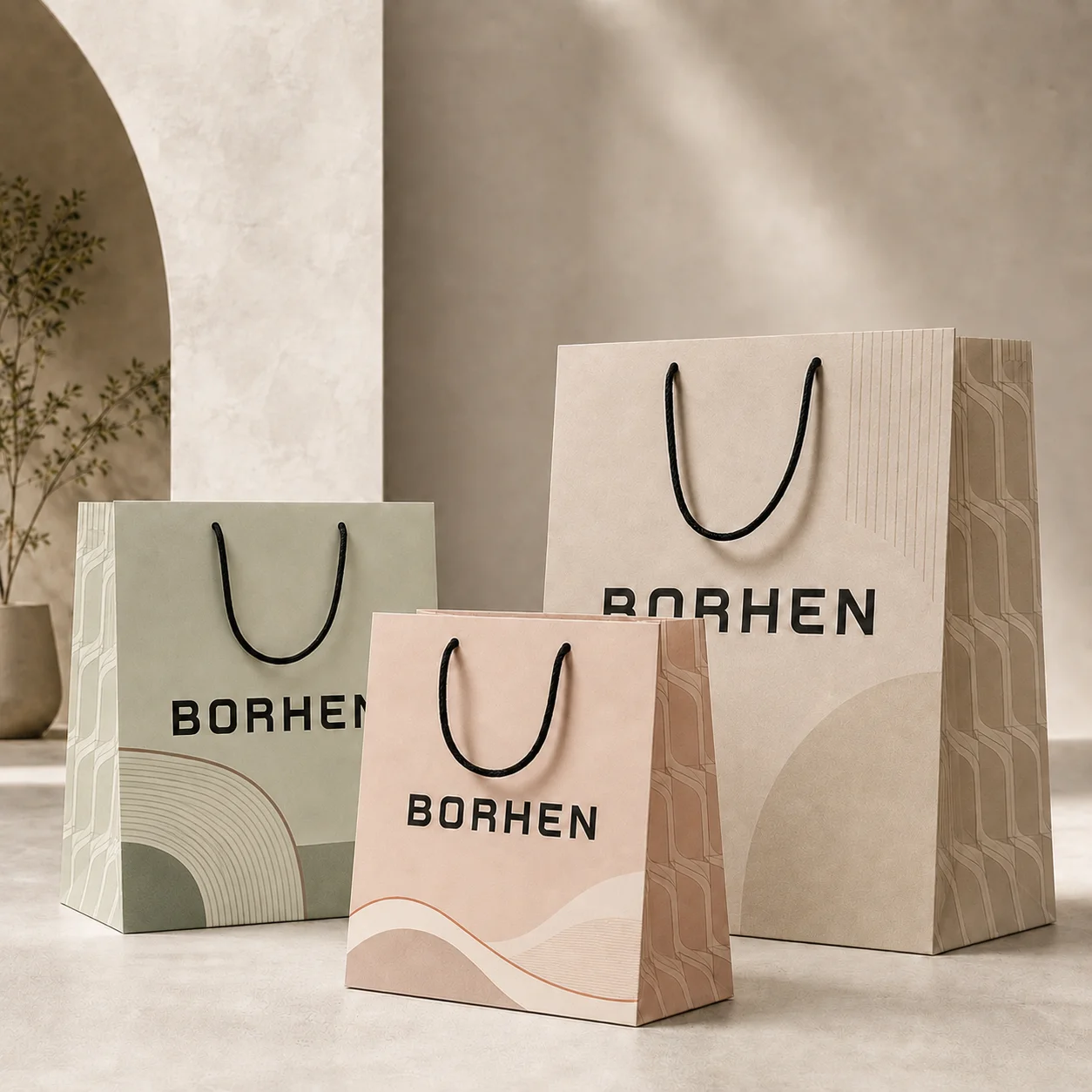
When I design or review side gusset artwork, I first decide whether the side should be printed or kept clean. For premium retail bags, a simple side gusset can make the bag feel elegant and reduce production risk. For promotional bags, a side gusset may carry a website, campaign message, or small brand element. For full-color printed bags, the side gusset may need to continue the background color to avoid visual breaks. However, I avoid placing fine text, QR codes, thin borders, or critical logos directly across fold lines. The side gusset should support the design, not create confusion when the bag is opened.
Bottom Panel Artwork Should Be Simple and Practical
The bottom panel of a paper bag is mainly a structural area. It helps the bag stand, carry weight, and hold the product. Because the bottom folds and glues into shape, it is not the best place for important artwork. I have seen designs where a brand tried to place a logo or message on the bottom panel, but after folding, the artwork became hidden or distorted. In most cases, the bottom should be treated with practical restraint.
If the bag uses full-color printing, the bottom panel still needs proper bleed and color extension so the bag does not show awkward white areas. If the bag uses a dark color, the bottom fold must be prepared carefully because scratches and rubbing may be more visible. If the bag needs bottom reinforcement, the reinforcement card or folding method may affect how the bottom feels and performs. In my view, the bottom panel should first support strength, cleanliness, and production stability. Only after those needs are satisfied should decorative artwork be considered.
Inside Printing Should Be Treated as a Separate Production Decision
Inside printing can create a more premium customer experience, especially for luxury paper bags, gift paper bags, boutique retail bags, cosmetics bags, fragrance bags, and promotional campaign bags. An inside color, pattern, or brand message can make the bag feel more complete when the customer opens it. However, inside printing is not simply “printing more.” It affects artwork setup, production sequence, cost, ink coverage, and sometimes lead time.
When I review inside printing, I check which inner areas will actually be visible when the bag is opened. I also check whether the inside artwork conflicts with fold lines, glue seams, handle reinforcement, or bottom structure. If the inside printing uses a full background color, color consistency and drying control become more important. If the inside printing uses a message, it must be placed where the customer can actually see it. I recommend inside printing when it supports a real brand experience, not just because it sounds premium. For many projects, a clean exterior logo with high-quality paper may be enough. For high-end retail or gift programs, inside printing can add a valuable detail when planned correctly.
Outside Printing Should Be Designed for Visibility and Durability
Outside printing is usually the main part of a custom paper bag design. It carries the logo, brand color, product message, pattern, or campaign identity. But outside printing also faces the most handling. The bag may rub against other bags during packing, move inside export cartons, touch store counters, and be carried by customers through real environments. That means outside printing should be planned for both appearance and durability.
When I review outside printing, I think about ink coverage, paper surface, lamination, finish, and packing method. A full-color printed paper bag may need more surface protection than a simple logo-printed kraft paper bag. A large dark background may look premium, but it may also show scuffs more easily. A minimalist logo may look refined, but it requires precise placement and good paper quality to avoid feeling empty. If the bag will be used in retail stores, the printing should remain clean under handling. If it will be used for events or gifting, the surface should look fresh when handed to the recipient. Printing is not only about color. It is about how the bag will look after real use.
Pantone Color References Should Be Defined Before Sampling
Pantone paper bag printing is important when a brand needs consistent color across different packaging items. If the paper bag needs to match custom boxes, rigid boxes, folding cartons, labels, cards, or retail displays, Pantone references can help keep the brand system more stable. I always ask whether the buyer has a Pantone code, a physical color swatch, an approved packaging sample, or a previous paper bag reference before sampling begins.
However, Pantone color matching is not magic. The same Pantone color can look different on white kraft paper, brown kraft paper, coated paper, textured paper, recycled paper, specialty paper, matte lamination, gloss lamination, or soft-touch lamination. Paper color, surface absorbency, and finishing all affect the final appearance. That is why I prefer to confirm color through sampling when brand color is important. The artwork can define the target, but the approved sample becomes the real production reference. This is especially important for repeat orders because customers expect the next batch to match the approved standard.
CMYK Printing Needs High-Quality Files and Realistic Color Expectations
CMYK printing is often used for full-color paper bags, image-based artwork, gradients, illustrations, and large-area background designs. It gives brands more visual flexibility, but it also requires realistic expectations. A design that looks bright on a digital screen may print softer on paper, especially if the paper is kraft, recycled, textured, or uncoated. Even coated paper bags can show slight differences depending on ink density, lamination, and production conditions.
When I review CMYK artwork, I check image resolution, color mode, artwork clarity, ink coverage, and whether the selected paper can support the intended effect. If the design includes photographs, gradients, or detailed graphics, I pay extra attention because these elements can shift during printing. If the buyer expects very precise brand colors, Pantone matching may be more suitable for key logo areas. CMYK can work very well, but the file must be prepared properly, and the buyer should understand how paper material influences the final printed result.
Full-Area Background Printing Requires Extra Production Control
Full-area background printing can make a paper bag look bold, premium, and highly branded. Many fashion brands, cosmetics brands, fragrance brands, lifestyle brands, and gift packaging buyers use full-color backgrounds to strengthen retail presence. But full-area printing also increases the need for production control. Large ink coverage can make color variation more visible, especially on dark tones such as black, navy, burgundy, deep green, or rich red.
When I review full-background designs, I check whether the bleed is sufficient, whether the paper surface is suitable, whether lamination is needed for protection, and whether the packing method can reduce rubbing marks. A dark matte laminated paper bag can look beautiful, but it may show fingerprints or scuffs if not packed carefully. A full-color bag without proper surface protection may look good at the factory but arrive with rub marks after international shipping. For B2B buyers, full-area printing should be planned as a production decision, not only a visual choice.
Foil Stamping Artwork Must Be Prepared as a Separate Layer
Foil stamping is a premium finishing process, and it must be prepared clearly in the artwork file. I always want the foil stamping layer to be separated from the normal printing layer. The file should show exactly which area needs foil, what foil color is expected, and where the foil should sit on the bag. If the foil is only shown in a mockup effect, the production team may not know how to prepare the stamping plate correctly.
For foil stamped paper bags, I also check logo size, line thickness, text size, paper texture, and placement. Thin lines may break. Small letters may lose sharpness. Textured paper may make foil less even. Foil too close to handle holes, top folds, side gussets, or bottom folds may be harder to align. A clean foil logo on a good paper material can make a luxury paper bag feel very refined, but only when the artwork is realistic for production. I always prefer one well-controlled foil detail over several complicated finishing areas that increase cost and risk.
Spot UV Layers Should Be Clear, Controlled, and Purposeful
Spot UV can add gloss contrast and make a custom printed paper bag feel more premium. It works especially well when applied to a logo, pattern, product name, or selected design detail on a matte background. But spot UV needs accurate alignment, and it should be prepared as a separate artwork layer. If the UV layer is unclear or misaligned, the final effect can look careless.
When I review spot UV paper bag artwork, I check whether the UV area is large enough to be visible, whether it is too close to folds or handle areas, and whether the paper surface can create enough contrast. Spot UV should not be added everywhere. If too much of the bag uses UV, it can increase cost and surface risk without improving the design. A controlled UV highlight is usually more effective. It helps guide the customer’s eye and adds a premium detail while keeping production more manageable.
Embossing and Debossing Need Suitable Design and Material
Embossing and debossing can create a tactile brand effect that customers can feel with their hands. Embossing raises the design from the surface, while debossing presses it into the paper. These finishes can work beautifully for luxury paper bags, gift bags, cosmetics bags, jewelry bags, and boutique retail bags. But they need suitable artwork, paper material, and enough space.
When I review embossing or debossing artwork, I check whether the design is too detailed, too small, or too close to a fold. I also consider whether the selected paper can hold the effect clearly. Smooth paper often shows embossing and debossing better than heavily textured paper. A blind debossed logo on soft-touch paper may feel quietly luxurious. A raised logo on coated paper may create stronger visual impact. But if the paper is too thin, too rough, or not suitable for pressure, the effect may be weak or uneven. I always connect embossing and debossing decisions with material selection because the same artwork can behave very differently on different paper.
Lamination Should Be Confirmed Before Final Color Approval
Matte lamination, gloss lamination, and soft-touch lamination all change how the printed color appears. Matte lamination can make colors feel softer and more refined. Gloss lamination can make colors look brighter and more saturated. Soft-touch lamination creates a smooth premium feel but can also affect how dark colors and fingerprints appear. Because lamination changes the visual result, it should be confirmed before the buyer gives final color approval.
I always recommend reviewing paper, printing, and lamination together. If a customer approves a color on unlaminated paper and later chooses matte lamination, the final tone may feel different. If they approve a bright color digitally and then use soft-touch lamination, the physical result may appear calmer. If the design uses dark background printing, lamination can also influence surface durability and packing requirements. In my experience, lamination is not just a finish. It is part of the color and surface performance of the paper bag.
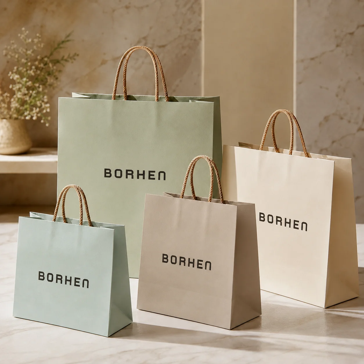
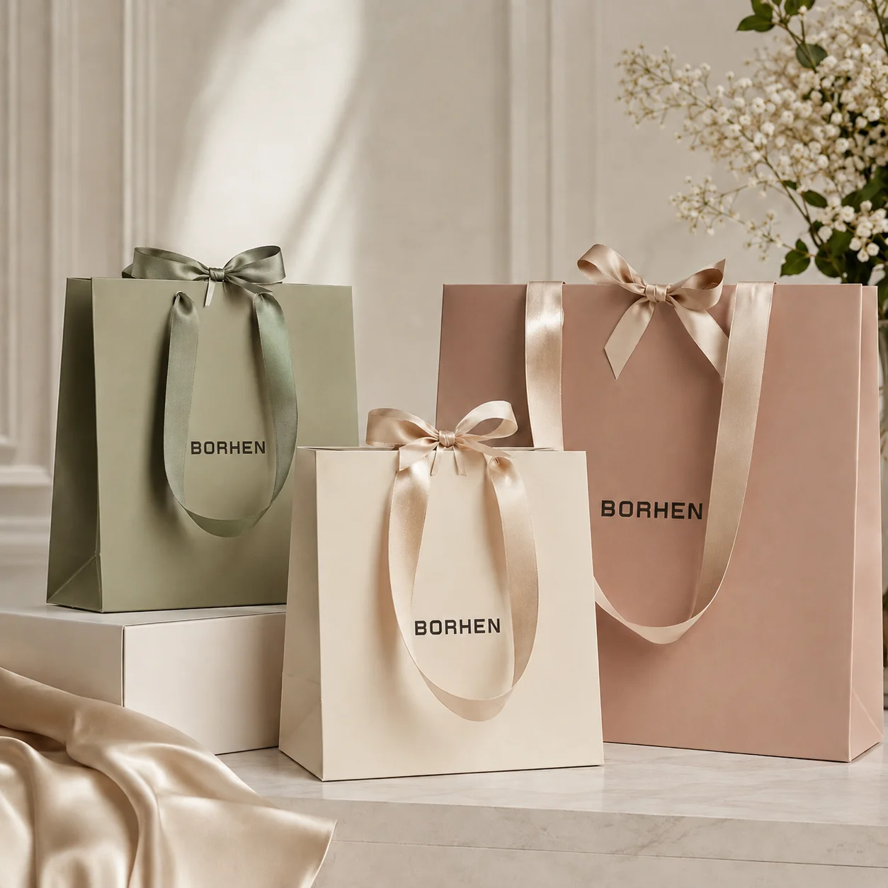
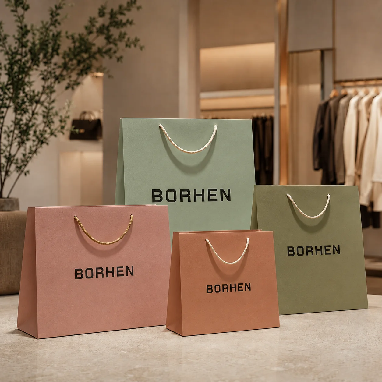
Handle Material, Handle Color, and Handle Length Should Be Specified Clearly
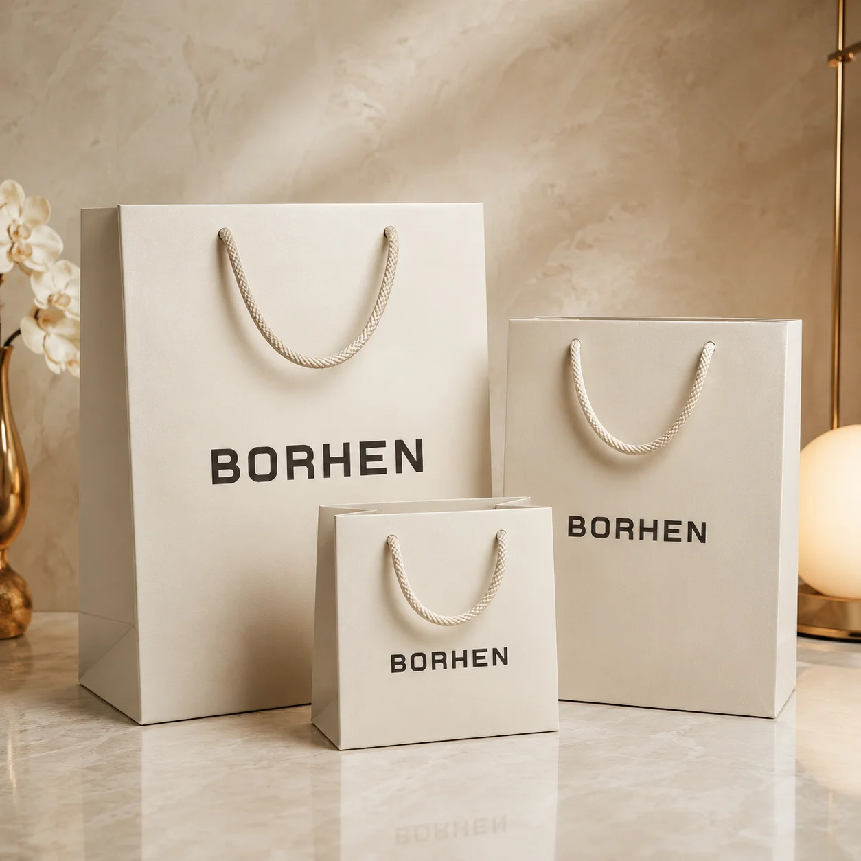
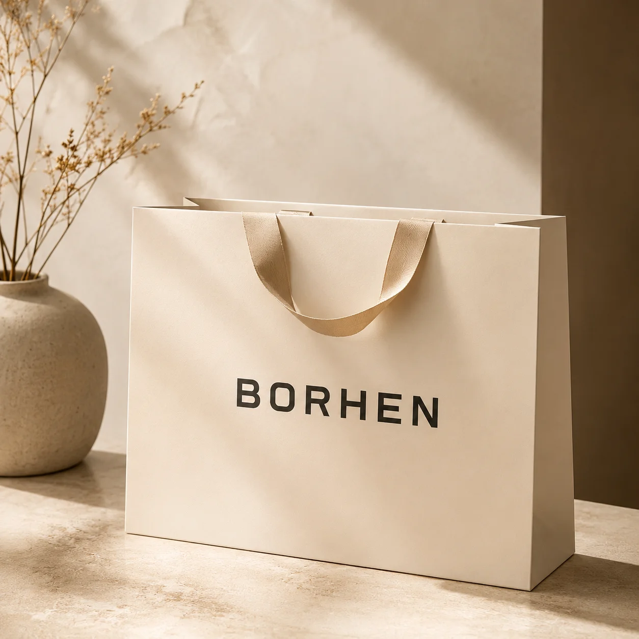
The handle is both a functional part and a visual part of the paper bag. Rope handles, cotton handles, ribbon handles, twisted paper handles, flat paper handles, and die-cut handles all create different feelings. A rope handle may make a bag feel more premium and suitable for retail or gift packaging. A twisted paper handle may be more practical for kraft bags and cost-conscious programs. A ribbon handle may create a softer and more decorative gift presentation. A die-cut handle can look clean and minimal, but it requires careful strength review around the cutout area.
When I prepare paper bag specifications, I always want the handle material, handle color, handle length, handle thickness, and attachment method to be clear. Handle length affects carrying comfort. Handle color affects brand harmony. Handle material affects cost and perceived quality. Handle attachment affects strength. If these details are not specified, the sample may not match the buyer’s expectation. A custom paper bag should feel coordinated from the printed surface to the handle. If the handle feels disconnected from the design, the whole bag can feel less professional.
Reinforcement Areas Should Be Planned Before Sampling
Reinforcement is especially important when the bag needs to carry heavier products. Some bags need reinforced top folds, handle patches, stronger bottom cards, thicker paper, or improved glue control. These reinforcement areas may not be obvious in a digital mockup, but they can affect both structure and appearance. If the reinforcement changes the thickness of the top area or bottom area, the artwork and handle position may need to be reviewed accordingly.
When I review reinforcement needs, I ask what product the bag will carry, how heavy it is, how the customer will use the bag, and whether the bag is meant for retail shopping, gifting, events, food takeaway, or product handover. A paper bag for jewelry may not need the same reinforcement as a bag carrying glass bottles, shoe boxes, candle jars, or multi-item gift sets. Reinforcement adds cost, but it can prevent handle tearing, bottom failure, and customer complaints. In my view, reinforcement should be decided before sampling, not after a weak bag has already been produced.
Glue Areas Should Be Kept Clear of Important Visual Elements
Glue areas are part of the manufacturing structure, not part of the main display space. They may be hidden, overlapped, pressed, or affected by folding. If important artwork is placed in a glue area, it may disappear or become misaligned after production. This is why I check glue seams and bottom glue zones before artwork approval.
For full-color or patterned paper bags, glue areas still need proper color extension so the final bag does not show gaps. But the design should not rely on perfect alignment across a glue seam unless the tolerance allows it. If a pattern crosses a side seam, I make sure the buyer understands that slight variation may happen. If a logo or text is near the seam, I usually recommend moving it to a safer area. Good artwork respects the structure of the paper bag. It does not force a functional zone to behave like a perfect display panel.
QR Codes and Small Text Need Practical Placement
QR codes, websites, social media handles, product messages, and certification marks can add useful information to custom paper bags, but they need practical placement. A QR code should sit on a flat, stable area with enough contrast and enough quiet space around it. It should not be placed near side gussets, bottom folds, handle holes, or areas that curve when the bag is opened. If it is printed too small or on a heavily textured surface, scanning may become unreliable.
Small text also needs attention. Text that looks clear on a screen may become difficult to read when printed on kraft paper, recycled paper, textured paper, or dark backgrounds. If the bag is used for retail or export markets, certification marks or environmental messages should remain readable. I usually recommend keeping small information clean, simple, and away from folds. A paper bag should communicate brand value clearly, not force customers to struggle with unreadable details.
Artwork Files Should Be Organized for Production, Not Only for Presentation
A beautiful mockup is useful for visual communication, but it is not enough for production. I prefer artwork files that are clean, editable, and organized by layer. The dieline should be separate from the artwork. The printing layer should be clear. Pantone colors should be labeled. CMYK images should be high resolution. Foil stamping, spot UV, embossing, and debossing should each have their own clearly marked layers. Fonts should be outlined or properly embedded. Linked images should be included. Notes should be specific rather than vague.
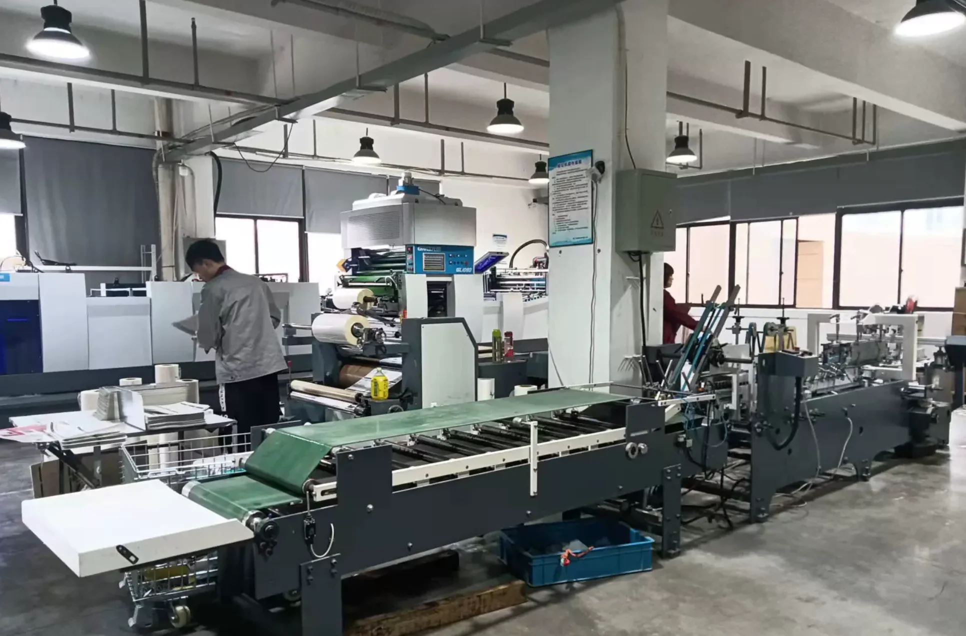
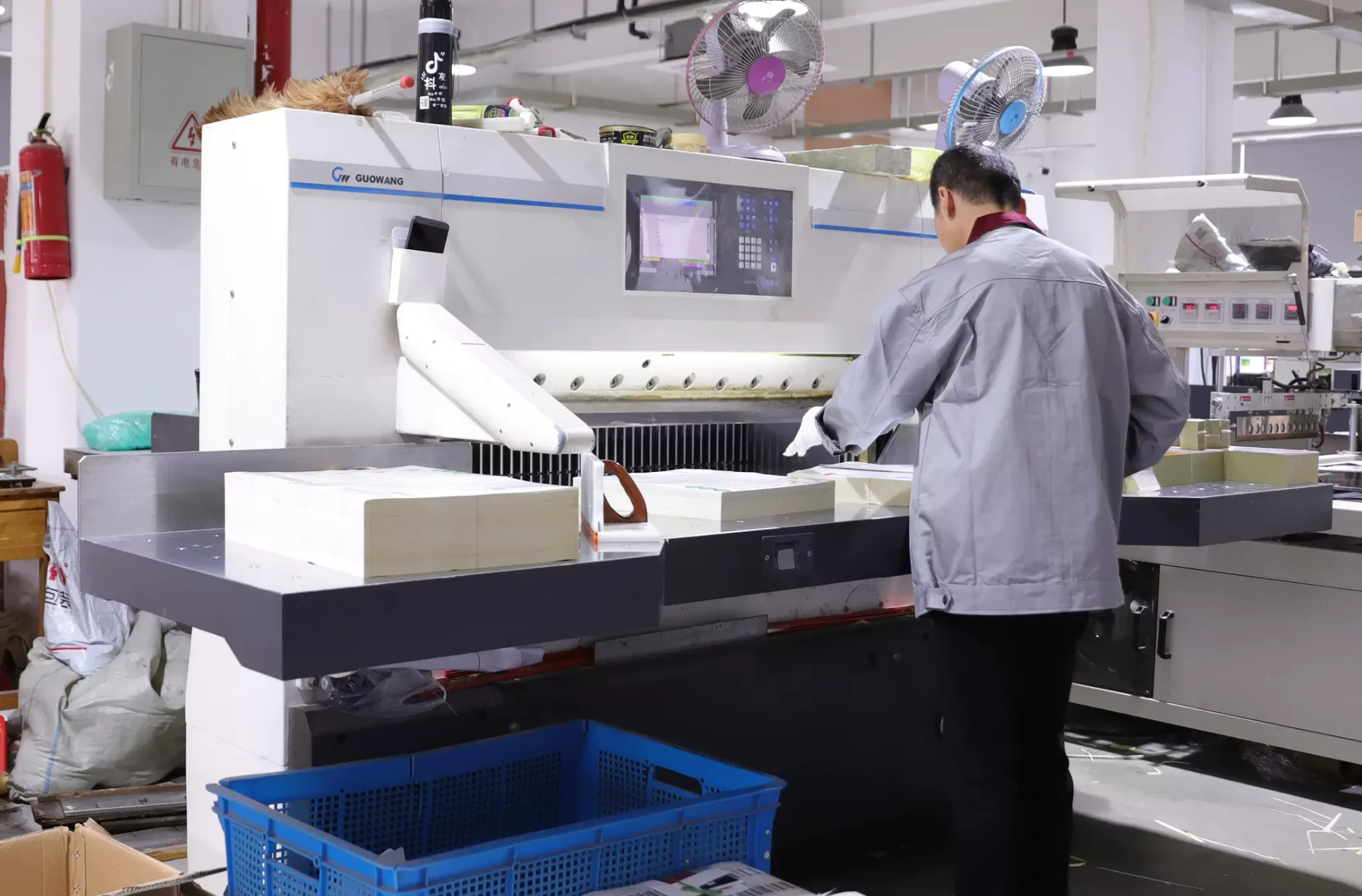
When the file is not organized, the manufacturer has to ask more questions before sampling. Missing fonts, unclear layers, low-resolution images, wrong dielines, and unclear finishing instructions can delay the project. For designers and agencies, a production-ready file protects the design from being misinterpreted. For brands and procurement teams, it reduces back-and-forth communication and helps the supplier move faster. In my view, artwork quality is not only about aesthetics. It is also about production clarity.
Material Specifications Should Be Included with the Artwork
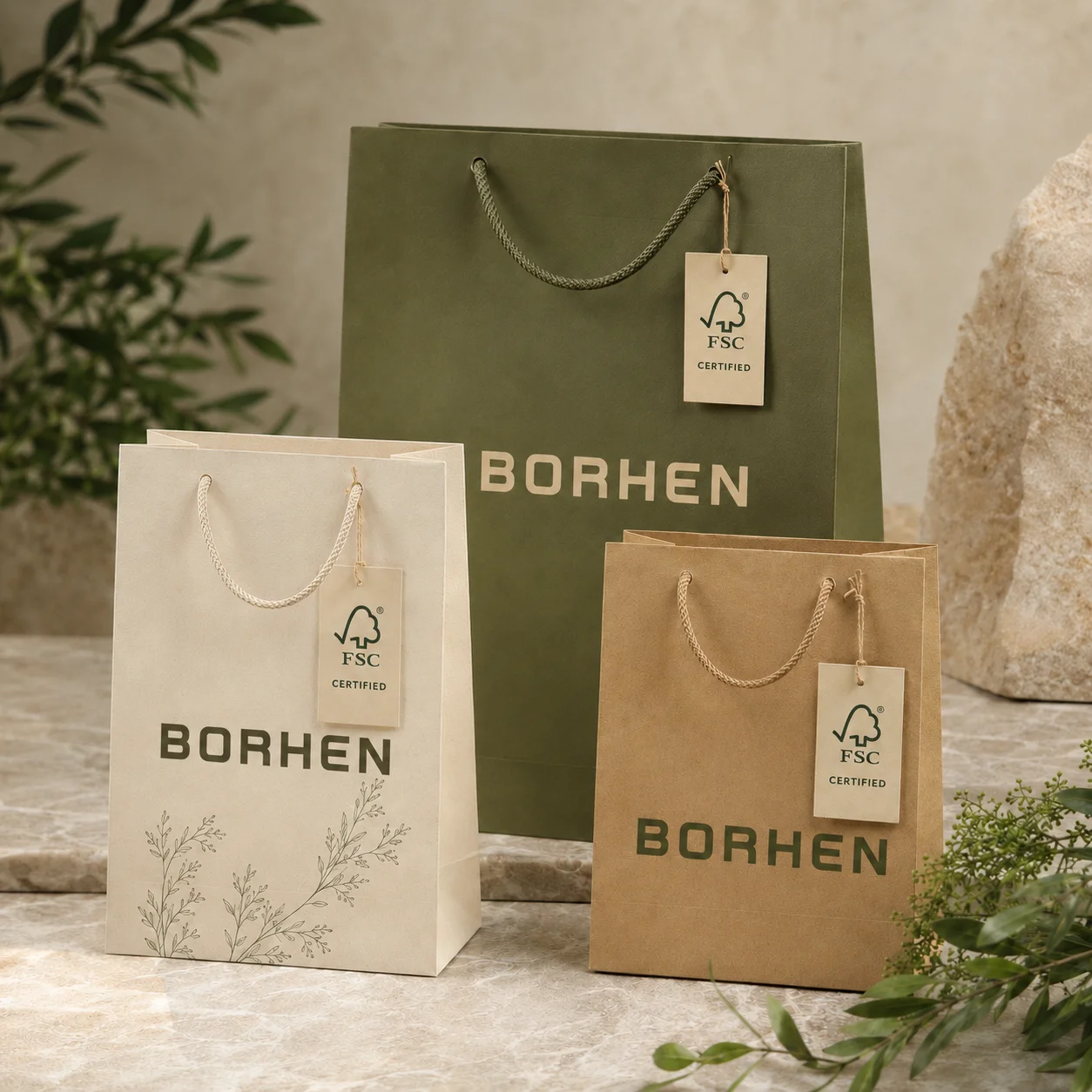
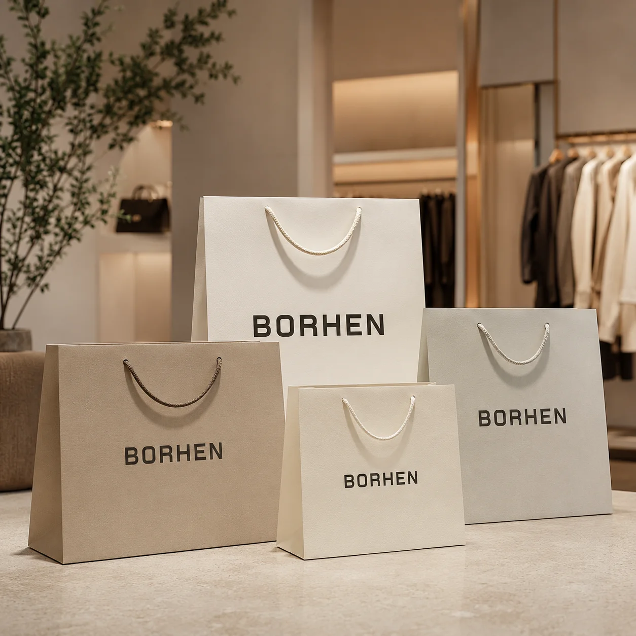
Paper material and paper weight should be included in the specification because they affect printing, color, strength, finishing, MOQ, and cost. The same artwork can look very different on white kraft paper, brown kraft paper, coated paper, art paper, textured paper, specialty paper, FSC-certified paper, or recycled paper. If the buyer does not specify the material direction, the supplier may choose something that works technically but does not match the brand expectation.
When I prepare or review paper bag specifications, I want to know the paper type, paper weight, surface texture, whether FSC-certified paper options are required, whether lamination is needed, and whether the paper must match another packaging item. If a brand wants a natural look, brown kraft paper may be suitable. If it wants sharp color printing, coated paper may be better. If it wants a premium hand-feel, textured or specialty paper may be useful. These choices should be confirmed before sampling because material decisions directly influence the final appearance and production feasibility.
Printing and Finishing Specifications Should Be Detailed
A complete production specification should explain not only what the bag looks like, but also how the finish should be produced. If the bag includes logo printing, CMYK printing, Pantone matching, full-color printing, inside printing, outside printing, matte lamination, gloss lamination, soft-touch lamination, foil stamping, embossing, debossing, or spot UV, those processes should be clearly listed. The position, color, effect, and layer requirements should be defined before sampling.
Vague instructions such as “make the logo shiny” or “add luxury finish” can create misunderstanding. A factory needs to know whether the logo should be foil stamped, spot UV coated, embossed, debossed, or printed with metallic ink. These effects are not the same. They require different artwork layers, different tools, different costs, and different production steps. I always prefer clear finishing specifications because they reduce sampling mistakes and make the buyer’s expectations easier to control.
Packing Requirements Should Be Confirmed Early
Packing is often discussed too late, but for custom paper bags, packing can affect the final quality at arrival. Paper bags can crease, deform, rub, or get damaged during shipping if they are not packed properly. Rope handles, ribbon handles, foil stamped logos, matte laminated surfaces, soft-touch finishes, and dark printed backgrounds may need extra protection. If bags are packed too tightly, they may develop pressure marks. If they are packed too loosely, they may shift inside cartons and damage corners.
When I review packing requirements, I think about whether the bags should be packed flat, how handles should be arranged, whether inner protection is needed, how many bags should go into each carton, how strong the outer carton should be, and whether the shipment will travel by sea, air, courier, or local delivery. For international buyers, export packing is especially important because the bags may go through long-distance transport, warehouse handling, customs checks, and distributor storage. A custom paper bag should not only leave the factory in good condition. It should arrive clean, flat, and ready for retail or gifting use.
Physical References Help the Manufacturer Understand the Target
Physical references are very helpful when the buyer has strict expectations. A digital file can show design direction, but it cannot fully communicate paper stiffness, handle feel, surface texture, foil shine, embossing depth, lamination touch, or exact color. If the buyer has an existing paper bag, custom box, Pantone guide, printed swatch, material sample, or approved packaging reference, I like to review it before sampling.
This is especially useful when the paper bag needs to match other packaging items. Many brands want their custom paper bags, rigid boxes, folding cartons, gift boxes, thank-you cards, and labels to share a consistent visual system. Matching this system requires more than placing the same logo on each item. The paper tone, print color, finish, and overall proportion should feel coordinated. Physical references make this process much easier and help reduce color or material misunderstanding before sampling.
The Approved Sample Should Become the Production Standard
Once the paper bag sample is approved, I treat it as the production standard. The sample confirms the real paper material, paper weight, bag size, handle type, handle color, logo placement, printing effect, finishing result, reinforcement method, and packing direction. It should not be treated as only a temporary preview. It is the physical reference that helps control bulk production and future repeat orders.
For B2B buyers, this is extremely important because repeat order consistency depends on clear standards. If the next order uses a slightly different paper, handle, color, or lamination, the bag may no longer match the approved sample. Retail brands, distributors, importers, and promotional project buyers often need stable packaging across multiple shipments, stores, markets, or campaigns. A clear approved standard helps reduce sample-to-bulk differences and makes reordering much easier. In my experience, the best paper bag projects are the ones where the approved sample becomes a reliable foundation for long-term production.
How I Review Artwork and Specifications at BorhenPack
At BorhenPack, I review artwork from both a design perspective and a manufacturing perspective. I check whether the custom paper bag dieline matches the real structure, whether the bag size fits the product, whether the logo placement is safe, whether the printing bleed is enough, whether the side gusset artwork respects fold lines, whether the bottom panel is practical, whether handle holes affect the design, whether Pantone or CMYK requirements are clear, and whether foil stamping, spot UV, embossing, or debossing layers are properly separated.
I also review paper material, paper weight, handle type, handle color, reinforcement needs, lamination, inside printing, outside printing, packing method, and repeat order expectations. If I see a risk, I prefer to explain it before sampling. The logo may need to move away from the handle holes. The side pattern may need to avoid a fold. The bottom artwork may need simplification. The bleed may need extension. The foil stamping area may need thicker lines. The QR code may need more space. This early review helps reduce rework and gives the customer a clearer path from artwork to approved sample and bulk production.
Why Good Artwork Preparation Helps Designers, Brands, and Procurement Teams
Good artwork preparation benefits everyone involved in the project. For designers and agencies, it protects the creative concept and helps the final bag match the design intention more closely. For brands, it keeps the packaging aligned with the brand identity and reduces the risk of disappointing samples. For procurement teams, it makes quotations clearer, sampling faster, and supplier communication more efficient. For importers and distributors, it helps create specifications that can be repeated across future orders.
I often see artwork preparation as the point where creativity becomes operational. A beautiful design creates the brand direction, but a production-ready artwork file turns that direction into something the factory can actually make. When the file is clear, the supplier can review the project more accurately. When the specifications are complete, the quotation becomes more meaningful. When the sample is approved based on a clear standard, bulk production becomes more stable. This is why I believe artwork preparation is not a small technical step. It is one of the most important foundations of a successful custom paper bag program.
Final Thoughts on Preparing Artwork and Specifications
Preparing artwork and specifications for paper bag manufacturing is about building a clear bridge between design and production. The artwork should be based on the correct custom paper bag dieline, with enough printing bleed, safe zones, practical logo placement, properly planned side gusset graphics, careful bottom panel treatment, accurate handle hole positioning, and clear finishing layers for foil stamping, spot UV, embossing, or debossing. The specifications should also include paper material, paper weight, handle type, handle color, lamination, printing method, Pantone or CMYK color references, reinforcement needs, inside and outside printing, packing method, and quality expectations.
From my perspective, a custom paper bag is not only a design file. It is a real brand packaging product used in retail stores, gift packaging, promotional events, e-commerce handover, distributor programs, and repeat supply. When the artwork is prepared with real manufacturing details in mind, the final bag is more likely to look professional, carry the brand clearly, perform well in real use, and remain consistent across bulk production and repeat orders. That is the real value of strong artwork preparation: it reduces uncertainty before production begins and helps turn a paper bag idea into a reliable packaging solution.


