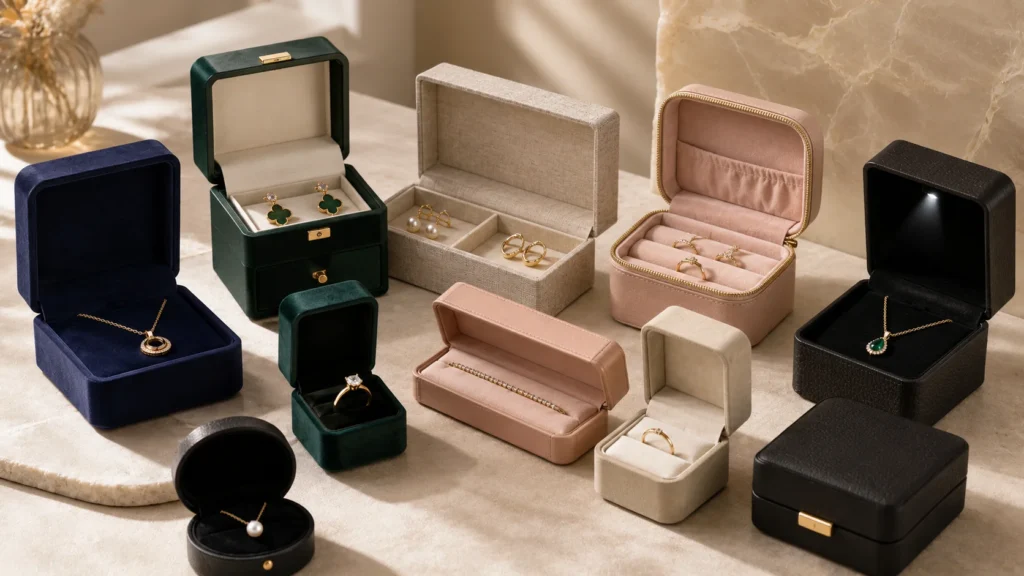

Custom jewelry boxes should balance material, box style, insert design, and logo finishes to protect jewelry, strengthen brand identity, improve customer experience, and remain practical for production, shipping, and repeat orders.
When I think about custom jewelry boxes, I never see them as simple containers used to hold a ring, necklace, bracelet, earrings, or jewelry set. A jewelry box is often the first physical contact between a brand and the customer, and it quietly shapes how the product is judged before the jewelry itself is fully seen. The material, box style, insert, logo finish, opening feel, surface texture, and internal layout all work together to influence perceived value, trust, gifting experience, and product protection. A beautiful piece of jewelry can lose part of its impact if the box feels weak, the insert is loose, the logo looks careless, or the product shifts during shipping.
In many custom packaging projects, I find that the biggest challenge is not choosing the most expensive box or the most decorative finish. The real challenge is choosing the right combination. A textured rigid box may work beautifully for a premium jewelry line, but it may not be practical for every product or quantity. A drawer box may create a refined reveal, but it needs a stable insert to prevent movement. A folding carton may be cost-efficient and lightweight, but it may need better printing and insert planning to feel professional. Foil stamping, embossing, debossing, spot UV, and full-color printing can all improve surface branding, but only when they match the material, structure, and brand style.
This article is written to help make those decisions more clearly. I will walk through how to choose jewelry box materials, box styles, inserts, and logo finishes in a practical way, so the final packaging does more than look good in a sample photo. A good custom jewelry box should protect the product, present it beautifully, support the brand image, fit the sales channel, and remain realistic for cost, MOQ, sampling, and repeat production. In my view, the best jewelry packaging is not the one with the most processes. It is the one where every detail has a reason and every choice helps the jewelry feel more valuable when the box is opened.
What Makes a Jewelry Box Different From General Packaging
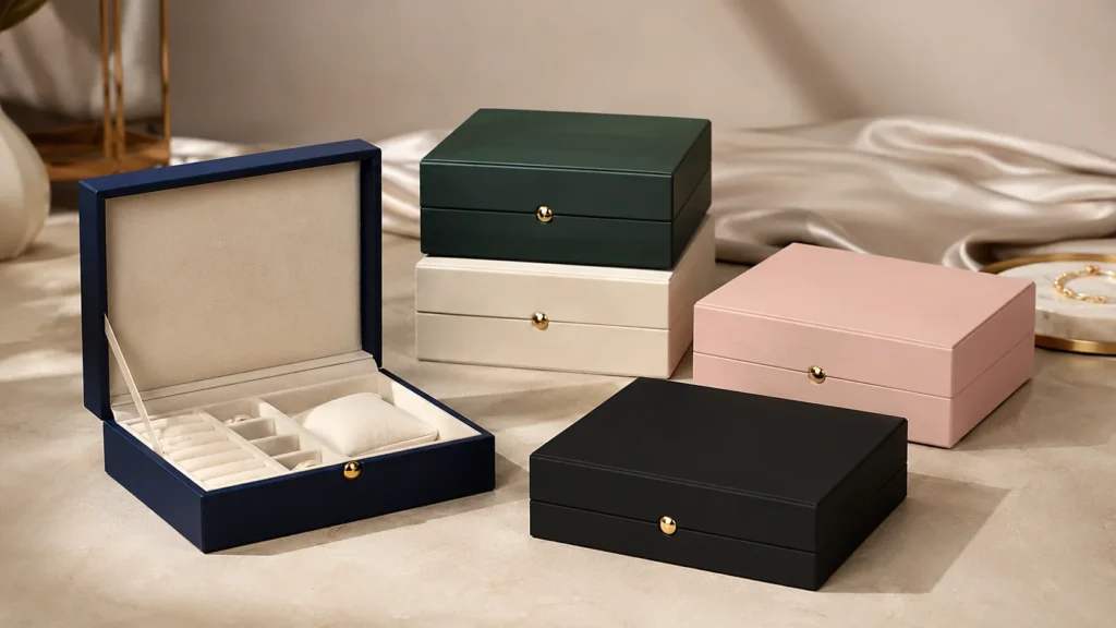
When I compare jewelry boxes with general product packaging, I always feel that jewelry packaging has a much heavier responsibility in a much smaller space. A jewelry box is not only expected to protect the product; it also needs to present something delicate, valuable, emotional, and often gift-related. Unlike many ordinary packages that only need to carry, store, or ship a product, a jewelry box must control details that customers can see and feel immediately. Its size, structure, insert, surface material, logo finish, and opening experience all influence how the customer understands the jewelry before they even touch it.
Jewelry Boxes Carry More Meaning in a Smaller Format
I often think the biggest challenge of jewelry packaging is that the box is usually small, but the expectation behind it is very high. A cosmetic box, a food box, or an apparel carton may have more surface area to communicate information, display graphics, or cover small production variations. A jewelry box does not have that luxury. The customer usually holds it close, opens it slowly, and pays attention to every visible detail. This makes the small format much more demanding. A slight gap between the lid and base, a poorly centered logo, an uneven edge, or a loose insert can be noticed more easily because everything happens within a compact space.
This is why I do not see jewelry boxes as simple scaled-down versions of general packaging. The smaller the box, the more important the proportion becomes. The relationship between the jewelry size and the box size must feel intentional. If a small ring is placed inside a box that feels too large, the product may look less valuable because the empty space weakens the presentation. If a necklace is forced into a box that is too compact, the chain may bend, tangle, or feel compressed. In jewelry packaging, space is not just a technical measurement; it is part of how the product is visually valued.
Jewelry Packaging Requires Higher Detail Control
I have found that detail control matters more in jewelry boxes because customers interact with them at a closer distance. They do not simply glance at the packaging from a shelf. They hold it in their hand, feel the surface, open the lid, look at the insert, and often keep the box for storage or gifting. This means the finishing quality must be more precise. The corner wrapping, paper mounting, cut lines, lid fit, drawer sliding, magnetic closure, insert alignment, and logo position all contribute to whether the box feels refined or careless.
In general packaging, a box may still work well if it performs its basic function of protecting the product and carrying the brand design. With jewelry packaging, the emotional standard is higher. A customer may not consciously analyze the corner folding or insert thickness, but they can still feel when the box is well made. A smooth opening motion, a clean paper surface, and a firm structure create a quiet sense of quality. When these details are inconsistent, the packaging may make the jewelry feel less premium, even if the product itself is attractive.
Jewelry Boxes Need to Protect Products That Are Easy to Scratch Move or Tangle
I always pay special attention to the protection needs of jewelry because jewelry items are usually delicate in ways that general products are not. A ring may have a polished surface that can be scratched by rough contact. A plated necklace may need protection from friction. A thin chain can tangle easily if it moves inside the box. Earrings can rotate, fall out of position, or rub against each other. A bracelet may need enough support to prevent bending or shifting. These are not always problems that can be solved by making the outer box stronger. They usually require the internal structure and insert to be designed correctly.
This is one of the clearest differences between jewelry packaging and ordinary product packaging. For many products, if the outer box prevents compression and impact, the packaging is considered successful. For jewelry, I also need to think about micro-movement inside the box. Even if the jewelry is not damaged, it can still arrive in a messy position. A tangled necklace or tilted ring can reduce the sense of care when the customer opens the box. This is why the inside of the jewelry box is just as important as the outside.
Movement Control Is Part of the Presentation
I often remind brands that a jewelry box should not only look good when it is arranged for photography. It must keep the jewelry in the right position after handling, packing, shipping, and opening. Movement control is not only about avoiding damage; it is also about preserving the presentation moment. When a customer opens a jewelry box, they expect the product to appear neat, centered, and ready to admire. If the jewelry has shifted, the emotional impact of the opening moment is weakened.
A good insert helps solve this problem by holding the product securely without making it difficult to remove. For rings, the slot needs enough grip to keep the ring upright. For necklaces, the insert should manage both the pendant and the chain. For earrings, the card or insert must keep both pieces balanced. For bracelets, the holding area should support the shape without making the box feel empty. In my view, a well-designed insert works almost like a quiet display assistant. It keeps the jewelry stable, improves the first view, and helps the customer feel that the product has been prepared with care.
Jewelry Boxes Must Support Display Not Just Storage
I see jewelry boxes as small presentation stages rather than simple storage containers. Many customers do not immediately discard jewelry boxes after receiving the product. They may keep them for storage, use them when gifting, place them on a dressing table, or reuse them when traveling. For brands, this means the box may continue representing the brand long after the first purchase. General packaging often disappears after the product is opened, but jewelry packaging may remain part of the customer’s personal space.
This is why display quality matters. The way the jewelry sits inside the box should make the product easy to appreciate. A ring should not sink too deeply into the insert. A necklace pendant should not be hidden under the chain. Earrings should not appear uneven. A jewelry set should not feel crowded or randomly arranged. The interior layout should make the product look intentional and complete. When the display is done well, the jewelry box does more than protect the product; it helps the customer see the jewelry in its best condition.
Jewelry Packaging Has a Stronger Emotional Role
I believe jewelry packaging carries more emotion than many general packaging categories because jewelry is often connected to personal meaning. It may be purchased for a proposal, anniversary, birthday, wedding, holiday, graduation, or self-reward. In these situations, the customer is not only buying a physical item. They are buying a moment, a memory, or a feeling. The box becomes part of that moment. It influences how the giver presents the gift and how the receiver experiences the surprise.
This emotional role changes the standard for packaging. A plain box may be acceptable for many everyday products, but jewelry customers often expect a more thoughtful experience. The box should create a sense of anticipation before opening and a sense of satisfaction after opening. This can come from a firm structure, a soft interior, a clean logo finish, a carefully chosen color, or a smooth opening method. The goal is not always luxury in the expensive sense. The goal is to make the packaging feel appropriate to the emotion behind the purchase.
The Opening Experience Matters More Than Many Brands Expect
I often evaluate jewelry packaging by imagining the customer’s hand movement. How does the lid lift? Does the drawer slide smoothly? Does the magnetic closure feel stable? Does the product appear immediately when the box opens? Is the jewelry easy to remove without damaging the insert or disturbing the presentation? These details are important because the opening experience is part of the product experience. The customer may not describe it in technical terms, but they will feel whether the box opens with quality or with weakness.
A premium opening experience does not always require the most expensive material. It often comes from good proportion, structure, and finishing control. A simple lid and base box can feel refined if the fit is accurate and the material feels right. A drawer box can feel premium if the sliding resistance is smooth and stable. A magnetic box can feel trustworthy if the closure aligns well and does not feel loose. In jewelry packaging, the reveal moment matters because it is the first time the customer sees the product inside the brand’s intended presentation.
Jewelry Packaging Needs to Work for Both Retail and Ecommerce
I also think jewelry boxes are different because they often need to satisfy more than one selling environment. A retail jewelry box may need to look elegant under store lighting, support product display, and create a strong in-person impression. An ecommerce jewelry box needs to survive shipping, control product movement, and still create a good unboxing experience when it reaches the customer. A gift-focused jewelry box needs to look presentable without additional wrapping. These different use cases affect the choice of box style, material, insert, and finish.
This is where general packaging logic is not always enough. A box that looks beautiful on a retail counter may not perform well in ecommerce delivery if the structure is too delicate or the surface scratches easily. A lightweight mailer-style box may work well for shipping but may not provide the same emotional value for premium gifting. I believe brands need to understand where the customer will first experience the box. The best jewelry packaging is not only attractive; it is appropriate for the channel where it will be used.
A Jewelry Box Must Balance Protection Presentation and Brand Value
In my view, the main difference between a jewelry box and general packaging is the balance it needs to achieve. It must protect delicate products, keep them in position, support display, communicate brand value, and create a meaningful opening experience. If it focuses only on appearance, it may fail during shipping or daily use. If it focuses only on protection, it may feel too plain for jewelry. If it focuses only on decoration, it may become expensive or visually excessive without improving the customer experience.
This is why I always look at jewelry packaging as a complete system. The outer structure, inner insert, material surface, logo finish, box size, opening method, and product position should work together. When these elements are aligned, the box feels natural, professional, and trustworthy. When they are not aligned, the packaging may feel attractive in one area but weak in another. A good jewelry box should make the jewelry feel safer, more valuable, and more memorable. That is what makes it different from general packaging.
Start With the Jewelry Type Before Choosing the Box
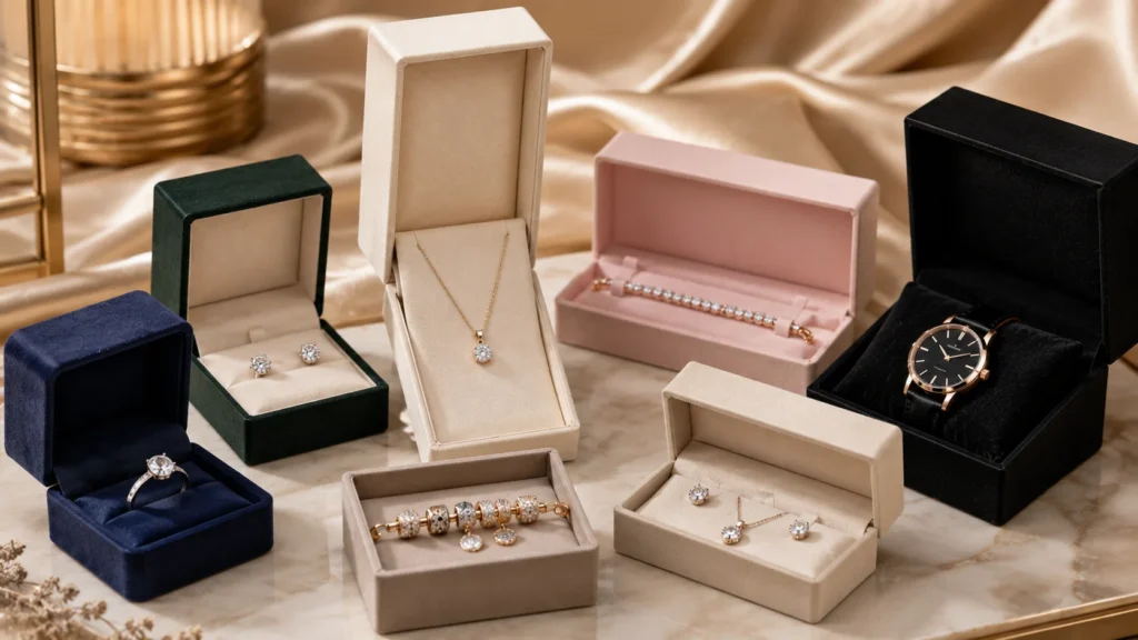
When I plan custom jewelry boxes, I always start with the jewelry type before I look at box styles, materials, colors, inserts, or logo finishes. This is because every jewelry product has its own shape, weight, surface sensitivity, display angle, and movement risk. A box that looks elegant in a reference photo may not be suitable if it cannot hold the jewelry securely or present it clearly after shipping. In my view, jewelry packaging should begin with one practical question: what does this product need the box to do? Once I understand the product itself, the rest of the packaging decisions become much more logical.
Product Shape Should Guide the Packaging Direction
I believe the shape of the jewelry should always guide the first packaging decision. A ring, necklace, bracelet, charm, watch, and jewelry set do not sit inside a box in the same way. Some products need to stand upright, some need to lie flat, some need to hang naturally, and some need to be fixed at multiple points. If the box is chosen only because it looks beautiful, the structure may work against the product instead of supporting it. This is one of the most common mistakes I see when brands develop jewelry packaging from a visual reference rather than from the actual product.
For example, a small ring usually needs a compact box with a secure slot, while a necklace needs more attention to chain control and pendant position. A bracelet may need length support, while a pair of earrings needs symmetry and balance. A watch needs stronger cushioning because it is heavier and more structured than most jewelry items. These differences show why I do not treat jewelry packaging as one general category. The product type should decide the internal space, insert design, box depth, opening direction, and even the material strength.
Rings Need Upright Support and a Clear Center Focus
When I think about ring packaging, I focus on how the ring appears the moment the customer opens the box. Rings are small, but they often carry strong emotional value, especially when they are used for engagement, wedding, anniversary, gemstone, or premium gift occasions. The ring should appear upright, centered, and stable. If it leans, sinks too deeply, or moves inside the slot, the whole presentation can feel less intentional.
I usually pay close attention to the insert slot, because it controls both protection and display. The slot needs enough grip to keep the ring in position, but it should not be so tight that the customer struggles to remove the ring. The box height also matters. If the inner height is too low, the ring may press against the lid. If the box is too deep, the ring may look small and less important. A good ring box should create a strong first view without overcomplicating the structure. In my opinion, ring packaging succeeds when the product becomes the clear visual center immediately after opening.
Earrings Need Pair Alignment and Stable Holding
When I work with earring packaging, I think about pair presentation first. Earrings are usually judged as a pair, so the packaging needs to keep both pieces aligned, balanced, and visible. If one earring tilts or shifts, the presentation can feel careless, even if the product itself is well made. This is especially important for small studs, hoops, drop earrings, and delicate fashion earrings because each style has a different way of moving inside the box.
For stud earrings, I look at whether the backing and post can be held securely without making the product hard to remove. For hoop earrings, the box needs enough space so the circular shape is not pressed or distorted. For drop earrings, vertical space becomes more important because the design may need to hang naturally. I also consider whether the insert card or inner tray matches the earring style. A very soft insert may feel premium, but it may not hold certain earring types as accurately as a well-cut card. In my view, good earring packaging should make the pair look complete, balanced, and ready to wear.
Necklaces Need Chain Control and Pendant Presentation
I often see necklaces as one of the most difficult jewelry products to package well because they have two different parts that behave differently. The chain is thin, flexible, and easy to tangle, while the pendant is usually the visual focus. If the chain is not controlled, the necklace may arrive twisted or messy. If the pendant is not positioned well, the customer may not immediately see the design clearly when the box opens.
For necklace packaging, I focus on how the chain is guided and how the pendant is displayed. A lightweight necklace may work well with a card insert if the chain is fixed cleanly behind the card. A more premium necklace may need a rigid box with a shaped insert that keeps the pendant centered and reduces chain movement. If the pendant is heavy, the insert must prevent it from sliding downward. If the chain is very fine, the packaging must avoid sharp contact points that may cause tangling or deformation. In my experience, the best necklace box makes the pendant look elegant while quietly managing the chain in the background.
Bracelets Need Length Support and Natural Shape Control
When I evaluate bracelet packaging, I first look at the bracelet’s structure. A soft chain bracelet, a rigid bangle, a beaded bracelet, a leather bracelet, and a cord bracelet all require different packaging solutions. A flexible bracelet can often be arranged flat or slightly curved, but a bangle needs space to maintain its natural shape. If the packaging forces the bracelet into the wrong position, the product may look awkward or feel difficult to remove.
Bracelet boxes also need to avoid two opposite problems. If the box is too small, the bracelet may feel compressed or bent. If the box is too large, the product may move during shipping and lose its display position. I usually prefer to let the bracelet shape decide the box length, insert curve, and internal support. A premium bracelet may look better in a longer rigid box with a soft insert, while a lightweight fashion bracelet may work better with a paper card inside a compact carton. The right decision depends on how the bracelet needs to sit naturally and how the customer should see it when the box opens.
Watches Need Stronger Support Than Most Jewelry Items
When watches are included in jewelry or accessory packaging, I treat them as a more demanding product because they are heavier, thicker, and more structured. A watch has a dial, glass surface, strap, buckle, and sometimes a metal case that needs protection from friction and impact. A weak box or loose cushion can make the watch feel unstable, which immediately reduces the perceived value of the product.
For watch packaging, I focus on structure strength, inner cushioning, and product angle. The cushion should hold the strap and dial firmly without creating pressure marks. The box should feel stable when the customer picks it up, because weight and hand feel both influence perception. I also look at whether the watch can be removed easily without pulling or forcing the strap. In my view, watch packaging should feel more like a protective presentation case than a simple box. It needs to communicate durability, precision, and value from the moment the customer holds it.
Charms Need Visibility in a Very Small Space
When I think about charm packaging, I focus on visibility and proportion. Charms are often small, and small products can easily look less valuable if the packaging is not planned carefully. If the box is too large, the charm may look lost. If the box is too tight, the customer may not see the design clearly or may find it difficult to remove. This makes internal layout especially important.
For charm packaging, I usually look for a solution that creates a clear focal point. The charm should be fixed in a position where the customer can see its shape, detail, and finish. If the charm belongs to a collection, packaging consistency also becomes important because customers may buy multiple pieces over time. A compact rigid box, drawer box, folding carton, or card insert can all work, but the product should never feel like it was simply dropped into a small container. It should feel placed, framed, and intentionally presented.
Jewelry Sets Need Layout Planning and Visual Hierarchy
When I work with jewelry sets, I treat the box almost like a miniature display layout. A set may include a necklace, earrings, ring, bracelet, or several matching pieces, and each item has its own movement risk. If all pieces are placed without a clear layout, the set can look crowded or confusing. The customer should be able to understand the relationship between the pieces immediately after opening the box.
For jewelry sets, I pay attention to visual hierarchy. The main item should usually receive the strongest focus, while the supporting items should be arranged around it in a balanced way. The insert should separate the pieces to prevent scratching, rubbing, and tangling. The box also needs enough space to show the set clearly without creating large empty areas that weaken the value perception. In my experience, a well-designed jewelry set box can make the collection feel more complete and giftable, while a poorly planned layout can make even valuable pieces feel less organized.
Movement Risk Should Be Considered Before Decoration
I always consider movement risk before choosing decoration. Jewelry packaging can look beautiful when the product is arranged carefully for a photo, but the real test happens during packing, shipping, handling, opening, and gifting. If the product shifts during that process, the customer may not see the jewelry in the way the brand intended. This is why movement control should come before paper texture, foil stamping, or color matching.
Different jewelry types move in different ways. A chain can tangle, a ring can tilt, earrings can rotate, a bracelet can slide, and a charm can disappear into empty space. These problems are usually solved by the box structure and insert, not by surface decoration. I believe a good jewelry box should first hold the product correctly, then use materials and finishes to enhance the experience. If the foundation is wrong, decoration cannot fully fix the packaging.
Design Preference Should Follow Product Needs
I understand why brands are often attracted to beautiful packaging references. A magnetic box, drawer box, textured rigid box, or foil-stamped logo can create a strong impression. But I always remind myself that a beautiful reference does not automatically mean it is suitable for every jewelry product. The same box style may work well for a ring but fail for a necklace. The same insert material may look premium but may not hold earrings securely. The same compact size may reduce cost but create problems for bracelets or jewelry sets.
This is why I believe design preference should follow product needs. Once the product type, movement risk, display requirement, and sales channel are clear, the brand can choose a box style with more confidence. The result is not only better-looking packaging, but also packaging that performs better in real customer use. In my view, this is where thoughtful packaging begins: not from asking which box looks best, but from asking which box helps the jewelry look, feel, and arrive at its best.
A Better Jewelry Box Begins With Product Understanding
I believe the best custom jewelry boxes begin with careful product understanding. Before I decide on material, color, insert, logo finish, or structure, I want to know what the jewelry needs from the box. Does it need to stand upright, lie flat, hang, stay separated, avoid friction, or remain fixed during shipping? Does the customer expect a luxury reveal, a clean ecommerce unboxing, a gift-ready experience, or a practical storage box? These questions help turn packaging from a visual choice into a functional and emotional solution.
When brands start with the jewelry type, every later decision becomes more meaningful. The box style supports the product shape. The insert controls movement. The material matches the brand position. The logo finish improves the presentation without adding unnecessary complexity. In my experience, this is the difference between packaging that only looks attractive and packaging that truly works for the jewelry, the brand, and the customer.
How Brand Positioning Affects Jewelry Box Choices
When I think about custom jewelry boxes, I never separate packaging from brand positioning. A jewelry box is not only a place to hold the product; it is also one of the fastest ways for a customer to understand what kind of brand they are buying from. The structure, material, insert, color, surface texture, and logo finish all send signals before the customer sees the jewelry itself. This is why I believe luxury, minimalist, handmade, sustainable, fashion, and mass-market jewelry brands should not choose packaging in the same way. Each brand type has a different customer expectation, price logic, emotional tone, and practical packaging need.
Brand Positioning Should Define the Packaging Feeling First
I always start with the feeling the brand wants to create before choosing a box style or material. If a brand wants to feel luxurious, the box should communicate stability, refinement, and confidence. If a brand wants to feel minimal, the box should communicate clarity, restraint, and precision. If a brand wants to feel handmade, the box should communicate warmth, craft, and sincerity. These feelings cannot be created by logo printing alone. They come from the entire packaging system, including how the box feels in the hand, how it opens, how the jewelry sits inside, and how the materials match the brand story.
In my experience, many packaging mistakes happen when brands choose a box because it looks attractive in another brand’s photo. A magnetic closure box may look premium, but it may be too heavy or costly for a fast-moving fashion jewelry line. A kraft paper box may look natural, but it may not give enough refinement for a luxury gemstone collection. A glossy printed box may look colorful, but it may conflict with a brand that wants to express sustainability. This is why I always ask what the packaging should make the customer feel before I think about decoration. The answer to that question usually guides the structure, material, insert, and finish more clearly than visual preference alone.
Luxury Jewelry Brands Need Quiet Confidence and Precise Details
When I evaluate packaging for luxury jewelry brands, I look for quiet confidence rather than excessive decoration. Luxury packaging usually needs a stronger structure, better material feel, cleaner finishing, and a more controlled opening experience. A rigid box, lid and base box, drawer box, or magnetic closure box often works well because these structures give the customer a sense of weight and permanence. The customer should feel that the product has value even before seeing the jewelry inside.
For luxury jewelry boxes, I often see textured paper, specialty paper, soft-touch surfaces, velvet inserts, microfiber linings, foil stamping, embossing, debossing, and subtle spot UV as suitable options. However, I do not believe luxury packaging should use every premium finish at once. Too many effects can make a box feel noisy or overly commercial. A deep navy rigid box with a small gold foil logo, a black textured box with blind debossing, or a soft beige box with a clean velvet insert can feel more premium than a design that tries to show every process. In my view, luxury jewelry packaging should make the customer feel that every detail has been controlled, not that every decorative option has been added.
Minimalist Jewelry Brands Need Simplicity That Feels Intentional
When I work with minimalist jewelry brands, I pay close attention to whether the packaging feels intentionally simple or just plain. There is a big difference between minimal packaging and underdeveloped packaging. Minimalist brands often rely on clean lines, neutral colors, subtle branding, and calm visual balance. Because there are fewer design elements, every small detail becomes more important. The box proportion, paper texture, color consistency, logo position, insert alignment, and opening feel must all be carefully controlled.
For minimalist jewelry packaging, I usually prefer clean rigid boxes, compact drawer boxes, simple folding cartons, smooth uncoated paper, one-color printing, blind debossing, or very subtle foil details. The insert should also be simple and organized, allowing the jewelry to become the main visual focus. A minimalist silver necklace, for example, may look more refined in a clean white or warm gray box with a precise insert than in a heavily decorated box. In my opinion, minimalist packaging works best when the customer feels that nothing is unnecessary, but nothing is careless.
Handmade Jewelry Brands Need Warmth and a Human Touch
When I think about handmade jewelry brands, I look for packaging that feels personal, tactile, and authentic. Customers who buy handmade jewelry often care about story, craft, material feeling, and individuality. The packaging should support that expectation. If the box feels too glossy, too industrial, or too mass-produced, it may weaken the handmade value of the product. A handmade gemstone necklace or artisan silver ring often benefits from packaging that feels more natural and less mechanical.
For handmade jewelry packaging, I usually consider kraft paper, textured paper, cotton-like paper, natural color tones, small rigid boxes, drawer boxes, folding cartons, paper cards, and simple printed details. The logo finish can be modest, such as one-color printing, blind debossing, or a small foil mark if the brand still wants a premium touch. I also think the insert should feel compatible with the product story. A paper insert may feel more honest for a craft-focused brand, while a soft insert may work better for a higher-value handmade piece. In my view, handmade packaging should not try too hard to look luxurious; it should make the customer feel that the product was prepared with care by real people.
Sustainable Jewelry Brands Need Packaging That Matches Their Values
When I evaluate packaging for sustainable jewelry brands, I always look for consistency between the brand message and the packaging decisions. A brand that talks about responsibility, ethical sourcing, natural materials, or lower environmental impact should avoid packaging that feels excessive, oversized, or difficult to recycle. Customers who choose sustainable jewelry are often more sensitive to material choices, unnecessary plastic, heavy lamination, and over-packaging. If the box looks responsible but uses a structure or finish that contradicts the brand message, the customer may notice the inconsistency.
For sustainable jewelry packaging, I usually consider FSC-certified paper, recycled paper, kraft paper, paper-based inserts, molded pulp inserts, smaller box dimensions, reduced surface finishing, and simpler printing methods. I do not think sustainable packaging has to look basic or low-value. A well-proportioned paper box with a natural texture, clean logo, and carefully designed paper insert can still feel premium. The key is honesty. In my view, sustainable jewelry packaging should not pretend to be eco-friendly only through colors or words. The material, size, insert, finish, and overall packaging logic should all support the responsible message.
Fashion Jewelry Brands Need Strong Visual Identity and Flexibility
When I think about fashion jewelry brands, I usually focus on visual impact, speed, and flexibility. Fashion jewelry often moves with trends, seasons, social media campaigns, influencer collections, and frequent product launches. The packaging needs to create brand recognition quickly, but it also needs to remain practical for changing designs and multiple SKUs. A structure that is too complex or expensive may reduce the brand’s ability to update packaging for new collections.
For fashion jewelry packaging, I often see folding cartons, compact rigid boxes, drawer boxes, printed paper cards, mailer-style jewelry boxes, and colorful printed packaging as useful options. Strong colors, full-color printing, spot UV, metallic foil, pattern design, and bold logo placement can help the brand feel more energetic and memorable. However, I still believe fashion packaging needs discipline. If the packaging becomes too busy, it can compete with the jewelry instead of supporting it. In my view, fashion jewelry packaging should look fresh and recognizable while staying realistic for fast production, seasonal updates, and cost control.
Mass-Market Jewelry Brands Need Scalable and Consistent Packaging
When I look at mass-market jewelry packaging, I think about consistency, efficiency, and repeatability. These brands may sell many SKUs across ecommerce platforms, retail channels, promotional programs, or wholesale distribution. The packaging may need to be produced in larger quantities, packed quickly, shipped efficiently, and repeated many times without major variation. In this situation, packaging cannot rely on overly complicated structures or finishes that create high cost and production instability.
For mass-market jewelry brands, I often see folding cartons, standardized rigid boxes, simple paper cards, clear printed branding, and efficient insert systems as practical choices. The packaging still needs to look clean and trustworthy, but it should not become heavier or more expensive than the product can support. A mass-market jewelry box can still feel professional if the size is correct, the printing is clean, the insert holds the product well, and the brand identity remains consistent. In my opinion, good mass-market packaging does not need to look cheap; it needs to look reliable, organized, and suitable for scale.
Brand Positioning Influences the Choice of Inserts
I often see inserts as one of the most overlooked parts of brand positioning. Many brands focus on the outside of the box, but the insert is what the customer sees when the box is opened. It directly affects protection, product display, and perceived value. A luxury brand may choose velvet, microfiber, or carefully shaped foam because the customer expects softness and refinement. A sustainable brand may prefer paper-based inserts or molded pulp because the insert should support the environmental message. A fashion jewelry brand may use printed cards that are easier to update for different collections.
The insert should not be selected only by cost or availability. It should match the product and the brand feeling. A velvet insert inside a kraft-style sustainable box may feel inconsistent if the brand wants a fully natural message. A thin paper card inside a high-value luxury ring box may feel too weak. A foam insert may protect the jewelry well, but it may not fit a brand that emphasizes plastic reduction. In my view, the insert is where brand positioning and product protection meet, so it deserves careful attention.
Logo Finishes Should Match the Brand Voice
When I choose logo finishes for jewelry boxes, I think of them as the brand’s voice on the packaging surface. A foil-stamped logo can feel premium and ceremonial. A blind debossed logo can feel quiet and modern. A one-color printed logo can feel clean and practical. A spot UV logo can feel contemporary and slightly more expressive. None of these options is automatically better than the others. The right choice depends on what the brand wants to communicate.
For luxury jewelry, foil stamping, embossing, or debossing can support a refined image. For minimalist brands, a subtle debossed logo or single-color print may feel more controlled. For handmade brands, a simple printed or stamped effect may feel more personal. For fashion jewelry brands, stronger color contrast or metallic details may help the packaging stand out. For sustainable brands, simpler and lower-impact finishes may feel more consistent. In my opinion, logo finishes should not be added only because they look decorative. They should make the brand identity clearer.
Customer Expectation Should Shape the Packaging Standard
I always believe jewelry packaging should be designed around what the customer expects from the brand. A customer buying an engagement ring expects a different experience from someone buying affordable trend earrings. A customer buying a handmade gemstone bracelet may appreciate natural texture and warmth. A customer buying a modern silver necklace may expect clean lines and subtle branding. A customer buying gift jewelry may expect the box to feel presentable without needing extra wrapping. If the packaging does not match these expectations, the product experience may feel incomplete.
This is why I connect packaging choices with customer psychology. The same material or structure can communicate different things depending on the brand context. A kraft box can feel authentic for a handmade or sustainable brand, but it may feel too casual for a high-end diamond product. A magnetic rigid box can feel premium for luxury jewelry, but it may feel excessive for low-priced fashion accessories. In my view, strong packaging does not come from choosing the most expensive option. It comes from choosing the option that matches what the customer expects to receive.
The Best Jewelry Box Makes the Brand Easier to Understand
In my experience, the best jewelry box is the one that makes the brand easier to understand without needing explanation. When the customer holds the box, they should quickly feel whether the brand is refined, minimal, handmade, responsible, fashionable, or accessible. The box should prepare the customer for the product inside. It should not create confusion between the brand message and the physical experience.
This is why I see jewelry box design as a complete system. Materials create the first touch impression. Structures shape the opening experience. Inserts control presentation and protection. Logo finishes create visual memory. Colors and proportions define the overall mood. When all of these elements support the same brand positioning, the packaging feels coherent and trustworthy. When they move in different directions, the box may still look nice, but the brand message becomes weaker. For jewelry brands, especially those building long-term customer trust, this alignment is one of the most important reasons to choose packaging carefully.
Choosing Materials for Custom Jewelry Boxes
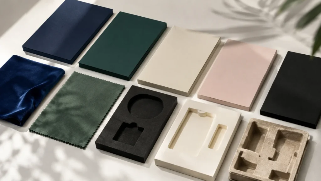
When I choose materials for custom jewelry boxes, I always treat material as one of the most important decisions in the whole packaging system. The material does not only decide how the box looks; it also affects how the customer feels when they touch it, how strong the structure can be, how well the jewelry is protected, how clearly the printing or logo finish appears, how much the final packaging may cost, and how believable the brand experience feels. In jewelry packaging, material is often the bridge between product value and customer perception. A well-chosen material can make a small piece of jewelry feel more complete, while the wrong material can make even a beautiful product feel under-presented.
Material Choice Should Start With the Product and Brand Position
I never choose jewelry box materials by looking at samples alone, because a material that looks beautiful in one project may feel wrong in another. The first thing I consider is what kind of jewelry will be placed inside the box and what kind of brand feeling the package needs to create. A luxury ring, a handmade necklace, a fashion earring collection, a sustainable charm line, and a watch gift set may all need different material directions. The same paper surface, insert material, or lining may communicate premium quality in one context and unnecessary cost in another.
This is why I think material choice should start with product value, jewelry type, customer expectation, sales channel, and brand positioning. If the jewelry is delicate and high-value, the material needs to support both protection and emotional presentation. If the jewelry is sold online, the box material needs to survive shipping and handling without losing its appearance. If the brand emphasizes sustainability, the material should not contradict that message. If the product is affordable and fast-moving, the material should still look clean and reliable, but it also needs to stay practical for cost and repeat production. Good material selection begins when the brand understands what the box must achieve.
Rigid Paperboard Gives Jewelry Boxes Structure Weight and Confidence
I often use rigid paperboard as the structural foundation for premium jewelry packaging because it gives the box a stronger body and a more confident hand feel. Compared with lightweight carton materials, rigid board can create better shape retention, cleaner edges, stronger protection, and a more giftable impression. When a customer holds a rigid jewelry box, the firmness and weight can make the product feel more valuable even before the box is opened. This is why rigid paperboard is commonly used for lid and base boxes, drawer boxes, magnetic closure boxes, book-style boxes, and premium jewelry set boxes.
However, I also think rigid paperboard should be chosen with practical judgment. A thicker board can improve strength and perceived value, but it can also increase material cost, labor steps, shipping weight, and production complexity. For a high-value ring, bracelet, watch, or gift set, this investment may make sense because the box is part of the premium experience. For low-cost fashion jewelry, the same rigid structure may feel excessive unless the brand wants a more elevated image. In my view, rigid paperboard works best when the packaging needs to feel stable, protective, reusable, or gift-ready, but it should be balanced with budget and quantity expectations.
Coated Paper Works Well When Clean Printing and Color Control Matter
When a jewelry brand needs strong visual branding, clear graphics, smooth color blocks, or consistent logo printing, I often consider coated paper. Its smoother surface can help printing appear cleaner and more controlled, which is useful for brands that rely on precise brand colors, full-color artwork, seasonal patterns, or polished ecommerce presentation. Coated paper can make a jewelry box feel modern, clean, and commercially ready, especially when the design includes printed graphics rather than relying mainly on texture.
At the same time, I do not see coated paper as a universal solution. It can create strong print quality, but it may not deliver the same tactile warmth as textured paper, kraft paper, or specialty fiber paper. For a handmade jewelry brand or a sustainable jewelry line, a very smooth coated surface may feel less natural unless the design is handled carefully. I also consider how coated paper will interact with lamination, spot UV, foil stamping, and other finishes. A matte laminated coated paper can feel clean and refined, while gloss lamination may create a brighter and more retail-focused look. In my experience, coated paper is a strong choice when visual accuracy, color consistency, and print sharpness are more important than natural texture.
Textured Paper Creates a Stronger Tactile Memory
I like textured paper for custom jewelry boxes because it gives the customer something to feel, not only something to see. Jewelry packaging is often touched closely and slowly, so the surface of the paper can leave a strong impression. A fine linen texture, soft grain, leather-like surface, cotton paper feeling, or subtle embossed texture can make a simple box feel more intentional and premium. This is especially useful for jewelry brands that want to create elegance without using too many printed graphics or decorative finishes.
Textured paper also helps the box carry a quieter sense of value. Instead of relying on large logos or complex artwork, the material itself becomes part of the brand language. A deep green textured paper with a small gold foil logo, a warm ivory paper with blind debossing, or a dark gray grain paper with a simple insert can all create a refined impression. But I also pay attention to production limits. Some textured papers do not hold fine printing details as clearly as coated paper, and some surfaces may affect foil edges or color coverage. In my view, textured paper works best when the brand wants depth, touch, and character, but the design should respect the limits of the surface.
Specialty Paper Can Make a Jewelry Box More Distinctive
When a brand wants jewelry packaging to feel more memorable, I often look at specialty paper. Specialty paper can include pearlescent paper, metallic paper, soft-touch paper, fiber paper, color-core paper, embossed paper, suede-like paper, or other decorative surfaces. These materials can give a box a unique identity even when the structure is simple. For jewelry brands competing in gift, retail, or premium ecommerce markets, specialty paper can help the packaging stand out without depending only on printing.
Still, I treat specialty paper as a strategic choice rather than a default upgrade. Some specialty papers are more expensive, some have higher material minimums, some are sensitive to scratches or fingerprints, and some may have batch color differences. A pearlescent paper may look elegant under light, but it may not fit a natural handmade brand. A metallic paper may create visual impact, but it may feel too strong for a minimalist jewelry line. A soft-touch paper may feel premium, but it may need careful handling to avoid surface marks. In my opinion, specialty paper should be chosen when it strengthens the brand identity enough to justify the added cost and production attention.
Kraft Paper Gives Jewelry Packaging a Natural and Honest Character
I often consider kraft paper when a jewelry brand wants to communicate natural simplicity, handmade value, or a more responsible packaging direction. Kraft paper has a grounded and honest feeling that can work well for artisan jewelry, eco-conscious brands, casual gift packaging, and products that want to feel warm rather than polished. It can make the packaging feel less industrial and more connected to material authenticity.
However, kraft paper needs careful design to avoid looking too basic. A kraft jewelry box can feel intentional when the structure is clean, the logo is clear, and the insert matches the natural style. If the design is not controlled, it may look inexpensive rather than thoughtfully simple. I also consider printing limitations because colors on kraft paper usually appear more muted than they do on white coated paper. Fine details may not be as sharp, and light colors may need special handling. In my view, kraft paper is best when the brand wants warmth, honesty, and environmental awareness, but it still needs good proportions and clean production to feel professional.
Velvet Adds Softness Depth and a Classic Jewelry Feeling
When I think about the interior of jewelry boxes, velvet is one of the materials most strongly associated with traditional jewelry presentation. Velvet creates softness, depth, and a more ceremonial feeling. It can make a ring, necklace, bracelet, or pair of earrings feel better protected and more formally presented. The contrast between metal, gemstone, and soft velvet can help the jewelry stand out visually, especially for gift boxes, ring boxes, and premium jewelry sets.
But I do not think velvet should be used automatically just because the product is jewelry. Velvet carries a classic mood, and that may not suit every brand. A very modern minimalist brand may prefer microfiber or paper-based inserts. A sustainable brand may avoid velvet if it does not match the material story. Velvet can also show dust, fibers, pressure marks, or glue problems if production is not controlled carefully. In my experience, velvet is strongest when the brand wants softness, tradition, gifting emotion, and a more formal premium presentation.
Microfiber Creates a Cleaner and More Contemporary Interior
I often see microfiber as a more modern alternative to velvet. It still gives the jewelry a soft surface, but the feeling is usually cleaner, smoother, and less traditional. Microfiber can work well for premium watches, minimalist rings, modern bracelets, silver jewelry, and brands that want a refined interior without creating an overly classic jewelry-store feeling. It can make the inside of the box feel controlled and polished.
Microfiber also needs careful handling because the quality of cutting, wrapping, and assembly will affect the final impression. If the edges are rough, the glue is uneven, or the surface becomes marked, the premium effect can weaken quickly. I usually consider microfiber when the product value supports a better interior finish and when the brand wants a quiet, modern softness. In my view, microfiber is a good choice when the box should feel premium but not overly decorative.
Foam Inserts Help With Cushioning Shape and Movement Control
When protection and stability are priorities, I often consider foam for jewelry inserts. Foam can be cut into specific shapes, support different product forms, and reduce movement during handling or shipping. It is useful for rings, watches, bracelets, jewelry sets, and products that need precise positioning. A well-cut foam insert can help the jewelry stay centered, reduce friction, and create a cleaner opening presentation.
However, foam is not only a visual decision; it is mainly a functional material. Plain foam may look too technical or basic for some jewelry brands, so it is often covered with velvet, microfiber, paper, or fabric when a better presentation is needed. Foam also may not align with brands that emphasize plastic reduction or fully paper-based packaging. I usually recommend foam when movement control, cushioning, and precision are more important than a fully natural material story. In my view, foam works best when it is used as a hidden support system that improves the customer experience without distracting from the jewelry.
Paper-Based Inserts Support Lightweight and Responsible Packaging
I often recommend paper-based materials when a brand wants packaging that feels lighter, cleaner, more recyclable, or more consistent with responsible packaging goals. Paper card inserts, folded paper structures, molded pulp inserts, and paperboard supports can reduce the use of plastic-based materials while still helping position the jewelry. These materials can work well for earrings, charms, lightweight necklaces, handmade jewelry, sustainable brands, and ecommerce packaging where weight and material message matter.
Paper-based inserts need thoughtful structure because they do not behave like foam or velvet. They may not provide the same softness, but they can provide clean organization and good visual presentation if designed well. A folded paper card can hold a necklace chain neatly. A paper insert can support earrings with a clean layout. A molded pulp tray can create a more natural protective form. In my opinion, paper-based materials are valuable when the brand wants to balance cost, sustainability, and presentation, but they should be tested carefully to make sure the jewelry remains stable and easy to remove.
Material Choice Changes How Customers Judge Quality
I believe customers judge material quality faster than many brands realize. They may not know the technical name of the paper or the exact thickness of the board, but they can feel whether the box is firm, smooth, textured, soft, natural, or weak. They can sense whether the insert protects the jewelry or simply fills empty space. They can notice whether the material supports the product price or makes the jewelry feel less valuable. This is why material choice directly affects perceived quality.
A high-value product in a weak box can feel under-supported. A simple product in a carefully chosen box can feel more complete. A sustainable product in excessive plastic-heavy packaging can feel inconsistent. A minimalist product in an over-decorated box can feel visually confused. In my view, material is not just a supply decision. It is a communication tool. It tells the customer how the brand sees its own product.
Material Selection Also Affects Cost and Production Practicality
When I choose jewelry box materials, I also think about cost and production practicality. A material may look beautiful in a sample, but it still needs to work in real production. Rigid board may increase cost and shipping weight. Specialty paper may require higher minimum quantities or longer sourcing time. Velvet and microfiber may add labor and quality control requirements. Foam may improve protection but create sustainability concerns. Paper inserts may reduce material complexity but need careful structural testing.
This is why I do not judge materials only by appearance. I consider whether the material can be sourced consistently, whether it can be produced at the required quantity, whether it works with the chosen printing or finishing process, and whether it can stay stable across repeat orders. For jewelry brands, especially those building long-term packaging systems, consistency is very important. A beautiful first batch is not enough if the material cannot be repeated reliably.
The Best Material Choice Should Work With the Whole Packaging System
In my view, the best material is not always the most expensive, most textured, or most decorative one. It is the material that works best with the jewelry type, box structure, insert, logo finish, brand positioning, sales channel, and customer expectation. A textured paper may be excellent for a luxury rigid box but unsuitable for detailed full-color printing. A kraft paper box may work beautifully for handmade jewelry but feel too casual for a premium gemstone line. A velvet insert may support a classic luxury ring box but feel inconsistent for a fully paper-based sustainable brand.
This is why I always choose materials as part of the whole packaging system. The outer paper, board strength, inner lining, insert material, logo finish, and product position should work together. When they do, the jewelry box feels coherent and trustworthy. When they do not, the box may look attractive in one detail but weak as a complete experience. For custom jewelry boxes, material choice should make the product safer, the brand clearer, and the customer experience more valuable.
Material Comparison for Different Brand Needs
When I compare materials for custom jewelry boxes, I never start by asking which material looks the most expensive. I prefer to ask which material best supports the brand’s real business situation, product value, customer expectation, sales channel, and long-term packaging plan. A material that works beautifully for a luxury ring brand may feel too costly for a fast-moving fashion jewelry line. A kraft paper box that feels honest and natural for a sustainable jewelry brand may feel too casual for a premium bridal collection. A smooth coated paper box that gives strong print clarity for a modern brand may not give enough tactile warmth for a handmade jewelry studio. This is why I believe material comparison should not be treated as a simple list of options. It should be understood as a decision about brand perception, packaging performance, production practicality, and customer experience.
Luxury Jewelry Brands Need Materials That Create Depth and Confidence
When I think about luxury jewelry packaging, I usually focus on materials that create depth, stability, and quiet confidence. Luxury customers often expect more than a box that simply looks attractive. They expect the package to feel substantial in the hand, open smoothly, protect the jewelry carefully, and present the product with restraint. This is why textured paper, specialty paper, thicker rigid paperboard, velvet, microfiber, and soft-touch surfaces are often suitable for luxury jewelry boxes. These materials can make the box feel more considered, especially when they are used with clean structure and precise finishing.
I also believe luxury material selection should avoid over-decoration. A luxury box does not always need multiple metallic effects, heavy patterns, or excessive visual layers. In many cases, a strong material choice can communicate more value than complicated decoration. A deep textured paper with a small foil-stamped logo can feel more refined than a glossy box with too many printed details. A microfiber insert can make the interior feel modern and controlled, while velvet can create a more classic and ceremonial jewelry feeling. The important point is that the material should make the customer feel that the brand is confident enough to be selective. In my experience, luxury packaging feels most convincing when the material, structure, insert, and logo finish all speak with the same calm tone.
Clean Modern Jewelry Brands Need Smooth Surfaces and Precise Visual Control
When I work with clean modern jewelry brands, I usually pay attention to smoothness, color control, and visual discipline. These brands often rely on simple design language, controlled typography, neutral colors, and a refined but not overly decorative appearance. For this type of brand, smooth coated paper, fine uncoated paper, matte laminated paper, and carefully printed surfaces can be more suitable than strong textured or highly decorative materials. The material should help the packaging look clean, accurate, and intentionally quiet.
I also think clean modern packaging is less forgiving than many brands expect. Because the design is simple, small problems become easier to see. A slight color difference, uneven logo position, poor edge finishing, or low-quality paper surface can weaken the whole impression. This is why I often prefer materials that support precision. Smooth coated paper can make printed colors and brand graphics appear clearer. Fine uncoated paper can create a softer modern feeling without looking too commercial. Matte surfaces can reduce glare and create a calmer appearance. In my view, clean modern jewelry packaging should not feel empty. It should feel controlled, balanced, and professionally finished.
Sustainable Jewelry Brands Need Materials That Make the Brand Promise Believable
When I evaluate materials for sustainable jewelry brands, I always ask whether the material choice makes the brand promise more believable. Customers who care about sustainable jewelry often look beyond the outside appearance of the box. They may notice whether the packaging feels oversized, whether the insert uses too much plastic, whether the surface is heavily laminated, or whether the material story feels consistent with the brand’s values. For this reason, kraft paper, FSC-certified paper, recycled paper, natural textured paper, paper-based inserts, molded pulp, and reduced-finishing surfaces can be strong choices.
I do not believe sustainable jewelry packaging has to look plain or low-end. A kraft paper box with clean structure, an FSC-certified paper box with a subtle logo, or a molded pulp insert designed with good proportions can still feel refined and valuable. The key is honesty. If a brand wants to communicate responsibility, the packaging should not rely only on green colors or eco-style wording. The material itself should support that message. I usually avoid unnecessary layers when they do not improve protection or customer experience. In my opinion, sustainable packaging works best when it feels thoughtful, proportionate, and practical, rather than decorative in a way that contradicts the brand’s values.
Ecommerce Jewelry Brands Need Materials That Survive the Delivery Journey
When I think about ecommerce jewelry packaging, I always imagine the box going through the full delivery journey before reaching the customer. It may be packed in a warehouse, placed inside a mailer or shipping carton, handled by couriers, stacked with other parcels, and finally opened by a customer who expects the product to look neat and undamaged. This makes material performance very important. The packaging must be durable enough to protect the jewelry, stable enough to control movement, and presentable enough to create a positive unboxing experience after shipping.
For ecommerce jewelry brands, I often compare materials by strength, weight, and internal support. A compact rigid box may work well for premium ecommerce jewelry because it offers better protection and a stronger gift feeling. A strong folding carton may be more suitable for lightweight earrings, charms, or affordable jewelry because it reduces weight and shipping cost. Paper-based inserts can work well if they control movement properly, while foam inserts may be useful when the product needs stronger cushioning. In my view, ecommerce packaging needs a careful balance. If the material is too weak, the customer may receive a damaged or messy package. If the material is too heavy or oversized, shipping costs and storage pressure may increase unnecessarily.
Handmade Jewelry Brands Need Materials That Feel Warm Personal and Authentic
When I work with handmade jewelry brands, I usually look for materials that feel warm, tactile, and honest. Handmade jewelry customers often care about the story behind the product, the maker’s care, the material origin, and the feeling of individuality. Packaging for this type of brand should not feel overly industrial unless the brand intentionally wants a modern contrast. Kraft paper, textured paper, cotton-like paper, natural-tone paper, simple paper cards, and soft uncoated surfaces can help create a more human and personal impression.
At the same time, I do not think handmade packaging should look rough or unfinished. There is an important difference between authentic and careless. A kraft paper box can feel charming when the structure is clean, the logo is placed well, and the insert holds the jewelry securely. A textured paper card can feel personal when it supports the product neatly and matches the brand tone. If the cutting is uneven, the printing is unclear, or the jewelry moves around inside the box, the packaging may weaken the trust that handmade brands work so hard to build. In my view, handmade jewelry packaging should feel sincere, but it still needs professional control.
Fashion Jewelry Brands Need Materials That Support Visual Change and Cost Control
When I think about fashion jewelry brands, I usually consider how quickly the brand may need to update packaging for new collections, seasonal colors, influencer collaborations, or social media campaigns. Fashion jewelry often depends on freshness and visual energy, so the material should support design flexibility. Smooth coated paper, printed paper cards, folding cartons, lightweight rigid boxes, and materials that work well with full-color printing can help the brand create different looks without rebuilding the entire packaging system every time.
I also pay close attention to cost control for fashion jewelry packaging. A material may look beautiful, but if it raises the unit cost too much, slows down production, or becomes difficult to source repeatedly, it may not be realistic for a brand that updates products often. Fashion jewelry packaging should be attractive and recognizable, but it also needs to stay efficient. In my experience, the best material direction for fashion jewelry is one that allows strong color, clear branding, and flexible design updates while keeping production simple enough for frequent launches and repeat orders.
Mass-Market Jewelry Brands Need Materials That Are Stable Repeatable and Scalable
When I evaluate materials for mass-market jewelry packaging, I focus on stability and repeatability. These brands may manage many SKUs, large quantities, retail programs, promotional sets, or wholesale distribution. The material must be easy to source, easy to print, easy to assemble, and consistent across repeat orders. A material that looks impressive in a small sample but creates color variation, surface defects, or production delays in bulk may not be suitable for mass-market jewelry.
For mass-market jewelry brands, I often see standard paperboard, coated paper, folding carton materials, paper cards, and practical inserts as more realistic choices. These materials can still create a clean and trustworthy presentation when the design is controlled. The goal is not to make every box feel luxurious, but to make every box feel reliable and appropriate for the product. I believe mass-market packaging should avoid looking careless. Even when cost is important, the box still needs clear printing, proper fit, stable structure, and reasonable protection. Good scalable packaging should make the brand look organized, not cheap.
Gift-Focused Jewelry Brands Need Materials That Support Emotion and Presentation
When jewelry is purchased mainly for gifting, I look at materials differently. The box is not only protecting the item; it is also part of the emotional moment. A gift-focused jewelry brand may need materials that feel more presentable, more pleasant to touch, and more suitable for the opening experience. Rigid paperboard, textured paper, specialty paper, soft-touch surfaces, velvet, microfiber, and well-structured inserts can all help make the box feel more gift-ready.
I also think gift packaging should be careful with proportion and material tone. A box that is too lightweight may not feel special enough for a gift. A box that is too large may feel wasteful or make the jewelry look small. A material that scratches easily may create disappointment before the gift is even opened. In my view, gift-focused materials should create anticipation and reassurance. The customer should feel comfortable giving the jewelry without needing to hide or replace the original packaging.
Retail Jewelry Brands Need Materials That Perform Under Display Conditions
When I think about jewelry packaging for retail, I consider how the material looks under store lighting, how it feels when handled by staff and customers, and how it supports shelf or counter presentation. Retail packaging often needs to be visually consistent across multiple boxes, especially when several SKUs are displayed together. Materials with stable color, clean edges, and good surface resistance are important because the boxes may be touched, moved, opened, and displayed repeatedly.
For retail jewelry brands, textured paper can create premium shelf presence, coated paper can support clean graphics, and rigid board can make the packaging feel more substantial. However, I also consider whether the material will show fingerprints, scratches, dust, or edge wear easily. A beautiful dark specialty paper may look elegant, but if it marks too easily, it may not perform well in a high-touch retail environment. In my experience, retail packaging materials must balance visual appeal with practical durability, because the box may be judged many times before the product is sold.
Material Choice Should Match the Customer’s First Real Experience
I always think about where the customer first experiences the box. If the customer receives the product through ecommerce, durability and unboxing condition become more important. If the customer buys in a boutique, hand feel and display quality may matter more. If the customer receives the jewelry as a gift, the emotional reveal becomes central. If the customer buys a sustainable product, material honesty may carry more weight than decorative richness. This is why the same material can be right or wrong depending on the customer journey.
For example, a textured rigid box may be ideal for premium retail gifting, but it may increase shipping cost for a high-volume ecommerce brand. A lightweight folding carton may work well for online accessory sales, but it may not provide enough emotional value for bridal jewelry. A kraft paper box may feel authentic for handmade or sustainable jewelry, but it may feel too casual for a luxury diamond piece. In my view, the right material is the one that fits the moment when the customer meets the product.
The Best Material Comparison Looks Beyond Appearance
When I compare materials, I always look beyond appearance because packaging must work in real life. A material may look excellent in a sample book but perform differently when printed, folded, wrapped, shipped, or handled by customers. Specialty paper may look premium but scratch easily. Kraft paper may feel natural but mute printed colors. Coated paper may print beautifully but feel less tactile. Rigid board may improve perceived value but increase cost and shipping weight. Paper-based inserts may support sustainability but need stronger structural planning to control jewelry movement.
This is why I compare materials through several layers of judgment. I think about how the material looks, how it feels, how it protects, how it prints, how it handles finishing, how it affects cost, and how reliably it can be repeated in production. In my experience, the best material is rarely the one with only the most attractive surface. It is the one that creates the best balance between brand meaning, product protection, customer expectation, and production reality.
The Right Material Makes the Whole Brand Experience More Coherent
In my view, material choice should make the whole jewelry packaging experience feel coherent. Luxury brands may need textured or specialty paper because their customers expect depth and refinement. Clean modern brands may prefer smooth coated or fine uncoated paper because they depend on precision and visual control. Sustainable brands may choose kraft paper, FSC-certified paper, recycled paper, or paper-based inserts because the material story must support the brand promise. Ecommerce brands may need durable and lightweight materials because the package must survive shipping while still creating a good first impression.
When the material matches the brand need, the customer usually feels the difference immediately. The box feels more natural, the product feels better supported, and the brand message becomes easier to believe. When the material does not fit, the packaging may still look acceptable, but the experience can feel disconnected. That is why I treat material comparison as a brand decision, a functional decision, and a customer experience decision at the same time.
Common Box Styles for Jewelry Packaging
When I compare common box styles for jewelry packaging, I never look at the structure only as a visual shape. A jewelry box style should be chosen because it solves a real packaging problem. It should protect the jewelry, control movement, support the product display, create the right opening experience, fit the sales channel, and match the brand’s price position. Lid and base boxes, drawer boxes, magnetic closure boxes, folding carton boxes, book-style boxes, mailer boxes, and compact rigid boxes can all be useful, but they are not interchangeable. Each structure has its own strengths, limits, cost logic, and customer experience. In my view, a box style becomes valuable only when it helps the jewelry arrive safely, look intentional, and feel appropriate for the brand.
Lid and Base Boxes Create a Familiar and Stable Jewelry Experience
When I think about lid and base boxes, I see them as one of the most classic and reliable structures in jewelry packaging. The customer removes the lid from the base, and the jewelry is revealed directly inside the box. This simple opening method feels familiar, giftable, and easy to understand, which is why it works across many jewelry categories. I often see this structure used for rings, earrings, necklaces, bracelets, watches, charms, and jewelry sets because it can adapt to different sizes and insert systems.
What I like about lid and base boxes is their stability. The base can hold a shaped insert, velvet pad, foam insert, paper card, or divided tray, while the lid gives enough protection and creates a clean outer presentation. For a ring, the box can hold the product upright with a secure slot. For earrings, it can keep the pair balanced. For a jewelry set, it can provide a larger display area with separate compartments. However, the quality of the fit matters a lot. If the lid is too loose, the box feels careless and may open too easily during handling. If the lid is too tight, the customer may struggle with the opening experience. In my view, a good lid and base box should feel controlled, not forced. It is a strong choice when a brand wants a classic reveal, good insert flexibility, and a reliable gift-ready feeling.
Drawer Boxes Create a Slower Reveal and a Boutique Feeling
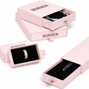
When I choose drawer boxes for jewelry packaging, I usually think about the emotional rhythm of opening. A drawer box does not reveal the product all at once. The customer pulls the inner tray out gradually, and this sliding motion creates anticipation. That slower reveal can make the packaging feel more boutique, more thoughtful, and more memorable. I often consider drawer boxes for necklaces, bracelets, charms, earrings, and gift jewelry because the structure gives the brand a chance to create a more layered unboxing experience.
The drawer structure also separates the outer sleeve from the inner tray, which can be useful for branding and presentation. The outer sleeve can carry the brand color, logo, texture, or printed design, while the inner tray focuses on holding the jewelry securely. This makes drawer boxes especially suitable for brands that want a clean outside and a more refined inside. However, I always check the sliding performance carefully. If the drawer slides out too easily, it may feel loose or unsafe. If the friction is too strong, the customer may feel the box is poorly made. The insert must also be planned well because jewelry can move when the tray is pulled. In my experience, drawer boxes work best when the brand wants a controlled reveal and has enough attention to detail to make the sliding movement feel smooth and stable.
Magnetic Closure Boxes Create a Stronger Premium and Gift-Ready Impression
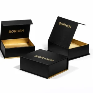
When I think about magnetic closure boxes, I usually connect them with premium jewelry packaging, gift sets, and products that need a stronger perceived value. The magnetic closure gives the box a secure closing feeling, and that small sound or resistance when the box closes can make the packaging feel more finished. It is not only a structural feature; it becomes part of the customer’s tactile experience. For higher-value necklaces, bracelets, watches, jewelry sets, or premium accessories, this kind of closure can make the box feel more substantial and reusable.
However, I do not think magnetic closure boxes should be chosen simply because they look expensive. They usually require more board material, more assembly work, more accurate structure control, and sometimes more shipping space. If the product price is not high enough, the packaging may become too costly for the business model. I also consider whether the magnetic closure suits the brand personality. It may work beautifully for luxury or gift-focused jewelry, but it may feel excessive for a lightweight fashion earring line. In my view, magnetic closure boxes are strongest when the brand needs a premium closing experience, a reusable feeling, and a box that can make the customer feel the product has been carefully prepared.
Folding Carton Boxes Are Practical for Lightweight and Scalable Jewelry Packaging
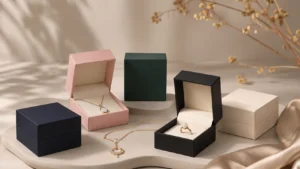
When I evaluate folding carton boxes, I usually think about production efficiency, shipping weight, and design flexibility. Folding cartons are lighter than rigid boxes, easier to store before assembly, and often more suitable for larger quantities or multiple SKUs. For earrings, charms, lightweight necklaces, fashion jewelry, and affordable accessories, a folding carton can be a practical choice when the insert is designed correctly. It may not create the same heavy premium feeling as a rigid box, but it can still look clean, professional, and brand-consistent.
Folding carton boxes are also strong for printing. If a brand wants full-color graphics, seasonal artwork, product information, or visual changes across different collections, folding cartons can offer more flexibility. I often see them used for fashion jewelry brands that need to refresh packaging without rebuilding an expensive structure each time. However, the board thickness, tuck style, locking method, and insert support should be chosen carefully. A weak carton can collapse, dent, or fail to protect delicate jewelry during ecommerce delivery. In my view, folding cartons work best when the brand needs a lightweight structure, strong printability, cost control, and scalable production, but they should still be engineered around the jewelry’s movement risk.
Book-Style Boxes Create a Presentation Case Experience
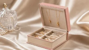
When I use book-style boxes for jewelry packaging, I usually think of them as small presentation cases rather than ordinary boxes. The cover opens like a book, which gives the customer a slower and more ceremonial reveal. This structure can work very well for premium necklaces, bracelets, watches, bridal sets, and jewelry collections because it creates a wider interior display area. When the box opens, the product can be presented almost like it is being shown on a stage.
Book-style boxes are especially useful when the jewelry needs visual hierarchy. A necklace pendant can be centered, earrings can be placed beside it, and a bracelet or ring can be arranged in a balanced layout. The structure allows more storytelling inside the box, which may be useful for gift collections or higher-value products. However, this style requires good hinge strength, accurate board wrapping, strong closure control, and careful insert alignment. If the cover does not close flat, if the hinge feels weak, or if the insert shifts inside, the premium feeling quickly weakens. In my experience, book-style boxes are best when the brand wants a more refined opening experience and the product value justifies the added structure.
Mailer Boxes Support Ecommerce Delivery and Branded Unboxing
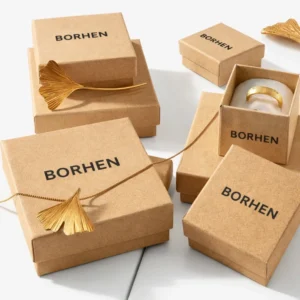
When I think about mailer boxes for jewelry packaging, I focus on the delivery journey. Ecommerce jewelry packaging has a different responsibility from retail packaging because the box must survive handling before the customer sees it. A mailer box can protect the inner jewelry box, hold product cards, organize tissue paper, reduce movement, and create a branded unboxing experience. For online brands, the mailer may be the first branded surface the customer sees after opening the shipping package.
I do not see mailer boxes as a direct replacement for all jewelry boxes. For premium jewelry, I usually expect the mailer to work as an outer branded layer while the inner box handles presentation. For affordable fashion jewelry, a well-designed mailer with a card insert may be enough if the product is lightweight and properly secured. The most important question is whether the mailer protects the product and still feels intentional when opened. If the inside looks messy, the mailer fails as a brand experience. In my view, mailer boxes are valuable when ecommerce delivery, product protection, and unboxing presentation need to work together.
Compact Rigid Boxes Balance Premium Feeling With Practical Size
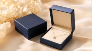
When I evaluate compact rigid boxes, I often see them as a strong option for brands that want better perceived value without oversized packaging. A compact rigid box can work well for rings, earrings, charms, small necklaces, and selected bracelet styles. It gives the customer a stronger hand feel than a folding carton, but it can still keep packaging volume, shipping cost, and storage space under control. This makes it especially useful for ecommerce jewelry brands that want a more premium presentation but cannot use large gift boxes for every order.
The challenge with compact rigid boxes is internal planning. Because the box is smaller, the insert needs to be more precise. A ring should not touch the lid. Earrings should not feel crowded. A charm should not disappear in empty space. A necklace should not tangle because the box is too tight. I often look carefully at the relationship between product size, insert shape, and inner depth. In my view, compact rigid boxes work best when the packaging needs to feel refined, but the brand still wants practical dimensions for shipping, storage, and cost.
The Box Style Should Match the Jewelry Product First
I always choose jewelry box styles by starting from the product rather than the structure itself. A ring usually needs a secure slot and a compact presentation. Earrings need pair balance and stable holding. Necklaces need chain control and pendant focus. Bracelets need length support and enough room to follow their natural shape. Watches need stronger cushioning and a stable structure. Jewelry sets need organized compartments and clear visual hierarchy. If the structure does not support the product, the box may look attractive but fail in real use.
This is why I do not believe there is one best jewelry box style for every brand. A drawer box may create a beautiful reveal, but it may not work if the necklace chain cannot be controlled. A folding carton may be efficient, but it may feel too light for a luxury ring. A magnetic box may look premium, but it may be unnecessary for affordable earrings. A mailer box may be practical for ecommerce, but it may not provide enough emotional value for bridal jewelry unless an inner presentation box is added. In my view, the box style should always answer the product’s practical needs first.
The Sales Channel Changes the Best Box Style
When I compare jewelry box structures, I always consider where the customer will first experience the packaging. Retail packaging needs strong shelf presence, clean display, and a good hand feel when the customer or sales staff handles it. Ecommerce packaging needs protection during shipping, movement control, and a satisfying unboxing experience. Gift packaging needs emotional value, presentability, and a box that feels suitable for giving directly to someone. A box style that works well in one channel may not be the best choice in another.
For retail jewelry, a lid and base box, compact rigid box, or book-style box may create a stronger display experience. For ecommerce jewelry, a compact rigid box, folding carton, or mailer system may be more practical depending on product value. For gift-focused jewelry, magnetic closure boxes, drawer boxes, or refined rigid boxes may create a more memorable reveal. In my experience, the sales channel should influence box style as much as brand positioning does because packaging has to perform in the environment where the customer actually meets it.
The Opening Experience Should Match the Brand Emotion
I believe box style strongly affects how the customer emotionally experiences the jewelry. A lid and base box creates a familiar and traditional reveal. A drawer box creates a slower and more private reveal. A magnetic closure box creates a stronger sense of security and premium value. A book-style box creates a presentation case feeling. A folding carton creates efficiency and simplicity. A mailer box creates an ecommerce unboxing journey. These opening experiences are different, and each one sends a different message about the brand.
This is why I do not treat structure as only an engineering choice. It is also a storytelling choice. A brand that wants to feel quiet and minimal may not need a dramatic opening structure. A gift-focused brand may benefit from a slower reveal. A fashion jewelry brand may need a simple but visually energetic structure that supports fast product updates. A luxury brand may need a box that opens with weight and control. In my view, the best box style should make the opening moment feel natural for the brand.
Box Style Should Work With Materials Inserts and Finishes
I always evaluate box style together with materials, inserts, and finishes because these choices influence one another. A magnetic closure box may feel premium, but if the paper material is too thin or the insert looks weak, the structure alone cannot create luxury. A drawer box may create anticipation, but if the tray is loose or the jewelry moves inside, the experience becomes unstable. A folding carton may be cost-effective, but it needs enough board strength and internal support to protect delicate items. A book-style box may look elegant, but it requires good hinge control and precise insert alignment.
In my experience, the best jewelry packaging happens when the structure, material, insert, and finish work as one complete system. The structure controls how the customer opens the box. The material controls how the box feels. The insert controls how the jewelry is displayed and protected. The finish controls how the brand is remembered. When these elements support each other, the box feels professional and coherent. When they are chosen separately, the packaging may look attractive in one detail but fail as a complete customer experience.
A Good Box Style Should Balance Beauty Function and Production Reality
I always remind brands that a beautiful jewelry box still needs to be realistic to produce, pack, ship, and repeat. Some structures look impressive in photos but require more labor, higher MOQ, stricter quality control, or more expensive materials. If a brand plans to reorder frequently, the structure must be stable across production batches. If the packaging needs to support many SKUs, the structure should be adaptable. If the brand sells online, the structure should not create unnecessary shipping cost or damage risk.
This is why I compare box styles through both customer experience and production practicality. A luxury brand may accept a more complex box if it supports the product value. A fashion brand may need a simpler structure to stay flexible. A sustainable brand may avoid excessive structures that use too much material. An ecommerce brand may choose compact boxes to control shipping. In my view, the right box style should look good, protect well, open naturally, fit the brand, and remain practical for real business use.
How to Match Box Style With Jewelry Products
When I match a box style with a jewelry product, I never start from the box shape alone. I start from the product’s physical behavior inside the packaging. Jewelry is usually small, delicate, and detail-sensitive, but different jewelry types move, display, and protect very differently. A ring needs upright positioning, a necklace needs chain control, earrings need balanced pair support, bracelets need length and shape space, watches need stronger cushioning, charms need visual focus, and jewelry sets need organized compartments. In my view, the right box style is not simply the most beautiful one. It is the structure that helps the product stay secure, appear clearly, and create the correct feeling when the customer opens the box.
Product Behavior Should Decide the Box Structure First
I always believe the product should decide the structure before the brand chooses the decoration. A box may look premium from the outside, but if the jewelry shifts inside, tangles during shipping, presses against the lid, or looks poorly arranged when opened, the customer experience will still feel weak. Jewelry packaging is different from many general boxes because the inside view matters almost as much as the outside appearance. The customer expects the product to be presented neatly, not just delivered safely.
This is why I first study how the jewelry behaves inside the box. I look at whether it stands, lies flat, hangs, slides, rotates, bends, or tangles. I also consider whether the customer will receive it through ecommerce delivery, buy it in retail, or give it as a gift. These conditions change the best structure. A box for a necklace shipped directly to a customer needs more movement control than a box used only for counter display. A bracelet box for gifting may need more emotional presentation than one used for mass-market accessories. In my experience, good packaging starts when the structure solves the product’s real behavior instead of only following a visual trend.
Rings Need Secure Slots and a Strong Center Reveal
When I package rings, I focus on the first reveal because the customer usually sees the ring immediately after opening the box. A ring is small, but it often carries strong emotional value. Engagement rings, wedding bands, gemstone rings, anniversary rings, and premium fashion rings all need packaging that makes the product feel important and secure. If the ring leans, sinks too deeply, rotates in the slot, or touches the lid, the box may weaken the product’s perceived value.
For ring packaging, I often consider compact rigid boxes, small lid and base boxes, magnetic closure boxes, or small book-style boxes. The insert slot is the most important part of the structure. It should hold the ring upright with enough firmness, but it should not make removal difficult. The inner height must also be checked carefully, especially for rings with raised stones, thick settings, or decorative shapes. I also pay attention to the empty space around the ring. Too much space can make the ring look small, while too little space can make the product feel compressed. In my view, a good ring box should frame the ring like a focal point and make the customer feel that the product was prepared with care.
Necklaces Need Anti-Tangle Space and Pendant Control
When I match a box style with necklaces, I always think about the chain and pendant as two separate packaging problems. The chain is flexible, thin, and easy to tangle, while the pendant needs to stay visible and centered. If the box does not manage both parts, the necklace may arrive safely but still look messy when the customer opens it. This is one of the most common issues I see in necklace packaging, especially for ecommerce brands.
For necklaces, I often consider lid and base boxes, drawer boxes, book-style boxes, compact rigid boxes, or folding cartons with a well-planned insert card. A lightweight necklace may work well with a paper card if the chain is fixed behind the card and the pendant remains in the correct position. A premium necklace may need a rigid box with a shaped insert or soft inner support to reduce movement and create a more refined reveal. A drawer box can create a beautiful opening experience, but the insert must keep the necklace from sliding when the tray is pulled. In my opinion, the best necklace box lets the pendant become the visual center while quietly managing the chain so the customer never has to untangle the product before enjoying it.
Earrings Need Pair Balance and Accurate Insert Support
When I choose packaging for earrings, I pay attention to symmetry and pair stability. Earrings are not usually judged as two separate items; they are judged as one matched pair. If one earring tilts, rotates, falls lower than the other, or becomes loose during shipping, the presentation immediately feels careless. This is especially important for stud earrings, hoops, drop earrings, and delicate fashion earrings because each type needs a different holding method.
For stud earrings, the insert or card needs accurate holes and enough backing space so the posts and backs do not push awkwardly against the box. For hoop earrings, the box needs enough room to protect the circular shape without pressing the metal. For drop earrings, the package may need vertical space or a card layout that allows the earrings to hang or lie naturally. I often use folding cartons, paper cards, compact rigid boxes, drawer boxes, or lid and base boxes for earrings depending on the product value. In my view, the best earring packaging makes the pair look balanced, easy to understand, and ready to wear as soon as the customer opens the box.
Bracelets Need Longer Holding Areas and Shape Respect
When I package bracelets, I always start with the product’s length, flexibility, and natural curve. A chain bracelet, bangle, beaded bracelet, leather bracelet, cord bracelet, and cuff bracelet all behave differently inside a box. Some need to lie flat, some need a gentle curve, and some need enough height or width to keep their shape. If the box is too short, the bracelet may bend unnaturally. If the box is too large, the bracelet may slide and lose its intended display position.
For bracelet packaging, I often consider longer lid and base boxes, drawer boxes, book-style boxes, magnetic closure boxes, or extended rigid boxes. The inner support should hold the bracelet along its natural form instead of forcing it into a structure designed for rings or earrings. For premium bracelets, a longer rigid box with a soft insert can create a strong gift feeling. For lightweight fashion bracelets, a folding carton or paper card can work if the product is fixed properly. In my experience, bracelet packaging succeeds when the box gives the product enough space to look relaxed, controlled, and easy to remove.
Watches Need Protective Structures With Stable Cushioning
When watches are included in jewelry or accessory packaging, I treat them as a higher-support product. Watches are heavier and more structured than many jewelry items, and they usually have a dial, glass surface, case, strap, buckle, and sometimes metal finishing that needs protection. A lightweight or poorly supported box can make a watch feel unstable, even if the product itself is well made. The packaging should match the weight and perceived value of the item.
For watches, I usually prefer rigid boxes, magnetic closure boxes, book-style boxes, drawer boxes, or strong lid and base boxes with a stable cushion. The cushion should hold the watch at a good viewing angle and keep the strap naturally supported. The box should also feel firm when the customer holds it, because hand feel strongly affects perceived quality in watch packaging. I also think about removal. If the customer has to pull too hard to remove the watch, the experience becomes awkward. In my view, a watch box should behave like a small presentation case: protective, stable, and visually controlled.
Charms Need Compact Structures With Clear Product Focus
When I match packaging with charms, I focus on scale and visibility. Charms are often very small, and small jewelry can easily look less valuable when placed inside a box that is too large or too empty. If the charm slides around, hides under paper, or appears visually lost, the customer may not immediately understand the detail or value of the product. This makes proportion especially important.
For charms, compact rigid boxes, small drawer boxes, folding cartons with card inserts, and small lid and base boxes can all work well. The insert or card should create a clear focal point and hold the charm in a stable position. If the charm is part of a collectible series, I also think about packaging consistency across different designs. The box should feel organized enough for repeat purchases and collection display. In my view, charm packaging should make a small product feel intentional, detailed, and worth keeping, rather than simply placed inside a generic small box.
Jewelry Sets Need Divided Compartments and Visual Hierarchy
When I work with jewelry sets, I treat the box almost like a small display layout. A set may include a necklace, earrings, bracelet, ring, charm, or several matching pieces. Each item has a different shape and movement risk, so the box needs more than one general holding area. Without divided compartments or a carefully shaped insert, the pieces may rub against each other, tangle, or look visually crowded. This can reduce the perceived value of the whole set.
For jewelry sets, I often consider larger lid and base boxes, book-style boxes, magnetic closure boxes, drawer boxes, or custom rigid boxes with divided inserts. The layout should create visual hierarchy. The main item should usually receive the strongest focus, while the supporting pieces should be placed around it in a balanced way. A necklace pendant may sit in the center, earrings may sit on both sides, and a ring or bracelet may have its own dedicated space. In my experience, a well-matched jewelry set box can make the collection feel more complete, more giftable, and more valuable than the individual pieces alone.
Lightweight Jewelry Can Use Simpler Structures When the Inside Is Planned Well
When jewelry is lightweight, I do not automatically recommend a heavy rigid box. Small earrings, charms, simple necklaces, and lightweight bracelets can often use folding cartons, paper card packaging, compact drawer boxes, or lightweight mailer-compatible structures. The key is whether the inside support is planned well. A simple package can still feel professional if the product stays stable, appears cleanly, and matches the brand’s price point.
This is especially important for fashion jewelry and ecommerce brands that need to control cost, shipping weight, and storage space. A well-designed paper card inside a clean folding carton may work better than an oversized rigid box if the product is affordable and sold in higher volume. However, I still check movement risk carefully. Lightweight jewelry can shift easily because it has less weight to keep it in place. In my view, simpler structures are successful only when the insert, card, or internal layout does the quiet work of keeping the product controlled.
Premium Jewelry Needs Stronger Structures but Not Always Larger Boxes
When I package premium jewelry, I usually look for structures that create stronger hand feel, better protection, and a more controlled reveal. Rigid boxes, magnetic closure boxes, drawer boxes, book-style boxes, and refined lid and base boxes can all help support higher perceived value. These structures can make the box feel more giftable and help the customer believe that the product has been prepared with care.
However, I do not think premium jewelry always needs a large box. Oversized packaging can sometimes make a small product look weaker, especially if the insert does not create a strong focal point. A compact box with the right material, insert, and opening experience may feel more refined than a large box with unnecessary empty space. In my opinion, premium packaging should use structure to support value, not to create size for its own sake. The best premium box feels intentional, controlled, and proportionate to the jewelry.
Ecommerce Jewelry Needs Structures That Preserve the Opening Moment After Shipping
When I choose packaging for ecommerce jewelry, I always imagine what happens before the customer opens the box. The package may be moved, shaken, stacked, compressed, or handled many times during delivery. This means the box style needs to protect not only the jewelry but also the presentation. If a necklace arrives tangled, earrings arrive tilted, or a ring shifts in its slot, the customer may feel disappointed even if the product itself is not damaged.
For ecommerce use, compact rigid boxes, sturdy folding cartons, secure drawer boxes, mailer-compatible boxes, and protective inserts can all work depending on the product value. I often pay special attention to how tightly the product is held and whether the box has enough structure to survive the shipping journey. The customer should open the box and see the jewelry in the intended position, not after it has moved around. In my view, ecommerce jewelry packaging must be designed for motion, not only for photography.
Retail Jewelry Needs Box Styles That Support Display and Handling
When jewelry is sold in retail, I think about how the box will look and behave in a store environment. Retail packaging may be touched by staff, handled by customers, opened for display, placed under lighting, or arranged with other products. The box style should support clean presentation and repeated handling. A weak structure may look acceptable at first but can quickly lose its shape in a retail environment.
For retail jewelry, lid and base boxes, compact rigid boxes, book-style boxes, and refined drawer boxes can work well when the brand wants a stronger presentation. Folding cartons may also work for accessible jewelry if the printing and structure are clean. The key is consistency. If multiple boxes are displayed together, the size, color, logo placement, and structure should feel organized. In my view, retail jewelry packaging should make the product easy to show, easy to understand, and consistent with the brand’s shelf presence.
The Best Match Comes From Product Shape Customer Use and Brand Position
I believe the best box style match comes from connecting product shape, customer use, and brand position. Product shape tells me how the jewelry should be held. Customer use tells me whether the box needs to support ecommerce delivery, retail display, gifting, storage, or collection. Brand position tells me whether the packaging should feel luxury, minimal, handmade, sustainable, fashionable, or accessible. When these three factors are aligned, the box decision becomes much clearer.
This is why I do not choose box styles by trend alone. A magnetic closure box may look premium, but it may be unnecessary for lightweight earrings. A folding carton may look simple, but it may be the smartest choice for scalable fashion jewelry. A drawer box may create a beautiful reveal, but only if the insert keeps the product stable. A book-style box may feel elegant, but it should be used when the product needs a stronger display experience. In my experience, the right match is the one that helps the jewelry look better, travel safer, and feel more consistent with the brand promise.
Understanding Jewelry Box Inserts
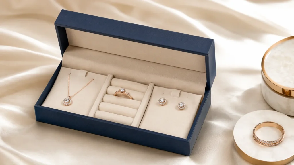
When I evaluate custom jewelry boxes, I never see the insert as a simple inner filler or a small detail that can be decided at the end. In jewelry packaging, the insert is one of the most important parts of the entire box because it decides how the jewelry is protected, positioned, displayed, and experienced. The outer box creates the first expectation, but the insert controls the moment when the customer finally sees the product. If the insert works well, the jewelry looks stable, clean, centered, and ready to appreciate. If the insert fails, even a beautiful outer box can feel unfinished. In my view, inserts are a core part of jewelry packaging because they connect product safety, visual presentation, brand perception, and customer trust.
Inserts Are the Hidden Structure Behind a Good Jewelry Presentation
I often think of the insert as the hidden structure that makes a jewelry box feel complete. A customer may first notice the color, surface, logo, or opening style of the outer box, but the insert is what makes the product look organized inside. It decides whether a ring stands upright, whether earrings appear as a balanced pair, whether a necklace pendant stays visible, whether a bracelet follows its natural shape, and whether a jewelry set feels like a complete collection instead of several loose items placed together.
This hidden role is important because jewelry is usually small and detail-sensitive. A tiny shift in position can change the whole opening impression. If a ring leans to one side, it may feel less premium. If a necklace pendant is hidden under the chain, the customer may not immediately see the design. If earrings are uneven, the pair may look careless. The insert quietly prevents these problems by giving each item a proper position. In my experience, the best inserts are often not the ones customers notice directly, but the ones that make the jewelry look naturally correct the moment the box opens.
Inserts Protect the Opening Moment After Shipping and Handling
I always think about what happens to a jewelry box before the customer opens it. The package may be assembled, packed, moved between workstations, placed into cartons, shipped through couriers, stacked in warehouses, and handled by the final customer. During that entire process, the jewelry inside can shift, rotate, slide, or tangle if the insert does not control it properly. This is especially important for ecommerce jewelry packaging because the customer’s first impression depends on how well the product has survived the delivery journey.
A good insert protects more than the jewelry itself. It protects the presentation that the brand intended. When a customer opens the box, the jewelry should appear in the position the brand planned, not wherever it ended up after transportation. This is why I do not judge inserts only by how they look in a sample photo. I think about whether the insert can still hold the product after the box is shaken, turned, moved, or packed inside an outer carton. In my view, a strong insert is one of the most practical ways to keep the unboxing experience consistent from sample approval to real customer delivery.
Inserts Reduce Scratching Friction and Product Contact
I also see inserts as an important protective barrier between the jewelry and the surfaces around it. Jewelry can be sensitive to contact because many products have polished metal, plated finishes, gemstones, pearls, enamel, chains, or delicate decorative details. If the jewelry rubs against the inner wall of the box, another jewelry piece, a rough paper edge, or a poorly designed insert, small scratches or marks may appear. Even minor surface issues can affect customer trust because jewelry customers often look closely at finishing details.
This is why I pay attention to how the insert touches the product. A ring slot should support the band without pressing too much against a raised stone. Earrings should be separated enough so the two pieces do not rub against each other. A necklace insert should control the chain without creating sharp contact points. A bracelet support should follow the product’s shape without forcing it into an awkward position. For jewelry sets, each piece should have enough separation to avoid friction. In my opinion, the insert should not only hold the jewelry; it should hold it gently, safely, and intelligently.
Inserts Control Movement Without Creating a Difficult Removal Experience
One of the most important balances I look for in insert design is secure holding without difficult removal. An insert that is too loose will allow the jewelry to move during shipping or handling, but an insert that is too tight can make the customer struggle when removing the product. Both problems damage the customer experience in different ways. A loose insert makes the package feel careless. A tight insert makes the product feel inconvenient or even risky to take out.
For rings, I usually want the slot to hold the ring upright while still allowing the customer to lift it smoothly. For earrings, the holes or card support should keep the pair stable but not make the backs hard to release. For necklaces, the chain should be fixed clearly but not wrapped so tightly that the customer has to untangle it from the packaging. For bracelets, the holding area should prevent sliding while keeping the product easy to remove. In my experience, a good insert should feel effortless to the customer. It should protect the product during movement and then allow a smooth, pleasant interaction when the box is opened.
Inserts Turn the Inside of the Box Into a Product Display
I believe one of the biggest values of an insert is that it turns the inside of the box into a small product display. Without an insert, the jewelry may sit at the bottom of the box without focus. With the right insert, the product can be lifted, centered, angled, separated, or framed in a way that makes it easier to appreciate. This is especially important for jewelry because the product is usually small and can lose visual strength if the internal layout is not carefully planned.
A ring insert can make the ring stand like a focal point. An earring card can create symmetry. A necklace insert can bring attention to the pendant. A bracelet insert can support the curve and length of the product. A jewelry set insert can organize several items into one complete story. The customer may not describe this as display design, but they will feel it. When the insert presents the jewelry clearly, the product feels more valuable and the brand feels more careful. In my view, insert design is one of the most direct ways to improve perceived value without changing the jewelry itself.
Inserts Influence How Premium or Practical the Box Feels
I often find that insert material strongly affects how customers judge the packaging. A velvet insert can create a soft, classic, gift-ready feeling. A microfiber insert can feel clean, smooth, and modern. A foam insert can provide strong cushioning and precise positioning, especially when covered with a better surface material. A paper card insert can feel simple, efficient, and flexible for earrings, charms, or lightweight necklaces. A molded pulp or paper-based insert can support a more responsible material direction for sustainable brands.
The material choice should match both the product and the brand. A luxury ring may feel under-presented if the insert looks thin or unstable. A sustainable necklace brand may feel inconsistent if the outer box is natural paper but the insert looks heavily plastic-based. A fashion jewelry line may benefit from printed cards because they allow quick design updates across collections. A premium watch or bracelet may need foam or microfiber support because the product is heavier and needs more cushioning. In my view, insert material is not only a cost decision. It is part of how the customer understands the brand’s level, values, and attention to detail.
Inserts Need to Be Designed Around Each Jewelry Type
When I choose inserts, I always begin with the jewelry type because different products need different support. A ring needs a slot that holds it upright and keeps it from rotating. Earrings need holes, cards, pads, or shaped supports that keep the pair aligned. Necklaces need chain control and pendant positioning. Bracelets need longer holding areas, curved support, or enough internal space to follow their natural shape. Watches need cushions that support the strap, dial, and overall weight. Jewelry sets need divided compartments so each item has its own place.
This is why I do not like using a single generic insert for many different jewelry products unless the product range is very simple. A generic insert may reduce development time, but it may also weaken presentation and protection. A paper card that works well for studs may not work for long drop earrings. A standard foam pad may hold a ring but fail to present a necklace properly. A flat insert may look neat but may not control a bracelet’s movement. In my experience, the insert should be shaped around how the jewelry sits, moves, and should be seen.
Inserts Should Continue the Same Brand Story as the Outer Box
I also believe the insert should feel connected to the outer box. The packaging experience can feel disconnected if the outside and inside speak different languages. A refined rigid box with a weak insert may create disappointment when opened. A natural kraft paper box with a highly synthetic-looking insert may weaken a sustainable brand message. A minimalist box with an overly decorative insert may feel visually inconsistent. The insert should continue the brand story rather than interrupt it.
For a luxury brand, I may expect a soft, fitted, and clean insert that supports refinement. For a minimalist brand, I may prefer a simple, precise insert with no unnecessary details. For a handmade brand, I may look for warmer paper textures or natural-feeling support. For a sustainable brand, I may consider paper-based inserts or molded pulp if they can protect the product properly. For a fashion brand, I may consider printed cards that support visual flexibility. In my view, the insert is part of the brand’s interior experience, and it should make the outer packaging feel more believable.
Inserts Affect the Box Size More Than Many Brands Expect
I often remind brands that the insert is not independent from the box size. The insert has thickness, height, holding points, product clearance, and removal space. These factors influence the internal dimensions of the box. If the insert is planned too late, the box may become too shallow, too deep, too tight, or too large. A ring with a raised stone may need more height above the slot. A necklace may need enough space behind the card to manage the chain. A bracelet may need a longer holding area. A jewelry set may need separate compartments that increase the overall footprint.
This is why I prefer to think about the box and insert together from the beginning. The outer box size should not be finalized before the product and insert layout are clear. Otherwise, the brand may need to compromise later by using a weaker insert or changing the box structure after sampling. In my experience, many fit problems can be avoided when the insert is treated as part of the structural design rather than a late-stage accessory.
Inserts Influence Cost Assembly and Production Consistency
When I evaluate inserts, I also think about how they affect cost and production. A simple paper card insert may be efficient, flexible, and easier to update for different SKUs. A die-cut foam insert may hold products more precisely but may require tooling, cutting, covering, and more careful assembly. A velvet-covered insert may improve perceived value but can add labor and quality control requirements. A molded pulp insert may support sustainability but may need development time and product-specific testing.
This does not mean brands should always choose the cheapest insert. It means the insert should match the product value, order quantity, packing process, and repeat production needs. If a brand has many SKUs, it may need an insert system that can be adapted without creating too many different tooling requirements. If a product is high-value, a more refined insert may be justified because it improves protection and presentation. If the brand sells through ecommerce, the insert must be tested for movement. In my view, a good insert is not only beautiful and protective; it must also be realistic to produce consistently.
Inserts Are Especially Important for Ecommerce Jewelry Packaging
For ecommerce jewelry brands, I see inserts as one of the most important parts of the package because the customer experiences the result after shipping, not the carefully arranged sample at the factory or studio. The product may move through several hands and environments before reaching the buyer. If the insert is not strong enough, the jewelry may arrive in a position that looks careless. A tangled necklace, tilted earrings, loose ring, or shifted bracelet can make the brand feel less professional even if the item itself is undamaged.
This is why I think ecommerce inserts should be tested more seriously. The box should be moved, lightly shaken, turned, and packed in a way that reflects real delivery conditions. If the jewelry does not stay in position, the insert needs improvement. The goal is not only to avoid damage, but also to preserve the opening experience. In my view, the best ecommerce jewelry insert makes the product arrive as if it had been placed carefully just before the customer opened the box.
A Good Insert Makes the Entire Jewelry Box Feel More Complete
In my view, a good insert completes the jewelry box. The outer box may create a strong first impression, but the insert makes the product feel secure, organized, and intentionally presented. It protects delicate surfaces, controls movement, supports the reveal, improves perceived value, and connects the packaging to the brand identity. When the insert is well designed, the customer may not consciously think about it, but they will feel that the package is thoughtful.
This is why I consider inserts a core part of custom jewelry packaging. They are not small accessories or optional fillers. They decide how the jewelry appears, how safely it travels, how easily it is removed, and how professionally the brand is experienced. A simple box with a well-designed insert can feel surprisingly refined, while an expensive box with a poor insert can feel unfinished. For any brand that wants to improve jewelry packaging, understanding inserts is one of the most important steps.
Common Insert Options and When to Use Them
When I compare common insert options for custom jewelry boxes, I never judge them only by how they look in a sample photo. An insert has to work inside the real packaging system. It needs to hold the jewelry, protect delicate surfaces, reduce movement during shipping, support the opening presentation, match the brand identity, and stay realistic for cost and production. EVA inserts, foam inserts, velvet inserts, microfiber inserts, paper card inserts, molded pulp inserts, and folded paper inserts can all be useful, but each one solves a different problem. In my view, the right insert is not simply the softest, cheapest, or most premium-looking option. It is the option that fits the product’s movement risk, the brand’s message, the customer’s expectation, and the practical limits of production.
EVA Inserts Are Strong When Jewelry Needs Precise Positioning
When I choose EVA inserts, I usually do it because the jewelry needs stronger positioning and a more controlled internal layout. EVA can be cut into specific shapes, so it works well when the product needs to sit firmly in one place. I often consider EVA for rings, watches, bracelets, charms, and jewelry sets where the product should not rotate, slide, or shift during handling. It can also help create a clean visual layout when several pieces need to be placed in separate positions inside one box.
The strength of EVA is stability, but its limitation is that it may feel too functional if left exposed. For premium jewelry packaging, plain EVA may not create the emotional feeling customers expect, so it is often covered with velvet, microfiber, paper, or fabric. I also consider the brand’s sustainability direction because EVA is not usually the first choice for brands that want a fully paper-based or reduced-plastic packaging story. In my experience, EVA is best when product positioning is the main priority and when the brand is willing to use surface covering or careful finishing to make the insert feel more refined.
Foam Inserts Work Well for Cushioning and Movement Control
When I use foam inserts, I usually think about cushioning and product stability. Foam can absorb minor pressure, reduce product movement, and protect jewelry from direct contact with the box. It is useful for rings, bracelets, watches, pendants, and jewelry sets that need a softer holding area. Foam can also be shaped or cut to fit different product forms, which makes it flexible for many custom jewelry box projects.
However, foam also needs careful treatment because the exposed surface may not always feel premium. A basic foam insert may protect the jewelry but still make the packaging feel too technical or low-value if the rest of the box is designed for a refined brand experience. This is why foam is often covered with velvet, microfiber, or paper. I also think about sustainability expectations because foam may not match brands that want to reduce synthetic materials. In my view, foam is a practical choice when cushioning, stability, and cost control matter, but it should be visually upgraded when the brand wants a more premium opening experience.
Velvet Inserts Create a Classic Jewelry Presentation
When I think about velvet inserts, I think about softness, tradition, and ceremony. Velvet has a strong connection with jewelry presentation because it creates a rich background and a gentle surface for polished metal, gemstones, pearls, and delicate finishes. A ring placed into velvet, earrings displayed on velvet, or a necklace presented against a velvet surface can immediately feel more formal and gift-ready. This is why velvet is often used for bridal jewelry, gemstone jewelry, anniversary gifts, and classic luxury collections.
At the same time, velvet is not the right choice for every brand. It can feel too traditional for a clean modern jewelry brand, and it may not fit a sustainable brand that wants a simpler paper-based packaging story. Velvet also needs careful production control because dust, fibers, pressure marks, glue marks, and uneven covering can be noticeable. I usually choose velvet when the product and brand need softness, emotional value, and a classic premium feeling. In my opinion, velvet works best when it supports the customer’s expectation of a special jewelry moment.
Microfiber Inserts Offer a Modern Soft-Touch Interior
When I choose microfiber inserts, I usually want a soft interior that feels cleaner and more contemporary than velvet. Microfiber can protect jewelry surfaces while creating a smooth and understated premium feeling. It works well for modern rings, minimalist necklaces, watches, bracelets, and silver jewelry brands that want refinement without a traditional jewelry-store mood. The surface feels gentle, but the visual effect is usually calmer and more modern.
The limitation of microfiber is that it still requires good workmanship. If the cutting is rough, the wrapping is uneven, or the surface becomes marked during assembly, the premium effect can disappear quickly. It can also cost more than simple paper inserts or basic uncovered foam. I usually recommend microfiber when the jewelry has enough value to justify a better interior finish and when the brand wants a soft but controlled presentation. In my view, microfiber is especially suitable for brands that want the inside of the box to feel refined without looking overly decorative.
Paper Card Inserts Are Flexible for Lightweight Jewelry
When I think about paper card inserts, I usually see them as a practical and flexible choice for lightweight jewelry. They are commonly used for earrings, charms, simple necklaces, pins, and small fashion jewelry because they can hold the product, carry printed branding, and keep the package lightweight. For brands with many SKUs, seasonal designs, or fast product updates, paper cards are useful because the artwork, size, holes, and slots can be adjusted more easily than molded inserts.
The main limitation is that paper cards do not provide the same cushioning or premium tactile feeling as EVA, foam, velvet, or microfiber. If the card is too thin, earrings may tilt, necklaces may shift, or charms may rotate. If the holes or cuts are not planned well, the product may look unbalanced or become difficult to remove. I often recommend paper card inserts when the product is lightweight, the brand needs print flexibility, and the cost needs to stay controlled. In my experience, paper cards can still look professional when the paper thickness, layout, printing, and product placement are carefully designed.
Molded Pulp Inserts Support Natural and Responsible Packaging
When I consider molded pulp inserts, I usually think about brands that want a more responsible and paper-based packaging direction. Molded pulp can be shaped to support the product while reducing the use of plastic-based materials. It can work well for sustainable jewelry brands, handmade jewelry brands, and ecommerce jewelry packaging when the product shape and protection needs are suitable. The natural texture can also support a more honest and material-conscious brand feeling.
However, molded pulp is not always suitable for every jewelry product. Its surface is usually not as soft as velvet or microfiber, so it needs testing when the jewelry has delicate polished surfaces, plating, pearls, or easily scratched finishes. Molded pulp may also require tooling and development time, especially if the insert needs a precise shape. In my view, molded pulp is valuable when sustainability is central to the brand identity, but it should be evaluated carefully for surface contact, product stability, and customer removal experience.
Folded Paper Inserts Balance Structure and Material Simplicity
When I use folded paper inserts, I usually see them as a smart option between a flat paper card and a molded insert. Folded paper can create height, separation, holding points, and internal support without relying on foam or plastic-based materials. It can work for earrings, charms, lightweight necklaces, slim bracelets, and small jewelry sets when the folding structure is well designed. It is especially useful for brands that want lighter packaging and a cleaner material story.
The challenge is that folded paper inserts depend heavily on structure. If the paper is too thin, the insert may collapse or deform. If the folds are too complicated, assembly may become slower and less consistent. If the holding points are not accurate, the jewelry may move during shipping. I usually consider folded paper inserts when a brand wants to balance sustainability, cost, and practical support. In my view, folded paper can be very effective, but it should always be tested with the actual jewelry and box before production.
Insert Materials Should Be Matched With Jewelry Surface Sensitivity
When I compare insert options, I always think about how the jewelry surface will touch the insert. A polished ring, plated necklace, pearl earring, gemstone pendant, or enamel charm may react differently to contact. A hard or rough insert may create friction. A soft insert may protect better but may collect dust or fibers. A paper insert may feel clean and lightweight but may need smooth edges to avoid scratching. This is why surface contact matters as much as visual appearance.
I usually evaluate whether the insert material supports the jewelry gently and whether the product can be removed without scraping against the holding area. For delicate or high-value jewelry, I may prefer covered foam, velvet, microfiber, or carefully finished paper-based support. For lightweight fashion jewelry, paper cards may be enough if the surface contact is not risky. In my opinion, the insert should protect the finish of the jewelry as much as it protects the position of the jewelry.
Insert Choice Should Reflect the Shipping and Sales Channel
I also choose inserts based on how the jewelry will reach the customer. If the product is sold in a retail store, the insert needs to support display and repeated handling. If the product is sold through ecommerce, the insert must handle movement during delivery. If the product is mainly used for gifting, the insert should create a clean and emotionally satisfying reveal. The same jewelry may need a different insert depending on whether the customer first sees it in a boutique, at home after shipping, or during a gift-opening moment.
For ecommerce packaging, I usually pay more attention to movement control because the product may be shaken before it is opened. For retail packaging, I think more about display angle, easy removal, and consistency across multiple boxes. For gift packaging, I focus on whether the insert makes the product feel special and well prepared. In my view, the insert should be chosen not only for the jewelry type, but also for the customer journey.
Insert Choice Should Match Brand Identity and Cost Reality
When I choose inserts, I always balance brand identity with cost reality. A luxury brand may need velvet, microfiber, or covered EVA because the customer expects a more refined interior. A minimalist brand may prefer a clean paper insert or microfiber surface because simplicity and precision matter more than decoration. A sustainable brand may prefer molded pulp, folded paper, or paper card inserts because the interior should support the same responsible message as the outer box. A fashion jewelry brand may choose printed paper cards because they support frequent design updates and SKU flexibility.
At the same time, the insert must make sense for the product price and order quantity. A very refined insert may improve perceived value, but it may also add cost, labor, and production complexity. A simple insert may control cost, but it must still protect the product and look professional. I do not believe every jewelry box needs the most expensive insert. I believe every jewelry box needs the most appropriate insert for its product, brand, and customer expectation.
The Best Insert Option Solves the Main Packaging Risk First
In my view, the best insert option is the one that solves the most important packaging risk first. If the product moves too much, the insert should improve positioning. If the product scratches easily, the insert should improve surface protection. If the product needs a premium reveal, the insert should improve presentation. If the brand focuses on sustainability, the insert should support the material story. If the product is sold in large quantities, the insert should also be realistic for assembly and repeat production.
This is why I never choose inserts based only on what looks best in isolation. EVA, foam, velvet, microfiber, paper cards, molded pulp, and folded paper all have useful roles, but they should be selected according to product behavior and brand needs. A good insert makes the jewelry safer, the box more complete, and the customer experience more convincing. A poor insert can make even an expensive outer box feel unfinished.
Logo Finishes and Surface Branding Options
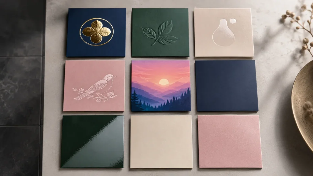
When I choose logo finishes and surface branding options for custom jewelry boxes, I never treat them as the final decoration added after the box is already designed. A finish changes how the customer reads the brand, how the box reacts to light, how the surface feels in the hand, and how the packaging supports the value of the jewelry inside. Foil stamping, embossing, debossing, spot UV, silk screen printing, full-color printing, matte lamination, gloss lamination, and soft-touch finish all create different visual and tactile effects. In my view, the right finish should not simply make the box look more expensive. It should make the brand identity clearer, the material more expressive, and the opening experience more consistent with the jewelry’s value.
Surface Branding Should Begin With the Brand Message
I always start surface branding by asking what the brand wants the customer to feel. A luxury jewelry brand may want refinement, weight, and quiet confidence. A minimalist brand may want restraint, clean proportion, and subtle detail. A fashion jewelry brand may need stronger visual recognition, color energy, and a more memorable first impression. A sustainable brand may want simpler finishes that feel honest and consistent with responsible material choices. These different goals should lead to different finishing decisions.
This is why I do not choose finishes only because they look attractive on a sample board. A gold foil logo may look premium, but it may feel too formal for a handmade brand that wants warmth and simplicity. A blind debossed logo may feel refined, but it may be too subtle for a colorful fashion jewelry line that needs stronger shelf or social media visibility. A glossy surface may create visual impact, but it may weaken a natural or minimalist brand direction. In my experience, surface branding works best when the finish supports the brand message before it tries to attract attention.
Foil Stamping Adds Metallic Shine and Premium Contrast
When I think about foil stamping, I usually connect it with metallic shine, premium recognition, and visual contrast. Foil stamping can make a logo, monogram, small icon, border, or selected design detail stand out from the box surface. In jewelry packaging, this process often feels natural because metallic foil visually relates to gold, silver, rose gold, and other jewelry tones. A small foil-stamped logo on a textured rigid box can create an immediate sense of value without making the design too complicated.
However, I also think foil stamping needs restraint. If the foil area is too large, the box may start to feel flashy rather than refined. If the logo lines are too thin or the artwork is too detailed, the foil edges may not appear as clean as expected, especially on textured or uneven paper. The foil color also matters. Gold foil may feel classic and ceremonial, silver foil may feel clean and modern, rose gold may feel softer and more feminine, and champagne foil may feel more understated. In my view, foil stamping works best when it is used as a controlled highlight rather than the main visual noise of the box.
Embossing Creates Raised Texture and a Stronger Physical Logo
When I use embossing, I think about how the customer experiences the logo through touch. Embossing raises part of the design above the surface, creating a three-dimensional effect that makes the brand mark feel more physical. This can be powerful for jewelry boxes because customers often hold the box closely and notice small surface details. A raised logo, subtle pattern, or embossed border can make the packaging feel more crafted and more memorable.
Embossing works best when the material has enough thickness and firmness to hold the shape clearly. Rigid boxes and thicker paper surfaces usually perform better than thin or weak materials. I also pay attention to the artwork because embossing is not ideal for every logo. Very thin lines, tiny letters, or overly complex graphics may lose clarity. Embossing can be used alone for a tactile premium effect, or it can be combined with foil stamping when the brand wants a more noticeable luxury detail. In my experience, embossing is valuable when the brand wants the logo to be seen and felt at the same time.
Debossing Creates Subtle Depth and Quiet Sophistication
When I choose debossing, I usually want a quieter and more understated brand effect. Debossing presses the logo or pattern into the surface, creating a recessed impression through shadow, pressure, and touch. This finish can feel elegant on minimalist jewelry boxes, luxury rigid boxes, textured paper surfaces, and packaging that wants to communicate confidence without too much shine. It is especially useful when a brand wants the box to feel refined but not overly decorative.
I like debossing because it can make the branding feel discovered rather than announced. A blind debossed logo on black textured paper, warm gray paper, or soft-touch paper can feel very sophisticated when the pressure and material are well matched. However, debossing may not be visible enough if the paper is too thin, the logo is too small, or the lighting does not catch the recessed area clearly. In my view, debossing is best for brands that value subtlety, touch, and a calm premium identity. It is not the loudest finish, but when used well, it can feel very deliberate.
Spot UV Creates Gloss Contrast and Modern Surface Interest
When I use spot UV, I usually think about selective contrast. Spot UV adds a glossy layer only to specific areas, such as a logo, pattern, line, or graphic detail. When it is placed on a matte surface, the contrast between gloss and matte can create a modern, polished, and slightly hidden effect. The design may appear softly at first and become more visible when the box catches light. This can be useful for contemporary jewelry brands that want something refined but not metallic.
Spot UV can work well on coated paper, matte laminated surfaces, and modern printed designs. It can help create a sleek surface detail for fashion jewelry, ecommerce jewelry, or modern gift packaging. However, I usually avoid using it on very rough or natural materials where the gloss effect may not appear clean. Registration also matters because the spot UV layer must align accurately with the printed design. In my experience, spot UV is strongest when the brand wants modern contrast and light interaction, but does not want the traditional feeling of foil stamping.
Silk Screen Printing Creates Solid Color and Direct Brand Presence
When I choose silk screen printing, I usually want solid color coverage and a stronger ink presence on the surface. Silk screen printing can create bold logos, simple graphic marks, and high-opacity color effects that may be difficult to achieve with some standard printing methods. It can be useful on colored paper, specialty paper, kraft paper, or surfaces where the brand wants a clean one-color logo with strong visibility.
I often consider silk screen printing for minimalist jewelry brands, handmade packaging, monochrome designs, or boxes where the logo needs to feel direct and tactile. It can create a slightly thicker printed surface, which gives the branding more physical presence than ordinary flat printing. However, it is not the best option for complex full-color artwork, gradients, or highly detailed images. Each additional color can also add setup complexity. In my view, silk screen printing works best when the brand wants a simple, solid, and confident logo without using metallic or glossy effects.
Full-Color Printing Supports Patterns Collections and Visual Storytelling
When I use full-color printing, I usually think about brands that need more visual storytelling. Full-color printing allows packaging to use patterns, illustrations, gradients, seasonal colors, product themes, campaign visuals, and more expressive brand graphics. This can be very useful for fashion jewelry brands, gift collections, ecommerce jewelry brands, and product lines that change by season or campaign. It gives the brand more freedom to make the box visually recognizable.
However, I also think full-color printing needs careful control in jewelry packaging. Too much artwork can compete with the jewelry, especially if the product itself is delicate or minimal. Color consistency is another important issue because brand colors should look stable across batches. Smooth coated paper usually supports full-color printing better than heavily textured paper, while kraft paper often makes colors appear more muted. In my experience, full-color printing is most useful when the packaging needs strong visual identity, but the design still needs enough balance so the jewelry remains the focus.
Matte Lamination Creates a Calm and Refined Protective Surface
When I think about matte lamination, I usually connect it with calmness, softness, and restraint. Matte lamination reduces reflection and gives the box a smoother, quieter surface. It can work well for minimalist jewelry brands, modern packaging, luxury rigid boxes, and products that want a refined but not flashy appearance. It also adds a protective layer over printed surfaces, which can help the box handle packing, shipping, and customer touch better than an unprotected printed surface.
At the same time, matte lamination is not completely problem-free. Dark matte surfaces may show fingerprints, scratches, or rubbing marks more easily, especially during shipping or retail handling. If the brand uses deep black, navy, dark green, or burgundy boxes, I always think about whether the surface can stay clean through real use. In my view, matte lamination is a strong choice when the brand wants an understated and modern finish, but it should be evaluated for handling durability, especially on darker colors.
Gloss Lamination Creates Brightness and Stronger Visual Energy
When I choose gloss lamination, I usually think about brightness, color intensity, and stronger visual impact. Gloss lamination makes the surface more reflective and can make printed colors appear more vivid. This can be useful for fashion jewelry, colorful gift packaging, promotional jewelry collections, and retail boxes that need to catch attention quickly. If the brand wants a lively and energetic visual effect, gloss can help the packaging appear brighter.
However, gloss lamination may not match every jewelry brand. It can feel too commercial for luxury packaging, too shiny for minimalist branding, too artificial for handmade products, or inconsistent with sustainable packaging messages. It may also show scratches under certain light if the box is handled frequently. I usually use gloss when the design needs stronger color performance and visual energy, rather than when the brand wants a soft, natural, or restrained feeling. In my opinion, gloss lamination is useful, but it should be chosen because the brand needs brightness, not because shine is automatically better.
Soft-Touch Finish Creates a Sensory Premium Experience
When I use soft-touch finish, I think first about hand feel. Soft-touch surfaces create a smooth, velvety, and almost skin-like sensation that can make the box feel more premium when the customer holds it. This finish can make a simple structure feel more refined because the customer experiences quality through touch. It works well for luxury jewelry boxes, modern gift packaging, premium rigid boxes, and minimalist designs that rely on sensory detail rather than heavy graphics.
However, soft-touch finish needs careful handling and realistic expectations. Some soft-touch surfaces can show fingerprints, oil marks, scratches, or rubbing more easily, especially on dark colors. It can also increase cost compared with standard matte or gloss finishes. I usually recommend soft-touch when touch is an important part of the brand experience and when the packaging will be handled carefully enough to maintain the surface. In my view, soft-touch is powerful when the brand wants the customer to slow down and feel the packaging, but it should be tested under real handling conditions before bulk production.
Finishes Should Be Matched With the Paper Material
I always match logo finishes with the chosen paper material because the same process can look very different on different surfaces. Foil stamping may look crisp on smooth coated paper but slightly softer on textured paper. Debossing may look deep and elegant on thick rigid paper but weak on thin material. Spot UV may create clear contrast on matte coated paper but may not perform well on rough kraft paper. Full-color printing may appear vivid on coated paper but more muted on natural or recycled paper. This is why I never choose the finish separately from the material.
For jewelry packaging, this matching process is especially important because small details are easy to notice. A logo that looks perfect in a digital rendering may behave differently during real production. Paper texture, ink absorption, stamping pressure, heat, lamination, and coating all affect the final result. In my experience, the most successful packaging finishes come from testing the finish and material together, not assuming that one process will look the same on every surface.
Finishes Should Also Match the Box Structure and Use Scenario
I also think finishes should match the box structure and how the customer will use the packaging. A rigid box can usually support more premium finishes because the structure itself feels substantial. A folding carton may be better suited for printing, lamination, and simpler logo treatments, especially when cost and quantity matter. A drawer box may use different finishes on the outer sleeve and inner tray to create a layered reveal. A mailer box may need finishes that can withstand handling and shipping rather than very delicate surface effects.
The use scenario matters as well. Retail boxes may be touched frequently, so surfaces should resist visible wear. Ecommerce boxes may move through shipping, so delicate finishes should be protected. Gift boxes may benefit from tactile finishes because the customer pays more attention to the opening moment. In my view, a finish should not only look good at the sample stage. It should continue to look appropriate after handling, shipping, opening, and gifting.
The Best Finish Is Often the One Used With Restraint
I believe one of the biggest mistakes in jewelry packaging is using too many finishes at once. A box with foil stamping, embossing, spot UV, gloss, texture, and full-color printing may sound premium, but it can easily become visually crowded. Jewelry packaging often feels more refined when the finish is chosen with restraint. A single well-placed foil logo, a clean debossed mark, a soft-touch surface, or a subtle spot UV pattern can sometimes create a stronger impression than several effects used together.
In my experience, restraint is especially important for jewelry because the product itself should remain the focus. The packaging should frame the jewelry, not compete with it. When the finish supports the material, brand position, and opening experience, the box feels complete. When finishes are added only to make the box look more expensive, the result can feel over-designed. For custom jewelry boxes, I always prefer finishes that make the brand clearer and the customer experience more coherent.
How to Choose Logo Finishes Based on Brand Style
When I choose logo finishes for custom jewelry boxes, I never start from the process itself. I start from the brand style, the customer expectation, and the feeling the packaging should create before the jewelry is even seen. A finish can make a box feel luxurious, minimal, fashionable, handmade, sustainable, modern, or accessible, but the same finish can also feel wrong if it does not match the brand identity. In my view, logo finishes should not be chosen only because they look premium in a sample. They should help the box speak the same language as the jewelry, the material, the insert, and the customer experience.
Brand Style Should Decide the Finish Before Decoration Does
I always believe brand style should lead the finish decision because the logo treatment is one of the most direct signals on the box surface. Customers may not know whether a logo was made by foil stamping, debossing, silk screen printing, or full-color printing, but they can quickly feel whether the result matches the brand. A shiny logo may feel premium for one brand but too formal for another. A quiet debossed mark may feel elegant for a minimalist brand but too subtle for a colorful fashion jewelry line. This is why I do not choose finishes by popularity alone.
Before selecting a finish, I usually ask what the brand needs the box to communicate. Should it feel refined and ceremonial, clean and modern, warm and handmade, responsible and natural, bold and trend-driven, or practical and accessible? Once that emotional direction is clear, the finish becomes easier to choose. In my experience, the best logo finish is not the one that looks most expensive in isolation. It is the one that makes the brand feel more believable when the customer holds the box.
Luxury Jewelry Brands Need Premium Signals With Restraint
When I work with luxury jewelry brands, I often choose finishes that create refinement, depth, and a controlled sense of value. Foil stamping and embossing can work very well because they give the box a stronger premium signal. Foil stamping adds metallic shine that naturally connects with jewelry, precious metals, gifting, and ceremony. Embossing adds raised texture and makes the logo feel more physical. When these finishes are used carefully, they can make the box feel more valuable without needing a complicated graphic design.
However, I do not think luxury packaging should be overloaded with finishes. A luxury box often feels more confident when it uses fewer details with better control. A small gold foil logo on textured navy paper, a champagne foil mark on warm ivory paper, or an embossed monogram on a rigid box can feel more elegant than a surface covered with metallic decoration. I also pay attention to the paper material because foil and embossing need the right surface to look clean. In my view, luxury finishes should create a quiet sense of quality. They should make the customer feel that the brand is precise, selective, and confident.
Minimalist Jewelry Brands Need Quiet Finishes With High Precision
When I choose finishes for minimalist jewelry brands, I focus on restraint and accuracy. Minimalist packaging often depends on clean space, balanced proportions, subtle materials, and small details. Debossing, blind stamping, one-color printing, or a very small foil detail can work well because they keep the branding quiet while still giving the box identity. The finish should not compete with the jewelry. It should create a calm background that allows the product to remain the focus.
The challenge is that minimalist finishes expose every mistake. If a one-color logo is slightly misaligned, if a debossed mark is too shallow, or if the paper surface looks uneven, the simplicity of the design makes the issue more visible. This is why I think minimalist branding needs strong production discipline. A soft gray box with blind debossing, a white box with a small black printed logo, or a matte black box with a subtle tone-on-tone mark can all feel premium, but only when the details are executed cleanly. In my experience, minimalism does not mean doing less care. It means every small choice has to be more intentional.
Fashion Jewelry Brands Need Color Energy and Visual Flexibility
When I think about fashion jewelry brands, I usually allow the logo finish to become more expressive. Fashion jewelry often depends on trend, color, collection identity, social media appeal, and fast customer recognition. Stronger color, full-color printing, spot UV, gloss effects, bold logo placement, and graphic surface design can help the box feel fresh and memorable. For brands that update collections frequently, printing-based finishes can be especially useful because they allow the packaging to change with campaigns, seasons, or product drops.
However, I still believe fashion finishes need a clear visual system. Strong color should not become random decoration. A full-color printed box should still support the product and brand rather than overwhelm them. Spot UV can add modern shine, but it should be placed where it creates contrast and not just where there is empty space. Gloss lamination can make colors more vivid, but it may not fit every jewelry style. In my view, fashion jewelry finishes should create energy while still staying practical for cost, production speed, and repeat updates.
Sustainable Jewelry Brands Need Simpler Finishes That Feel Honest
When I choose finishes for sustainable jewelry brands, I look for consistency between the brand’s values and the packaging surface. A brand that speaks about responsibility, natural materials, or conscious consumption should be careful with finishes that feel excessive, plastic-heavy, or difficult to justify. One-color printing, blind debossing, simple stamping, uncoated paper, kraft paper, recycled paper, and FSC-certified paper can all support a more responsible packaging message.
I do not think sustainable packaging needs to look plain or unfinished. A simple debossed logo on textured natural paper can feel refined. A clean one-color logo on kraft paper can feel honest and warm. A small stamped mark on FSC-certified paper can communicate care without making the surface feel over-processed. What I try to avoid is contradiction. If the packaging uses a natural-looking paper but adds heavy gloss, oversized metallic effects, or unnecessary surface layers, the customer may feel the sustainability message is less believable. In my view, sustainable finishes should make the brand feel thoughtful rather than decorative.
Handmade Jewelry Brands Need Warmth and a Human Feeling
When I work with handmade jewelry brands, I usually choose finishes that feel personal and sincere. Handmade jewelry customers often care about story, craft, material origin, and the sense that the product was made with attention. The packaging finish should support that feeling. One-color printing, simple stamping, blind debossing, small foil details, kraft paper surfaces, and textured paper can all work well when they make the box feel warm rather than overly industrial.
I usually avoid finishes that make handmade jewelry packaging feel too corporate or too polished unless the brand intentionally wants a high-end studio image. A printed logo on kraft paper may feel more authentic than a large metallic logo. A subtle debossed mark on textured paper can feel crafted and personal. A small foil accent may help if the product is premium, but too much shine can make the handmade story feel less natural. In my view, handmade jewelry finishes should make the customer feel that the product was prepared with care by real people, not processed through a generic luxury template.
Modern Premium Brands Need Subtle Contrast and Strong Hand Feel
When I think about modern premium jewelry brands, I often look for finishes that create quality through touch and controlled contrast rather than obvious decoration. These brands may not want the traditional luxury language of heavy gold foil or ornate embossing. Instead, they may prefer soft-touch finish, matte lamination, blind debossing, tone-on-tone printing, spot UV, champagne foil, or black foil. These effects can create a premium feeling while keeping the box modern and restrained.
Soft-touch finish can be especially powerful because it makes the customer feel quality before they analyze the design. A matte surface with a subtle spot UV logo can create a sleek modern effect. A debossed mark on a soft-touch rigid box can feel quiet but memorable. However, I always consider durability because soft-touch and dark matte surfaces can show fingerprints or rubbing marks if not handled well. In my experience, modern premium finishes should feel sensory and controlled, but they should still be practical for the way the box will be packed, shipped, and opened.
Affordable Jewelry Brands Need Clear Branding and Repeatable Results
When I choose finishes for affordable or mass-market jewelry packaging, I usually focus on clarity, consistency, and production efficiency. These brands may need packaging for many SKUs, larger quantities, retail programs, ecommerce platforms, or promotional sales. The finish should make the box look professional without adding unnecessary cost or production risk. One-color printing, standard full-color printing, matte lamination, gloss lamination, and simple logo placement can often work better than complicated premium processes.
I do not believe affordable jewelry packaging should look careless. A simple printed logo can still feel trustworthy if the box material is appropriate, the color is consistent, and the structure holds the product well. What I try to avoid is using expensive finishes that do not match the product price or business model. A low-priced earring line may not need foil stamping and embossing together. It may need clean printing, stable cards, and a surface that looks good across many units. In my view, accessible jewelry packaging should feel organized, clear, and repeatable, not like a weak imitation of luxury packaging.
The Finish Should Match the Material Surface
I always match logo finishes with the material surface because the same process can look very different depending on the paper. Foil stamping can look crisp on smooth paper but softer on heavily textured paper. Debossing can look elegant on thick rigid paper but weak on thin carton material. Full-color printing can look vivid on coated paper but muted on kraft paper. Spot UV can create strong contrast on matte coated paper but may not work well on rough natural surfaces.
This is why I think material and finish should be selected together. A brand may love a certain logo effect in a reference photo, but the result may change if the paper material is different. A textured specialty paper may be beautiful, but it may not support detailed printing. A kraft paper may feel natural, but it may not show light ink clearly. A soft-touch surface may feel premium, but it may need careful handling. In my experience, the finish should enhance the material, not fight against it.
The Finish Should Match the Sales Channel and Handling Conditions
I also consider where and how the box will be handled. Retail jewelry packaging may be touched by staff and customers, displayed under lighting, and opened repeatedly. Ecommerce packaging may be packed, shipped, rubbed, stacked, and handled before the customer sees it. Gift packaging may be held closely and judged more emotionally during the opening moment. These conditions affect which finish is practical.
A delicate soft-touch surface may feel excellent for a premium gift box, but it may need protection during shipping. A gloss laminated box may look bright for retail, but it may feel too commercial for a luxury boutique product. A debossed logo may feel refined, but it may be too subtle if the box needs strong shelf recognition. In my view, a finish should not only look good in a sample. It should still look appropriate after the real journey from production to customer.
The Best Finish Is the One That Makes the Brand More Coherent
In my view, the best logo finish is the one that makes the whole packaging experience more coherent. Luxury brands may use foil stamping or embossing, but they should do it with restraint. Minimalist brands may prefer debossing or one-color printing, but the execution must be precise. Fashion brands may use stronger color and full-color printing, but the design still needs control. Sustainable brands may choose simpler finishes, but the result should still feel intentional and professional.
When the finish matches the brand style, the material, the structure, and the jewelry product, the box feels natural. When the finish is chosen only because it looks attractive on its own, the packaging can feel disconnected. I always prefer finishes that make the customer understand the brand faster and trust the product more easily. A finish should not be decoration for decoration’s sake. It should be a small but powerful part of the brand experience.
How Materials Box Styles Inserts and Finishes Work Together
When I evaluate custom jewelry boxes, I never separate materials, box styles, inserts, and finishes into four independent decisions. In real packaging development, these choices affect each other at every step. The material decides how the surface can be printed, stamped, embossed, or touched. The box style decides how the customer opens the package and how much internal support the jewelry needs. The insert decides whether the product stays stable, protected, and visually centered. The finish decides how the brand is remembered on the surface. If these choices are made separately, the box may look attractive in individual details but feel disconnected as a complete experience. In my view, the strongest jewelry packaging is created when every element supports the same product need, brand message, sales channel, and customer expectation.
A Jewelry Box Should Be Planned as One Connected Experience
I always think of a jewelry box as one connected experience because customers do not judge packaging in separate technical categories. They do not open the package and think only about the paper, then only about the insert, then only about the logo finish. They experience everything together. They feel the surface, notice the logo, open the structure, see the jewelry, touch the insert, and decide whether the package feels professional within a few seconds. This means every element has to work together, even if each one is produced through a different process.
For example, a luxury rigid box can lose value if the insert looks thin or unstable. A beautiful textured paper can feel wasted if the logo finish is poorly matched. A drawer box can create anticipation, but that anticipation disappears if the product slides inside when the tray is pulled. A folding carton can be efficient and attractive, but it may feel inconsistent if the brand adds heavy luxury finishes that the structure cannot support. In my experience, packaging feels strongest when the outside promise and inside experience match each other.
Material Choice Should Guide the Finish Instead of Following It
When I choose finishes, I always let the material guide the decision. Some brands choose foil stamping, embossing, or spot UV first because they like the effect, but the final result depends heavily on the paper surface. Textured paper can pair beautifully with foil stamping because the metallic logo contrasts with the tactile background. It can also work well with debossing because the pressure creates a refined shadow. But if the texture is too uneven, very fine foil lines or small logo details may not appear as sharp as expected.
Smooth coated paper often supports full-color printing, spot UV, and clean logo reproduction better because the surface is more controlled. Kraft paper may be better suited for simple one-color printing, blind debossing, or restrained stamping because bright colors can appear muted on natural brown fibers. Soft-touch paper can feel premium with subtle foil or debossing, but it may require careful handling to avoid surface marks. In my view, a finish should enhance the material, not fight against it. The best surface branding comes from choosing a material and finish that naturally support each other.
Box Structure Should Decide How Stable the Insert Needs to Be
I always connect box structure with insert stability because different opening methods create different movement risks. A drawer box moves horizontally when the customer pulls the tray, so the insert must hold the jewelry more securely. If a necklace, ring, or bracelet is placed loosely inside a drawer box, the sliding motion can cause the product to shift before the customer sees it. A lid and base box opens vertically, so the insert needs to focus more on the first top-down view and product positioning. A book-style box opens like a display case, so the insert must look clean and balanced across the full interior.
This is why I do not choose inserts after the box structure is already finalized. The opening direction, internal depth, tray movement, lid clearance, and customer removal experience all affect insert design. A ring slot in a compact box must protect the ring from touching the lid. A necklace insert in a drawer box must control the chain so it does not move when the tray slides. A bracelet insert in a longer box must support the product shape without making it hard to remove. In my experience, box style and insert design should be developed together from the beginning.
Inserts Should Connect Product Protection With the Brand Reveal
I see the insert as the bridge between protection and presentation. It keeps the jewelry stable during handling and shipping, but it also controls the reveal when the customer opens the box. A ring that stands upright, earrings that sit evenly, a pendant that stays centered, and a bracelet that follows a natural curve all create a stronger first impression. If the insert fails, the product may still be inside the box, but the presentation can feel accidental rather than intentional.
The insert also needs to match the brand identity. A luxury box may need velvet, microfiber, or covered foam to support softness and refinement. A sustainable box may need molded pulp, folded paper, or paper-based inserts to keep the material story consistent. A fashion jewelry box may use printed cards because the brand needs flexibility across colors and collections. A minimalist box may need a clean paper or microfiber insert that avoids visual distraction. In my view, the insert should continue the same message that the outer material and finish have already started.
Heavy Finishes Need a Structure That Can Support Them
I often see brands try to make packaging feel premium by adding heavy finishes, but this only works when the structure can support the message. Large foil areas, deep embossing, multiple surface effects, soft-touch coatings, and layered finishes can create a high-end impression on a strong rigid box. But on a lightweight folding carton, these same finishes can sometimes feel mismatched. The surface may look ambitious, while the hand feel still tells the customer that the box is light and practical.
This does not mean lightweight structures should look plain. A folding carton can look excellent with clean printing, matte lamination, one-color branding, or a small foil detail. It can be the right choice for fashion earrings, charms, or scalable ecommerce jewelry. The key is to let the finish match the role of the structure. In my experience, finishes should strengthen what the box already does well. They should not be used to cover up a structure that was never intended to feel luxurious.
Premium Structures Need Premium Details Inside
I also believe that premium structures create higher expectations. If a brand chooses a magnetic closure box, drawer box, or book-style box, the customer expects the inside to feel equally considered. A magnetic box with a weak insert can feel disappointing because the strong closure raises the customer’s expectation before opening. A drawer box with poor sliding resistance can make the structure feel cheap even if the outside paper is beautiful. A book-style box with a misaligned insert can make the display feel careless because the full interior is visible at once.
For this reason, I always check whether the inside matches the outside. If the box structure feels premium, the material, insert, logo finish, and assembly quality must support that promise. The more refined the structure, the more important the internal details become. In my view, premium packaging is not created by structure alone. It is created by consistency between the first touch, the opening motion, the product reveal, and the final customer impression.
Product Type Should Control the Whole Packaging System
When I build packaging logic, I always return to the jewelry product itself. Different products create different system requirements. A ring needs secure upright positioning, so the box structure, insert slot, internal height, and finish should all support a strong reveal. A necklace needs chain control and pendant focus, so the insert and box depth become especially important. Earrings need pair balance, so the card, pad, or insert must hold both pieces evenly. Bracelets need longer support, watches need stronger cushioning, and jewelry sets need divided compartments.
This means the product type should influence every packaging decision. A premium ring may work well with a compact rigid box, textured paper, a soft slot insert, and foil stamping. A lightweight fashion earring line may work better with coated paper, full-color printing, and a paper card inside a folding carton. A sustainable necklace brand may use FSC-certified paper, a folded paper insert, and simple one-color branding. In my experience, the best system begins with the jewelry’s real physical needs, then builds the material, structure, insert, and finish around them.
Brand Positioning Should Keep Every Choice Moving in the Same Direction
I use brand positioning as the guide that keeps packaging decisions from becoming random. A luxury brand needs every element to feel refined and controlled. A minimalist brand needs fewer details but better precision. A handmade brand needs warmth and material honesty. A sustainable brand needs responsible materials and simpler finishing. A fashion brand needs visual energy and flexibility. If these directions are not clear, packaging choices can easily conflict with one another.
A kraft paper box with a paper insert and simple logo can feel honest and sustainable. But if the same box uses heavy gloss and large metallic foil, the message may become less clear. A luxury rigid box with textured paper and foil stamping can feel premium. But if the insert is thin or poorly fitted, the inside weakens the outside promise. A fashion jewelry box can use bright printing and a simple card insert effectively. But if it uses costly specialty paper that limits frequent updates, it may not fit the brand’s business rhythm. In my view, brand positioning should connect every packaging choice like a single thread.
Sales Channel Changes the Priority of the System
I also consider how the jewelry will reach the customer because retail, ecommerce, and gift packaging each require a different balance. Retail packaging may need strong display value, clean surfaces, and good hand feel under store lighting. Ecommerce packaging needs more movement control, shipping durability, compact dimensions, and finishes that can survive handling. Gift packaging needs emotional value, a smoother reveal, and materials that feel pleasant when held.
This changes how I combine packaging elements. For ecommerce necklaces, I may prioritize a stable insert and compact structure over a delicate surface finish. For retail earrings, I may focus on clear printing, card presentation, and consistent display. For luxury gift sets, I may use a stronger rigid structure, soft inserts, and restrained foil or debossing. In my experience, the same box idea can become more or less suitable depending on where the customer first experiences it. A complete packaging system should be designed for the actual customer journey.
Cost Should Be Distributed Strategically Across the Box
When I think about packaging cost, I do not believe every element needs to be upgraded at the same time. Sometimes the smartest decision is to invest in the insert because product movement is the biggest risk. Sometimes the material deserves more budget because hand feel is central to the brand. Sometimes a simple structure with excellent printing works better than a premium structure with weak internal support. A good packaging system is about knowing where the value matters most.
For example, a fashion jewelry brand may keep the structure simple but invest in full-color printing to support collection identity. A luxury brand may choose a rigid box and a high-quality insert, but use only one restrained logo finish. A sustainable brand may simplify decoration and invest in better paper materials. An ecommerce brand may choose compact packaging and a stable insert to reduce shipping issues. In my view, the best cost strategy is not to add more everywhere. It is to place the budget where it improves the customer experience most.
Production Reality Should Be Considered Before Finalizing the Design
I always consider production feasibility before finalizing a packaging system. Some combinations look beautiful in concept but become difficult in real manufacturing. A textured paper may not hold detailed printing cleanly. A deep embossing may not work well on thin paper. A drawer box may need very accurate assembly to slide smoothly. A covered insert may increase labor and quality control requirements. A soft-touch surface may need extra care to avoid fingerprints or rubbing marks.
This is why I prefer to think about production early rather than after the visual direction is fixed. A successful sample is important, but repeat production is just as important for brands that reorder packaging. The box should be practical to make, inspect, pack, ship, and reproduce with stable quality. In my experience, a packaging system is truly successful only when it looks good, works well, and can be repeated reliably.
A Coherent System Feels More Valuable Than Separate Premium Details
In my view, the best jewelry packaging does not come from choosing the most premium material, the most complex structure, the softest insert, and the most expensive finish at the same time. It comes from choosing the right combination. A textured paper box with a small foil logo, a stable insert, and a controlled opening can feel premium because all elements support the same message. A kraft paper box with a folded paper insert and simple printing can feel responsible because the material story is consistent. A coated paper carton with full-color graphics and a clean card insert can feel right for fashion jewelry because the system supports flexibility and cost control.
Customers may not analyze every packaging decision, but they can feel when the system is coherent. The box feels easier to trust, the jewelry feels better presented, and the brand feels more professional. That is why I always think as a complete packaging system. A single beautiful detail can impress for a moment, but a well-aligned system creates a stronger and more lasting customer experience.
Cost Factors Brands Should Understand Before Customizing Jewelry Boxes
When I explain the cost of custom jewelry boxes, I always tell brands that a quote is not just a number for one box. It is the result of many connected decisions, including size, material, structure, insert type, printing method, finishing process, order quantity, tooling, sampling, assembly, packing, inspection, and production complexity. Two jewelry boxes may look similar in a photo, but their real cost can be very different if one uses thicker board, specialty paper, a covered foam insert, foil stamping, and manual assembly, while the other uses standard paperboard, simple printing, and a paper card insert. In my view, brands should understand these cost factors before comparing prices, because a lower quote is only meaningful when the specifications, quality level, and production expectations are truly the same.
Cost Should Be Understood as a Packaging System, Not a Single Unit Price
I always look at jewelry box cost as a complete packaging system because each decision affects the next one. A larger size may require more board and insert material. A more premium structure may require more labor and tighter assembly control. A special finish may require tooling, setup, and slower inspection. A softer insert may improve perceived value but increase assembly time. If a brand only asks for the lowest unit price without understanding these connected factors, it may end up comparing very different packaging solutions.
This is why I believe cost education is important before price comparison. A cheaper box may be cheaper because the material is thinner, the structure is simpler, the insert is weaker, or the finish is less controlled. A higher quote may include better board, more stable insert design, more accurate logo finishing, or more careful packing. In my experience, the most useful question is not simply why one price is higher than another. The better question is what each price includes and whether that specification supports the jewelry, brand, and customer experience.
Box Size Affects Material Use Storage Shipping and Product Presentation
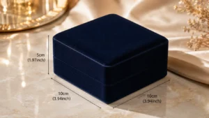
When I evaluate the cost of a jewelry box, I start with size because size affects much more than the amount of paper used. A larger box needs more rigid board or paperboard, more surface paper, more insert material, and sometimes more glue, wrapping labor, and finishing area. It also increases the space needed for storage and shipping. For international buyers and ecommerce brands, volume can affect freight cost, carton packing efficiency, warehouse space, and even the final delivery packaging.
However, I do not believe brands should reduce size blindly. If the box becomes too small, the product may not sit properly. A necklace may not have enough room for chain control, a bracelet may bend unnaturally, and a ring with a raised stone may touch the lid. If the box becomes too large, the jewelry may look visually weak or the insert may need more material to fill the space. In my view, the best size is a balance between product fit, protection, presentation, and logistics efficiency. A box should be compact enough to control cost but spacious enough to make the jewelry feel properly presented.
Material Cost Depends on Quality Availability and Brand Position
When I compare materials, I think about more than the name of the paper or board. Rigid paperboard, folding carton board, coated paper, textured paper, specialty paper, kraft paper, FSC-certified paper, velvet, microfiber, EVA, foam, molded pulp, and paper-based inserts all have different cost logic. Some materials cost more because they are thicker, harder to source, require higher minimum quantities, or need more careful handling. Some materials may also create more waste during cutting or wrapping, which affects the final cost.
I also look at how the material supports the brand. A luxury jewelry brand may need textured paper, thick rigid board, or a soft insert because the packaging must support a higher perceived value. A sustainable jewelry brand may choose FSC-certified paper or kraft paper because the material story matters to its customers. A fashion jewelry brand may choose coated paper because it supports clear printing and collection updates. In my experience, the right material is not always the cheapest one. It is the one that gives the best value for the product’s position and the customer’s expectation.
Box Structure Has a Direct Impact on Labor and Production Difficulty
When I evaluate box structure, I always think about how many production steps are required to make it. A folding carton is usually more efficient because it can be printed, die-cut, creased, shipped flat, and assembled more easily. A rigid box usually requires board cutting, paper wrapping, gluing, drying, and more manual inspection. A drawer box needs both a sleeve and a tray, and the sliding fit must be controlled. A magnetic closure box needs magnet placement, closure alignment, and stronger structural control. A book-style box needs hinge accuracy and clean closing.
Each additional structural feature can increase labor and quality control requirements. A box may look simple to a buyer, but from a production perspective, a small change in structure can create more assembly time or a higher defect risk. For example, a drawer that is too tight will frustrate the customer, while a drawer that is too loose will feel cheap. A magnetic box that does not close neatly will weaken the premium impression. In my view, structure cost is not only about material. It is also about precision, labor, and consistency.
Inserts Can Be One of the Most Important Hidden Cost Factors
I often see brands underestimate insert cost because the insert is inside the box, but it can strongly affect both price and performance. A simple paper card insert may be cost-efficient for lightweight earrings or charms. A folded paper insert may require more design and assembly. Foam or EVA inserts may need cutting, shaping, covering, or tooling. Velvet and microfiber inserts may create a premium feel but require more careful handling. Molded pulp inserts may support sustainability goals but may require development and mold costs for custom shapes.
The insert should be evaluated by what it solves. If the product is delicate, a better insert may reduce scratching and movement. If the jewelry is sold online, a stable insert may preserve the opening presentation after shipping. If the brand is premium, a soft or well-fitted insert may support perceived value. If the brand is sustainable, a paper-based insert may support the material story. In my view, insert cost is often worth discussing carefully because a weak insert can make even an expensive outer box feel unfinished.
Printing Cost Depends on Color Artwork and Production Setup
When I look at printing cost, I think about design complexity, color count, printing method, and setup requirements. Simple one-color printing is usually more straightforward and can work well for minimalist, handmade, or sustainable jewelry packaging. Full-color printing can support patterns, gradients, illustrations, and seasonal branding, but it requires more color control and artwork accuracy. Silk screen printing can create strong solid color on certain surfaces, but multiple colors may increase setup complexity.
Printing cost also changes with quantity because setup time is spread across the order. A low-quantity order may have a higher unit price because printing setup, machine adjustment, and color matching still need to happen. A larger order can often distribute these costs more efficiently. I also think brands should understand that color accuracy is part of cost. If a brand needs strict color matching across repeat orders, production may need more control, comparison, and approval time. In my experience, printing should be chosen based on brand needs, not only visual ambition.
Finishing Processes Add Perceived Value but Increase Complexity
When I discuss finishing cost, I always explain that finishes add value only when they support the brand clearly. Foil stamping can create a premium metallic effect, but it may require a stamping die and careful pressure control. Embossing and debossing can add texture and depth, but they need tooling and suitable material thickness. Spot UV can create modern contrast, but registration must be accurate. Matte, gloss, and soft-touch finishes can improve surface feeling, but they add material, process time, and handling considerations.
I usually advise brands to spend finishing budget strategically. A small foil logo may be enough to create a premium impression. A blind debossed logo may support minimalist packaging better than several decorative layers. A soft-touch finish may make sense for a luxury box but may not be necessary for every SKU. Too many finishes can increase cost without improving customer perception. In my view, finishing cost should be used where it makes the brand more believable, not simply where it makes the box more complicated.
Tooling Cost Often Appears in More Customized Projects
When a jewelry box includes a custom structure, special die-cut shape, foil stamping, embossing, debossing, molded pulp insert, EVA insert, or custom compartment layout, tooling may be required. Tooling can include cutting dies, stamping dies, embossing plates, molds, or insert-specific tools. These costs are often more visible in the first order because the tools need to be created before production starts. If the design remains unchanged, some tools may be reused in future production.
I think tooling should be understood as part of customization rather than a strange extra cost. Tooling can help create cleaner shapes, more accurate logo placement, better insert fit, and more repeatable production. But brands should clarify whether tooling is included in the quote, whether it is a one-time cost, and whether the tool can be reused for repeat orders. In my experience, clear tooling discussion helps buyers compare quotes more fairly and avoid misunderstandings later.
Sampling Cost Helps Reduce Bulk Production Risk
When I talk about sampling, I always explain that a sample is a development process, not simply one expensive box. A custom sample may require hand assembly, material sourcing, structural adjustment, insert fitting, printing tests, finish tests, and communication between the brand and the production team. This is especially true for jewelry boxes because small differences in insert fit, opening feeling, logo placement, or internal height can affect the final customer experience.
I see sampling as risk reduction. A sample can reveal whether the ring touches the lid, whether the necklace chain stays controlled, whether the drawer slides smoothly, whether the foil logo is too large, whether the box feels too light, or whether the insert is difficult to remove. Without a sample, brands may approve packaging based on drawings or reference images and discover problems only after bulk production. In my view, sampling cost is valuable because it helps prevent much larger mistakes.
Order Quantity Changes Unit Price and Production Efficiency
When brands compare prices, order quantity is one of the biggest factors. Custom packaging usually includes setup costs for materials, printing, die-cutting, finishing, tooling, and production preparation. At lower quantities, these costs are spread across fewer boxes, so the unit price may be higher. At higher quantities, production becomes more efficient and the same setup costs are distributed across more units.
However, I do not think brands should increase quantity only to chase a lower unit price. The right quantity should match sales forecasts, packaging storage space, cash flow, product lifecycle, and branding stability. A fashion jewelry brand with seasonal packaging may not want too much inventory. A mature jewelry brand with stable SKUs and repeat sales may benefit from higher quantities. In my view, quantity decisions should balance price efficiency with business reality.
Production Complexity Affects Lead Time Inspection and Consistency
When a packaging project combines multiple processes, production becomes more complex. A simple folding carton with one-color printing may be relatively efficient. A rigid drawer box with textured paper, foil stamping, covered foam insert, and strict fit tolerance needs more coordination between material preparation, printing, finishing, wrapping, assembly, inspection, and packing. Each process adds time, labor, and possible variation.
Complex packaging also needs clearer quality standards. If the brand expects precise color, clean foil edges, smooth drawer movement, consistent insert fit, and perfect surface handling, these requirements must be communicated and checked during production. More complex boxes can absolutely be worth the effort, especially for premium jewelry, but they need realistic lead time and quality control. In my experience, complexity should be chosen when it supports the brand and product, not only because it looks impressive.
Packing and Freight Can Change the Real Total Cost
I always remind brands that the factory unit price is not the only cost to consider. Jewelry boxes also need to be packed, stored, shipped, and sometimes protected individually. Rigid boxes usually take more space because they are already assembled. Folding cartons may save space because they can be shipped flat or semi-flat. Large gift boxes may increase carton volume and freight cost. If each box needs protective wrapping, dust bags, dividers, or careful carton packing, that also affects labor and material cost.
For international buyers, volume-based freight can make a major difference. A box that looks premium because it is large may become expensive when shipped in bulk. Ecommerce brands should also think about whether the jewelry box fits efficiently inside mailers or shipping cartons. In my view, true packaging cost includes production cost, packing cost, storage cost, shipping cost, and operational convenience.
Comparing Prices Requires Comparing the Same Specifications
I often see brands compare two quotes without realizing the specifications are not equal. One supplier may quote thinner board, standard paper, simple printing, and a paper card insert. Another may quote thicker board, textured paper, foil stamping, a covered foam insert, and more careful assembly. Both may be called custom jewelry boxes, but they are not the same product. Comparing only the final unit price can lead to the wrong decision.
Before judging whether a price is high or low, I believe brands should compare box size, material thickness, surface paper, structure, insert type, printing method, finish, quantity, tooling, sampling, packing method, and shipping assumptions. Once these details are aligned, price comparison becomes much more meaningful. In my experience, the cheapest quote is not always the best value, and the highest quote is not always necessary. The right price depends on whether the specification fits the brand’s real needs.
The Best Cost Decision Supports Both Budget and Customer Experience
In my view, the best cost decision is not simply the lowest price. It is the solution that balances budget, product protection, brand image, customer experience, and repeat production. Sometimes the smartest choice is to simplify the logo finish and invest in a better insert. Sometimes it is better to choose a compact box size to reduce freight. Sometimes a clean printed carton is more suitable than a luxury rigid box because the product is lightweight and price-sensitive. Sometimes a premium material is worth the cost because it supports the brand’s perceived value.
I believe brands should think about jewelry box cost as part of the product experience. A good box can improve perceived value, reduce product movement, support gifting, protect delicate surfaces, and make the customer trust the brand more. But cost spent in the wrong area may only make the box more complicated without improving the experience. When brands understand the real cost factors, they can compare prices more intelligently and choose packaging that is realistic, consistent, and valuable over the long term.
MOQ and Production Practicality for Custom Jewelry Boxes
When I explain MOQ for custom jewelry boxes, I always want brands to understand the production logic behind the number. MOQ is not simply a barrier created by suppliers, and it is not only about asking a buyer to order more. In custom packaging, MOQ usually comes from material sourcing, printing setup, finishing setup, die-cutting, insert production, tooling preparation, manual assembly, quality inspection, packing efficiency, and repeat production stability. A simple jewelry card or standard folding carton may be realistic at a lower quantity, but a highly customized rigid jewelry box with specialty paper, foil stamping, shaped inserts, and several manual steps often needs a higher quantity to make production practical. In my view, understanding MOQ helps brands choose the right packaging path for their stage, budget, and product plan instead of treating every box idea as equally easy to produce.
MOQ Starts With the Difference Between Standard Packaging and Custom Packaging
I always separate standard packaging from fully custom packaging when discussing MOQ. A standard jewelry box may use existing sizes, common materials, simple logo printing, and ready-made structures. Because the production foundation already exists, the quantity requirement may be lower or the setup cost may be easier to manage. A fully custom jewelry box is different. It may require a new size, a custom insert, special paper, unique color, special logo finish, or a structure that needs separate tooling and assembly planning.
This difference matters because custom packaging needs more preparation before mass production starts. The supplier may need to check product dimensions, confirm the dieline, source material, test printing, adjust the insert, and confirm finishing results. These steps require time and coordination before the first bulk box is completed. In my experience, brands often understand MOQ better when they see it as the difference between using an existing production path and creating a new production path from scratch.
Material Sourcing Often Creates the First MOQ Limitation
When I plan custom jewelry boxes, material sourcing is often the first place where MOQ appears. Common paperboard, coated paper, or regular kraft paper may be available in smaller quantities because these materials are used frequently across many projects. But textured paper, specialty paper, soft-touch paper, color-core paper, FSC-certified paper, velvet, microfiber, EVA, foam, and molded pulp materials may have their own minimum purchase requirements from material suppliers. The packaging factory cannot always buy only the exact amount needed for a few hundred boxes.
This is especially important when a brand wants a very specific color, texture, or certified material. If the material supplier requires a larger roll, sheet batch, or minimum purchase, the packaging factory has to absorb or pass on that cost. If the remaining material cannot be used for other orders, the project becomes inefficient at low quantity. In my view, the more unique the material choice is, the more important it is to think about MOQ early. Material selection is not only a design decision; it is also a sourcing decision.
Printing Setup Requires Time Even for Small Orders
When I evaluate MOQ, I always consider printing setup because every custom print requires preparation. Even a simple logo print may need artwork checking, file adjustment, color confirmation, machine setup, ink preparation, test printing, and quality review. If the brand needs full-color printing, patterns, gradients, seasonal artwork, or strict brand color matching, the printing setup becomes more involved. These steps do not disappear just because the order quantity is small.
This is why small custom orders often have higher unit costs. The setup time is nearly the same, but fewer boxes share that cost. If a brand wants lower MOQ, I often suggest simplifying the print design at the beginning. One-color printing, standard brand colors, or a smaller printed area can make the production more practical than complex full-color artwork. In my experience, printing setup is one of the main reasons why simple packaging can be made more flexibly, while highly customized printed packaging usually needs a more realistic quantity.
Finishing Setup Adds Another Production Layer
When a jewelry box uses foil stamping, embossing, debossing, spot UV, matte lamination, gloss lamination, or soft-touch finish, the production process gains another layer of setup. Foil stamping may require a custom die, heat control, pressure adjustment, and position testing. Embossing and debossing need plates and suitable material thickness. Spot UV needs accurate registration with printed artwork. Soft-touch finish needs special surface handling and inspection. Each finish adds beauty, but each also adds preparation and process control.
I usually recommend brands choose finishes according to their quantity and stage. A small foil logo may be realistic for a lower quantity, while large foil coverage or multiple finishes may create much higher setup pressure. Combining foil, embossing, spot UV, and soft-touch in one box may create a premium look, but it also increases cost, time, and MOQ expectations. In my view, finishes should be added where they create clear brand value, not simply because they are available.
Die-Cutting and Tooling Need Enough Volume to Spread the Cost
When a jewelry box uses a custom shape, custom size, unique opening structure, special insert cutout, window design, foil stamping, embossing, debossing, molded pulp insert, or EVA insert, tooling may be required. A cutting die may be needed to make the box shape. A stamping die may be needed for foil. An embossing plate may be needed for a raised or recessed logo. A mold may be needed for molded pulp. These tools help production become accurate and repeatable, but they must be created before the order can be produced.
If the quantity is very low, tooling cost becomes heavy per unit. This does not mean tooling is unnecessary. In many custom projects, tooling is exactly what makes the box fit correctly and look consistent. But brands should understand that custom tooling usually makes more sense when there is enough quantity or repeat order potential. In my view, a brand testing its first jewelry collection may choose a more standard structure, while a mature brand with stable sales can justify more customized tooling.
Insert Production Can Increase MOQ Because Jewelry Requires Precise Holding
I often find that inserts create more MOQ pressure than brands expect. Jewelry inserts may look small, but they often require accurate product holding. A ring slot must hold the ring upright. A necklace insert must control the chain and pendant. An earring card must keep the pair balanced. A bracelet support must match the product length and curve. A jewelry set insert may need divided compartments. These details can require cutting, shaping, folding, covering, gluing, molding, or testing.
A simple paper card insert may be easier for lower quantities, especially for earrings or charms. But covered foam, EVA, velvet, microfiber, molded pulp, or custom divided inserts usually require more setup and assembly work. If each SKU needs a different insert, the production run becomes even less efficient. In my experience, brands should treat the insert as part of MOQ planning, not as a small detail added after the box is priced. The more precise the insert needs to be, the more realistic the quantity should be.
Manual Assembly Makes Premium Jewelry Boxes Less Efficient at Very Low Quantities
When I look at rigid jewelry boxes, drawer boxes, magnetic boxes, book-style boxes, and covered inserts, I always think about manual assembly. These boxes are not produced the same way as simple flat cartons. They may require board cutting, paper wrapping, corner finishing, glue control, magnet placement, tray assembly, hinge alignment, insert fitting, surface cleaning, and final inspection. Each step requires trained workers and a stable process flow.
At very low quantities, this workflow becomes inefficient. The team still has to prepare materials, learn the assembly method, set the quality standard, and organize the process, but the production ends before efficiency improves. This is why low-volume rigid jewelry boxes often have higher unit costs. In my view, MOQ is partly about allowing the production team to work consistently enough to control quality. Premium packaging needs stable labor rhythm, not only good materials.
Quality Control Also Becomes More Practical at the Right Quantity
I believe MOQ is also connected to quality control. Custom jewelry boxes often require inspection of small details, such as lid fit, drawer sliding, magnet alignment, foil position, paper wrapping, corner cleanliness, insert fit, color consistency, and surface marks. Jewelry boxes are usually small and held closely, so minor flaws can be easier to notice. This makes inspection important, especially for premium jewelry packaging.
When the order quantity is too low, the cost of setup, adjustment, and inspection becomes heavier per unit. When the quantity is more practical, quality control can be organized more efficiently across the batch. This does not mean small orders cannot be made carefully, but it does mean they may cost more if the quality expectation is high. In my experience, brands should match their quality expectations with realistic quantity and budget. Highly customized packaging with strict inspection standards usually needs enough production scale.
Multiple SKUs Can Make MOQ More Complicated
When a jewelry brand has rings, earrings, necklaces, bracelets, charms, and sets, MOQ becomes more complex because each product may need a different box size, insert, artwork, or finish. If every SKU uses its own custom packaging, the total order may be divided into several small production batches. This reduces efficiency and can increase unit cost. Even if the total number of boxes is large, the MOQ may still be difficult if each version has a very small quantity.
I often suggest brands think about packaging standardization when possible. One outer box size may work for several product types if the insert changes. One consistent box structure may support different collections with different paper cards. One shared material and finish system can help keep the brand identity consistent while reducing production complexity. In my view, brands with multiple SKUs should plan packaging as a system, not as separate packaging for every product.
Lower MOQ Usually Works Better With Simpler Packaging Choices
When a brand needs lower MOQ, I usually recommend simplifying the packaging direction. Standard structures, common materials, one-color printing, simple logo finishes, and paper card or folded paper inserts can make production more realistic. This approach is especially useful for startup jewelry brands, small collections, market testing, or seasonal products where the brand does not want to hold too much inventory.
However, simple does not mean weak. A lower-MOQ jewelry box can still look professional if the size is correct, the paper feels suitable, the logo is clean, and the insert holds the product well. The key is to focus on the most important details instead of adding every possible customization. In my view, lower MOQ packaging should be clear, consistent, and practical. It should help the brand test the market without creating unnecessary production burden.
Higher MOQ Can Support More Refined Customization
When a brand has stable sales, repeat orders, or a mature product line, higher MOQ can support more refined packaging. Larger quantities make material sourcing more efficient, printing setup more reasonable, finishing processes more practical, and assembly workflows more stable. This can help reduce unit cost and improve consistency across the batch. It can also make specialty paper, custom inserts, foil stamping, embossing, or more complex structures easier to justify.
Higher MOQ does not only mean buying more boxes. It can mean building a stronger packaging system. A mature jewelry brand may benefit from a custom rigid box, a carefully designed insert, and a restrained premium finish because the packaging will be used across repeat orders. In my experience, higher MOQ becomes valuable when the brand has enough sales confidence to support the investment.
MOQ Should Match Cash Flow Storage and Packaging Lifecycle
I always think MOQ should be connected to business reality. A brand may want a lower unit price, but ordering too many boxes can create inventory pressure. Packaging takes storage space, ties up cash, and may become unusable if the brand changes logo, colors, product size, or collection direction. This is especially important for fashion jewelry brands that update designs often or early-stage brands that are still testing their market.
A mature brand with stable products may handle higher MOQ more comfortably because the packaging will be used consistently. A startup may need lower MOQ even if the unit price is higher because flexibility is more important than price efficiency. In my view, the best MOQ decision balances production efficiency with cash flow, storage, sales forecast, and branding stability. MOQ should support the business, not create unnecessary pressure.
Understanding MOQ Helps Brands Choose the Right Customization Level
In my view, MOQ becomes much easier to understand when brands connect it to customization level. If the packaging uses standard materials, simple printing, and a practical insert, lower quantities may be more realistic. If the packaging uses specialty paper, custom structure, foil stamping, shaped inserts, and multiple manual processes, higher quantities are usually needed to make production practical. The higher the customization level, the more preparation and coordination are required.
This does not mean brands should avoid customized jewelry boxes. It means customization should match the brand’s stage and order plan. A new brand may begin with a simpler packaging system and improve it as sales grow. A mature brand may invest in more advanced customization because it has stable demand. When brands understand MOQ in this way, they can make smarter packaging decisions, reduce surprises, and build a packaging plan that grows with the business.
Sustainability Considerations for Jewelry Packaging
When I think about sustainability in custom jewelry packaging, I never see it as a single material choice or a visual style. A box does not become more responsible only because it uses kraft color, natural texture, or simple graphics. Real sustainability comes from a series of practical decisions: where the paper comes from, how much material is used, whether the insert can be paper-based, how much plastic can be reduced, whether the finish is necessary, how compact the box is, how efficiently it ships, and whether the packaging can be repeated consistently in future orders. In my view, sustainable jewelry packaging should be honest, functional, and realistic. It should reduce unnecessary waste while still protecting the jewelry, supporting the brand, and giving customers a thoughtful opening experience.
Sustainability Should Be Judged by the Whole Packaging System
I always evaluate sustainable jewelry packaging as a complete system, not as one isolated material. A box may use natural kraft paper, but if it is oversized, filled with plastic foam, covered with heavy coatings, and shipped in a large carton, the overall result may not be as responsible as it appears. Another box may look cleaner and more modern, but if it uses FSC-certified paper, a right-sized structure, a paper-based insert, and fewer surface processes, it may be a more practical sustainable choice.
This is why I do not judge sustainability only by appearance. I look at material sourcing, structure efficiency, insert design, finishing choices, shipping volume, and whether the package can protect the jewelry without extra layers. Jewelry packaging is often small, so unnecessary material can be easy to overlook. A few millimeters of extra size, an overly thick insert, or a decorative layer that does not improve protection can add up across thousands of units. In my experience, sustainability becomes more meaningful when every part of the box has a clear purpose.
FSC-Certified Paper Helps Build a More Responsible Material Foundation
When a brand wants to improve the material story of its jewelry packaging, I often consider FSC-certified paper as a practical starting point. FSC-certified paper can support responsible sourcing and give brands a clearer way to communicate material responsibility, especially in markets where buyers care about environmental claims and supply chain transparency. It can be used for rigid box wrapping paper, folding cartons, sleeves, paper cards, paper bags, and some paper-based inserts, depending on the packaging design.
However, I do not treat FSC-certified paper as a complete solution by itself. A box can use responsible paper and still be wasteful if the structure is too large, the insert is excessive, or the finish adds unnecessary layers. I see FSC-certified paper as the foundation of a better packaging decision, not the final answer. In my view, it works best when combined with right-sized box dimensions, reduced plastic components, simpler finishes, and a structure that matches the real needs of the jewelry product.
Recyclable Paper-Based Inserts Can Support Both Presentation and Responsibility
When I look at jewelry inserts from a sustainability perspective, I often start with paper-based options. Paper card inserts, folded paper supports, paperboard frames, and molded pulp inserts can help reduce dependence on foam, EVA, and plastic trays. These options can work well for earrings, charms, lightweight necklaces, handmade jewelry, and some ecommerce jewelry products when the product is not too heavy or delicate. They can also make the inside of the box feel more consistent with a responsible packaging message.
At the same time, I always test whether paper-based inserts can actually hold the jewelry properly. A necklace still needs chain control. Earrings still need pair alignment. A ring still needs a secure slot. A bracelet still needs shape support. If the insert fails, the jewelry may shift, tangle, or scratch, which can create returns and waste. In my view, a recyclable or paper-based insert is only a good sustainability choice when it also performs well. Responsibility should not mean sacrificing product protection.
Reducing Plastic Should Focus on Unnecessary Plastic First
I support reducing plastic materials in jewelry packaging, but I do not believe the goal should be to remove every plastic-based component without thinking about function. Some materials such as foam or EVA can provide cushioning, shape control, and movement protection for products that need it. If a brand removes them too quickly, the jewelry may become less protected, especially during ecommerce shipping. That can create damage, customer complaints, and replacement waste.
A more practical approach is to identify where plastic is unnecessary and where it can be replaced safely. Lightweight earrings may not need foam. A charm may work with a folded paper insert. A simple necklace may be held by a paper card if the chain is guided well. But a heavy watch, premium bracelet, or delicate set may still require stronger support. In my view, reducing plastic should be a careful engineering decision, not only a marketing decision. The best result is less plastic without weaker protection.
Simpler Finishes Often Strengthen a Sustainable Packaging Message
When I choose surface finishes for sustainable jewelry packaging, I usually prefer restraint. Heavy gloss lamination, large foil areas, multiple coatings, excessive spot UV, and complex layered effects can make a package feel more processed than necessary. They may also weaken the brand’s sustainability message if they do not add real value to protection or customer experience. A simpler finish often feels more honest and consistent with responsible packaging.
This does not mean the box must look plain. A blind debossed logo on natural textured paper can feel refined. A one-color printed logo on kraft paper can feel warm and professional. A small restrained mark on FSC-certified paper can feel clean and trustworthy. The key is to use finishes that support the material rather than hide it. In my experience, sustainable jewelry packaging becomes more credible when the surface feels intentional, not overdecorated.
Smaller Box Sizes Reduce Waste Only When Product Fit Is Still Correct
I always consider box size as one of the most practical sustainability decisions. Jewelry products are usually small, so oversized boxes can use unnecessary paperboard, wrapping paper, insert material, carton space, and shipping volume. A right-sized box can reduce material use and make logistics more efficient. It can also improve presentation because the jewelry does not look lost inside too much empty space.
However, I do not recommend making the box as small as possible. A box that is too tight can create product pressure, difficult removal, or poor insert performance. A ring may need enough internal height, a necklace may need space for chain control, and a bracelet may need length support. In my view, the best sustainable size is not the smallest size. It is the most efficient size that still protects the jewelry, presents it well, and avoids unnecessary empty space.
Lightweight Structures Can Reduce Shipping Pressure
When jewelry packaging is shipped internationally or used for ecommerce, lightweight structures can support both sustainability and cost control. Folding cartons, compact rigid boxes, paper sleeves, lightweight mailer-compatible structures, and card-based packaging can reduce shipping weight and volume compared with oversized rigid gift boxes. This can be especially useful for fashion jewelry, earrings, charms, and lightweight necklaces sold in larger quantities.
Still, lightweight packaging must be strong enough for the actual sales channel. If the box crushes, bends, or allows the product to move too much, it may create a worse result than a slightly stronger structure. I usually look for the point where the package is light but not weak, compact but not cramped, and efficient but still presentable. In my view, lightweight structures are most valuable when they reduce unnecessary material while keeping the customer’s opening experience clean and reliable.
Sustainable Choices Should Match the Jewelry Type
I always connect sustainability decisions to the jewelry type because different products need different protection. Earrings may work well with paper cards. Charms may work with compact boxes and simple folded paper inserts. Necklaces may need more careful chain control. Rings may need secure upright support. Bracelets may need longer holding areas. Watches and jewelry sets may need stronger cushioning or divided support. The sustainable material choice should not ignore these product differences.
This is why I avoid one-size-fits-all sustainability solutions. A paper insert may be excellent for one product and unsuitable for another. A lightweight carton may work for earrings but not for a premium watch. A molded pulp insert may support a responsible message but may not be soft enough for every delicate finish. In my experience, sustainability becomes stronger when it respects the physical behavior of the jewelry instead of forcing every product into the same material solution.
Sustainable Packaging Should Still Feel Brand-Appropriate
I believe sustainability should support brand positioning, not weaken it. A sustainable jewelry brand may want FSC-certified paper, kraft paper, paper-based inserts, simple printing, and compact structures as part of its identity. A handmade brand may benefit from warm natural textures and simple logo treatments. A minimalist brand may use clean uncoated paper, blind debossing, and restrained shapes. A luxury jewelry brand may also use responsible paper choices, but it may need more refined structure and insert design to match customer expectations.
In my view, sustainable packaging does not mean every brand must use the same natural brown box. The material and structure should still match the product value and customer expectation. If a premium jewelry product feels under-presented because the package is too basic, the customer may lose trust. If a sustainable brand uses overly decorative finishes, the message may feel inconsistent. The best solution is the one that makes responsibility and brand experience work together.
Natural Appearance Does Not Always Equal Better Sustainability
I often remind brands that natural-looking packaging is not automatically more sustainable. A kraft-style box may look eco-friendly, but if it uses excessive material, large dimensions, plastic-heavy inserts, and unnecessary layers, the real benefit may be limited. A clean white paper box may look less “natural,” but if it is FSC-certified, right-sized, lightweight, and paired with a recyclable paper insert, it may be more practical and responsible.
This is why I prefer to judge packaging by real decisions rather than visual signals. Color, texture, and style can support a sustainability message, but they do not prove it. Material sourcing, size efficiency, insert choice, finish simplicity, and shipping performance matter more. In my experience, customers are more likely to trust sustainable packaging when the choices feel practical and consistent, not when the box only looks eco-friendly on the surface.
The Opening Experience Still Matters in Sustainable Packaging
When I reduce material or simplify finishes, I still protect the opening experience. Jewelry packaging carries emotional value because jewelry is often purchased as a gift, a personal reward, or a meaningful item. If sustainable packaging feels weak, messy, or poorly structured, the brand may lose the sense of care that customers expect. A responsible package should not feel unfinished.
A simple paper-based jewelry box can still feel refined if the material is clean, the insert holds the product well, and the logo treatment is precise. A compact kraft box can still feel giftable when the proportions are right. A folded paper insert can still present a necklace neatly if the chain is controlled. In my view, sustainable packaging should remove unnecessary excess, not remove thoughtfulness. The customer should still feel that the product was prepared with care.
Sustainability Should Be Realistic for MOQ and Repeat Production
I always consider whether a sustainable packaging idea can be produced consistently at the brand’s real order quantity. Some responsible materials may have higher sourcing minimums. Molded pulp inserts may need tooling. Special recycled or textured papers may have availability limits. A packaging solution may look excellent in a sample, but if it is difficult to repeat, too expensive for the product line, or unstable in supply, it may not be practical for long-term use.
For this reason, I often prefer step-by-step improvements. A brand may begin with FSC-certified paper, reduce box size, simplify finishing, or replace one plastic component with a paper-based alternative. Later, when order volume grows, it can explore more customized molded pulp inserts or broader material standardization. In my experience, the most useful sustainability strategy is one the brand can repeat across real production, not one that only works for a single campaign.
Sustainable Jewelry Packaging Should Be Honest Practical and Balanced
In my view, sustainable jewelry packaging should be honest, practical, and balanced. FSC-certified paper, recyclable paper-based inserts, reduced plastic materials, simpler finishes, smaller box sizes, and lightweight structures can all help, but they should be chosen according to product protection, brand positioning, sales channel, cost, MOQ, and production feasibility. Sustainability should not become a decoration or a claim that the package cannot support.
The strongest sustainable packaging decisions are often quiet but meaningful. A smaller box that still protects the jewelry, a paper insert that holds the product securely, a simple finish that respects the material, or an FSC-certified paper choice that supports responsible sourcing can all create real value. When these decisions work together, the packaging feels more credible to customers and more practical for the brand. In my experience, that is the most useful way to approach sustainability in custom jewelry packaging.
Common Mistakes When Choosing Custom Jewelry Boxes
When I review custom jewelry box decisions, I often find that most mistakes do not come from bad design taste. They usually come from looking at packaging too narrowly. A brand may focus on a beautiful reference image, a luxury finish, a low quote, or a trendy box style, but overlook product movement, insert fit, shipping conditions, MOQ, material durability, and customer expectations. Jewelry packaging is small, detailed, and emotional, so even minor mismatches can affect how the customer judges the product. In my view, the best way to avoid mistakes is to treat the jewelry box as a complete packaging system instead of a surface design project.
Choosing Only by Appearance Instead of Real Function
One of the most common mistakes I see is choosing a jewelry box because it looks beautiful in a photo. A textured rigid box, drawer box, magnetic closure box, or foil-stamped logo can look very attractive on a reference board. I understand why brands are drawn to these examples, because jewelry packaging needs to feel emotional and visually appealing. But a reference photo does not show whether the box fits the product properly, whether the insert controls movement, whether the material can survive shipping, or whether the structure is practical for the brand’s order quantity.
When I evaluate a jewelry box, I always look at what happens after the customer stops admiring the outside. The box still needs to open smoothly, hold the jewelry securely, protect delicate surfaces, and present the product clearly. A beautiful box that allows a necklace to tangle or earrings to shift can damage the unboxing experience. A box that looks premium but feels weak in the hand can reduce customer trust. In my experience, appearance should be supported by function. If the function is weak, the visual design cannot fully save the packaging.
Ignoring How the Jewelry Moves Inside the Box
I believe product movement is one of the biggest hidden risks in jewelry packaging. Jewelry is usually small, lightweight, and easy to shift during handling. A ring can lean inside the slot, earrings can rotate on the card, a necklace chain can tangle behind the pendant, a bracelet can slide across the tray, and a charm can move into a corner of the box. These issues may not appear in a carefully arranged sample photo, but they often appear after packing, shipping, and delivery.
This is especially important for ecommerce jewelry brands. The customer does not open the box at the factory table where the product was arranged perfectly. They open it after the package has moved through a real delivery journey. If the insert does not control movement, the product may arrive looking careless even if it is not physically damaged. In my view, brands should test product movement before approving a box. The packaging should protect the intended presentation, not only the jewelry itself.
Using Too Many Finishes and Losing Brand Clarity
Another mistake I often see is adding too many surface finishes because the brand wants the box to feel premium. Foil stamping, embossing, debossing, spot UV, full-color printing, matte lamination, gloss lamination, and soft-touch finish can all be useful, but they should not all compete on the same package. When too many finishes are used without a clear hierarchy, the box can become visually noisy, harder to produce, and more expensive without feeling more refined.
I usually believe a strong jewelry box needs a clear finishing direction. A luxury brand may only need textured paper and a small foil logo. A minimalist brand may only need blind debossing or one-color printing. A sustainable brand may look more credible with simpler finishes. A fashion brand may use stronger color, but it still needs visual discipline. In my experience, the best finish is not the one that shows the most processes. It is the one that makes the brand style easier to understand.
Choosing Fragile Materials for Rough Shipping Conditions
When brands choose materials, they sometimes focus on the sample appearance and forget the real shipping journey. Some specialty papers, dark matte surfaces, soft-touch finishes, metallic papers, and delicate textures can look beautiful when handled carefully, but they may show scratches, fingerprints, edge wear, dust, or rubbing marks during packing and delivery. If the box is used for ecommerce, international shipping, or bulk distribution, material durability becomes more important.
I always ask how the box will travel before recommending a material. Will it be protected inside another carton? Will each box need a sleeve or bag? Will the surface rub against other boxes? Will the customer receive it directly after shipping? A delicate surface may be suitable for boutique retail or premium gifting, but it may need extra protection if it is shipped individually. In my view, a material should not only look good in a sample room. It should still look acceptable when it reaches the customer.
Copying Luxury Packaging Without Understanding the Business Model
I often see growing jewelry brands copy luxury packaging because they want their product to look more premium. The intention makes sense, but luxury packaging usually comes with higher material costs, more manual assembly, higher MOQ, larger shipping volume, custom inserts, refined finishes, and stricter inspection standards. A magnetic rigid box with specialty paper, foil stamping, velvet insert, and custom compartments may look impressive, but it may not be realistic for every jewelry price point.
In my view, brands should learn from luxury packaging principles instead of copying luxury packaging literally. Luxury packaging often works because of proportion, restraint, material quality, precise insert fit, and controlled detail. A smaller brand can apply these principles in a more practical way. A compact rigid box, stable insert, clean paper, and small foil logo may create a premium impression without overloading the cost structure. Packaging should support the product margin and customer expectation, not create pressure the business model cannot carry.
Choosing a Box Style Before Studying the Jewelry Type
I always start with the jewelry type before choosing the box style. Rings, necklaces, earrings, bracelets, watches, charms, and jewelry sets all need different internal support. A ring needs an upright slot. A necklace needs chain control. Earrings need pair alignment. A bracelet needs length and shape support. A watch needs cushioning. A jewelry set needs divided compartments. If the brand chooses the box style first and then forces the jewelry into it, the package may look attractive outside but fail inside.
This mistake often appears when a brand wants one universal box for all products. Standardization can be useful, but it must be planned carefully. A shared outer box may work if the insert changes by product type. But using the same insert for every product often leads to poor fit, movement, and weak presentation. In my experience, the jewelry should define the internal packaging logic first, and then the box structure should be selected around that logic.
Treating the Insert as an Afterthought
I think one of the most serious mistakes is treating the insert as a small detail to decide after the outer box is finished. The insert controls product stability, product visibility, surface protection, and removal experience. It also affects the box’s internal size, height, depth, and opening view. If the insert is added too late, the brand may discover that the box is too shallow, too deep, too loose, or too small for the product.
For jewelry packaging, the insert is often the part that determines whether the first opening view feels professional. A weak insert can make a luxury rigid box feel unfinished. A well-designed insert can make a simple carton feel organized and thoughtful. Necklaces need anti-tangle support. Earrings need balanced card or pad positions. Rings need secure slots. Bracelets need longer holding areas. In my view, the insert should be designed together with the box, not fitted into the box as an afterthought.
Selecting Materials That Do Not Match the Brand Story
Material choice can easily create confusion when it does not match the brand story. A kraft paper box may support a handmade or sustainable brand, but it may feel too casual for a premium diamond or gemstone line. A glossy printed carton may work well for fashion jewelry, but it may look too commercial for a minimalist or natural brand. A velvet insert may support classic luxury, but it may feel too traditional for a modern silver jewelry brand.
I always treat material as part of brand communication. Customers may not know the technical name of the paper, but they feel the weight, texture, color, surface, and interior material. These details tell them whether the brand feels refined, natural, playful, modern, responsible, or accessible. If the material sends the wrong signal, the box may feel disconnected from the product. In my view, material selection should reflect product value, customer expectation, sales channel, and long-term brand positioning.
Forgetting That Low MOQ and High Customization Often Conflict
Some brands want a highly customized jewelry box at a very low quantity, and this can create unrealistic expectations. Specialty paper, custom structures, foil stamping, embossing, soft-touch finish, velvet inserts, molded pulp inserts, and multiple box sizes all require setup, sourcing, tooling, labor, and quality control. When the quantity is very low, these preparation costs are spread across fewer units, making the unit price higher and production less efficient.
I usually recommend matching customization level with the brand’s stage. If the brand is testing the market, it may be smarter to use a standard structure, common material, clean logo printing, and a practical insert. If the brand has stable sales, repeat orders, and a clearer packaging direction, more advanced customization becomes easier to justify. In my experience, MOQ is not just a supplier rule. It reflects the production reality behind custom packaging.
Skipping Sample Testing and Relying Only on Renderings
Skipping sample testing is a mistake I always try to prevent. A digital rendering or reference image can show the design direction, but it cannot fully show material feel, lid fit, insert stability, drawer sliding, color accuracy, logo size, surface marks, or product removal experience. Many problems only appear when the real jewelry is placed inside the real sample.
A sample can reveal whether the ring touches the lid, whether the necklace chain stays controlled, whether earrings remain aligned, whether the magnet closes neatly, whether the drawer slides smoothly, and whether the material marks too easily. I see sampling as a way to reduce risk before bulk production, not as an optional expense. In my view, brands should never approve a highly customized jewelry box only from a digital mockup, especially when structure, inserts, or special finishes are involved.
Ignoring the Sales Channel and Customer Journey
I always consider how the customer will first experience the box. Retail packaging, ecommerce packaging, gift packaging, wholesale packaging, and subscription-style packaging all have different needs. Retail boxes may be handled repeatedly and displayed under lights. Ecommerce boxes must survive shipping and still open neatly. Gift boxes need emotional presentation. Wholesale packaging may need efficiency and consistency. If the sales channel is ignored, the box may work in one situation but fail in another.
For example, a delicate soft-touch box may look beautiful in a boutique but may show marks during ecommerce delivery if not protected. A lightweight carton may work for affordable earrings but may feel insufficient for luxury gift jewelry. A large rigid box may feel premium but may increase freight cost for international shipments. In my experience, packaging should be designed around the customer journey, not only around the brand’s preferred appearance.
Comparing Prices Without Comparing the Same Specifications
I often see brands compare quotes without realizing that the specifications are different. One supplier may quote thinner board, standard paper, simple printing, and a basic card insert. Another may quote thicker board, textured paper, foil stamping, covered foam, and more careful assembly. Both may be called custom jewelry boxes, but they are not the same product. If the brand only compares unit price, the decision may be misleading.
Before comparing quotes, I always want to confirm size, board thickness, surface paper, structure, insert type, printing method, finish, quantity, tooling, sample requirements, packing method, and shipping assumptions. A lower price may simply mean fewer details or weaker specifications. A higher price may include processes that the brand actually needs, or it may include unnecessary upgrades. In my view, a fair price comparison starts with a fair specification comparison.
Overlooking Repeat Orders and Packaging Consistency
Another mistake I see is focusing only on the first order and forgetting repeat production. Jewelry brands that plan to grow need packaging that can be repeated with stable quality. If a brand chooses a rare material, complicated finish, or highly manual structure without checking repeatability, future orders may face color differences, sourcing delays, or quality variation. This can create inconsistency across product batches.
I always think about whether the material can be sourced again, whether the finish can be controlled, whether the insert can be repeated, and whether the same box can support future SKUs. A beautiful first batch is not enough if the packaging cannot be reproduced consistently. In my view, custom jewelry packaging should be designed for long-term use, especially for brands that care about repeat orders, retail consistency, and customer recognition.
A Better Jewelry Box Comes From Balanced Decisions
In my view, most jewelry packaging mistakes happen when one factor dominates the decision. Appearance dominates function. Luxury inspiration dominates cost reality. Low MOQ dominates customization expectations. Surface decoration dominates brand clarity. Sustainability appearance dominates product protection. Speed dominates sample testing. A better jewelry box comes from balance.
The box should look attractive, but it should also protect the jewelry. It should feel aligned with the brand, but it should also fit the product value. It should control movement, survive the sales channel, remain realistic for MOQ, and be tested before production. When brands treat custom jewelry packaging as a complete system, they can avoid many common mistakes and create boxes that feel more professional, more reliable, and more valuable to customers.
How to Evaluate a Jewelry Box Sample
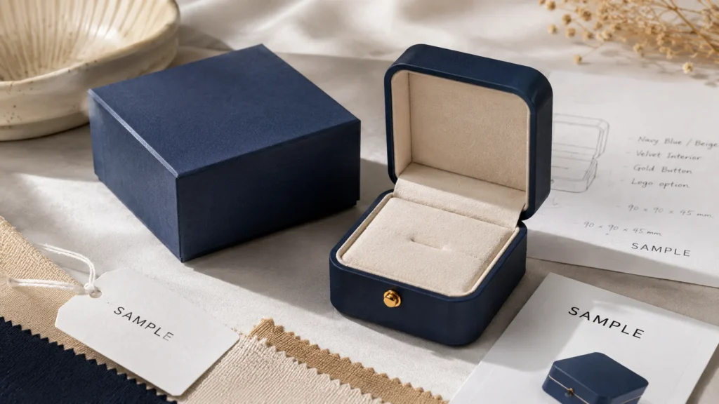
When I evaluate a jewelry box sample, I never treat it as a formality before bulk production. I see it as the most important checkpoint between a packaging idea and a real customer experience. A sample helps me confirm whether the material, color, logo finish, structure, insert, product fit, opening experience, workmanship, and shipping performance can actually work together. For custom jewelry boxes, this step is especially important because the box is usually small, detail-sensitive, and closely handled by customers. A small issue in the sample may become a visible quality problem in bulk production, so I always evaluate the sample carefully before approving it as the production standard.
First Check Whether the Sample Matches the Original Packaging Intention
When I receive a sample, I first look at the whole box and ask whether it matches the original intention of the project. Before checking small technical details, I want to know whether the box feels right for the jewelry type, brand style, sales channel, and customer expectation. A luxury ring box should feel stable, refined, and emotionally suitable for gifting. A minimalist jewelry box should feel clean, precise, and controlled. A sustainable jewelry box should feel honest, material-consistent, and not over-processed. A fashion jewelry box should feel fresh, recognizable, and practical for repeat collection updates.
This first impression is important because a sample can meet the written specification but still feel wrong for the brand. The box may use the correct paper, but the surface may feel too plain for the product value. The logo may be centered, but the finish may feel too strong for a minimalist brand. The structure may be well made, but the opening experience may not create the right reveal. In my experience, sample evaluation should begin by asking whether the box delivers the intended brand experience, not only whether it matches the technical description.
Check the Material Feel Beyond the Material Name
When I evaluate the material, I do not stop at confirming the paper name or board type. I hold the sample, touch the surface, open the box, and feel whether the material matches the product’s value. Customers often judge jewelry packaging through touch before they study the details. A rigid box should feel firm and confident. A folding carton should feel clean and practical, not weak. A kraft paper box should feel natural but still professional. A soft-touch surface should feel premium but not overly delicate. The material must support the brand promise in the customer’s hand.
I also check whether the material feels consistent with the price point and sales channel. If the jewelry is premium, a thin or hollow-feeling box may reduce perceived value. If the brand is sustainable, a heavily processed or plastic-like surface may feel inconsistent. If the box is used for ecommerce, the material must not only feel good but also survive handling. In my view, material feel is one of the most direct ways to judge whether the sample can create customer trust.
Check Color Accuracy Under More Than One Condition
When I review color, I always remember that packaging is not experienced under one perfect light. The box may be seen under daylight, office lighting, retail lighting, warehouse lighting, product photography lighting, or a customer’s home lighting. A navy box may look too dark in one environment. A cream color may become too yellow. A soft pink may look warmer on textured paper than on coated paper. This is why I compare the sample with the approved color reference under different viewing conditions when possible.
I also check color consistency across the full box. The lid and base should not look like different colors unless that contrast is intentional. The drawer sleeve and inner tray should feel coordinated. Large-area printing should not show streaks, patches, uneven ink, or visible color shifts. If the brand plans to use the same packaging across several SKUs, I pay even more attention to consistency because boxes may be displayed, photographed, or shipped together. In my view, color approval should be based on brand consistency, not only whether one sample looks attractive.
Check Logo Position Scale and Visual Balance
When I evaluate the logo, I check whether it feels balanced on the box surface. Jewelry packaging is usually small, so logo placement can strongly influence the entire look. A logo that is slightly too large can make the box feel heavy. A logo that is too small may disappear. A logo placed too close to the edge can feel careless. A logo that is not centered can immediately weaken the premium impression. This is especially true for minimalist and luxury packaging, where there are fewer design elements to distract from alignment problems.
I also check whether the logo size matches the box structure and opening direction. A logo on a drawer sleeve should still look balanced when the tray is partially opened. A logo on a lid should not feel too high or too low when the customer views it from above. A logo on a magnetic box should not compete with the closure line. In my experience, logo placement should be judged in relation to how the customer sees and opens the box, not only by measuring it on a flat artwork file.
Check the Logo Finish Under Real Light and Touch
When the logo uses foil stamping, embossing, debossing, spot UV, silk screen printing, or another finish, I always inspect it under light and touch. Foil stamping should have clean edges, even pressure, complete transfer, and no broken areas. Embossing should feel raised enough to be noticed without distorting the paper. Debossing should create a clear impression without looking weak. Spot UV should align with the artwork and create controlled contrast. Screen printing should feel solid and opaque without rough edges or ink spread.
I also think about whether the finish matches the material. A fine foil logo may not appear clean on a very rough textured paper. A debossed logo may be too subtle on thin material. Spot UV may not show well on certain natural papers. In my view, logo finish approval should include both visual quality and material compatibility. A finish that looks good in theory must still work on the actual sample surface.
Open and Close the Box Repeatedly
When I evaluate structure, I do not open the box once and stop. I open and close it several times because the customer experience depends on repeated physical interaction. A lid and base box should not be too loose or too tight. A drawer box should slide smoothly with controlled resistance. A magnetic closure box should close cleanly and feel secure. A book-style box should open naturally and close flat. A folding carton should tuck or lock without tearing or feeling weak.
This process reveals whether the box feels intuitive. If the customer has to struggle, pull too hard, or worry about damaging the box, the opening experience becomes less pleasant. Jewelry packaging should create anticipation, not frustration. In my experience, the opening and closing feel is one of the most important differences between a box that simply contains jewelry and a box that presents jewelry with care.
Check the Insert Fit as Part of the Structure
When I inspect the inside of the sample, I look at whether the insert feels built into the box rather than placed loosely inside it. The insert should fit neatly, sit flat, and align with the box structure. It should not warp, shift, lift at the corners, expose glue, or leave awkward gaps. If the insert moves when the box is tilted, it may not protect the jewelry well during shipping.
I also check whether the insert material matches the outer box. A refined rigid box with a thin unstable insert may feel inconsistent. A sustainable paper box with a plastic-heavy insert may weaken the brand message. A minimalist box with a visually busy insert may feel confusing. In my view, the insert is part of the structure and brand experience. It should be evaluated as carefully as the outer box.
Test the Real Jewelry Inside the Sample
I never approve a jewelry box sample only when it is empty. I need to place the actual jewelry or a very accurate product sample inside the box. The real product reveals problems that an empty box cannot show. A ring may touch the lid because the stone is higher than expected. A necklace may not have enough chain control. Earrings may tilt because the holes are slightly misaligned. A bracelet may slide because the insert surface is too smooth. A charm may look lost if the internal space is too large.
After placing the jewelry inside, I gently move and tilt the box to see whether the product stays in place. I also reopen it to check whether the first view still looks intentional. This matters especially for ecommerce brands because the product must survive movement before the customer opens it. In my view, product-in-box testing is the most important step in sample evaluation because it shows whether the package works in real use.
Check Product Stability Without Making Removal Difficult
A good sample should hold the product securely, but it should not trap it. I always test whether the customer can remove the jewelry smoothly. A ring slot should hold the ring upright without gripping it too tightly. Earring holes should keep the pair stable without making the backs hard to release. A necklace should be controlled but not wrapped so tightly that the customer struggles. A bracelet should be supported without being forced into the insert.
This balance matters because both extremes create problems. If the insert is too loose, the product moves during shipping. If it is too tight, the customer experience becomes awkward. In my experience, a good insert should protect the jewelry during movement and then release it naturally when the customer wants to use the product. Sample evaluation is the best time to find that balance.
Inspect Corners Edges Folds and Glue Areas Closely
When I inspect workmanship, I always look closely at corners, edges, folds, seams, glue areas, and wrapping lines. Jewelry boxes are small and handled near the eyes, so these details are easy to notice. Corners should be clean and firm. Edges should not show exposed board, lifting paper, cracking, rough cuts, or uneven wrapping. Glue should not be visible. Drawer boxes should stay square. Book-style boxes should close evenly. Magnetic boxes should align cleanly.
These details may seem small, but they often decide whether the box feels premium or careless. If a sample has rough corners or visible glue, the issue may become repeated in bulk production unless corrected. In my view, corner and edge finishing is one of the strongest signs of production control. A beautiful material cannot fully compensate for poor workmanship.
Check Surface Cleanliness and Sensitivity to Marks
When I evaluate the surface, I look for scratches, fingerprints, dust, glue residue, ink spots, foil flakes, rubbing marks, pressure marks, lamination bubbles, and uneven coating. Some surfaces are more sensitive than others. Dark matte paper, soft-touch finishes, metallic paper, and specialty textures may look beautiful but can show marks easily. If the sample already looks marked after light handling, the bulk order may need better packing protection or a different surface choice.
I also check how the surface behaves when touched normally. If fingerprints remain easily, if rubbing creates visible marks, or if edges scuff quickly, the brand should understand the handling risk. This does not mean the material cannot be used, but the packing method may need adjustment. In my experience, surface cleanliness should be judged together with the real sales channel. A boutique gift box and an ecommerce shipping box may need different surface durability.
Check Whether the Structure Holds Its Shape
When I handle the sample, I check whether the structure stays stable. A rigid box should not feel hollow or easily deformed. A folding carton should not collapse under light pressure. A drawer tray should not twist. A magnetic closure should hold properly. A book-style cover should not warp after opening. Jewelry boxes should feel controlled because customers often associate structure strength with product value.
I also look at whether the box sits flat and whether the walls are straight. Warped surfaces, uneven lid alignment, or unstable bases can make the packaging feel less professional. For international shipping or ecommerce delivery, shape stability becomes even more important because the box may experience pressure before reaching the customer. In my view, structural stability is part of both protection and perceived quality.
Consider Shipping Durability Before Giving Final Approval
When the box will be used for ecommerce or overseas delivery, I always consider shipping durability before approval. A sample may look perfect on a table, but the real question is whether it can survive movement, stacking, rubbing, and handling. The insert should keep the jewelry stable, the surface should remain acceptable, and the structure should not dent or deform easily. If the sample cannot handle light movement in review, it may struggle during real shipping.
I often use simple practical checks. I place the jewelry inside, close the box, tilt it, gently shake it, place it into the intended outer carton or mailer, and reopen it to see whether the product still looks presentable. This does not replace formal transit testing, but it helps reveal obvious risks before bulk production. In my view, sample approval should include thinking about the full customer journey, not only the factory handover.
Compare the Sample With the Approved Specification
When I evaluate a sample, I always compare it with the approved specification. The size, board thickness, surface paper, color, printing method, logo finish, structure, insert type, and packing method should match what was confirmed. If the supplier changed anything, I need to know why. Sometimes a change improves production feasibility. Sometimes it is a substitute that affects quality or cost. Either way, it should not be ignored.
This matters because the approved sample becomes the production reference. If the sample is approved without checking specifications, the bulk order may follow details the brand did not intend. In my experience, sample approval should be specific and documented. It should create a clear standard for bulk production rather than relying on vague impressions like “looks good.”
Use the Sample to Identify What Must Change Before Bulk Production
After evaluating the sample, I decide whether it can be approved, whether minor changes are needed, or whether a new sample is necessary. Some issues can be adjusted with clear comments, such as logo position, foil pressure, insert tightness, color correction, or packing protection. Other issues may require a new sample, such as wrong material feel, poor structure, unsuitable size, unstable insert, or weak product presentation.
I see the sample as a warning system. If a problem appears in one sample, it may appear across the whole order unless it is corrected. A loose insert, weak corner, poor drawer movement, or fragile surface should not be accepted casually. In my view, sample evaluation gives brands the chance to solve problems while they are still manageable. Once bulk production begins, every small issue becomes more expensive to fix.
A Strong Sample Should Prove the Box Is Ready for Real Customers
In my view, a jewelry box sample should prove that the entire packaging system is ready for real customers. The material should feel right, the color should match the brand, the logo should be clear and properly positioned, the structure should open smoothly, the insert should fit well, the jewelry should stay stable, the corners should be clean, the surface should survive handling, and the package should suit the intended sales channel. A sample should not only look attractive. It should answer the practical questions that decide whether the box can perform in real use.
That is why I take sample evaluation seriously. It protects the brand from approving packaging too early, helps the supplier understand the production standard, and gives the buyer confidence before placing a larger order. For custom jewelry boxes, a good sample is not just a prototype. It is the bridge between a packaging idea and a reliable customer experience.
How to Prepare Information Before Requesting a Quote
When I prepare information before requesting a quote for custom jewelry boxes, I always see it as more than a purchasing question. A quote request is the beginning of the packaging development process. The clearer the information is, the easier it becomes for the supplier to understand the product, recommend a suitable structure, estimate material use, calculate production cost, and judge whether the requested design is practical for the quantity. If the information is vague, the quotation will often be based on assumptions, and those assumptions may change later when the real size, insert, material, finish, or shipping requirement becomes clear. In my view, a well-prepared quote request helps brands save time, reduce misunderstanding, compare suppliers more fairly, and move toward sampling with fewer unexpected changes.
Start With the Jewelry Type Because It Defines the Packaging Problem
When I request a custom jewelry box quote, I always begin with the jewelry type because different jewelry products create different packaging problems. A ring needs upright support and enough internal height. A necklace needs pendant focus and chain control. Earrings need pair balance and stable backing support. A bracelet needs length, curve, and movement control. A charm needs a small focal point so it does not look lost. A watch needs stronger cushioning. A jewelry set needs divided compartments and visual hierarchy. Without knowing the jewelry type, the supplier cannot properly judge the box structure or insert design.
I also think jewelry type gives the supplier an early understanding of the product’s value and customer expectation. A bridal ring, fine jewelry set, handmade pendant, fashion earring line, and promotional charm collection do not need the same packaging level. If I only say “jewelry box,” the supplier may quote a generic option that does not fit the real product. In my experience, clearly stating the jewelry type helps the supplier think in terms of protection, presentation, and practical use rather than only quoting a standard box.
Provide Accurate Product Size Because Box Dimensions Depend on the Jewelry
When I prepare quote information, I always try to provide product measurements instead of asking the supplier to estimate from photos. Jewelry products are often small, but small differences can change the box size and insert design. A ring with a raised stone may need more height than a flat band. A necklace pendant may need a larger display area than the chain itself. A bracelet may need a longer box even if it is lightweight. A set may need a wider interior layout to separate each piece clearly.
I usually provide the product’s length, width, height, thickness, diameter, pendant size, chain length, ring height, or any other measurement that affects the package. If the product has delicate stones, sharp details, hanging parts, or flexible chains, I also mention that because these details affect clearance and protection. In my view, product size is one of the most important quotation details because it affects material usage, box proportions, insert structure, shipping volume, and final cost.
Explain the Desired Box Style and the Reason Behind It
When I already have a preferred box style, I include it in the quote request, but I also explain why I want that structure. A lid and base box may be chosen for a classic gift presentation. A drawer box may be chosen for a slower reveal. A magnetic closure box may be chosen for premium gifting. A folding carton may be chosen for lightweight jewelry or scalable production. A book-style box may be chosen for jewelry sets or stronger display. A mailer box may be chosen for ecommerce delivery.
Explaining the reason behind the box style helps the supplier understand whether the choice is functional, visual, or flexible. Sometimes a brand likes a magnetic box from a reference image, but the product price, MOQ, or shipping method may make a compact rigid box more practical. Sometimes a drawer box looks elegant, but a necklace may need a more stable insert if the tray slides. In my experience, sharing the preferred style is helpful, but sharing the reason behind the preference is even more useful.
Describe the Material Direction in Practical Terms
When I request a quote, I avoid vague descriptions such as “high quality paper” or “premium material” because different suppliers may interpret those words differently. I try to describe the material direction in practical terms. The box may need rigid paperboard, folding carton board, coated paper, textured paper, specialty paper, kraft paper, FSC-certified paper, velvet, microfiber, foam, EVA, molded pulp, or a paper-based insert. If I do not know the exact material, I describe the desired feeling, such as luxury, natural, minimalist, lightweight, durable, sustainable, or cost-controlled.
Material direction matters because it affects both price and customer perception. A textured paper rigid box creates a different cost and brand impression from a printed folding carton. FSC-certified paper may be important for brands selling into sustainability-conscious markets. Velvet or microfiber may support premium interiors, while paper-based inserts may support a responsible material story. In my view, material preference helps the supplier quote the right packaging level instead of guessing between a basic and premium solution.
Clarify the Insert Function Before Asking for the Final Price
When I prepare a quote request, I always clarify the insert function because the insert can change the entire packaging cost and structure. A paper card insert, folded paper insert, foam insert, EVA insert, velvet insert, microfiber insert, molded pulp insert, or divided compartment insert all have different production methods and price levels. More importantly, each insert solves a different product problem.
I usually explain how the jewelry should be held inside the box. If it is a ring, I mention whether it should stand upright. If it is a necklace, I explain whether the chain should be hidden, fixed, or displayed. If it is earrings, I describe whether the pair should be on a card or inside a soft insert. If it is a bracelet, I clarify whether it should lie flat or follow a curve. If it is a set, I explain how many pieces need separate spaces. In my view, insert information should be prepared before quotation because the inside of the box often determines whether the package works well in real use.
Prepare Logo Artwork and Clarify the File Quality
When I request a quote, I prepare the logo artwork as clearly as possible because logo production depends on file quality. A vector file such as AI, EPS, or PDF usually gives the supplier more accurate information for printing, foil stamping, embossing, debossing, or screen printing. A low-resolution image may be useful for reference, but it may not be enough for production or accurate cost estimation.
I also clarify the logo position and approximate size if I already know them. A small logo on the lid, a foil mark on the drawer sleeve, a printed logo inside the cover, or branding on an insert card can all affect the quote differently. If the artwork is still under development, I still share the current version or reference direction so the supplier can estimate the process. In my experience, clear artwork reduces uncertainty and prevents the quote from being too general.
Explain the Logo Finish or the Brand Feeling I Want
When I prepare a quote request, I include the finishing idea because logo finishes and surface treatments can significantly change cost, MOQ, and production time. Foil stamping, embossing, debossing, spot UV, silk screen printing, full-color printing, matte lamination, gloss lamination, and soft-touch finish all have different setup requirements. A simple printed logo is very different from a foil-stamped and embossed logo, even if the box size is the same.
If I do not know the exact finish, I describe the brand feeling instead. A luxury brand may want a refined metallic logo or embossed detail. A minimalist brand may want blind debossing or one-color printing. A fashion brand may want stronger color and full-color graphics. A sustainable brand may want simpler finishes and fewer surface layers. In my view, describing the intended feeling helps the supplier recommend a process that fits the brand rather than blindly quoting the most expensive finish.
Give the Quantity and Explain Whether It Is a Test Order or Repeat Order
When requesting a quote, I always provide the expected quantity because quantity changes the real unit cost. A 300-piece test order, 500-piece launch order, 1,000-piece first production run, 3,000-piece repeat order, and 10,000-piece distribution order have very different cost logic. Setup costs for printing, finishing, die-cutting, tooling, material preparation, and assembly are spread across the order differently.
I also explain whether the order is for market testing, a product launch, repeat production, retail supply, ecommerce fulfillment, or wholesale distribution. This context helps the supplier recommend the right level of customization. A test order may need a simpler lower-MOQ solution. A repeat order may justify more refined materials or custom inserts. In my experience, quantity is not just a number; it tells the supplier how practical and scalable the packaging solution should be.
When I prepare quote details, I include the target market because packaging expectations can vary by region and sales environment. Jewelry packaging for the UK, Germany, France, Italy, the Netherlands, the Nordics, the United States, Canada, Australia, or the Middle East may differ in sustainability expectations, gift presentation, retail display style, and shipping requirements. A European buyer may care more about FSC-certified paper or reduced plastic. A premium gift market may care more about structure and surface feel. An ecommerce market may care more about compact size and shipping durability.
The target market also helps the supplier understand the practical environment where the box will be used. If the packaging needs to support retail display, surface cleanliness and consistency matter. If it will be shipped directly to consumers, insert stability and outer protection matter more. In my view, target market information helps the supplier quote a packaging solution that fits the actual customer, not only the buyer’s reference image.
Explain the Shipping Method and Packing Requirement
When I request a quote, I always mention how the boxes will be shipped and used. If the jewelry boxes are shipped internationally in bulk, carton packing, compression resistance, and volume efficiency matter. If the boxes are used for ecommerce delivery, the package may need to fit inside mailers or shipping cartons and keep the jewelry stable during movement. If the boxes are for retail or gifting, surface protection and presentation may become more important.
Shipping method can also change packaging recommendations. A delicate soft-touch surface may need protective wrapping. A rigid box may increase freight volume but improve premium presentation. A folding carton may save space and cost but need a good insert for product stability. In my experience, shipping information helps the supplier avoid quoting a box that looks good as a sample but creates problems during real logistics.
Provide a Budget Range to Make the Recommendation More Realistic
When preparing a quote request, I think providing a budget range can be very helpful. Some buyers worry that sharing budget will limit negotiation, but in custom packaging it often helps the supplier recommend a realistic solution. If the budget is limited, the supplier can suggest standard structures, common paper, simpler printing, and practical inserts. If the product has higher value, the supplier can recommend better materials, stronger inserts, or more refined finishes.
Without budget guidance, the supplier may quote a solution that is too basic or too expensive. A brand may want luxury packaging but have a fashion jewelry budget, or it may need only a simple box but receive an over-complicated quote. In my view, budget is not only a price limit. It is a decision filter that helps match packaging ambition with business reality.
Include Reference Photos but Explain What Each Reference Means
When I send reference photos, I always explain what I want the supplier to notice. A reference image may show a box style, color, material texture, insert layout, logo finish, opening experience, or general brand mood. If I send the image without notes, the supplier may misunderstand the priority. They may think I want the exact structure when I only like the color, or they may focus on the logo finish when I actually like the insert layout.
I usually describe whether each reference is for structure, surface, color, insert, finish, or overall feeling. I also clarify whether the reference is only inspiration or a target direction. In my experience, references become much more useful when they are explained. Clear notes reduce back-and-forth communication and help the supplier quote closer to the actual need.
Ask Whether Sampling Tooling and Packing Are Included
When I review a quote, I always want to know whether sample cost, tooling cost, foil die cost, embossing plate cost, mold cost, packing method, and export carton details are included. These items can affect the real total cost, especially for custom jewelry boxes with special structures, inserts, or finishes. One quote may appear lower because it excludes tooling or sample cost, while another quote may include them.
I also ask whether tooling can be reused for future orders if the design stays the same. This matters for brands that plan repeat production. A first order may include more setup cost, but future orders may become more efficient. In my view, a quote is more useful when it clearly shows what is included and what may be charged separately. This helps brands compare suppliers fairly.
Think About Future Reorders Before Finalizing the Request
When I prepare quotation information, I also consider whether the packaging should support future growth. A brand may begin with one necklace or earring line but later add rings, bracelets, charms, or sets. If the packaging system is planned with some flexibility, future development becomes easier. A shared box size with different inserts, a consistent material system, or a reusable logo finish can help maintain brand consistency and reduce future development effort.
I also mention if the brand expects repeat orders because this may affect material sourcing, tooling decisions, color control, and long-term production planning. In my experience, packaging should not always be designed as a one-time order. If the brand wants to build recognition, the box should be realistic for repeat production and future SKU expansion.
A Well-Prepared Quote Request Leads to Better Pricing and Better Samples
In my view, preparing information before requesting a quote is one of the easiest ways to improve the entire custom packaging process. Jewelry type, product size, box style preference, material direction, insert needs, logo artwork, finishing idea, quantity, target market, shipping method, budget range, reference photos, sampling needs, tooling expectations, and future reorder plans all help the supplier understand the real project.
A vague request often leads to vague pricing, repeated questions, delayed sampling, and later cost changes. A clear request helps the supplier quote more accurately, recommend better alternatives, and prepare a sample that is closer to the final packaging goal. For brands, this preparation also makes supplier comparison more fair because the quotes are based on similar specifications. In my experience, better preparation does not make the process slower. It actually makes the entire packaging project move faster and more confidently.
Final Thoughts: A Good Jewelry Box Should Balance Beauty Protection and Practicality
When I think about a good custom jewelry box, I never define it by one single feature. It is not simply the most expensive box, the heaviest structure, the most decorative surface, or the most eye-catching logo finish. A truly good jewelry box should balance beauty, protection, brand identity, production practicality, and real customer use. It should make the jewelry look valuable, keep the product stable, support the brand image, fit the sales channel, and remain realistic for cost, MOQ, and repeat orders. In my view, the best custom jewelry box is the one where every choice has a reason and every detail works together to create a better product experience.
The Best Jewelry Box Starts With the Product, Not the Box
I always believe a jewelry box should begin with the jewelry itself. The product’s shape, size, weight, surface sensitivity, movement risk, and display direction should guide the packaging decision before the brand chooses materials or finishes. A ring needs secure upright support. A necklace needs chain control and pendant focus. Earrings need pair balance. A bracelet needs length and shape support. A watch needs stronger cushioning. A jewelry set needs divided compartments and visual hierarchy. If the packaging does not answer these product needs, the outside design will not be enough.
This is why I do not choose a box only because it looks attractive in a reference photo. A beautiful box can still fail if the jewelry shifts, tangles, scratches, or feels difficult to remove. The first responsibility of the box is to make the product look correct and feel protected when the customer opens it. In my experience, when the product fit is solved first, the rest of the packaging choices become much clearer and more meaningful.
Beauty Should Support the Jewelry Instead of Competing With It
I believe beauty is important in jewelry packaging, but it should never overpower the product inside. The box should create anticipation, support perceived value, and make the brand feel thoughtful, but the jewelry should remain the focus. A surface with too many colors, finishes, or decorative effects may attract attention for a moment, but it can also distract from the actual product. This is especially important for delicate jewelry, minimalist jewelry, and premium pieces where restraint often feels more refined.
In my view, beautiful packaging is not always complicated packaging. A clean textured paper, a well-placed logo, a balanced box proportion, and a stable insert can create more elegance than multiple finishes used without purpose. The best packaging beauty comes from alignment. The material, color, finish, structure, and insert should all make the jewelry easier to appreciate. When beauty supports the product rather than competing with it, the whole package feels more confident.
Protection Should Preserve Both the Product and the Opening Moment
When I talk about protection, I do not only mean avoiding physical damage. I also mean protecting the way the product is supposed to appear when the customer opens the box. Jewelry can be delicate, lightweight, and easy to move. A necklace can tangle, earrings can rotate, a ring can lean, a bracelet can slide, and a jewelry set can become visually messy if the insert is not designed well. Even if nothing is broken, the opening experience can feel careless if the product is not in place.
This is why I see protection and presentation as connected. A good insert, proper internal size, stable structure, clean surface, and suitable packing method all help preserve the intended reveal. The customer should open the box and see the jewelry as if it was placed carefully just for them. In my experience, this kind of protection creates trust because it shows that the brand cares about the product even after it leaves production.
Brand Image Should Be Built Through Consistent Details
I believe a jewelry box should communicate brand identity through consistent details rather than one dramatic feature. A luxury brand may use textured paper, rigid structure, soft interior, and restrained foil stamping. A minimalist brand may use clean surfaces, precise spacing, and subtle debossing. A sustainable brand may use FSC-certified paper, paper-based inserts, smaller sizes, and simpler finishes. A fashion brand may use stronger color, full-color printing, and flexible card inserts. Each detail should support the same message.
When packaging details are inconsistent, the customer can feel it. A natural brand with heavy gloss and excessive foil may feel less believable. A premium product in a weak carton may feel under-supported. A minimalist brand with too many effects may feel confused. In my view, a good jewelry box should make the brand easier to understand before the customer reads any explanation. The box should quietly confirm what the brand wants to say.
The Sales Channel Should Shape the Packaging Decision
I always consider how the jewelry will reach the customer because the same box is not suitable for every sales channel. Retail packaging may need strong display value, clean surfaces, and repeated handling resistance. Ecommerce packaging needs movement control, shipping durability, compact dimensions, and surface protection. Gift packaging needs emotional reveal, hand feel, and a more complete presentation. Wholesale or distribution packaging may need consistency, packing efficiency, and practical carton handling.
A box that performs beautifully in a boutique may not be practical for ecommerce delivery. A delicate soft-touch finish may need extra protection if it is shipped directly to customers. A large rigid box may support luxury gifting but increase freight and storage cost. A folding carton may be smart for scalable fashion jewelry but may not provide enough premium value for a high-end gift set. In my view, packaging should be designed for the real journey from production to customer, not only for the sample table or product photo.
Production Practicality Keeps Packaging Quality Repeatable
I believe a packaging design is only truly successful if it can be produced consistently. A sample may look beautiful, but the brand also needs to know whether the material can be sourced again, whether the color can remain stable, whether the insert can be repeated, whether the finish can be controlled, and whether the structure can be assembled efficiently in bulk. Custom jewelry packaging often involves many steps, including material sourcing, printing, finishing, die-cutting, insert production, assembly, inspection, and packing.
This is especially important for brands that plan repeat orders. A box should not only impress once; it should support future production with stable quality. If the design depends on rare materials, difficult finishes, or highly manual steps that are hard to control, repeat consistency may become a problem. In my experience, practical production does not make packaging less creative. It makes good packaging sustainable for the business.
Cost Should Be Invested Where It Improves the Customer Experience
I do not believe the best jewelry box is always the most expensive one. I believe the best box uses budget intelligently. Sometimes the insert is the most important investment because product movement is the biggest risk. Sometimes the material deserves more attention because hand feel defines the brand. Sometimes the structure should be upgraded because the product has strong gift value. Sometimes the logo finish can stay simple because the brand needs restraint more than decoration.
A box can become expensive without becoming better if the cost is spent in the wrong places. Large foil areas, oversized structures, unnecessary inserts, or too many finishes may increase price but not improve the customer experience. On the other hand, a compact box with good material, stable insert, and clean branding can feel valuable and practical. In my view, cost should be measured by the value it creates for the product, customer, and brand, not only by how premium the specification sounds.
Simplicity Can Be Stronger Than Overdesign
I often find that brands worry a simple box will look too basic, but simplicity can be powerful when it is done with intention. A clean structure, suitable material, accurate logo placement, and well-fitted insert can create a refined experience without unnecessary decoration. This is especially true for jewelry packaging because the product itself is often small and detailed. Too much packaging design can make the box feel louder than the jewelry.
In my view, simplicity is not the same as low value. A simple box can still feel premium if the proportion is right, the surface is clean, and the product is presented well. A simple sustainable box can feel more credible than an overly processed one. A simple minimalist box can feel more confident than a crowded design. The key is whether the simplicity feels controlled and purposeful. Good packaging does not need to do everything. It needs to do the right things well.
Repeat Orders Should Be Considered From the Beginning
For brands that plan to grow, I always think about repeat orders early. Packaging should support not only the first launch but also future batches, new SKUs, and long-term brand consistency. If a box uses a hard-to-source material, an unstable color, a complex finish, or a very specific insert that cannot be repeated easily, future orders may become difficult. This can create inconsistency across collections or delays when the brand needs to restock.
A good custom jewelry box should be designed with repeatability in mind. The supplier should understand the approved sample standard, the material should be available, the artwork should be controlled, and the insert should be practical to reproduce. In my experience, repeat order consistency is especially important for mature brands, ecommerce sellers, distributors, and multi-SKU jewelry lines. Packaging becomes part of the brand system, not just one order.
The Right Jewelry Box Feels Coherent From Outside to Inside
I believe the strongest jewelry box is one that feels coherent from the first touch to the final reveal. The customer touches the material, notices the logo, opens the structure, sees the insert, and finally meets the jewelry. Each moment should feel connected. The outside should create the right expectation, and the inside should deliver on that expectation. If the outer box feels premium but the insert is weak, the experience breaks. If the sustainable material story outside is contradicted by a plastic-heavy interior, the message weakens.
When the outside and inside work together, the customer may not notice every technical decision, but they feel the care behind the package. They feel that the jewelry was protected, the brand was thoughtful, and the purchase was worth trusting. In my view, coherence is one of the most important signs of good packaging. It makes the box feel complete rather than assembled from disconnected choices.
The Best Custom Jewelry Box Is Appropriate, Not Excessive
In the end, I believe the best custom jewelry box is the one that is appropriate for the product, brand, customer, and business model. It does not need to be the most expensive, the largest, the heaviest, or the most decorative. It needs to match the jewelry, protect it properly, support the brand image, fit the sales channel, and remain realistic for production and repeat orders. When a box does all of these things, it becomes valuable even if the design is simple.
This is the mindset I want brands to take away. Good jewelry packaging is not about adding more for the sake of more. It is about making better choices. A balanced box creates stronger trust than an overdesigned one because customers can feel when the packaging is thoughtful, practical, and aligned with the product. In my experience, the best custom jewelry box is not the one that tries hardest to impress. It is the one that quietly proves the brand understands quality, protection, and customer experience.
FAQ About Custom Jewelry Boxes
When I answer common questions about custom jewelry boxes, I always try to give answers that help brands make better decisions, not just quick definitions. Jewelry packaging is rarely a one-size-fits-all choice. The right material, box style, insert, logo finish, cost direction, and production standard depend on the jewelry type, brand positioning, budget, sales channel, sustainability goals, order quantity, and customer expectation. In my view, a useful FAQ should help readers understand the logic behind each decision so they can communicate more clearly with suppliers, compare options more fairly, and avoid choosing packaging only because it looks attractive in a reference photo.
What Is the Best Material for Custom Jewelry Boxes?
When people ask me what the best material is for custom jewelry boxes, I usually explain that the best choice depends on what the packaging needs to achieve. A luxury brand may need rigid paperboard, textured paper, specialty paper, velvet, microfiber, or a covered insert because the customer expects a refined hand feel and a more premium reveal. A minimalist brand may prefer smooth coated paper, uncoated paper, or clean specialty paper because the packaging should feel calm, precise, and visually controlled. A sustainable brand may prefer FSC-certified paper, kraft paper, molded pulp, folded paper inserts, or other paper-based options if those materials can still protect the jewelry properly.
I also consider budget and product value before choosing material. A high-value ring or necklace may justify stronger board and a more refined inner surface because the packaging supports perceived value. A lightweight fashion earring line may not need heavy rigid packaging if a clean carton and paper card insert can present the product well. A handmade jewelry brand may benefit from warm textures that make the product feel personal. In my experience, the best material is not the most expensive material. It is the material that matches the brand story, protects the jewelry, feels right in the customer’s hand, and stays realistic for production.
Which Box Style Is Best for Jewelry Packaging?
When I choose a box style, I always begin with the jewelry product instead of the box appearance. Rings, necklaces, earrings, bracelets, watches, charms, and jewelry sets all need different packaging logic. A ring often needs a compact box with a secure slot and enough height for the stone or setting. A necklace needs chain control and pendant positioning. Earrings need pair balance, card support, or insert support. A bracelet needs longer space or curved support. A jewelry set needs divided compartments and a layout that helps the customer understand the full collection at first glance.
This is why I do not believe there is one best box style for all jewelry brands. Lid and base boxes can feel classic and gift-ready. Drawer boxes can create a slower reveal, but they need stable inserts because the sliding motion may move the product. Magnetic closure boxes can feel premium, but they usually add cost and production complexity. Folding cartons can be efficient and lightweight for fashion jewelry or ecommerce use. Book-style boxes can work well for sets or stronger presentation. In my view, the best box style is the one that fits the jewelry shape, protects the product, supports the brand image, fits the sales channel, and remains practical for quantity and budget.
What Insert Is Best for Jewelry Boxes?
When I choose an insert, I first think about the product’s shape, movement risk, surface sensitivity, display needs, and sustainability goals. The insert is not only an inner accessory. It decides whether the jewelry stays stable, whether it scratches, whether it looks centered, whether the customer can remove it easily, and whether the product still looks presentable after shipping. A ring needs a slot or support that keeps it upright. Earrings need holes, cards, pads, or shaped support that keep the pair balanced. A necklace needs a structure that controls the chain and keeps the pendant visible. A bracelet needs longer holding areas. A jewelry set needs separated spaces so the pieces do not rub or tangle.
Different insert materials have different strengths. EVA and foam can provide stronger positioning and cushioning. Velvet and microfiber can create a softer premium interior. Paper cards and folded paper inserts can work well for lightweight jewelry and brands that want more cost-effective or paper-based packaging. Molded pulp can support sustainability goals when the product shape and surface sensitivity allow it. In my experience, the best insert is the one that solves the most important packaging risk first. If the product moves, stability matters most. If the surface scratches easily, softness matters more. If the brand focuses on sustainability, paper-based support may be the right direction, as long as protection is not weakened.
What Logo Finish Looks Best on Jewelry Boxes?
When people ask which logo finish looks best on jewelry boxes, I usually connect the answer to brand style and material surface. Foil stamping is a common choice because metallic shine naturally connects with jewelry, precious metals, gifting, and premium recognition. Embossing can add raised texture and make the logo feel more physical. Debossing can create a quiet, refined, and modern impression. Spot UV can create gloss contrast, especially on matte surfaces, and may work well for contemporary or fashion jewelry brands. Silk screen printing and one-color printing can also be strong choices when the brand wants clean, direct, and cost-aware branding.
However, I do not think the best logo finish is always the brightest or most expensive one. A luxury brand may use foil stamping or embossing with restraint. A minimalist brand may prefer blind debossing or one-color printing. A fashion brand may need stronger color, full-color printing, or spot UV. A sustainable brand may choose simpler finishes so the packaging feels honest and not over-processed. In my view, a good logo finish should make the brand easier to understand. It should enhance the material and support the jewelry, not compete with the product inside.
Are Paper Jewelry Boxes Suitable for Luxury Brands?
Yes, I believe paper jewelry boxes can be very suitable for luxury brands when the details are selected carefully. Paper-based packaging does not automatically mean simple, cheap, or low-value. A rigid paperboard box with strong board, textured paper, clean wrapping, accurate corners, a well-fitted insert, and a restrained foil or debossed logo can feel highly premium. Luxury often comes from proportion, surface feel, opening control, insert stability, and detail quality rather than from using the most complicated materials.
I also like paper-based luxury packaging because it can offer flexibility in texture, color, finish, structure, and sustainability direction. A brand can use FSC-certified paper, specialty paper, soft-touch surfaces, velvet or microfiber inserts, paper-based inserts, and refined logo finishes depending on the positioning. The key is execution. If the board is thin, the insert is loose, the corners are rough, or the logo finish is poorly controlled, the box will not feel premium. But when material, structure, insert, and finish are aligned, paper jewelry boxes can support luxury branding very well.
How Can Brands Control the Cost of Custom Jewelry Boxes?
When brands want to control the cost of custom jewelry boxes, I usually recommend looking at the entire packaging system instead of cutting one part blindly. Cost can often be controlled by simplifying the structure, choosing suitable materials, reducing unnecessary finishes, standardizing box sizes, and using practical inserts. A compact box can reduce material use and shipping volume. A shared outer box size with different inserts can help brands manage multiple SKUs more efficiently. A single well-chosen finish can often create stronger value than several decorative processes used together.
I do not believe cost control should make packaging look careless. It should make the packaging more focused. If product movement is the main risk, the insert may be the best place to invest. If brand perception matters most, material feel and structure may deserve more attention. If the product is lightweight and price-sensitive, a folding carton with clean printing may be better than a rigid box with heavy finishes. In my view, good cost control means removing details that do not add value while keeping the details that protect the jewelry and support the brand.
What Should Brands Check Before Bulk Production?
Before bulk production, I always recommend checking the physical sample carefully because the approved sample becomes the production standard. The brand should review material feel, color accuracy, logo position, logo finish quality, opening experience, insert fit, product stability, corner finishing, surface cleanliness, structure strength, and shipping durability. A digital rendering can show direction, but it cannot fully show how the box feels, opens, holds the jewelry, or performs during handling.
I also believe brands should test the sample with the actual jewelry whenever possible. The product should stay stable when the box is gently moved, avoid touching the lid, remain easy to remove, and look properly presented after opening. The insert should not shift, the surface should not mark too easily, and the structure should feel suitable for the intended sales channel. In my experience, careful sample approval helps prevent small problems from becoming expensive bulk production issues. It is one of the most important steps before confirming a custom jewelry box order.
When I think about custom jewelry boxes, I always see them as more than packaging used to hold a ring, necklace, bracelet, earrings, or jewelry set. A jewelry box is part of the first impression, the gifting moment, the product protection, and the perceived value of the jewelry itself. The material, box style, insert, logo finish, opening experience, surface texture, and internal layout all work together to decide whether the final package feels refined, trustworthy, and suitable for the brand.
Throughout this article, I wanted to show that choosing custom jewelry boxes should not begin only with appearance. A beautiful box still needs to match the jewelry type, product size, target customer, retail or e-commerce channel, budget, MOQ, and production requirements. A rigid jewelry box may feel more premium for fine jewelry, while a drawer box can create a stronger reveal experience. A paperboard insert, velvet insert, EVA insert, or molded pulp insert may each change how the jewelry is protected and presented. Foil stamping, embossing, debossing, textured paper, and matte finishes can all add value, but only when they support the brand style rather than overpower it.
I also believe the best jewelry packaging is usually created through balance. It does not need every premium material or every decorative finish at the same time. A simple textured paper box with a debossed logo, a rigid box with a clean insert, or a matte jewelry box with a small foil detail can often feel more elegant than a package filled with too many effects. The strongest jewelry packaging feels intentional from the outside surface to the product placement inside.
For brands developing custom jewelry boxes, the most important step is choosing a paper packaging supplier that understands both presentation and production. A good supplier should help review the box structure, material selection, insert design, logo finish, color consistency, sampling details, MOQ, and bulk production stability. This is especially important when the packaging needs to support long-term product lines, retail display, gifting, e-commerce delivery, or repeat orders.
At BorhenPack, we help brands develop custom paper boxes and jewelry packaging solutions that balance premium appearance, practical structure, reliable production, and brand presentation. If you are looking for a paper box packaging partner for custom jewelry boxes, gift boxes, cosmetic packaging, or related paper packaging projects, BorhenPack can support your project from concept review and material selection to sampling and bulk production.