Your Trusted Custom Supplement Packaging Boxes Manufacturer

You get custom supplement packaging boxes built for consistent branding, clear product presentation, multi-SKU packaging, and stable repeat production — so your paper packaging stays professional and consistent from sampling through bulk production and future reorders.
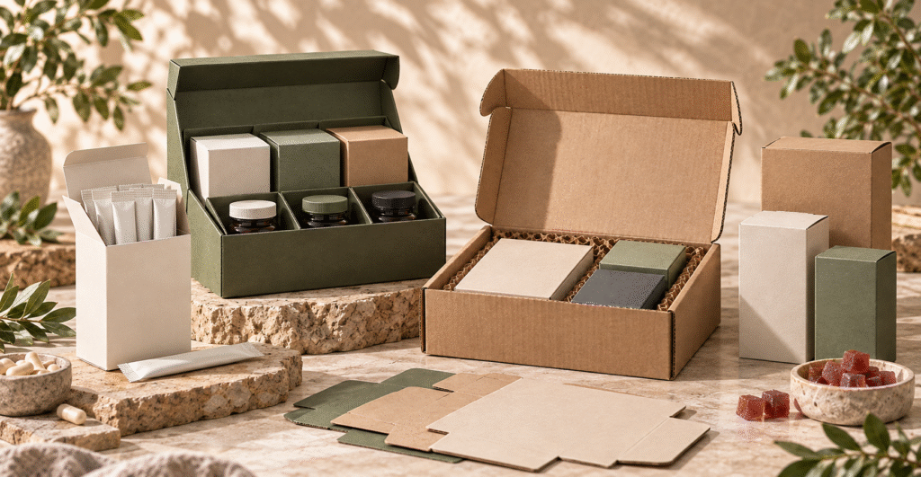
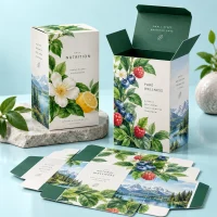
Custom supplement folding cartons, vitamin boxes, capsule packaging and gummy supplement boxes displayed as a coordinated multi-SKU paper packaging collection.
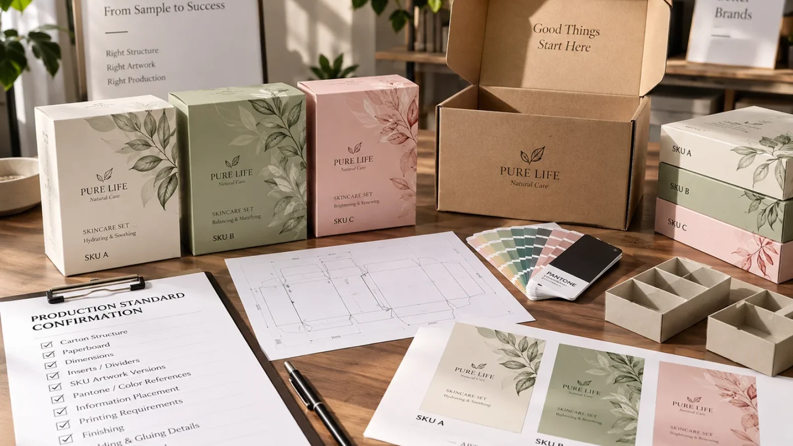
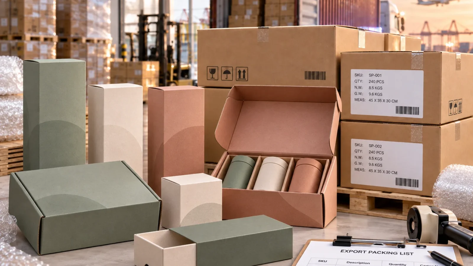
Sachet cartons, supplement multipack boxes, corrugated mailer boxes and FSC-style paper packaging arranged as a coordinated supplement packaging collection.

Custom Supplement Packaging Boxes for Vitamin, Nutraceutical, and Wellness Brands

At BorhenPack, we know a custom supplement packaging box needs to do more than simply hold a finished product. It helps present the product clearly on retail shelves, organize branding and product information, distinguish different SKUs, and create a consistent packaging system that can be repeated across sampling, bulk production, and future orders. Box structure, paperboard strength, printing clarity, color consistency, information layout, surface finish, and production accuracy all influence whether supplement packaging looks professional and remains practical for long-term commercial use.
 
We work with supplement brands, vitamin brands, nutraceutical companies, procurement teams, importers, distributors, growing e-commerce brands, and packaging designers that need custom supplement packaging boxes for vitamins, capsules, tablets, gummies, powders, probiotics, sports nutrition, and other wellness product lines. Some customers need folding cartons for individual retail products, while others need coordinated paper packaging for multiple SKUs, product launches, e-commerce programs, wholesale distribution, or long-term repeat supply. In every case, the packaging needs to balance brand presentation, clear product identification, box structure, paper material, printing quality, cost, production feasibility, and consistency across different SKUs and production runs.
 
As your custom supplement packaging boxes manufacturer in China, we help turn approved packaging concepts and artwork into practical paper-based packaging that can be sampled, produced, inspected, shipped, and reordered with greater confidence. We support decisions around carton structure, paperboard material, box size, inserts and dividers, artwork review, logo printing, Pantone color matching, CMYK printing, surface finishing, FSC-certified paper options, bulk production, quality control, export packing, and repeat-order consistency. BorhenPack focuses on custom paper-based secondary packaging: we manufacture paper boxes and cartons, not supplement formulations or primary packaging. Our goal is to help supplement brands build packaging that looks professional, keeps multiple SKUs visually consistent, and remains reliable as production volumes and product lines grow.
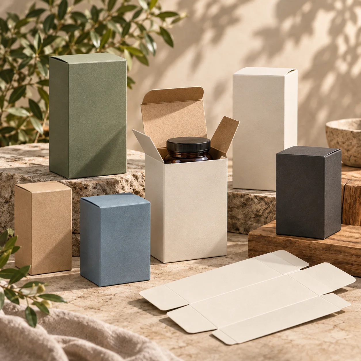
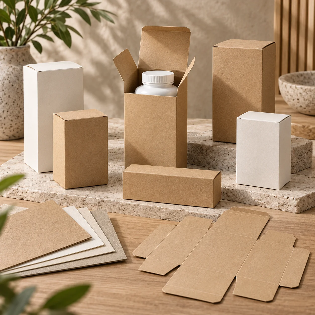
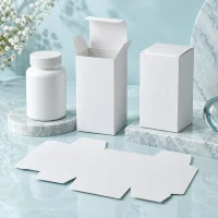
Custom supplement folding carton boxes in different sizes with an open carton fitted around a blank finished supplement bottle.

Supplement Folding Carton Boxes

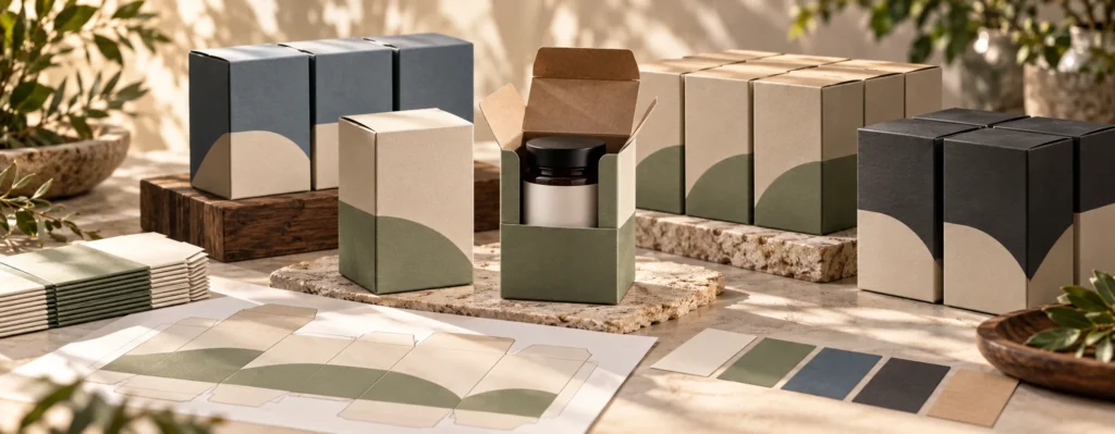
Custom vitamin packaging boxes arranged as a coordinated multi-SKU paper carton family with blank vitamin bottles fitted inside selected cartons.

Vitamin Packaging Boxes

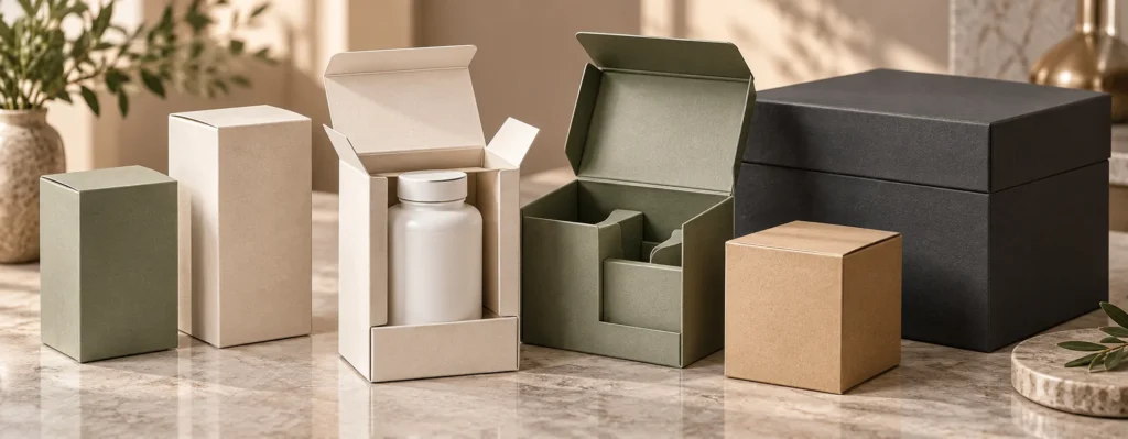
Custom capsule and tablet packaging boxes with blank supplement bottles, realistic folding carton structures, and coordinated paperboard materials.

Capsule and Tablet Packaging Boxes

Custom gummy supplement packaging boxes with a blank gummy jar fitted inside a paper folding carton and coordinated multi-SKU cartons nearby.

Gummy Supplement Packaging Boxes

Custom sachet and stick pack cartons with blank supplement stick packs organized inside realistic paper folding cartons.

Sachet and Stick Pack Cartons

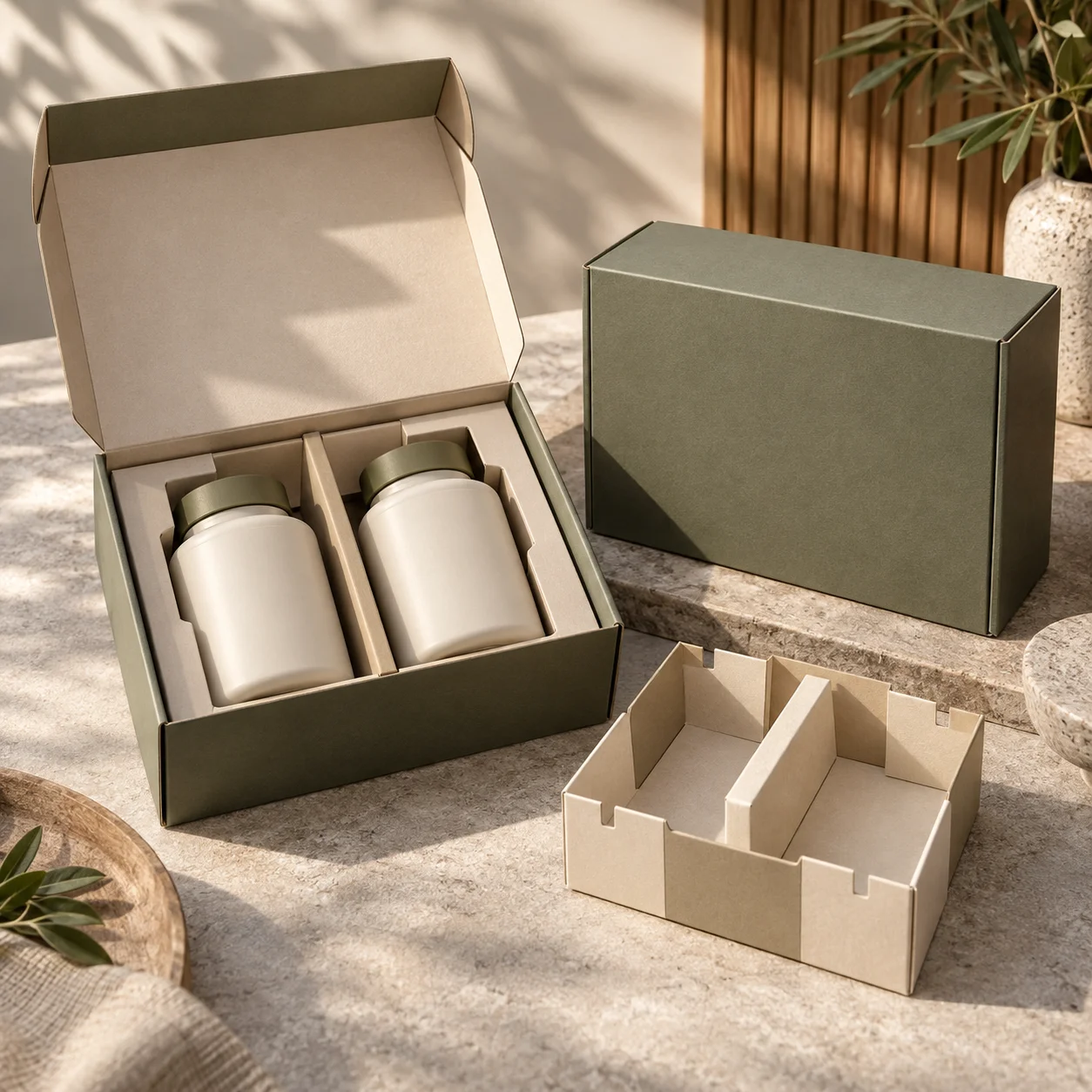
Custom supplement multipack box with multiple blank supplement cartons organized inside using realistic paperboard dividers.

Supplement Multipack Boxes

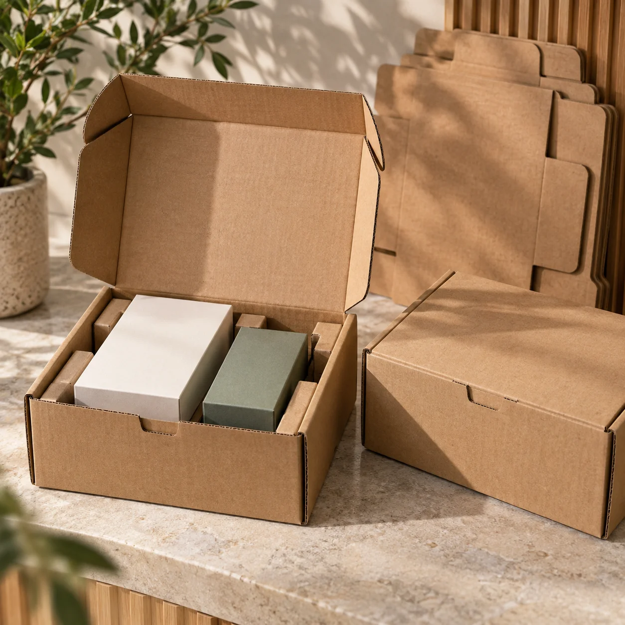
Open kraft corrugated supplement mailer box with blank retail cartons fitted neatly inside for e-commerce and DTC fulfillment.

Corrugated Supplement Mailer Boxes

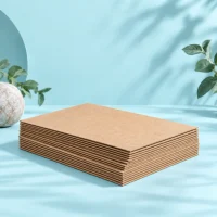
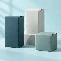
Natural kraft and white paper supplement packaging boxes representing FSC-certified paper options for vitamin and nutraceutical brands.

FSC-Certified Supplement Packaging Boxes

Build Custom Supplement Packaging Boxes for Consistent Branding and Multi-SKU Growth

At BorhenPack, we see custom supplement packaging boxes as part of a larger packaging system rather than a one-time printed carton. The packaging needs to present each product clearly, support consistent brand recognition across retail and e-commerce channels, provide practical space for approved product information, and remain reliable as production moves from sampling to bulk orders and future reorders. Paperboard material, carton structure, printing clarity, color control, surface finishing, and production accuracy all influence how professional and consistent the finished packaging looks across a supplement product line.
 
For growing supplement, vitamin, and nutraceutical brands, packaging becomes more complex as the number of SKUs increases. Several related products may share the same carton structure and brand system while product names, colors, artwork, information panels, and order quantities change between versions. We help review these differences before production so multi-SKU packaging stays visually connected without making every SKU unnecessarily difficult to manufacture. A well-planned packaging system can make new product launches easier to manage, reduce avoidable variation between SKUs, and create a more stable basis for repeat production as the product range expands.
 
As your custom supplement packaging boxes manufacturing partner in China, we help review carton structure, paperboard selection, artwork placement, SKU variations, Pantone color matching, CMYK printing, finishing details, FSC-certified paper options, sample approval, bulk production requirements, quality control, and export packing before the project moves into full production. Our goal is to help supplement brands build paper packaging that looks consistent across different products, remains practical at commercial order quantities, and can be reproduced with greater confidence across bulk production and future repeat orders.
Our Most Requested Custom Supplement Packing Box Options
1️⃣ Folding Carton Supplement Boxes
Folding carton supplement boxes are a practical choice for retail-ready supplement packaging, multi-SKU product lines, and larger-volume production programs. They provide a lightweight and scalable paper packaging format that supports clear product identification, full-color printing, consistent brand presentation, and efficient storage before packing. For supplement, vitamin, and nutraceutical brands that need multiple products to follow the same packaging system, folding cartons can make it easier to maintain a consistent structure while changing artwork, product names, colors, and information between SKUs.
When developing folding carton supplement boxes, we review paperboard strength, carton dimensions, tuck or bottom structure, artwork layout, printing coverage, Pantone color requirements, finishing details, assembly efficiency, and repeat-order requirements. The goal is to create a carton that looks professional on the shelf while remaining practical for bulk production, multi-SKU management, packing, and future reorders.
2️⃣ Supplement Multipack Boxes
Supplement multipack boxes are suitable when several units or related products need to be presented and sold together in one paper packaging format. They can support retail bundles, promotional programs, product combinations, subscription assortments, and multi-SKU packs while helping the brand maintain a more organized and consistent presentation across the complete set.
For multipack projects, we review the number of products, box dimensions, internal layout, paperboard strength, inserts or dividers, artwork hierarchy, SKU identification, packing sequence, and production quantity for each version. A well-planned supplement multipack should keep the products organized without creating unnecessary packaging complexity, helping brands balance presentation, packing efficiency, cost, and repeat production.
3️⃣ Supplement Kit Boxes
Supplement kit boxes are often selected for wellness sets, product launch kits, sample collections, promotional programs, and premium multi-product packaging. Compared with a standard single-product carton, a kit box gives brands more space to organize several products and create a coordinated presentation, making it useful when the packaging needs to communicate a complete product program rather than a single SKU.
We help review paper box structure, product arrangement, paperboard or rigid-board requirements, insert design, opening experience, printing, Pantone color matching, finishing, and export packing based on the purpose of the kit. The goal is to create a paper-based kit that presents multiple products clearly, stays practical to assemble and pack, and can be reproduced consistently for launches, campaigns, and repeat programs.
4️⃣ Corrugated Supplement Mailer Boxes
Corrugated supplement mailer boxes are suitable for e-commerce, DTC, subscription, and shipping-focused supplement packaging programs. Unlike lightweight retail folding cartons, corrugated mailers provide a stronger paper-based structure for products that need additional protection during fulfillment and transportation while still giving the brand a printable surface for a consistent customer experience.
We help review corrugated board strength, mailer structure, internal space, inserts or dividers, artwork placement, printing requirements, packing efficiency, and outer shipping conditions based on the products and fulfillment method. A good supplement mailer should protect the packed products during delivery while remaining practical for fulfillment, branded presentation, and repeat e-commerce orders.
Practical Customization, MOQ, and Scalability for Supplement Packaging Projects
At BorhenPack, we help make custom supplement packaging boxes practical for both current production needs and future product-line growth. Supplement packaging projects can vary significantly depending on carton structure, paperboard material, box size, printing coverage, finishing requirements, order quantity, and especially the number of SKUs involved. This makes early project planning particularly important for established supplement brands, vitamin and nutraceutical companies, procurement teams, importers, distributors, and growing e-commerce businesses that may start with several products and continue adding new formulas, strengths, flavors, or market versions over time.
 
For multi-SKU supplement packaging, total order quantity does not always tell the full production story. An order of one SKU at 5,000 pieces is different from five SKUs at 1,000 pieces each, even though both projects total 5,000 boxes. Multiple SKUs may share the same carton size, paperboard, structural dieline, and finishing system, while still requiring separate artwork files, product names, color references, information panels, proof approvals, quantity allocation, production identification, and quality checks. Depending on the printing method, different versions may also require separate plates or press setup. These factors can influence MOQ, setup cost, production waste, unit price, sampling requirements, lead time, and repeat-order planning. We review the SKU structure before quoting so buyers can understand how quantity is distributed across the project instead of evaluating cost only by the combined number of boxes.
 
Where possible, we help simplify multi-SKU packaging by standardizing the elements that do not need to change. Using a common carton structure, consistent paperboard, shared dimensions, controlled printing specifications, and repeatable finishing standards can make artwork variations easier to manage while helping different products remain visually connected as one brand family. We also support artwork review, Pantone color matching, sample development, production-standard confirmation, bulk production control, quality inspection, export packing, and repeat-order reference management. Our goal is to help your supplement packaging remain commercially practical as your business grows — from an initial group of SKUs to larger product families, repeat production programs, distributor orders, and long-term supply.

More Than Just a Custom Supplement Packaging Boxes Manufacturer

At BorhenPack, we do not treat custom supplement packaging boxes as a simple printing order or a one-time carton purchase. For established supplement, vitamin, and nutraceutical brands, the packaging often becomes part of a larger product system that may include multiple SKUs, different artwork versions, retail programs, e-commerce sales, distributor orders, and repeat production across different markets. Once a project moves beyond the first sample, carton structure, paperboard consistency, artwork accuracy, color control, information placement, production identification, packing method, and dependable repeat orders become just as important as the visual design.
 
That is why we focus on how supplement paper packaging performs throughout sampling, bulk production, packing, shipping, and future reorders — not only how one finished sample looks. We review carton structure, material, inserts or dividers, approved artwork placement, printing, color references, finishing, SKU variations, quality requirements, and export packing before bulk production begins. The goal is to help supplement brands manage paper packaging with fewer production misunderstandings, clearer SKU control, and better consistency as product lines and order volumes grow.

✅ Structure and Carton Fit Planning

We help review carton style, paperboard material, box dimensions, internal clearance, inserts or dividers, opening structure, assembly method, and packing requirements before the supplement box structure is finalized. The carton should hold the finished packed product correctly, use space efficiently, remain practical for packing and retail handling, and support stable bulk production without unnecessary structural complexity. For multi-SKU programs, we also consider whether related products can share common carton dimensions or structural standards to make future production and reorders easier to manage.

✅Artwork, Printing and Color Guidance

Supplement packaging often requires more artwork and version control than a single lifestyle packaging project because related SKUs may share the same brand system while product names, colors, approved information panels, barcode or code areas, and order quantities vary between versions. We help review artwork-to-dieline placement, printing areas, Pantone references, CMYK printing, small-text clarity, logo position, finishing layers, and version differences before production. The goal is to keep each SKU easy to identify while maintaining a consistent visual system across the wider product line.

✅ Sample-to-Bulk Consistency

For supplement brands, procurement teams, importers, and distributors, an approved sample should establish a clear production reference rather than remain only a presentation sample. We pay attention to paperboard specification, carton dimensions, structure, approved artwork version, printing clarity, Pantone color references, information placement, finishing accuracy, folding and gluing quality, and SKU identification. These controls help custom supplement packaging boxes remain aligned with the approved standard from sampling through bulk production and future repeat orders.

✅ Export Packing for Supplement Packaging Programs

Custom supplement packaging boxes need to remain clean, correctly identified, and well organized as they move through storage, export packing, and international transportation. We review inner packing, master-carton strength, carton arrangement, SKU separation, version identification, carton counts, stacking efficiency, and surface protection to reduce crushed cartons, rubbing, deformation, packing confusion, and unnecessary shipping space. The goal is to help each supplement packaging version arrive in good condition, remain clearly separated for downstream use, and be easier for brands, importers, and distributors to manage after delivery.

Custom Supplement Packaging Boxes Built for Retail, E-Commerce, and Distribution Use

When you work with BorhenPack, you are not only choosing a custom supplement packaging boxes manufacturer. You are working with a team that understands how paper packaging needs to perform after the sample is approved — during retail display, e-commerce packing, multi-SKU production, warehouse handling, distributor supply, international shipping, and repeat ordering. A supplement carton may look professional in a sample, but its real value depends on whether the structure, paperboard, artwork, color, SKU identification, finishing, and packing method can remain consistent in real business use.
 
We support supplement brands, vitamin and nutraceutical companies, procurement teams, importers, distributors, growing e-commerce brands, and packaging designers that need custom paper packaging to balance clear product presentation with practical production control. Some projects focus on retail folding cartons, while others require multi-SKU packaging systems, multipack boxes, supplement kits, corrugated mailers, or FSC-certified paper packaging for e-commerce, distributor programs, product launches, and long-term repeat supply.
⚙️ Built for Retail Shelves
Custom supplement packaging boxes need to help products look organized, professional, and easy to distinguish in a retail environment. We review carton size, front-panel hierarchy, logo placement, product-name visibility, printing clarity, color differentiation, surface finishing, and shelf consistency so related supplement SKUs can remain part of the same brand family while still being easy for customers to recognize. The goal is to create retail cartons that communicate clearly on the shelf while remaining practical for packing, bulk production, and repeat orders.
📦 Built for E-Commerce
For growing e-commerce, DTC, and subscription supplement brands, paper packaging needs to support both professional presentation and practical fulfillment. We help review folding cartons, corrugated supplement mailer boxes, internal organization, paperboard strength, printing direction, packing efficiency, and export packing based on the sales and delivery model. The goal is to help supplement packaging remain clean, branded, and practical as products move from warehouse packing to direct customer delivery.
🧩 Built for Multi-SKU Product Lines
Supplement brands often grow through multiple formulas, strengths, flavors, product types, or market versions, which makes packaging consistency increasingly important. Related SKUs may share the same carton dimensions, structural dieline, paperboard, and brand system while product names, colors, approved artwork, information panels, and order quantities vary between versions. We help review these shared and variable elements before production so multi-SKU packaging remains visually connected, easier to manage, and more practical for future product expansion and repeat orders.
🎨 Built for Brand and Product Recognition
Supplement packaging needs to make both the brand and the individual product easy to identify. We help control logo position, product-name hierarchy, Pantone color matching, CMYK printing, SKU color systems, information layout, and finishing details so different cartons remain recognizable as one brand while maintaining clear product differentiation. This is especially important when several related supplement products appear together on retail shelves, e-commerce listings, or distributor catalogs.
🚚 Built for Importer and Distributor Supply
Importers and distributors often manage several supplement SKUs, production quantities, delivery schedules, and downstream customers at the same time. We help support clear carton specifications, SKU-separated packing, controlled carton counts, master-carton organization, export packing, and repeatable production standards so bulk supplement packaging is easier to receive, identify, store, distribute, and reorder. The goal is to reduce unnecessary confusion between versions while supporting more predictable long-term supply.
🔁 Built for Repeat Orders
For established supplement brands, procurement teams, importers, and distributors, repeat-order consistency can be just as important as the first approved sample. We help control paperboard specifications, carton dimensions, approved artwork versions, Pantone references, printing clarity, finishing details, folding and gluing quality, SKU identification, and packing methods so future production remains aligned with the approved standard. This makes the packaging system easier to manage as product ranges, order volumes, and distribution requirements continue to grow.

Materials, Structures, Inserts, Printing, and Finishing Options for Custom Supplement Packaging Boxes

A successful custom supplement packaging box depends on how paperboard, carton structure, internal support, printing, finishing, and production requirements work together. For supplement, vitamin, and nutraceutical brands, these choices affect more than appearance. They can influence information clarity, SKU consistency, packing efficiency, MOQ, unit cost, sampling, bulk production, storage, and future repeat orders. At BorhenPack, we review each option from both a brand and manufacturing perspective so the final paper packaging remains professional, practical to produce, and easier to manage as product lines grow.

Supplement Box Materials

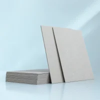
Material selection affects carton strength, print clarity, folding performance, surface appearance, unit cost, and repeat production. For most retail supplement cartons, SBS paperboard is an important option because its smooth printable surface can support detailed graphics, product information, and consistent color reproduction. CCNB can provide a more cost-conscious paperboard direction for suitable projects, while kraft paperboard can support a more natural visual identity. Greyboard is more relevant when a project requires a stronger supplement kit or premium set box rather than a standard folding carton. FSC-certified paper options can also support responsible sourcing requirements where requested. We help review paperboard strength, print surface, carton structure, MOQ, cost, and repeat availability before sampling.
SBS Paperboard of Materials

SBS Paperboard

CCNB of Materials
CCNB
Kraft Paperboard
Kraft Paperboard
Greyboard Chipboard
Greyboard
FSC-Certified Paper Options
FSC-Certified Paper

Supplement Box Structures

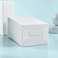
The carton structure affects how efficiently supplement packaging is produced, stored, assembled, packed, displayed, and reordered. Straight tuck end and reverse tuck end cartons are practical for many standard retail supplement boxes, while auto-lock and snap-lock bottoms can provide stronger bottom support where the packed product requires it. Seal end cartons may suit projects that need a more permanently closed structure or efficient packing workflow, while sleeves can support controlled SKU or promotional variation. Corrugated mailer boxes are more suitable when e-commerce shipping requires a stronger paper-based structure. We help compare these structures based on carton dimensions, packed weight, assembly method, production quantity, retail use, e-commerce requirements, cost, and repeat production.
Straight Tuck End
Straight Tuck End
Reverse Tuck End
Reverse Tuck End
Auto-Lock Bottom
Auto-Lock Bottom
Snap-Lock Bottom
Snap-Lock Bottom
Seal End Cartons
Seal End Cartons
Sleeve Packaging
Sleeve Packaging
Supplement Packaging Corrugated Mailer Boxes
Corrugated Mailer Boxes

Inserts and Inner Support

Paper-based inserts and dividers can help organize supplement multipacks, kits, product combinations, and other packaging formats where several items need to remain correctly positioned inside one box. The right insert should provide enough support without creating unnecessary material, assembly work, or production complexity. We help review internal dimensions, product arrangement, carton structure, packing sequence, sustainability direction, cost, and repeat production before the insert design is finalized.
Supplement Packaging Paperboard Inserts
Paperboard Inserts
Supplement Packaging Cardboard Dividers
Cardboard Dividers
Supplement Packaging Corrugated Inserts
Corrugated Inserts
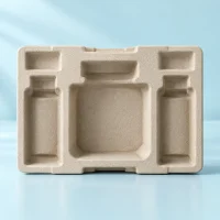
Supplement Packaging Molded Pulp Inserts
Molded Pulp Inserts

Printing Options

Supplement packaging often carries more product information than lifestyle-oriented packaging, so printing needs to support both brand presentation and clear product identification. Small text, product names, SKU colors, approved information panels, logos, barcodes or code areas, and other artwork elements need to remain clear and consistently positioned across different versions. We support CMYK printing, Pantone color matching, offset printing, inside printing, and outside printing based on the artwork, paperboard, order quantity, and production requirements. For multi-SKU programs, we also pay attention to how color references and artwork variations remain visually consistent across the wider product family.
Supplement Packaging CMYK Printing
CMYK Printing
Supplement Packaging Pantone Color Matching
Pantone Color Matching
Supplement Packaging Offset Printing
Offset Printing
Supplement Packaging Inside Printing
Inside Printing
Supplement Packaging Boxes Outside Printing
Outside Printing

Finishing Options

Finishing can help supplement packaging create stronger shelf presence, improve surface feel, highlight important brand elements, and support a more defined market position. Matte lamination can create a clean and controlled appearance, gloss lamination can increase color brightness, and soft-touch lamination can create a more tactile surface. Foil stamping, embossing, debossing, and spot UV can be used selectively to emphasize a logo, product name, or other important brand detail. However, finishing should be planned carefully so it does not interfere with information clarity, add unnecessary SKU complexity, or make repeat production difficult to control.
Supplement Packaging Boxes Matte Lamination
Matte Lamination
Supplement Packaging Boxes Soft-Touch Lamination
Soft-Touch Lamination
Supplement Packaging Boxes Gloss Lamination
Gloss Lamination
Supplement Packaging Boxes Foil Stamping
Foil Stamping
Supplement Packaging Boxes Embossing
Embossing
Supplement Packaging Boxes Debossing
Debossing
upplement Packaging Boxes Spot UV
Spot UV

Choosing Options Based on Real Supplement Packaging Needs

We do not recommend paperboard, carton structures, inserts, printing methods, or finishing options simply because they look more premium in a sample. We review how each choice affects the complete supplement packaging program, including retail use, e-commerce requirements, number of SKUs, artwork variations, order quantity, MOQ, packing efficiency, storage, budget, sampling, production feasibility, export packing, and long-term repeat orders. The goal is to create custom supplement packaging boxes that communicate the brand clearly, keep different products organized and recognizable, remain practical for commercial production, and support future growth without making the packaging system unnecessarily complex.

How We Develop Custom Supplement Packaging Boxes

At BorhenPack, we follow a clear development process to help your custom supplement packaging boxes move from initial project requirements to approved samples, bulk production, quality inspection, and export delivery with better control across different SKUs and repeat orders. Supplement carton projects often involve more than one artwork version, so carton dimensions, paperboard, SKU quantities, printing references, information placement, sample standards, and packing identification all need to be reviewed before production begins.
① Project Requirement Review

① Project Requirement Review

We review your supplement packaging requirements, including the number of SKUs, finished packed-product dimensions, carton quantity for each SKU, sales channel, destination market, retail or e-commerce use, delivery schedule, reference packaging, and approved brand requirements before quoting. If several products belong to the same range, we also review which elements can share a common carton structure and which need separate sizes, artwork versions, colors, or production quantities. This gives us a clearer basis for structure recommendations, MOQ planning, sampling, and production instead of evaluating the project only by its total box quantity.

② Material Recommendation

② Material Recommendation

We help recommend suitable paperboard based on carton structure, printing requirements, packed-product weight, order quantity, budget, and repeat-production plans. Options may include SBS paperboard, CCNB, kraft paperboard, greyboard for suitable kit-box applications, and FSC-certified paper options. The goal is to select a paper material that supports clean printing, reliable folding and forming, practical bulk production, and consistent availability for future orders.

③ Structure and Artwork Review

③ Structure and Artwork Review

We review carton dimensions, dieline structure, opening and closure method, inserts or dividers, front-panel layout, logo placement, product-name hierarchy, SKU differences, approved information panels, barcode or code areas, bleed, printing areas, Pantone references, finishing layers, and multi-language artwork versions where required. For multi-SKU projects, we also compare artwork versions so shared brand elements remain consistent while individual products remain clearly identifiable. Our review focuses on printability, placement, structure compatibility, and production control; the brand remains responsible for approving product claims, labeling content, and market-specific regulatory information.

④ Sample Development

④ Sample Development

We develop paper-box samples so you can confirm carton dimensions, structure, paperboard, internal clearance, inserts or dividers, artwork position, printing effect, surface finishing, opening and closing performance, and overall presentation before bulk production. Where an actual finished packed product is available, the carton can be reviewed around that customer-supplied production sample. Otherwise, we develop the structure according to confirmed finished-product dimensions. The purpose is to verify that the paper packaging works in real packing conditions, not simply that the empty sample looks correct.

⑤ Sample Approval and Production Standard Confirmation

⑤ Sample Approval and Production Standard Confirmation

Once the sample is approved, we confirm the key specifications that will become the production reference, including carton structure, paperboard, dimensions, inserts or dividers, SKU artwork versions, Pantone or approved color references, information placement, printing requirements, finishing, folding and gluing details, packing method, and quality expectations. For multi-SKU projects, the approved versions need to remain clearly identified so each carton can be produced against the correct artwork and specification during bulk production and future repeat orders.

⑥ Bulk Production

⑥ Bulk Production

We manage material preparation, printing, lamination or coating where required, die-cutting, folding, gluing, insert or divider production, finishing, assembly, and final packing according to the approved production standard. For multi-SKU supplement packaging programs, production planning also considers artwork versions, quantity allocation, shared structures, and SKU separation so related cartons can remain visually consistent without losing individual product identification.

⑦ Quality Inspection

⑦ Quality Inspection

We inspect paperboard, carton dimensions, structural accuracy, folding and gluing quality, artwork version, printing clarity, Pantone or approved color consistency, product-name presentation, information-panel placement, barcode or code-area position, finishing quality, surface condition, SKU identification, and packing condition before shipment. For projects containing several versions, clear SKU separation and artwork-version control are especially important to reduce mix-ups during packing and downstream distribution.

⑧ Export Packing and Shipping Coordination

⑧ Export Packing and Shipping Coordination

We arrange suitable inner packing, master cartons, carton counts, SKU separation, stacking methods, surface protection, and shipping coordination so your supplement paper packaging remains clean, well-shaped, correctly identified, and organized during international transportation. For multi-SKU projects, export packing should also make different versions easier for procurement teams, importers, distributors, and warehouses to receive, identify, store, and distribute after delivery.

FAQs About Custom Supplement Packaging Boxes

For your convenience, we have gathered some of the most common questions buyers ask about our custom supplement packaging boxes. These questions cover paper carton types, MOQ, multi-SKU production, shared structures, artwork versions, Pantone color control, detailed printing, FSC-certified paper options, and repeat production. If your supplement packaging project includes several SKUs or different order quantities, we can also review the complete packaging program before sampling and bulk production.
1. What types of supplement products can you make packaging boxes for?
We manufacture custom supplement packaging boxes for a wide range of finished supplement products, including vitamins, capsules, tablets, gummies, probiotics, collagen products, sports nutrition products, herbal supplements, powdered supplements, sachets, stick packs, and other nutraceutical products.
The packaging format depends on how your finished product is packed and sold. We can develop folding carton boxes for bottles and jars, cartons for sachets and stick packs, multipack boxes for several products, corrugated supplement mailer boxes for e-commerce, and FSC-certified paper packaging options. Before recommending a structure, we normally review the finished product size, weight, sales channel, number of SKUs, packing method, and presentation requirements so the packaging works for both your product and your supply process.
Yes. We can manufacture paper-based outer boxes for finished supplement bottles and jars in different sizes and shapes. These are commonly used for vitamin bottles, capsule bottles, tablet bottles, gummy jars, probiotic containers, powder jars, and other finished supplement products.
We usually ask for the actual bottle or jar dimensions, including the cap or lid, before confirming the carton size. We then review internal clearance, carton structure, paperboard strength, opening method, insert requirements, and packing efficiency. The goal is to make sure the box fits the finished product properly without being unnecessarily large or too tight for efficient packing.
Yes. Multi-SKU packaging is one of the areas we pay particular attention to because supplement brands often manage several products, strengths, flavors, formulas, sizes, or market versions at the same time.
For example, one supplement range may include vitamins, probiotics, collagen, gummies, and capsules that use the same overall brand system but different artwork, colors, product information, and barcodes. We can help organize these versions around a consistent packaging structure, paper specification, printing standard, and production reference. This makes it easier to manage different SKUs during sampling, bulk production, export packing, and future repeat orders.
Our typical MOQ for custom supplement packaging boxes starts from 1,000 pieces, but for multi-SKU projects we need to review how the total quantity is divided between different artwork versions, sizes, structures, and materials.
For example, 10,000 boxes with one artwork is very different from 10 SKUs with 1,000 boxes per SKU. Even if the total quantity is the same, each SKU may require separate artwork checking, printing setup, color control, production identification, and packing management. If several SKUs share the same structure and material, we can review whether the production plan can be organized more efficiently. We prefer to understand the SKU breakdown early so we can give you a realistic MOQ and quotation instead of only looking at the total quantity.
Yes, and in many multi-SKU programs this can be a practical way to improve consistency and simplify repeat production. If several supplement products use bottles or jars with similar dimensions, we can review whether they can share the same carton size, structural dieline, material specification, and packing method while using different printed artwork for each SKU.
A shared packaging structure can help reduce unnecessary tooling changes, make production planning easier, simplify warehouse management, and create a more consistent brand presentation across the product range. However, we do not recommend forcing different products into one standard box if the fit is poor. We first compare the actual product dimensions, internal clearance, weight, closure, and packing requirements before deciding whether a common structure is suitable.
Yes. We support Pantone color matching, CMYK printing, full-color printing, inside and outside printing, and coordinated color systems for custom supplement packaging boxes.
For supplement brands with several SKUs, color consistency can be particularly important because individual products may use different color codes while still needing to look like one brand family. We review the Pantone references, paper material, printing coverage, lamination, and finishing requirements before production. Because paper surface, coating, ink coverage, and finishing can influence the final color appearance, we normally recommend confirming important colors through an approved sample or color reference before bulk production. This also gives us a clearer standard for future repeat orders.
Yes. We can print detailed product information on supplement cartons based on the final artwork supplied and approved by your team. This can include product names, Supplement Facts panels, ingredient information, serving information, usage directions, warnings, barcodes, QR codes, SKU codes, batch or lot areas, expiry or best-before areas, company information, and other content required by your brand or target market.
Our role is to review this information from a printing and packaging production perspective. We check whether text is positioned too close to folds or cut lines, whether barcode or QR code areas have enough space, whether small text is likely to remain readable on the selected paper, and whether different SKU artwork versions are clearly identified before production. Regulatory content itself should be confirmed by your own regulatory or legal team, while we focus on making sure the approved information can be reproduced clearly and consistently on the carton.
Yes. We can support paper-based inserts, cardboard dividers, molded pulp inserts, and other suitable internal structures depending on the product format and packaging requirements.
Inserts are especially useful for supplement multipacks, gift sets, bottle combinations, sachet collections, stick-pack assortments, or products that need to stay organized inside a larger box. Before recommending an insert, we review the number of products, individual dimensions, weight, internal layout, product movement, packing method, retail presentation, e-commerce requirements, and shipping conditions. We try to keep the internal structure practical rather than adding complexity that does not provide real value.
Yes. BorhenPack is FSC certified, and we can support FSC-certified paper options for custom supplement packaging boxes when responsible paper sourcing is important for your brand, retailer, distributor, or target market.
FSC-certified options can be used for folding cartons, kraft packaging, corrugated supplement mailers, multipack boxes, and other suitable paper-based structures. At the same time, we review FSC material together with printing quality, paperboard strength, box structure, finishing, MOQ, cost, and repeat production requirements. We do not treat FSC as a separate marketing feature; the paper still needs to work properly for the finished supplement product and remain practical for bulk production.
BorhenPack focuses on paper-based packaging, not the manufacture of supplement bottles, jars, capsules, tablets, gummies, sachet films, or other primary supplement containers.
We manufacture the secondary packaging around your finished products, including supplement folding cartons, vitamin packaging boxes, bottle and jar cartons, sachet and stick-pack cartons, supplement multipack boxes, corrugated supplement mailer boxes, inserts, dividers, and other custom printed paper packaging.
If you already have the finished bottle, jar, sachet, stick pack, or product dimensions, you can send us the specifications or physical samples. We can then review the carton size, structure, material, insert, artwork, printing, finishing, and packing method around the actual finished product. This helps keep the packaging development process focused on what we do best: creating paper packaging that is practical for retail, e-commerce, export supply, multi-SKU management, and repeat production.

Who We Work With And Why They Choose BorhenPack

We work with buyers who need custom supplement packaging boxes that can support more than a single product launch. Many of our customers manage multiple supplement SKUs, different bottle or jar sizes, changing artwork versions, detailed product information, retail programs, e-commerce sales, importer supply, private label collections, or repeat packaging orders across different markets. They need a packaging manufacturer that can help keep the box structure, paper specification, printing, color references, SKU identification, sampling, bulk production, and future reorders easier to manage as the product range grows.
At BorhenPack, we focus on paper-based secondary packaging around finished supplement products. Whether the project involves vitamins, capsules, tablets, gummies, probiotics, collagen products, powders, sachets, stick packs, or multipacks, we help review the packaging from both a brand and production perspective so the approved packaging can remain practical beyond the first sample.

For Supplement Brands

You may start with one supplement product, but successful supplement brands rarely stay with only one SKU. New formulas, strengths, flavors, sizes, bundles, and market versions can quickly turn one packaging project into a larger packaging system. The challenge is keeping the brand recognizable while making each product easy to identify, produce, pack, and reorder.
We help review carton dimensions, shared box structures, paperboard specifications, artwork versions, Pantone colors, printing standards, finishing details, SKU identification, and repeat-order references across your product range. Where practical, related products can use common structural standards while maintaining different artwork and product information for each SKU. This can make future launches and repeat production easier to manage without rebuilding every box from the beginning.
 
Why it works: your supplement packaging can grow as a connected brand system, helping new SKUs stay visually consistent while keeping production and repeat orders more organized.

For Vitamin and Nutraceutical Brands

Vitamin and nutraceutical products can come in very different formats, including bottles, jars, capsules, tablets, gummies, powders, sachets, and stick packs. Each format creates different requirements for carton size, internal clearance, paperboard strength, information layout, and packing method.
We help develop vitamin packaging boxes and other nutraceutical paper packaging around the actual finished product rather than choosing a generic carton first. We review bottle or jar dimensions, carton fit, opening structure, inserts or dividers, printable panel space, Supplement Facts placement, ingredient information, barcode areas, QR codes, batch or lot areas, and other approved artwork details from a packaging production perspective.
 
Why it works: the carton is planned around the real product format and information requirements, helping you avoid poor fit, crowded artwork, and unnecessary packaging changes later in the project.

For Importers and Distributors

You may be managing packaging for multiple customers, product lines, SKUs, languages, or destination markets at the same time. In this type of supply program, a small packaging inconsistency can create much more work downstream. Incorrect artwork versions, mixed SKUs, unstable colors, changing specifications, or unclear packing identification can make receiving, warehousing, distribution, and repeat ordering more difficult.
We help establish clearer production references for carton dimensions, paper materials, artwork versions, Pantone colors, SKU identification, packing quantities, and export packing. For repeat programs, the approved sample and confirmed specifications can provide a more stable reference for future production instead of treating every reorder as a completely new project.
 
Why it works: clearer specifications and SKU control make supplement packaging programs easier to manage across bulk orders, different markets, and long-term distributor supply.

For Private Label Supplement Brands

Private label supplement brands often need to launch several products under one visual identity while keeping each formula easy to distinguish. A product range may include vitamins, magnesium, probiotics, collagen, gummies, or other supplements that use similar bottles but require different artwork, Pantone colors, Supplement Facts, barcodes, and product information.
We help review whether related SKUs can share carton dimensions, structural dielines, paper materials, or production standards while keeping the printed artwork specific to each product. This can be especially useful when you are expanding a private label range because new SKUs do not always need a completely new packaging structure.
We focus on the paper-based secondary packaging around your finished private label products. We do not manufacture supplement formulas, capsules, tablets, gummies, bottles, or jars.
 
Why it works: you can expand a private label supplement range with a more consistent packaging system while reducing unnecessary structural changes between individual SKUs.

For Growing E-Commerce Supplement Brands

Growing e-commerce supplement brands often move quickly from a small number of products into bundles, subscription programs, multipacks, new formulas, and larger repeat orders. Packaging that works for the first launch may become difficult to manage once the number of SKUs and fulfillment combinations increases.
We help review folding cartons, supplement multipack boxes, corrugated supplement mailer boxes, inserts, dividers, and FSC-certified paper options based on your product format, order quantity, fulfillment method, bundle structure, and growth plan. We also consider whether related products can share carton sizes or packing standards so future SKU expansion remains easier to control.
With a typical MOQ starting from 1,000 pieces, we can discuss practical starting quantities based on the number of SKUs, artwork versions, box sizes, materials, and printing requirements rather than looking only at the total order quantity.
 
Why it works: your packaging can develop from individual product cartons into bundles, subscriptions, and larger repeat programs without forcing you to rebuild the entire packaging system each time the business grows.

For Packaging Designers and Agencies

You may already have a strong supplement packaging concept, brand guideline, dieline direction, or artwork system, but the final design still needs to work as a physical carton. Supplement packaging can be particularly demanding because visual design often has to coexist with dense product information, multiple SKUs, barcodes, QR codes, color systems, finishing layers, and limited printable panel space.
We help review dielines, artwork placement, bleed, folds, glue areas, Pantone references, paperboard materials, small-text areas, information panels, barcode positioning, finishing layers, inserts, and production feasibility before sampling and bulk production. We do not change or approve regulatory content; instead, we focus on whether the customer-approved artwork can be reproduced clearly and practically on the selected packaging structure and material.
 
Why it works: your creative direction becomes more production-ready, helping reduce the gap between design files, physical samples, bulk manufacturing, and future repeat orders.

Borhen Pack in Numbers

25,000㎡ Production Facility

Supports stable capacity planning and multi-line production

100+ Advanced Machines

Ensures precision and efficiency across different packaging types

400+ Skilled Workers

Maintains consistent execution across large-volume orders

Dedicated QC System

Controls quality from sampling to mass production

Multi-Line Production Setup

Reduces delays and improves delivery reliability

Repeat Order Control System

Ensures consistency across multiple production cycles

Material & Color Standards

Helps maintain uniform output across batches

Structured Workflow Process

Minimizes errors and improves production efficiency

So your production stays stable — even as your order volume grows.

Your Ultimate Guide to Custom Supplement Packaging Boxes

If you’re developing custom supplement packaging boxes for retail, e-commerce, distributor supply, or a growing multi-SKU product line, the packaging needs to do more than simply surround the finished product. I see the paper carton as part of a larger packaging system that needs to fit the finished packed product accurately, present the brand and product clearly, keep different SKUs easy to identify, reproduce detailed artwork consistently, and remain practical as order quantities increase. For supplement, vitamin, and nutraceutical brands, details such as carton structure, paperboard, product-name hierarchy, Pantone colors, information panels, printing clarity, and SKU differentiation can directly affect how professional the packaging looks and how easily the product range can be managed across retail shelves, online sales, and future launches.
 
In this guide, I focus on the decisions that matter most when supplement packaging boxes move from an initial design into sampling, bulk production, distribution, and repeat orders. I explain how to choose practical paper-box structures, manage packaging across multiple SKUs, organize approved artwork and product information, control printing and color consistency, understand how SKU quantities affect MOQ and unit cost, evaluate samples, establish production standards, and compare packaging manufacturers from a B2B sourcing perspective. My goal is to help Product Managers, procurement teams, supplement and nutraceutical brands, importers, distributors, growing e-commerce businesses, and packaging agencies build a paper packaging system that is easier to produce, easier to scale, and more consistent as the product line grows.

Table of Contents

What Should Buyers Define Before Requesting Custom Supplement Packaging Boxes?

When I review a new custom supplement packaging boxes project, I do not start with the question, “How many boxes do you need?” Quantity is important, but by itself it tells me very little about how the project should actually be developed or produced. One buyer may need 5,000 identical cartons for a single product, while another may need the same total quantity divided across five or ten SKUs with different artwork, colors, approved information, launch dates, and destination markets. From a manufacturing and sourcing perspective, those are two very different packaging programs.
Before I recommend paperboard, carton structure, printing, finishing, MOQ, sampling, or production timing, I want to understand how the entire packaging system is expected to work. I look at the finished packed product, the number of SKUs, the quantity of each version, the sales channel, the market where the cartons will be used, the current artwork status, the required launch schedule, and whether the brand expects to add more SKUs later. The more clearly these points are defined at the beginning, the easier it becomes to make good decisions about cost, standardization, production efficiency, and repeat-order consistency.
For me, the most useful way to think about this stage is not, “I need 5,000 supplement boxes.” It is, “I need a packaging program that can be sampled, approved, produced, identified, packed, shipped, reordered, and expanded without unnecessary confusion.” That shift in thinking is especially important for Product Managers, procurement teams, importers, and distributors managing more than one product.
 
Start With the Real Finished Packed Product
The first thing I want to understand is the actual finished packed product that will go inside the paper carton. I prefer to work from the real finished dimensions rather than from a rough product category, an online photo, or an estimated box size. Small differences in length, width, height, packed weight, cap height, closure shape, or overall profile can change the paper-box dimensions and sometimes even the most suitable carton structure.
When the outer carton is too tight, packing can become slower, panels can bow outward, tuck flaps may not close properly, and the finished box can look distorted. When there is too much clearance, the product may move unnecessarily inside the carton, the box may become larger than needed, and both paper use and shipping volume can increase. I therefore pay attention not only to whether the product physically fits, but also to whether the carton can be packed, closed, displayed, stored, and handled efficiently.
If the project includes an insert, divider, multipack layout, or kit arrangement, I also need to understand how the finished products sit together inside the box. Internal support can affect carton depth, board strength, assembly time, product loading, and even the final master-carton configuration. For that reason, I prefer to confirm the real packed-product dimensions before the dieline is finalized.
BorhenPack focuses on the paper-based secondary packaging around the customer’s finished supplement product. I do not manufacture supplement formulations or primary packaging containers, but I do need accurate information about the finished packed product so the paper carton can be developed around real production conditions.
 
Define the Number of SKUs Before Asking for MOQ
The next question I normally ask is how many SKUs are involved. This is one of the most important details in a supplement packaging project because the total quantity does not always reflect the real production complexity.
For example, one SKU at 5,000 pieces may use one artwork file, one color system, one production version, and one packing identification standard. A project with five SKUs at 1,000 pieces each may use the same structural dieline and paperboard, but it can still require separate artwork files, product names, color references, information panels, approvals, production identification, quality checks, and packing separation.
Even if both projects total 5,000 cartons, I would not evaluate them as if they were identical.
This is why I prefer buyers to tell me the quantity per SKU, not only the combined total. If one product needs 3,000 cartons while four smaller SKUs need only 500 each, that quantity split can influence the printing setup, production planning, unit cost, waste, proofing process, and even whether it is practical to combine certain versions in one production program.
The number of SKUs also affects how I think about standardization. If ten related products can share one carton size, one structural dieline, one paperboard, and one finishing system, the packaging program can be much easier to manage than ten completely unrelated box specifications. I therefore look for common production elements wherever they genuinely make sense.
 
Separate the Shared Packaging System From the SKU-Specific Elements
For brands with multiple supplements, I find it helpful to divide the packaging into two layers: the elements that should remain standard across the whole product family and the elements that should change by SKU.
The structural layer may include carton dimensions, dieline, paperboard, logo position, overall typography system, finishing rules, and general brand architecture. These are the elements that can create manufacturing stability and visual consistency across the range.
The variable layer may include product names, SKU colors, strengths, flavors, approved information, language versions, barcode or code areas, and order quantities. These are the elements that help customers distinguish one product from another.
I prefer to clarify this distinction before production because it reduces unnecessary variation. If every SKU uses a different box size, different paperboard, different finishing, and a completely separate artwork layout, the packaging system can become difficult to manage as the range grows. On the other hand, forcing all products into exactly the same structure when the finished packed products are different can create fit or performance problems.
My goal is not to standardize everything. My goal is to identify where standardization is genuinely useful and where variation is necessary.
For a mature supplement brand, this becomes increasingly valuable because the packaging is no longer just supporting individual products. It is supporting the architecture of the whole product line.
 
Confirm the Quantity Allocation, Not Only the Total Order Volume
When a buyer says, “Our total order is 10,000 pieces,” I usually need one more layer of detail before I can understand the project properly.
I want to know how those 10,000 cartons are divided.
A quantity split such as 5,000 + 3,000 + 2,000 is very different from ten SKUs at 1,000 pieces each. The carton structure may be identical, but production planning can still change because each SKU needs the correct artwork, correct quantity, correct identification, and correct packing separation.
This matters for quotation accuracy too. MOQ and unit price are often affected by the production quantity of each version rather than by the total project volume alone. Buyers sometimes expect the unit cost of ten small SKU runs to be the same as one large production run simply because the combined quantity is similar. In practice, version changes, proofing, printing setup, production separation, quality control, and waste can make the project more complex.
I prefer to explain this before sampling rather than after the quotation changes. For a Procurement Manager, clear quantity allocation makes quotations easier to compare. For a Product Manager, it creates a more realistic plan for launch quantities and future restocking.
 
Define How and Where the Packaging Will Be Sold
The sales channel also changes how I evaluate a supplement carton.
A carton designed mainly for retail shelves needs to work visually at a distance. Product names, SKU colors, brand hierarchy, and front-panel information need to be easy to recognize when several related products sit next to each other. The paperboard and surface treatment also need to remain presentable during handling, stocking, and customer interaction.
For e-commerce, the questions can be different. I may need to consider how the retail carton fits inside a corrugated mailer, whether the product is sold individually or in a multipack, how efficiently orders are fulfilled, and whether the printed carton surface is protected during handling and transport.
For importer and distributor programs, I pay more attention to version identification, SKU separation, carton counts, master-carton organization, warehouse handling, and repeatable specifications. A carton that looks good individually can still create downstream problems if different versions are difficult to identify or master cartons are not organized clearly.
This is why I ask about the sales channel before recommending structure or packing. The packaging needs to perform in the real commercial environment, not only during sample approval.
 
Clarify the Destination Market Early
The destination market is another detail I prefer to confirm at the beginning because the same supplement product may use different carton artwork in different countries or regions.
A brand might keep the same paperboard, carton dimensions, dieline, and finishing across several markets while changing language, approved product information, barcode or code areas, distributor information, or other market-specific content.
From my manufacturing perspective, these differences create separate artwork versions that need to be identified clearly. If the project includes English, German, French, Italian, or other language versions, I need to understand whether they will be produced at the same time, whether the quantities are different, and how the cartons should be separated during packing.
I do not approve the regulatory content itself. The brand or its regulatory team remains responsible for supplement claims, ingredients, mandatory labeling, and destination-market requirements. My role is to make sure the customer’s approved content fits the carton structure, prints clearly, remains within safe areas, and is correctly linked to the appropriate production version.
This distinction becomes especially important for importers and distributors handling the same product across several markets.
 
Confirm Whether the Artwork Is Final, Draft, or Still Being Developed
Artwork status can have a major impact on how quickly a project moves into sampling.
If the artwork is already complete and approved, I can review how it fits the actual dieline. I normally look at logo position, product-name hierarchy, text areas, bleed, fold lines, glue zones, Pantone references, barcode or code areas, small text, finishing layers, and version differences.
If the artwork is still being developed, I usually prefer the structure and dieline to be confirmed first. Designing a complete supplement carton around estimated dimensions can create unnecessary revisions later. Once the physical structure changes, panel proportions, folds, glue flaps, text positioning, and finishing areas may all need to be adjusted.
For multi-SKU projects, I also want to know whether the brand has already created a master artwork system. A strong master system can make later SKUs easier to develop because the logo hierarchy, product-name position, information-panel structure, color logic, and general layout rules are already established.
This is another reason I think of supplement packaging as a system. Artwork should not be treated as a separate graphic file disconnected from the carton structure and production process.
 
Decide Which Colors Are Brand Standards and Which Are SKU Colors
Color planning is often overlooked during the first quotation stage, but I find it very useful to clarify early.
Many supplement brands have one or two permanent brand colors that should stay visually consistent across the whole product line. At the same time, they may use different colors to identify magnesium, vitamin C, probiotics, collagen, sports nutrition, or other product categories.
These two types of color serve different purposes.
The permanent brand colors need stable references because they help customers recognize the brand across different SKUs and repeat orders. SKU colors are allowed to change, but they still need to follow a controlled system so that different products remain visually related.
If Pantone references are important, I prefer to know this before sampling. Paperboard surface, ink coverage, lamination, coating, and finishing can affect how the printed color looks. A color that appears bright on a digital screen may look different on SBS paperboard after matte lamination.
Understanding the color system early helps me think about the project as a family of cartons rather than isolated artwork files.
 
Work Backward From the Commercial Launch Date
I also ask buyers for the launch date rather than only the desired shipping date.
A supplement packaging program includes several stages before the cartons are ready for delivery. The structure may need to be finalized, artwork may need to be completed, samples may need to be produced and reviewed, revisions may need to be made, material needs to be prepared, printing and die-cutting need to be scheduled, finishing needs to be completed, cartons need to be folded or glued, quality inspection needs to be performed, and export packing needs to be arranged.
When several SKUs launch together, the timeline becomes even more interconnected.
One artwork version that is not approved can delay the entire program if several SKUs share the same production schedule. A finishing process that requires additional setup can affect the sequence of multiple versions. A late change to one carton can also affect master-carton packing or shipment planning.
For that reason, I prefer to work backward from the actual commercial launch date and identify when each important decision needs to be completed.
For Product Managers, this makes the project easier to coordinate internally. For procurement teams, it creates a more realistic production schedule and reduces the risk of relying on an unrealistic final delivery date.
 
Think About How the Packaging Will Be Reordered
Another question I like to ask early is how the brand expects to reorder the packaging.
Some supplement businesses place one large annual order. Others reorder every few months. Some SKUs move quickly while others sell more slowly. Importers may combine several versions into one shipment, while e-commerce brands may need smaller but more frequent restocking.
These patterns affect how useful standardization can become.
If related products use shared carton dimensions, common paperboard, consistent printing standards, and clear version identification, repeat ordering can become easier. If every SKU has completely different specifications, the brand may need to reconfirm more details every time it reorders.
I therefore think about repeat production during the first project rather than treating it as something to solve later.
The approved sample, carton structure, paperboard, artwork version, color reference, finishing specification, packing method, and SKU identification can all become useful production references for future orders.
This is particularly valuable for Procurement Managers and importers because repeatability often matters more than one visually perfect first sample.
 
Consider Future SKUs Before Finalizing the First Packaging System
For growing supplement brands, I also want to understand what the product range may look like six months or one year later.
If the brand currently has three SKUs but already plans to launch another ten, I would rather know that before the first structure is finalized.
This does not mean all future products must use the same carton. Finished-product size, weight, and commercial requirements still need to determine the structure. But if several future SKUs are likely to use similar dimensions, it may be worth establishing shared packaging rules now.
A common paperboard, structural family, logo position, artwork hierarchy, finishing standard, and Pantone system can make future packaging development much easier.
The value here is not simply lower cost. It is also better internal management.
A Product Manager can add new products without rebuilding the packaging logic every time. Procurement can compare quotations against known specifications. Designers can work within established dielines. Quality teams can compare production against approved standards. Warehouses and distributors can identify related SKUs more easily.
This is why future SKU planning is an important B2B packaging decision, even when the immediate order only includes a small number of products.
 
Treat the Quote as a Packaging Program, Not a Price for One Box
When all of these details are clear, I can evaluate a custom supplement packaging boxes project much more accurately.
I can understand which carton structures genuinely need to differ, which SKUs can share a common specification, how artwork versions should be controlled, how quantities affect MOQ, whether Pantone references need to be established, how samples should be approved, how production should be separated, and how the cartons should be packed for export.
This gives the quotation much more meaning.
Instead of comparing suppliers only on a single unit price, the buyer can compare how each manufacturer understands the full project. One quotation may appear cheaper because it assumes one artwork version, simple printing, and one bulk quantity. Another may reflect five SKUs, separate artwork control, Pantone matching, inserts, SKU-separated packing, and repeat-production requirements.
Those are not necessarily equivalent quotations.
For this reason, I encourage Procurement Managers, Product Managers, and importers to define the packaging program first and compare pricing second.
When the project is clearly defined from the beginning, I can make more practical recommendations about structure, materials, MOQ, sampling, printing, quality control, and repeat production. More importantly, the packaging becomes easier to manage as the brand grows.
That is the real purpose of this first stage: not simply to prepare enough information to receive a quotation, but to establish a production framework that can support the first order, future reorders, and the next generation of SKUs with greater consistency.

How Should Supplement Brands Choose the Right Paper Box Structure?

When I help a supplement brand choose the right paper box structure, I rarely begin by asking which style looks the most premium. I begin with a more practical question: how will this carton actually work from the moment it is produced to the moment the finished product reaches the customer?
For me, the structure needs to work through several stages at the same time. It needs to fit the finished packed product correctly, use paperboard efficiently, assemble at a realistic speed, provide enough structural support, display well in the intended sales channel, pack efficiently into master cartons, survive handling and transportation, and remain practical when the brand places the next order six months later.
This is especially important for supplement, vitamin, and nutraceutical brands because many projects are not limited to one SKU. A brand may start with three products and later expand to ten, twenty, or more. If the first carton structure is selected only because it looks attractive in a rendering, the brand may discover later that the structure is too slow to assemble, too expensive to scale, too difficult to standardize across related SKUs, or inefficient for warehouse and shipping use.
That is why I treat carton structure as a production decision, not simply a visual decision.
 
I Start With the Finished Packed Product Before I Look at the Dieline
The first thing I want to understand is the actual finished packed product that will go inside the carton.
I need to know the confirmed length, width, height, packed weight, overall shape, and whether there are any parts that need additional clearance. Even small differences in dimensions can change the way a carton folds, closes, stacks, and fits into an outer shipping carton.
If the internal space is too tight, the product may be difficult to insert during packing. The side panels can bow outward, the top flap may not close properly, and the finished carton can lose its clean rectangular shape. If the carton is too loose, the product can move unnecessarily inside the box, the carton may become larger than needed, and the buyer may pay more for both paperboard and freight.
I also consider how the product is loaded. A structure that technically fits the product may still be awkward if workers need to force the product through a narrow opening or if the tuck flap interferes with the packing process.
For that reason, I always look at internal clearance, opening direction, closure depth, and packing access together rather than treating the carton as an empty object.
When inserts or dividers are required, I go one step further. I want to understand the relationship between the finished packed product, the internal support, and the outer carton. A paperboard insert that looks simple can still change the required carton depth, affect assembly time, and influence whether the entire packaging system packs efficiently into master cartons.
My goal is not only to make the product fit. I want the carton to fit in a way that remains practical when hundreds or thousands of units are packed.
 
Packed Weight Can Change the Structure More Than Buyers Expect
One detail I think buyers often underestimate is packed weight.
Two cartons can have almost the same external dimensions but need completely different bottom structures because one finished product is much heavier than the other.
A lightweight product can often work well in a straightforward tuck-end carton. A heavier finished product may place much more pressure on the bottom panels during packing, storage, shelf handling, and transportation. In that situation, I may start comparing Snap-Lock Bottom and Auto-Lock Bottom structures rather than relying on a basic tuck-end design.
I also consider how the weight is distributed.
If most of the weight sits close to the bottom of the carton, I pay more attention to base stability. If several products are packed together in a multipack or kit, I also look at whether the load is concentrated in one area or distributed evenly across the box.
Paperboard thickness alone does not solve every structural problem. A thicker board with a weak structural design can still perform poorly. In many cases, a better bottom construction can provide more value than simply increasing board weight.
This is one reason I prefer to make material and structure decisions together rather than selecting paperboard first and structure second.
 
Retail Shelf Use Requires More Than a Good Front Panel
For supplement brands selling through retail, I look closely at how the carton behaves as part of a product family.
The front panel needs to provide a clear area for the brand name, product name, SKU differentiation, and approved product information. But I also think about what happens when several related products sit side by side.
If ten SKUs all use completely different carton proportions, the range can look less organized on the shelf even when the artwork itself is good. If they can share a consistent structural family, the brand often creates a stronger visual system.
This is why Straight Tuck End and Reverse Tuck End cartons are so useful for many retail supplement projects. They provide familiar rectangular forms, large printable surfaces, flat storage before packing, and relatively straightforward production.
I also consider shelf stability. The carton should stand upright cleanly, the bottom should remain flat, and the finished box should not lean or deform because of poor product fit.
For me, retail structure selection is therefore about more than appearance. I am trying to create a carton that presents the product clearly, works efficiently in production, and gives the whole SKU family a more controlled shelf presence.
 
Assembly Speed Can Become a Major Cost at Higher Volumes
When a buyer orders a few hundred cartons, a few extra seconds of assembly may not feel important.
When a brand packs tens of thousands of cartons, those seconds matter.
I always ask how the carton will be assembled and packed. Is the operation manual? Semi-automatic? Fully automated? Is the brand packing in-house, using a contract packer, or sending cartons to another facility?
The answer can change the most suitable structure.
A basic tuck-end carton is simple and familiar, but a heavier product may need a stronger bottom. A Snap-Lock Bottom can provide that support, but it requires more folding steps. An Auto-Lock Bottom costs more to convert because the base is pre-glued, but it can open into shape much faster during packing.
For high-volume programs, this difference can affect labor cost significantly.
This is why I do not compare structures only by the ex-factory carton price. A slightly more expensive carton can sometimes reduce total packing cost if it saves enough labor.
At the same time, I do not automatically recommend Auto-Lock Bottom cartons just because they are faster. If the order volume is low, the additional converting cost may not be justified.
I prefer to match the structure to the real packing scale.
 
Storage Efficiency Matters Before the Carton Is Even Used
One of the practical advantages of folding cartons is that they are normally delivered flat.
For supplement brands, importers, distributors, and e-commerce businesses, this can significantly reduce warehouse space compared with pre-assembled packaging.
However, different structures use warehouse space differently.
Straight Tuck End and Reverse Tuck End cartons generally store very efficiently because they remain relatively simple flat blanks. Auto-Lock Bottom cartons contain more glued construction and can take slightly more space per flat unit. Kit boxes and rigid structures can require substantially more warehouse volume because some formats are delivered partially or fully formed.
This can matter a great deal at scale.
If a buyer orders 50,000 cartons and warehouse space is expensive, flat-storage efficiency becomes part of the packaging economics. If the buyer has limited labor but more warehouse space, a faster-erecting structure may be more valuable.
I therefore think about storage and assembly as connected decisions.
The right structure is often the one that gives the buyer the best balance between warehouse efficiency and packing efficiency rather than optimizing only one of them.
 
Straight Tuck End Cartons Work Well When I Want a Clean, Consistent Retail System
A Straight Tuck End carton has top and bottom tuck flaps that close in the same direction.
I often consider this structure for standard retail supplement cartons because it creates a clean and predictable box form. The major printable panels remain easy to organize, and the structure works well for products where presentation and consistent panel orientation matter.
For multi-SKU supplement brands, Straight Tuck End cartons can be especially useful when several products share similar dimensions. One structural dieline can sometimes support multiple artwork versions, helping the brand standardize production while changing product names, colors, and approved information by SKU.
I also like Straight Tuck End cartons when the artwork uses strong front-to-back alignment or when the opening direction needs to remain consistent.
However, I still check paperboard use and dieline efficiency. Straight Tuck End is not automatically the most material-efficient solution for every dimension.
I usually recommend it when the brand values a clean retail presentation and the packed product does not require unusually strong bottom support.
 
Reverse Tuck End Cartons Can Improve Dieline Efficiency
A Reverse Tuck End carton uses top and bottom tuck flaps that close in opposite directions.
From the customer’s perspective, it may look very similar to a Straight Tuck End carton. From a production perspective, however, the difference can matter.
Depending on carton dimensions, the reverse arrangement can sometimes allow a more efficient nesting layout on the paperboard sheet. Better sheet utilization can reduce material waste, especially at larger quantities.
This is why I often consider Reverse Tuck End for commercial supplement programs where the brand wants a clean folding carton but does not need both closures oriented in the same direction.
It is commonly suitable for standard retail cartons, multiple SKU families, and larger production runs.
The decision between Straight Tuck End and Reverse Tuck End is not simply about preference. I compare artwork orientation, product loading, dieline efficiency, paperboard use, closure position, and the way the carton will be packed.
For one SKU, the difference may seem minor. Across a large multi-SKU production program, it can become more important.
 
Auto-Lock Bottom Cartons Can Save Time During Packing
An Auto-Lock Bottom carton is one of the structures I consider when the buyer needs stronger bottom support and faster assembly.
The bottom panels are pre-glued during production. When the flat carton is opened, the base forms automatically rather than requiring the packer to fold several bottom flaps manually.
This is particularly useful when the packed product is moderately heavy or when packing speed matters.
For high-volume supplement programs, an Auto-Lock Bottom can make the packing line more efficient. If workers are forming thousands of cartons per shift, saving even a small amount of time on each carton can create a meaningful operational difference.
The trade-off is that the carton itself is more complex to manufacture. It requires additional gluing and converting, so the unit cost may be higher than a standard tuck-end structure.
I therefore compare the higher carton cost against the potential labor savings.
For a small launch quantity, the structure may be unnecessary. For a larger recurring program, it can be very practical.
 
Snap-Lock Bottom Cartons Offer Strong Support With a More Manual Assembly Process
A Snap-Lock Bottom carton uses several interlocking bottom flaps that fold into one another.
I often see this as a useful middle option when the buyer needs stronger bottom support but does not want or need a fully pre-glued Auto-Lock Bottom.
The structure can handle more weight than a very simple bottom construction, making it useful for certain finished supplement products where bottom stability matters.
The main trade-off is assembly time.
The packer needs to fold the flaps into the correct locking sequence. This is manageable at moderate volumes, but at high volumes the extra labor can become noticeable.
I therefore look carefully at order quantity.
For 2,000 cartons, the lower converting cost may make Snap-Lock Bottom attractive. For 50,000 cartons packed manually, Auto-Lock Bottom may produce better total economics even if the individual carton price is higher.
This is a good example of why I think about total packaging cost instead of unit-box price alone.
 
Seal End Cartons Make More Sense When the Packing Process Is Designed Around Them
Seal End cartons use glued or sealed closing panels rather than a simple consumer tuck closure.
I usually consider this structure only after I understand the buyer’s packing process.
For high-volume programs or operations using automated packing equipment, a Seal End carton can provide a controlled closure and consistent box shape. It can also reduce the chance of the carton opening unintentionally after packing.
However, the same structure may be inconvenient for a small brand that packs manually.
If every carton needs to move through a sealing process that the buyer does not already have, the structure can create more labor instead of less.
That is why I do not describe Seal End as simply “stronger” or “better.” Its value depends heavily on the filling and closing workflow.
For me, this structure is closely tied to production-system design.
 
Sleeve Packaging Can Help When I Want Controlled Variation Without Changing the Whole Box
Sleeves can be very useful when the brand wants to add a second printed layer around another paper-based package.
I sometimes consider sleeves when several products share the same underlying carton but need different external communication. The sleeve can carry SKU-specific artwork, promotional graphics, campaign information, or seasonal presentation while the base packaging remains standardized.
This can be useful for limited editions, promotional bundles, product launches, or multi-market programs.
However, I do not recommend sleeves simply because they look premium.
Every additional packaging component adds material, production, storage, assembly, and packing work.
The sleeve should therefore solve a real problem.
If it helps reduce the need to redesign the entire base carton across several SKUs, it may create valuable flexibility. If it only adds another decorative layer, the extra cost may not make sense for a scalable supplement program.
 
Corrugated Mailer Boxes Need to Be Evaluated as Shipping Packaging
A Corrugated Mailer Box performs a different job from a normal retail folding carton.
When I design a mailer for a supplement brand, I think about parcel handling rather than only retail presentation.
The box may be stacked, dropped, rubbed against other parcels, compressed during transit, and handled several times before reaching the customer.
I therefore review corrugated board strength, box dimensions, internal clearance, product arrangement, insert or divider requirements, closure security, surface printing, and fulfillment speed.
For many DTC brands, the retail carton still sits inside the mailer. In that case, the two structures should be developed as a system.
The retail carton handles product identification and shelf-style presentation. The corrugated mailer provides stronger shipping protection and creates the outer e-commerce experience.
For subscription or multipack programs, the mailer itself may become the main branded secondary package.
I always clarify which role the mailer is expected to perform before deciding its structure.
 
I Treat Single-Product Cartons as the Foundation of Most Scalable Supplement Programs
For one supplement product sold as one unit, a single-product folding carton is usually the most efficient starting point.
It gives the brand a clear printable surface, flat storage, familiar retail handling, and relatively efficient manufacturing.
More importantly, it can become the structural foundation for future SKUs.
If several products share similar finished dimensions, I often explore whether they can use a common carton size and dieline. This allows the artwork to change while the physical structure remains standardized.
That can simplify tooling, artwork planning, purchasing, quality control, and repeat ordering.
I do not force different products into a common size when the fit is poor. But where the differences are small and the product requirements allow it, a shared structural system can create significant long-term value.
 
I Design Multipack Boxes Around Product Arrangement, Not Just the Outer Dimensions
A Supplement Multipack Box is much more than a larger carton.
I need to understand how many units go inside, whether the products are identical or different, how they should be arranged, and how the customer expects to remove them.
If four products are placed side by side, the structure behaves differently from a 2-by-2 arrangement. If different SKUs are packed together, I also consider whether their orientation should make product names visible when the box is opened.
Internal dividers or inserts may be needed to keep products organized. These components affect box dimensions, assembly time, material use, and unit cost.
I also think about sales channel.
A wholesale multipack may prioritize material efficiency and product organization. A retail promotional bundle may need stronger visual presentation. A subscription pack may need to work inside a corrugated mailer.
The multipack should therefore be designed around the commercial program, not only around the number of products it contains.
 
Supplement Kit Boxes Need More Thought About Internal Presentation
A Supplement Kit Box usually has a stronger presentation role than a standard multipack.
The kit may combine several different products, different sizes, printed materials, or promotional elements.
I therefore pay more attention to internal organization.
The customer should be able to open the kit and immediately understand the relationship between the products. At the same time, the packer should be able to load the kit without a complicated sequence that increases labor unnecessarily.
Depending on the project, I may consider paperboard inserts, corrugated supports, molded pulp inserts, or dividers.
I also evaluate whether the kit really needs a rigid structure.
Some brands immediately associate “premium kit” with a rigid box. In practice, a well-designed folding carton or corrugated structure with an intelligent insert can sometimes provide the required presentation at a much lower storage and shipping cost.
For scalable B2B programs, I prefer to justify the structure through actual value rather than perceived luxury alone.
 
E-Commerce Mailers Should Be Designed Around Fulfillment Speed as Well as Shipping Protection
For e-commerce supplement brands, I pay attention to how quickly the mailer can be assembled and packed.
A strong box that requires too many folding steps can slow down fulfillment. A beautifully printed mailer that contains too much empty space can increase dimensional shipping cost. An oversized box can also require additional filler material.
I therefore look for a balance between protection and efficiency.
The carton should be large enough to accommodate the products and any necessary internal support, but not so large that the shipment contains unnecessary air.
If several SKU combinations are shipped, I also consider whether one mailer size can cover multiple order configurations without becoming inefficient.
This becomes particularly important for subscription businesses because fulfillment repeats continuously rather than as a one-time launch.
 
Shipping Requirements Can Change the Entire Packaging System
Retail and e-commerce packaging should not be treated as the same problem.
A folding carton that performs perfectly on a retail shelf may not be suitable as the only shipping package.
If the final product goes through parcel delivery, I consider whether the retail carton needs an additional corrugated mailer or stronger external protection.
For importer and distributor supply, I focus more on master-carton arrangement, stacking, carton counts, surface protection, and pallet efficiency.
This is why I ask about the shipping route before finalizing the structure.
The correct packaging solution is often a system of layers rather than one box doing every job.
 
Master-Carton Efficiency Is Part of Structure Selection
One detail I think B2B buyers should consider much earlier is how the retail cartons fit into the master carton.
A carton that is slightly larger than necessary may appear harmless at the individual level. Across 20,000 units, it can significantly increase outer-carton size, pallet volume, and freight cost.
I therefore look at how the finished retail cartons can be arranged inside the export carton.
Sometimes a small adjustment to the retail carton dimensions creates a much more efficient master-carton configuration without affecting product fit or shelf presentation.
This is especially valuable for importers and distributors because shipping efficiency has a direct effect on landed cost.
For me, carton structure and logistics should not be separated.
 
Order Quantity Changes the Best Structural Choice
I do not recommend exactly the same structure for every production quantity.
For a lower-volume launch, simplicity can be more valuable than maximum packing speed. A standard tuck-end carton may keep tooling and converting more straightforward.
As volume grows, the economics can shift.
A more advanced structure such as Auto-Lock Bottom may cost more per carton but reduce assembly labor enough to become more economical overall.
At very high quantities, the buyer may also consider whether the carton needs to integrate with automated or semi-automated packing equipment.
I therefore ask buyers about both current volume and expected future volume.
A structure that works for 1,000 units today should not create unnecessary operational problems if the brand reaches 20,000 or 50,000 units later.
 
Multi-SKU Programs Benefit From Structural Standardization
For a supplement brand with many related products, I often look for ways to reduce structural variation.
If several SKUs can share one carton size, paperboard, bottom structure, and finishing system, the brand can keep the packaging family much easier to manage.
The artwork can still vary significantly.
Product names, SKU colors, approved information, language versions, and order quantities can change while the core production specification remains stable.
This can simplify dielines, artwork development, sample approval, purchasing, QC, warehouse identification, and repeat ordering.
But I do not recommend standardization simply for convenience.
If one product is significantly larger or heavier, forcing it into the same carton may create poor fit or unnecessary material.
The principle I follow is simple: standardize what can genuinely remain common and separate what needs to be different.
 
I Always Consider the Total Packaging Cost, Not Only the Box Price
A paper box has more than one cost.
There is the manufacturing cost, but there is also assembly labor, storage space, master-carton efficiency, freight volume, insert cost, fulfillment time, waste, and repeat-order complexity.
A very simple box may have a low unit price but require more manual labor. A larger carton may look premium but increase shipping volume. A rigid kit box may create strong presentation but occupy much more warehouse space.
This is why I prefer to compare structures through total operational cost.
For Procurement Managers, this makes quotations more meaningful.
Instead of asking which supplier can produce the lowest-priced carton, the buyer can ask which structure gives the best combination of unit cost, labor, storage, logistics, production stability, and brand presentation.
 
I Prefer Structures That Can Become Stable Production Standards
The sample stage can make almost any box look impressive.
The real test is whether the structure still works during bulk production and future repeat orders.
I pay attention to how many folding steps are required, how consistent the gluing needs to be, whether the structure depends on specialty components, and whether the material can be sourced repeatedly.
If a structure is too sensitive to manual assembly or relies on unnecessarily complicated details, it may produce more variation at scale.
For mature supplement brands, I generally prefer structures that can be documented, sampled, approved, produced, inspected, and reproduced clearly.
That does not mean complex structures should be avoided.
It means complexity should have a purpose.
If a kit needs a more advanced structure because the product presentation truly depends on it, that is justified. If a standard retail SKU can achieve its business goal with a well-designed tuck-end carton, adding unnecessary structural features usually creates more cost than value.
 
I Test the Structure With the Real Finished Packed Product Before Bulk Production
Before I consider a structure fully approved, I want to see how it performs with the actual finished packed product or confirmed production dimensions.
I check whether the product loads easily, whether the internal clearance feels correct, whether the bottom remains stable, whether the tuck flaps close naturally, whether any inserts or dividers stay in place, and whether the carton maintains its intended shape after packing.
I also consider what happens after multiple packed cartons are placed together.
Do they stack properly? Do the side panels remain straight? Does the surface rub against neighboring cartons? Does the box fit efficiently into the planned master carton?
This practical testing stage is important because many structural problems are difficult to identify from a dieline or digital rendering alone.
For me, the structure is not finished when the drawing is finished. It is finished when the real packed carton works properly.
 
The Right Structure Should Support the Next Order as Well as the First
The final question I ask is whether the chosen structure still makes sense when the buyer places another order.
Can the same paperboard be sourced reliably?
Can the dieline be reused?
Can new artwork versions be added without changing the physical structure?
Can the quality standard be documented clearly?
Can the carton still work if order volume increases?
Can the packaging system accommodate future related SKUs?
These questions matter because the value of a good B2B packaging structure is not limited to the first production run.
For mature supplement brands, procurement teams, importers, and distributors, long-term repeatability can be more important than creating the most unusual box in the market.
 
I Choose the Structure by Business Performance, Not by Appearance Alone
When I compare Straight Tuck End, Reverse Tuck End, Auto-Lock Bottom, Snap-Lock Bottom, Seal End, Sleeve, Single-Product Cartons, Multipacks, Supplement Kits, and Corrugated Mailers, I do not believe one structure is universally better than the others.
Each one solves a different packaging problem.
For one supplement brand, a standardized SBS Straight Tuck End carton used across ten SKUs may provide the best combination of shelf consistency, production efficiency, and repeat-order control. For another, an Auto-Lock Bottom may make more sense because the finished packed product is heavier and packing speed is important. A growing e-commerce business may need a retail folding carton combined with a corrugated mailer, while a premium launch may justify a more structured kit box with a paper-based insert.
The question I want buyers to ask is therefore not, “Which box looks better?”
I prefer to ask, “Which paper box structure fits the finished product properly, supports my sales channel, assembles efficiently, uses storage space well, keeps shipping practical, controls cost, works across my SKU system, and can still be reproduced reliably when I reorder?”
When I can answer all of those questions with one coherent structure, I know the packaging decision is moving beyond a good-looking sample and becoming a practical supplement packaging boxes system for real commercial use.

How Should Supplement Brands Manage Packaging Across Multiple SKUs?

When I work with a supplement brand that already has several products, or expects the range to grow, I do not treat every SKU as an isolated box project. I first try to understand the complete product family and identify which packaging elements can become common standards and which elements genuinely need to vary.
This distinction becomes increasingly important as the number of SKUs grows. A brand with three products can sometimes manage packaging differences informally. A brand with fifteen or twenty SKUs usually cannot. Different carton sizes, artwork files, Pantone colors, language versions, information panels, order quantities, launch dates, and repeat-order schedules can quickly become difficult to control if every product has been developed independently.
For me, good multi-SKU packaging is therefore not simply about making several cartons look visually related. It is about creating a controlled packaging system that can support design, sourcing, production, quality inspection, export packing, warehouse handling, repeat orders, and future product launches without unnecessary complexity.
The goal is not to make every SKU identical. The goal is to make every similarity intentional and every difference clearly controlled.
 
I Start by Defining the Packaging Architecture Before I Define Individual SKUs
The first thing I want to understand is the overall packaging architecture.
I look at how many products belong to the current range, which products are likely to be added later, whether several products share similar finished dimensions, whether they are sold through the same channels, and whether the brand wants one visual system across the whole range or several sub-families.
This matters because the packaging architecture determines how much standardization is realistic.
For example, a supplement brand may have twelve SKUs, but those twelve products may actually fall into only three physical size groups. Instead of creating twelve different carton structures, I may be able to work with three structural families and then manage the differences through artwork, color, product name, approved information, and quantity.
This is much easier to control than twelve unrelated specifications.
I therefore prefer to think in terms of a packaging family first and individual SKUs second.
 
I Separate Common Production Standards From SKU-Specific Variables
For every multi-SKU project, I divide the packaging into two categories in my mind.
The first category contains the elements that can remain common.
These may include carton dimensions, structural dieline, paperboard, logo position, overall typography hierarchy, finishing system, folding and gluing standard, master-carton configuration, and general brand architecture.
The second category contains the elements that normally change.
These may include product name, SKU color, approved artwork, information panels, language version, barcode or code areas, market-specific content, and order quantity.
This distinction is extremely useful because it tells me where the project can be standardized without weakening product differentiation.
If the structural and production foundation remains stable, the brand can introduce different SKUs as controlled artwork versions rather than creating a completely new packaging specification every time.
 
Shared Carton Dimensions Can Simplify the Entire Supply Chain
When several finished products genuinely fit the same carton dimensions, I see a major opportunity for standardization.
A shared size can simplify dieline management, paperboard purchasing, die-cutting, artwork development, warehouse storage, master-carton planning, and repeat orders.
The visual benefit is also significant.
When related supplement products have consistent carton proportions, the range usually looks more organized on retail shelves and in e-commerce photography. Different SKU colors and product names can create enough differentiation while the common shape keeps the brand family visually connected.
However, I never recommend one carton size simply because it is convenient.
If one finished product is noticeably taller, wider, or heavier, forcing it into the same carton can create unnecessary empty space, poor internal fit, distorted side panels, inefficient master cartons, and higher freight volume.
For me, carton-size standardization is valuable only when it improves the total packaging system without compromising product fit.
 
I Often Prefer a Small Family of Standard Sizes Rather Than One Universal Box
For larger product ranges, I find that one universal carton is often too restrictive.
A more practical approach can be to create a small number of standardized size families.
A brand might eventually have one compact carton format, one standard format, and one larger format. Several SKUs can then fit within each family.
This gives the brand many of the advantages of standardization while still respecting real differences between finished products.
For Product Managers, this makes future launches easier because a new SKU does not automatically require a completely new structure. The first question becomes, “Which existing size family does this product belong to?”
For procurement teams, it also reduces the number of unique structural specifications that need to be sourced, approved, and reordered.
 
The Structural Dieline Should Become a Controlled Brand Asset
I see the dieline as the technical backbone of the packaging family.
When several SKUs share one structure, the front panel, side panels, back panel, tuck flaps, glue areas, folds, and major print zones remain consistent.
That gives the design team a fixed framework.
It also helps me review artwork more efficiently because I know where important elements are expected to appear. If one new SKU suddenly places critical information too close to a fold, changes a barcode area, or moves the product name into a different visual position, the difference becomes easier to identify.
For a growing supplement brand, a stable dieline can become as important as the visual brand guidelines.
It creates a production framework that designers, Product Managers, procurement teams, and packaging suppliers can all reference.
 
Paperboard Should Be Standardized Where the Product Family Allows It
I also look at whether related SKUs can share the same paperboard specification.
If several retail supplement cartons can all use the same SBS grade and thickness, I usually prefer that over choosing slightly different boards for each product without a clear functional reason.
Using a consistent paperboard helps stabilize the printing surface, folding behavior, hand-feel, structural performance, and color reproduction across the range.
It can also simplify repeat production because the brand has one established material reference instead of several similar but separate specifications.
That said, I do not force every packaging format into the same material.
A larger multipack, corrugated mailer, or premium kit may require a different structural material. In those cases, I would rather create a second clear material standard than compromise performance.
For me, controlled standardization is always more valuable than artificial uniformity.
 
Logo Position and Brand Hierarchy Should Remain Stable Across the Family
One of the fastest ways a multi-SKU range can start to feel inconsistent is when the logo, product name, or key brand elements move unpredictably from one carton to another.
I prefer to establish a common hierarchy.
The logo can remain in a similar position. The product name can occupy a consistent zone. The approved information panels can follow the same basic logic. SKU-specific colors can then create variation inside that structure.
This makes the product family easier to recognize.
It also makes future artwork development more efficient because the design team is not deciding the basic hierarchy again for every SKU.
For me, this is where brand architecture and manufacturing discipline begin to overlap.
A consistent hierarchy is not only a design advantage. It also reduces unnecessary artwork variation.
 
Product Names Need Strong Differentiation Without Breaking the Brand System
The product name is one of the most important SKU-specific elements.
When several supplement products sit together, the customer should be able to distinguish them quickly.
A brand can have excellent overall consistency and still create poor product recognition if the individual SKU names are visually too weak.
I therefore look at the relationship between the brand logo, product name, SKU color, approved descriptor, and other identifying elements.
The shared brand system should remain stable, but the product identity needs enough visual emphasis to prevent confusion.
This is especially important for product ranges where several cartons use similar colors or closely related names.
The packaging should help customers, warehouse teams, distributors, and internal staff identify the correct product without needing to read every panel in detail.
 
I Treat Color as Both a Branding Tool and a SKU-Control Tool
Color is often one of the most effective ways to differentiate supplement SKUs.
But I prefer the brand to define clearly which colors are permanent brand standards and which colors are intended to change by product.
A permanent brand color might appear in the logo or a consistent design element across all SKUs. SKU colors might change to distinguish magnesium, vitamin C, probiotics, collagen, or other product families.
I want those two roles to remain separate.
The shared brand color should be controlled carefully across production. SKU colors should be different enough to create useful differentiation.
If several SKU colors are only slightly different, the distinction may become less clear after printing because paperboard, ink coverage, lamination, and finishing can influence the final appearance.
For that reason, I prefer to review the color system across the complete product family rather than approving each carton in isolation.
 
Pantone References Can Create More Stable Shared Brand Colors
When color consistency is commercially important, I pay close attention to Pantone references.
A Pantone target can provide a clearer production reference for important brand colors, especially when the same color appears across several SKUs and multiple production runs.
However, I also explain that a Pantone number alone does not guarantee that every printed surface will look identical.
Paperboard surface, coating, lamination, ink coverage, and finishing can all influence the visible result.
This is why I treat Pantone references together with approved physical samples and production references.
For multi-SKU packaging, I want the permanent brand colors to remain intentionally consistent while the SKU-specific colors remain intentionally different.
 
Finishing Should Follow a Clear Rule Across the Product Range
Finishing can become another source of unnecessary complexity.
If one SKU uses matte lamination, another uses gloss, another adds foil stamping, another adds spot UV, and a fifth uses soft-touch simply because each project was developed separately, the brand can end up with a packaging family that is difficult to manufacture and difficult to reorder.
I prefer to establish clear finishing rules.
The core range may use one common surface treatment. A premium sub-range may use an additional foil or embossing effect. A seasonal edition may intentionally break the normal rule.
The important point is that the differences should be deliberate.
Every additional finishing variation can affect artwork preparation, production setup, quality inspection, sampling, lead time, and repeat-order control.
For that reason, I see finishing as part of SKU management, not only part of graphic design.
 
Artwork Versions Need Their Own Control System
As the number of SKUs grows, artwork control becomes one of the biggest risks.
Two cartons can share the same size, same structure, same paperboard, and same general design, while containing different product names, approved information, colors, barcodes, or language versions.
From a production perspective, those are separate versions.
I therefore prefer every SKU to have one clearly approved production artwork file.
If the brand updates a file, the new version should replace the old version in a controlled way rather than creating several nearly identical files with uncertain approval status.
This becomes especially important when different internal teams are involved.
Design may have one file. Regulatory may have another. Procurement may have a PDF saved earlier. The manufacturer may still hold a previous production version.
If everyone is not referring to the same approved artwork, the risk of using an outdated version increases.
 
Artwork File Naming Is More Important Than It Looks
For small brands, file naming may feel like an administrative detail.
For a large multi-SKU supplement range, I see it as part of production control.
I prefer artwork names that make the product, SKU, market version, and revision easy to identify.
The exact naming convention can vary, but the objective should be simple: when someone sees the file six months later, they should know which SKU it belongs to and whether it is the current approved version.
This reduces confusion during sampling, proofing, printing, repeat orders, and future updates.
Good file control is not exciting, but it prevents expensive mistakes.
 
Approved Information Needs to Be Managed Separately From the Visual Design
Supplement cartons often carry more detailed approved information than many lifestyle packaging categories.
This creates another layer of version control.
Two SKU artworks can look almost identical visually while containing different side-panel information, language content, barcode data, or market-specific text.
For me, this means visual approval and content approval should not be treated as the same thing.
BorhenPack can review printability, placement, dieline compatibility, small-text clarity, and production feasibility, but the customer remains responsible for approving supplement claims, ingredients, labeling content, and market-specific regulatory information.
Once the customer provides final approved content, I want that version to be clearly linked to the correct SKU.
 
Multi-Language Packaging Should Be Treated as Separate SKU Versions
When one supplement product is sold into several markets, the physical carton may remain the same while the artwork changes by language.
An English version, French version, German version, or Italian version may all share the same paperboard, structure, Pantone brand colors, and finishing.
Operationally, however, I treat them as separate production versions.
They have separate artwork files.
They may have different order quantities.
They need separate approval.
They also need clear separation during final packing.
This is particularly important for importers and distributors because the cartons may all arrive in the same shipment.
If language versions are mixed inside master cartons, the problem can create unnecessary warehouse work after delivery.
 
Quantity Per SKU Matters More Than Total Quantity Alone
One of the most important commercial points I explain to buyers is that total quantity does not tell me the complete production story.
Five SKUs at 1,000 pieces each are not the same production project as one SKU at 5,000 pieces.
The total volume is identical.
The manufacturing complexity is not.
The five-SKU project may require five approved artwork files, five color combinations, five quantity allocations, multiple proof approvals, separate printing versions, separate production identification, separate quality checks, and separate packing control.
Depending on the printing process, different artwork versions may also require separate plates or press setup.
There may also be additional startup waste every time production changes from one version to another.
This is why I always ask for quantity per SKU.
 
I Never Quote Multi-SKU Projects Based Only on the Combined Quantity
If a buyer tells me, “We need 10,000 boxes,” I still need to know whether that means one version or ten versions.
The quantity split changes how I evaluate production efficiency.
Ten thousand pieces of one artwork can usually be produced more efficiently than ten artwork versions at 1,000 pieces each.
This can affect unit cost, MOQ, lead time, and the printing method I would consider.
For a Procurement Manager, this is important when comparing supplier quotations.
If one supplier assumes one artwork version and another supplier understands that there are eight SKUs, the two quotations may look different because they are not actually quoting the same project.
I prefer to clarify that before the buyer compares unit prices.
 
SKU Quantity Allocation Should Reflect Real Sales Demand
I also encourage brands not to divide packaging quantities equally across SKUs simply because the products belong to the same range.
In real supplement programs, sales velocity is usually different.
One hero product may move quickly. A newer SKU may sell slowly. A niche market version may require much less packaging.
For me, packaging quantity planning should follow realistic commercial demand.
If a core SKU needs 5,000 cartons and a new SKU only needs 1,000, I would rather know that at the beginning.
Ordering too much packaging for a slow-moving SKU creates inventory risk. If the artwork, product information, or branding changes before those cartons are used, the remaining packaging can become obsolete.
Ordering too little for a fast-moving SKU can create frequent small reorders, which may be less efficient.
I therefore see packaging quantities as part of inventory planning, not simply manufacturing planning.
 
Artwork Proof Approval Should Happen at Two Levels
For a large multi-SKU program, I find it useful to think about approval in two layers.
The first layer is the shared packaging standard.
This includes carton size, structural dieline, paperboard, overall print quality, finishing, folding performance, and general brand presentation.
The second layer is SKU-specific artwork approval.
Each product version still needs the correct product name, SKU color, approved information, language version, barcode or code area, and other variable content.
This distinction can make the approval process more efficient.
The brand does not necessarily need to treat every SKU as if the physical structure were completely new, but it still needs to approve every SKU-specific artwork correctly.
 
One Physical Sample Should Not Automatically Approve Every SKU
This is an important detail that I think many buyers overlook.
If a brand physically samples one SKU, that sample can confirm many common production standards.
It can confirm carton size.
It can confirm the paperboard.
It can confirm the structure.
It can confirm the general printing effect and finishing.
But it does not automatically confirm the artwork content of every other SKU.
The magnesium version, probiotic version, and vitamin C version still have their own approved files.
I therefore prefer to define exactly what the physical sample represents.
This avoids confusion later.
 
Printing Method Can Change Multi-SKU Economics
The number of SKUs can influence which printing approach is more practical.
With offset printing, different artwork versions can require separate plates or press setups. Each version change can create additional setup time and startup waste.
For higher quantities, offset printing can still be highly efficient and provide strong print quality.
Digital printing does not require traditional printing plates, which can provide more flexibility for shorter version quantities or frequent artwork changes.
However, digital printing does not eliminate the need for artwork control, proof approval, color management, SKU identification, and production separation.
I therefore do not choose between digital and offset based only on the number of SKUs.
I look at quantity per SKU, total quantity, color requirements, paperboard, artwork complexity, finishing, and future reorder plans together.
 
I Treat Printing Setup as Part of SKU Cost
When several SKUs use separate artwork, I want the buyer to understand that the manufacturing process may need to reset or change between versions.
That change has a cost.
It can involve artwork preparation, printing plates, press setup, color adjustment, startup sheets, inspection, and production identification.
This is why the unit price of a 1,000-piece SKU may not simply equal one-fifth of the price of a 5,000-piece single-SKU run.
The structure may be the same, but the setup cost is being spread across fewer units.
For Procurement Managers, understanding this makes quotation comparisons much more meaningful.
 
SKU Identification Needs to Continue Through Every Production Stage
Correct artwork at printing is only the beginning.
After printing, the cartons may move through lamination, die-cutting, foil stamping, embossing, folding, gluing, quality inspection, counting, and export packing.
If several SKUs share the same dimensions and structure, the versions can become difficult to distinguish once they are stacked together.
For this reason, I think about SKU identification throughout the production workflow.
The purpose is to reduce the chance that cartons from one version enter another SKU’s production batch or final master carton.
The more similar the cartons are, the more important this control becomes.
 
Quality Inspection Should Confirm the Correct Version, Not Only Printing Quality
For multi-SKU supplement packaging, I do not think quality inspection should ask only, “Is the printing clean?”
A perfectly printed carton can still be wrong if it belongs to another SKU.
I therefore want QC to consider version accuracy as well as manufacturing quality.
The correct artwork version should match the correct SKU.
The product name should be correct.
The intended color should be correct.
Information placement should match the approved file.
Barcode or code areas should appear in the correct location.
The quantity should also match the production allocation.
This is where multi-SKU QC becomes different from single-SKU QC.
 
Packing Separation Is Part of SKU Management
After the cartons pass inspection, they still need to remain separated.
For importers and distributors, this is particularly important.
If several versions are packed into the same export shipment, the warehouse should be able to identify them easily when they arrive.
I pay attention to how individual SKU quantities are counted, packed, labeled, and organized inside master cartons.
Poor separation can create downstream problems even when the printed cartons themselves are perfect.
Warehouse teams may need to open multiple cartons to find the correct SKU. Different market versions may be mixed. Repacking may be required before distribution.
I therefore treat export packing as the final stage of SKU control.
 
Shared Carton Dimensions Can Simplify Master-Carton Planning
When several retail cartons share the same external dimensions, another advantage appears during export packing.
They may be able to share the same master-carton dimensions and packing quantity.
This can simplify carton counts, warehouse planning, palletization, freight calculations, and repeat shipments.
For importers and distributors managing many SKUs, this standardization can make receiving and storage much easier.
It can also make reorder forecasting simpler because the logistics configuration is already known.
This is one reason I consider shipping efficiency when I evaluate whether structural standardization makes sense.
 
Reorders Need Formal Version Control
When a brand places a repeat order, I do not assume that the previous artwork should simply be used again.
I prefer to confirm whether anything has changed.
The carton dimensions may remain identical.
The paperboard may remain identical.
But perhaps the product name changed.
Perhaps one information panel was updated.
Perhaps the barcode changed.
Perhaps the French version now contains revised approved content.
For me, a repeat order is therefore also a version-control event.
I want the buyer to confirm which SKU versions are current before production begins.
This avoids using an old artwork simply because it exists in the previous project folder.
 
I Compare the Repeat Order Against the Approved Production Standard
The more clearly the first order is documented, the easier the reorder becomes.
I want the previous carton structure, paperboard, artwork version, Pantone references, printing standard, finishing, folding, gluing, SKU identification, and packing method to serve as production references.
Then the new order can be compared against that standard.
If nothing changes, the reorder can follow the established specification.
If something changes, the difference can be identified and approved intentionally.
This creates a more controlled process than treating every reorder as a new project.
 
I Plan Future SKUs Before the Current Range Becomes Difficult to Control
For Product Managers, I think one of the most valuable questions is:
“How many SKUs do you expect to have next year?”
If the brand currently has five products but already expects to launch ten more, I want to consider that future range when I develop the current packaging system.
The existing products can establish the rules.
They can establish carton-size families.
They can establish paperboard standards.
They can establish logo position.
They can establish brand colors.
They can establish the product-name hierarchy.
They can establish information-panel logic.
They can establish finishing rules.
Then the future SKU does not begin from zero.
It enters an established system.
 
New SKUs Should Be Added Through Controlled Variation
When a new product is introduced, I prefer to ask which existing elements can be reused before creating something new.
Does the finished product fit an existing carton family?
Can it use the same paperboard?
Can it follow the same structural dieline?
Can the logo remain in the same position?
Can the approved information follow the same panel architecture?
Can the same finishing system be used?
If the answer is yes, the development process becomes easier.
The new SKU can focus on the elements that genuinely need to change.
This reduces unnecessary redesign and creates stronger continuity across the brand.
 
I Avoid Letting Every New SKU Create a New Production Exception
One of the problems I often see in growing brands is gradual complexity.
The first product uses one carton.
The second changes the paperboard slightly.
The third adds a different finish.
The fourth moves the logo.
The fifth uses a new structure.
None of these changes seems serious individually.
After twenty SKUs, the brand may have twenty different specifications.
That makes sourcing, artwork management, QC, reorders, and warehouse handling much more difficult.
I therefore try to stop unnecessary exceptions early.
If a new SKU genuinely needs a different structure or material, I support that difference.
If the change adds no meaningful functional or brand value, I usually prefer to keep the established standard.
 
Change Management Becomes Essential as the Product Family Grows
Another area I consider important is how changes are managed after launch.
Supplement packaging does not remain static forever.
Artwork can change.
Product names can change.
Language content can change.
Barcode information can change.
Brand colors can be adjusted.
New markets may require different approved information.
When this happens, I prefer every change to have a clear effective version.
That allows the brand and manufacturer to know which cartons belong to the old specification and which belong to the new specification.
This is especially important when the brand still has packaging inventory from the previous version.
Without clear change control, old and new cartons can become mixed.
 
Packaging Inventory Should Be Considered Before Artwork Changes
When a brand updates one SKU, I also think about remaining packaging inventory.
If there are still 10,000 old cartons in the warehouse, changing the artwork immediately can create obsolete stock.
For Product Managers and procurement teams, I think it is useful to connect artwork changes with packaging inventory.
A new design may be commercially attractive, but the timing of the change can have a direct cost.
In some situations, the brand may decide to consume the remaining cartons before switching versions.
In other situations, the artwork change may be mandatory and the old packaging can no longer be used.
The important point is that packaging version changes should be planned with real inventory in mind.
 
Multi-SKU Packaging Can Support Better Forecasting
A standardized packaging system can also make forecasting easier.
When the brand knows which SKUs share a carton family, paperboard, finishing system, and production standard, future orders can be planned with more confidence.
Fast-moving SKUs can be reordered more frequently.
Slow-moving SKUs can be ordered in smaller quantities.
New SKUs can enter existing production families.
This does not eliminate MOQ constraints, but it gives procurement teams a much clearer view of where production efficiency comes from.
For mature brands, I think this can be just as valuable as reducing the unit cost of one order.
 
I Look at Total SKU Complexity, Not Only SKU Count
Ten SKUs are not automatically more complicated than five.
What matters is how different those SKUs are.
Ten SKUs with the same carton size, paperboard, finishing, and brand structure may be relatively manageable.
Five SKUs with five different sizes, three paperboards, four finishing systems, multiple languages, and different packing methods may be much more complex.
I therefore look at what I call the effective complexity of the SKU system.
I want to understand how many structural versions exist, how many artwork versions exist, how many color systems exist, how many finishing setups exist, and how many packing configurations exist.
That gives me a more realistic understanding of the project than SKU count alone.
 
I Treat the Packaging Specification as a Living System
For a growing supplement brand, I do not think the packaging specification should be treated as a static document created once and forgotten.
The system evolves as products are added, markets expand, and artwork changes.
What matters is that the evolution remains controlled.
A new SKU should be connected to an existing carton family where possible.
A new color should fit the existing color logic.
A new language version should follow the established artwork structure.
A new finish should have a clear reason.
A repeat order should reference the correct approved version.
This is what allows the packaging system to grow without becoming chaotic.
 
A Good Multi-SKU Program Should Make the Twenty-First SKU Easier Than the First
For me, this is one of the clearest tests of whether the system is working.
If the brand already has twenty supplement SKUs and SKU twenty-one still requires the team to start from zero, the packaging architecture is probably not doing enough work.
Ideally, the new product can enter a known process.
I can determine which carton-size family it belongs to.
I can use an established dieline.
I can use an approved paperboard specification.
The designer can follow an established artwork hierarchy.
The brand can select an appropriate SKU color.
The approved information can be placed within known panel zones.
The production team can follow established printing, finishing, QC, and packing standards.
That makes the new SKU easier to launch and easier to reorder later.
 
I Manage Multiple SKUs as One Production Program With Controlled Versions
The most important principle I want Product Managers, Procurement Managers, and Nutraceutical Brand Managers to take from this section is that multi-SKU supplement packaging should be managed as one production program with controlled versions, not as a collection of unrelated carton orders.
I want the common elements to remain stable where they provide real value.
Carton-size families can remain controlled.
Structural dielines can remain controlled.
Paperboard standards can remain controlled.
Logo position and brand architecture can remain controlled.
Finishing rules can remain controlled.
Production and packing standards can remain controlled.
Then I want the elements that genuinely distinguish the products to change intentionally.
Product names can change.
Artwork can change.
SKU colors can change.
Approved information can change.
Language versions can change.
Barcodes can change.
Quantities can change.
The operational work then becomes controlling those differences through artwork approval, proofing, printing setup, SKU identification, quality inspection, packing separation, version control, and repeat-order references.
For the buyer, this creates more than visual consistency.
It creates a packaging system that is easier to quote, easier to approve, easier to manufacture, easier to inspect, easier to receive, easier to reorder, and easier to expand.
That is what I consider a scalable custom supplement packaging boxes program.
I am not trying to make twenty cartons look exactly the same. I am trying to make twenty different SKUs behave like one well-organized packaging system, so when the brand introduces SKU twenty-one, the packaging process becomes more predictable rather than more complicated.

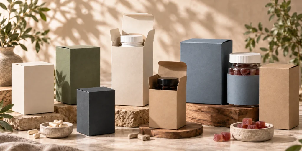
How Should Product Information and Artwork Be Planned on Supplement Cartons?

When I review artwork for supplement packaging boxes, I do not look at the design only as a visual file. I look at it as a production document that needs to work on real paperboard, on a real carton structure, through printing, finishing, die-cutting, folding, gluing, inspection, packing, shipping, and future repeat orders.
This is especially important for supplement cartons because the artwork usually has two jobs at the same time. It needs to make the brand look professional, and it also needs to organize a large amount of product information in a clear and controlled way. Compared with many lifestyle packaging categories, supplement packaging often carries more product names, variant details, approved information panels, barcode or code areas, small text, multi-language content, and SKU-specific differences.
That is why I never separate artwork planning from carton structure. A design may look clean and premium on a flat screen, but once it is placed on a dieline, every panel, fold line, glue flap, tuck flap, bleed area, barcode zone, and finishing layer starts to matter. A beautiful design can become difficult to manufacture if important text sits too close to a fold, if the barcode is placed near a curved or glued area, if foil is applied over small information, or if several SKU versions are not clearly named and approved before production.
For Product Managers, procurement teams, nutraceutical brands, importers, distributors, and packaging designers, this is one of the most important steps before sampling. Artwork is not truly ready for production when it looks good in a PDF. It is ready when the approved content, visual hierarchy, carton structure, printing method, finishing process, and SKU version control all work together.
 
I Begin With the Dieline Because the Carton Is Not a Flat Poster
The first thing I want to see is whether the artwork has been built on the correct dieline. This sounds simple, but in real packaging projects it is one of the most important checks.
A supplement carton is not a flat advertisement. It has a front panel, back panel, side panels, top flaps, bottom flaps, tuck flaps, dust flaps, glue areas, fold lines, bleed areas, and sometimes internal inserts or dividers that affect how the box is opened, packed, and displayed. When artwork is created without respecting these physical areas, the finished carton may not match what the designer imagined.
I look carefully at where the main logo sits, where the product name appears, where the information panels are placed, where the barcode or code area is located, and how the design continues across folds or edges. I also check whether the artwork leaves enough safe area around critical information, because small movement during die-cutting and folding is normal in real production.
This is why I prefer to review the dieline before the design becomes too final. If the structure changes after the artwork is completed, panel proportions may change, fold lines may move, glue areas may shift, and the design may need another round of revision. For a single SKU, that can already delay sampling. For a multi-SKU supplement range, that delay can multiply across every version.
 
The Front Panel Should Make the Product Clear Before It Tries to Say Everything
The front panel is usually the first area a customer sees, so I want it to communicate quickly and confidently. In supplement packaging, the front panel normally needs to show the brand, the product name, the SKU or variant, and the main visual identity of the product line.
I do not believe the front panel should carry every detail. If too much information is placed on the front, the carton can become crowded, and the most important message may become weaker. A strong front panel should create recognition first. It should help the customer understand which brand this is, which product this is, and how this SKU differs from other products in the same range.
For example, a brand may sell vitamin C, magnesium, probiotics, collagen, and sports nutrition products under one visual system. If all front panels look too similar, customers may struggle to distinguish the SKUs. If every front panel looks completely different, the range may lose brand consistency. I normally look for a controlled balance: stable brand architecture with clear product-level differentiation.
I also think about how the front panel appears in different environments. On a retail shelf, the carton needs to communicate at a short viewing distance and often next to several related SKUs. In e-commerce, the same front panel may appear as a product image at a smaller size. In distributor catalogs, buyers may compare several versions side by side. This is why front-panel hierarchy should not depend only on decorative design. It needs to support quick recognition.
 
The Brand Logo Should Stay Consistent Across the Product Family
The brand logo is one of the most important fixed elements in a multi-SKU supplement packaging system. I usually prefer the logo position, size relationship, and surrounding space to remain consistent across related products unless there is a strong reason to change them.
When the logo moves unpredictably from one SKU to another, the product family can start to look less controlled. It may still look creative, but it can become harder for customers to recognize the range as one brand system. It can also make artwork review more difficult because every SKU behaves like a separate design.
A stable logo position gives the packaging system a visual anchor. Product names, SKU colors, approved information, and market-specific versions can change around that anchor while the brand remains recognizable. For mature supplement brands, this consistency is important because the packaging is not only used for one launch. It may need to support many SKUs, repeat orders, retail programs, e-commerce listings, and distributor supply over time.
From a manufacturing perspective, consistent logo placement also helps with production review. If foil stamping, embossing, debossing, or spot UV is used on the logo, I can evaluate the finishing area more systematically when the logo remains in a controlled position across the range.
 
Product-Name Hierarchy Needs to Be Strong Enough for Real Use
The product name is where many supplement cartons become weaker than they should be. The brand may look attractive, but the customer may not immediately understand which product they are looking at.
I pay close attention to the relationship between the brand logo, product name, product type, strength, flavor, count, and other brand-approved product identifiers. The hierarchy should make the product easy to recognize without making the carton feel chaotic.
For a one-SKU project, product-name hierarchy may feel less complicated. For a multi-SKU range, it becomes critical. If the product names are too small, too low-contrast, or placed inconsistently, the cartons may look good individually but perform poorly as a product family.
I also consider warehouse and distributor use. Product names are not only read by end customers. They are also read by procurement teams, warehouse staff, retailers, fulfillment teams, and distributors. Clear product-name hierarchy can reduce confusion long after the cartons leave the factory.
For me, a good supplement carton should not require someone to study the entire package to identify the product. The main product identity should be visible quickly and consistently.
 
SKU Differentiation Should Be Designed as a System, Not Added at the End
SKU differentiation is one of the most important parts of supplement artwork planning. Many brands use color, bands, icons, panel blocks, product names, or layout variations to separate products within the same range. That can work well, but only when the logic is intentional.
I prefer to understand the SKU system before the artwork is finalized. Which elements represent the whole brand? Which elements identify the individual product? Which colors are permanent brand colors? Which colors are SKU-specific? Which areas are allowed to change when future SKUs are added?
If these rules are not defined early, the range may become inconsistent as it grows. The first few products may look organized, but by the time the brand adds ten or twenty products, each new carton may introduce another small exception. Over time, the packaging system can become difficult to manage.
A good SKU system should allow difference without losing control. Vitamin C can have its own product color. Magnesium can have another. Probiotics can have another. But the logo, layout, typography logic, panel structure, and finishing rules should still make the range feel connected.
 
SKU Colors Should Remain Distinguishable After Printing, Not Only on Screen
Color is one of the easiest ways to distinguish supplement products, but it is also one of the easiest areas to misunderstand before production.
On screen, two SKU colors may look clearly different. After printing on paperboard, especially after lamination or finishing, the difference may become less obvious. Paperboard surface, ink coverage, printing method, matte lamination, gloss lamination, and soft-touch finish can all affect the final visual result.
This is why I prefer to review SKU colors as a printed packaging system, not only as digital artwork. If two colors are too close, the product range may become harder to distinguish in retail, e-commerce photos, or warehouse handling. If the colors are too unrelated, the range may lose brand unity.
For multi-SKU supplement packaging, I look for a controlled color logic. Shared brand colors should remain stable. SKU colors should be intentionally different. The full product family should look connected but not confusing.
 
The Side Panels Should Not Become Leftover Space
Side panels are often treated as secondary areas, but I think they deserve more attention in supplement packaging.
Because supplement cartons often contain detailed product information, side panels may carry important approved content, product identifiers, usage-related information supplied by the brand, barcode or code areas, distributor information, or multi-language text. These panels are narrow, which makes them more sensitive to text size, line spacing, contrast, and folding position.
A side panel that looks acceptable in a large artwork file may become difficult to read when printed at actual size. If the panel uses small text, low contrast, heavy background color, or a decorative pattern, readability can suffer.
I also think about how the carton may be stored or displayed. In some retail or warehouse environments, the side panel may be visible before the front panel. If the side panel contains no useful product identifier, staff may need to rotate or handle cartons more often just to confirm the SKU.
For multi-SKU projects, I prefer side-panel logic to remain consistent. If barcode placement, product identifiers, and information panels move from one SKU to another without a reason, the range becomes harder to manage.
 
The Back Panel Should Carry Detail Without Becoming Overloaded
The back panel often becomes the most information-heavy area of a supplement carton. It may contain approved product descriptions, instructions, usage information supplied by the brand, distributor details, barcode areas, symbols, or market-specific content.
My main concern is whether the content can be printed clearly and read comfortably at real size. It is very common for brands to underestimate how much space detailed information needs. On screen, the designer can zoom in and everything looks sharp. On a printed carton, small text, narrow spacing, low contrast, and dense paragraphs can quickly become difficult to read.
If the back panel is overloaded, I usually look for ways to improve the structure of the information. Sometimes the hierarchy can be improved. Sometimes content can be distributed more logically between panels. Sometimes non-essential design elements need to be reduced. In some cases, the carton size itself may need to be reviewed if the approved content genuinely does not fit.
A professional supplement carton should not only include information. It should present information in a way that remains readable, printable, and consistent with the brand system.
 
Approved Information Panels Need Safe, Stable Placement
Supplement cartons often include information that has already been reviewed and approved by the brand. My role is not to decide what that information should say, but I do care about where it sits on the carton and whether it can be produced clearly.
I prefer approved information panels to stay on stable, flat areas of the dieline. Important text should not sit too close to fold lines, cut lines, glue areas, or finishing effects that may affect readability. If a panel crosses a fold, the content may look acceptable in the flat artwork but become harder to read after the carton is formed.
I also want information-panel placement to remain consistent across related SKUs. If every SKU places approved content in a different location, future artwork updates become harder to control. When the information architecture is stable, new versions can be developed more efficiently.
This is especially valuable for brands that sell into multiple markets or regularly update product information.
 
Barcode and Code Zones Should Be Planned Before the Layout Is Crowded
Barcode and code areas should never be treated as the last thing to place after all other design elements are finished.
These areas are functional, and they need enough clean space. I prefer barcode or code zones to sit on flat areas of the carton, away from folds, curves, heavy textures, glue flaps, and finishing effects. The surrounding background should also support clarity.
Even though BorhenPack does not validate the barcode data itself, I still review the physical placement from a packaging perspective. A barcode placed too close to a fold or edge can create practical issues. A code area placed on a heavily decorated background may become harder to use.
For importers, distributors, retailers, and e-commerce fulfillment teams, consistent barcode placement can also improve handling. If every SKU uses a different barcode location, downstream teams may find the packaging less efficient to scan, identify, or organize.
For me, barcode placement is part of the carton structure, not only part of graphic design.
 
Multi-Language Artwork Needs More Space Than Buyers Often Expect
Multi-language supplement cartons need careful planning because translated content does not always occupy the same space as the original version.
A carton that feels clean in English may become crowded in German, French, Italian, Spanish, or another language. Some translations are longer. Some markets may need additional approved information. Some versions may require different barcode or distributor details.
When I review multi-language artwork, I look at whether the panel space can realistically carry the required content without reducing the text to an impractical size. I also look at whether each language version follows the same overall information architecture.
From a production perspective, every language version should be treated as a separate artwork version. Even if the structure, paperboard, colors, and finishing are the same, the approved content is different.
That means the file needs separate approval, the production quantity needs to be clear, and the cartons need to remain separated during packing.
This matters a lot for importers and distributors. If language versions are mixed in master cartons, the problem may only appear when the shipment reaches the destination warehouse.
 
Small Text Must Be Planned for Printing Reality
Small text is one of the most sensitive parts of supplement carton artwork.
A file can look perfect on a screen because the designer can zoom in. The printed carton cannot be zoomed. Once small text is printed on paperboard, the result depends on font size, font weight, line spacing, contrast, ink coverage, paper surface, printing method, and finishing.
I prefer to review small text before sampling because it can create real production concerns. Thin fonts may lose clarity. Reversed-out white text on a dark background may become harder to read. Dense paragraphs may look too heavy. Fine lines may not reproduce as sharply as expected.
I also consider whether small text sits near folds or edges. Even if the text itself is technically printable, its placement can make it less stable after die-cutting and folding.
For supplement packaging, small text should not be treated as decoration. It is often part of the functional information system, so it needs enough space and contrast to be produced responsibly.
 
Bleed Areas Protect the Final Carton Appearance
Bleed is a technical detail that often becomes visible only when it is missing.
When a color block, image, or background extends to the edge of a panel, the artwork needs to continue beyond the final trim line. This extra area helps prevent unwanted white edges if there is slight movement during die-cutting.
Supplement packaging often uses clean panels, color bands, and SKU color systems. If bleed is not planned correctly, small production tolerances can create visible inconsistencies along the carton edges.
I always check bleed before production because it is much easier to correct in the file than after printing.
For multi-SKU projects, bleed consistency also matters across the range. If one version has correct bleed and another does not, the final cartons may not look equally clean even when the general design is the same.
 
Fold Lines Should Guide the Artwork, Not Damage It
Fold lines become physical creases on the finished carton. I always treat them as real production zones, not just technical marks.
Important logos, product names, barcodes, and small text should not sit too close to fold lines. A fold can interrupt the artwork visually, slightly distort color, or make fine details harder to read.
Sometimes a design intentionally wraps around a corner, and that can look attractive when done well. But functional information should usually stay on stable panel areas.
For supplement cartons, I am especially careful with fold lines because the artwork often contains dense information. A fold crossing an approved information area can make the packaging look less professional and harder to read.
I prefer to adjust the layout early so the fold structure supports the design instead of fighting against it.
 
Glue Areas Should Remain Production-Friendly
Glue areas are usually not exciting to look at, but they are essential for carton performance.
If heavy ink, lamination, foil, spot UV, or other finishing is applied incorrectly in a glue area, it can affect adhesion or create avoidable production risk. If important artwork is placed on a glue flap, it may become hidden after assembly.
I review glue areas because the carton must be manufactured, not only viewed.
A design that ignores glue zones can create issues during folding and gluing, especially in bulk production. For repeat orders, inconsistent glue-area treatment can also make the carton harder to reproduce reliably.
For multi-SKU ranges, I prefer to keep the glue-area logic consistent across all related versions. This keeps production more predictable.
 
Finishing Layers Should Be Built Into the Artwork, Not Added Casually
Finishing should be planned as part of the artwork file, not treated as a final decoration added after the design is complete.
Matte lamination, gloss lamination, soft-touch lamination, foil stamping, embossing, debossing, and spot UV all require production planning. Some finishing effects need separate layers. Some need enough space around the artwork. Some need registration tolerance. Some may not work well over small text or dense information areas.
When I review finishing layers, I ask what role the finish is supposed to play.
Is it highlighting the logo? Is it separating a premium product line? Is it creating shelf presence? Is it protecting the printed surface? Is it part of the SKU system?
If the finish has no clear function, it may add cost and production complexity without improving the packaging program.
For supplement packaging, finishing should support brand recognition while protecting information clarity. It should not make important product information harder to read or make SKU versions unnecessarily difficult to control.
 
Multi-SKU Artwork Needs a Master Layout
When a supplement brand has several SKUs, I prefer to work from a master artwork layout rather than separate designs that were created independently.
A master layout defines the repeated logic of the packaging family. It shows where the logo belongs, where the product name sits, where SKU color appears, where approved information panels are placed, where barcode or code zones are located, and how finishing is used.
Once that master layout is clear, each SKU becomes a controlled variation.
This is much more scalable than designing every carton from the beginning.
It also makes production review easier. I can compare each new SKU against the master layout and quickly identify whether a change is intentional or accidental.
For Product Managers, a master layout helps new products launch faster. For designers, it gives creative boundaries. For procurement teams, it creates a clearer production standard.
 
Artwork Naming Should Prevent Confusion Before It Reaches Production
As soon as multiple SKUs are involved, artwork naming becomes part of production control.
I have seen projects become delayed because several files had similar names, and nobody was completely sure which version was final.
For a supplement product range, I prefer file names that make the SKU, market, language, and revision status clear. The purpose is not to create a complicated administrative system. The purpose is to make sure everyone can identify the correct approved file quickly.
This matters during sampling. It matters during proof approval. It matters during printing. It matters during repeat orders.
A clear artwork name can prevent a wrong file from becoming a wrong carton.
 
Version Control Should Continue After the First Order
Artwork version control does not end after the first production run.
Supplement packaging can change over time. Product information may be updated. Barcodes may change. A market version may be revised. A new language version may be added. The brand may adjust the color system or redesign part of the carton.
When this happens, I want the new version to be clearly separated from the old version.
For repeat orders, I prefer to confirm whether the customer wants to reproduce the previous approved file or produce a revised file. I do not assume that the old file is still correct simply because it exists in the previous project folder.
This protects both sides.
The customer avoids printing outdated packaging, and the manufacturer avoids producing the wrong version.
 
Approved Files Should Become the Production Reference
Before bulk production begins, the approved files should be locked.
This includes the dieline, artwork, SKU versions, Pantone or color references, finishing layers, and any market-specific files. If one of these remains uncertain, the project is not truly ready for production.
Late changes can affect print setup, plate preparation where applicable, color matching, die-cutting, finishing, schedule planning, inspection, and shipping time. For multi-SKU projects, one late file can affect the whole program if the versions are being produced together.
Once the files are approved, they become more than artwork.
They become the reference for sample review, bulk production, quality inspection, packing separation, and future repeat orders.
 
SKU Identification Should Be Clear for Customers and for Production Teams
SKU identification needs to work for more than end customers.
The production team needs to know which artwork belongs to which quantity. The inspection team needs to confirm the correct version. The packing team needs to separate the correct cartons. The warehouse or distributor needs to receive the right SKU. The e-commerce team may need to fulfill orders accurately.
This is why I think product names, SKU colors, barcode or code areas, and version records should all work together.
If several cartons look almost identical, the risk of mix-up increases even when the printing quality is good.
A supplement carton can be visually perfect and still create a serious problem if it belongs to the wrong SKU.
 
I Review Manufacturing Feasibility, Not Regulatory Meaning
This boundary is very important.
BorhenPack can review the artwork from a paper packaging manufacturing perspective. I can look at printability, placement, dieline compatibility, panel space, small-text clarity, barcode or code-area placement, finishing feasibility, fold and glue areas, SKU consistency, and production control.
I do not approve supplement claims, ingredients, dosage statements, warnings, nutrition information, regulatory wording, or market-specific labeling requirements.
Those must be supplied and approved by the customer, brand owner, regulatory team, or other responsible party before production.
My role is to help make the approved content work on the paper carton. I can help identify whether the content has enough space, whether it is likely to print clearly, whether it sits in a safe area, and whether the correct version is connected to the correct SKU. But the content itself remains the customer’s responsibility.
This keeps the project scope clear and prevents confusion between packaging production review and regulatory approval.
 
I Treat Artwork Planning as One of the Most Important Production Steps
In my view, supplement carton artwork is not just a design file.
It is one of the most important control points in the entire packaging program.
Good artwork planning helps the carton look professional, keeps product information organized, improves SKU recognition, reduces revision cycles, supports print clarity, prevents version confusion, makes sampling more useful, and creates a stronger reference for repeat orders.
Poor artwork planning creates the opposite problem. It can delay sampling, create unclear printing, cause barcode or information placement issues, increase revision costs, confuse SKU versions, and make reorders less reliable.
That is why I want buyers to think about artwork earlier, not later.
The right question is not only, “Does this carton design look good?”
The better question is, “Can this approved artwork be printed clearly, folded correctly, identified by SKU, inspected reliably, packed separately, and reproduced consistently when the next order is placed?”
When the answer is yes, the artwork is not only visually ready. It is production-ready.
That is the standard I try to reach when developing custom supplement packaging boxes for brands that need reliable, scalable, and repeatable paper packaging.

How Can Brands Keep Printing and Colors Consistent Across Multiple Supplement Products?

When I work on custom supplement packaging boxes for a brand with several products, I do not treat printing and color as simple decoration. I see them as part of the packaging standard. A supplement carton is often one piece of a larger product family, and once the brand has several SKUs, the color system becomes one of the most visible signs of whether the packaging has been professionally controlled.
For one carton, a slight color difference may look like a small issue. For a product line with vitamin C, magnesium, collagen, probiotics, gummies, sports nutrition, and other supplement products, the same color difference can become much more noticeable. Customers may see several products together on a retail shelf. E-commerce buyers may compare different SKUs in product images. Importers and distributors may receive cartons from different production runs and place them next to older stock. In these situations, color consistency is not only about beauty. It affects brand trust, product recognition, SKU clarity, and repeat-order confidence.
This is why I always want to understand the color system before production begins. I want to know which colors represent the permanent brand identity, which colors are used to separate product categories, which colors need Pantone references, which parts are printed in CMYK, which paperboard will be used, which lamination or finishing is required, and whether the same standard needs to be repeated in future orders. The earlier these decisions are made, the easier it becomes to control color across sampling, bulk production, new SKUs, and reorders.
For me, the most important principle is simple: shared brand colors should remain stable, while intentional SKU colors should remain clearly differentiated. A supplement packaging system should not make every product look the same, but it should make every product look like it belongs to the same brand family.
 
I First Identify Which Colors Are Brand Colors and Which Are SKU Colors
The first thing I clarify is whether a color is a brand color or a SKU color. This may sound like a design question, but it has a direct effect on printing, sampling, quality control, and repeat production.
A brand color is usually expected to remain stable across the whole product range. It may appear in the logo, background system, headline area, icon style, brand band, or repeated visual element. Its job is to make the brand recognizable. If this color changes from one SKU to another without intention, the product family can look inconsistent, even if every carton is printed cleanly.
A SKU color has a different role. It helps the customer distinguish one product from another. A supplement brand may use orange for vitamin C, blue for magnesium, green for probiotics, purple for collagen, or another color system for different product functions, strengths, flavors, or market lines. These colors are allowed to change, but the change should follow a clear logic.
When I review artwork, I do not want to see colors changing randomly because different designers prepared different files or because each product was developed at a different time. I want the brand colors to have a stable reference and the SKU colors to have a clear differentiation purpose. This makes the whole packaging range easier to manage.
 
Shared Brand Colors Should Stay Stable Across Every Product
Shared brand colors are usually the colors I treat most carefully. They are the visual anchor of the product family.
If the logo color, main brand band, or repeated graphic element changes noticeably between different supplement cartons, customers may feel that the packaging is not controlled. This is especially noticeable when products are displayed together. Even small changes can become visible when five or ten cartons are placed side by side.
For a mature supplement brand, shared brand color is not only a design preference. It becomes a production standard. The same color may need to appear across different product types, different carton sizes, different artwork versions, different production batches, and different destination markets.
That is why I prefer to define the shared brand colors before sampling. If the color is important enough to represent the brand, it should not depend only on a digital file or a screen preview. It should have a controlled reference that can be used during production and repeat orders.
 
SKU Colors Should Be Clearly Different After Printing
SKU colors should help customers and internal teams recognize different products quickly. However, I often see brands select SKU colors that look different on screen but become too similar after printing.
This can happen because paperboard changes the color effect, lamination softens or brightens the surface, ink coverage behaves differently on different materials, or two digital colors are simply too close once printed at carton size.
For example, two shades of green may look distinct in a digital design file, but after matte lamination they may appear much closer. A pale blue and pale lavender may feel different on a monitor but become weak on paperboard. A dark background color may look premium but reduce the contrast of small text or product names.
This is why I prefer to review SKU colors as a product family, not as isolated files. I want to see whether the full range remains easy to distinguish after printing. The goal is not to make the SKU colors extremely loud. The goal is to make the differences intentional, visible, and useful.
 
Pantone Colors Help Create a More Controlled Target
Pantone references are useful when a brand needs a clearer color target, especially for important brand colors that must remain stable across multiple SKUs and repeat orders.
When a buyer gives me only a digital file, the color can be interpreted differently depending on screen settings, software, export profile, and printing conditions. A Pantone reference gives the production team a more specific target to work toward. This is particularly valuable for logos, brand colors, color bands, and repeated design elements that appear across the entire supplement product line.
However, I also explain that Pantone is not a magic guarantee. A Pantone number is a reference target, but the final printed result still depends on the paperboard surface, coating, ink coverage, printing method, lamination, finishing, and production conditions. The same Pantone target may look different on SBS paperboard compared with kraft paperboard, and it may look different before and after matte lamination.
For that reason, I prefer to use Pantone references together with approved physical samples and documented production standards. The Pantone number gives direction, the sample gives a physical reference, and the production record helps support future consistency.
 
CMYK Printing Needs a Different Kind of Control
CMYK printing is often used for full-color artwork, gradients, images, illustrations, detailed backgrounds, and complex supplement packaging designs. It is practical and flexible, but it requires realistic expectations.
CMYK colors are created by mixing cyan, magenta, yellow, and black. This means that a color shown in the artwork file is not always reproduced exactly the same way on paperboard. The final result can be affected by color profile, ink density, paper surface, lamination, and the way large printed areas behave during production.
I pay special attention when a brand uses CMYK values for important brand colors. If different SKU artwork files are prepared by different designers or at different times, the CMYK values may not be exactly the same. The difference may seem small inside the file, but once printed across several cartons, the brand color can appear inconsistent.
For multi-SKU supplement packaging, I prefer the brand to define which colors should be controlled by Pantone reference and which areas can be handled through CMYK. This gives the project a more realistic production standard.
 
Paperboard Can Change the Final Printed Color
Paperboard is one of the biggest reasons why the same artwork can look different after printing. This is why I never separate material selection from color planning.
SBS paperboard usually provides a smooth white surface, which can support clean printing, sharper details, and stronger color control. This is one reason it is often suitable for supplement folding cartons, especially when the artwork includes detailed information, small text, color bands, and a clean retail presentation.
Kraft paperboard creates a very different result. It can support a natural or responsible-looking packaging style, but colors printed on kraft usually appear warmer, darker, or less vivid than they would on a white coated surface. If a buyer expects bright, clean SKU colors on kraft paperboard, I would explain the likely visual difference before sampling.
CCNB and other paperboard options can also affect color because the surface tone, smoothness, coating, and ink absorption may differ. Even when the same file is used, the printed result may not look identical across different paper materials.
For this reason, I treat paperboard as part of the color standard. If a brand wants strong repeat color consistency, changing paperboard later can change the color result too.
 
Lamination Can Make the Same Color Feel Different
Lamination is often selected for surface protection, hand-feel, or brand positioning, but it also affects color appearance.
Matte lamination usually creates a softer and more controlled surface. It can make the carton look refined, but it may reduce the perceived brightness of some colors. Gloss lamination can make colors appear more vivid and reflective, but it can also create glare under strong light. Soft-touch lamination creates a premium tactile effect, but it may slightly change color depth and surface perception.
For one SKU, this may not create a major concern. For a product family, inconsistent lamination choices can create visible differences. If the core range uses matte lamination but one SKU uses gloss without a clear reason, the same brand color may appear different even if the ink values are correct.
This is why I prefer to define lamination as part of the packaging family standard. If a brand wants stable color across several supplement products, the surface treatment should not be changed casually from SKU to SKU.
 
Finishing Effects Can Influence Color Perception
Finishing details such as foil stamping, embossing, debossing, and spot UV can improve shelf presence, but they also influence how people perceive the printed carton.
Spot UV can make a selected area appear glossier or darker because it changes the way light reflects from the surface. Foil stamping can draw attention to a logo or product detail, but it may also compete with nearby printed colors. Embossing and debossing can create shadow and texture, which can change how a printed area appears from different angles.
For supplement cartons, finishing should support the brand and product hierarchy. It should not make important information harder to read or create unnecessary differences between SKUs.
When I review finishing, I ask whether the effect belongs to the whole brand system, one product tier, or a special launch. If every SKU uses different finishing without a clear reason, production becomes more complex and color consistency becomes harder to control.
 
Ink Coverage Can Make Some Colors Harder to Control
Ink coverage is another important detail that buyers often overlook.
A small logo printed in one color is usually easier to control than a full-panel background with heavy ink coverage. Large solid colors, dark backgrounds, gradients, and full-coverage panels can show variation more easily during production. They can also be more sensitive to paperboard surface, drying conditions, lamination, and finishing.
Supplement brands often use color blocks or large background areas to differentiate SKUs. This can work well, but it should be planned carefully. If each SKU uses a different full-color background, every color may need to be reviewed individually.
Heavy ink coverage can also affect small text and barcode areas if the contrast is not strong enough. A dark background may look premium, but if the product name, approved information, or code area becomes less clear, the color choice is creating a functional problem.
For me, color is successful only when it supports both visual identity and information clarity.
 
Color Consistency Should Be Checked Across the Whole Carton, Not Only the Front Panel
Many buyers focus mainly on the front panel because that is the most visible area in product photos. I understand why, but I also review the side panels, back panel, flaps, and any color that wraps around edges.
A supplement carton is three-dimensional. A color block that looks perfect on a flat dieline may appear different after folding because the light hits each panel differently. If a color band wraps from the front to the side panel, alignment and cutting tolerance can also affect the finished appearance.
Side panels matter because they may be visible in retail displays, warehouse storage, or distributor handling. Back panels matter because they often carry dense information and may use a different color or contrast system. If the front looks excellent but the side and back panels feel uncontrolled, the carton still does not look fully professional.
I therefore review the full formed carton whenever possible, not only the flat artwork.
 
Approved Samples Turn Color From an Opinion Into a Reference
A physical approved sample is one of the most useful tools for color control. It turns an idea into a reference.
A digital proof can show layout, general design, and artwork placement, but it cannot fully show how the color will appear on the selected paperboard with the selected printing method, lamination, and finishing. The physical sample gives the buyer and manufacturer a shared object to discuss.
For supplement brands with multiple SKUs, I also clarify what the sample represents. If one SKU is physically sampled, that sample may confirm the paperboard, printing quality, lamination, finishing, and shared brand color direction. However, it may not fully confirm every SKU color if the other colors are significantly different.
In some projects, it may be worth reviewing more than one color sample, especially when the SKU colors are critical to product differentiation. In other projects, one approved sample and strong artwork references may be enough.
The key point is that approved samples should become production references, not just approval photos.
 
Color References Should Be Documented for Future Orders
Color consistency becomes much harder when the first order is treated as a one-time project.
If a brand expects repeat orders, I want the color references to be documented. This can include Pantone numbers, CMYK values, approved artwork files, selected paperboard, lamination type, finishing details, and the approved physical sample.
When the next order is placed, the production team can compare the new job against the previous reference instead of relying only on memory or a screenshot.
This is especially important for supplement brands because they may reorder different SKUs at different times. A fast-moving product may be reordered every few months, while a slower SKU may still use cartons from an earlier batch. If the brand color shifts noticeably, old and new stock may not look consistent together.
Good color documentation helps reduce this risk.
 
Repeat Orders Should Be Compared Against the Approved Standard
When a buyer asks why the same color looks different in a repeat order, I usually look at whether the production conditions were truly the same.
Was the same paperboard used? Was the same lamination used? Did the artwork file change? Were the same Pantone references provided? Did the ink coverage change? Was the previous physical sample available as a reference? Was the same finishing effect applied?
A repeat order should not be managed only by saying, “Please print the same as last time.” That instruction is not precise enough.
I prefer to compare the repeat order against the approved production standard. If something has changed, the buyer should understand that the color result may also change. If the brand changes from gloss to matte lamination, switches paperboard, adjusts the artwork file, or changes the ink coverage, the final color may not look exactly like the previous order.
Repeat consistency depends on stable references and stable production conditions.
 
Existing Packaging Inventory Should Be Considered Before Changing Color
Color changes can create problems when the brand still has older packaging inventory.
For example, a supplement brand may update its packaging color slightly for a new reorder, but the warehouse may still have cartons from the previous batch. If both versions are used at the same time, the difference may become visible to customers, retailers, or distributors.
This is especially common in multi-SKU product lines. One fast-moving SKU may move into the new color standard quickly, while slower-moving SKUs still use the older packaging. The product family can then look inconsistent for a period of time.
Before changing brand colors, SKU colors, lamination, or paperboard, I like to ask whether old and new packaging will overlap in the market. If they will, the transition should be intentional.
Sometimes the brand may decide to consume the old packaging first. Sometimes the change is necessary and the brand accepts the difference. The important point is to make the decision consciously rather than discovering the inconsistency after the cartons arrive.
 
New SKUs Should Be Matched to the Existing Color System
When a supplement brand launches a new SKU, I do not treat the new carton color as a completely separate decision.
I look at the existing range first. I want to understand the current brand colors, existing SKU colors, product categories, and visual logic. Then I think about how the new product can fit into that system.
A new SKU color should be different enough from existing products to prevent confusion, but not so disconnected that the carton looks like it belongs to another brand. If the new product belongs to a sub-range, the color system should also make that relationship clear.
This is where long-term product planning becomes useful. If a brand expects to launch many future products, it should not use all strong color options in the first few SKUs without thinking ahead. Otherwise, future products may become harder to differentiate.
A good color system leaves room for growth.
 
Color Approval Should Happen Across the Product Family
For multi-SKU supplement packaging, I prefer to review color across the whole family rather than approving each carton separately.
A carton can look good by itself but create problems when placed next to the rest of the range. The SKU color may be too close to another product. The brand color may look slightly different. The contrast may feel inconsistent. The finishing may make one SKU look like it belongs to a different product tier.
This is why I like to see the key SKUs together during color review.
The buyer should ask whether the shared brand elements remain stable, whether the SKU differences are clear, and whether the full range looks intentional.
For a Product Manager, this is much more useful than approving one product at a time without seeing the product-line effect.
 
Printing Clarity Must Not Be Sacrificed for Color Impact
Strong color can make supplement packaging more visible, but it should not weaken readability.
A dark background may look premium, but it can make small text harder to read if the contrast is weak. A bright SKU color can help product differentiation, but it should not overpower the product name. A full-color design can create shelf impact, but it should not make barcode or code areas difficult to use.
I review color together with typography, information panels, small text, barcode zones, and finishing layers.
Supplement packaging usually carries more information than many other categories, so color must support clarity. If the color system creates visual excitement but makes product identification or approved information harder to read, it is not the right solution.
For me, a good supplement carton should be recognizable, differentiated, and readable at the same time.
 
I Treat Color Control as a Long-Term Packaging Standard
The most important point I want buyers to understand is that color consistency is not achieved by one instruction such as “match our brand color.” It is achieved through a controlled packaging standard.
That standard includes brand color rules, SKU color logic, Pantone references, CMYK values, paperboard selection, ink coverage, lamination, finishing, approved samples, artwork version control, production records, and repeat-order comparison.
For one product, this already matters. For a supplement brand with multiple SKUs, it becomes essential.
Shared brand colors should remain stable. SKU colors should remain clearly different. New products should fit the existing color system. Repeat orders should be compared against approved references. Changes in paperboard, lamination, finishing, or artwork should be understood before production begins.
This is how I approach printing and color consistency for custom supplement packaging boxes. I am not only trying to make the first production run look good. I am trying to help the brand create a color system that can continue working across different products, future SKUs, bulk production, e-commerce presentation, importer programs, and long-term repeat orders.
When color is managed this way, the packaging becomes more than printed paperboard. It becomes a reliable visual system that supports brand recognition, product differentiation, procurement control, and long-term growth.

What Really Affects MOQ and Unit Cost for Supplement Packaging Boxes?

When I discuss custom supplement packaging boxes with a Procurement Manager, importer, distributor, or growing e-commerce supplement brand, MOQ and unit cost are usually two of the first questions. I understand this very well. Buyers need to compare suppliers, plan launch budgets, estimate landed cost, control packaging inventory, and decide whether a project is suitable for sampling and bulk production.
However, I do not believe MOQ and unit cost should be answered with one simple number before the packaging project is properly defined. A supplement carton is not priced only by the total number of boxes. The real cost comes from the complete production program behind the box. Carton dimensions, paperboard, structure, printing method, number of SKUs, quantity per SKU, artwork versions, finishing, inserts, production setup, machine adjustment, material waste, assembly requirements, packing method, export organization, and repeat-order expectations can all change the final cost.
This is especially true for supplement, vitamin, and nutraceutical packaging because many projects are not one-product packaging orders. A buyer may need cartons for several formulas, strengths, flavors, language versions, or market versions at the same time. The boxes may look similar, but each SKU can require separate artwork, proof approval, color control, production identification, quality inspection, counting, and packing separation.
For me, the most important question is not only, “How much is one supplement box?” The more useful question is, “What production work is required to make this packaging program correctly, consistently, and repeatedly?”
 
I Do Not Treat MOQ as a Random Number
MOQ is sometimes misunderstood as a number chosen only by the manufacturer. In reality, MOQ is usually connected to production efficiency.
Before a custom supplement carton can be produced, several fixed steps need to happen. The artwork needs to be reviewed. The dieline needs to be confirmed. Paperboard needs to be prepared. Printing setup needs to be arranged. Color references need to be checked. Die-cutting, lamination, finishing, folding, gluing, inspection, and packing all need to be planned.
These steps take time and production resources whether the buyer orders 1,000 boxes or 20,000 boxes. When the quantity is too low, the fixed preparation work is spread across fewer units, so the unit cost becomes much higher. This is one reason MOQ exists.
I therefore do not see MOQ only as a sales threshold. I see it as the point where the project becomes more practical for material purchasing, printing setup, machine operation, quality control, and export packing.
For buyers, understanding this helps make MOQ discussions more realistic. Instead of only asking whether the MOQ can be lower, it is more useful to ask what part of the specification is making the MOQ or unit cost difficult.
 
Total Quantity Does Not Tell Me Enough
When a buyer says, “I need 5,000 supplement boxes,” I still cannot understand the real cost structure.
I need to know whether those 5,000 boxes are for one SKU or several SKUs. I need to know whether all cartons share the same size, structure, paperboard, printing method, finishing, and packing method. I also need to know whether the artwork is one version or several versions.
A project with one artwork version and one carton specification is usually much easier to produce than a project with five artwork versions, even when the total number of boxes is the same.
This is why I always ask for quantity per SKU. Without that information, a quotation may look simple, but it may not reflect the real production work behind the project.
For a Procurement Manager, this is especially important when comparing suppliers. If one quotation is based on one version and another quotation is based on five versions, the unit prices are not comparing the same production reality.
 
1 SKU × 5,000 Pieces Is Not the Same as 5 SKUs × 1,000 Pieces
This is one of the most important cost principles in supplement packaging.
1 SKU × 5,000 pieces usually means one carton size, one structural dieline, one artwork file, one color target, one proof approval, one production version, one inspection reference, and one packing arrangement. The setup cost and production preparation are spread across 5,000 identical cartons.
5 SKUs × 1,000 pieces may still total 5,000 boxes, but it is not the same production program. It may require five artwork versions, five product names, five color systems, five approved information panels, five quantity allocations, separate proof approvals, separate version identification, separate production control, separate inspection references, and SKU-separated packing.
The physical box may be the same size. The paperboard may be the same. The structure may be the same. But the production work is not identical because the manufacturer is managing five controlled versions instead of one.
This is why the unit cost of five smaller SKU runs can be higher than one larger single-SKU run. The difference is not only material cost. It is also setup, proofing, color control, artwork management, waste, inspection, counting, and packing organization.
 
Carton Dimensions Affect More Than Paper Usage
Carton dimensions are one of the first cost drivers I review because size directly affects material consumption. A larger carton usually requires more paperboard, a larger printed area, a larger die-cutting layout, and sometimes a larger master carton.
However, I do not look at carton dimensions only from the factory side. I also look at how the size affects packing, storage, and freight.
A carton that is slightly oversized may not look like a serious issue in one sample. But across 10,000 or 50,000 pieces, that extra board area can become a real cost. It can also reduce the number of cartons that fit into one master carton, increase shipping volume, reduce pallet efficiency, and raise the landed cost for importers and distributors.
At the same time, a carton that is too tight can create packing problems. Workers may need more time to insert the finished product. The panels may bow outward. The tuck flaps may not close smoothly. The finished carton may look less professional.
For me, the best carton size is not the smallest possible box. It is the most efficient size that still fits the finished packed product correctly, supports the structure, protects presentation, and packs well for shipment.
 
Paperboard Choice Affects Cost, Printing, and Repeat Consistency
Paperboard has a direct effect on unit cost, but I never choose paperboard by price alone.
For many supplement folding cartons, SBS paperboard is often a strong option because it offers a clean white surface, good printability, clear small text reproduction, and a professional retail appearance. This can be important when the carton carries detailed product information, multiple colors, Pantone references, and clean brand graphics.
CCNB may be more cost-conscious for suitable projects, but the buyer needs to consider surface appearance, stiffness, folding performance, and printing effect. Kraft paperboard can support a natural or responsible-looking brand direction, but printed colors usually appear warmer or less vivid than they do on white paperboard. Greyboard may be more suitable for stronger kit boxes or premium set structures rather than standard lightweight folding cartons.
FSC-certified paper options can also affect cost depending on material type, availability, and order quantity. FSC certification can support responsible paper sourcing, but it does not replace the need to review structure, print performance, MOQ, and cost.
When I recommend paperboard, I look at structure, print quality, brand positioning, product weight, order quantity, storage, export packing, and repeat availability together. A cheaper board that creates poor printing, weak folding, or inconsistent repeat production is not always the lower-cost choice in the long run.
 
Box Structure Changes Both Factory Cost and Buyer-Side Labor
The structure of the supplement carton can change manufacturing cost because different structures require different dielines, paperboard layouts, cutting methods, folding steps, gluing processes, and production control.
A Straight Tuck End or Reverse Tuck End carton is often efficient for standard retail supplement products. These structures are familiar, flat-packed, relatively straightforward to produce, and practical for many single-product cartons.
A Snap-Lock Bottom carton can provide stronger bottom support, but the base needs more manual folding during assembly. An Auto-Lock Bottom carton can open faster because the base is pre-glued, but it costs more to manufacture because of the additional converting process. A Seal End carton may be practical for certain higher-volume packing systems, but only when the packing workflow supports it. A Sleeve can create flexible branding or SKU variation, but it adds another component and another assembly step. A Corrugated Mailer uses a different material and structure because it is designed for e-commerce shipping rather than only shelf presentation.
I therefore do not compare structures only by the box price. A carton with a lower unit cost may require more time to assemble. A structure with a higher unit cost may save labor during packing, especially at larger quantities.
For buyers, this is where total packaging cost becomes more important than the ex-factory carton price.
 
Printing Method Can Change the Cost Model
Printing method is another important factor behind MOQ and unit cost.
Offset printing is often efficient for larger quantities and can support strong color reproduction, detailed artwork, Pantone matching, and professional retail presentation. However, it may require plate preparation, press setup, color adjustment, and startup sheets before stable production begins. These setup steps become more efficient when spread across a larger quantity.
Digital printing can be useful for smaller quantities, test runs, short SKU versions, or projects with frequent artwork changes because it does not require traditional printing plates. However, digital printing still needs proper file preparation, proofing, color management, version control, and production organization.
I do not choose offset or digital printing only by asking which method sounds cheaper. I look at the total quantity, quantity per SKU, number of artwork versions, color requirements, paperboard, finishing, timeline, and repeat-order plan.
For example, a single SKU at a larger quantity may be more suitable for offset printing. A multi-SKU project with smaller quantities per version may need a different discussion because flexibility and version control become more important.
 
The Number of SKUs Can Increase Cost Even When the Box Size Is the Same
Many supplement brands assume that if several SKUs use the same carton size, the cost should be almost the same as one larger order.
Sometimes standardization does help reduce complexity. But it does not remove all version-related costs.
Each SKU may still require its own artwork review, proof approval, product-name check, color reference, information-panel review, barcode or code-area check, quantity allocation, production identification, quality inspection, and final packing separation.
This is why the number of SKUs affects cost even when the structure is shared.
If five cartons use the same dieline but five different artwork files, the project still needs to be managed as five production versions. If those five SKUs also have different languages or destination markets, the version-control work becomes even more important.
For me, the question is not only whether the carton structure is the same. The question is how many controlled production versions need to be managed.
 
Quantity Per SKU Affects How Setup Cost Is Spread
Quantity per SKU is one of the most important cost drivers in supplement packaging.
If one artwork version is produced at 5,000 pieces, the setup cost is spread across a larger number of cartons. If the same level of setup work is required for only 1,000 pieces, the unit cost usually becomes higher.
This does not mean smaller SKU quantities are wrong. Growing supplement brands often need smaller quantities when testing new products, launching new formulas, or managing inventory risk.
But the buyer should understand the economics.
A small SKU run still needs artwork review, printing setup, color control, die-cutting, folding, gluing, inspection, counting, and packing. These steps do not become five times simpler just because the quantity is one-fifth of a larger run.
This is why I always ask buyers to separate total order quantity from quantity per SKU. It gives a much more accurate picture of cost.
 
Artwork Versions Add Production Work Before Printing Begins
Artwork version control can affect cost before the first sheet is printed.
Each artwork file needs to be checked against the dieline. Product names, SKU colors, approved information panels, language versions, barcode or code areas, bleed, fold lines, glue areas, and finishing layers need to be reviewed carefully.
For supplement packaging, this is especially important because small artwork differences can carry major meaning. One outdated barcode, one incorrect product name, one wrong language file, or one old information panel can make the carton unusable even if the printing quality is excellent.
When multiple artwork versions are involved, the project also needs more communication and approval steps. The customer needs to confirm the correct files. The manufacturer needs to organize those files correctly. Production needs to match each artwork version to the correct quantity.
This is why artwork preparation is part of the cost structure. It is not just a design issue.
 
Approved Information Panels Can Affect Layout and Production Complexity
Supplement cartons often carry more approved product information than many other paper packaging categories.
The more information the carton needs to carry, the more carefully the layout needs to be planned. Dense back panels, small text, multi-language content, code areas, and market-specific artwork can increase review time and sometimes require adjustments to carton size or layout.
BorhenPack can review printability, placement, dieline compatibility, small-text clarity, and production feasibility. The customer remains responsible for approving claims, ingredients, regulatory statements, and market-specific labeling content.
From a cost perspective, the important point is that information-heavy cartons require more careful artwork checking. If the approved information is not final before production, late changes can cause delays, revised proofs, new plates where applicable, schedule changes, and additional cost.
This is why I encourage buyers to finalize approved content before treating the quotation as fully stable.
 
Finishing Can Add Cost in Several Different Ways
Finishing is often discussed as a visual upgrade, but from a production perspective it can affect cost in several ways.
Matte lamination, gloss lamination, soft-touch lamination, foil stamping, embossing, debossing, and spot UV each add their own production steps. Some require additional films or materials. Some require tooling. Some require separate artwork layers. Some require careful registration. Some increase setup waste before stable production begins.
If the same finishing system is used across several SKUs, the project is usually easier to manage. If every SKU uses a different finishing combination, the complexity increases.
This does not mean finishing should be avoided. A well-chosen finish can strengthen brand positioning and shelf presence. But I prefer finishing to have a clear purpose.
If foil stamping highlights the logo across a premium product line, that may be a strong brand decision. If spot UV is added randomly to one SKU without any system, it may add cost without improving the packaging program.
For me, finishing should create visible brand or commercial value, not just increase the number of production steps.
 
Inserts and Dividers Affect More Than the Inner Appearance
Inserts and dividers can be useful for supplement multipacks, kits, and product sets, but they change the cost structure more than buyers sometimes expect.
A paperboard insert, cardboard divider, corrugated insert, or molded pulp insert may require its own material, dieline, cutting process, assembly method, and packing sequence. It can also change the required outer-carton size and affect how many units fit into a master carton.
I always ask what the insert is supposed to solve.
If the insert keeps several products organized, improves presentation, supports a kit layout, or prevents movement inside the box, it may be valuable. If the insert is only being used because the outer carton is too large, I may first review whether the carton size should be improved.
An insert should not be used to hide inefficient structure planning.
For buyers, it is important to remember that an insert is not just an accessory. It is another packaging component with its own material cost, tooling logic, labor requirement, and quality-control needs.
 
Production Setup Is a Real Cost Before Bulk Production Starts
Production setup is one of the reasons custom packaging cost cannot be judged only by paperboard weight.
Before bulk production begins, the factory needs to confirm the dieline, review artwork, prepare materials, arrange printing, set color targets, prepare plates where required, test lamination or finishing, adjust die-cutting, prepare folding and gluing, and organize quality-control standards.
These steps require time, machine resources, technical review, and production coordination.
When the order quantity is large, setup cost is spread across more boxes. When the quantity is low or divided across many SKU versions, setup cost has a stronger effect on unit price.
This is why a custom supplement carton cannot usually be priced like a stock plain box. Custom structure, custom artwork, custom printing, and custom finishing all require preparation before stable production begins.
 
Production Waste Is Part of the Real Cost
Waste is normal in paper packaging production. It can occur during printing setup, color adjustment, lamination, die-cutting, foil stamping, embossing, folding, gluing, inspection, and packing.
The goal is not to pretend waste does not exist. The goal is to control avoidable waste.
Some carton structures use paperboard more efficiently than others. Some dielines leave more unused board area. Heavy ink coverage may require more startup sheets. Difficult color matching can create additional adjustment waste. Complex finishing can increase spoilage. Multi-SKU production can add waste because the line changes from one version to another.
This is one reason standardized dimensions, shared structures, consistent paperboard, and controlled finishing can reduce cost over time.
A simpler, more repeatable packaging system usually creates fewer unnecessary production risks.
 
Assembly Requirements Can Change the Buyer’s Real Cost
The factory unit price is only part of the packaging cost.
After the cartons are produced, they still need to be assembled, filled, closed, counted, packed, stored, shipped, and handled.
If a carton is difficult to open, slow to fold, awkward to load, or requires multiple components, the buyer may spend more time during packing. That labor cost may not appear in the supplier’s quotation, but it still affects the buyer’s real cost.
For example, a Snap-Lock Bottom carton may have a lower manufacturing cost than an Auto-Lock Bottom carton, but it may require more manual folding. An Auto-Lock Bottom carton may cost more to produce, but it can save packing time when the order volume is high. A sleeve may create an attractive presentation, but it adds another step because it must be placed over the base package.
This is why I always think about how the packaging will be used after production. The lowest box price does not always create the lowest total cost.
 
Packing Method Can Add Cost or Save Cost
Final packing also affects unit cost and buyer-side efficiency.
If the order contains one SKU, packing is relatively straightforward. If the order contains many SKUs, each version needs to be counted, separated, identified, protected, and packed correctly.
For supplement brands, importers, and distributors, SKU-separated packing can be very important. Different versions may need to arrive clearly organized so the warehouse can receive, store, and distribute them without confusion.
Packing can also affect carton protection. If printed cartons have delicate surfaces, lamination, foil, or heavy ink coverage, inner packing may need to reduce rubbing. If the retail carton is easily crushed, the master carton needs to be planned more carefully.
The master-carton size and packing quantity also affect shipping efficiency. A retail carton that fits poorly into the outer carton can increase freight volume.
For me, packing is not the final afterthought. It is part of the cost and logistics structure of the project.
 
Export Packing Matters More for Importers and Distributors
For importers and distributors, export packing can affect the real landed cost and the ease of receiving goods.
I look at master-carton strength, carton counts, SKU separation, version identification, stacking method, pallet arrangement, and shipping space. A project with many SKU versions needs stronger packing organization than a single-SKU order.
If different versions are mixed or poorly identified, the importer may spend extra time sorting the shipment after arrival. If master cartons are weak, the printed cartons may arrive crushed or deformed. If the packing arrangement wastes space, freight cost can increase.
A low box price can lose its advantage if export packing creates downstream handling problems.
That is why I include packing and logistics thinking when discussing the real cost of supplement packaging.
 
Common Carton Dimensions Can Reduce Repeated Development Work
One of the most practical ways to reduce complexity is to standardize carton dimensions where the finished products allow it.
If several supplement SKUs have similar finished-product dimensions, they may be able to share one carton size. This can simplify dieline development, artwork layout, paperboard planning, die-cutting, master-carton configuration, and repeat orders.
It can also make the product family look more organized on retail shelves and in e-commerce images.
However, I do not recommend shared dimensions if the product fit becomes poor. A box that is too large wastes material and shipping space. A box that is too small creates packing and closure problems.
The right shared dimension should make the system more efficient while still fitting the real finished packed products correctly.
 
A Shared Structure Can Make Multi-SKU Packaging More Economical
A shared carton structure can help reduce unnecessary production complexity across related SKUs.
For example, a supplement brand may use the same Straight Tuck End or Reverse Tuck End structure for several products. The artwork changes, but the physical box system remains consistent.
This can reduce repeated development work, simplify sampling, make artwork preparation easier, and create a stronger reference for quality control and repeat orders.
It can also make supplier quotations easier to compare because the structure is clearly defined.
A shared structure does not mean the products lose differentiation. Product names, SKU colors, approved information panels, and language versions can still change.
The goal is to separate structural consistency from artwork variation.
 
Shared Paperboard Supports Both Cost Control and Color Consistency
Using the same paperboard across related SKUs can support cost control and visual consistency at the same time.
A shared paperboard specification can stabilize print appearance, color response, folding performance, surface feel, and structural behavior. It can also make material planning and repeat production easier.
If each SKU uses a slightly different paperboard without a clear reason, the project becomes harder to control. Printing may look different. Folding may behave differently. Reorders may become more difficult to match.
I usually recommend different paperboards only when there is a clear functional or brand reason. A larger kit box, corrugated mailer, or premium set package may need a different material. But similar retail cartons should be reviewed for possible paperboard standardization.
 
Consistent Finishing Prevents Cost From Spreading Across Too Many Versions
Finishing is one of the areas where cost can grow quietly.
A brand may not notice the issue at the beginning because each finishing choice seems small. One SKU uses matte lamination. Another adds foil. Another uses spot UV. Another changes to soft-touch. Over time, the packaging family becomes more expensive and harder to manage.
I prefer to define finishing rules early.
The main product range can use one surface treatment. A premium sub-line can use one additional effect. A campaign or limited edition can be treated as a separate project.
This keeps finishing intentional and helps prevent every SKU from becoming its own production exception.
For Procurement Managers, this makes cost easier to understand. For Product Managers, it keeps the product family more visually controlled.
 
Standardized Specifications Make Supplier Quotations More Comparable
A clear specification is one of the strongest tools a buyer has when comparing quotations.
If a buyer sends a vague request such as “5,000 custom supplement boxes” to several suppliers, each supplier may make different assumptions. One supplier may assume simple CMYK printing. Another may assume Pantone matching. One may include matte lamination. Another may not include finishing. One may assume one SKU. Another may understand that there are five artwork versions.
The prices may look different, but the quotations may not be based on the same project.
I prefer buyers to define the carton dimensions, paperboard, structure, printing method, number of SKUs, quantity per SKU, artwork status, finishing, inserts, packing method, and delivery expectations before comparing prices.
When the specification is clear, the buyer can evaluate whether the supplier is quoting the same packaging program.
This reduces the risk of choosing a low price that is based on missing details.
 
The Lowest Unit Price May Hide Missing Assumptions
A low unit price is not automatically a bad price. Sometimes a simple specification is exactly what the project needs.
However, I always encourage buyers to ask what is included in the quotation.
Does it include the correct paperboard?
Does it include the right structure?
Does it include all SKU versions?
Does it include Pantone matching if required?
Does it include lamination or finishing?
Does it include inserts?
Does it include SKU-separated packing?
Does it include export packing suitable for the shipment?
If these details are missing, the final cost may change later.
For importers and distributors, this is especially important because missing assumptions can affect landed cost, warehouse handling, and repeat-order reliability.
For me, a good quotation should be transparent enough for the buyer to understand what they are really buying.
 
I Reduce Cost by Removing Complexity That Does Not Add Value
When buyers ask how to reduce cost, I do not immediately suggest weakening the packaging.
I do not want to remove necessary paperboard strength, reduce print clarity, or choose a poor structure just to lower the unit price.
Instead, I look for complexity that does not add enough value.
Can several SKUs share a carton size?
Can they use one structural dieline?
Can the same paperboard be used?
Can finishing be simplified or standardized?
Can the insert be redesigned with less material?
Can the artwork system be organized more clearly?
Can SKU quantities be planned according to real demand?
Can the master-carton configuration be improved?
These changes can reduce cost while keeping the packaging professional and functional.
For me, smart cost reduction means improving the packaging system, not making the box look cheap.
 
Over-Customization Can Make Future Reorders More Expensive
One hidden cost I often think about is the future cost of an over-customized packaging system.
A special paperboard, unusual structure, unique finishing effect, complicated insert, or highly specific manual assembly process may be acceptable for a one-time launch. But if the brand needs repeat orders, those choices can make future production harder to manage.
The buyer may face longer lead times, higher MOQ, more setup work, more difficulty matching previous results, or more complicated quality control.
This does not mean special packaging should never be used. Premium launches and kit boxes may justify more complex specifications.
But for core supplement SKUs that need stable repeat supply, I usually prefer specifications that can be produced reliably again.
The best structure for a long-term product line is often the one that balances presentation with repeatability.
 
Packaging Inventory Can Affect the Real Cost of MOQ Decisions
MOQ is also connected to inventory risk.
If a buyer orders too few cartons, the unit cost may be high and frequent reorders may become inefficient. If the buyer orders too many cartons, packaging inventory may sit in the warehouse for too long.
This is especially risky for supplement packaging because artwork, product information, barcode details, language versions, or branding may change. If the packaging changes before old cartons are used, the buyer may have obsolete stock.
For growing e-commerce brands, I often see this tension. They want lower unit cost, but they may not want to hold too much packaging inventory for a new SKU.
This is why I prefer to discuss realistic sales velocity, SKU priority, and reorder plans. The right order quantity is not always the highest quantity. It is the quantity that balances unit cost, inventory risk, and production efficiency.
 
Growing E-Commerce Brands Need a Different Cost Balance
For a growing e-commerce supplement brand, the packaging decision often needs more flexibility than a mature retail program.
The brand may be testing new SKUs, running subscription offers, adding bundles, or changing product positioning quickly. In that situation, ordering very large quantities for every SKU may create too much inventory risk.
At the same time, ordering many tiny SKU runs can make unit cost high.
This is where standardization becomes valuable. If the brand can use common dimensions, shared paperboard, consistent structure, and controlled finishing, it may be able to manage smaller SKU quantities more efficiently.
For me, the goal is to keep enough flexibility for growth without making every new SKU a completely separate packaging project.
 
Importers and Distributors Should Consider Landed Cost, Not Only Factory Price
For importers and distributors, the factory price is only one part of the real cost.
Landed cost can include freight volume, master-carton efficiency, pallet configuration, customs handling, warehouse receiving, SKU sorting, storage, distribution, and repeat-order coordination.
A carton that is slightly oversized or poorly packed may increase freight cost. A multi-SKU shipment that is not separated clearly may increase warehouse labor. A weak master carton may cause damage that creates replacement cost or customer complaints.
This is why I encourage importers and distributors to evaluate packaging cost from the full supply-chain perspective.
The best quotation is not always the lowest ex-factory unit price. It is the quotation that gives the most reliable combination of carton quality, specification control, packing efficiency, shipment organization, and repeat supply.
 
MOQ and Unit Cost Should Be Planned With Repeat Orders in Mind
A first order should not be treated as an isolated event if the brand expects repeat production.
When the carton dimensions, structure, paperboard, printing references, finishing, insert design, packing method, and SKU system are clearly approved during the first order, future reorders become easier to manage.
The buyer can reorder against a known specification.
The manufacturer can compare production against an approved reference.
New SKUs can be added into the existing packaging system more efficiently.
If the first project is poorly defined, every reorder may feel like starting again. That can increase communication time, revision risk, and production uncertainty.
For me, good MOQ and unit-cost planning includes the next order, not only the first order.
 
I See Unit Cost as the Result of the Whole Packaging System
The most important point I want buyers to understand is that the unit cost of custom supplement packaging boxes is not created by one factor.
It is the result of the whole packaging system.
Carton dimensions affect material use and freight efficiency. Paperboard affects cost, strength, print quality, and repeat consistency. Structure affects manufacturing, assembly, and packing. Printing method affects setup, color control, and version economics. SKU count affects artwork management and production separation. Quantity per SKU affects how setup cost is spread. Finishing affects production steps and inspection. Inserts affect material and labor. Waste affects production cost. Packing affects export organization and downstream handling.
When I understand these details, I can recommend a packaging direction that is more realistic, more stable, and easier to scale.
For Procurement Managers, this creates clearer supplier comparisons. For importers and distributors, it improves landed-cost visibility and supply-chain control. For growing e-commerce brands, it helps balance small-batch flexibility with future production efficiency.
That is why I do not treat MOQ and unit cost as a simple price-per-box question. I treat them as the financial result of a complete supplement packaging program.
When the project is defined clearly, cost control becomes much more practical. The buyer is no longer only trying to find a cheaper box. The buyer is building a packaging system that can support current products, future SKUs, repeat orders, and long-term commercial growth.

What Should Buyers Check Before Approving a Supplement Packaging Sample?

When I review a supplement packaging sample, I do not treat it as a simple presentation piece. I treat it as the first physical proof of whether the packaging idea can become a reliable production standard. A sample is not only asking, “Does this box look good?” It is asking whether the carton can fit the finished packed product, close correctly, print clearly, hold its shape, support the intended sales channel, and be reproduced consistently in bulk production.
This stage is especially important for supplement, vitamin, and nutraceutical brands because the carton often carries more responsibility than appearance alone. It may need to present the brand, separate multiple SKUs, carry approved product information, support barcode or code areas, maintain Pantone color consistency, protect the finished packed product presentation, and remain stable through packing, warehousing, export shipping, retail display, e-commerce fulfillment, and future repeat orders.
I like to remind buyers that once a sample is approved, it often becomes the reference that the manufacturer, procurement team, Product Manager, quality team, warehouse team, and sometimes even future suppliers use to understand what “correct” means. That is why I never recommend approving a supplement packaging sample only because the first impression looks attractive. The sample should be reviewed as a working carton, not just a nice-looking mockup.
A good sample approval process should confirm the physical structure, product fit, material feel, printing result, color reference, finishing effect, artwork position, folding quality, gluing quality, insert performance, and overall commercial presentation. If the sample has unresolved issues, those issues can easily become larger once thousands of cartons are produced. If the sample is reviewed carefully, it can reduce production uncertainty and give the buyer much more confidence before placing a bulk order.
 
I Always Start by Testing the Carton With the Actual Finished Packed Product
The most important thing I want to check is how the sample works with the actual finished packed product. An empty carton can look perfect on a table, but the real test begins when the final product is placed inside.
For supplement packaging, the finished product may be a bottle, jar, sachet pack, stick pack, pouch, inner tray, or another completed product format supplied by the customer. BorhenPack focuses on the paper-based secondary packaging around that finished product, so I need the final packed-product dimensions to be accurate. If the product is not available yet, I prefer to use confirmed production dimensions and a realistic size-and-weight mockup rather than approving the paper carton only from a visual sample.
When I place the actual product inside the carton, I look at whether it enters smoothly, whether the internal clearance is comfortable, whether the panels remain straight, whether the bottom stays flat, whether the closure works naturally, and whether the finished carton still looks professional after packing. This is where many hidden problems appear. A carton that looks clean when empty may bulge once filled. A tuck flap that looks fine in an empty sample may become difficult to close with the product inside. An insert that looks accurate by itself may shift when the real product weight is added.
For me, a supplement carton should not be approved until it has been tested as a real packed unit. The buyer is not purchasing empty paperboard. The buyer is purchasing a packaging system that needs to work around the actual product.
 
Carton Dimensions Should Be Verified as Functional Dimensions, Not Just Printed Numbers
I always review carton dimensions carefully, but I do not treat dimensions only as technical numbers. Length, width, and height should be checked against the actual product fit, the packing process, the shelf presentation, and the outer shipping arrangement.
A carton that is too tight may cause several problems. The product may be difficult to load. The side panels may curve outward. The top flap may resist closing. The carton may become slightly distorted, making the packaging look less premium. In bulk packing, this can slow down workers and create inconsistent finished units.
A carton that is too loose creates a different kind of problem. The product may move inside the box, the packaging may feel less secure, and the buyer may pay for unnecessary paperboard. The retail carton may also take up more space than needed inside master cartons, which can increase shipping volume and storage requirements.
This is why I prefer to evaluate dimensions through real use. I want the sample to prove that the carton has the right balance between protection, fit, packing convenience, material efficiency, and logistics efficiency. Good dimensions should not only make the box look proportional. They should make the whole packaging program more practical.
 
Paperboard Should Match the Product Weight, Printing Needs, and Brand Positioning
Paperboard is one of the first things I feel when I hold a sample. It affects the carton’s strength, folding behavior, surface quality, printing clarity, hand-feel, and overall brand impression.
For supplement folding cartons, I often look at whether the selected paperboard supports the finished packed product without feeling weak or overbuilt. If the board is too light, the carton may deform during handling, especially if the product has more weight. If the board is unnecessarily heavy, the buyer may increase cost without gaining meaningful value.
The printing surface is also important. Supplement cartons often include detailed product names, small text, SKU colors, approved information panels, barcode or code zones, and sometimes multi-language artwork. If the paperboard surface does not support clean printing, the sample may reveal unclear details, dull colors, or a less professional appearance.
I also consider whether the paperboard choice is suitable for future repeat production. A beautiful sample is not enough if the selected paperboard is difficult to source consistently, creates unstable color results, or does not fit the buyer’s long-term cost structure.
For me, paperboard approval should answer three questions at the same time: does it support the product physically, does it support the artwork visually, and does it support repeat production commercially?
 
Opening and Closing Should Be Checked Repeatedly
I do not approve a supplement carton after opening and closing it only once. I prefer to test the opening and closing several times because this reveals whether the structure is naturally practical or only acceptable with careful handling.
The tuck flaps should enter smoothly. The top and bottom should close without force. The carton should stay square after closing. The paperboard should not crease in the wrong place. The opening should feel controlled rather than fragile or awkward.
This matters because bulk packing is not performed like a slow sample review. Workers need to assemble, load, and close cartons efficiently. If the sample already requires careful adjustment to close correctly, the same issue may become much worse when thousands of pieces are packed.
Opening experience also affects the end customer. A supplement carton may be handled by retailers, distributors, e-commerce customers, or subscription buyers. If the carton feels difficult to open, weak after opening, or poorly aligned after closing, the perceived quality of the product can decrease.
A good carton should feel natural in the hand. It should not require explanation.
 
Internal Clearance Should Allow Real Packing Tolerance
Internal clearance is one of the most important details I check during sample approval. It is not enough for the product to barely fit inside the carton. The fit needs to allow realistic production and packing tolerance.
In real production, finished products can have small dimensional differences. Paperboard cartons also have normal manufacturing tolerance. If the carton is designed too tightly, these small differences can create packing problems during bulk production.
I prefer a carton that allows the product to enter smoothly while still feeling controlled inside the box. The product should not rattle, shift excessively, or make the package feel empty. At the same time, it should not press against the panels so strongly that the carton deforms.
This is especially important for supplement brands using similar cartons across several SKUs. One product may fit perfectly, while another SKU with a slightly different cap, pouch thickness, or product height may be too tight. If several SKUs share one structure, the sample should be checked against the real range, not only one product.
For me, good internal clearance is the difference between theoretical fit and production-ready fit.
 
Insert Fit Should Be Tested as Part of the Whole Packaging System
If the supplement packaging uses an insert, divider, tray, or internal support, I review it as part of the whole carton system rather than as a separate component.
An insert should hold the finished products in the correct position, fit cleanly inside the outer box, support the intended presentation, and remain practical during assembly and packing. If the insert is too tight, workers may struggle to load the products. If it is too loose, the products may shift, tilt, or look disorganized when the package is opened.
For supplement multipacks and kit boxes, I also look at the product arrangement. I want to see whether the products sit evenly, whether the opening presentation makes sense, whether the customer can remove the products easily, and whether the insert still performs after the carton is moved or lightly handled.
I also ask whether the insert is solving a real problem. If it is protecting several products, organizing a kit, improving presentation, or preventing movement, it may be valuable. If it is only filling empty space because the outer carton was designed too large, then the better solution may be to adjust the carton dimensions.
A good insert should improve the packaging system. It should not hide an inefficient structure.
 
Artwork Placement Should Be Checked on the Finished Formed Carton
Artwork placement should always be reviewed on the formed carton, not only on the flat artwork file.
A supplement carton has folds, flaps, glue areas, panel transitions, and three-dimensional edges. Once the box is formed, the logo, product name, SKU color, information panels, barcode or code zones, and finishing areas may appear differently than they did in the flat file.
I check whether important artwork is centered where it should be, whether panel alignment looks correct, whether key information is too close to edges, whether artwork crosses folds in a controlled way, and whether any important content has shifted into an awkward position after forming.
For multi-SKU projects, this becomes even more important because the sample may establish the layout standard for future versions. If the first sample has weak artwork placement and the buyer approves it, later SKUs may inherit the same problem.
I prefer to correct placement issues during sampling because after bulk production begins, even small layout problems can become very expensive.
 
Product-Name Hierarchy Should Be Easy to Understand at Actual Size
A supplement sample should be reviewed at actual size. This is especially important for product-name hierarchy.
On a computer screen, the artwork may appear clear because the buyer can zoom in. On the real carton, the product name, brand logo, SKU identifier, flavor, strength, count, or product category must be understood at the physical size customers will actually see.
I usually look at whether the product name is strong enough, whether it competes with the logo, whether SKU differentiation is clear, and whether the hierarchy remains consistent with the rest of the product family.
For supplement brands with multiple products, this is a serious issue. If customers, warehouse teams, or distributors cannot quickly distinguish one SKU from another, the packaging may look attractive but still create confusion.
The sample should prove that the product identity works in real life. It should not rely on someone zooming into the artwork file or reading every panel carefully.
 
Small Text Should Be Reviewed Under Normal Viewing Conditions
Small text is one of the most sensitive areas in supplement packaging samples. I always want buyers to check it on the physical carton, under normal lighting, without magnification.
Supplement cartons may include detailed product information, instructions, side-panel content, back-panel information, barcode or code areas, and multi-language content supplied and approved by the customer. Even when the content itself is the customer’s responsibility, the physical readability and print clarity need to be reviewed.
Small text can be affected by font size, font weight, line spacing, contrast, paperboard surface, ink coverage, lamination, and printing method. Thin fonts may lose sharpness. Reversed-out white text on a dark background may become harder to read. Small text placed over a textured or colored area may appear weaker than expected.
If the sample shows unclear small text, I prefer to solve the issue before approval. The bulk production will not magically improve readability if the problem comes from artwork size, contrast, or layout.
For supplement cartons, clear small text is part of professional packaging execution.
 
Pantone Colors Should Be Compared With Physical References
If the packaging uses Pantone colors, I prefer the sample to be compared against the approved physical reference rather than only the digital artwork.
Pantone color control is important when shared brand colors need to remain stable across several SKUs or repeat production runs. However, the final color appearance can still be influenced by the selected paperboard, coating, lamination, ink coverage, and lighting.
When I review the sample, I look at whether the brand color feels aligned with the approved direction and whether SKU colors remain clearly differentiated. If several products belong to the same product family, I prefer to view them together whenever possible.
A color may look acceptable on one carton but appear inconsistent when placed beside other SKUs. A new production sample may look slightly different from older packaging stock. A matte surface may make the color feel softer, while gloss may make it appear brighter.
This is why color approval should not be based only on memory. The sample should become part of the physical color reference for bulk production and future orders.
 
Finishing Should Be Reviewed for Both Appearance and Production Stability
Finishing can improve the sample’s presentation, but I look beyond whether the effect looks premium.
Matte lamination, gloss lamination, soft-touch lamination, foil stamping, embossing, debossing, and spot UV should all be checked for alignment, surface quality, consistency, and practical value. I want to know whether the finish supports the brand identity, improves shelf presence, protects the surface, or clearly separates a premium product line.
I also check whether the finishing interferes with product information. Foil or spot UV may look attractive on a logo, but it should not make small text harder to read. Embossing may create a tactile effect, but it should not distort important artwork. Lamination may improve surface feel, but it may also change color perception.
For multi-SKU supplement packaging, finishing needs to be especially controlled. If the approved sample uses a finish that is difficult to reproduce or too costly for the full product range, the buyer should decide whether it is truly part of the long-term packaging standard.
A good finish should improve the packaging without creating unnecessary production risk.
 
Folding Quality Shows Whether the Structure and Paperboard Work Together
Folding quality tells me a lot about whether the structure is ready for bulk production.
I check whether the carton folds cleanly, whether the creases are in the correct positions, whether the panels align properly, whether the box stands squarely, and whether the corners look controlled. If the folds are rough, uneven, cracked, or misaligned, the sample may need further review.
Folding issues can come from the carton structure, paperboard thickness, crease depth, die-cutting accuracy, surface treatment, or finishing process. Sometimes the paperboard is too thick for the structure. Sometimes the crease is not strong enough. Sometimes heavy ink or lamination affects the folding behavior.
For supplement packaging, clean folding supports the sense of precision and trust. A box with uneven corners or distorted panels can make the product feel less professional even if the artwork is attractive.
I therefore treat folding quality as a structural and production issue, not a small cosmetic detail.
 
Gluing Quality Should Be Secure, Clean, and Repeatable
Gluing is another detail that buyers sometimes overlook during sample approval. I always check it because weak or messy gluing can affect both appearance and function.
The glued seam should hold securely. The carton should keep its shape. The glue should not overflow visibly. The panels should not shift out of alignment. The carton should not open unexpectedly during handling or packing.
I also consider whether the artwork or finishing creates any risk in the glue area. Heavy ink coverage, lamination, foil, or coating in the wrong place can affect adhesion. This is why glue areas should be respected during artwork planning.
For bulk production, gluing quality needs to be repeatable. One sample may hold well, but the structure should also be practical for stable folding and gluing across thousands of pieces.
If the sample shows gluing concerns, I prefer to adjust the structure, glue area, material, or finishing treatment before approval.
 
Surface Condition Should Be Checked Before Approving the Standard
I also review the surface condition of the sample carefully.
The printed surface should be clean. There should not be obvious scratches, rubbing marks, dirt, glue marks, dents, crushed corners, color contamination, uneven lamination, or finishing defects. The sample should give the buyer a realistic view of the expected finished carton quality.
For dark-colored supplement cartons or cartons with large solid ink coverage, surface marks may be more visible. For soft-touch lamination or matte surfaces, rubbing and handling marks may also show more clearly. For foil or spot UV areas, alignment and surface cleanliness become more important.
The buyer should decide whether the selected surface treatment is practical for the real packing and shipping environment.
A beautiful surface in a carefully handled sample may not be the best choice if it marks easily during bulk packing or international transportation.
 
The Sample Should Be Reviewed With Master-Carton Packing in Mind
A supplement carton sample should not be reviewed only as one individual box. I also think about how many finished cartons will fit inside a master carton and how they will be protected during shipping.
If the retail carton is slightly oversized, the master carton may hold fewer units. If the carton surface is sensitive, additional protection may be needed to reduce rubbing. If the structure is weak, stacking inside the master carton may create deformation.
For importers and distributors, this matters because master-carton efficiency affects freight cost, warehouse receiving, pallet planning, and downstream distribution.
If several SKUs share the same carton dimensions, master-carton planning may become more efficient. If every SKU has a different size, export packing may become more complex.
This is why I prefer to consider shipping and master-carton arrangement before approving the sample.
 
The Sample Should Be Checked Against the Actual Sales Channel
I also review the sample based on where the packaging will be used.
If the carton is for retail, I look at front-panel visibility, shelf standing, product-name clarity, SKU color differentiation, and how the carton would look next to related products. A good retail sample should feel organized and easy to recognize.
If the carton is for e-commerce, I consider whether the retail carton needs additional corrugated mailer protection, whether the surface can survive fulfillment handling, whether the product moves inside the carton, and whether the package still feels professional when the customer opens it.
If the carton is for importer or distributor supply, I think about SKU identification, packing separation, carton counts, master-carton organization, and repeat-order stability.
A sample should be approved for the real commercial environment, not only for a clean desk photograph.
 
Multi-SKU Sample Approval Needs a Shared Standard and Separate Version Checks
For multi-SKU supplement packaging, I do not treat one approved sample as automatic approval for every version.
If several SKUs use the same carton structure, one physical sample may confirm the shared standard. It can confirm the carton size, paperboard, structure, folding, gluing, lamination, finishing, and general print quality.
However, every SKU-specific artwork version still needs its own approval. The product name, SKU color, approved information panel, language version, barcode or code area, and quantity allocation must match the correct product.
This distinction prevents confusion.
A vitamin C sample may approve the structural standard, but it does not automatically approve the magnesium, probiotic, collagen, or sports nutrition artwork files.
For me, multi-SKU sample approval should always separate what is shared from what is version-specific.
 
Approved Samples Should Be Stored as Future References
Once a sample is approved, I believe it should be treated as a production reference, not just a temporary confirmation.
The approved sample can help define carton size, paperboard, color, printing effect, finishing quality, folding standard, gluing standard, insert fit, and overall presentation. It can also help during future repeat orders, especially when the brand wants the next production run to match the previous one.
For supplement brands with multiple SKUs, approved samples can become part of the packaging control system. They help Product Managers, procurement teams, designers, QC teams, and suppliers understand what standard was accepted.
If possible, the buyer should keep a clean approved sample in good condition. Relying only on photos or memory can make future color, finish, and structure discussions less precise.
 
A Sample With Small Problems Should Not Be Approved Too Quickly
Sometimes a buyer receives a sample that looks mostly correct but still has small concerns. The carton may be slightly tight. The color may be close but not fully approved. The small text may be borderline. The insert may shift a little. The folding may not be clean enough. The gluing may need improvement.
In these situations, I prefer to define whether the issue is acceptable, adjustable in bulk production, or serious enough to require a revised sample.
Not every small issue requires a completely new sample, but every issue should be understood clearly before approval. If the buyer assumes the issue will disappear in mass production without confirming the cause, the risk increases.
I would rather slow down slightly during sample approval than discover the same problem across thousands of finished cartons later.
 
Sample Approval Should Create a Clear Production Standard
The most important purpose of sample approval is to create clarity before bulk production.
Once approved, the sample helps define what the manufacturer should reproduce. The carton dimensions, paperboard, structural performance, product fit, printing result, Pantone color direction, finishing, folding quality, gluing quality, insert fit, artwork placement, and overall presentation all become part of the production expectation.
This also protects communication between the buyer and manufacturer. If both sides understand what the approved sample represents, quality inspection becomes more objective.
Instead of saying, “This does not look right,” the buyer and manufacturer can compare the bulk goods against an approved reference.
For Procurement Managers, this reduces production uncertainty. For Product Managers, it protects brand presentation. For importers and distributors, it supports repeat-order consistency.
 
I Treat Sample Approval as the Final Risk Review Before Bulk Production
For me, sample approval is the final opportunity to correct problems before the project becomes expensive to change.
At the sample stage, carton dimensions can still be adjusted. Artwork placement can still be corrected. Text clarity can still be improved. Color expectations can still be discussed. Inserts can still be refined. Folding and gluing concerns can still be addressed.
After bulk production begins, every change becomes more difficult.
This is why I treat the sample as a risk review, not a formality.
The buyer should ask whether the carton fits the real product, whether the structure works, whether the artwork is correct, whether the information is clear, whether the color is acceptable, whether the finish is practical, whether the box can be packed efficiently, whether the carton can be shipped safely, and whether the approved standard can be repeated later.
If the answer is not clear, I prefer to resolve the uncertainty before approval.
 
I Approve the Sample Only When It Can Guide Bulk Production Confidently
The final question I ask before approving a custom supplement packaging box sample is not simply whether I like it.
I ask whether this sample can guide bulk production with confidence.
Can the finished packed product fit correctly? Can the carton be assembled efficiently? Can the box open and close naturally? Can the internal clearance handle real packing tolerance? Can the insert hold the product properly? Can the artwork be reproduced in the correct position? Can the product name be recognized quickly? Can the small text remain clear? Can the Pantone colors be referenced again? Can the finishing be controlled? Can the folding and gluing quality be repeated? Can the packaging survive the intended sales channel and shipping method? Can the sample become a useful reference for future repeat orders?
If the answer is yes, the sample is doing its real job.
It is no longer just a sample. It becomes the approved physical standard for production, inspection, packing, shipment, and future reorders.
That is how I believe buyers should review supplement packaging samples. The goal is not only to approve a good-looking carton. The goal is to approve a carton that is practical, manufacturable, readable, repeatable, and ready to support the brand’s real packaging program.

How Should Buyers Control Quality Across Bulk Production, Repeat Orders, and Future SKUs?

When I talk about quality control for custom supplement packaging boxes, I do not think only about checking finished cartons at the end of production. Final inspection is important, but it is only one part of a much larger control system. For mature supplement brands, procurement teams, importers, and distributors, real quality control begins when the approved production standard is clearly defined before bulk production starts.
A supplement carton can look simple, but many details need to remain stable if the packaging is going to work across bulk production, repeat orders, and future SKU expansion. The paperboard specification, carton dimensions, structural dieline, SKU artwork version, Pantone references, printing requirements, information placement, finishing, folding and gluing, SKU identification, insert or divider details, and packing method all need to be controlled. If these details are not clearly recorded, the buyer may receive cartons that look generally similar to the sample but differ in important production details.
For me, quality control is not only about finding defective boxes. It is about making sure the approved standard can be repeated. A good supplement packaging system should not depend on memory, temporary communication, or one person’s judgment. It should have clear references that allow the buyer and manufacturer to confirm what has been approved, what must remain unchanged, and what has intentionally changed.
This matters because most established supplement brands do not place only one packaging order. They reorder successful SKUs, update artwork, add language versions, launch new products, test new sales channels, and expand product families over time. If the first project does not create a clear quality standard, every future order becomes harder to control.
 
I Start by Treating the Approved Sample as a Production Standard
Once a sample is approved, I do not see it only as a nice-looking sample. I see it as a physical production standard. It tells the buyer and the manufacturer what the carton should look like, how it should feel, how it should fold, how the color should appear, how the finish should perform, and how the product should fit inside the box.
This is why sample approval needs to be careful. If the sample has a small issue and the buyer approves it without clarification, that issue may become part of the bulk production expectation. If the carton is slightly tight, if the Pantone color is not final, if the small text is only barely readable, or if the insert fit is not fully confirmed, these details should be discussed before mass production begins.
For supplement packaging, the approved sample should connect the physical box with the approved technical files. The sample shows the real result. The dieline, artwork, paperboard specification, color references, finishing details, and packing requirements explain how that result should be reproduced.
When these references are aligned, quality control becomes much more objective. Instead of saying, “This batch looks different,” the buyer can compare the bulk production against a clearly approved standard.
 
The Paperboard Specification Should Be Locked and Recorded
Paperboard is one of the first details I want to control because it affects almost everything else. It influences strength, stiffness, folding behavior, print clarity, color appearance, surface feel, finishing effect, and repeat production.
For many supplement folding cartons, the selected paperboard needs to support detailed artwork, product names, SKU colors, approved information panels, barcode or code areas, and small text. If the paperboard changes between sample and bulk production, the final cartons may not look or behave the same. The color may appear different. The folding may feel different. The carton may become softer, stiffer, rougher, or less stable than expected.
This is why I prefer to record the approved paperboard clearly. The grade, thickness, surface type, color tone, and certification requirement should be treated as part of the production standard. If FSC-certified paper is required, that should also be defined as a paper-sourcing requirement, while still reviewing the material for printing, structure, and cost.
For repeat orders, this becomes even more important. If a brand reorders after several months and the paperboard is replaced with a similar but not identical material, the buyer may notice differences in print appearance, folding quality, or carton feel. A stable paperboard specification helps reduce those surprises.
 
Carton Dimensions Should Be Controlled Around Real Product Fit
Carton dimensions are not just size numbers. They define how the finished packed product fits, how the carton closes, how efficiently it is packed, how it stands on a shelf, and how it fits into master cartons.
When I inspect supplement cartons, I check whether the production dimensions match the approved standard and whether the real product fit remains correct. The internal clearance should not become too tight or too loose. The product should enter smoothly. The carton should close naturally. The panels should not bow outward. The bottom should remain stable. The finished box should keep its intended shape after packing.
This is especially important when the carton is developed around customer-supplied finished products such as bottles, jars, sachets, stick packs, or other completed formats. BorhenPack focuses on the paper-based secondary packaging around the finished product, so carton dimensions need to remain connected to the confirmed product dimensions.
For multi-SKU programs, dimensions become even more sensitive. If several products share one carton size, that size must work across the intended SKU group. If a future SKU is expected to use the same carton family, the approved dimensions should be treated as a long-term structural reference, not only as a one-order decision.
 
The Structural Dieline Should Not Be Changed Casually
The structural dieline is the technical backbone of the carton. It controls panel sizes, fold lines, tuck flaps, dust flaps, glue areas, bottom structure, opening direction, insert position, and overall box behavior.
Once a structure is approved, I do not want the dieline to change without review. Even a small adjustment can affect product fit, artwork placement, closure performance, folding quality, gluing stability, and master-carton packing.
For example, changing flap depth may affect how securely the carton closes. Moving a fold line may affect artwork position. Adjusting a glue flap may affect panel alignment. Changing the bottom structure may affect assembly speed and packed-product support.
This is why I treat the approved dieline as a controlled document. If the project uses a Straight Tuck End, Reverse Tuck End, Auto-Lock Bottom, Snap-Lock Bottom, Seal End, Sleeve, or Corrugated Mailer structure, the approved form should be clearly referenced for bulk production and repeat orders.
A “similar” dieline is not always the same dieline. For quality control, that difference matters.
 
SKU Artwork Versions Need Clear Approval Before Production
For supplement packaging, artwork-version control is one of the biggest quality-control risks.
Many supplement cartons in the same product family can look very similar. They may share the same carton size, paperboard, logo position, typography style, and finishing system. The differences may be in product name, SKU color, approved information panel, barcode or code area, language version, or market-specific content.
Because of this, quality control cannot only check whether the printing looks clean. It also needs to confirm that the correct artwork version was printed for the correct SKU.
I prefer every SKU artwork file to be clearly named, approved, and linked to its exact production quantity before bulk production begins. If the same product has different language or market versions, I treat each version as a separate approved production file.
A carton can have perfect color, sharp printing, and clean folding, but it is still wrong if it carries the wrong product name, old artwork, incorrect language, or outdated approved information. For supplement brands, artwork accuracy is part of product quality.
 
Pantone References and Color Standards Should Be Production References
Color consistency should not depend only on visual memory. If the project uses Pantone references, approved CMYK values, or a physical color sample, these should be part of the production standard.
For multi-SKU supplement packaging, I pay special attention to shared brand colors and SKU colors. Shared brand colors should remain stable across the product family. SKU colors should remain clearly differentiated so customers, retailers, warehouses, and distributors can identify products correctly.
When a brand color appears across many cartons, even small differences become more visible. If a reorder looks slightly different from the previous batch, the buyer may notice the difference when old and new packaging inventory overlap.
That is why I prefer color references to be recorded together with paperboard and lamination details. The same Pantone target can appear different on different paperboards or under different surface treatments. Matte lamination, gloss lamination, soft-touch lamination, kraft board, SBS board, and heavy ink coverage can all affect the final color feeling.
For me, color QC is not only checking ink. It is checking the full color condition: artwork, ink, material, surface treatment, approved sample, and repeat-order reference.
 
Printing Requirements Should Include Clarity, Position, and Version Accuracy
Printing quality for supplement cartons should be judged by more than general visual attractiveness. A supplement box often carries functional information, so clarity and accuracy are essential.
I check whether the logo is sharp, the product name is readable, the SKU color is correct, the small text is clear, the barcode or code area is positioned properly, and the approved information panels match the correct artwork file. I also check whether the print is aligned correctly after die-cutting and folding, because a design that looks centered on the sheet may look different once the carton is formed.
For information-heavy packaging, small text deserves extra attention. If the type is too thin, too small, too low-contrast, or affected by heavy ink coverage, the carton may look less professional. If the back panel or side panel becomes crowded, the buyer may need to adjust the artwork before production.
For multi-SKU projects, version accuracy is part of printing QC. The inspection team should not only ask whether the printing is clean. It should ask whether this is the correct printed version for this SKU, this language, this quantity, and this order.
 
Information Placement Should Match the Approved Layout
Information placement is especially important on supplement cartons because the packaging often includes detailed approved content supplied by the customer. This may include product information, usage directions, barcode areas, distributor details, language versions, or other market-specific content.
BorhenPack can review printability, placement, dieline compatibility, artwork consistency, and production feasibility. The customer remains responsible for approving claims, ingredients, regulatory statements, and market-specific labeling content.
From a quality-control perspective, I want the approved information to remain in the correct panel areas. Important text should not shift too close to fold lines, cut edges, glue flaps, or finishing zones. Barcode and code areas should remain on stable, usable surfaces. Language versions should match the correct SKU and destination market.
This matters because a carton can be manufactured well but still fail the buyer’s expectation if the approved content is placed incorrectly.
 
Finishing Should Be Checked for Consistency and Practicality
Finishing creates another layer of quality control. Matte lamination, gloss lamination, soft-touch lamination, foil stamping, embossing, debossing, and spot UV all need to match the approved standard.
I check whether lamination is even, whether the surface is clean, whether foil is aligned, whether embossing or debossing is controlled, whether spot UV sits in the correct position, and whether the finish supports the design without interfering with readability or gluing.
For supplement packaging, finishing should not create problems for information clarity. A foil effect may look premium on a logo, but it should not make small text difficult to read. Spot UV may improve contrast, but it should not be misaligned with important artwork. Soft-touch lamination may feel premium, but it may show handling marks more easily depending on the design and packing method.
For repeat orders, finishing consistency also matters. If the first order used matte lamination and the reorder uses a slightly different surface effect, the buyer may perceive the packaging as inconsistent even if the artwork is the same.
 
Folding Quality Should Show Stable Carton Formation
Folding quality tells me whether the paperboard, dieline, crease lines, and production process are working together.
I look at whether the carton forms squarely, whether the fold lines are clean, whether panels align properly, whether corners are controlled, whether tuck flaps close naturally, and whether the carton stands flat after assembly. If the folds are cracked, uneven, twisted, or misaligned, the carton may not feel professional even when the printing looks good.
For supplement packaging, this matters because the product category often depends on trust and precision. A carton with poor folding or uneven shape can weaken the perceived quality of the product.
Folding quality is also important for repeat production. If the first bulk order folds well but the reorder folds differently, I need to check whether the paperboard, crease depth, die-cutting, or structure changed.
For me, folding QC is not cosmetic. It shows whether the carton structure can be reproduced reliably.
 
Gluing Quality Should Be Secure, Clean, and Repeatable
Gluing is sometimes overlooked because it is not as visible as printing or finishing, but it has a direct effect on carton stability.
I check whether the glued seam is secure, whether panels align correctly, whether there is visible glue overflow, whether the carton twists after forming, and whether the glued area remains stable during opening, packing, and handling.
The glue area should also be compatible with the artwork and surface treatment. Heavy ink coverage, lamination, coating, or finishing in the wrong area can affect adhesion. This is why glue zones need to be respected during dieline and artwork planning.
For Auto-Lock Bottom, Seal End, or other glued structures, gluing quality becomes even more important because the structure depends on consistent adhesion.
A well-printed carton with weak gluing is not a reliable carton. The box needs to hold its shape in real packing and handling conditions.
 
Insert and Divider Quality Should Be Controlled When Used
If the supplement packaging uses paperboard inserts, cardboard dividers, corrugated inserts, or molded pulp inserts, these components should also be part of the quality-control standard.
I check whether the insert fits the outer carton properly, whether it holds the finished product in the intended position, whether it can be assembled efficiently, and whether it stays stable during handling. For multipacks and supplement kit boxes, insert accuracy can affect both product protection and presentation.
An insert that is too tight can slow packing. An insert that is too loose can allow products to move. An insert with inaccurate dimensions can make the full package look disorganized when opened.
I also consider whether the insert matches the approved material and structure. If the insert changes between sample and bulk production, the product arrangement may change even if the outer carton looks correct.
For me, the insert is not an accessory. It is part of the packaging system.
 
SKU Identification Should Continue From Artwork to Packing
SKU identification should not stop when the artwork file is approved. It should continue through production, inspection, counting, and packing.
In a multi-SKU supplement project, several cartons may share the same size and brand architecture. When they are flat, stacked, or packed in master cartons, they may be easier to mix than the buyer expects.
I want each SKU to remain clearly identified throughout the production process. The production team should know which artwork file belongs to which SKU. The inspection team should know which version it is checking. The packing team should know which version goes into each master carton.
This is especially important when the project includes different language versions or market versions. If cartons are mixed during packing, the problem may not be discovered until the shipment arrives at the buyer’s warehouse.
Good SKU identification reduces confusion before it becomes expensive.
 
Packing Method Should Protect Both Carton Quality and SKU Organization
Packing is part of quality control because it determines what the buyer actually receives after transportation.
Even if cartons are produced correctly, poor packing can cause crushed corners, surface rubbing, deformation, moisture exposure, mixed SKUs, unclear counts, or difficult receiving.
I look at how the cartons are arranged inside master cartons, whether the surfaces are protected, whether the master cartons are strong enough, whether carton counts are clear, and whether each SKU is separated and identified properly.
For cartons with matte lamination, dark ink coverage, foil, soft-touch surfaces, or special finishes, surface protection may need more attention. For multi-SKU orders, version separation is just as important as physical protection.
For importers and distributors, packing method can affect warehouse efficiency. If each SKU is clearly organized, receiving and distribution become easier. If versions are mixed, the buyer may spend extra time sorting and correcting the shipment.
This is why I want packing requirements to be included in the approved production standard.
 
Bulk Production QC Should Ask Whether the Order Matches the Approved Standard
During bulk production, the central quality question is simple: does the production match the approved standard?
I compare the finished cartons against the approved sample, paperboard specification, structural dieline, artwork version, Pantone reference, printing requirement, finishing standard, folding and gluing standard, insert fit, SKU identification, and packing method.
This is different from asking whether the carton looks generally acceptable. General similarity is not enough for a mature supplement brand.
The carton should match the approved dimensions. The paperboard should match the approved material. The artwork should match the correct SKU file. The color should follow the agreed reference. The information placement should be correct. The finishing should be consistent. The folding and gluing should be stable. The packing should follow the agreed method.
Bulk-production QC should not depend on vague judgment. It should compare the order against defined references.
 
Repeat Orders Should Reproduce the Same Specifications Intentionally
Repeat orders are where production stability is truly tested.
A buyer may expect the next order to match the previous order, but consistency does not happen automatically. The same specifications need to be confirmed again before production starts.
I prefer to review the paperboard, carton dimensions, dieline, artwork version, Pantone references, printing method, finishing, folding and gluing, insert details, SKU identification, and packing method before every repeat order.
If all details remain unchanged, the order can follow the established standard. If something has changed, the difference should be identified and approved before production.
This prevents many common reorder problems. It helps avoid color differences caused by material changes, artwork errors caused by outdated files, finishing differences caused by changed surface treatment, and packing confusion caused by unclear SKU separation.
For me, repeat production should be intentional, not assumed.
 
Repeat Orders Should Confirm Whether Artwork and Content Have Changed
One of the most common repeat-order risks is using an old artwork file by accident.
Supplement packaging can change over time. Product names may be updated. Barcode or code areas may change. Approved information panels may be revised. Language versions may be added. Distributor details may change. Brand elements may be adjusted.
If the manufacturer simply reuses the previous file without confirmation, the carton may be wrong even if the printing and structure are correct.
That is why I prefer every repeat order to include artwork confirmation. The buyer should confirm whether each SKU uses the same approved version as last time or a revised file.
This is especially important for multi-SKU programs. One SKU may remain unchanged while another has updated content. One market version may be revised while another stays the same.
Repeat-order QC is therefore also version-control QC.
 
Repeat Orders Should Consider Existing Packaging Inventory
When a brand reorders, I also think about whether old packaging inventory still exists.
If the new order looks slightly different from the previous order, the difference may be visible when old and new cartons are used together. This can happen with color, paperboard, lamination, finishing, or even small layout changes.
For fast-moving SKUs, old stock may be used quickly. For slower-moving SKUs, old packaging may remain in the warehouse while a new batch arrives for another product in the same family.
If the brand changes the packaging standard, I prefer the change to be intentional. The buyer should understand whether old and new cartons will overlap in retail, e-commerce fulfillment, distributor inventory, or warehouse storage.
This is not only a production issue. It is also a brand consistency and inventory-management issue.
 
Future SKUs Should Enter the Existing System Whenever Practical
When a supplement brand adds a new SKU, I do not automatically create a completely new packaging specification. I first check whether the new product can enter the existing packaging system.
Can it fit an existing carton-size family? Can it use the same structural dieline? Can it use the same paperboard? Can it follow the same logo position, product-name hierarchy, information-panel layout, Pantone brand color, finishing system, and packing method?
If the answer is yes, the new SKU can be developed as a controlled version inside an existing system. This makes sampling faster, artwork review easier, production more predictable, and brand presentation more consistent.
However, I do not force a new SKU into an existing system if the product does not fit. If the finished packed product is larger, heavier, sold through a different channel, or requires a different packing method, a new structure may be necessary.
The goal is not blind standardization. The goal is practical continuity.
 
Future SKU Development Should Not Rebuild Every Decision
One of the strongest advantages of a controlled packaging system is that future SKUs do not need to start from zero.
If the brand already has approved carton-size families, paperboard standards, dielines, Pantone references, information-panel rules, finishing systems, folding standards, gluing standards, and packing methods, the next product has a clear starting point.
The Product Manager can focus on product-specific positioning and artwork. The designer can work within the established layout. Procurement can quote against known specifications. The manufacturer can evaluate whether the SKU fits the existing system. The QC team can compare against familiar references.
This makes the packaging program easier to scale.
Instead of every new supplement product becoming a new sourcing project, each new SKU becomes a controlled extension of a known system.
 
Change Management Should Be Part of Quality Control
As brands grow, changes are normal. A carton may need new artwork. A product may need a new language version. A barcode may be updated. A paperboard alternative may be considered. A finish may be adjusted. A new sales channel may require a different packing method.
I do not see change itself as the problem. I see uncontrolled change as the problem.
Whenever something changes, I want to identify exactly what has changed and what should remain the same. If the artwork changes but the structure remains unchanged, that should be clear. If the paperboard changes, the buyer should understand that printing and folding may also change. If the lamination changes, color appearance may change. If the packing method changes, shipping protection and receiving efficiency may change.
Quality control is stronger when changes are documented instead of hidden inside production assumptions.
 
Quality Records Reduce Future Communication Problems
For long-term supplement packaging programs, I believe quality records are extremely valuable.
Approved samples, dielines, artwork files, paperboard specifications, Pantone references, CMYK values, finishing standards, inspection notes, insert details, packing methods, and previous order records all help create continuity.
When a repeat order begins, these records reduce the need to explain everything again. When a new SKU is added, the records provide a clear reference. When a quality concern appears, both sides can compare the result against the approved standard.
Without records, every discussion depends too much on memory.
For procurement teams and importers, this can create risk because staff may change, designers may update files, and previous communication may become difficult to trace. Good records keep the packaging program stable even when people or projects change.
 
I Treat Quality Control as a System, Not a Final Inspection
The main point I want buyers to understand is that quality control for custom supplement packaging boxes is not just the final inspection before shipment.
It is a system that begins with the approved production standard and continues through bulk production, repeat orders, and future SKU expansion.
During bulk production, I want to confirm that the cartons match the approved standard.
During repeat orders, I want to confirm that the same specifications are reproduced intentionally.
During future SKU development, I want to confirm that new products can enter the existing packaging system where practical.
This approach gives mature supplement brands better long-term consistency. It gives Procurement Managers clearer supplier-control standards. It gives importers and distributors more predictable receiving, storage, and reorder management.
For me, quality control is not only about preventing bad cartons. It is about keeping the entire packaging program stable as the product line grows.
 
The Real Goal Is Packaging Stability Over Time
One successful order is important, but it is not the final goal for an established supplement brand.
The real goal is packaging stability over time.
The first bulk order should match the approved sample. The second order should match the approved specification. The new SKU should enter the existing structure where possible. The brand colors should remain recognizable. The artwork versions should remain controlled. The carton dimensions should remain reliable. The folding and gluing should remain stable. The packing method should remain clear. The importer or distributor should be able to receive the shipment without confusion.
This is the quality standard I care about.
I do not want a buyer to approve one good sample and then feel uncertain every time the next order begins. I want the approved standard to become a practical reference that supports production, inspection, packing, reordering, and future product expansion.
That is how I believe quality should be controlled across bulk production, repeat orders, and future SKUs. The strongest supplement packaging programs are not built only by inspecting finished cartons. They are built by defining the standard clearly, producing against it carefully, recording it properly, and using that standard again as the brand continues to grow.

What Should Importers, Distributors, and E-Commerce Brands Consider for Packing and Distribution?

When I develop custom supplement packaging boxes, I do not consider the packaging project finished when the cartons are printed, die-cut, folded, glued, and inspected. For importers, distributors, and e-commerce brands, the real business value of the carton continues after manufacturing. The packaging still needs to be counted, separated, protected, packed into master cartons, shipped internationally, received by the warehouse, stored correctly, picked accurately, distributed to different customers or channels, and reordered later with the same level of control.
This is why I think packing and distribution should be discussed before bulk production is completed, not after the cartons are already made. A supplement carton can have the right structure, clean printing, accurate Pantone color, and good finishing, but if the cartons arrive with rubbed surfaces, crushed corners, mixed SKUs, unclear carton counts, or inefficient master-carton organization, the buyer will still face real operational problems.
For me, this section is where packaging design becomes supply-chain management. The carton is not only a printed paper box. It is a working component in the buyer’s product launch, inventory system, warehouse operation, e-commerce fulfillment process, distributor network, and repeat-order plan. If the packaging cannot move through those stages smoothly, then the project is not fully successful.
 
I Look Beyond the Retail Carton Itself
The first thing I consider is that the retail carton is only one layer of the complete packaging system. It may be the most visible layer, but it is not the only one that matters.
A supplement folding carton may present the product clearly to the customer, but it still needs to be protected inside master cartons during export transportation. If the product is sold online, the retail carton may also need to work together with a corrugated mailer. If the project includes several products, the cartons may need to be organized into multipacks, kits, subscription sets, or distributor-ready shipping units.
This is why I do not review a supplement box only as an individual finished carton. I also think about how it will be packed with other cartons, how it will be stored before use, how many pieces fit into one master carton, how the surface will be protected, how the SKU will be identified, and how the buyer will handle the cartons after delivery.
A good carton should look professional by itself, but it should also work efficiently as part of the wider packing and distribution system.
 
Packing Is the First Supply-Chain Control Point After Production
After production and inspection, packing becomes the first step that protects the buyer’s real order value.
If packing is not planned carefully, cartons that were produced correctly can still arrive damaged, mixed, or difficult to manage. Printed surfaces may rub against each other. Corners may become compressed. Flat cartons may bend. Master cartons may be too weak. Different SKUs may be mixed together. Carton counts may be unclear.
I treat packing as part of quality control because it affects what the buyer actually receives.
For supplement packaging, this matters even more when the carton uses matte lamination, dark solid colors, soft-touch surfaces, foil stamping, embossing, spot UV, or other finishing details. These surfaces can improve presentation, but they may also require more careful protection during transportation and warehouse handling.
Good packing should protect the carton’s shape, surface, quantity accuracy, and SKU organization at the same time.
 
SKU Separation Should Be Planned Before Final Packing
For importers and distributors, SKU separation is one of the most important details in the entire packing process.
A supplement shipment may include vitamin C cartons, magnesium cartons, probiotic cartons, collagen cartons, sports nutrition cartons, and several language or market versions. These cartons may share the same size, same paperboard, same structural dieline, and similar brand design. The differences may be product names, SKU colors, approved information panels, barcode areas, or language versions.
If these versions are mixed during final packing, the problem may not be discovered until the shipment reaches the destination warehouse. At that point, the buyer may need to spend time opening cartons, sorting versions, recounting quantities, and correcting distribution plans.
This is why I prefer SKU separation to continue from production through inspection and final export packing. Each SKU should remain connected to its own quantity, packing arrangement, master-carton count, and version identification.
For me, SKU separation is not a small warehouse detail. It is part of the packaging program’s operational reliability.
 
Language and Market Versions Need Extra Separation Control
Language and market versions create another level of packing risk.
An English carton, German carton, French carton, Italian carton, or other market-specific version may look almost identical at first glance. The physical carton may be the same, but the approved information, barcode, distributor details, or language content may be different.
From the buyer’s perspective, these versions cannot be mixed.
For importers and distributors, mixed language versions can create serious receiving and distribution problems. A warehouse may receive the right total quantity but still have the wrong version allocation. A retailer may receive packaging intended for another market. A distributor may need to repack or re-sort cartons before they can be used.
I therefore treat language and market versions as separate production and packing versions, even when the box structure is identical.
Clear version identification in final packing helps reduce downstream confusion.
 
Carton Counts Should Be Predictable and Easy to Verify
Carton counts are another practical detail that can strongly affect warehouse receiving.
If every master carton contains the same number of retail cartons for a particular SKU, the buyer can verify the shipment more easily. If quantities vary from master carton to master carton without clear identification, receiving teams may need to open more cartons and count manually.
For multi-SKU supplement orders, this becomes especially important because each SKU may have a different order quantity. One product may have 5,000 cartons, another may have 2,000, and a smaller market version may have only 500. The packing plan should make these quantities easy to identify after arrival.
I also consider whether the master carton should be filled fully or partially. Overloading can deform cartons. Underfilling can allow movement and surface rubbing. A good packing count should balance quantity efficiency with physical protection.
For procurement teams and importers, predictable carton counts reduce receiving time and make inventory control easier.
 
Master-Carton Organization Should Support Warehouse Receiving
A master carton is more than an outer box used for export. It becomes the handling unit for the buyer’s warehouse.
Warehouse teams need to unload it, identify it, count it, store it, open it, and sometimes split it for distribution. If the master-carton organization is poor, the receiving process becomes slower and more error-prone.
When I think about master-carton organization, I consider the number of retail cartons per outer carton, the strength of the master carton, the internal arrangement, surface protection, SKU grouping, carton labeling method, and whether the packing quantity is consistent.
For importers and distributors, this can make a real difference. A well-organized shipment can move into inventory quickly. A poorly organized shipment may require extra sorting, recounting, relabeling, or repacking.
I want the buyer to receive packaging that is not only undamaged but also easy to manage.
 
Version Identification Should Be Clear at the Shipment Level
Version identification should not stop at the artwork file or retail carton. It needs to continue at the master-carton and shipment level.
If a shipment contains multiple supplement SKUs or market versions, the buyer should be able to identify which master cartons contain which version without opening every outer carton.
This matters because supplement cartons can look very similar when they are stacked, flat-packed, or stored in master cartons. A small difference in product name or language version may not be visible from the outside of the packing unit.
I prefer the shipment organization to make version identification practical for the receiving team. The buyer should be able to match the master cartons to the purchase order, SKU list, and warehouse plan with minimal confusion.
This reduces downstream labor and helps protect distribution accuracy.
 
Warehouse Receiving Should Be Designed Into the Packing Plan
Many packaging suppliers focus only on getting cartons out of the factory. I prefer to think about what happens when those cartons arrive.
Warehouse receiving is where the buyer confirms whether the shipment is usable, organized, and aligned with the order. The receiving team needs to check quantities, identify SKUs, separate market versions, inspect carton condition, and store the packaging correctly.
If the packing plan is clear, receiving becomes much easier. If the packing plan is unclear, the warehouse may need to spend extra time opening master cartons, checking individual cartons, sorting versions, and reconciling quantities.
For importers and distributors, this can affect labor cost and delivery speed to downstream customers.
That is why I believe packing should be planned from the receiving side backward. A good shipment should answer the warehouse’s practical questions before the warehouse needs to ask them.
 
Storage Efficiency Begins With Carton and Master-Carton Design
Storage efficiency is often overlooked during packaging design, but it can become a real cost for importers, distributors, and e-commerce brands.
Flat folding cartons usually store more efficiently than pre-assembled packaging, which is one of their practical advantages. However, storage efficiency still depends on carton size, structure, packing quantity, master-carton dimensions, SKU organization, and warehouse layout.
If several SKUs share the same carton dimensions, storage can be simpler because master cartons may follow the same configuration. If every SKU has a different size, outer carton count, and packing method, warehouse planning becomes more complicated.

For e-commerce brands, packaging inventory can also take up valuable fulfillment space. If cartons are oversized, packed inefficiently, or separated across too many small versions, the packaging may occupy more space than the buyer expected.

I therefore consider storage when reviewing carton size and master-carton packing. The packaging should fit the product, but it should also fit the buyer’s warehouse reality.
 
Distribution Requires Packaging That Is Easy to Identify and Handle
After receiving and storage, the cartons may need to move into distribution. For importers and distributors, this can mean sending packaging or packed products to retailers, regional warehouses, fulfillment centers, private-label customers, or different market channels.
In this environment, identification and organization become very important.
If several SKUs look similar and master cartons are not clearly organized, distribution teams may pick the wrong version. If carton counts are inconsistent, order preparation becomes slower. If market versions are mixed, the distributor may need to re-sort before delivery.
I prefer the packaging system to support distribution from the beginning. Retail cartons should have clear SKU logic. Master cartons should be organized by version. Packing counts should be predictable. Repeat orders should follow the same structure where practical.
A well-designed packaging system reduces the effort required to move products through the distribution network.
 
Retail Cartons and Corrugated Mailers Should Not Be Confused
For e-commerce supplement brands, one of the most important distinctions is the difference between the retail carton and the corrugated mailer.
A retail carton is usually designed for product presentation. It carries the brand logo, product name, SKU color, approved information, and overall product identity. It may look clean and professional, but it may not be strong enough to serve as the only shipping package.
A corrugated mailer has a different job. It needs to protect the product during parcel shipping. It may face stacking, compression, drops, rubbing, and repeated handling before it reaches the customer.
I often recommend thinking about these two layers together. The retail carton should present the supplement product clearly, while the corrugated mailer should protect it during delivery and support the e-commerce experience.
If a brand expects a folding carton to perform like a shipping mailer, the packaging may be under-designed for real DTC distribution. If a brand uses an oversized mailer for every order, the packaging may waste space and increase fulfillment cost.
The two layers should each have a clear role.
 
DTC Fulfillment Needs Packaging That Can Be Packed Quickly
For direct-to-consumer supplement brands, packing speed becomes a real cost factor as order volume grows.
A carton may look attractive, but if it is slow to assemble, difficult to load, or awkward to close, it can slow the fulfillment process. A corrugated mailer with too many folding steps may create unnecessary labor. A multipack insert that needs careful manual adjustment may reduce packing speed. A package that requires excessive filler material may increase both cost and packing time.

I therefore review packaging from the fulfillment team’s perspective.
How quickly can the box be opened? How easily can the product be inserted? Does the carton close naturally? Does the mailer hold the retail carton securely? Can the packing process be repeated consistently by different workers?
For growing e-commerce brands, this matters because fulfillment inefficiency grows with volume. What feels acceptable for 100 orders may become expensive at 10,000 orders.
 
Subscription Orders Need Repeatable Packing Logic
Subscription supplement programs create another type of packing requirement.
The same customer may receive products monthly or quarterly. The packaging experience should feel consistent, but the SKU combination may change over time. Some subscription orders may contain one product, while others may include two, three, or several products. Some brands may include refill packs, seasonal items, trial sizes, or bundled sets.
I like to understand these order patterns before recommending mailer size, multipack structure, or insert layout.
If the subscription program usually ships one or two products, a compact mailer may be efficient. If it often ships several products together, the brand may need a different structure or internal support. If the product mix changes frequently, the packaging system should avoid becoming too rigid.

For subscription brands, repeatability is essential. The packaging should not require a new packing method every month.

 
Multipack Packaging Should Be Designed Around the Real Product Combination
A supplement multipack is not simply a larger box. It needs to be designed around the exact product combination.
I want to know whether the multipack contains several identical products or different SKUs. I want to understand how the products should be arranged, whether the product names should be visible when opened, whether dividers or inserts are needed, and whether the multipack is for retail, wholesale, subscription, or e-commerce fulfillment.
If products are loose inside the multipack, the package may feel disorganized and the cartons may rub against each other. If the insert is too tight, packing may become slow. If the outer box is too large, the brand may waste paperboard and shipping space.
For mixed-SKU multipacks, organization is especially important. The packing team needs to know exactly which products belong in each set. The customer should also be able to understand the set when opening the package.
I treat multipack design as both a packaging and fulfillment decision.
 
Supplement Kit Boxes Need Presentation and Packing Discipline
Supplement kit boxes often have a stronger presentation role than ordinary multipacks. They may include several products, trial items, printed materials, or promotional components. Because of this, the internal arrangement becomes very important.
When I review a kit box, I think about how the customer sees the products after opening, but I also think about how the packer loads the products before shipping. A beautiful layout that is difficult to pack can become expensive when order volume increases.
The internal support should hold each item in the right position. The opening experience should feel organized. The product arrangement should not collapse during transport. The box should not require unnecessary manual adjustment for every unit.
I also consider whether the kit box structure is realistic for the intended volume. A rigid premium box may be suitable for a high-value launch, but a folding carton or corrugated structure with a well-designed paper insert may be more scalable for larger programs.
For me, the best kit structure is the one that balances presentation, protection, packing efficiency, storage, and cost.
 
Surface Protection Should Match the Printing and Finishing
Surface protection is not the same for every supplement carton.
A simple printed carton may only need standard protection. A carton with dark solid ink, matte lamination, soft-touch finish, foil stamping, embossing, debossing, or spot UV may need more careful packing to reduce rubbing, scratching, fingerprints, or surface marks.
I always consider how the cartons will touch each other inside the master carton. If the printed surfaces rub during long-distance transportation, the cartons may arrive with visible marks even though production quality was good.
At the same time, I do not want to overpack unnecessarily. Extra protection adds cost and material. The goal is to match protection to the real surface sensitivity, shipping route, and buyer expectation.
For high-end supplement packaging, surface condition can strongly influence perceived quality. A carton with rubbed panels or damaged foil may weaken the brand impression before the product is even used.
 
Packing Efficiency Affects the Buyer’s Total Cost
Packing efficiency is part of the buyer’s real cost, even if it does not always appear clearly in the packaging quotation.
If a box is slow to assemble, difficult to load, or requires several extra components, the buyer may spend more time during fulfillment or packing. If a mailer is too large, the buyer may use more filler and pay more freight. If a multipack requires too much manual adjustment, packing labor increases.
I try to identify these issues before the structure is finalized.
A slightly more expensive carton can sometimes reduce total cost if it saves packing time. A simpler insert can sometimes improve efficiency without hurting presentation. A better-sized mailer can reduce shipping volume and filler use.
For growing e-commerce brands, this is very important because operational cost increases as orders scale. A packaging structure should support growth, not become a bottleneck.
 
Export Packing Should Protect Carton Shape During Long-Distance Transport
Export shipments expose packaging to stacking, vibration, handling, loading, unloading, and storage pressure. Even flat cartons can be damaged if they are packed poorly.
I consider master-carton strength, carton arrangement, stacking direction, outer-carton size, pallet method, and shipping route. The goal is to prevent carton deformation, crushed corners, bent panels, and damaged surfaces.
Supplement cartons often need to arrive clean and well-shaped because they are used for retail or e-commerce presentation. If they arrive deformed, the buyer may not be able to use them even if the printing and structure were correct at the factory.
For importers and distributors, this can create cost beyond replacement. It can delay downstream packing, create customer complaints, and disrupt inventory planning.
This is why export packing should be part of the packaging discussion, not an afterthought.
 
Carton Deformation Can Come From Poor Packing, Not Only Weak Material
When buyers see carton deformation, they may immediately think the paperboard was too weak. Sometimes that is true, but not always.
Deformation can also come from poor packing pressure, incorrect stacking, oversized master cartons, insufficient support, overfilled outer cartons, underfilled outer cartons, or long-distance compression during shipping.
A strong retail carton can still deform if it is packed incorrectly. A well-designed folding carton can still arrive damaged if the master carton is weak or overloaded.
I therefore review deformation risk across the full system. I look at paperboard, carton structure, flat-packing method, master-carton strength, stacking plan, and shipping conditions together.
The goal is to preserve the carton shape from factory to warehouse.
 
Surface Rubbing Should Be Controlled During Transit
Surface rubbing is one of the most frustrating issues in printed paper packaging because the cartons may look excellent before packing but arrive with visible marks.
This can happen when cartons move against each other during transport. It can be more obvious on dark colors, matte lamination, soft-touch surfaces, foil areas, and full-coverage ink designs.
I review whether the cartons need tighter packing, better internal arrangement, paper separation, different stacking direction, or more appropriate master-carton sizing.
The solution depends on the surface treatment and shipping route. Some cartons do not need special handling. Others require more protection to preserve the premium appearance.
For supplement packaging, surface rubbing can damage trust because customers often judge product quality from the box before opening it.
 
Master-Carton Efficiency Affects Freight and Landed Cost
Master-carton efficiency is especially important for importers and distributors because it affects freight volume, pallet use, warehouse space, and landed cost.
A retail carton that is slightly oversized can reduce how many units fit into one master carton. Across thousands of cartons, this can increase the number of outer cartons and the total shipping volume.
Sometimes a small adjustment to the retail carton dimensions can improve master-carton packing without affecting product fit or shelf presentation. This is not always possible, but it is worth reviewing when the buyer is ordering at scale.
I also consider whether multiple SKUs can share the same master-carton configuration. If several retail cartons use the same size, packing and storage become easier. If each SKU has a different carton size and outer packing arrangement, logistics become more complex.
For B2B buyers, packaging cost is not only the price of the retail box. It also includes how efficiently that box moves through export and distribution.
 
E-Commerce Mailers Should Be Sized Around Real Order Patterns
For e-commerce supplement brands, mailer size should not be based only on one product sample.
I want to understand the most common order patterns. Does the brand usually ship one product, two products, three products, or mixed bundles? Are subscription orders common? Are multipacks increasing? Does the customer receive only supplement products, or are other items included?
If the mailer is too large, the brand pays for extra corrugated material, filler, and shipping volume. If the mailer is too tight, the retail carton may be difficult to pack or may not be protected properly.
Using too many mailer sizes can also complicate fulfillment. Using one oversized universal mailer can waste space. The best solution often requires balancing simplicity with real order efficiency.
I prefer to design e-commerce mailers around actual fulfillment behavior, not only around an ideal packaging photo.
 
Packing Should Support Returns, Repacking, and Downstream Handling When Needed
Some e-commerce and distributor programs also need to consider what happens after the first delivery.
Products may be repacked by distributors. Retailers may split cartons into smaller quantities. E-commerce returns may occur. Warehouses may move cartons several times before final use.
If the packaging or master-carton system is too difficult to identify, reopen, count, or store, downstream handling becomes less efficient.
I do not design every supplement carton around returns, but I do consider whether the packing method creates avoidable work for the buyer’s real operation.
For importers and distributors, this can matter because the packaging may pass through several facilities before reaching the final sales channel.
 
Packing and Distribution Should Support Repeat Orders
A good packing method should be repeatable.
If the first order uses one master-carton count, one SKU separation method, one packing protection approach, and one export organization logic, I prefer the repeat order to follow the same standard unless there is a clear reason to change.
This makes receiving easier for the buyer because the warehouse already understands the packing pattern. It also helps procurement compare future shipments more accurately.
If every reorder arrives with a different packing method, the buyer may need to recheck receiving procedures each time.
For mature supplement brands, repeat-order consistency should include not only carton quality but also packing organization.
 
Packaging Should Support Future SKU Expansion
As supplement brands grow, the packaging and packing system should grow with them.
A brand may begin with five SKUs and later add fifteen more. If the first packaging program has no clear SKU separation, carton-count logic, master-carton organization, or version identification method, the system may become messy as the product line expands.
I prefer to build simple but scalable rules early.
Similar carton sizes can use similar master-carton configurations. SKU versions can be separated consistently. Language versions can be identified clearly. E-commerce mailers can be reviewed based on common order combinations. Multipack and kit structures can follow repeatable packing logic.
This helps future SKUs enter the system without creating unnecessary operational confusion.
 
I Treat Packing and Distribution as Part of Packaging Performance
The most important point I want buyers to understand is that packaging performance does not end when the carton is manufactured.
A supplement box still needs to survive export packing, warehouse receiving, storage, distribution, fulfillment, and repeat ordering. It needs to remain clean, well-shaped, easy to identify, easy to count, easy to store, and practical to handle.
For importers and distributors, this means SKU separation, carton counts, master-carton organization, version identification, warehouse receiving, storage, and distribution should be considered as part of the packaging program.
For e-commerce brands, this means the relationship between retail cartons and corrugated mailers, DTC fulfillment, subscription orders, multipacks, surface protection, and packing speed should be reviewed before the brand scales.
For export shipments, this means stacking, carton deformation, surface rubbing, master-carton strength, and freight efficiency all matter.
When I develop custom supplement packaging boxes, I want the packaging to look professional, but I also want it to move through the buyer’s real business system with fewer problems. A carton that is beautiful at the factory but difficult to receive, store, identify, pack, ship, or reorder is not fully optimized.
That is why I see packing and distribution as part of supply-chain management. The best supplement packaging system does not only protect the product image. It also helps the buyer control inventory, reduce handling confusion, improve fulfillment efficiency, support distributor operations, and build a more stable long-term packaging program.

How Should Buyers Evaluate a Custom Supplement Packaging Boxes Manufacturer?

When I help buyers evaluate a custom supplement packaging boxes manufacturer, I do not begin by asking which supplier offers the lowest unit price or which supplier can send the most attractive sample. Those two points matter, but they are not enough to judge whether a manufacturer is truly suitable for a supplement packaging program.
For supplement, vitamin, and nutraceutical brands, the packaging often needs to support more than one simple carton order. The buyer may need several SKUs, different product names, different SKU colors, approved information panels, barcode or code areas, language versions, Pantone color references, inserts, corrugated mailers, multipacks, export packing, repeat orders, and future product launches. A supplier that can make one beautiful box may not necessarily be able to manage this full system consistently.
That is why I prefer to evaluate a manufacturer by its ability to control the whole packaging process. I want to know whether the supplier understands paperboard specifications, carton structures, artwork versions, Pantone requirements, MOQ planning, sample approval, bulk production control, quality inspection, SKU separation, export packing, repeat orders, and future SKU expansion.
For me, choosing a manufacturer is not only a purchasing decision. It is a risk-control decision. The right supplier should help the buyer reduce uncertainty before production, not create new questions after the cartons arrive.
 
I Do Not Judge a Manufacturer Only by the Lowest Unit Price
The lowest unit price can look attractive at the quotation stage, especially when several suppliers are competing for the same project. I understand why buyers pay attention to it. Procurement Managers need to control budgets. Importers need to calculate landed cost. E-commerce brands need to protect margins.
However, I do not believe the lowest unit price is always the best supplier choice.
A low quotation may be based on assumptions that are not visible at first. One supplier may quote thinner paperboard. Another may not include Pantone matching. One may assume only one artwork version, while the buyer actually has five SKUs. Another may exclude inserts, lamination, foil stamping, sample revisions, SKU-separated packing, or stronger export cartons. One supplier may quote a simpler structure than the project truly requires.
If the specifications are different, the prices are not truly comparable.
When I review a quotation, I want to know exactly what the supplier included. I want to see whether the price is based on the correct carton dimensions, paperboard, structure, printing method, finishing, number of SKUs, quantity per SKU, artwork versions, inserts, packing method, and export requirements.
A low price can be useful when it comes from better efficiency or a smarter specification. But if the low price comes from missing details, weak material assumptions, unclear version control, or simplified packing, the buyer may pay more later through revisions, delays, quality problems, repacking, damaged cartons, or unstable repeat orders.
 
I Do Not Treat One Attractive Sample as Proof of Long-Term Capability
A good sample is important, but I do not treat one attractive sample as complete proof that the manufacturer can manage bulk production.
Samples are often produced more carefully than bulk orders. They may receive extra attention, slower handling, and more manual adjustment. This is normal, but it means the buyer should ask one deeper question: can the supplier reproduce this same standard across thousands of cartons, multiple SKU versions, export packing, repeat orders, and future product launches?
A sample should not only look good. It should connect to a clear production standard.
I want the manufacturer to explain the paperboard specification, carton dimensions, structural dieline, printing method, Pantone references, CMYK values where relevant, finishing details, insert structure, folding method, gluing standard, QC checkpoints, SKU separation method, and packing method.
If the supplier cannot explain how the approved sample will be converted into bulk production control, then the sample is only a presentation piece. It may help the buyer visualize the carton, but it does not yet prove manufacturing stability.
For supplement packaging, this matters because the buyer usually needs repeatable packaging, not only one impressive prototype.
 
A Good Manufacturer Should Ask About the Finished Packed Product First
One of the first signs of a serious supplement packaging manufacturer is whether they ask about the actual finished packed product.
A paper carton cannot be evaluated correctly without knowing what it needs to hold. The product may be a finished bottle, jar, sachet pack, stick pack, pouch, blister-style inner pack, kit component, or another completed format supplied by the customer. BorhenPack focuses on paper-based secondary packaging, so I need to understand the finished product’s dimensions, weight, shape, and packing requirements before recommending the carton structure.
If a supplier immediately quotes without asking about the finished packed product, internal clearance, product weight, sales channel, or packing method, I would be cautious.
The carton may look correct in size on paper, but it may become too tight, too loose, too weak, too large, or inefficient for packing and shipping.
For me, a manufacturer should not only ask, “What box size do you want?” A better manufacturer asks, “What finished product goes inside, how will it be packed, and how will the carton be used after production?”
 
Paperboard Specifications Should Be Explained Clearly
Paperboard selection is one of the most practical ways to evaluate a manufacturer’s technical understanding.
A supplier should not describe paperboard only as “high quality,” “thick,” or “premium.” Those words are not specific enough. The manufacturer should explain why a certain paperboard is suitable for the carton structure, product weight, printing requirements, finishing, cost target, sales channel, and repeat-order plan.
For many supplement folding cartons, SBS paperboard may be useful because it provides a clean white printing surface, good small-text clarity, and a professional retail appearance. Kraft paperboard may support a more natural visual direction, but printed colors may appear warmer or less vivid. CCNB may be more cost-conscious for suitable projects, while greyboard may be more relevant for rigid-style kit boxes or premium set packaging.
A good manufacturer should also explain that paperboard affects more than strength. It affects print clarity, color appearance, folding behavior, gluing stability, surface feel, lamination effect, carton stiffness, and repeat consistency.
If a supplier treats paperboard as an interchangeable detail, the buyer may face problems when the bulk production does not match the approved sample. I prefer suppliers who record paperboard as a controlled specification.
 
The Supplier Should Recommend Carton Structures Based on Real Use
A reliable manufacturer should recommend carton structures based on real packaging performance, not only visual preference.
The structure should match the finished product, product weight, retail or e-commerce channel, assembly method, packing speed, storage requirement, master-carton efficiency, shipping route, order quantity, and future SKU plan.
A Straight Tuck End or Reverse Tuck End carton may work well for many standard retail supplement products. A Snap-Lock Bottom or Auto-Lock Bottom may be more suitable when bottom support or packing speed matters. A Seal End carton may make sense when the packing process is designed around it. A Sleeve may support promotional variation or SKU differentiation, but it adds another component. A Corrugated Mailer may be necessary for e-commerce shipping because a retail folding carton is not always enough for parcel delivery.
I trust a manufacturer more when they can explain trade-offs. A structure with a lower unit price may require more assembly labor. A stronger bottom may cost more but improve packing reliability. A premium kit box may improve presentation but increase storage and freight volume.
A good supplier should help the buyer choose a structure because it fits the business use, not because it looks impressive in a sample photo.
 
The Manufacturer Should Understand Multi-SKU Packaging as a System
Multi-SKU capability is one of the strongest tests of a supplement packaging manufacturer.
Many supplement brands do not order one carton for one product forever. They may have several formulas, strengths, flavors, product functions, language versions, or market versions. Several cartons may share the same dimensions, paperboard, structure, logo position, and finishing system, while product names, SKU colors, approved information, barcode areas, and quantities change.
This requires system thinking.
A supplier should understand that 1 SKU × 5,000 pieces is not the same production project as 5 SKUs × 1,000 pieces. The total quantity may be the same, but the production control is different. Multiple SKUs require separate artwork files, proof approvals, color checks, version identification, production separation, inspection references, counting, and packing organization.
If a manufacturer does not ask how many SKUs are involved or how the quantity is divided per SKU, the quotation may not reflect the real production workload.
For me, a strong manufacturer should help the buyer separate shared packaging standards from SKU-specific variables. That is how a growing supplement brand keeps its packaging organized as the product line expands.
 
Artwork Version Control Should Be a Core Supplier Capability
Artwork control is one of the most important supplier-selection points for supplement packaging.
Supplement cartons often carry detailed product information, small text, SKU colors, barcode or code areas, language versions, and approved content supplied by the customer. A small artwork mistake can make the carton unusable even if the printing quality is excellent.
I want to know how the supplier manages artwork versions before production.
A serious manufacturer should check whether the artwork fits the correct dieline, whether bleed is sufficient, whether small text is readable, whether important information avoids fold lines and glue areas, whether finishing layers are clear, whether barcode or code zones are placed on stable panels, and whether each SKU file is correctly identified.
For multi-language or multi-market projects, each version should be treated as a separate approved artwork file.
BorhenPack can review printability, placement, dieline compatibility, small-text clarity, finishing feasibility, and production consistency. The customer remains responsible for approving supplement claims, ingredients, regulatory statements, and market-specific labeling content.
A good supplier respects this boundary while still helping the buyer make the approved artwork production-ready.
 
Pantone and Color Requirements Should Be Managed With Physical Standards
Color consistency is another area where a manufacturer’s real capability becomes visible.
A supplier should understand the difference between shared brand colors and SKU colors. Shared brand colors need to remain stable across the product family and repeat orders. SKU colors need to remain clearly different so products can be identified easily.
If Pantone colors are required, the supplier should explain how they will be referenced during sampling and bulk production. If CMYK printing is used, the supplier should explain how paperboard, ink coverage, lamination, and finishing may affect the final result.
I do not like vague color promises. A phrase such as “we can match the color” is not enough by itself.
I prefer to work with physical references, approved samples, Pantone targets, CMYK values, paperboard specifications, lamination details, and previous production records where available. These references make color discussion more objective.
For repeat orders, this becomes especially important. The buyer may need the next production run to sit beside older inventory, retail displays, or e-commerce product photography. Without clear color references, repeat consistency becomes harder to manage.
 
MOQ Planning Should Be Transparent and Practical
A good manufacturer should be able to explain what affects MOQ and unit cost. The answer should not be limited to “higher quantity is cheaper.”
MOQ can be influenced by paperboard purchasing, carton dimensions, structure, printing method, number of SKUs, quantity per SKU, artwork versions, finishing, inserts, production setup, machine time, waste, assembly, packing, and export requirements.
If a supplier gives a MOQ but cannot explain why it exists, the buyer has limited ability to adjust the project intelligently.
A better supplier can show where complexity comes from. Perhaps the project has too many small SKU quantities. Perhaps different SKUs can share one carton size. Perhaps finishing can be standardized. Perhaps the insert can be simplified. Perhaps the paperboard can be shared across related products. Perhaps a future reorder plan can make the production more efficient.
For me, MOQ should be explained as part of production planning. It should not feel like an arbitrary number.
 
A Reliable Manufacturer Should Help Buyers Compare Specifications, Not Only Prices
When buyers compare suppliers, the biggest risk is comparing different assumptions.
One supplier may quote one artwork version. Another may quote five. One may include matte lamination. Another may not. One may include Pantone color matching. Another may use standard CMYK only. One may include inserts. Another may quote only the outer carton. One may include SKU-separated export packing. Another may pack everything more generally.
The buyer may think they are comparing prices, but they are actually comparing different specifications.
A reliable manufacturer should help make the specification clear. I prefer to define carton size, paperboard, structure, printing method, finishing, inserts, number of SKUs, quantity per SKU, artwork status, sample requirements, QC expectations, packing method, and shipping requirements before the buyer makes a price decision.
A quotation becomes much more useful when the buyer understands exactly what is included.
 
Sample Approval Should Be Treated as a Production Readiness Check
A manufacturer’s sample process says a lot about their production mindset.
If the supplier treats the sample only as a visual mockup, I would be careful. For supplement packaging, the sample should help confirm production readiness.
The buyer should be guided to check carton dimensions, paperboard, opening and closing, internal clearance, insert fit, artwork placement, product-name hierarchy, small-text clarity, Pantone color, finishing, folding, gluing, surface condition, and overall commercial presentation.
Most importantly, the sample should be tested around the actual finished packed product or confirmed production dimensions whenever possible.
A good manufacturer should explain what the sample approves and what still needs approval. One sample may approve the structure and paperboard, but it may not automatically approve every SKU artwork version. One physical color result may approve the brand color direction, but other SKU colors may still need review.
This level of clarity protects the buyer before bulk production begins.
 
Bulk Production Control Should Match the Approved Standard
A reliable manufacturer should be able to explain how bulk production will match the approved standard.
The paperboard should match the approved specification. The carton dimensions should match the approved size. The structure should follow the approved dieline. The artwork should match the correct SKU version. The Pantone or color reference should be followed. The printing should remain clear. The information placement should be correct. The finishing should be consistent. The folding and gluing should be stable. The insert should fit correctly if used. The packing method should follow the agreed plan.
I do not want a supplier to say only that they will “check quality.” I want to know what they check and what reference they use.
For supplement cartons, quality control needs to be specific because many problems are not obvious at first glance. A wrong artwork version, weak small text, shifted barcode area, different paperboard, unstable color, or mixed SKU packing can create serious downstream issues even if the cartons look acceptable generally.
The stronger the production standard, the easier it is to control quality objectively.
 
QC Should Include Both Manufacturing Quality and Version Accuracy
Quality control for supplement packaging should not be limited to checking whether the cartons are clean, unbroken, and well printed.
Those checks are necessary, but they are not enough.
The manufacturer should also check version accuracy. Each SKU should match the correct artwork file, product name, SKU color, approved information panel, language version, barcode or code area, and production quantity.
This is especially important when several SKUs share the same carton structure and brand layout. The cartons may look similar, but they are not interchangeable.
A perfectly printed carton is still wrong if it belongs to the wrong SKU or uses outdated information.
That is why I prefer suppliers who understand that supplement packaging QC includes both physical manufacturing quality and content-version control.
 
SKU Separation During Packing Should Be Explained Clearly
For multi-SKU supplement projects, packing separation is a major supplier-selection factor.
The buyer should ask how different SKUs are kept separate after printing, finishing, die-cutting, folding, gluing, inspection, and final packing. The supplier should be able to explain how carton counts are controlled, how master cartons are organized, how versions are identified, and how mixed SKU risk is reduced.
This is especially important for importers and distributors because the problem may only appear after the shipment arrives. If different versions are mixed, the buyer may need to open master cartons, sort cartons manually, recount quantities, and delay downstream distribution.
A good manufacturer should not treat packing as an afterthought. Packing is part of quality control and supply-chain management.
When I evaluate a supplier, I want to know how the finished cartons will arrive, not only how they will be produced.
 
Export Packing Should Protect the Cartons During Real Transportation
Export packing is another area where supplier capability becomes visible.
A supplement carton may be produced correctly but arrive damaged if the master cartons are weak, carton arrangement is poor, or surface protection is not suitable. Printed cartons can suffer from crushed corners, deformation, rubbing marks, dents, scratches, or mixed versions during transportation.
This is especially important when the cartons use dark colors, matte lamination, soft-touch finish, foil stamping, embossing, debossing, or spot UV. These surfaces can improve appearance, but they may also show handling marks more easily.
A reliable manufacturer should consider master-carton strength, stacking method, carton counts, SKU separation, surface protection, pallet arrangement where needed, and export handling.
For importers and distributors, good export packing also supports warehouse receiving. The shipment should be easy to identify, count, store, and distribute after arrival.
The buyer is not only buying cartons. The buyer is buying cartons that need to arrive usable.
 
Repeat Orders Should Be Matched to Previous Production Intentionally
Repeat-order control is one of the most important differences between a simple supplier and a long-term packaging partner.
A reliable manufacturer should be able to reproduce previous specifications intentionally. This means the supplier should reference the approved paperboard, carton dimensions, structural dieline, artwork version, Pantone references, printing standard, finishing, folding and gluing standard, insert details, packing method, and previous QC notes.
Before a repeat order begins, the manufacturer should also confirm whether anything has changed.
Has the artwork changed? Has the barcode changed? Has the product name changed? Has the language version changed? Has the paperboard changed? Has the brand color been updated? Does the buyer still have old packaging inventory that needs to match the new batch?
Repeat orders should not depend only on memory. They should be controlled against approved references.
For mature supplement brands, this repeatability is often more valuable than a one-time low price.
 
The Manufacturer Should Support Future SKU Expansion
A strong supplement packaging manufacturer should help the buyer think beyond the current order.
If the brand plans to add future products, the supplier should be able to evaluate whether those future SKUs can enter the existing packaging system. This may involve shared carton-size families, shared paperboard, shared structural dielines, common logo positions, consistent information-panel layouts, Pantone brand colors, finishing rules, and packing methods.
This does not mean every new product should be forced into the same carton. If the finished packed product is larger, heavier, more fragile, or sold through a different channel, a new structure may be necessary.
But when future SKUs can use existing standards, the buyer can reduce development time, simplify quotation, improve brand consistency, and make repeat production easier.
For me, this is a sign of a more strategic supplier. The manufacturer is not only producing today’s cartons. They are helping the brand create a packaging platform for future growth.
 
The Supplier Should Give Clear Answers About MOQ
One of the questions I think buyers should ask is: what affects MOQ for this project?
A serious supplier should be able to explain how MOQ is influenced by carton dimensions, paperboard, printing method, box structure, number of SKUs, quantity per SKU, artwork versions, finishing, inserts, production setup, waste, assembly, and packing.
If the answer is vague, the buyer may not know how to adjust the project.
A clear answer helps the buyer decide whether to standardize carton dimensions, combine related SKUs, simplify finishing, change the structure, adjust quantity allocation, or plan repeat orders differently.
This kind of answer shows whether the manufacturer understands production economics or only gives a price.
 
The Supplier Should Explain Whether SKUs Can Share Structures
Another important question is whether several supplement SKUs can share one structure.
A good supplier should not answer this casually. They should ask about the finished packed product dimensions, product weight, internal clearance, sales channel, artwork requirements, packing method, and future SKU plan.
If the products can share one structure, the buyer may reduce dieline complexity, simplify artwork development, make sampling more efficient, improve shelf consistency, and support repeat production.
If the products cannot share one structure, the supplier should explain why. Perhaps one product is taller. Perhaps one is heavier. Perhaps one needs an insert. Perhaps one is sold as a kit or multipack.
A useful manufacturer helps the buyer understand where standardization creates value and where separate specifications are necessary.
 
The Supplier Should Explain How Artwork Versions Are Controlled
Buyers should also ask how artwork versions are controlled.
The supplier should be able to explain how approved files are named, checked, confirmed, separated, and connected to the correct production quantity. They should explain how they manage multi-SKU projects, language versions, market versions, revised files, and repeat-order artwork updates.
This question is especially important for supplement brands because artwork often contains critical product identification and approved content.
If a supplier cannot explain artwork version control, the buyer may face higher risk of printing the wrong file.
For me, this is one of the most practical questions because it reveals how organized the manufacturer really is before production starts.
 
The Supplier Should Explain How Approved Colors Are Referenced
Buyers should ask how approved colors are referenced during sampling, bulk production, and repeat orders.
A capable manufacturer should be able to discuss Pantone references, CMYK values, approved physical samples, paperboard influence, lamination influence, finishing influence, and previous production records.
They should also understand the difference between matching a brand color and managing SKU colors across a product family.
Color cannot be judged only by a computer screen. A supplier that understands real color control will talk about physical references, material, surface treatment, and repeat production conditions.
This is especially important when the brand needs packaging consistency across several SKUs or future reorders.
 
The Supplier Should Explain What Is Checked During QC
A buyer should ask what the supplier checks during QC.
The answer should be specific. For supplement cartons, QC should include paperboard, carton dimensions, structural accuracy, artwork version, printing clarity, small text, Pantone or color consistency, information placement, finishing quality, folding, gluing, insert fit, SKU identification, surface condition, carton counts, packing method, and export protection.
If the project includes several SKUs, QC should also confirm that every version matches the correct artwork and quantity.
A supplier that only says “we inspect before shipment” may not provide enough detail.
I prefer suppliers who can explain their inspection logic in a way that connects back to the approved production standard.
 
The Supplier Should Explain How Multiple SKUs Are Separated During Packing
Multi-SKU separation is one of the clearest questions importers and distributors should ask.
The supplier should explain how different versions are kept separate during production and final packing. They should explain how master cartons are organized, how quantities are counted, how SKU versions are identified, and how the shipment is prepared for warehouse receiving.
This matters because a multi-SKU shipment can look correct in total quantity but still be wrong if the versions are mixed.
If the buyer needs 1,000 cartons each for five SKUs, receiving 5,000 cartons total is not enough. The buyer needs the correct quantity for each version, clearly separated and identifiable.
A good manufacturer understands this before the shipment leaves the factory.
 
The Supplier Should Explain How Repeat Orders Are Matched to Previous Production
The final supplier-evaluation question I like to ask is how repeat orders are matched to previous production.
A reliable manufacturer should be able to reference the previous paperboard, dieline, artwork version, Pantone color, CMYK values, finishing, folding and gluing, insert, QC notes, packing method, and approved sample.
They should also confirm whether anything has changed before starting production.
This is important because supplement packaging may need to match old inventory, product photography, retail displays, distributor stock, or previous customer expectations.
If repeat orders are not controlled carefully, small changes can accumulate. The brand may see color drift, board differences, finishing differences, artwork inconsistencies, or packing changes.
A good manufacturer helps the buyer avoid these surprises by treating repeat orders as controlled reproduction, not just another new order.
 
I Prefer a Manufacturer That Helps Buyers Reduce Risk Before Problems Happen
For me, the best manufacturer is not the one that simply agrees to every request quickly.
The best manufacturer is the one that asks the right questions early.
They ask about the finished packed product. They ask how many SKUs are involved. They ask about quantity per SKU. They ask whether the cartons need to share a structure. They ask about artwork status, Pantone references, finishing, inserts, sales channel, packing method, export requirements, and repeat orders.
These questions may feel detailed, but they protect the buyer.
They reduce the risk of wrong sizes, unclear quotations, artwork mistakes, color inconsistency, weak structures, packing confusion, and reorder differences.
I trust a supplier more when they are willing to explain complexity clearly rather than hide it until production begins.
 
I Evaluate the Manufacturer by Long-Term Control, Not One-Time Convenience
The most important point I want buyers to take from this final section is that choosing a custom supplement packaging boxes manufacturer is not only about finding someone who can make one paper box.
It is about choosing a supplier that can control the packaging program over time.
The manufacturer should understand paperboard specifications, carton structures, multi-SKU projects, artwork versions, Pantone requirements, MOQ planning, sample approval, bulk production, quality control, SKU separation, export packing, repeat orders, and future SKU expansion.
A strong supplier should be able to answer practical questions clearly. What affects MOQ? Can several SKUs share one structure? How are artwork versions controlled? How are approved colors referenced? What is checked during QC? How are multiple SKUs separated during packing? How are repeat orders matched to previous production?
These answers matter because they reveal whether the manufacturer understands the buyer’s real business needs.
For a mature supplement brand, Procurement Manager, importer, distributor, or growing e-commerce business, the goal is not only to approve one good-looking sample. The goal is to build a paper packaging system that can support current products, future SKUs, bulk production, international shipping, distributor programs, e-commerce growth, and long-term repeat orders.
That is how I evaluate a custom supplement packaging boxes manufacturer. I look for the supplier that can help the buyer reduce uncertainty, control specifications, protect brand consistency, manage production details, organize multi-SKU packaging, and make the next order easier than the first.

Ready to Start Your Custom Packaging Project?

🔒 Borhen Pack takes your privacy seriously. All information is strictly confidential and used only for technical and commercial communication.
Tell us about your product and volume.
We help brands source structured, bulk-ready packaging with clear quotes and timelines.

Request a Quote for
Your Packaging Project

Tell us about your product and estimated volume.
We typically support projects with MOQ 1,000+ units and ongoing production needs.

🔒Your information is kept strictly confidential and used only for project evaluation and communication.