
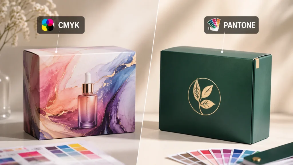

When I work on custom packaging box projects, I often find that color decisions are more important than they first appear. A box may have the right structure, the right material, and a beautiful layout, but if the printed color does not match the brand direction, the whole package can feel less controlled. A logo may look slightly different from the approved brand color. A product photo may become darker than expected. A soft gradient may lose its smooth transition. A kraft paper box may make the printed color look warmer and more muted. These details can quietly change how the final packaging is perceived.
Choose CMYK for custom packaging boxes with product photos, realistic images, gradients, or complex artwork, and choose Pantone for solid brand colors, logos, metallic inks, or fluorescent inks; test colors on the final material and finish before bulk printing.
CMYK and Pantone are two of the most common color systems used in custom packaging printing, but they are often misunderstood. I do not see them as two simple choices where one is always better than the other. CMYK is usually the better starting point for product photographs, realistic images, gradients, shadows, and complex multicolor artwork. Pantone is usually more useful when a design depends on a solid brand color, a simple logo, a large flat color area, or a special ink effect such as metallic or fluorescent printing. In many real packaging projects, the best solution may even be a combination of both.
The challenge is that color on a screen is not the same as color on a finished packaging box. A digital mockup may look bright and clean, but printed color depends on ink, paper, coating, surface texture, lamination, varnish, lighting, and the printing method. A HEX code or RGB value may work well for a website, but it does not automatically become a reliable print standard. A Pantone number gives a clearer reference, but it still needs to be checked on the actual material and finish. A CMYK file can print beautifully, but only when the images, color mode, black settings, resolution, and proofing process are handled correctly.
I wrote this guide to make the decision easier and more practical. Instead of treating CMYK and Pantone as technical terms only used by printers, I want to explain how they affect real packaging results. I will walk through what CMYK means, what Pantone means, how they differ, when each one works better, how materials and finishes change the final color, how cost and order quantity affect the decision, and how to check color before bulk production.
My approach is simple: I first look at the design content, then the color requirement, then the material, finish, quantity, and budget. This order matters because a photo-heavy carton, a minimalist logo box, a kraft mailer, a premium rigid box, and a retail packaging family may all need different color decisions. Choosing CMYK or Pantone should not be based on habit, assumption, or the idea that one system is always more professional. It should be based on what the package needs to reproduce and how the final box will actually be produced.
By the end of this guide, I want the color decision to feel clearer. CMYK is not a low-quality choice, and Pantone is not a perfect guarantee. They are both useful tools. The real value comes from using the right tool for the right part of the packaging design, approving color with the right proof, and confirming the result on the material and finish that will be used in bulk production.
CMYK vs Pantone Quick Answer
When I compare CMYK and Pantone printing for custom packaging boxes, I do not ask which system is universally better because they are designed to solve different printing problems. I first look at the artwork and identify what the packaging needs to reproduce. If the design depends on photographs, gradients, shadows, realistic textures, or many blended colors, I generally begin with CMYK. If the design depends on a specific solid brand color, a simple logo, a large flat color area, or a metallic or fluorescent ink, I usually consider Pantone.
I also look beyond the artwork itself. The final result is influenced by the packaging material, the printing process, the surface finish, the order quantity, and the level of color consistency expected across different products or production runs. A Pantone number may provide a clearer color reference, but it cannot make the same ink look identical on white coated paper, brown kraft paper, textured stock, and corrugated board. CMYK can reproduce a wide range of visual information, but it cannot reproduce every bright screen color or special ink effect.
For that reason, my quick answer is straightforward. I use CMYK when the packaging needs visual complexity. I use Pantone when the packaging needs better control of one or several important solid colors. I combine CMYK and Pantone when the design contains both complex imagery and a critical brand color that should not be left entirely to a four-color approximation.
Use CMYK When
I normally use CMYK when the packaging design contains product photographs, people, lifestyle scenes, or other realistic images. These visuals contain far more color information than most people notice at first glance. A single product photograph may include highlights on a glass bottle, soft reflections on a metallic cap, shadows beneath the product, subtle changes in skin tone, and dozens of color transitions in the background. Reproducing all of these details with individually mixed spot colors would be impractical. CMYK allows those variations to be built from cyan, magenta, yellow, and black inks printed in carefully controlled percentages.
I find CMYK especially suitable when a packaging design needs to show the product realistically. Food packaging often needs to reproduce the texture of chocolate, the freshness of fruit, the color of a prepared meal, or the surface of baked goods. Cosmetic packaging may need to show skin tones, liquid textures, makeup shades, or reflective bottles. Electronics packaging may include lifestyle photography, device screens, hands, environments, and lighting effects. In all of these cases, CMYK gives me the broad tonal range needed to move from bright highlights into deep shadows without preparing a separate ink for every visible shade.
I also prefer CMYK when a design contains gradients. A gradient is not simply one color beside another. It may move gradually from dark blue into pale blue, from pink into orange, or from a solid color into transparency. It may also include light, shadow, and several intermediate tones that create depth. CMYK reproduces these transitions through halftone dots of different sizes and densities, allowing the eye to perceive a smooth change rather than a series of separate solid colors.
The same reasoning applies to shadows and dimensional effects. When a designer creates a box that appears to have depth, floating elements, glowing edges, soft shadows, or transparent layers, the artwork depends on many small tonal changes. CMYK is generally more practical for these effects because the four process inks can be combined continuously across the image. Pantone inks can also be screened to create lighter tones, but building an entire complex illustration from many separate spot colors would usually increase the number of inks, printing plates, and registration requirements without providing a clear advantage.
I also choose CMYK when the packaging includes complex illustrations. A botanical design may contain green leaves with yellow highlights, deep blue shadows, brown stems, and small flowers in several tones. A children’s product may use colorful characters, scenery, decorative shapes, and detailed backgrounds. A gift box may include an artistic pattern with overlapping colors and textured brush effects. These designs often contain dozens or hundreds of visible color variations, even when the designer originally created them from a relatively small digital palette.
In this situation, I do not count every visible shade as a separate printing color. I use CMYK to reproduce the complete artwork through four process inks. This keeps the printing structure manageable while preserving the visual richness of the design. It also gives the designer more flexibility because the artwork can include subtle color changes without requiring a new spot ink every time another shade is introduced.
CMYK is often the more practical choice for packaging families with multiple SKUs. I may review a skincare range in which each formula uses a different ingredient image, background color, and product photograph. I may also work with a food brand that changes the flavor image and supporting colors on every box. When each SKU has different visual content, CMYK provides a consistent technical framework for reproducing those variations.
I would not automatically use a separate Pantone ink for every SKU color unless those colors perform an important branding function. Doing so could create a growing set of special inks, plates, and production references. CMYK allows the brand to change photographs, illustrations, and secondary colors more freely while maintaining a common printing method across the range.
I also consider CMYK when a design contains many mixed colors that do not need to match a strict brand standard. A decorative background may include teal, coral, beige, purple, and several intermediate tones. Those colors may contribute to the overall visual mood without each one needing to match a specific physical reference. In that situation, reproducing the overall appearance is often more important than controlling every color as an individual spot ink.
However, I never assume that CMYK can reproduce every color shown on a computer screen. Screens create color with red, green, and blue light, while printed packaging creates color by placing ink on a physical surface. Light emitted by a screen can appear brighter and more saturated than light reflected from ink and paper. This difference becomes especially noticeable with vivid blues, bright greens, intense oranges, fluorescent pinks, and other highly saturated colors.
When I see those colors in digital artwork, I expect some change during conversion to CMYK. A bright RGB blue may become more muted. A luminous green may lose some intensity. A vivid orange may shift toward red or brown. These changes do not necessarily mean that the printing is poor. They may reflect the smaller color range available through standard CMYK inks.
I therefore evaluate CMYK artwork in the correct print color space rather than relying only on a monitor. I also pay attention to the source file, the intended printing method, and the paper being used. A CMYK image printed on bright white coated paper may appear cleaner and more saturated than the same image printed on uncoated or kraft paper. The material forms part of the final color result.
I also consider the importance of black in CMYK artwork. Small black text is often best produced with black ink alone because this keeps the letters sharp and reduces the risk of colored edges caused by misregistration. A large black background, by contrast, may use a carefully prepared rich black formula that combines black with selected amounts of other process colors to create greater depth. I do not apply the same black formula to every element because text, fine lines, and large solid areas have different printing needs.
Registration is another practical factor I consider with CMYK. Because four printing plates must align, very small text, thin lines, and delicate reversed details can be sensitive to slight movement. A complex color built from several inks may show a colored edge if the plates are not perfectly aligned. This is usually managed through proper artwork preparation, trapping, printing control, and suitable minimum line widths, but it is still part of the decision.
For me, CMYK is the right starting point when the design depends on realistic images, smooth tonal transitions, detailed illustrations, or a large number of mixed colors. I use it because it can reproduce visual complexity efficiently, not because I assume it is always cheaper or always easier. The artwork, material, printing method, and required quality still need to work together.
Use Pantone When
I normally consider Pantone printing when the packaging design is built around one or a few important solid colors. Unlike CMYK, which creates colors by combining four process inks, Pantone printing usually uses an ink mixed to a defined spot-color formula. That ink is then printed as its own color rather than being simulated through overlapping cyan, magenta, yellow, and black dots.
I find this especially valuable when a brand is strongly associated with a particular color. A specific blue, green, red, or purple may appear across the logo, retail packaging, paper bags, promotional materials, and other branded items. In this situation, the color is not merely decorative. It is part of how customers recognize the brand.
A Pantone reference gives the brand owner, designer, printer, and packaging buyer a common language for discussing that color. Instead of describing it as “a slightly dark blue” or supplying only an RGB or HEX value intended for screens, the team can identify a specific Pantone reference. This does not remove every production variable, but it creates a much clearer target.
I often consider Pantone for simple logos because a logo made from one or two solid colors does not need the full visual range of CMYK. If a logo contains one navy blue and one warm orange, I can treat those colors as separate spot inks. This may produce cleaner solid areas and make the color specification easier to communicate than building both colors from several CMYK components.
The value becomes more obvious when the same logo appears across several packaging formats. A brand may place it on folding cartons, rigid boxes, mailer boxes, paper bags, sleeves, labels, and printed inserts. The materials and printing methods may not be identical, so the physical results may still vary, but the Pantone reference gives each supplier and production team a defined color target from which to work.
I also use Pantone when a packaging design contains a large area of flat color. A full-color background may look simple, but it can be demanding because the viewer sees the color across a broad, uninterrupted surface. Small shifts in density, hue, or coverage become more noticeable when there are no photographs or textures to hide them.
A dedicated spot ink can provide a more direct way to produce that large color area. Instead of creating the color by overlapping several process inks, I use one mixed ink designed to reach the required hue. This can be especially useful for strong corporate colors, deep solid backgrounds, and minimalist packaging in which color quality carries much of the visual impact.
I also consider Pantone when the design requires metallic ink. Standard CMYK can create a printed image that resembles gold, silver, bronze, or copper, but it cannot produce true metallic reflection. A CMYK gold is usually a combination of yellow, brown, orange, and black tones. It may look gold in the artwork, but it remains a flat printed simulation.
A metallic spot ink contains reflective particles that interact with light. This creates a physical effect that cannot be achieved through ordinary CMYK alone. I distinguish metallic ink from foil stamping because they are different processes. Metallic ink is printed, while foil is transferred as a separate finishing material. Both may create a metallic appearance, but they differ in reflectivity, texture, coverage, detail, cost, and production requirements.
Fluorescent colors are another reason I may use Pantone or another specified spot-ink system. Fluorescent pink, orange, yellow, or green can appear much brighter than standard process colors because the ink has special optical properties. CMYK may approximate the hue, but it cannot reproduce the same fluorescent intensity.
I find this important in packaging designed to stand out quickly on a shelf, at an event, or in a promotional campaign. However, I still consider whether the effect supports the brand and product. A fluorescent color can create strong visual impact, but it is not automatically suitable for every premium or minimalist package.
Pantone is also useful when a brand has a family of products that must share one recognizable color. The individual SKUs may use different photographs, product names, or secondary graphics, but the brand color remains consistent across the range. A fixed spot-color reference can help preserve that relationship.
I would still never tell a reader that using the same Pantone number guarantees an identical result on every package. The ink is only one part of the final appearance. The color of the paper, the surface texture, the coating, the ink film thickness, the printing equipment, and the finishing process all influence what the eye sees.
A Pantone color printed on bright white coated paper may appear more vivid than the same reference printed on uncoated paper. Uncoated fibers absorb more ink and scatter light differently, which can make the color appear softer or darker. On brown kraft paper, the natural paper color influences the printed ink because many inks are not fully opaque. A blue printed directly onto kraft may appear duller or greener than the same blue printed on white paper.
Colored and textured papers create similar considerations. A black paper may require an opaque white base before another color can be printed visibly. A strongly textured stock may affect ink coverage and fine details. Pearlescent or reflective paper may alter how the color changes under light. I therefore treat the Pantone reference as the beginning of color control, not the end of it.
I also consider whether the project is referring to a Pantone color for coated or uncoated paper. These references are viewed on different paper surfaces, and the same ink formula may appear different because the stock changes how the ink is absorbed and reflected. I do not assume that choosing the same number with a different suffix creates an entirely different color formula in every case; rather, I understand that the guide shows how the reference appears under different paper conditions.
Another detail I consider is whether the spot color will be printed as a solid area or screened into lighter tints. A Pantone ink can be printed at full strength, but it can also be screened to create lighter tonal values. This allows one ink to produce several visual tones. However, a screened spot color is not the same as adding white ink to the formula, and the appearance will still depend on dot structure, paper, and printing method.
I avoid selecting Pantone simply because it is sometimes associated with premium packaging. A poorly chosen spot color on unsuitable material will not automatically create a high-end result. Good packaging depends on the relationship between color, structure, typography, material, finish, and print quality.
If a design contains only a small logo and many detailed photographs, I may use CMYK for most of the artwork and reserve Pantone only for the logo if the color is important enough. If the logo color can be acceptably reproduced in CMYK, adding another plate may not create enough value. I make the decision according to the visual difference and the production requirements rather than using Pantone as a status symbol.
For me, Pantone is most useful when a solid color has a clear function. It may protect an important brand identity, improve the clarity of a simple logo, provide stronger control over a large flat area, or create a special metallic or fluorescent effect. I use it when that function justifies the additional ink and production setup.
Use CMYK and Pantone Together When
I often find that the most effective packaging solution is not CMYK or Pantone alone. Many designs contain two different types of color requirements. They need CMYK to reproduce photographs, gradients, illustrations, and realistic visual details, but they also contain a logo or brand color that deserves its own spot ink.
In this case, I combine CMYK with one or more Pantone colors. CMYK remains responsible for the complex artwork, while Pantone handles the important solid color. This approach allows each system to do the work it is best suited to perform.
A cosmetic packaging box provides a clear example. The front panel may contain a photograph of the product, a soft reflection on the bottle, a skin-tone image, a gradient background, and a subtle shadow. All of those elements require many tonal transitions, so I would normally reproduce them through CMYK.
The same box may also feature a distinctive purple logo used across the entire brand. If that purple is difficult to reproduce consistently through CMYK, or if small shifts would weaken brand recognition, I may specify it as a Pantone spot color. The finished job would then use CMYK for the photograph and design, plus one Pantone ink for the logo.
I apply the same reasoning to food packaging. The product photograph may need CMYK to show texture, ingredients, highlights, and natural color variation. The brand mark may use a fixed red, blue, or green that appears on every SKU. Printing that brand color as a spot ink can separate it from the changing photographic content.
Electronics packaging can follow a similar structure. The packaging may include a full-color lifestyle photograph, a rendered product image, icons, and detailed interface graphics. At the same time, the company may have a highly recognizable corporate color. I can reproduce the complex imagery in CMYK while keeping the corporate color as a separate Pantone ink.
I also use a combined approach when the artwork requires a color outside the normal CMYK range. A package may contain full-color illustrations together with a fluorescent orange accent. CMYK can handle the illustrations, but the fluorescent effect requires a special spot ink. The same principle applies when a design includes a metallic ink alongside four-color artwork.
This does not mean that every important-looking element should become a Pantone color. I always ask whether CMYK can reproduce the color within an acceptable range. If it can, the extra spot color may not be necessary. I add Pantone only when the visual, branding, or technical benefit is clear.
The number of colors matters because CMYK already uses four process inks. When I add one Pantone color, the project becomes a five-color job. Adding two Pantone colors creates a six-color job. Each additional spot color may require its own plate, ink preparation, press unit, setup, wash-up, and quality control.
The actual impact depends on the printing method and equipment. Some presses are configured to handle several colors in one pass, while others may require additional production arrangements. In flexographic printing, each color also requires its own printing plate and ink station. In offset printing, the available press configuration can influence whether all colors are printed in one pass or through additional steps.
I therefore evaluate the combined approach as a complete production system. I look at the number of colors, the size of the printed areas, the order quantity, the packaging material, the expected color tolerance, and whether the spot color will be reused in future orders. A Pantone color used consistently across a long-term packaging range may justify the setup more easily than a special color used only once on a small seasonal design.
I also pay attention to how CMYK artwork interacts with the Pantone element. If the spot-color logo sits directly beside or over a CMYK background, trapping and registration need to be considered. A tiny gap may appear if two printed areas do not align perfectly. Proper artwork preparation can create a small overlap to reduce that risk without making the overlap visible.
Overprinting also needs attention. A Pantone element set to overprint may combine visually with the CMYK inks beneath it rather than knocking them out. This can be useful in some technical situations, but it may also change the intended color. I do not leave these settings to chance because a spot color viewed on screen may not behave as expected when separated for print.
Transparency and blending effects can create further complications. A designer may place a transparent Pantone object over a CMYK photograph, expecting it to behave like a digital overlay. During print preparation, that transparency may be flattened, converted, or separated in a way that changes the result. I prefer to test these interactions before production rather than assuming the software preview is fully reliable.
I also consider the packaging material when combining the systems. A Pantone logo printed over a CMYK background on white coated paper may be relatively straightforward. The same design printed on kraft paper may need an opaque white base beneath parts of the artwork. If white ink is added, the project may involve CMYK, Pantone, and white as separate printing components.
Surface finishes can further change the relationship between the colors. A matte lamination may soften both the CMYK image and the Pantone color. A gloss finish may increase contrast and saturation. Spot UV applied over the Pantone logo may make it appear darker or more reflective than the surrounding printed area. I therefore consider the finished surface, not only the wet ink color.
The strongest reason for me to combine CMYK and Pantone is that the package genuinely needs two different functions. CMYK carries the visual story through photography, illustration, depth, and tonal variation. Pantone protects a critical solid color or creates an effect that process inks cannot reproduce well.
I do not see the combined method as a compromise. When it is used carefully, it can be the most technically appropriate solution. It allows the design to remain visually rich while giving an important brand color a more defined production reference.
My final decision remains practical. I use CMYK alone when the artwork is complex and the brand colors can be reproduced acceptably through process inks. I use Pantone alone when the design is simple and depends mainly on one or a few solid colors. I combine them when complex artwork and strict solid-color control are both essential to the same packaging design.
What Is CMYK Printing?
When I explain CMYK printing for custom packaging boxes, I describe it as a practical method for turning digital artwork into a physical printed image using four standard process inks. CMYK stands for cyan, magenta, yellow, and black. By printing these inks as carefully controlled dots and allowing them to overlap, I can reproduce photographs, gradients, shadows, illustrations, and a wide range of mixed colors without preparing a separate ink for every shade visible in the design.
The most important point I want a non-design professional to understand is that CMYK is not a collection of four visible colors placed side by side. It is a color-building system. A finished packaging design may contain hundreds of apparent colors, but those colors can still be created from the same four inks. The press changes the percentage, dot size, density, and overlap of cyan, magenta, yellow, and black in each part of the artwork.
I also avoid describing CMYK as a perfect copy of what appears on a computer screen. A screen produces color with light, while printed packaging produces color with ink, paper, and reflected light. The final result therefore depends on more than the CMYK values inside the artwork. I also consider the packaging material, printing method, ink density, press calibration, surface finish, and viewing environment.
What Do Cyan, Magenta, Yellow, and Black Do?
I use cyan, magenta, yellow, and black as the four basic building blocks of process-color printing. Cyan is a blue-green ink, magenta is a red-purple ink, yellow provides the yellow component, and black strengthens shadows, contrast, fine detail, and dark areas. These four inks work together rather than performing as four isolated colors.
When cyan and yellow overlap, the eye normally perceives green. When magenta and yellow overlap, they create red and orange tones. Cyan and magenta can create blues, violets, and purples. By changing the contribution of each ink, I can produce lighter, darker, warmer, cooler, brighter, or more neutral variations.
I find black especially important because cyan, magenta, and yellow alone do not normally create a clean, stable black in commercial printing. Combining all three process colors may produce a dark brown or muddy gray rather than a strong neutral black. Black ink gives photographs greater depth, improves contrast, strengthens small details, and helps fine text remain legible.
The letter K is used for black because the black printing plate is traditionally associated with the key plate. For a packaging buyer, the historical terminology is less important than the practical meaning. K is the black component that anchors the other process colors and prevents dark areas from depending entirely on a heavy mixture of cyan, magenta, and yellow.
I do not use black in exactly the same way for every part of a packaging design. Small black text is commonly created with black ink alone because this keeps the letter edges sharper and reduces the risk of colored outlines caused by slight plate movement. A large black background may use a controlled combination of black with additional process colors to create a deeper and richer appearance. I treat those two applications differently because a tiny ingredient list and a full black presentation panel do not have the same printing requirements.
How Does CMYK Form a Large Range of Colors?
I explain CMYK color formation through the idea of tiny printed dots. A printing press does not usually blend the four inks into one liquid color before placing it on the sheet. Instead, it prints separate dot patterns for cyan, magenta, yellow, and black. These dots vary in size and density according to the color values assigned to each part of the design.
When the dots are small enough, the eye no longer sees them individually from a normal viewing distance. It visually combines them and perceives a single color. A green leaf may actually contain cyan and yellow dots. A dark purple background may contain cyan, magenta, and black. A warm skin tone may contain carefully balanced amounts of all four inks.
This dot-based system is commonly called halftone printing. I do not expect a buyer or brand manager to calculate screen frequencies or dot structures, but understanding the principle helps explain why CMYK can reproduce so many shades with only four inks. The press changes how much of each ink is present rather than mixing a unique ink for every visible color.
A light blue may use a low percentage of cyan and little contribution from the other inks. A darker blue may require more cyan, added magenta, and a controlled amount of black. A pale pink may contain a small amount of magenta, while a strong red may combine high magenta and yellow values.
The numbers shown in a CMYK formula represent the intended contribution of each ink. For example, a red area may contain no cyan, a high level of magenta, a high level of yellow, and little or no black. A dark brown may use all four process inks in different proportions.
I treat these percentages as production instructions rather than absolute visual guarantees. The digital formula tells the press how the color should be built, but the physical result still depends on the material, ink behavior, press condition, and finishing process. The same CMYK values can look different on glossy white paper, uncoated natural paper, kraft board, or textured specialty stock.
Why Does CMYK Not Need a Separate Ink for Every Color?
One of the most useful points I explain to packaging buyers is that CMYK does not require a new ink every time another color appears in the design. A product photograph may contain blue sky, green leaves, red fruit, brown wood, white highlights, and dark shadows, but all of those areas can be reproduced from the same four process inks.
This is what makes CMYK practical for visually rich packaging. If I had to prepare a separate physical ink for every color variation in a photograph, the project would require an unrealistic number of inks, plates, press stations, and production controls. CMYK solves that problem by using four standard inks to simulate a much broader visible color range.
A photograph of a glass perfume bottle may contain transparent areas, bright reflections, dark edges, soft shadows, and colored liquid. Those visual details may look like many separate colors, but CMYK reproduces them through changing dot combinations. I do not need one ink for the reflection, another for the shadow, and another for every tone inside the liquid.
The same principle applies to illustrations. A botanical drawing may include yellow-green highlights, dark blue-green shadows, pale flowers, brown stems, and subtle texture. I can reproduce the complete illustration through the four process inks without assigning each visible shade its own spot color.
For me, this is the simplest way to explain the difference between CMYK and Pantone. CMYK combines four fixed inks to create many visual colors. Pantone normally begins with a specifically mixed ink intended to print one defined spot color. Neither approach is automatically better. They are simply designed for different types of artwork and color control.
Why Is CMYK Well Suited to Product Photography?
I normally use CMYK for printed photographs because photographs contain continuous variations in light, color, texture, and depth. Even a simple product photo includes more visual information than it may appear to contain. A bottle can reflect the studio lights, show a soft gradient across the glass, reveal a darker edge, cast a shadow, and pick up color from the surrounding background.
CMYK separates the photograph into four process-color channels. Each channel controls the contribution of one ink. When the four channels are printed in accurate alignment, the eye combines them into the final photographic image.
I find this especially valuable in food packaging. A photograph of strawberries may contain bright red fruit, darker red shadows, yellow seeds, green leaves, white highlights, and subtle surface texture. A photograph of chocolate may require warm browns, deep shadows, soft highlights, and fine detail to make the product look realistic. CMYK can reproduce all of those variations through four process inks.
Cosmetic packaging creates similar demands. A skincare box may show skin tones, cream textures, transparent liquid, reflective glass, or a metallic cap. Makeup packaging may need to represent subtle differences between shades. These details depend on gradual tonal changes rather than a few flat solid colors.
I also use CMYK for electronics packaging and lifestyle imagery. A device image may contain screen graphics, metallic surfaces, reflections, hands, furniture, and environmental lighting. Reproducing all of those elements through a small number of separate Pantone inks would be unnecessarily complicated.
I still pay close attention to the quality of the original photograph. CMYK can reproduce detailed visual information, but it cannot restore information missing from the source image. A low-resolution photograph can remain blurred or pixelated regardless of how well the press is controlled. Image resolution, focus, lighting, and retouching quality all influence the printed result.
I also consider the paper surface. A photograph printed on smooth coated paper can usually retain finer detail, sharper edges, and stronger contrast than the same photograph printed on rough uncoated stock. A textured surface may soften small details, while kraft board can influence the color balance. I therefore evaluate the photograph together with the final packaging material rather than judging it only on screen.
Why Is CMYK Suitable for Gradients, Shadows, and Complex Artwork?
I use CMYK for gradients because it can gradually change the amount of each process ink across the printed area. A gradient may move from dark blue to light blue, from pink to orange, or from a solid color into a pale background. Instead of printing separate blocks of color, CMYK changes the dot percentages in small steps so the eye perceives a smoother transition.
This makes CMYK suitable for soft shadows, glowing effects, transparent overlays, realistic lighting, and dimensional illustrations. A designer may want a product to appear as though it is floating above the background. That effect requires a shadow that gradually fades rather than stopping with a hard edge. CMYK can reproduce the transition by reducing the ink percentages across the shadow area.
I also find CMYK useful for artwork containing several transparent layers. A colored shape may overlap a photograph, while a highlight or texture sits above both. Digital artwork can contain many interactions that produce new colors where the layers overlap. CMYK converts those visual relationships into process-color information that can be printed through the four channels.
Complex illustrations benefit from the same flexibility. A detailed floral pattern may contain multiple greens, pinks, yellows, shadows, outlines, and textured brush effects. A children’s product may include characters, landscapes, decorative objects, and colorful backgrounds. A seasonal gift box may contain several illustrations with subtle changes in hue and light.
Although CMYK handles this complexity efficiently, I do not assume every gradient will print perfectly without careful preparation. Very subtle gradients can sometimes show visible tonal steps, especially when the source file has limited color information or the transition is compressed into a small area. Dark gradients may also behave differently from light ones because they contain heavier ink coverage.
I therefore review the source artwork, the gradient length, the color range, and the intended printing process. A smooth digital preview is helpful, but it does not always reveal every issue that may appear in print. Proofing remains important when a large gradient is a major visual element of the box.
How Do CMYK Halftone Dots Stay Visually Smooth?
I often explain that the four CMYK dot patterns are printed at different angles. This helps prevent the dots from stacking in an obvious repetitive pattern. When the screen angles are controlled correctly, the dots form a fine rosette structure that is difficult to notice at normal viewing distance.
This matters because poorly controlled dot interaction can create unwanted patterns known as moiré. A moiré pattern may appear as waves, grids, or repeated visual interference across an image. It can be especially noticeable in photographs of fabrics, screens, fine lines, or other repeating textures.
I do not expect a brand manager to specify technical screen angles, but I think it is valuable to understand that full-color printing is not simply four flat layers placed on top of one another. The dot structure, image resolution, press setup, and plate alignment all contribute to the final appearance.
The fineness of the dots also affects detail. A smoother coated paper can often support a finer halftone screen than a rough corrugated or uncoated surface. Fine dots may be lost or distorted on an absorbent or textured material. This is one reason why I do not expect the same photograph to appear equally sharp on every packaging substrate.
When artwork contains very thin lines, tiny reversed text, or delicate details, I evaluate whether the chosen material and printing method can hold them reliably. CMYK can reproduce detail well, but the physical surface must be capable of supporting the dot structure and registration required by the design.
Why Does CMYK Use Subtractive Color?
I describe CMYK as a subtractive color system because the inks absorb, or subtract, parts of the light that reaches the printed surface. The paper reflects the remaining light back to the eye, and that reflected light determines the color we see.
This is different from a screen, which adds red, green, and blue light together. A white screen is created when the display emits strong red, green, and blue light. A white area on ordinary printed packaging is usually created by leaving the white paper unprinted.
This difference helps explain why printed colors often look less luminous than screen colors. A monitor emits light directly toward the viewer. Printed ink depends on ambient light entering the surface and reflecting back. The material, texture, coating, and lighting environment all influence the result.
I find the concept easier to understand when I compare a bright digital blue on a phone with the same color printed on paper. The phone can emit a highly saturated blue light. The printed box must approximate that appearance using physical inks that absorb and reflect light. Some brightness is naturally lost in the transition.
The whiteness of the paper also matters because CMYK printing normally assumes that the unprinted surface provides the lightest value. A bright white paper gives the process colors a cleaner base. A cream, gray, or brown material changes the reflected light and therefore changes how every printed color appears.
Why Can RGB Colors Not Directly Represent CMYK Printing?
I always explain that RGB and CMYK are built for different environments. RGB stands for red, green, and blue, and it is used by screens. CMYK is used for physical printing. The two systems overlap, but they do not contain exactly the same range of colors.
An RGB screen can display some colors that ordinary CMYK inks cannot reproduce. These colors are often described as being outside the CMYK gamut. Bright electric blues, vivid greens, intense oranges, fluorescent pinks, and other highly saturated colors are common examples.
When RGB artwork is converted to CMYK, colors outside the printable range must be moved to the nearest achievable process-color value. A luminous green may become duller. A bright blue may shift slightly toward purple or become less intense. A vivid orange may lose some brightness or move toward red.
I do not treat these changes as automatic printing defects. They are often a natural result of converting light-based colors into ink-based colors. The important task is to identify the changes before production and decide whether the CMYK result remains acceptable.
The monitor itself can also be misleading. A screen set to high brightness can make the design appear lighter, cleaner, and more vibrant than the printed box. Two monitors may display the same RGB file differently because they use different panels, settings, calibration, and color profiles.
A phone photo of a printed sample adds another layer of uncertainty. The phone camera adjusts exposure, white balance, contrast, and saturation. The image is then displayed on another screen with its own settings. For that reason, I never consider a phone photograph an exact color reference.
I use digital previews to check layout, copy, image placement, and general appearance. When color is critical, I rely on a controlled proof or physical sample on the intended material rather than expecting a screen to predict the final print perfectly.
Can CMYK Accurately Reproduce Every Brand Color?
I do not claim that CMYK can reproduce every brand color exactly. It can create a wide range of colors, but its gamut is limited by the characteristics of cyan, magenta, yellow, and black inks.
Some brand colors convert into CMYK very successfully. A dark navy, neutral gray, warm red, or muted green may be reproduced within an acceptable range. Other colors are more difficult. Bright orange, highly saturated blue, fluorescent pink, vivid purple, and intense green can lose clarity or shift during conversion.
I also consider how the color is used. A slight change in a small decorative icon may be difficult to notice. The same shift across a large background or a well-known logo can be much more obvious. Color importance depends on the size, position, repetition, and branding role of the element.
The way the brand defines its color also matters. A HEX code is intended for digital use. An RGB value describes emitted light. A CMYK formula describes a process-ink combination. A Pantone number describes a standardized spot-color reference. These values are related, but they are not interchangeable promises of identical appearance.
When a brand supplies only an RGB or HEX color, I expect the print version to require interpretation. The converted CMYK value may be the closest available process-color match, but it may not carry the same visual intensity as the screen version.
If the color is critical, I compare the CMYK reproduction with the intended physical reference. If CMYK produces an acceptable result, there may be no reason to add a spot color. If the difference is too large and the color carries significant brand value, Pantone may become a more suitable option.
I therefore avoid answering the question with a simple yes or no. CMYK can reproduce many brand colors effectively, but not every color exactly. The correct judgment depends on the specific color, material, printing method, and acceptable tolerance.
Why Can the Same CMYK Values Look Different on Different Papers?
I treat the paper or board as an active part of the color result. Ink is not viewed by itself. It is viewed after it has been printed onto a surface that has its own color, texture, absorbency, and level of brightness.
Coated paper normally has a smoother, less absorbent surface. The ink remains closer to the top of the sheet, which can produce sharper dots, stronger contrast, and greater apparent saturation. Fine photographs and small details are often easier to reproduce on this type of surface.
Uncoated paper absorbs more of the ink into its fibers. This can make colors appear softer, darker, or less saturated. Fine details may lose some sharpness because the ink spreads slightly into the paper structure.
This spreading is often described as dot gain. A printed halftone dot may appear larger on paper than it was intended to be in the digital file or plate. When the dots become visually larger, the image can look darker because more of the paper surface is covered by ink.
I expect more dot gain on absorbent or rough materials than on smooth coated paper. Color management and press settings can compensate for part of the effect, but the physical surface still has a strong influence.
Kraft paper introduces the additional issue of background color. The natural brown tone remains visible through many standard process inks because they are not fully opaque. A yellow may become warmer and less clear. A blue may appear darker or slightly greener. Pale colors may lose contrast.
When I need bright color on kraft or dark paper, an opaque white layer may be printed first. The CMYK image can then be printed over the white base. This improves brightness and color separation, but it also changes the technical structure and cost of the job.
Textured paper affects ink coverage and reflected light. A strong texture may interrupt fine halftone dots or create small variations in solid areas. Pearlescent, metallic, or colored papers can change the appearance further because the material contributes its own optical effect.
For this reason, I do not approve a color on one material and assume it will remain unchanged when transferred to another. If the stock changes, the printed result should be reviewed again.
How Does Total Ink Coverage Affect CMYK Printing?
I also pay attention to the total amount of ink placed in one area. A very dark CMYK color may contain high percentages of cyan, magenta, yellow, and black. If the combined ink coverage is too heavy, the sheet may dry slowly, mark during handling, lose detail, or create production problems.
This is often called total ink coverage or total area coverage. The acceptable limit depends on the paper, press, ink system, and production conditions. A smooth coated stock may accept a different ink load from an absorbent uncoated material.
I do not create dark colors simply by setting every channel to one hundred percent. That would place an excessive amount of ink on the surface. Instead, I use controlled formulas that create visual depth without overloading the material.
Heavy ink coverage can also affect folding, cutting, laminating, and gluing. Ink that has not dried or cured properly may scuff, transfer, crack, or interfere with later finishing steps. Packaging is not only printed; it is also die-cut, creased, folded, glued, laminated, and packed.
This is why I see CMYK artwork preparation as part of the complete manufacturing process. A color formula that looks strong on screen may need to be adjusted so it can be printed and finished reliably.
What Is the Difference Between Standard Black and Rich Black?
I distinguish between standard black and rich black because they serve different purposes. Standard black normally uses black ink alone. I prefer it for small text, barcodes, fine rules, and other details that require maximum sharpness.
If small text is created from all four process inks, the cyan, magenta, yellow, and black plates must align precisely. Even a slight shift can create colored edges and make the text appear less sharp. Using black ink alone reduces that risk.
Rich black uses black together with selected amounts of one or more process colors. I may use it for large black backgrounds or wide dark panels where ordinary black would look too flat or gray.
I do not use one universal rich-black formula for every press and material. The appropriate combination depends on the printing process, paper, ink limit, and required visual tone. A cool black may contain more cyan, while a warm black may contain more magenta or yellow.
I also consider what appears next to the black area. A large rich-black background surrounding white text needs careful registration and trapping. A black area near a light-colored panel must also be controlled to prevent contamination or visible misalignment.
Understanding this difference helps buyers see why “black” is not always a single technical instruction. The visual role and size of the area determine how I prepare it.
Why Does Registration Matter in CMYK Printing?
CMYK normally requires four color separations, and those separations must align during printing. This alignment is called registration.
When registration is accurate, the cyan, magenta, yellow, and black dots combine correctly and the image appears sharp. When the plates or color units shift slightly, the viewer may see colored edges around text, lines, or image details.
I pay particular attention to very small text, thin lines, reversed text, barcodes, and high-contrast edges. These elements reveal registration differences more easily than soft photographs or textured illustrations.
Registration tolerance depends partly on the printing method and material. A stable smooth sheet may support tighter alignment than flexible corrugated material. Direct flexographic printing on corrugated board may require simpler artwork and stronger line widths than offset printing on coated paper.
I do not consider every microscopic shift a serious defect. Commercial printing operates within manufacturing tolerances. The goal is to prepare the artwork and select the printing method so that normal movement does not harm readability or visual quality.
Trapping can help reduce visible gaps between adjacent colors. A small overlap is created where two printed areas meet, allowing for minor registration variation. The overlap is designed to be difficult to notice while preventing a white line from appearing between the colors.
Why Can Different Printing Methods Produce Different CMYK Results?
I explain that CMYK describes the color system, but it does not describe one single printing technology. Offset printing, flexographic printing, digital printing, and inkjet proofing can all use CMYK, yet they form and place color differently.
Offset printing transfers ink from a printing plate to a rubber blanket and then onto the paper. It can reproduce fine detail and controlled halftones, especially on suitable coated and uncoated stocks.
Flexographic printing uses flexible relief plates and is widely used for corrugated packaging, labels, and other packaging materials. The ink, plate structure, substrate, and anilox roll influence color density and detail.
Digital printing creates the image without conventional printing plates. It can be useful for shorter runs, variable artwork, and faster sampling, but its colorants and image-formation process may differ from those used in offset or flexographic production.
An office printer, digital proof, and production press may all receive the same CMYK file but produce visibly different output. Each device has its own color range, profile, ink or toner system, screening method, and substrate.
This is why I do not assume that a digitally printed sample will automatically match an offset or flexographic production run exactly. A digital proof may be useful for evaluating design direction, but its relationship to the final printing method must be understood.
Why Do Color Profiles Matter?
I use color profiles to help translate digital color values into the behavior of a specific printing condition. A CMYK number by itself does not describe every detail of the press, paper, ink, and dot gain.
A color profile represents an expected relationship between digital values and printed output. Different profiles may be created for coated paper, uncoated paper, regional printing standards, or specific production conditions.
When artwork is converted from RGB to CMYK, the selected profile influences how out-of-gamut colors are adjusted and how black is generated. Two conversions using different profiles may produce different CMYK values even when the original RGB artwork is the same.
I do not expect every buyer to manage ICC profiles personally, but I believe it is important to understand why “convert the file to CMYK” is not always a complete instruction. The conversion should reflect the intended printing condition.
If the wrong profile is used, shadows may become too heavy, neutral grays may contain unnecessary color, or the total ink coverage may exceed what the paper can handle. Color management helps reduce these problems before the artwork reaches the press.
Why Can Different Presses Produce Slight Color Differences?
I explain that CMYK is standardized in principle, but printing remains a physical manufacturing process. Two presses can receive the same CMYK file and produce slightly different results because their calibration, ink systems, screening methods, pressure, and operating conditions are not identical.
Ink density has a direct effect on appearance. A heavier cyan density can make blues and greens look stronger. Changes in magenta can affect reds, purples, and skin tones. Small density adjustments may be necessary during production to maintain balance.
Plate condition, blanket condition, water balance in offset printing, anilox selection in flexographic printing, and the characteristics of the substrate can also influence the result.
Environmental conditions matter as well. Temperature and humidity can affect paper moisture, ink behavior, drying, and dimensional stability. Packaging factories control these variables as much as practical, but physical production is never as fixed as a digital screen.
I do not present normal variation as evidence that CMYK is unreliable. Good printing control aims to keep variation within an acceptable range. The important distinction is between reasonable manufacturing tolerance and a visible inconsistency that fails the approved standard.
Why Can Repeat Production Runs Show Small Differences?
I prepare readers for the possibility that a repeat order may not look absolutely identical under every condition, even when the same artwork and CMYK values are used.
Paper may come from a different manufacturing batch. Its brightness, coating, moisture, or surface may vary slightly. Ink batches can also have small differences. The press may operate under different environmental conditions, and the finished packaging may be laminated or varnished in a separate production period.
Large flat areas make variation easier to notice because the eye sees one broad uninterrupted color. A detailed photograph can hide small density differences more easily.
I do not rely on the CMYK formula alone when repeat-order consistency is important. I also consider the approved material, printing method, surface finish, production notes, and physical reference sample.
The physical sample is useful because it records the combined result of ink, paper, press, coating, and finish. A CMYK formula records only the intended ink percentages.
I also define expectations realistically. Two boxes placed side by side under controlled light will reveal differences that may be difficult to notice when products are sold separately in different locations. The acceptable tolerance should reflect the commercial importance of the color and the way the packaging will actually be used.
How Do Lamination and Varnish Change CMYK Colors?
I do not judge CMYK color only before finishing because lamination and varnish can change the visual result.
Gloss lamination can make colors appear deeper, more saturated, and more reflective. Dark areas may look stronger, while photographs may gain contrast.
Matte lamination reduces surface reflection and can make colors appear softer or slightly more muted. It may create a more restrained visual style, but it can also change how the buyer perceives saturation and depth.
Soft-touch lamination changes both the tactile and optical surface. Its lower reflection can affect the appearance of dark colors and large solid areas.
Varnish can produce similar changes depending on its gloss level and coverage. Spot UV creates a strong contrast between glossy and non-glossy areas, so the same printed color may appear darker or richer beneath the glossy coating.
I therefore prefer to evaluate critical colors after the intended finish has been applied. Approving an unlaminated sheet and then adding a strong matte or gloss finish can lead to unexpected differences.
How Should a Packaging Buyer Read a CMYK Formula?
When I show a packaging buyer a CMYK formula, I explain that the four values describe the relative contribution of cyan, magenta, yellow, and black in that area. They do not describe a universal physical color independent of production conditions.
Two different CMYK formulas can sometimes appear visually similar. The same formula can also look different on different papers or presses.
I use the formula to communicate how the color should be separated for printing. I then use proofs, material tests, color measurements, and physical samples to evaluate how that formula behaves in the actual production environment.
This helps prevent a common misunderstanding. A buyer may believe that keeping the same CMYK numbers guarantees an identical result forever. In reality, the numbers are only one part of the standard.
The complete result depends on the file profile, ink, press, substrate, dot gain, finish, and viewing light. When color consistency is important, I control as many of those factors as possible instead of relying on the four numbers alone.
How Do I Decide Whether CMYK Is the Right Choice?
I begin with the artwork. If the packaging contains photographs, gradients, shadows, realistic textures, or complex illustrations, CMYK is usually the most logical starting point.
I then examine the brand colors. If the important solid colors can be reproduced acceptably within the CMYK range, the entire design may remain in four-color process printing. If one color falls clearly outside that range or requires stronger control, I may consider adding a Pantone spot color.
I also look at the material. Smooth white coated paper supports a different visual result from kraft board, rough uncoated stock, or direct-printed corrugated material. A design suitable for one surface may need adjustment for another.
The printing method and quantity also matter. Offset, flexographic, and digital printing have different production structures. I do not choose CMYK based only on the number of boxes; I choose it because the artwork requires the color range and tonal flexibility that four-color printing provides.
My final judgment is therefore based on the complete packaging system rather than a single rule. CMYK is not simply “the option for many colors.” It is the option I use when the artwork depends on continuous tone, realistic imagery, mixed hues, and visual complexity.
How I Explain CMYK in One Practical Sentence
When I need to explain CMYK as simply as possible, I say that it uses four fixed process inks to build a large range of printed colors instead of mixing a separate physical ink for every shade in the artwork.
That is why CMYK works so well for photographs, gradients, shadows, illustrations, and multicolor packaging graphics. It gives me the flexibility to reproduce complex visual information through a manageable four-ink process.
At the same time, I remind readers that CMYK does not reproduce every screen color exactly, and it does not look identical on every paper or press. The final result is shaped by the color conversion, material, printing technology, ink density, surface finish, and normal production tolerance.
For me, the value of CMYK is not that it promises perfect color under every condition. Its value is that it provides an efficient and widely used way to transform visually complex packaging artwork into a printable physical image.
What Is Pantone Printing?
When I explain Pantone printing for custom packaging boxes, I describe it as a method of producing a clearly identified color with its own dedicated ink. The full name is the Pantone Matching System, commonly shortened to PMS. Instead of asking a press to build every color by overlapping cyan, magenta, yellow, and black, I can specify a Pantone reference and use a specially prepared spot-color ink for that part of the artwork.
I find Pantone printing most valuable when one solid color has a specific purpose. It may be the main color of a logo, a recognizable brand blue, a large red background, a fluorescent accent, or a metallic ink that standard CMYK cannot reproduce convincingly. In these situations, the color is not simply one decorative element among many. It may be central to how the brand is recognized and how the packaging is judged.
I also make an important distinction from the beginning. Pantone provides a clearer and more standardized color reference, but it does not guarantee that the color will look perfectly identical on every packaging material. The final appearance can still change with paper color, surface texture, ink absorption, printing method, ink density, lamination, varnish, lighting, and normal production variation. I treat Pantone as a stronger color communication system, not as a way to remove every physical variable from printing.
What Does the Pantone Matching System Mean?
When I use the term Pantone Matching System, I am referring to a standardized library of identified colors used to improve communication between designers, brand owners, packaging buyers, and printers. Each color is assigned a reference, allowing everyone involved in the project to discuss a more clearly defined target.
This is important because ordinary color descriptions are too subjective for packaging production. If someone asks for a dark green, I may imagine a cool forest green, while another person may imagine an olive green with more yellow. Descriptions such as royal blue, warm red, luxury gold, or soft pink may sound clear in conversation, but they do not provide enough technical precision for ink preparation.
Digital values can also create confusion. A HEX code may define a color for a website, while an RGB value may describe how the same color appears on a screen. Neither value directly defines how a physical ink should look when printed on coated paper, kraft paper, textured stock, or corrugated board. When I use a Pantone reference, I replace a vague digital or verbal description with a more specific physical color target.
I still do not consider the Pantone number to be the entire production specification. A color reference alone cannot tell me which paper will be used, whether the surface will be laminated, how much ink will be applied, or how the selected press will reproduce the color. For a reliable packaging result, I combine the Pantone reference with the actual material, printing method, finishing requirements, and an approved physical sample whenever color is critical.
What Is a Pantone Spot Color?
When I refer to a Pantone spot color, I mean a color that is normally prepared and printed as its own ink rather than being created entirely from the four CMYK process inks. The word “spot” can sometimes be misunderstood. It does not mean the color is only printed in a small spot on the box. It means the color exists as a separate color separation and a separate ink in the printing process.
For example, if a packaging design contains one distinctive blue logo, I may specify that blue as a Pantone spot color. The ink is prepared before printing, placed in its own press unit, and printed wherever that blue appears in the artwork. The same prepared ink may be used for the logo, a border, a block of text, and a large background panel if they all require the same color.
A CMYK blue is created differently. It may be formed by overlapping cyan, magenta, and sometimes black dots. Its final appearance depends on the balance and alignment of several process inks. A Pantone blue is generally printed from one prepared ink mixture, giving the press a more direct target for that solid color.
I find this distinction especially important for minimalist packaging. A simple design may contain only a logo, a product name, and one large area of color. Because there are few visual elements, the quality of the solid color becomes more noticeable. In this situation, a dedicated spot color can have more value than it would in a visually busy design filled with photographs and complex illustrations.
How Is a Pantone Ink Prepared?
I usually explain Pantone ink preparation as a controlled mixing process. Selected base inks are measured and combined according to a target formula. The resulting mixture becomes the spot ink used for that particular color.
The principle may sound simple, but small changes in the mixture can influence the result. A little more yellow can make a green warmer. A small increase in blue can make it cooler. Additional black may deepen the color but also reduce brightness. Transparent base, white, and other components can affect strength, opacity, and lightness.
I also pay attention to how thoroughly the ink is mixed. A well-prepared formula still needs to be blended evenly so the color remains consistent throughout the container. If the ink is not fully mixed, one portion may appear stronger or slightly different from another.
The amount of ink placed on the material also matters. A heavy ink film can make a color appear deeper or more saturated, while a lighter film can make the same formula appear weaker. This is why I do not assume that the correct formula alone guarantees the correct result. Ink preparation and ink application must work together.
The type of ink also depends on the printing method and substrate. Offset ink used on coated paper behaves differently from water-based flexographic ink used on corrugated packaging. Screen-printing ink can have greater thickness and opacity. UV-curable ink reacts differently from conventional oil-based ink. The Pantone reference may remain the target, but the physical ink system changes how that target is approached.
What Do Pantone Numbers Actually Do?
I use Pantone numbers as shared color identifiers. They allow several people to discuss the same intended color without depending on memory, screen display, or subjective language.
This becomes particularly useful when a packaging project moves through several departments. A branding agency may develop the identity, a graphic designer may create the packaging artwork, a product manager may approve the design, a procurement team may request quotations, and a printer may prepare the final production files. A Pantone number gives all of them a common reference.
Pantone numbers can also support consistency across different printed items. A brand may use one main color on folding cartons, rigid boxes, paper bags, labels, sleeves, inserts, and retail displays. These products may not use the same material or printing method, but the Pantone reference provides a common direction.
I still avoid presenting the number as a universal guarantee. If one supplier prints the color on smooth white coated paper and another prints it directly on brown corrugated board, the results may look noticeably different even when both are working toward the same Pantone reference. The number identifies the intended color, while the substrate and process determine how closely the result can visually approach it.
For repeat packaging orders, I prefer to preserve more than the Pantone number. I also consider the paper specification, the printing method, the finishing treatment, the ink notes, the approved sample, and any agreed tolerance. The Pantone number tells me what the color should be, while the complete production record tells me how that color was successfully achieved on the specific package.
Why Is Pantone Printing Suitable for Logos?
I often consider Pantone printing for logos because logos are usually built from clean, recognizable shapes and solid colors. They do not normally require the wide tonal range needed for a photograph, but their color may carry strong brand importance.
If a logo uses one distinctive blue, red, green, or purple, I can define that color through a specific Pantone reference instead of recreating it from several CMYK percentages. This gives the brand and printer a clearer target during file preparation, ink mixing, proofing, and production.
A single spot color can also reduce one particular type of registration risk. If a blue logo is created from cyan, magenta, and black, all three process colors must align correctly. A slight shift can create colored edges around fine text or small graphic details. When the logo is printed with one Pantone ink, that specific color no longer depends on the alignment of several process plates.
I find this especially helpful when a logo contains small lettering, narrow lines, or detailed symbols. The cleaner color separation can support sharper edges, provided the printing method and packaging material are capable of holding the detail.
However, I do not automatically recommend Pantone for every logo. If the logo color can be reproduced acceptably in CMYK and the overall artwork already uses four-color printing, adding a separate spot ink may not provide enough benefit to justify the extra plate and press setup. I look at the importance of the color, the size of the logo, the number of packages being produced, and whether the color will be reused across multiple SKUs and future orders.
Why Is Pantone Useful for Core Brand Colors?
I find Pantone particularly useful when a brand is strongly associated with one color. In such cases, the color is not merely part of the design; it contributes to recognition.
A customer may identify a product range from its specific green before reading the product name. A cosmetics brand may use one particular pink across every box. A technology brand may rely on a consistent blue across packaging and marketing materials. When color has this level of importance, a more precise reference can reduce ambiguity during production.
Pantone is also helpful when many SKUs need to share one stable visual element. The photographs, illustrations, product names, and secondary colors may change from one box to another, while the main brand color remains constant. A fixed Pantone reference can act as a visual anchor across the range.
I still keep expectations realistic. Pantone can strengthen communication and control, but it cannot make all boxes identical if the materials differ. A logo printed on coated folding carton stock may appear brighter than the same logo printed on a matte paper bag. A brand color on a rigid box may change after soft-touch lamination. A direct-printed corrugated mailer may have a different surface and ink system from an offset-printed carton.
For me, good brand color management means preserving the identity of the color across different applications, while accepting that each material may need its own production adjustment and physical approval.
Why Does Each Pantone Color Usually Need Its Own Printing Plate?
I explain the plate requirement by treating each Pantone color as an independent printing component. If a design contains one Pantone blue, the blue normally needs its own color separation and printing plate. If a Pantone red is added, the red normally needs another plate.
The plate defines where that ink should appear. In offset printing, one plate usually works with one ink unit. In flexographic printing, each color generally uses its own flexible plate and ink station. The equipment differs, but the basic principle remains the same: one separate ink needs one separate way to transfer its artwork to the packaging.
This is why the number of Pantone colors affects production complexity. A simple one-color box may require one ink and one plate. A two-color design may require two inks and two plates. A CMYK design already uses four process colors, so adding one Pantone color usually turns it into a five-color job.
Each additional spot color may affect plate preparation, ink mixing, press setup, registration, production time, wash-up, quality control, and cost. I therefore do not add Pantone colors simply because they are available. Every extra color should have a clear design or branding purpose.
Press configuration also matters. Some presses can handle CMYK plus one or two spot colors in a single pass. Other presses may have fewer units, which can require an additional run or a different production arrangement. The same design may therefore have a different cost and workflow on different equipment.
Can Pantone Produce Colors That CMYK Cannot Reproduce Well?
I often use Pantone when the target color falls outside the practical color range of standard CMYK. CMYK can reproduce a broad range of colors, but it cannot create every bright, saturated, or special color with equal strength.
Certain vivid oranges, intense blues, saturated greens, bright purples, and clean reds can lose vibrancy when converted to CMYK. The process version may be close enough for some projects, but it may not preserve the visual character of a highly distinctive brand color.
A Pantone spot ink can sometimes reach a cleaner or stronger result because the ink is mixed specifically for that hue. Instead of asking cyan, magenta, yellow, and black to simulate the color, I use a dedicated mixture designed to approach it more directly.
I still evaluate the actual difference before choosing a spot color. A color may appear different in a technical comparison but remain visually acceptable in the finished packaging. In another project, even a modest shift may be unacceptable because the color is central to the brand identity.
I therefore do not decide based only on whether CMYK can mathematically approximate the color. I look at how the color appears on the actual packaging material, how large the area is, how closely customers associate it with the brand, and whether the improvement justifies the added production requirements.
How Does Pantone Handle Metallic Colors?
I consider metallic inks one of the clearest examples of what Pantone or another spot-color system can achieve beyond standard CMYK. CMYK can simulate the appearance of gold, silver, bronze, or copper using ordinary process inks, but the result remains flat because the inks do not contain reflective metallic particles.
A CMYK gold may use combinations of yellow, magenta, and black to create a golden hue. It can look convincing in a digital design or printed illustration, but it will not reflect light like true metallic ink.
Metallic spot inks contain particles that interact with light. The printed area may appear brighter or darker as the viewing angle changes. This gives the packaging a physical effect that ordinary process inks cannot reproduce.
I also distinguish metallic ink from foil stamping. Metallic ink is applied through a printing process and normally sits within the printed surface. Foil is transferred as a separate material and can create stronger reflectivity, sharper mirror-like effects, and a different tactile appearance.
The choice between metallic ink and foil depends on the desired effect, artwork detail, substrate, order quantity, and budget. Metallic ink may suit fine printed areas or a more subtle sheen, while foil may be selected for stronger reflection and contrast.
I never describe metallic Pantone ink as automatically identical to metallic foil. They are different techniques with different visual and production characteristics.
How Does Pantone Handle Fluorescent Colors?
Fluorescent colors are another area where standard CMYK has clear limitations. A fluorescent pink, orange, yellow, or green can appear far brighter than an ordinary process-color version because fluorescent pigments interact with light differently.
CMYK may approximate the general hue of a fluorescent color, but it cannot reproduce the same intensity. A bright fluorescent orange converted to process color may look like a normal orange. The basic color family remains, but the visual energy is lost.
I consider fluorescent spot ink when the packaging genuinely needs high visibility. It may be useful for promotional packaging, youth-oriented products, sports products, limited-edition designs, event packaging, or warning and attention elements.
I still consider how the fluorescent ink will work with the brand and material. Fluorescent colors can fade more quickly than conventional inks under strong light, and their appearance may change on absorbent or colored paper. They can also be difficult to reproduce accurately in photographs and online product images.
For me, a fluorescent Pantone color is a specific visual tool. I use it when the brightness is central to the design, not merely as an unnecessary decoration.
Is Pantone Always More Accurate Than CMYK?
I do not describe Pantone as automatically more accurate in every type of artwork. Pantone is usually more direct for a specific solid color, but CMYK is more appropriate for photographs, complex illustrations, gradients, and continuous tonal changes.
If the objective is to reproduce one corporate blue, Pantone may provide a clearer and more controllable target. If the objective is to reproduce a photograph containing hundreds of shades, CMYK is the more accurate and practical system because it is designed to create that tonal complexity.
The word “accuracy” therefore needs context. I ask what is being reproduced. I also ask whether accuracy means matching one solid reference, preserving photographic realism, maintaining consistency across SKUs, or reproducing a special ink effect.
A Pantone color can reduce some variables associated with building a solid color from several process inks, but it still depends on ink mixing, film thickness, paper, press condition, and finish. It offers a stronger reference, not immunity from variation.
Can Pantone Guarantee the Same Color on Every Packaging Material?
I never state that Pantone guarantees exactly the same color on every material because that would ignore the physical behavior of ink and paper.
Pantone provides a clearer color reference, but the final result can still change with paper color, surface texture, ink absorption, printing equipment, ink density, finishing, and lighting. The same ink formula can appear brighter, darker, warmer, cooler, cleaner, or more muted depending on the surface beneath it.
Coated paper normally keeps more ink near the surface. The color can appear sharper and more saturated because the coating limits absorption. Uncoated paper allows more ink to enter the fibers, which can soften the color and reduce apparent brightness.
Kraft paper adds its own brown tone to the result. Many spot inks are not fully opaque, so the paper color remains visible through the ink. A blue may appear darker or slightly greener. A yellow may become warmer. A pale color may lose contrast.
Textured paper can interrupt coverage and change reflected light. A deeply textured stock may produce small variations between raised and recessed areas. Pearlescent or metallic paper may shift the perceived color depending on the viewing angle.
For this reason, I always treat the Pantone reference and the packaging material as one combined decision. A color approved on coated white stock should not be assumed to look identical on kraft, black paper, or uncoated stock.
What Do Pantone C and Pantone U Mean?
When I see a Pantone reference followed by C, I understand that the color is being shown on coated paper. When I see U, I understand that the color is being shown on uncoated paper.
The distinction matters because the same general ink color can look very different on the two surfaces. Coated stock normally produces a cleaner, brighter appearance, while uncoated stock often creates a softer and more absorbed result.
I do not interpret C and U as a simple instruction that one is superior to the other. They represent different viewing conditions. The correct reference should be selected according to the intended packaging material.
If a folding carton uses coated paperboard, I consider the coated reference more relevant. If a paper bag uses natural uncoated kraft, the uncoated reference may offer a more realistic visual starting point.
I also remember that a Pantone guide is a physical printed product. Its swatches can fade, yellow, or become contaminated over time. A heavily used or old guide may no longer represent the intended color as reliably as a newer, properly stored one. For critical color work, I prefer a suitable and well-maintained physical guide.
How Does Pantone Printing Work on Kraft Paper?
I treat kraft paper as a special color condition because its brown base influences nearly every transparent or semi-transparent ink printed on it.
When I print a Pantone color directly onto kraft, the paper tone combines visually with the ink. A bright blue can appear darker and duller. A clean yellow can become more golden or brown. Light pink may lose clarity. The result may still be attractive, especially for natural or earthy branding, but it will not look the same as the same ink on white coated paper.
If the design requires a brighter and cleaner color, I may consider an opaque white underbase. White ink is printed first, and the Pantone color is then printed over it. This separates the color from the brown substrate and can improve brightness.
However, the white underbase introduces additional production considerations. It normally requires another plate and printing unit. The white and Pantone layers must align. The underbase may also change the surface texture and the final color strength.
I therefore do not recommend white underprinting automatically. I first consider whether the natural kraft influence supports the intended design. A muted spot color may look authentic and appropriate on kraft, while a bright beauty or technology brand color may need greater separation.
How Does Pantone Printing Work on Dark Paper?
Dark paper creates an even stronger opacity challenge. A normal transparent spot ink may become weak or nearly invisible when printed directly on black, navy, deep red, or another dark-colored stock.
In these situations, I may use an opaque white underbase or a specially formulated opaque ink. The color is then built over a lighter foundation instead of competing directly with the dark surface.
I still test the result because opacity is not absolute. A white base may require more than one pass to reach the desired strength. A thick ink layer can affect fine detail, drying, cracking, and finishing.
I also consider whether foil, screen printing, or another process may be more appropriate than ordinary offset or flexographic spot ink. The best method depends on the required brightness, detail, texture, and order quantity.
The main lesson I give readers is that a Pantone number does not override the color of the paper. On dark stock, the technical construction of the printed color becomes just as important as the color reference itself.
Can One Pantone Ink Create Several Lighter Tones?
I can use one Pantone ink to create lighter visual tones by printing it as a halftone tint. A full-strength area may use the ink at 100 percent, while a lighter background may use 50 percent, 20 percent, or another screened value.
This can give a design more visual variety without adding another physical ink. A strong Pantone blue may be used for the logo, a medium tint for a secondary panel, and a pale tint for a background pattern.
However, a screened tint does not mean the ink itself has been mixed with white. The lighter appearance is created by printing smaller or more widely spaced dots, allowing more of the paper to remain visible.
This makes the substrate especially important. A light tint on bright white paper can appear clean and delicate. The same tint on cream or kraft paper may take on more of the substrate color.
Very light tints can also be sensitive to dot gain and press variation. A small increase in dot size can make a 10 percent or 20 percent tint appear noticeably darker. Large areas of subtle tint therefore need careful proofing and process control.
How Do Lamination and Varnish Affect Pantone Colors?
I never consider a Pantone color fully approved until I understand how the planned surface finish will affect it.
Gloss lamination can increase contrast and make a color appear deeper, richer, or more saturated. Dark blues, reds, and greens may look stronger beneath a glossy surface.
Matte lamination reduces glare and can make the same color appear softer or slightly muted. The hue may remain similar, but the perceived brightness and intensity can change.
Soft-touch lamination introduces another optical effect. Because the surface reflects less direct light, dark colors can appear more subdued or, in some conditions, visually deeper.
Varnish also changes color perception. A full gloss varnish can make the ink look more vivid, while a matte varnish can reduce visual intensity. Spot UV can make one portion of the Pantone area appear darker and glossier than the surrounding uncoated area, even though the printed ink beneath it is the same.
I therefore prefer to evaluate critical Pantone colors with the intended finish included. An unlaminated press sheet may not accurately predict the final appearance of the completed packaging box.
Why Can the Same Pantone Color Look Different on Different Printing Presses?
I explain that the Pantone reference defines the target, but printing equipment determines how ink is transferred to the material.
Offset printing uses plates and rubber blankets to place ink on paper. Flexographic printing uses relief plates and anilox rolls. Screen printing can apply a much thicker ink layer. Digital printing may simulate a Pantone color with process inks or an expanded ink set rather than using a traditional pre-mixed spot ink.
Each system has different ink chemistry, transfer pressure, film thickness, dot structure, and substrate compatibility. As a result, the same target color may look slightly different across technologies.
Press condition also matters. Ink density, printing speed, plate condition, pressure, and drying can all influence the result. In flexographic printing, anilox selection affects how much ink is transferred. In offset printing, water balance and blanket condition can affect color strength.
I therefore distinguish between using the same Pantone number and achieving visually identical output. The number provides the common target, while each printing method must be adjusted and approved in its own production environment.
Why Can Repeat Pantone Orders Show Slight Differences?
I also explain that the same Pantone number may show minor variation between repeat production runs.
The ink may need to be mixed again. The new paper batch may have a slightly different brightness or coating. Temperature and humidity may affect paper and ink behavior. The press may be calibrated slightly differently. Lamination or varnish may come from another batch.
These differences are often most visible in large solid areas. A full-color background gives the eye a broad uninterrupted field to compare. A small logo may hide minor variation more easily.
For repeat production, I do not rely on the Pantone number alone. I also preserve the material specification, ink notes, finish, approved physical sample, and any agreed color tolerance.
The approved sample is particularly useful because it records the combined appearance of ink, paper, press, and finish. It gives future production teams a physical result to compare against rather than only a reference number.
I still keep expectations realistic. Commercial printing is a manufacturing process, and a reasonable tolerance may remain even under strong controls. The objective is consistent brand appearance, not the claim that every molecule of ink will behave identically in every production run.
How Should I Approve a Pantone Color Before Production?
When color is important, I separate design approval from physical color approval.
A digital artwork file can confirm layout, text, image placement, and the intended color reference. It cannot fully predict how the spot ink will look on the actual packaging material.
I first consider an appropriate physical Pantone guide under controlled lighting. This provides a more reliable reference than a monitor or online color image.
I then prefer a printed color sample on the actual or closely matched material. This reveals how the paper color, absorption, texture, and ink film affect the target.
If the finished box will use matte lamination, gloss lamination, varnish, or another coating, I prefer the approved sample to include that finish. The final surface can change color perception enough to make an uncoated sample incomplete.
I avoid approving critical colors solely through a phone photograph. A phone camera changes exposure, white balance, contrast, and saturation. The image is then viewed on another screen with its own brightness and calibration. This creates too many uncontrolled variables for precise color approval.
When possible, I evaluate the physical sample under a stable neutral light source and compare it with the intended reference. I also view the finished package in realistic retail or natural lighting because that is where customers will eventually see it.
What Are the Most Common Misunderstandings About Pantone Printing?
The first misunderstanding I often correct is that Pantone means perfect sameness on every material. Pantone improves the clarity of the color target, but paper and production conditions still influence the result.
The second misunderstanding is that Pantone is always more expensive. Cost depends on the number of spot colors, the press setup, the printing method, the order quantity, and whether CMYK is already required. A simple one-color spot print may be efficient, while a design containing six Pantone colors may become complex.
The third misunderstanding is that Pantone is always more premium. Pantone is a technical color system, not a quality label. A successful premium package may use CMYK, Pantone, metallic ink, foil, embossing, or a simple one-color design. The quality comes from how the complete packaging system is designed and produced.
The fourth misunderstanding is that every Pantone color is opaque. Many standard spot inks remain influenced by the substrate beneath them. Kraft, dark paper, and colored stock may require testing, white underprinting, or another ink system.
The fifth misunderstanding is that a Pantone screen preview is an exact representation of the printed ink. Screens cannot fully reproduce the appearance of physical spot ink, especially metallic and fluorescent colors. A digital preview is useful for identification, but physical evaluation remains necessary.
When Is Pantone Printing Not the Best Choice?
I do not use Pantone as the main system when the packaging artwork contains full-color photography, realistic shadows, detailed gradients, or many mixed colors.
A photograph may contain hundreds of visible shades. Reproducing it with separate Pantone inks would require an impractical number of colors. CMYK is designed for this type of tonal complexity.
I also avoid adding a Pantone color when the CMYK version already reproduces the color acceptably and the spot ink adds no meaningful brand or visual benefit. Every additional color may increase setup requirements, so it should solve a genuine problem.
A short seasonal project may not need the same degree of spot-color control as a core packaging range that will be repeated for years. The expected lifespan and reuse of the color are part of my decision.
I also consider the material and printing method. Some packaging surfaces may not be capable of reproducing a very fine or subtle Pantone effect as expected. In those cases, simplifying the artwork or selecting another process may be more effective than insisting on a spot color.
How I Explain Pantone Printing in One Practical Sentence
When I need to explain Pantone printing simply, I say that it uses a specifically identified and usually pre-mixed spot ink to reproduce an important solid color as its own separate printing color.
That is why I consider it for logos, fixed brand colors, large flat areas, metallic inks, fluorescent inks, and colors that standard CMYK may not reproduce well.
I also remind readers that Pantone is a color reference, not a guarantee that every material will produce an identical result. The final appearance still depends on paper color, texture, opacity, ink film, printing technology, finishing, and viewing conditions.
For me, the true value of Pantone printing is that it gives a packaging project a clearer color target and a more disciplined way to communicate, test, and control important solid colors.
CMYK vs Pantone Key Differences
When I compare CMYK and Pantone printing for custom packaging boxes, I do not reduce the decision to a simple question of which system produces the “best” color. I first look at how the artwork is constructed, what the color needs to achieve, how important brand consistency is, and which material and printing process will be used. CMYK is designed to reproduce visual complexity through four process inks, while Pantone is designed to define and print selected spot colors more directly.
The difference affects far more than the appearance of a logo. It influences how photographs are reproduced, how gradients behave, how many printing plates are required, how metallic or fluorescent colors can be achieved, how the packaging responds to different papers, and how production costs are calculated. I therefore use the following comparison as a practical starting point, while remembering that the actual result still depends on the complete printing conditions.
| Comparison | CMYK Printing | Pantone Printing |
| Color system | Four process inks | Pre-mixed spot ink |
| Best for | Photos, gradients, complex artwork | Logos, solid colors, brand colors |
| Number of colors | Produces many colors from four inks | Each color is selected separately |
| Color consistency | Can vary within normal production limits | Provides a clearer spot-color reference |
| Photographs | Suitable | Not normally used alone |
| Gradients | Suitable | More limited when used alone |
| Metallic colors | Difficult with standard CMYK | Available through specific Pantone systems |
| Fluorescent colors | Limited with standard CMYK | Available as special spot colors |
| Printing plates | Normally four | Normally one for each spot color |
| Material influence | Significant | Still significant |
| Cost | Depends on printing method and artwork | Depends on the number of spot colors and setup |
I always add one important explanation after this table. CMYK does not automatically mean weak, inaccurate, or inconsistent color. Pantone does not automatically mean the color will look identical on every box, paper, printing press, or production run. Both systems can produce excellent packaging when they are selected for the right purpose and controlled under suitable production conditions.
CMYK and Pantone Create Color in Different Ways
The first difference I explain is how the two systems physically create color. CMYK uses cyan, magenta, yellow, and black as four fixed process inks. These inks are printed as fine halftone dots in different percentages. When the dots overlap, the eye visually combines them into colors such as green, orange, purple, brown, gray, and many intermediate shades.
This means I do not need a separate container of green ink for every green leaf in an illustration. The green can be created by combining cyan and yellow. I do not need a separate purple ink for every purple shadow. The purple can be built from cyan and magenta, sometimes with black added for depth.
Pantone printing works differently. When I specify a Pantone spot color, that color is normally prepared as its own ink before printing. If the design contains a particular blue, the press does not necessarily build that blue from several CMYK inks. Instead, the blue is mixed according to a defined color target and printed through its own color separation.
This difference is fundamental because it explains why CMYK is efficient for complex multicolor artwork and why Pantone is useful for selected solid colors. CMYK creates many visual colors from four inks. Pantone normally treats each chosen color as an independent physical ink.
CMYK Is a Process-Color System
I use the term process color because CMYK creates color during the printing process through the interaction of four inks. A particular red may contain magenta and yellow. A dark navy may contain cyan, magenta, and black. A neutral brown may contain contributions from all four channels.
The percentages change throughout the design. A photograph may contain hundreds of different combinations across highlights, shadows, textures, and background areas. The press still uses the same four inks, but the halftone structure changes from one part of the artwork to another.
I find this especially valuable when the packaging contains realistic imagery. A picture of fruit may include several reds, greens, yellows, whites, and shadows. A cosmetics image may contain skin tones, transparent liquid, reflective glass, and soft lighting. CMYK can reproduce these variations without turning each visible shade into an individual ink.
The main limitation is that CMYK has a defined printable color range. Some bright digital colors sit outside that range and must be approximated. I therefore use CMYK for visual complexity while checking whether any critical brand color needs more specific treatment.
Pantone Is a Spot-Color System
I use the term spot color because a Pantone color is normally separated and printed as its own ink. The word “spot” does not mean the ink can only cover a small area. A Pantone color can be used for a tiny logo, a full background, a wide border, or several design elements across the entire box.
If one packaging design uses a Pantone red and a Pantone blue, I normally treat them as two independent printing colors. Each one has its own ink preparation and usually its own plate or print unit.
This gives me a more direct way to control selected solid colors. I am not relying on several CMYK inks to balance correctly in order to create the final hue. The required color is already prepared as one mixed ink.
I find this useful when the color itself has strong branding value. If a company is recognized by a particular green, blue, or red, Pantone gives the designer, buyer, brand manager, and printer a clearer shared reference.
CMYK Produces Many Visible Colors From Four Physical Inks
One of the most important differences for a packaging buyer to understand is that the number of visible colors in a CMYK design does not equal the number of physical inks used on the press. A package may appear to contain red, blue, green, yellow, purple, orange, beige, brown, and gray, but it can still remain a standard four-color CMYK job.
This makes CMYK efficient for artwork with many unrelated colors. A detailed illustration may contain dozens of shades. A photograph may contain hundreds. The press does not need to stop and mix a new ink for every visible variation.
I often see this advantage in product families. A food brand may change the flavor photograph and background colors for every SKU. A skincare brand may use different ingredient imagery and secondary colors across a range. CMYK allows these visual differences to be reproduced within the same four-color framework.
This flexibility does not mean every color is controlled independently. A red and an orange in the same CMYK design are both produced through combinations of the four process inks. If the press balance changes, several colors may shift together. This is why calibration and process control remain important.
Pantone Colors Are Selected and Produced Separately
With Pantone printing, I normally select each important color separately. If the design contains one Pantone green, that green is treated as one physical ink. If the design adds a Pantone orange, the orange becomes another physical ink and another color separation.
This gives me stronger control over a small number of important colors, but it becomes less practical as the number of spot colors increases. A design containing ten different Pantone colors may require ten separate ink preparations, plates, and press positions.
For this reason, I reserve Pantone for colors that have a clear purpose. A main logo color may justify its own ink. A fluorescent promotional accent may justify another. A minor decorative shade that can be reproduced acceptably in CMYK may not need separate Pantone treatment.
The question I ask is not simply whether a color can be printed as Pantone. I ask whether the improvement in brand recognition, color clarity, or visual effect is valuable enough to justify the additional production structure.
CMYK Is Better for Photographs
I normally use CMYK for full-color photographs because photographic images contain continuous changes in light, color, and tone. Even a simple product image may contain highlights, reflections, shadows, transparent areas, surface texture, and many intermediate colors.
CMYK divides the image into four process-color channels. When the cyan, magenta, yellow, and black separations are printed in alignment, the eye reconstructs the final photograph.
A photograph of a perfume bottle may contain pale glass, dark edges, colored liquid, metallic reflection, and a shadow fading into the background. Reproducing all of these elements with separate Pantone inks would require far more colors than a practical commercial packaging job normally allows.
I also consider the original image quality. CMYK can reproduce detailed photography, but it cannot restore detail that is absent from a low-resolution file. The photograph must still have suitable resolution, focus, lighting, and color preparation.
The packaging surface matters as well. I expect sharper photographic detail on smooth coated paper than on rough uncoated stock or direct-printed corrugated board. CMYK is suitable for photographs, but the substrate determines how much detail the final package can retain.
Pantone Is Not Normally Used Alone for Realistic Photography
Pantone printing can reproduce flat illustrations and limited-color images, but I do not normally use Pantone alone for realistic full-color photography. A photograph may contain hundreds of subtle tones, and each spot ink represents only one selected color family.
Specialized printers can reproduce images with several spot colors, but this is not usually the most efficient approach for ordinary custom packaging. It increases the number of plates, inks, and registration points without necessarily improving the realistic appearance.
When a package contains photography and an important Pantone brand color, I normally combine the two systems. CMYK handles the photograph, while the Pantone ink is reserved for the logo, brand name, or another critical solid area.
This is a good example of why CMYK and Pantone are not always competing options. In many packaging projects, they perform different jobs within the same design.
CMYK Is Better for Multicolor Gradients
I use CMYK when a gradient moves between several colors or contains complex tonal changes. A background may shift from blue to purple, from pink to orange, or from a saturated color into a very pale tone. CMYK can change the percentages of several process inks gradually across the design.
This also makes CMYK suitable for soft shadows, transparent layers, light effects, and dimensional artwork. A shadow can fade gradually into the background rather than stopping at a hard edge. A highlight can move from bright to transparent. A product render can include subtle changes in tone that create depth.
I still review large or delicate gradients carefully. Very subtle transitions can show banding if the source artwork has insufficient tonal information or if the printing process cannot hold the required changes smoothly. Dark gradients can also produce heavy ink coverage.
The strength of CMYK is that it can manage complex changes across several color channels. It gives the designer more freedom when the visual effect depends on continuous movement rather than one flat color.
Pantone Can Create Tints but Has More Limited Gradient Range
A Pantone color can be printed at full strength or as lighter screened tints. I can use one Pantone blue at 100 percent for a logo, a medium percentage for a side panel, and a pale percentage for a background pattern.
This allows one physical ink to create several visual tones, but the lighter areas are still based on the same basic hue. The system does not automatically create a multicolor gradient moving from blue into orange or pink into green.
A screened Pantone tint is also influenced strongly by the paper. The lighter the tint becomes, the more of the substrate remains visible. A 20 percent tint on bright white coated paper may look clean and pale, while the same tint on cream or kraft paper may appear warmer and less distinct.
Very light tints can also be affected by dot gain. If the printed dots spread slightly, a delicate tint can appear darker than intended. I therefore use Pantone tints for controlled variations within one color family and CMYK for more complex multicolor transitions.
CMYK Is Flexible but Has a Limited Gamut
CMYK can produce a broad range of printable colors, but I do not claim that it can reproduce every color visible on a screen or every color found in a Pantone guide.
RGB screens emit light and can display highly saturated blues, greens, oranges, and pinks that standard process inks may not reproduce with the same brightness. When these colors are converted to CMYK, they may become duller, darker, or slightly different in hue.
Some brand colors convert well to CMYK and remain visually close to the intended target. Others show a clear difference. I therefore evaluate the actual color rather than assuming that every brand needs a spot ink.
If the CMYK conversion is acceptable on the intended material, I may keep the entire design within four-color process printing. If the color loses an important part of its identity, I may consider adding a Pantone spot color.
Pantone Can Reach Some Colors Outside Standard CMYK
Pantone spot inks can sometimes produce brighter, cleaner, or more saturated colors than standard CMYK. This is possible because the ink is mixed specifically for the target color rather than being simulated through four process inks.
I often see this difference with strong oranges, vivid greens, saturated blues, and certain purples. A CMYK version may be visually close, but the Pantone version may have greater intensity or a cleaner hue.
This does not mean every Pantone color is impossible to reproduce in CMYK. Many Pantone colors have process approximations that may be perfectly acceptable for a particular project. The value of the spot ink depends on how visible the difference is and how important the color is to the brand.
I also consider the material. A vibrant Pantone color printed on brown kraft may lose much of the advantage it showed on white coated paper. The physical surface still plays a major role.
Standard CMYK Cannot Produce True Metallic Color
I can create a CMYK color that looks visually similar to gold, silver, bronze, or copper, but it remains a flat printed simulation. The ink does not contain reflective metallic particles.
A CMYK gold may use yellow, magenta, and black to create a golden-brown hue. It can work well in an illustration or photograph where the artwork only needs to suggest the appearance of metal.
However, it will not reflect light like actual metallic ink. When the viewing angle changes, the CMYK area remains visually flat because ordinary process inks do not create a metallic surface.
When real reflection is important, I consider a metallic spot ink, foil stamping, or another specialized finish. I choose between them according to the desired shine, detail, material, and production requirements.
Pantone Includes Metallic Spot-Color Options
Pantone and other spot-color systems include metallic inks that contain reflective particles. These inks create a physical effect that standard CMYK cannot reproduce.
I may use metallic spot ink when the packaging needs a printed gold, silver, bronze, or copper effect without using foil. Metallic ink can work well for fine details, text, patterns, and areas where a subtle reflective appearance is preferred.
The substrate affects the result strongly. Smooth coated paper usually allows metallic particles to remain closer to the surface, creating stronger reflection. Absorbent uncoated paper can reduce the shine because more of the ink enters the fibers.
Finishing can also alter the appearance. A laminate or varnish placed over metallic ink may reduce or soften the reflection. I therefore test metallic effects as part of the complete finished package rather than judging the wet ink alone.
CMYK Cannot Produce True Fluorescent Intensity
Standard CMYK can approximate the hue of a fluorescent pink, orange, yellow, or green, but it cannot reproduce the same brightness and optical behavior.
A fluorescent orange converted to CMYK may remain orange, but it becomes a normal process orange. The high-visibility effect is reduced because ordinary CMYK pigments do not have the same fluorescent properties.
I do not promise a true fluorescent result from standard four-color printing. If the design depends on that intense brightness, it usually needs a special spot ink.
This distinction is important for packaging designed to attract attention quickly. The screen preview may look extremely bright because the display emits light, but the printed CMYK version will often appear more restrained.
Pantone Can Include Fluorescent Spot Inks
Fluorescent Pantone colors use specially formulated pigments that can produce much stronger visual intensity than ordinary CMYK inks.
I consider fluorescent spot colors for promotional packaging, youth-oriented products, sports products, seasonal editions, event packaging, or designs that intentionally use high-visibility accents.
I still evaluate durability and material interaction. Fluorescent inks may respond differently to light exposure, paper absorption, and surface finishing. Their appearance can also be difficult to represent accurately in digital photography and online product images.
For me, fluorescent ink is a functional design choice. I use it when the brightness is an essential part of the packaging concept, not simply because it looks unusual in a swatch book.
CMYK Normally Requires Four Printing Plates
In traditional offset or flexographic printing, CMYK normally uses one plate for cyan, one for magenta, one for yellow, and one for black.
These plates must align correctly so the halftone dots form the intended image. Registration is especially important around small text, fine lines, logos, barcodes, and high-contrast edges.
The major advantage is that the plate count normally remains four even when the artwork contains many visible colors. A highly colorful illustration and a detailed photograph can still use the same four process plates.
Digital CMYK printing may not use traditional physical plates, but the device still works with four-color process information. I therefore separate the concept of CMYK from the exact production technology used to apply it.
Every Pantone Color Normally Requires Its Own Plate
A Pantone spot color normally requires one independent color separation and one printing plate in traditional production.
A box printed with one Pantone color may need one plate. A box using three Pantone colors may need three. A CMYK design with one additional Pantone color normally becomes a five-color job.
The additional color may require a separate ink mixture, an available press unit, setup time, registration control, wash-up, and quality inspection. This is why adding a Pantone color is not merely a design-file change.
Press configuration matters. Some equipment can run CMYK plus one or two spot colors in one pass. Other presses may need another arrangement. The production impact therefore depends on the available technology.
I add a Pantone plate when it has a clear purpose, such as protecting a key brand color or creating a special effect that CMYK cannot achieve well.
CMYK Registration Depends on Four-Color Alignment
Because many CMYK colors are created from more than one plate, registration affects the sharpness and clarity of the result.
If cyan, magenta, yellow, and black are aligned accurately, the image appears clean. If one plate moves slightly, colored edges may appear around fine details.
I pay particular attention to small text built from several process colors. A tiny dark-blue sentence created from cyan, magenta, and black can be more sensitive to registration than text printed in black ink alone.
This does not mean CMYK cannot print fine detail. It means the artwork must be prepared with the production method and normal registration tolerances in mind.
The material also affects registration. A stable coated sheet may support tighter alignment than flexible or uneven corrugated board. I adjust the design expectations according to the substrate and printing process.
Pantone Can Simplify Registration for a Single Solid Color
When a logo or text is printed in one Pantone ink, that color does not depend on several CMYK plates aligning to form the final hue.
This can support cleaner edges in simple one-color elements, especially when the logo contains fine lines or small lettering.
However, a Pantone color still needs registration with other colors printed beside or beneath it. If the spot-color logo sits on a CMYK background, the Pantone plate must align with the process artwork.
I therefore do not describe Pantone as free from registration issues. It can simplify the construction of one solid color, but the complete multicolor job still requires accurate alignment.
CMYK Color Consistency Can Be Strong When the Process Is Controlled
I do not accept the idea that CMYK is naturally unreliable. Professional CMYK printing can be controlled closely when the artwork, color profile, paper, ink density, press calibration, and finishing remain consistent.
A CMYK color may involve several inks, so changes in one channel can influence the final hue. A purple may shift warmer if magenta becomes stronger or cooler if cyan increases. A neutral gray can show a color cast if the process inks are not balanced.
These variables are manageable. Standardized color profiles, calibrated proofing, density measurement, press control, and suitable materials can produce repeatable results within realistic commercial tolerances.
Many brands successfully use CMYK across large packaging ranges. I only recommend adding Pantone when the improvement is meaningful, not because process color is automatically considered inferior.
Pantone Provides a More Direct Reference for Solid Colors
Pantone often gives me a clearer target for one important solid color. The designer and printer can refer to the same identified spot color instead of relying on an informal description or screen-based value.
This can reduce ambiguity during communication. A request for “medium blue” is subjective. A Pantone reference is much more specific.
Because the ink is prepared as one color, its hue does not depend on balancing several process channels in the same way as a CMYK-built color. This can make solid-color control more direct.
However, the Pantone reference still needs to be interpreted through the real printing conditions. Ink mixing, density, paper, press, finish, and lighting can all change the visual result.
Packaging Materials Significantly Affect CMYK
The same CMYK formula can appear different on different packaging materials. I always consider the paper whiteness, absorbency, coating, texture, and base color.
On smooth white coated paper, CMYK images usually appear sharper and more saturated because the ink remains closer to the surface. On uncoated paper, more ink enters the fibers, which can soften detail and reduce apparent brightness.
On kraft paper, the natural brown background influences the process colors. A pale yellow may become warmer, a blue may appear darker, and light colors may lose contrast.
Textured stock can interrupt fine halftone dots. Direct printing on corrugated board may not reproduce small details as cleanly as printing on coated folding-carton stock.
I never treat a CMYK formula as a color that exists independently from the material beneath it.
Packaging Materials Still Affect Pantone
Pantone does not remove the influence of the packaging substrate. The same spot ink can look brighter on coated paper, softer on uncoated paper, darker on kraft, and weaker on heavily textured stock.
Many ordinary spot inks are not completely opaque. The paper color remains part of the final appearance. This becomes especially important with light inks on brown, colored, or black materials.
An opaque white underbase can sometimes improve brightness, but it adds another ink and production step. The white layer also needs registration with the Pantone color above it.
This is why I prefer to test a critical Pantone color on the intended material. A physical Pantone guide provides a useful reference, but it cannot reproduce every packaging substrate and finishing combination.
Finishing Changes Both CMYK and Pantone Colors
I also consider what happens after printing. Lamination, varnish, and other finishes can change the way both CMYK and Pantone colors appear.
Gloss lamination can make colors look deeper, brighter, and more saturated. Matte lamination can soften them and reduce surface reflection. Soft-touch film can change both the tactile and visual depth of dark colors.
Spot UV can make one printed area appear darker or more intense because the glossy surface reflects light differently. Even when the ink underneath is unchanged, the eye may perceive a color difference between coated and uncoated sections.
This means color approval should not stop at the unlaminated press sheet when the final packaging will receive a strong finish. I prefer to evaluate the completed surface whenever color is important.
CMYK Cost Depends on More Than Four Inks
I do not state that CMYK is always cheaper simply because it uses four process colors. Its cost depends on the printing method, order quantity, plates, material, proofing, artwork complexity, drying, and finishing.
For full-color photographs and complex illustrations, CMYK is normally more efficient than trying to reproduce the same artwork with numerous spot inks. The four-color structure remains stable even when the visual design contains many shades.
For a very simple one-color box, however, standard four-color printing may be unnecessary. A single spot color could be more economical, depending on the equipment and order specifications.
Digital CMYK and offset CMYK also have different cost structures. Digital production may avoid traditional plate costs, while offset production may become more efficient at higher quantities.
Pantone Cost Depends on the Number of Spot Colors
Pantone cost is closely connected to the number of separate colors selected.
One spot color may be relatively straightforward. Several spot colors require more plates, ink mixing, press units, registration, cleaning, and quality control.
Metallic and fluorescent inks may also cost more than ordinary spot inks because they use specialized pigments and may require more careful production conditions.
A simple two-color Pantone design can be efficient when the packaging has no photography or complex gradient. A CMYK design with two additional Pantone colors becomes a six-color job and may require a more complex press setup.
I therefore evaluate each spot color individually. The color should solve a real design or branding need rather than being added without a clear benefit.
CMYK Does Not Automatically Mean Inaccurate Color
The first oversimplified conclusion I want readers to avoid is that CMYK must be inaccurate because it creates colors from four inks.
Many solid brand colors can be reproduced successfully in CMYK. Photographs and illustrations can also be printed with excellent detail and controlled tonal balance.
The important question is whether the target color falls within the practical CMYK gamut and whether the production process is managed correctly.
A calibrated press, suitable proof, correct color profile, controlled material, and stable finishing process can deliver strong consistency. CMYK becomes less suitable only when a critical color cannot be reproduced closely enough or when a special physical effect is required.
Pantone Does Not Guarantee Identical Color on Every Material
The second oversimplified conclusion I avoid is that one Pantone number must look perfectly identical on every packaging surface.
Pantone provides a clearer spot-color reference, but the final result still depends on paper color, ink absorption, texture, press type, ink density, coating, lamination, and lighting.
A Pantone blue on white coated paper can look cleaner and brighter than the same blue on natural kraft. A spot color under matte lamination can look different from the same ink under gloss varnish.
Even repeat orders can show small differences because paper batches, ink batches, equipment conditions, and environmental factors may change.
When close consistency is important, I use the Pantone reference together with the approved material, finished physical sample, production notes, and a realistic color tolerance.
CMYK and Pantone Can Be Used Together
After comparing the differences, I remind readers that the decision does not always need to be one system or the other.
A packaging design may contain CMYK photographs, gradients, and illustrations while using one Pantone color for the main logo. This allows CMYK to manage the complex imagery and Pantone to provide a clearer target for the important solid color.
I consider this combined approach when the visual improvement is meaningful. I do not add spot colors automatically because every additional color increases the production structure.
The most practical solution is often the one that assigns each system a clear role. CMYK handles visual complexity. Pantone handles selected solid colors or special ink effects.
How I Interpret the Difference in a Real Packaging Project
When I review an actual packaging design, I first identify whether the artwork is dominated by photography, gradients, and complex color transitions or by a few flat colors.
I then identify which colors carry brand value. A decorative background may not need strict spot-color control, while the logo color may be central to brand recognition.
Next, I examine the material and finish. A color that works beautifully on coated white paper may behave differently on kraft, uncoated stock, textured paper, or matte-laminated rigid packaging.
I also consider quantity, repeat production, printing method, and acceptable tolerance. These factors determine whether a technically possible solution is also practical.
My conclusion is not that CMYK is less accurate and Pantone is more accurate. My conclusion is that CMYK is designed to reproduce many colors and continuous visual detail, while Pantone is designed to define selected spot colors more directly. The strongest packaging result comes from matching the color system to the real function of the design.
Which Color System Produces More Accurate Packaging Colors?
When I compare CMYK and Pantone for color accuracy, I never treat the question as a simple contest in which one system always wins. I first define what “accurate” means for the packaging project. If I need to reproduce a photograph, a gradient, realistic skin tones, or a complex illustration, CMYK is usually the more accurate system because it is designed to reproduce many related colors and continuous tonal changes. If I need to reproduce one critical logo color or a large solid brand color, Pantone usually gives me a clearer and more controllable target.
I also separate color accuracy from absolute sameness. No physical printing system can make one color look perfectly identical on every paper, every printing press, every surface finish, and under every light source. The ink may remain the same while the paper becomes warmer, the coating becomes glossier, or the lighting changes from daylight to warm retail light. I therefore judge accuracy by how closely the finished package matches an approved physical target under defined production conditions.
For me, Pantone generally offers stronger control over an important solid color, while CMYK generally offers stronger control over complex multicolor artwork. The most accurate result comes from selecting the system that suits the visual task and then controlling the artwork, ink, paper, press, finish, proofing method, and production tolerance as one complete system.
What Color Accuracy Really Means in Packaging Printing
When I talk about accurate packaging color, I am not only comparing a digital number with a printed result. I am comparing the finished physical package with an approved visual target. That target may be a Pantone swatch, a contract proof, a printed color sample, an earlier approved package, or a signed production sample.
I consider a color accurate when it remains acceptably close to that target after the correct paper, ink, printing method, and surface finish have been used. A color can be entered correctly in the artwork and still appear visually different if the paper or finishing changes. A CMYK formula printed on coated white paper may look deeper and cleaner than the same formula printed on uncoated stock. A Pantone color may match the reference before lamination but appear slightly darker after a matte film is applied.
I therefore treat accuracy as a relationship between the color specification and the finished packaging construction. I do not judge the ink independently from the material. I also do not judge a press sheet independently from the final lamination, varnish, or coating when those finishes form part of the completed box.
I also distinguish between a visible manufacturing variation and an unacceptable color failure. Printing is a physical production process, so a small amount of variation is normal. The real question is whether the difference remains within the agreed tolerance and whether it changes the overall appearance of the brand.
Is Pantone Always More Accurate Than CMYK?
I do not describe Pantone as universally more accurate because the answer depends on what I am trying to reproduce. Pantone is usually more direct for one solid color, while CMYK is usually more accurate for complex imagery.
If I need to reproduce a fixed corporate blue across a simple logo and a large background panel, Pantone may provide a stronger reference. The color is normally prepared as one spot ink instead of being built from several process inks. This reduces the need to balance cyan, magenta, yellow, and black in order to create that one particular blue.
If I need to reproduce a photograph of a perfume bottle, however, CMYK is the more suitable system. The image may contain transparent reflections, metallic highlights, dark edges, colored liquid, soft shadows, and many intermediate tones. Pantone alone is not designed to reproduce that full range of continuous visual information efficiently.
I therefore define accuracy according to the task. Pantone is usually more accurate for a specific solid target. CMYK is usually more accurate for photographs, gradients, complex illustrations, and images in which many colors need to relate naturally to one another.
How Accurate Can CMYK Printing Be?
I consider CMYK capable of producing highly accurate professional packaging when the target colors sit within the practical process-color range and the production conditions are controlled correctly. CMYK is not an inferior or unreliable system. It is the standard method used to reproduce full-color photographs, detailed illustrations, and multicolor packaging throughout commercial printing.
The accuracy of CMYK depends partly on how the intended color is built. A color created from one or two process inks may be easier to stabilize than a neutral or dark color built from several channels. A purple produced from cyan and magenta can shift warmer if magenta prints more strongly or cooler if cyan increases. A gray built from cyan, magenta, and yellow can develop a slight color cast if the three inks are not balanced carefully.
I pay close attention to gray balance because neutral areas reveal process variation quickly. A photograph may look acceptable overall while a neutral background appears slightly red, blue, or green. When the press maintains a stable gray balance, many other colors also remain more predictable because the relationship between the process inks is under control.
I also consider ink density, dot gain, paper whiteness, and the selected color profile. These elements influence how the CMYK values become a physical printed image. Accurate CMYK is not produced by the file alone. It is produced by a file and press condition that have been prepared to work together.
Why CMYK Can Reproduce Many Colors but Not Every Color
CMYK creates a broad range of colors by combining cyan, magenta, yellow, and black, but that range has physical limits. I think of CMYK as a large printable color space rather than an unlimited one.
Many natural colors, neutral tones, browns, conventional reds, dark blues, muted greens, skin tones, and photographic shades can be reproduced very effectively. The difficulty begins when a color depends on extreme saturation, unusual brightness, metallic reflection, or fluorescent intensity.
A screen can display some colors that ordinary CMYK inks cannot reproduce because the screen emits light directly toward the eye. Printed packaging reflects light from ink and paper. This makes some digital colors appear much brighter and more luminous than any standard process-color version.
When a bright RGB green is converted into CMYK, the closest printable version may become more muted. A vivid blue may lose luminosity or shift toward purple. A strong orange may become darker or slightly redder. I do not automatically interpret this as poor printing. I first determine whether the original color sits outside the physical range of standard CMYK.
Which Colors Are Commonly Difficult for CMYK?
I pay special attention to intense blues because they often create challenges during RGB-to-CMYK conversion. A bright electric blue may require strong cyan and magenta, but adding magenta can push the color toward purple while reducing magenta can make it appear weak. The screen version may still look brighter because the display is producing blue light rather than reflecting ink.
Highly saturated greens can also be difficult. CMYK green is normally formed from cyan and yellow. Some vivid digital greens contain a brightness and purity that ordinary process inks cannot achieve. The printed result may look duller, darker, or slightly more yellow than the screen image.
Strong oranges are another common challenge. A bright, clean orange may lose intensity when it is built from magenta and yellow. The result can become redder, browner, or less vivid than the intended brand color.
Bright pinks and purples also require care. A luminous pink shown on a phone may become darker or less energetic in CMYK. A highly saturated purple may shift depending on the balance between cyan and magenta. Fluorescent pink and fluorescent orange cannot be reproduced as true fluorescent colors with standard CMYK because ordinary process inks do not contain fluorescent pigments.
I also separate metallic colors from ordinary hue matching. CMYK can simulate a gold, silver, bronze, or copper color, but it cannot create true metallic reflection. A printed CMYK gold may look golden in a photograph or illustration, yet it remains visually flat because it contains no reflective metallic particles.
Can CMYK Match a Pantone Color?
I find that some Pantone colors can be matched closely with CMYK, while others can only be approximated. The result depends on where the Pantone color sits in relation to the available CMYK gamut.
A muted Pantone blue, conventional red, neutral gray, dark green, or warm brown may convert into a process formula that looks very close on the intended paper. If the difference is small and the overall design already uses CMYK, I may not see enough value in adding a separate spot ink.
A vivid orange, strong green, bright purple, fluorescent shade, or metallic reference may be much more difficult. The CMYK version may remain recognizable but lose the exact saturation, brightness, or physical effect that defines the original color.
I also consider how the color is used. A slight difference in a small decorative icon may not be important. The same difference across a full-panel background can become obvious because the eye sees the color over a large uninterrupted area.
Context matters as well. A CMYK approximation may look acceptable when viewed alone but clearly different when placed beside an older Pantone-printed package. I therefore judge the match in the real packaging family rather than only comparing digital values or isolated swatches.
Why a Pantone Color Changes When Converted to CMYK
When I convert Pantone into CMYK, I am changing the physical method used to create the color. The original Pantone color is usually intended to be printed as one prepared spot ink. The CMYK version must recreate the visual appearance by combining four process inks.
If the Pantone color falls comfortably inside the CMYK range, the converted result can remain close. If the Pantone color sits outside that range, the software must move it to the nearest reproducible process color. The new version may become duller, darker, warmer, cooler, or less saturated.
The selected color profile also affects the conversion. A profile created for coated paper may produce different CMYK percentages from a profile intended for uncoated paper. The profiles make different assumptions about paper whiteness, dot gain, ink behavior, and total ink coverage.
Black generation can also change the result. One conversion may create a dark color with more cyan, magenta, and yellow, while another may replace more of that mixture with black. Both formulas may look similar on screen, but they can behave differently on press.
For this reason, I never treat Pantone-to-CMYK conversion as a simple one-click replacement. I compare the converted color with the physical target on the intended material and decide whether the difference is acceptable.
Why the Same CMYK Values Can Look Different on Different Devices
I explain that CMYK numbers describe intended process-ink percentages, but they do not force every printing device to produce an identical visual result. An offset press, flexographic press, digital press, proofing printer, and office printer may all interpret the same file differently.
Offset printing transfers ink through plates and a rubber blanket. Flexographic printing uses relief plates and controlled ink delivery through an anilox roll. Digital presses may use toner, liquid electrophotographic colorants, or inkjet systems. Each method forms dots, transfers color, and interacts with the substrate differently.
The equipment may also have different color profiles and printable ranges. A proofing printer may include extra colorants beyond standard CMYK, allowing it to simulate a Pantone color more closely than the final production press. If that relationship is not understood, the proof may create an unrealistic expectation.
I therefore do not accept an office print as an exact production reference. It can help with layout and general direction, but its ink system, paper, profile, and image-formation method may be completely different from the process used for the final packaging boxes.
Why Paper Changes CMYK Color Accuracy
I treat paper as part of the printed color because the ink is always seen through the optical properties of the surface beneath it. The paper has its own whiteness, color, texture, coating, absorbency, and reflectivity.
On bright white coated paper, the ink normally remains closer to the surface. Halftone dots stay more clearly defined, and colors often appear sharper, brighter, and more saturated.
On uncoated paper, more ink enters the fibers. The printed dots can spread slightly, making the image darker and softer. Fine details may lose sharpness, while subtle gradients can appear less smooth.
On kraft paper, the natural brown tone influences the process colors because the inks are not fully opaque. A blue may look darker or greener, a pale yellow may become warmer, and light colors may lose contrast.
Paper whiteness also affects neutral colors. A slightly cream stock can make the complete printed design appear warmer. A bright bluish-white paper can make the same ink values appear cooler.
I therefore consider the substrate when approving CMYK. A CMYK formula cannot be separated from the material on which it will be printed.
Why Repeat CMYK Orders Can Show Small Differences
I prepare readers for minor differences between repeat production batches, even when the same artwork and CMYK percentages are used. Paper, ink, press conditions, and finishing are physical elements, and each may vary slightly over time.
A new paper batch may have a different brightness, coating weight, moisture content, or surface smoothness. A new ink batch may behave slightly differently. The press may use new plates, blankets, or other components. Temperature and humidity can also affect paper stability, ink transfer, drying, and registration.
Large solid colors reveal these differences more easily than detailed photographs. A photograph contains texture and tonal variation that can hide small density changes. A large flat background gives the eye a broad field in which even a slight shift becomes easier to notice.
For repeat orders, I do not rely only on the CMYK formula. I also preserve the material specification, printing process, finish, color profile, approved sample, and production notes. Together, these provide a stronger reference than the four numerical values alone.
Why Pantone Usually Gives a Clearer Reference for Solid Colors
I find Pantone more direct for a solid brand color because it gives the project a specifically identified spot-color target. The designer, brand manager, buyer, and printer can all refer to the same physical color standard.
This reduces ambiguity. A request for a “deep premium blue” can mean different things to different people. A Pantone reference narrows the discussion and gives the printer a clearer ink-mixing direction.
The color is also not dependent on several CMYK plates combining in the same area. A CMYK blue may rely on cyan, magenta, and black. If the balance changes, the hue changes. A Pantone blue is normally printed as one prepared ink, making the construction of the solid color more direct.
I find this particularly useful for recognizable logos, large background panels, and packaging families that repeat one primary brand color across many SKUs.
Why Pantone Can Still Vary
Although Pantone gives me a clearer reference, it does not remove every production variable. The final color still depends on the ink formula, mixing accuracy, ink-film thickness, paper, press type, finish, and lighting.
A small change in one strong base ink can shift the final hue. A heavier ink layer may make the color look deeper, while a lighter layer may make it look weaker. The same formula may appear more saturated on coated paper and more muted on uncoated paper.
Printing technology also matters. An offset Pantone color on smooth carton board may not appear identical when reproduced through flexographic printing on corrugated material. Screen printing can apply a thicker and more opaque layer. Digital printing may simulate the Pantone target through process colors instead of using the original pre-mixed spot ink.
I therefore describe Pantone as a clearer production target, not as a guarantee of identical output across every printing method.
Why Pantone Looks Different on Coated and Uncoated Paper
I expect the same Pantone color to look different on coated and uncoated surfaces because the paper changes how the ink sits and how light reflects from it.
Coated paper normally keeps more ink near the surface. The color can appear cleaner, brighter, and more saturated. Fine details may remain sharper because the ink spreads less into the fibers.
Uncoated paper absorbs more ink. The color may appear softer, darker, or less vivid. The paper surface also scatters reflected light differently, which changes the perceived hue and depth.
This is why Pantone references are commonly shown for coated and uncoated conditions. I use the guide that is most relevant to the packaging material, but I still test the actual stock when the color carries major brand importance.
I do not treat the coated appearance as the “correct” version and the uncoated appearance as a failure. They are different material conditions. The accurate result is the one approved for the chosen packaging surface.
Why Kraft and Colored Paper Change Pantone Results
I pay special attention when Pantone is printed on kraft, cream, gray, black, or another colored stock. Many standard spot inks are partly transparent, so the substrate remains visible through the ink.
On brown kraft, a bright blue may appear duller or slightly greener. A yellow may become warmer and more golden. A pale pink may lose clarity because the brown surface lowers the contrast.
On dark paper, a normal Pantone ink may become weak or nearly invisible. An opaque white underbase may be required before the spot color is printed. This improves separation from the substrate, but it adds another ink, plate, registration step, and cost.
The white layer can also change the final appearance. If the underbase is not fully opaque, some of the dark paper may still influence the color. If the white area does not align perfectly with the Pantone layer, a visible edge may appear.
For this reason, I never approve a Pantone color on white paper and assume that it will look the same on kraft or black stock. The actual material must be part of the color decision.
How Surface Finishing Changes Color Accuracy
I consider lamination, varnish, and coating part of the color system because they change the way light reaches and leaves the printed surface.
Gloss lamination can make a color appear deeper, brighter, and more saturated. Dark blues, reds, and greens may look richer because the glossy surface increases contrast and reflection.
Matte lamination reduces direct glare and can make the same color appear softer or slightly more muted. The numerical ink value has not changed, but the visual experience has changed.
Soft-touch lamination can reduce reflection even further. Dark solid colors may appear more restrained, and subtle differences between adjacent colors may become less noticeable.
Spot UV can make one part of the printed color appear darker or more intense than another part, even when the ink beneath it is identical. The difference comes from the glossy coating rather than the ink formula.
I therefore prefer to approve critical color after the intended finish has been applied. An unfinished press sheet may not represent the final packaging accurately enough.
Why a Computer Screen Cannot Confirm Final Color Accuracy
I never use a computer screen as the only final color standard because screens and printed packaging create color through different physical systems.
A screen emits RGB light directly toward the viewer. Printed packaging reflects environmental light from ink and paper. A screen can display some bright colors that ordinary CMYK inks cannot reproduce.
Monitor brightness creates another difference. A very bright screen can make artwork appear cleaner, lighter, and more saturated than the printed result. A dark or poorly calibrated screen may make the same file appear too heavy.
Different screens also display the same file differently. The panel technology, color profile, calibration, age, brightness setting, and surrounding light all affect the visible result. A designer’s calibrated monitor and a buyer’s mobile phone may show noticeably different versions of the same color.
A digital Pantone preview has similar limitations. A standard screen cannot reproduce true metallic reflection or fluorescent pigment behavior. It can only show a digital simulation of the approximate hue.
I use screens for reviewing design direction, layout, imagery, and relative color relationships. I use physical proofs and samples for approving actual printed color.
Why Phone Photos Are Especially Unreliable for Color Approval
I avoid treating a phone photograph as a precise color standard because both the camera and the receiving screen change the appearance.
The phone automatically adjusts white balance, exposure, contrast, sharpness, and saturation. Warm room lighting may make a blue package look slightly green or gray. Cool office lighting may make a cream package look whiter than it really is.
Gloss lamination can create reflections that the camera interprets as lighter color. Matte surfaces can appear flatter or darker in the photograph. The phone may also apply automatic image enhancement without making that change obvious.
After the photograph is taken, it may be compressed by messaging software. The recipient then views it on another screen with its own brightness and color settings.
I use phone images to discuss obvious design or production issues, but I do not use them as the final authority for a critical brand color. The physical sample remains the stronger reference.
How Lighting Changes the Perception of Color
I consider lighting essential because the same ink can look different under daylight, warm retail lighting, cool office lamps, or fluorescent light.
A red may look warmer under yellow lighting and cooler under bluish lighting. A neutral gray can appear slightly green or pink depending on the light source. Two colors that appear to match under one light may separate under another.
This phenomenon becomes especially important when different ink formulations are being compared. A CMYK approximation and a Pantone spot color may look similar under one light but noticeably different under another because their spectral properties are not identical.
I prefer to evaluate critical color under controlled neutral lighting and then review it under the realistic lighting in which the package will be sold or used. A package designed for luxury retail may need to be checked under warm store lighting, while an e-commerce package may be seen mostly in daylight and photography.
The surrounding background also affects perception. The same color can appear lighter beside black, darker beside white, warmer beside blue, or cooler beside orange. I therefore judge the color within the complete packaging design rather than as an isolated patch.
How I Use Instrumental Measurement to Support Accuracy
I rely on visual judgment because consumers ultimately see packaging with their eyes, but I also value objective measurement when color consistency is important.
A spectrophotometer measures the light reflected from the printed surface and converts that information into numerical color data. I can compare the measured production sample with the approved target and evaluate how far they differ.
Color difference is often expressed through a Delta E value. A lower value generally means the two measured colors are closer, while a higher value indicates a larger difference. I still do not treat one number as the full story because the visibility of a difference depends on the color, surface, gloss, texture, and size of the printed area.
A small difference across a full solid background may be easier to notice than a similar difference inside a detailed image. A glossy sample and a matte sample may also produce different instrumental and visual impressions.
I use measurement to support production decisions, especially across repeat orders. I combine the measured result with visual evaluation under controlled lighting because instruments and human perception provide different but complementary information.
Why Pantone Books and Physical References Must Be Maintained
I remember that a Pantone guide is itself a printed physical product. Its swatches can fade, yellow, collect dirt, or change after repeated handling and exposure to light.
An old guide may no longer represent the intended reference as reliably as a newer, properly stored one. If one team uses an older book and another uses a newer book, they may believe they are comparing the same reference while seeing slightly different physical swatches.
I also avoid comparing a printed sample with a Pantone guide under poor lighting. A reference viewed under warm office light may appear different from the same reference viewed under neutral proofing light.
For critical projects, I treat the physical guide as a controlled tool rather than an ordinary color catalog. I keep the relevant material condition, guide version, lighting, and approved production sample in mind.
What Is the Most Reliable Way to Approve Packaging Color?
I prefer an approval process that moves from digital intention to physical reality.
I first confirm the intended color reference and ensure that the artwork uses the correct color system. I check whether a Pantone color has accidentally been converted to CMYK or whether an RGB color remains inside a file intended for process printing.
I then review a proof that is appropriate for the decision being made. A basic digital proof can confirm text, layout, image position, and general appearance. A calibrated contract proof can give a more controlled preview of CMYK production. A simple office print cannot provide the same level of confidence.
For a critical solid color, I prefer a printed test on the actual or closely matched paper. This shows how the substrate affects the ink.
When the final package includes matte lamination, gloss lamination, varnish, or another finish, I prefer the approval sample to include that finish. I then retain the signed or approved physical sample as the production reference.
For repeat orders, I compare the new output with that approved sample under stable lighting. This gives me a practical reference for the combined result of ink, paper, press, and finishing.
When I Consider CMYK the More Accurate Choice
I choose CMYK when the main challenge is reproducing photographs, gradients, shadows, realistic textures, and complex illustrations. In these cases, color accuracy means preserving tonal relationships and visual detail across the complete image.
I also choose CMYK when the required brand colors fall comfortably within the process-color range. If the CMYK result matches the intended appearance closely enough, I do not add a Pantone color simply for technical prestige.
I still control the conversion, color profile, total ink coverage, paper, proofing, press condition, and finish. CMYK accuracy depends on the process being prepared and managed correctly.
For me, CMYK is accurate when it reproduces the complete artwork faithfully within the capabilities of the four-color system and the selected material.
When I Consider Pantone the More Accurate Choice
I choose Pantone when one or a few solid colors need a clearer and more stable production target. This may include a central logo color, a large flat brand background, a highly saturated color that CMYK cannot reproduce closely, or a metallic or fluorescent ink.
I also consider Pantone when the same brand color must appear repeatedly across many SKUs and future production runs. The identified reference gives the project a common language and supports more disciplined communication.
I still confirm the color on the intended material and with the intended finish. I do not assume that the Pantone number alone can overcome the optical effect of kraft paper, textured stock, matte film, or a different printing method.
For me, Pantone improves accuracy by defining the target more clearly. It does not eliminate the need for physical testing and production control.
Which Color System Is More Accurate Overall?
I do not name one universal winner because CMYK and Pantone measure accuracy in different ways.
CMYK is usually more accurate for photographs, gradients, complex illustrations, realistic shadows, and artwork containing many blended colors. It reproduces the relationships between many tones rather than controlling one solid color independently.
Pantone is usually more accurate for a specific solid logo, a critical brand color, a large flat area, or a special metallic or fluorescent effect. It gives the printer a more direct spot-color target.
When a package needs both photographic complexity and tighter control of one brand color, I often consider CMYK together with Pantone. CMYK handles the image, while Pantone controls the important solid color.
My final conclusion is that color accuracy does not come from choosing Pantone simply because it appears more precise, or choosing CMYK simply because it can reproduce many colors. Accuracy comes from matching the color system to the artwork and controlling the material, press, ink, finish, lighting, proofing, and approved physical standard as one complete packaging process.
When CMYK Is Better for Packaging Artwork
When I decide whether CMYK is the better choice for packaging artwork, I begin with the visual structure of the design rather than the number of colors I can see. I look at whether the artwork depends on photography, realistic lighting, smooth gradients, soft shadows, detailed textures, transparent effects, or illustrations containing many blended tones. These elements usually require a system that can reproduce continuous changes in color and brightness, and that is where CMYK is most useful.
I choose CMYK because cyan, magenta, yellow, and black can work together to create a wide range of printed colors without requiring a separately mixed ink for every visible shade. A package may contain hundreds of tonal variations, but the printing process can still remain a four-color job. This makes CMYK especially practical for designs that communicate through rich imagery rather than one or two carefully controlled solid colors.
I still do not treat CMYK as an automatic solution for every colorful package. I consider whether the key brand colors sit comfortably inside the CMYK color range, whether the artwork was created in RGB, how the selected paper will influence the colors, and whether the final surface finish will deepen or soften the appearance. I use CMYK when it is technically suited to the artwork, not simply because it is the most familiar full-color printing method.
Product Photography
I normally choose CMYK when product photography is a central part of the packaging design. A photograph may look simple when viewed quickly, but it usually contains far more visual information than a flat graphic. A single product image can include highlights, midtones, shadows, reflections, surface texture, depth, and many small changes in color.
I see this clearly in food packaging. A photograph of strawberries may contain bright red surfaces, darker red shadow areas, pale highlights, yellow seeds, green leaves, and subtle texture. A picture of chocolate may contain warm brown tones, darker edges, glossy highlights, crumbs, and shadows that help the product appear rich and realistic. I use CMYK because these connected color variations can be reproduced through four process-color channels instead of being separated into a large number of individually mixed inks.
I find the same need in cosmetic packaging. A skincare product photograph may include clear glass, cream-colored formulas, reflective caps, transparent liquids, soft skin tones, and controlled studio lighting. A makeup package may need to show the difference between several foundation shades or the texture of a lipstick surface. These visual details rely on gradual changes rather than flat color blocks, which makes CMYK the more practical choice.
Electronics packaging also benefits from CMYK when the product image includes metallic surfaces, illuminated screens, black glass, reflections, buttons, or environmental lighting. A device may appear silver, but the photograph can contain white highlights, cool gray reflections, dark edges, and colors reflected from the surroundings. I use CMYK to preserve this tonal complexity and help the printed product image retain a realistic sense of material and depth.
Why Photography Requires More Than a Few Solid Colors
When I review photography for packaging, I do not only count the obvious colors in the image. I pay attention to how those colors change across the product and background. A blue bottle may contain pale blue highlights, deep navy shadows, gray reflections, and transparent areas that reveal the background. Each of these details contributes to the final realistic appearance.
If I tried to reproduce that photograph with separate Pantone inks, I would need to simplify the image into a limited number of flat colors or prepare an impractical number of spot inks. Either approach could remove important visual detail. CMYK allows me to represent many related tones through controlled halftone dots, giving the photograph smoother transitions and more natural depth.
I also consider the emotional role of photography. A food image may need to make the product look fresh and appetizing. A beauty image may need to communicate softness, moisture, or healthy skin. A technology image may need to feel clean, sharp, and precise. I choose CMYK when these messages depend on realistic color relationships rather than one exact solid hue.
Lifestyle and People Photography
I prefer CMYK when the packaging includes people, faces, hands, clothing, interiors, or lifestyle scenes. Human skin tones are especially sensitive because the eye quickly notices when they appear unnatural. A small imbalance in cyan, magenta, or yellow can make skin look too red, too yellow, too gray, or too cool.
I use CMYK because it gives me the tonal range needed to reproduce subtle transitions across the face and body. Skin is not one flat color. It includes highlights, warm midtones, cooler shadows, natural texture, and reflected light from the surrounding environment. A limited spot-color system would not normally reproduce these variations as naturally.
Lifestyle photographs also contain many materials in the same image. I may see skin, fabric, wood, metal, plants, glass, walls, and background lighting all interacting together. CMYK allows these materials to remain visually distinct because it can reproduce a wide range of connected tones within one image.
I also consider how lighting shapes the emotional tone of a photograph. Warm natural light may create a calm and welcoming feeling, while cool blue light may create a modern and technical appearance. I choose CMYK when these lighting relationships are important to the packaging story, because the image needs a full tonal range rather than a few isolated colors.
Transparent and Reflective Products
I find CMYK particularly valuable when the product itself is transparent or reflective. A clear perfume bottle, skincare jar, glass candle container, or plastic package does not have one stable visual color. It reflects the studio environment, reveals background tones, and creates highlights and shadows that change across the surface.
A transparent bottle may contain a colored liquid that becomes lighter near the center and darker near the edges. It may also reflect the background color or create a bright white highlight from the studio lighting. CMYK allows me to reproduce these subtle relationships in a way that a few solid spot colors normally cannot.
Reflective metallic products create similar demands. A silver cap may contain bright white reflections, medium gray areas, dark edges, and color picked up from nearby objects. I use CMYK to reproduce the photographic appearance of the metal, while remembering that the printed image itself will remain flat ink on paper.
If the packaging also needs a true metallic effect, I separate that decision from the product photograph. I may use CMYK for the photographed metallic object and consider metallic ink or foil for a logo or decorative element. I do not confuse a printed photograph of metal with a real reflective printing finish.
Product Texture and Surface Detail
I choose CMYK when the product image depends on texture. Food, leather, wood, fabric, stone, cosmetics, and paper products all need subtle changes in light and shadow to appear believable.
A photograph of bread needs fine crust detail, soft interior texture, highlights, and darker baked areas. A candle image may need to show frosted glass, smooth wax, a paper label, and a metallic lid. A cosmetics image may need to show the difference between a matte cream, a glossy liquid, and a reflective bottle.
CMYK allows me to preserve those details because the four process channels can create gradual tonal variation. If the texture becomes too simplified, the product may appear flat, cheap, or artificial. I therefore use CMYK when the visual impression of material quality depends on realistic surface information.
I still check whether the selected packaging paper can hold that detail. A smooth coated sheet can normally reproduce finer halftone dots than a rough uncoated paper or direct-printed corrugated board. I may increase contrast, simplify very fine details, or adjust the image when the substrate is more absorbent or textured.
Gradients and Smooth Color Transitions
I normally choose CMYK when the packaging artwork contains gradients that move gradually from one color to another. A gradient may shift from dark blue to pale blue, from purple to pink, from orange to yellow, or from a solid tone into transparency.
CMYK is well suited to these effects because I can gradually change the percentage of each process ink across the printed area. The transition does not need to be divided into separate blocks. Instead, the halftone structure changes progressively, allowing the eye to perceive a smoother movement.
I often see gradients used to establish mood. A skincare box may move from pale pink into cream to create a soft and gentle appearance. A technology package may move from navy into purple to feel modern and energetic. A wellness product may fade from green into white to suggest freshness and calm.
I choose CMYK because these effects often depend on more than one color family. A single Pantone ink can be printed at different tint percentages, but it remains within one basic hue. CMYK gives me greater freedom when the gradient needs to move across several colors or include complex light and shadow.
Preventing Gradient Banding
Although CMYK is suitable for gradients, I do not assume that every digital gradient will print smoothly without preparation. I pay attention to banding, which appears when the transition breaks into visible steps rather than remaining continuous.
Banding can become visible when the source file contains limited tonal information, when the gradient is compressed into a small area, or when the color transition is extremely subtle. It can also appear after image compression or unsuitable file conversion.
I review gradients at the final print size rather than only when they are enlarged on a monitor. A transition that looks smooth at 400 percent zoom may behave differently when printed across a large box panel. I also consider the printing method, paper, and finish because each can change how the transition is perceived.
Dark gradients need additional care because they may contain heavy combinations of cyan, magenta, yellow, and black. If the total ink coverage becomes too high, shadow detail can close up, drying can slow down, and the final surface can become difficult to laminate or handle. I adjust the gradient so that it remains visually rich without creating unnecessary production risk.
Soft Shadows
I use CMYK when the artwork contains soft shadows because a realistic shadow is rarely one uniform gray shape. It usually begins darker near the product and becomes lighter and softer as it moves away.
CMYK allows me to reproduce that gradual change. I can control the amount of black and other process colors across the shadow, helping the product appear raised, grounded, or suspended above the background.
I also consider the color temperature of the shadow. A shadow may be cool and contain more cyan, or it may be warm and include more magenta or yellow. These differences help the image feel connected to the lighting environment.
I choose CMYK when the shadow contributes to the realism of the product image or the depth of the overall composition. A flat dark shape can make the design look artificial, while a carefully controlled gradient shadow can make the product appear more dimensional and professionally photographed.
Highlights, Glows, and Lighting Effects
I prefer CMYK when the design uses highlights, glows, or soft light effects. A bright edge around a product may fade gradually into the surrounding background. A soft glow may sit behind a logo or image to create separation and depth.
These effects require delicate tonal movement. I use CMYK because the process inks can gradually reduce or increase across the area. A spot-color design can create screened tints, but it usually has less flexibility when several colors and transparent effects interact.
I also review how the lighting effect will appear on the chosen paper. A soft glow that looks subtle and elegant on a bright coated sheet may disappear on kraft paper or become dull on a heavily textured surface. I sometimes strengthen the contrast or simplify the effect so that it remains visible after printing.
Transparent Layers and Overlapping Colors
I use CMYK when the artwork includes transparent layers, blended shapes, or overlapping color effects. A designer may place a semi-transparent blue shape over a photograph, creating a range of new colors where the two elements interact.
These overlapping areas are not separate physical inks in the way they appear on screen. They need to be converted into printable process-color information. CMYK can reproduce the final combined appearance by translating the digital interaction into cyan, magenta, yellow, and black values.
I pay close attention to transparency flattening and color conversion because some effects can change during print preparation. A transparent RGB layer may appear brighter on screen than after CMYK conversion. A blending mode may create unexpected dark areas or color shifts when the file is separated.
I review the final composite artwork rather than assuming the software preview will remain unchanged through production. When the transparent effect is important, I prefer to check it through a suitable proof on a material close to the final stock.
Complex Illustrations
I normally choose CMYK when an illustration contains many colors, textures, shadows, and layers. A complex illustration may look as though it uses a small number of main colors, but closer inspection often reveals many intermediate shades.
A botanical illustration may include yellow-green highlights, deep blue-green shadows, brown stems, pale flowers, and subtle paper-like texture. A food illustration may include ingredients, shadows, steam, reflections, and decorative backgrounds. A children’s package may include characters, scenery, clothing, objects, and patterns.
I use CMYK because all of these visual variations can be reproduced through four process inks. I do not need to assign a separate Pantone ink to every shade of green, pink, brown, blue, or yellow.
This keeps the printing structure practical while preserving the visual richness of the artwork. It also allows the illustrator to use more nuanced shading and color variation without turning the package into a large spot-color job.
Watercolor and Painterly Artwork
I find CMYK especially suitable for watercolor, gouache, oil-painting, or hand-drawn effects. These styles often contain transparent washes, irregular brush textures, overlapping colors, and gradual transitions.
A watercolor leaf may move from pale yellow-green into deep blue-green, with visible paper texture and uneven pigment. A painted flower may include soft edges, darker pigment deposits, and translucent layers.
These effects are difficult to divide into a limited number of solid spot colors without losing their natural character. I use CMYK because it can reproduce the complete scanned or digital artwork as one multicolor image.
I still make sure the original artwork is captured at sufficient resolution and with accurate color. A poor scan can lose fine texture, introduce unwanted shadows, or distort the original tones. CMYK can reproduce the file, but it cannot correct every weakness in the source image without careful retouching.
Detailed Patterns
I often choose CMYK for patterns containing many shapes, colors, textures, and overlapping elements. A repeated pattern may appear simple at first, but it can include numerous secondary colors and subtle variations.
Gift boxes, beauty packaging, fashion packaging, and seasonal cartons often rely on detailed patterns to create emotional appeal. A floral pattern may contain several flower colors, leaf tones, outlines, and background textures. A geometric pattern may include transparent overlaps and gradual color changes.
CMYK gives me the flexibility to reproduce the pattern without treating every visible color as a separate ink. I can maintain visual richness while keeping the project within a standard four-color process.
I also consider how the pattern crosses box panels, folds, and edges. A continuous pattern may need careful alignment between adjacent panels. Creasing and folding can change how light reaches the surface, making the same printed color appear slightly different across the structure. I evaluate the complete box layout rather than only one flat panel.
Artwork With Many Mixed Colors
I choose CMYK when the artwork contains many mixed colors that do not need to be controlled independently. A package may use coral, teal, violet, beige, yellow, brown, and several intermediate tones to create an overall mood.
In this situation, the brand may care more about the complete visual balance than about matching every decorative color to an individual physical standard. CMYK is practical because the colors can be built from four process inks rather than a large collection of spot inks.
I still identify which colors have real brand importance. A design may contain dozens of decorative colors but use one central logo color across every product. I can keep the artwork in CMYK while adding a Pantone spot color only for the logo if that color needs stronger control.
I do not force the whole project into one system. I use CMYK for visual variety and reserve Pantone for a color that serves a clear branding or technical function.
Multicolor Product Ranges
I find CMYK particularly flexible when a product range contains several SKUs with different photographs, patterns, ingredients, or supporting colors. The packaging structure may remain the same while the visual content changes from one product to another.
A tea brand may use different botanical photographs for each flavor. A skincare range may show different active ingredients. A snack brand may use different product images and background colors. A technology range may feature different devices or lifestyle scenes.
CMYK allows each SKU to use its own full-color artwork while maintaining the same four-color printing framework. I do not need to prepare a separate set of spot inks for every product variation.
This flexibility also helps the design team. They can change the image, illustration, and supporting colors more freely without rebuilding the entire printing system. The files still need individual review, but the fundamental color method remains consistent across the range.
Maintaining Visual Consistency Across Multiple SKUs
Although CMYK gives me flexibility, I still pay attention to how the product range looks together. Different SKUs should have enough variation to be distinguishable while still feeling like part of one brand family.
I review the shared elements, including the logo, typography, image style, color balance, and layout. If the logo color is important and difficult to reproduce in CMYK, I may use one Pantone spot color consistently across the entire range while leaving the changing imagery in CMYK.
I also consider how different dominant colors affect perception. A logo printed on a dark blue box may appear different from the same logo printed on a pale yellow box because the surrounding color changes the visual contrast. I evaluate the color in context rather than assuming the same numerical values will look identical across every design.
Seasonal Packaging
I often choose CMYK for seasonal packaging because these designs usually introduce temporary photographs, illustrations, patterns, and color themes.
A holiday package may contain snow, lights, ribbons, ornaments, characters, and decorative backgrounds. A summer package may include tropical photography, bright gradients, and colorful illustration. A limited-edition beauty box may use artistic artwork that differs completely from the standard range.
Using a separate Pantone ink for every seasonal shade may increase complexity without creating long-term value. CMYK allows the brand to change the creative direction while keeping the printing system practical.
If the seasonal design includes a true metallic gold, silver, or fluorescent accent, I may combine CMYK with one special spot color. I use the extra ink only when it creates a physical effect that standard process printing cannot achieve.
Limited-Edition Artwork
I also find CMYK suitable for limited-edition products because the artwork may be used only once or for a short production period. The design may prioritize storytelling, artistic expression, or campaign imagery rather than long-term repetition of several exact solid colors.
A limited-edition perfume box may contain a detailed illustration. A collaboration package may include an artist’s full-color work. A promotional product may combine photography, text, and decorative graphics.
CMYK allows these designs to retain their complexity without requiring a separate spot-color system for every temporary element. I still evaluate any critical brand color separately, but I do not add spot inks unless the visual difference is important enough to justify them.
Frequent Artwork Updates
I choose CMYK when packaging artwork changes frequently. A brand may update product photography, promotional messages, ingredients, regulatory information, illustrations, or campaign graphics.
The standard four process inks remain the same even when the visual content changes. Traditional offset or flexographic printing may still require new plates for the new artwork, but the ink system itself does not need a completely new set of mixed colors.
This can make CMYK more practical for brands that regularly refresh their packaging. I also consider digital CMYK printing for smaller quantities or frequent updates, although the final decision depends on the material, image quality, quantity, and expected color consistency.
Realistic Lighting and Depth
I use CMYK when the artwork depends on realistic lighting because light changes color continuously across an image. A product photographed under warm light may have yellow highlights and cooler shadows. A reflective surface may pick up colors from the surrounding environment.
CMYK allows these relationships to remain visible. It can reproduce the transition from highlight to midtone to shadow, helping the product maintain a three-dimensional appearance.
I pay particular attention to dark areas. If the conversion creates excessive black or total ink coverage, the shadow detail may disappear. A black bottle may turn into one flat dark shape rather than showing its edges, reflections, and surface.
I adjust the image so that the darkest areas remain rich but still contain visible separation. This helps the printed product retain depth and material quality.
Packaging That Uses Visual Storytelling
I often choose CMYK when the package needs to communicate a story through several visual elements. The design may show the product, ingredients, origin, lifestyle, use, or emotional benefit.
A food package may combine a product photograph, ingredient imagery, a serving scene, and decorative illustrations. A beauty package may include a bottle, botanical elements, skin imagery, and a soft gradient. A lifestyle product may show the object in use within a realistic environment.
CMYK allows these components to work together in one full-color composition. It supports both the factual and emotional parts of the packaging message.
Pantone may still be useful for a key brand color, but CMYK usually carries the broader visual story. I choose it when the design needs enough tonal and color range to communicate more than a simple logo and product name.
When CMYK Supports Better Design Flexibility
I find CMYK useful when the designer needs freedom to adjust secondary colors, images, and decorative elements during development. Because the system creates many colors from four process inks, the artwork can change without adding a separate physical ink for every new shade.
A designer can move from blue to teal, change a botanical illustration, replace a photograph, or adjust a background gradient while keeping the project within the same process-color framework.
This flexibility is valuable during product development, when the design may go through several rounds of review. I still check the final CMYK conversion and proof, but I do not need to reconsider the entire ink structure after every minor color change.
Highly Saturated Brand Colors Can Be Difficult
Although I choose CMYK for complex artwork, I always check whether the design includes a highly saturated brand color that may fall outside the standard CMYK range.
Bright royal blue, vivid green, intense orange, fluorescent pink, and some strong purples can lose brightness or shift during conversion. A digital color may look powerful on screen but appear more muted in print.
I judge whether the difference matters in the finished design. If the color appears only in a small decorative area, the CMYK approximation may be acceptable. If it covers a large panel or defines the logo, the difference may be too noticeable.
In that situation, I may use CMYK for the photographs and illustrations while adding one Pantone color for the critical brand element. This combined approach allows me to keep the visual complexity without sacrificing the identity of an important solid color.
RGB Artwork Can Become Darker After CMYK Conversion
I always prepare readers for the possibility that RGB artwork may appear darker or less vivid after conversion to CMYK. RGB screens create color with emitted light, while printed packaging relies on reflected light from ink and paper.
Some RGB colors sit outside the CMYK gamut. During conversion, they must be moved to the nearest printable process color. Bright blues, greens, oranges, and pinks may become less saturated. Dark areas may also gain more black and appear heavier.
I do not convert the file and assume that the result is finished. I review photographs, skin tones, shadows, gradients, and important colors after conversion. I may adjust the tonal range, saturation, or contrast so that the printed image remains visually balanced.
The selected CMYK profile also matters because different profiles make different assumptions about paper, dot gain, and ink coverage. I use a conversion that reflects the intended printing conditions rather than applying one generic CMYK setting to every packaging project.
Screen Brightness Can Mislead the Reader
I remind readers that a monitor can make packaging artwork look brighter and more colorful than the final print. A screen emits light directly toward the eye, while paper only reflects the light available in the surrounding environment.
A monitor set to high brightness can make dark areas look more open and light colors appear cleaner. Bright digital colors can look more intense than the physical inks can reproduce.
Two people may also see different versions of the same file because their monitors use different brightness, contrast, calibration, and color profiles. A designer’s professional monitor and a buyer’s phone may display noticeably different colors.
I use screens to review design direction, image placement, copy, and general relationships. I do not use them as the sole standard for approving final printed color.
Different Papers Produce Different CMYK Results
I always consider the packaging material because the same CMYK file can look very different on different paper surfaces.
On smooth white coated paper, process colors usually appear sharper and more saturated. The ink remains closer to the surface, and fine halftone dots retain more definition.
On uncoated paper, more ink enters the fibers. Colors may look softer, darker, or less vivid. Fine details can lose sharpness, and delicate gradients may become less visible.
On kraft paper, the natural brown background influences every process color. Light colors may lose brightness, while blues and greens may shift. Standard CMYK inks are not fully opaque, so the substrate becomes part of the final appearance.
Textured papers can interrupt small dots and fine details. Pearlescent or colored papers can alter the reflected light. Corrugated board may not hold the same photographic detail as folding-carton paper.
I adjust the artwork to the material rather than expecting one CMYK file to behave identically on every surface.
Finishing Changes the CMYK Appearance
I also consider the effect of lamination, varnish, and surface coating. These treatments do not change the CMYK numbers in the file, but they can change how the colors look.
Gloss lamination can make photographs and dark colors appear deeper and more saturated. Matte lamination can soften the colors and reduce brightness. Soft-touch film can make dark backgrounds appear more restrained.
Spot UV can make selected areas look darker or more intense because the glossy coating reflects light differently. The same CMYK ink may appear different in coated and uncoated sections.
When color is important, I prefer to evaluate the printed artwork after the intended finish has been applied. An unfinished press sheet may not represent the final box accurately enough.
When CMYK Is Not the Complete Solution
I use CMYK when the design requires full-color flexibility, but I also recognize when it needs support from another printing method.
If a brand color cannot be reproduced acceptably, I may add a Pantone spot ink. If the package needs real metallic reflection, I may use metallic ink or foil. If it needs fluorescent intensity, I may add a fluorescent spot color.
I do not see these additions as evidence that CMYK has failed. CMYK is designed for photographic and multicolor reproduction, not every special physical effect. I assign each process the role it is best suited to perform.
How I Decide That CMYK Is the Better Choice
When I review packaging artwork, I first look for photographs, gradients, shadows, realistic textures, transparent effects, and illustrations containing many mixed colors. If these elements form the core of the design, CMYK is usually the strongest starting point.
I then identify any color that has exceptional brand importance. If the key solid colors can be reproduced acceptably through CMYK, I keep the design within the four-color process. If one color cannot, I consider adding Pantone only for that element.
I also examine the actual paper, printing method, finish, order structure, and expected repeat use. These factors influence how the CMYK artwork will behave in physical production.
For me, CMYK is better when the packaging needs to reproduce a complete visual world rather than a few isolated solid colors. I choose it for product photography, people and lifestyle scenes, gradients, shadows, complex illustrations, detailed patterns, seasonal artwork, and multicolor product ranges because it can manage large amounts of visual information through four standard process inks.
When Pantone Is Better for Packaging Artwork
When I decide whether Pantone is better for packaging artwork, I focus on the function of the color rather than the number of colors visible in the design. Pantone becomes more valuable when one solid color carries clear brand meaning, needs to remain recognizable across several SKUs, covers a large uninterrupted area, or requires a metallic or fluorescent effect that standard CMYK cannot reproduce properly. In these situations, I am not only choosing a color. I am establishing a more clearly defined production reference for the people who design, approve, print, and repeat the packaging.
I do not describe Pantone as a superior or more luxurious version of CMYK. It serves a different purpose. CMYK is usually more practical for photographs, gradients, shadows, and complex illustrations, while Pantone is often more direct for solid logos, fixed brand colors, and special inks. A premium package can be printed entirely in CMYK, and a simple shipping box can use Pantone. The final quality depends on the design, structure, material, printing control, and finishing rather than the color system alone.
For me, Pantone is the better choice when a color is important enough to justify being treated as its own printing component. I use it when the brand needs a clearer color target, when a flat color must remain visually controlled across a large area, or when the physical effect cannot be achieved through ordinary process inks.
Solid Brand Colors
I normally consider Pantone when one solid color forms an important part of the brand identity. Some brands are recognized through a particular blue, green, red, pink, or purple before the customer reads the brand name. When color has that level of importance, I do not treat it as a secondary decorative choice. I treat it as an asset that needs a defined production standard.
A Pantone reference gives me a more precise way to describe that color than a general phrase such as dark green or warm red. Those descriptions may seem clear in conversation, but they leave too much room for personal interpretation. One person may imagine a cool forest green, while another imagines a warmer olive tone. A Pantone number gives the designer, brand manager, buyer, and printer a more specific target.
I also find Pantone useful when the same color appears across several physical items. A brand may use one primary color on folding cartons, rigid boxes, paper bags, labels, sleeves, printed inserts, and retail displays. These materials will not necessarily produce identical results, but the Pantone reference gives every supplier a common starting point.
I still remind readers that the number is not the complete production standard. The same ink can look different on coated paper, uncoated paper, kraft paper, textured stock, or corrugated board. I therefore combine the Pantone reference with the selected material, finishing process, and approved physical sample whenever the color plays an important branding role.
When Color Carries More Recognition Than the Logo
I give Pantone more importance when the package is recognized mainly through a dominant color rather than a large logo. In some designs, the logo may be small, but the brand color covers most of the box. The customer may notice the color first and read the logo later.
A large area of distinctive blue, green, or red can become a visual shortcut for recognition. If that color shifts too far between products or production batches, the brand family may appear less organized. The packaging may still contain the correct logo, but the overall identity can feel weaker because the main color no longer looks stable.
In this situation, I use Pantone to create a more direct reference for the dominant color. The production team can mix and adjust one spot ink rather than building the final color from several CMYK channels. This can make communication and approval more straightforward.
I still evaluate the color in context. The same Pantone color can appear lighter beside black, darker beside white, warmer beside blue, or cooler beside orange. I never judge a packaging color only as an isolated swatch. I judge it within the full design, because surrounding elements influence how the customer perceives it.
Simple One-Color Logos
I often consider Pantone when a logo uses one solid color and does not contain gradients, photographs, transparency, or complex tonal effects. In that situation, a dedicated spot ink can reproduce the logo directly without relying on several process inks to create the final hue.
If a blue logo is built through CMYK, it may contain cyan, magenta, and black. Those plates must align accurately. If one plate shifts slightly, a colored edge can appear around small lettering or fine graphic details. When I print the logo with one Pantone blue, that specific color no longer depends on several process plates combining in the same area.
This can be useful for logos with small text, narrow lines, geometric shapes, or detailed symbols. The simpler color construction can support cleaner edges, provided that the chosen material and printing method can reproduce those details reliably.
I still compare the Pantone version with the CMYK alternative. If the process version already looks accurate and the complete packaging uses CMYK for photographs or illustrations, adding one extra spot ink may not create enough value. I use Pantone when the color difference, brand importance, or registration benefit is meaningful rather than automatic.
Two-Color Logos and Simple Brand Marks
I also find Pantone practical when a logo or brand mark is built from two clearly defined solid colors. Each color can be specified and printed separately, giving the brand a clearer reference for both elements.
For example, a logo may combine a dark blue wordmark with a warm orange symbol. If those colors are central to the identity, I can treat them as two spot inks rather than recreating them through several CMYK combinations. This makes the intended relationship between the two colors easier to communicate.
The balance between the colors still matters. A slightly stronger orange can make the blue look cooler. A darker blue can make the orange appear brighter. I therefore approve the colors together rather than evaluating each one in isolation.
I also consider the total production structure. A two-color Pantone design normally requires two inks and two plates in traditional printing. If the rest of the package contains no photography or complex artwork, that may be a very practical solution. If the package already uses CMYK, adding two more spot colors creates a six-color job, so I examine whether both colors truly need separate control.
One-Color and Two-Color Packaging Designs
I often choose Pantone when the entire package uses only one or two solid colors. In these designs, the visual impact may come from typography, spacing, material, structure, and the relationship between printed and unprinted areas rather than from photography.
A kraft mailer box may use one black or dark green logo. A natural paper bag may use one brand color. A folding carton may combine one deep blue background with unprinted white paper or reversed white text. These designs do not automatically require four-color process printing.
Pantone can be technically direct in this situation because the physical ink structure matches the artwork. A one-color design uses one spot ink, while a two-color design uses two. I do not need to reproduce a limited palette through four process inks unless the selected production method makes that more practical.
I still consider the substrate carefully. One-color Pantone printing on coated folding-carton stock can look very different from one-color flexographic printing on corrugated board. The Pantone reference helps define the intended hue, but the surface and equipment determine the final sharpness, coverage, and saturation.
Large Solid Color Areas
I often prefer Pantone when the design contains a large uninterrupted field of solid color. A full red front panel, a deep blue sleeve, or a green background covering several sides of a box makes even small color shifts easier to notice.
A CMYK-built solid color can perform well, but it may depend on two, three, or four process inks. A blue may contain cyan, magenta, and black. If one of those inks prints slightly heavier or lighter, the final hue can change. The color may become more purple, more cyan, darker, or less saturated.
A Pantone color is normally mixed as one dedicated ink, so I control the density of that ink rather than balancing several channels to create the color. This gives me a more direct route to the target, especially when the color covers a large area.
I still pay attention to coverage quality. Large solid areas can reveal streaking, uneven density, pinholes, mottling, or surface texture. Pantone does not remove those manufacturing risks. It gives the production team one defined ink layer to manage, but the press, material, ink film, and drying conditions still affect the result.
Why Flat Color Makes Small Differences More Visible
I find that flat color areas reveal production differences more easily than detailed illustrations or photographs. A photograph contains texture, highlights, shadows, and many color transitions that can hide small variations. A solid background gives the eye one broad uninterrupted surface to compare.
If a red background changes slightly halfway across the sheet, the difference may be visible immediately. If two repeat-order boxes are placed side by side, a small shift in hue can also become obvious because the viewer compares one large field against another.
This is one reason I consider Pantone for large flat areas. The clearer spot-color target can help make density control and visual comparison more direct. It does not guarantee perfect sameness, but it provides a stronger reference for managing the solid area.
I also look at how the color crosses folds, corners, and panels. The same printed ink may appear slightly different because the structure changes the viewing angle and reflected light. I separate true color variation from optical changes caused by the shape of the box.
Minimalist Packaging
I often see Pantone used effectively in minimalist packaging because a simple design gives every element more visual weight. When a package contains only one logo, one product name, and one large color field, there are fewer decorative elements to distract the eye from color quality.
A small hue shift that might disappear inside a complex illustration can become noticeable in a minimalist layout. A muted green that becomes too yellow can change the mood of the entire package. A deep navy that shifts toward purple can make the design feel different from the approved identity.
Pantone can help establish a more deliberate color target for these designs. I find this valuable when the brand is relying on restraint, proportion, material, and solid color rather than complex visual content.
I still do not assume that minimalist packaging must use Pantone. A black-and-white design, a neutral gray, or a color that converts well to CMYK may not need a spot ink. Minimalism makes color more visible, but it does not automatically dictate the printing system.
Packaging Families With a Shared Brand Color
I find Pantone especially useful when several SKUs need to share one recognizable primary color. The product names, photographs, ingredients, patterns, or secondary colors may change, but the main brand color remains constant.
A skincare range may use different ingredient illustrations while repeating one green brand panel. A food range may change flavor photography but preserve one red logo area. A technology brand may use different product renders while keeping the same blue frame or header.
In these cases, the Pantone color can act as the visual thread connecting the full range. Customers can identify the products as belonging to the same brand even when the individual designs vary.
I still consider whether all SKUs use the same paper, printing method, and finish. A Pantone green on a coated folding carton may look different from the same green on a matte-laminated rigid box. I use the same color target across the family, but I approve each material and finish separately.
Maintaining a Shared Color Across Different SKU Designs
I pay close attention to the way one Pantone color appears inside different surrounding designs. The ink may be the same, but the visual impression can change depending on the colors around it.
A blue logo on a white background may appear clean and bright. The same blue on a dark gray background may appear lighter. On an orange background, it may look cooler. The color is physically unchanged, but the visual context changes how the eye interprets it.
For this reason, I do not assume that using one Pantone ink automatically makes every SKU look identical. I review the common color within each final layout and check whether the surrounding artwork changes its perceived strength.
I also evaluate the size of the shared element. A small Pantone logo may appear consistent enough across several designs, while a full Pantone panel may reveal differences in material, finish, or press density more clearly.
Repeat Packaging Orders
I consider Pantone more carefully when a package will be repeated over months or years. A fixed reference gives future production teams a clearer target when the ink must be prepared again.
A later order may use new paper, newly mixed ink, different press conditions, or another production date. The Pantone number helps reconnect the new order with the original color intention.
I still explain that repeat orders can show reasonable variation. A paper batch may be slightly warmer or brighter. Ink density may be adjusted differently. Matte film, gloss film, or varnish may come from a new batch. Temperature and humidity can affect paper and printing behavior.
For strong repeat-order control, I use the Pantone reference together with the approved paper specification, finish, physical sample, and production notes. The number identifies the target, while the finished sample records how that target looked in the actual packaging construction.
Packaging Produced by More Than One Supplier
I also see value in Pantone when a brand works with more than one printer or packaging supplier. A common reference can reduce the risk that each supplier interprets the brand color independently.
Without a defined standard, one supplier may use a slightly warmer green while another selects a cooler version. The difference may not be obvious until the paper bag, box, and label are displayed together.
Pantone gives each supplier a shared target, but I still avoid promising exact visual equality across different printing methods and substrates. An offset-printed folding carton, a flexographic corrugated mailer, and a digitally printed label do not form color in the same way.
I describe the goal as coordinated brand consistency rather than perfect physical sameness. Each format should remain recognizably related to the central brand color, even when material and process differences create slight visual changes.
Large Color Blocks Across Several Panels
I often consider Pantone when one solid color extends across several panels of a box. This may include the front, sides, lid, or sleeve as one continuous visual field.
Large color blocks create a strong identity, but they also make density changes, panel alignment, and finishing differences more visible. A color may appear lighter on one panel because of the viewing angle or darker near a crease because the structure changes the reflection.
I control the printing as one color system, but I also examine the completed three-dimensional package. A flat press sheet does not fully predict how the color will appear after die-cutting, folding, gluing, and assembly.
If the box uses matte lamination or another finish, I check whether the film is applied evenly across all panels. A variation in surface gloss can make the same Pantone ink appear different, even when the printed layer underneath is consistent.
Pantone for Strong Corporate Colors
I often use Pantone when a corporate color must remain clearly recognizable across physical packaging. Corporate colors are frequently used in logos, brand guidelines, retail displays, uniforms, websites, and printed materials.
A digital brand guide may list RGB, HEX, CMYK, and Pantone values, but those values do not produce identical appearances automatically. I treat the Pantone value as the physical spot-color reference and the other values as versions intended for different media.
When the corporate color is difficult to reproduce through standard CMYK, a spot ink can preserve more of its intended hue or saturation. This is particularly relevant for bright oranges, strong blues, saturated greens, and distinctive purples.
I still compare the improvement with the production cost. A separate spot ink should provide a visible and meaningful benefit. If the CMYK approximation already looks correct in the complete design, I may not need the extra color.
Colors Outside the Standard CMYK Gamut
I consider Pantone when a critical color falls outside the practical range of standard CMYK. CMYK can reproduce many colors, but some highly saturated or unusually clean tones become duller or shift during conversion.
A vivid orange may become redder or darker. An intense green may lose brightness. A strong blue may move toward purple. A bright coral or turquoise may lose part of the quality that makes it distinctive.
A Pantone spot ink can sometimes approach these targets more directly because it is mixed specifically for the required hue rather than simulated through four process inks.
I still test the actual difference. Some Pantone colors have excellent CMYK approximations, especially on suitable white coated paper. I use Pantone when the process version changes the brand identity enough to matter, not simply because the spot color exists.
Why the Size of the Color Area Matters
I consider the physical size of the color when deciding whether Pantone is worthwhile. A small process approximation may look perfectly acceptable because the difference is difficult to see. The same color covering half the box can reveal every change in hue and density.
A large color area also receives more visual attention. It may define the mood of the package and influence how the product is positioned. A soft muted pink creates a different impression from a brighter, warmer pink, even when the numerical difference appears small.
I therefore judge the spot-color decision in relation to scale. The larger and more important the area, the stronger the case may be for a dedicated Pantone reference.
Metallic Spot Colors
I consider metallic spot ink when the artwork requires an actual metallic effect rather than only a golden or silver-looking hue. Standard CMYK can simulate gold, silver, bronze, or copper, but the result remains flat because process inks do not contain reflective metallic particles.
A CMYK gold may work well inside a photograph or illustration. It can look visually golden, but it will not reflect light like metallic ink. When the package needs a physical sheen, I consider a metallic Pantone or another metallic spot-ink system.
Metallic ink can be used for logos, borders, patterns, text, decorative lines, or larger printed areas. It often produces a more subtle reflective effect than foil stamping.
I distinguish metallic ink from foil because they create different surfaces. Foil usually has stronger reflectivity and a sharper mirror-like appearance. Metallic ink looks more integrated with the print and may suit fine artwork or a softer effect.
How Material Affects Metallic Ink
I pay close attention to the substrate when using metallic spot ink. Reflective particles perform better when they remain near the surface and lie relatively flat.
Smooth coated paper usually produces stronger metallic reflection because the ink does not sink deeply into the fibers. On absorbent uncoated stock, the reflective effect may become weaker and more muted.
I also consider lamination and varnish. A film or coating over metallic ink can reduce or change its reflection. Some finishes may make the metallic area appear darker, while others may soften the shine.
For that reason, I do not approve metallic color only from an ink swatch. I evaluate the ink on the actual material with the intended final finish.
Fluorescent Spot Colors
I consider fluorescent Pantone or other special spot inks when the package needs brightness that ordinary CMYK cannot produce. CMYK may approximate the basic hue of a fluorescent pink, orange, yellow, or green, but it cannot create the same high-visibility optical effect.
Fluorescent inks use special pigments that interact with light differently. They can make a design feel energetic, youthful, promotional, sporty, or highly noticeable.
I may use fluorescent ink for limited editions, event packaging, warning elements, youth products, sports products, or designs intended to stand out quickly on a shelf.
I still evaluate whether the fluorescent effect supports the brand. A strong fluorescent accent can dominate the entire package. I use it deliberately rather than treating it as an automatic way to attract attention.
Limitations of Fluorescent Inks
I also explain that fluorescent colors have their own limitations. Their brightness may change on absorbent stock, and they can be influenced by lamination or varnish.
Some fluorescent pigments may be more sensitive to extended light exposure than conventional inks. Their appearance can also be difficult to photograph accurately because cameras and screens do not reproduce the physical effect reliably.
This means the packaging may look more intense in person than in an online image, or the photograph may distort the hue. I judge the color through the physical sample rather than relying only on digital presentation.
Pantone for Fine Typography
I sometimes select Pantone for small colored text when the text needs to use an exact brand color. A single spot ink can print the letters without requiring several CMYK plates to align in order to form the final hue.
This can support cleaner edges in small text, especially when the color would otherwise be built from three or four process inks. The benefit becomes more important with fine serif fonts, thin strokes, and small legal or product details.
I still avoid using overly delicate type on rough materials. Pantone cannot make a substrate hold detail beyond its physical capability. A fine line that prints well on smooth coated paper may break up on kraft or corrugated board.
I also use black-only printing where it is technically more appropriate. I do not force Pantone into small text unless the brand color requirement justifies it.
Pantone for Fine Lines and Geometric Shapes
I find Pantone useful for clean geometric graphics, narrow borders, icons, and line-based patterns that use one solid color. Because the color is printed from one ink, the edges do not depend on several process separations forming the final hue.
This can reduce visible color fringing around fine elements. It can also make the artwork easier to inspect because one plate controls the entire shape.
The material and printing method still determine the minimum line width and detail that can be reproduced. Offset printing on coated paper can normally hold finer detail than direct flexographic printing on corrugated board.
I adjust the artwork to the real process rather than assuming that spot color alone guarantees perfect fine detail.
Pantone on Coated Paper
I normally expect Pantone colors to appear cleaner and more saturated on coated paper because the coating limits ink absorption. More of the ink remains near the surface, allowing light to reflect more directly from the printed layer.
This can support strong solid colors, fine detail, and smooth coverage. Cosmetics cartons, retail folding boxes, and premium printed sleeves often benefit from this surface behavior.
I still consider whether the paper is gloss coated, matte coated, or later laminated. Each surface changes reflection and therefore changes how the same ink appears.
A coated Pantone reference is useful for communication, but I still approve the actual selected paper whenever color is critical.
Pantone on Uncoated Paper
I expect Pantone colors to appear softer and less saturated on uncoated paper because more ink enters the fibers. The surface also scatters light differently from coated stock.
This can create an attractive natural, tactile, or understated appearance. A muted green, brown, blue, or red may suit recycled, organic, or handmade brand positioning.
I do not treat the softer result as inaccurate if the uncoated material is intentional. The correct appearance is the one approved for that stock.
Different uncoated papers also behave differently. A warm cream paper can make the color look warmer. A gray recycled stock can reduce brightness. A rough sheet can create small variations across large solid areas. I therefore test the real material rather than relying only on a guide.
Pantone on Kraft Paper
I pay special attention when Pantone is printed on kraft paper because the natural brown tone becomes part of the final color. Most ordinary spot inks are not completely opaque, so the substrate remains visible through the printed layer.
A blue can appear darker or greener. A yellow can become more golden. A pale pink may lose clarity and become more earthy.
Sometimes this change supports the design. Natural kraft can create a warm and sustainable visual character. In other cases, the brand needs a brighter, cleaner color.
When greater brightness is required, I may consider printing an opaque white underbase before the Pantone color. This separates the spot ink from the brown paper, but it adds another ink, plate, registration step, and production cost.
Pantone on Dark-Colored Paper
Dark stock creates a stronger opacity challenge. A normal spot ink can become weak or nearly invisible when printed directly on black, navy, or another deep-colored paper.
I may need an opaque white underbase, a specially formulated opaque ink, screen printing, foil, or another process. The right solution depends on the required brightness, detail, and surface effect.
A white underbase must align accurately with the Pantone layer. If it extends beyond the color, a white border may appear. If it is too small, the dark substrate can show around the edges.
I therefore treat Pantone on dark stock as a layered construction rather than a simple one-ink print.
Pantone and Matte Lamination
I consider matte lamination during color approval because it reduces surface reflection and can make a Pantone color appear softer or less saturated.
A dark blue may feel more subdued. A bright red may lose some visual intensity. A muted color may appear even more restrained.
This effect can support an understated design, but it must be intentional. I do not approve the unlaminated spot color and assume the final matte-laminated box will look identical.
I prefer to review the color after the actual film has been applied, especially when the Pantone area covers a large part of the package.
Pantone and Gloss Lamination
Gloss lamination can make Pantone colors appear deeper, brighter, and more saturated. The reflective surface increases contrast and changes how the color responds to different viewing angles.
A dark green may look richer, while a bright blue may appear more intense. Gloss can also make small differences in surface uniformity more noticeable because reflections move across the package.
I evaluate whether the gloss effect supports the brand. A vibrant retail package may benefit from stronger saturation, while a quiet natural brand may prefer a softer finish.
Pantone and Spot UV
I also consider spot UV because it can make one section of a Pantone color appear darker, glossier, or more intense than another section printed with the same ink.
The difference comes from the coating rather than a change in the Pantone formula. A logo coated with spot UV may appear richer than the uncoated background, even when both use the same spot ink.
This can create effective contrast, but I plan it deliberately. If the brand expects one uniform color, a mixed gloss and matte surface may create the appearance of two shades.
Pantone Across Different Packaging Materials
I use Pantone as a common reference when the same brand color must appear across cartons, bags, labels, sleeves, corrugated boxes, and rigid packaging.
I do not promise that these items will look perfectly identical. A paper bag and coated carton reflect light differently. A flexographic corrugated print and offset folding carton use different inks and printing systems.
The value of Pantone is that it gives all of these applications one target. Each process can then be adjusted to produce a visually related result.
I describe this as maintaining brand continuity rather than forcing every substrate to look physically identical.
Pantone Is Not Reserved for Premium Packaging
I do not describe Pantone as a system used only for luxury packaging. It can appear on a basic corrugated box, a practical paper bag, a retail carton, or a premium rigid gift box.
The market position comes from the complete design and manufacturing result. Structure, material, typography, proportion, print quality, tactile finish, and opening experience all contribute to perceived value.
A one-color Pantone logo on kraft may look simple and practical. A deep Pantone background on a laminated rigid box may look refined. The same technical system can support very different brand positions.
CMYK can also produce premium packaging when photography, gradients, illustration, and color are handled well. I select Pantone because it fits the color requirement, not because I want to label the package as high-end.
Pantone Is Not Always More Expensive
I also avoid the simple claim that Pantone is always more expensive. The cost depends on the number of colors, printing method, quantity, plates, ink type, press setup, and whether CMYK is already required.
A one-color Pantone design may be more efficient than printing the same simple artwork with four process inks. A CMYK job plus three Pantone colors will normally be more complex because it combines four process plates with three additional spot inks.
Metallic and fluorescent inks can also add cost because they use special pigments and may require more careful production.
I therefore evaluate the complete specification rather than comparing the ink names alone.
Pantone Is Not Always Necessary
I do not add Pantone when a CMYK version already reproduces the color acceptably and the packaging requires full-color printing for other elements.
A small logo on a photograph-heavy box may not need its own spot ink. If the process version remains visually accurate, the extra plate and ink may add complexity without a meaningful improvement.
I also avoid Pantone when the artwork contains many unrelated colors. Creating a separate spot ink for every decorative shade would be inefficient and difficult to manage.
For me, Pantone should solve a real problem. It should protect a critical brand color, improve a large flat area, support fine solid artwork, or create a physical effect that CMYK cannot reproduce.
When Pantone and CMYK Work Better Together
I often combine Pantone with CMYK when the package contains photography or complex illustration together with one critical solid brand color.
CMYK can reproduce the product image, gradients, shadows, and decorative artwork. Pantone can reproduce the logo, primary brand panel, metallic accent, or fluorescent highlight.
This gives each system a clear purpose. CMYK manages visual complexity, while Pantone manages one selected color more directly.
I still compare the benefit with the additional production setup. CMYK plus one Pantone color becomes a five-color job in traditional printing. The extra color should create enough brand or visual value to justify that structure.
How I Decide That Pantone Is the Better Choice
When I review packaging artwork, I first identify whether one or a few solid colors carry unusual importance. I look at the logo, main brand panel, large background areas, repeated SKU elements, and any color that customers may associate strongly with the brand.
I then compare the Pantone target with the closest CMYK alternative. If the difference is small and the process result remains acceptable, I may keep the design in CMYK. If the color loses its identity, saturation, or clarity, I consider Pantone.
I also check whether the design requires metallic or fluorescent properties. Standard CMYK cannot reproduce those physical effects, so a special spot ink may be necessary.
Finally, I examine the paper, printing method, finish, quantity, and repeat-order requirements. A Pantone color that looks strong on coated white paper may behave very differently on kraft, uncoated stock, or matte-laminated rigid packaging.
For me, Pantone is better when a solid color needs a clearer production standard, stronger brand recognition, more direct control across a large surface, or a special effect beyond standard CMYK. I use it for important brand colors, simple logos, color-blocked designs, packaging families, metallic inks, fluorescent accents, and repeat packaging in which one physical color must remain recognizable over time.
Can CMYK and Pantone Be Used Together?
CMYK and Pantone can be used together on the same custom packaging box, and I often consider this hybrid approach when a design contains two very different types of color requirements. CMYK can reproduce product photography, gradients, shadows, transparent effects, realistic textures, and complex illustrations. Pantone can then be used for a fixed logo color, a recognizable brand panel, a large solid background, or a special metallic or fluorescent effect.
For example, a cosmetic carton may use CMYK for a photograph of the skincare bottle, botanical ingredients, soft shadows, and a pink-to-white gradient. The same carton may use one Pantone green for the logo and the repeated brand stripe. A food package may use CMYK for the product photograph and serving image, while a Pantone red controls the main brand block across several flavors. In these cases, the two color systems are not competing with one another. I give each system a specific role based on what it can reproduce most effectively.
I do not assume that every full-color package needs an additional Pantone ink. A spot color normally adds another separation, ink, plate, press unit, setup step, proofing requirement, registration relationship, and cost consideration. I only recommend a hybrid structure when the extra color solves a real branding, visual, or technical problem.
What Does a Hybrid CMYK and Pantone Printing Approach Mean?
When I use the term hybrid printing in this context, I mean that the same packaging artwork contains standard CMYK process printing together with one or more separately defined spot colors. The process-color areas and spot-color areas are prepared as independent color separations, even though they appear together in one finished design.
The CMYK portion normally contains the visually complex artwork. This may include photographs, realistic product renders, multicolor gradients, shadows, lifestyle images, or illustrations with many blended shades. Cyan, magenta, yellow, and black work together to create those colors.
The Pantone portion normally contains artwork that benefits from one specifically identified ink. This may include the logo, a corporate color strip, a large flat panel, a product-family identifier, a metallic accent, or a fluorescent highlight.
I find the hybrid approach most useful when the package needs both flexibility and control. CMYK provides flexibility across complex imagery, while Pantone gives me a clearer target for one selected color.
Can CMYK and Pantone Be Printed on the Same Packaging Box?
In conventional offset or flexographic printing, CMYK and Pantone can normally be printed on the same packaging box as long as the chosen press, material, and production plan can support the total number of colors.
A standard CMYK job normally contains four printing colors. Cyan uses one color separation, magenta uses another, yellow uses another, and black uses another. When I add one Pantone spot color, the project normally becomes a five-color printing job.
The fifth separation contains only the objects assigned to the Pantone ink. This may include the logo, a border, selected text, a side-panel block, or several repeated elements using the same color.
If I add two Pantone colors to CMYK, the job normally becomes a six-color project. Four colors reproduce the process artwork, while two additional spot colors reproduce the separately selected Pantone elements.
This does not mean every press can run every combination in one pass. The available number of printing units, the type of ink, the substrate, the finishing sequence, and the equipment configuration all influence how the job is produced.
How Does CMYK Plus One Pantone Color Work?
CMYK plus one Pantone color is one of the most common hybrid structures I consider because it solves a focused color problem without adding several unnecessary inks.
The four CMYK channels reproduce the complete full-color image. The fifth Pantone channel is reserved for one color that needs more direct control.
A cosmetic package may use CMYK for the product image, skin tones, ingredient photography, and gradient background. One Pantone purple may then print the logo and product-family name.
A food box may use CMYK for the food photograph, decorative illustration, and supporting information. One Pantone red may print the primary brand panel and logo.
A technology package may use CMYK for the product render, screen display, reflections, and lifestyle image. One Pantone blue may print the corporate logo and a repeated navigation stripe.
I prefer this targeted structure to adding several spot colors without a clear purpose. One Pantone color can protect the most important brand element while leaving the rest of the artwork flexible.
Why Do Brands Combine CMYK With One Pantone Color?
I usually see brands choose CMYK plus one Pantone color when most of the artwork prints well in process color but one solid color does not.
A brand may have photographs and gradients that clearly require CMYK. At the same time, its main corporate orange may become darker or less saturated when converted to process color. Instead of simplifying the entire design or accepting the color shift, I can leave the complex artwork in CMYK and print the orange as its own spot ink.
This approach can also help a brand maintain one recognizable color across several SKUs. The product photographs, ingredient images, and background colors may change, but the Pantone logo or brand block remains fixed.
I see this as a selective use of color control. The brand does not pay for separate inks for every decorative shade. It adds one spot color only where the visual or branding benefit is significant.
Why Is the Logo Often Chosen as the Pantone Element?
I often assign the logo to Pantone because the logo is one of the most repeated elements in a packaging system. Product photography, text, ingredients, and background graphics may change from one SKU to another, but the logo usually remains.
If the logo color is built from CMYK, its appearance depends on the balance of several process inks. A blue may require cyan, magenta, and black. If magenta becomes slightly stronger, the blue may shift toward purple. If cyan becomes stronger, the color may look cooler.
The logo may also contain small letters, thin lines, or precise geometric shapes. When several process plates combine to form one small colored element, slight registration movement may create visible colored edges.
A single Pantone ink can simplify the construction of that logo color. The hue comes from one prepared ink rather than several overlapping process colors.
I still compare the Pantone version with the CMYK alternative before adding the spot color. If the process version is already visually close and the logo is small, the additional ink may not be necessary.
Why Is a Fixed Brand Panel Often Printed as Pantone?
A fixed brand color may appear in more than the logo. It can cover a header, side panel, wide band, background block, sleeve, or repeated area across several packages.
I give Pantone more consideration when this color covers a large uninterrupted surface. Large solid areas make color shifts more visible because the eye sees one broad field rather than many changing image details.
A CMYK-built blue may contain cyan, magenta, and black. Small changes in any of those inks can affect the complete panel. A Pantone blue is normally mixed as one ink, giving the production team a more direct color target.
The spot ink does not eliminate every risk. Large solid areas can still reveal uneven ink density, streaking, surface texture, mottling, or differences in absorption. Pantone simplifies the color construction, but the paper, press, ink film, and finishing still determine the final result.
How Does CMYK Support the Complex Parts of the Design?
In a hybrid package, I normally leave photography, gradients, shadows, and complex illustrations in CMYK because those elements contain many connected colors.
A photograph of a perfume bottle may include bright highlights, dark edges, transparent glass, colored liquid, reflected background tones, and a metallic cap. Reproducing all of those details with separate spot inks would be impractical.
A food image may contain several reds, browns, yellows, greens, and neutral tones. A lifestyle image may include skin, fabric, furniture, plants, walls, and natural lighting.
CMYK reproduces those color relationships through four process channels. It gives me enough tonal flexibility to preserve depth, texture, and realism without preparing a physical ink for every visible shade.
How Does Pantone Support the Critical Parts of the Design?
I use Pantone for the parts of the artwork where one defined solid color carries unusual importance. This may include the logo, brand name, product-family strip, large solid panel, fine graphic details, or special ink effect.
One Pantone ink can appear in several places on the same package. A Pantone blue may print the logo, border, product name, side-panel icon, and opening instruction, provided all of those elements require the same color.
I prefer to reuse one spot ink thoughtfully rather than adding several similar spot colors. This allows the package to gain stronger brand-color control without becoming unnecessarily complex.
Can CMYK and Pantone Overlap in the Same Design?
CMYK and Pantone areas can overlap, but I handle those intersections carefully because physical ink layers do not always behave like transparent digital layers on a screen.
A Pantone logo may sit on top of a CMYK photograph. The artwork can be prepared so the process inks are removed beneath the logo. This is commonly described as knocking out the area. The Pantone ink then prints onto the paper or intended base layer.
The Pantone ink may also be set to overprint the process artwork. In that case, the process inks remain beneath it. The final appearance can become darker or shift because the spot ink interacts with the CMYK colors below.
The correct choice depends on the spot ink’s opacity, the background, the substrate, the printing sequence, and the intended visual effect. I never assume that a digital transparency preview will predict the physical overlap perfectly.
What Is a Knockout in Hybrid Packaging Printing?
A knockout removes the underlying printed colors from the area where another element will appear. If I place a Pantone logo over a CMYK background and use a knockout, the CMYK plates leave an unprinted opening for the spot-color logo.
This can help the Pantone color remain cleaner because it is not being printed over a mixed process-color layer.
However, the CMYK opening and the Pantone logo must register accurately. If the plates move slightly, a thin unprinted edge can appear around the logo.
I may use trapping to reduce that risk. The decision depends on the size of the element, the contrast between colors, the material, and the normal registration tolerance of the printing process.
What Is Overprinting in a CMYK and Pantone Job?
Overprinting means that one ink prints over another rather than replacing it. If a Pantone element overprints a CMYK background, both ink layers remain in the final area.
This may be intentional. A transparent spot ink can create an interesting color interaction, or a dark element may overprint to reduce the risk of white registration gaps.
It can also create problems when used accidentally. A light Pantone yellow over a dark photograph may become dull or nearly disappear. A bright brand color may change because the background remains visible through the ink.
I review overprint settings carefully because the design can look correct on screen while the printed separations behave differently.
Why Is Trapping Important When CMYK and Pantone Meet?
Trapping creates a very small overlap between adjacent colors to reduce the risk of a white gap caused by normal plate movement.
If a Pantone red panel touches a CMYK image, both areas may appear to meet perfectly in the digital file. On press, a slight shift could expose a thin line of paper between them. A controlled overlap can help protect that boundary.
The trap must remain small enough that it does not create a visible dark edge. The appropriate amount depends on the printing method, substrate, image detail, and registration capability.
Offset printing on stable coated board may support tighter alignment than flexographic printing on uneven corrugated material. I adjust trapping to the real production environment rather than using one universal setting.
How Does Registration Affect Hybrid Printing?
Every additional spot color creates another element that must align with the rest of the artwork. Registration becomes especially important when Pantone text, borders, or logos sit close to CMYK images.
A small shift may create a white edge, a dark overlap, or misaligned fine detail. The risk is more visible in small geometric elements than in soft photographic backgrounds.
I pay particular attention to fine lines, reversed text, small icons, borders, and logos that combine process and spot-color elements.
The substrate also matters. Paperboard may remain relatively stable, while corrugated or flexible materials may move more during printing. I prepare the design according to the realistic registration tolerance of the selected method.
Why Does an Extra Pantone Color Usually Require Another Plate?
In traditional offset and flexographic printing, each Pantone spot color is normally treated as its own color separation. That separation usually requires its own printing plate.
A standard CMYK job uses four process plates. One additional Pantone color normally creates a fifth plate. Two additional spot colors normally create a fifth and sixth plate.
The new plate contains all artwork assigned to that Pantone color. If the same spot ink appears in the logo, border, side panel, and product name, those elements can normally share one plate.
I explain this because adding a Pantone swatch is not only a design choice. It creates an additional physical production component.
How Does Hybrid Printing Affect Press Configuration?
The press must have enough available printing units to handle the total number of inks efficiently.
A five-color press may be able to print CMYK plus one Pantone ink in one pass. A six-color press may handle CMYK plus two spot colors. Some presses may also include extra units for varnish or coating.
If the press does not have enough available units, the printer may need another machine, a second pass, or a revised production sequence.
A second pass can increase handling time and registration difficulty because the sheet must return to the press after the first set of colors has been printed.
I therefore consider equipment capability before finalizing the color plan. A technically possible design may become unnecessarily expensive or risky when it exceeds the practical press configuration.
Does Hybrid Printing Always Require a Five-Color Press?
CMYK plus one Pantone color creates five printing colors, but it does not always mean the job must be produced on equipment officially described in the same way.
The printer may have a press with enough units to run all five colors at once. Another production setup may print the Pantone ink in a separate pass. Some digital systems may simulate the spot color without a traditional fifth plate.
The important distinction is whether the project uses a true dedicated spot ink or a process-color approximation. A digital device may display or reproduce a Pantone reference while still creating it from its available CMYK or expanded-gamut colorants.
When the brand requires a genuine mixed spot ink, I confirm that the production method can deliver that structure rather than only a digital simulation.
Does Adding One Pantone Color Increase Printing Cost?
Adding a Pantone color can increase cost because it normally adds ink preparation, plate making, press setup, registration control, proofing, production monitoring, and cleaning.
The size of the increase depends on the printing method, order quantity, package size, material, ink coverage, press configuration, and type of spot ink.
At a smaller order quantity, the fixed setup cost may have a stronger effect on the unit price because it is divided across fewer packages. At a larger quantity, the setup cost is spread across more units, although the additional ink and production control still remain.
I do not describe hybrid printing as automatically expensive. A single spot color may provide important brand value and justify the additional cost. The correct question is whether the color improvement is commercially meaningful.
Why Does the Number of Pantone Colors Matter?
Every added Pantone color usually introduces another ink, separation, plate, press unit, setup adjustment, and registration relationship.
CMYK plus one Pantone color is normally a five-color job. CMYK plus three Pantone colors is normally a seven-color job. The difference is not only the amount of ink. It changes the complete production structure.
Several spot colors may also require more time for mixing, matching, washing, and quality inspection. The press may not be able to run all colors in one pass.
I therefore evaluate each spot color individually. I want every additional ink to protect an important brand color, improve a major solid area, or create an effect that CMYK cannot reproduce.
Are Metallic Pantone Inks More Complex to Combine With CMYK?
Metallic spot inks can be combined with CMYK, but they require more careful planning than an ordinary solid spot color.
A gift box may use CMYK for a detailed illustration and metallic gold ink for the logo and border. The metallic ink normally needs its own separation, plate, and press unit.
Metallic inks contain reflective particles. The material, ink-film thickness, printing order, and surface finish can influence how strongly those particles reflect light.
A smooth coated surface may produce a clearer metallic effect than rough uncoated paper. Lamination or varnish can reduce or change the reflection.
I also distinguish metallic ink from CMYK gold. CMYK can create a gold-colored hue, but it cannot reproduce the physical reflectivity of metallic particles.
Can Fluorescent Pantone Ink Be Added to CMYK Artwork?
A fluorescent Pantone or another fluorescent spot ink can be added to CMYK artwork when the package needs true high-visibility brightness.
A promotional package may use CMYK photography and one fluorescent orange headline. A sports product may use a CMYK product image with a fluorescent green brand accent.
The fluorescent ink requires its own separation and normally its own plate. Its appearance cannot be predicted accurately on a standard monitor because screens do not reproduce fluorescent pigment behavior.
The substrate and finish also affect brightness. An absorbent surface can reduce the intensity, while some coatings may alter the appearance.
I use fluorescent ink only when the physical effect is essential to the design. A conventional CMYK approximation may be sufficient when the project only needs the general color hue.
Can Opaque White Be Added to a CMYK and Pantone Job?
Opaque white may be added when CMYK and Pantone are printed on kraft, colored, transparent, or dark substrates.
Standard process and spot inks are often partly transparent. On brown kraft, bright colors may become darker and more muted. On black paper, they may become weak or nearly invisible.
A white underbase can be printed first to create a lighter foundation. CMYK and Pantone inks are then printed over the white area.
This can improve brightness, but it also adds another color separation, plate, press unit, and registration relationship. A job that appears to use CMYK plus one Pantone color may actually become a six-color structure when an opaque white base is included.
I only add the white layer when the required visual result justifies the added complexity.
How Does Kraft Paper Affect a Hybrid CMYK and Pantone Design?
Kraft paper influences both the CMYK imagery and the Pantone spot color. Its natural brown tone remains visible through many inks.
A product photograph may lose brightness and contrast. Pale skin tones, white highlights, and soft gradients can become difficult to reproduce. A Pantone blue may appear darker or greener, while a yellow may become warmer.
This effect can support a natural or earthy design direction. Some brands intentionally allow the kraft color to interact with the artwork.
When the brand requires brighter imagery or a cleaner Pantone color, I may consider a white underbase beneath selected areas. I still evaluate whether the added white conflicts with the natural character that made kraft attractive in the first place.
How Does Dark Paper Affect Hybrid Printing?
Dark paper creates a stronger challenge because ordinary CMYK and many Pantone inks do not have enough opacity to remain bright when printed directly on the surface.
A white underbase may be required beneath the product image, logo, or full printed area. The process and spot colors then print over that lighter foundation.
Registration becomes more demanding because the white shape must align with the visible artwork. If the white extends beyond the image, a light halo may appear. If it is too small, the dark substrate may show around the edges.
In some projects, I may consider foil stamping, screen printing, a printed label, or a paper wrap instead of forcing a complex hybrid image directly onto dark stock.
How Does Coated Paper Affect CMYK Plus Pantone?
Coated paper usually supports sharper CMYK images and cleaner Pantone solids because it limits ink absorption.
The process-color halftone dots can remain more defined, helping photographs retain detail. The Pantone ink can appear brighter and more saturated because more of it remains near the surface.
This can make coated folding-carton stock suitable for hybrid designs containing detailed photography and a strong solid brand color.
I still consider the exact coating and final finish. Gloss-coated paper, matte-coated paper, gloss lamination, and matte lamination do not reflect light in the same way.
How Does Uncoated Paper Affect the Hybrid Result?
Uncoated paper absorbs more ink, so CMYK images may appear softer and Pantone colors may appear less saturated.
Fine photographic details can lose sharpness. Light gradients may become less visible. A spot color may look darker or more muted than the coated reference.
This does not necessarily mean the design is unsuccessful. The softer result may support a natural, tactile, or understated brand position.
I prepare the artwork for that surface rather than expecting an uncoated package to reproduce the same visual result as glossy coated board.
How Do Matte and Gloss Lamination Affect Both Color Systems?
Lamination changes the visual relationship between the CMYK imagery and Pantone spot color.
Gloss lamination can increase apparent contrast and saturation. Photographs may look deeper, and the Pantone color may appear stronger or darker.
Matte lamination reduces direct reflection. The CMYK image may appear softer, and the Pantone color may look slightly more muted.
Soft-touch film can reduce reflection further and change the appearance of dark backgrounds and large solid panels.
I prefer to approve the complete finished sample because the relationship between the process and spot colors can change after lamination.
Can Spot UV Be Added to CMYK and Pantone Printing?
Spot UV can be applied over selected CMYK or Pantone areas. It is a coating rather than another ink color, but it can create a strong visual difference.
A Pantone logo covered with spot UV may appear darker, glossier, and more prominent than the same spot color without UV.
A selected part of a CMYK photograph may gain stronger contrast or reflection. The underlying ink values remain the same, but the surface changes how the eye perceives them.
I plan this carefully because the same printed color may appear like two different shades when one area is glossy and the other is matte.
How Does Hybrid Printing Help Across a Packaging Family?
Hybrid printing can help a brand maintain one fixed color across several SKUs while allowing each product to use different full-color artwork.
A skincare line may use different ingredient photographs, gradients, and product images for each formula. One Pantone green remains in the logo and brand panel.
A food range may use different flavor photography and supporting colors. One Pantone red connects the complete series.
This creates a practical balance between recognition and differentiation. Customers can distinguish the products while still seeing them as one family.
I still review the Pantone color within each design because surrounding colors affect perception. The same green may appear brighter on a dark package and more muted on a pale one.
Can the Same Pantone Color Be Shared Across Different Packaging Formats?
A brand can use the same Pantone reference across folding cartons, rigid boxes, bags, labels, sleeves, inserts, and corrugated packaging.
I do not promise that all of those items will look perfectly identical. The materials, printing technologies, ink systems, coatings, and viewing conditions are different.
An offset-printed carton may show the color more cleanly than a flexographic corrugated box. A paper bag may absorb more ink. A matte-laminated rigid box may appear darker.
The Pantone reference still provides a shared target. I describe the objective as coordinated brand continuity rather than absolute physical sameness.
How Does Hybrid Printing Support Repeat Orders?
A hybrid structure can support repeat production when the Pantone color is preserved as a defined brand reference and the CMYK artwork remains controlled.
For later orders, the printer can refer to the same Pantone number, CMYK files, material specification, and approved finished sample.
I still expect normal production tolerances. Ink may be remixed, paper may come from another batch, and finishing materials may change slightly.
The approved physical sample becomes especially important because it records the combined appearance of CMYK, Pantone, paper, press, and finish.
How Should the Artwork File Be Prepared?
I prepare the CMYK and Pantone elements as separate color structures within the artwork file.
Photographs and process graphics remain in CMYK. The Pantone element remains defined as a spot color rather than being converted accidentally into process percentages.
I use one consistent spot-color swatch name throughout the document. If the same color appears under several names, the output system may interpret them as separate inks and create unnecessary plates.
I also inspect linked files, placed logos, transparent objects, and imported graphics. A logo may contain the correct Pantone swatch in its original file but become converted to CMYK when placed or exported incorrectly.
Before production, I review the color separations rather than relying only on the composite screen view.
Why Must the Pantone Swatch Remain Defined as a Spot Color?
Selecting a Pantone reference inside design software does not always mean the final file contains a true spot separation.
A Pantone swatch can be converted into CMYK percentages. The artwork may still look similar on screen, but the output system will no longer create a separate Pantone plate.
For a true hybrid job, the color needs to remain defined as a spot color in the production file.
The reverse mistake can also occur. A designer may leave a decorative color defined as a spot ink even though the project is supposed to be CMYK-only. This can create an unexpected plate and quotation change.
I always check the separation structure before approval.
Why Are Duplicate Spot-Color Names a Problem?
The same visual color may accidentally appear under several slightly different swatch names inside a design file.
For example, one object may use a Pantone swatch with the official name, while another uses a custom swatch called “Brand Blue.” A third may use a duplicated Pantone swatch imported from another file.
The artwork may look uniform on screen, but the output system can interpret the swatches as separate inks. That can create additional plates or inconsistent color handling.
I consolidate all elements intended to use the same physical ink into one correctly named spot-color separation.
How Can Transparency Affect the Spot Color?
Transparency, blending modes, shadows, and effects can change the way a Pantone object separates for printing.
A Pantone logo may have a transparent shadow or overlap a CMYK image. During file export or transparency flattening, part of the spot-color information can be converted into process color.
The visual result may look correct on screen while the production file contains an unexpected mixture of spot and CMYK elements.
I review separation previews and output files to confirm that the Pantone areas remain on the intended spot plate.
How Should I Proof CMYK and Pantone Together?
Proofing a hybrid job requires me to understand what each proof can and cannot show.
A calibrated digital proof can help me review CMYK photography, gradients, image balance, text, layout, and general color relationships.
The same proof may simulate the Pantone color through process inks rather than using the actual mixed spot ink. It may therefore provide only an approximate representation of the final spot color.
Metallic and fluorescent inks are even more difficult to simulate. A monitor or standard proof cannot reproduce their physical reflectivity or brightness.
For a critical Pantone color, I prefer a physical ink sample, drawdown, wet proof, press test, or packaging sample on the intended material.
What Is an Ink Drawdown and Why Can It Help?
An ink drawdown is a physical sample of the mixed spot ink applied to a selected or representative material.
It helps me see how the Pantone target behaves on the actual paper rather than relying only on a guide or screen simulation.
The drawdown can reveal whether the color becomes darker on uncoated stock, shifts on kraft, loses brightness after lamination, or requires an adjusted mixture.
It does not always reproduce every detail of the final press condition, but it provides more useful physical information than a digital preview alone.
Does Hybrid Printing Increase Setup Time?
A hybrid job normally requires more setup than standard CMYK alone.
The production team must prepare the additional ink, install the spot-color plate, set the press unit, adjust ink density, check registration, and compare the color with the approved reference.
If the Pantone color covers a large area, the operator may need to monitor uniformity closely. If it contains small text or fine lines, registration and edge clarity become more important.
The spot-color unit also needs cleaning after production, especially when the next job uses another ink.
Does Hybrid Printing Increase Quality-Control Requirements?
Hybrid printing adds another color that must be evaluated during production.
The CMYK image needs correct tonal balance, gray balance, registration, and ink density. The Pantone color needs the correct hue, strength, coverage, and relationship with the surrounding process artwork.
I also inspect whether the spot color remains consistent across the sheet, whether its boundaries align correctly, and whether the finish changes its appearance.
When a large brand panel is printed in Pantone, small density changes can be more visible than they would be in a detailed photograph.
Does Every Packaging Project Need a Hybrid Approach?
Most packaging projects do not automatically need both CMYK and Pantone.
CMYK can reproduce photographs, gradients, illustrations, and many solid colors successfully. If the brand color converts well and the final appearance is acceptable, I do not add a spot ink only to make the specification look more sophisticated.
Pantone-only printing can also be enough for a simple one-color or two-color package that contains no photography or complex tonal artwork.
I use a hybrid structure only when the design genuinely needs both capabilities.
When Is CMYK Alone Enough?
CMYK alone is often enough when the package is dominated by photography, gradients, and illustrations, and the key solid colors reproduce acceptably within the process gamut.
A small logo may not need a separate Pantone ink if the CMYK version remains visually close to the brand target.
A temporary campaign or short-run design may also accept a process approximation when the cost and setup of a spot color provide little practical benefit.
I judge the result in the complete design rather than comparing isolated numbers only.
When Is Pantone Alone Enough?
Pantone alone may be appropriate when the packaging uses one or two solid colors and contains no full-color photography, complex gradient, or multicolor illustration.
A kraft mailer box with one dark green logo may need only one spot ink. A minimalist carton using two solid brand colors may not require CMYK.
In these situations, adding four process colors would not automatically improve the design. The simpler spot-color structure may be more direct.
When Is Hybrid Printing Unnecessary?
Hybrid printing is unnecessary when the additional Pantone color does not create a visible or commercially meaningful improvement.
If the process version of the brand color is already close, the extra ink may add cost and complexity without changing how customers perceive the package.
It may also be unnecessary when the color appears in a very small decorative area or when the project will not be repeated.
I do not add technical complexity unless it supports a real design, branding, or production need.
Why More Spot Colors Do Not Automatically Improve Packaging
I do not believe that a package becomes better simply because it uses more Pantone colors.
Every additional spot ink can increase plates, press units, setup time, registration risk, proofing requirements, and cost.
A design with CMYK plus one carefully selected Pantone color may be more effective than a design with CMYK plus four similar spot colors that serve no clear purpose.
Color systems should support the artwork. They should not become unnecessary technical decoration.
Can an Expanded-Gamut System Replace Pantone?
Some printing systems use additional process inks beyond standard CMYK to increase the printable color range. These systems may include colors such as orange, green, or violet.
An expanded-gamut process can reproduce some colors more closely than standard CMYK and may reduce the need for certain spot inks.
However, it is not automatically equivalent to a true pre-mixed Pantone spot color. The result still depends on the available ink set, press calibration, substrate, profile, and production system.
I evaluate whether the expanded process can reach the required brand color closely enough before deciding whether a separate spot ink remains necessary.
Can Digital Printing Reproduce a Hybrid Appearance?
Digital presses can reproduce full-color artwork and may simulate Pantone colors, but not every digital system uses a separately mixed physical Pantone ink.
Some machines create the target through CMYK or an expanded set of digital colorants. Others may offer additional specialty units or spot-color capabilities.
For short runs, prototypes, or frequent artwork changes, digital production may provide a practical visual approximation.
When exact spot-ink behavior, metallic effect, fluorescent intensity, or repeat consistency is essential, I confirm what the digital equipment can physically produce rather than relying on the Pantone name alone.
How Does Order Quantity Affect the Hybrid Decision?
Order quantity influences how the additional setup cost is distributed.
For a small run, the plate, ink preparation, and press setup may add a noticeable amount to each package.
For a larger production run, the fixed setup cost is divided across more units, which can make one additional spot color more commercially reasonable.
However, quantity does not determine the choice by itself. A high-volume package may still remain CMYK-only if the brand colors reproduce well. A lower-volume luxury or launch package may still justify Pantone if the color is central to the project.
I combine quantity with color importance, repeat use, material, and production method.
How Does Repeat Use Affect the Value of One Pantone Color?
I see more long-term value in a Pantone color when it will be used across many SKUs, repeated orders, and future packaging formats.
The initial plate and setup are associated with the specific artwork and production job, but the defined color standard can continue supporting the brand over time.
A color used only once for a temporary decorative detail may offer less long-term value than a color that becomes part of the permanent identity.
I therefore consider the lifespan of the packaging system, not only the first order.
How I Decide Whether CMYK and Pantone Should Be Combined
When I review the artwork, I first identify the elements that require continuous-tone reproduction. Product photographs, lifestyle images, gradients, shadows, textures, and complex illustrations normally remain in CMYK.
I then identify the elements that may need a separate spot color. I look at the logo, large brand panels, repeated SKU elements, difficult high-saturation colors, metallic effects, fluorescent accents, and colors that cannot be reproduced acceptably in process printing.
I compare the CMYK approximation with the intended physical target on the selected material. I consider how large the area is, how strongly customers associate it with the brand, and whether the packaging will be repeated.
I then examine the production impact. One added Pantone color normally creates another separation, plate, ink, press unit, setup stage, registration relationship, proofing decision, quality-control requirement, and cost component.
For me, the best hybrid packaging does not use Pantone simply because it is available. It uses CMYK for the artwork that needs visual complexity and Pantone for the color that needs a clearer standard or a special physical effect. CMYK and Pantone are not limited to an either-or decision, but every added spot color should have a specific reason to exist.
How Packaging Materials Affect CMYK and Pantone Colors
When I evaluate packaging color, I never separate the ink from the material beneath it. A CMYK formula or Pantone number may define the intended color, but that reference does not exist in isolation once production begins. The final appearance is created by the interaction between ink, paper color, surface coating, absorbency, texture, printing pressure, ink-film thickness, finishing, and viewing light.
This is why the same CMYK values can look clear and saturated on coated white paper, softer and darker on uncoated paper, warmer on kraft stock, and less detailed when printed directly on corrugated board. The same Pantone number can also produce visibly different results on each of these materials, even when the printer is working toward the same color target.
I therefore treat the packaging substrate as part of the color specification rather than as a separate purchasing decision. When a brand changes from coated paper to uncoated stock, from white board to kraft, or from litho-laminated corrugated packaging to direct flexographic printing, I consider that a new color condition. I do not assume that the previously approved CMYK values or Pantone ink will transfer unchanged.
Why Packaging Material Is Part of the Printed Color
When I explain printed color to a packaging buyer, I describe the material as the foundation that controls how the ink is seen. Most printing inks are not completely opaque. Light passes through part of the ink layer, reaches the paper, and reflects back toward the viewer. The paper therefore contributes its own color and optical properties to the final result.
A bright white paper reflects more clean light through the ink, which can make colors appear brighter and more saturated. A warm cream paper reflects warmer light, making some colors appear slightly yellower or softer. Brown kraft paper introduces an obvious warm base, while gray recycled stock can reduce contrast and saturation.
The material also determines how much ink stays near the surface and how much enters the paper fibers. Ink that remains close to the top of the sheet normally produces sharper detail and stronger apparent color. Ink that absorbs more deeply can create a softer, darker, or more muted appearance.
I also consider how smooth or uneven the surface is. A smooth coated sheet can hold fine CMYK halftone dots and clean Pantone solids more reliably than a rough fibrous or textured stock. A corrugated liner may have additional surface variation caused by its fiber structure and the fluting underneath.
For me, the printed color is never only the ink formula. It is the visible result created by the complete interaction between the ink and the packaging surface.
Why the Same Pantone Number Can Look Different
A Pantone number provides a clearer color target, but it does not force the printed result to look identical on every material. I use the Pantone reference to communicate the intended hue, but the substrate still influences the final appearance.
If I print one Pantone blue on smooth coated white paper, the ink may look clean, strong, and saturated. If I print the same target on uncoated paper, the color may appear softer and slightly darker because more ink enters the fibers and the surface reflects light differently.
On kraft paper, the brown base remains visible through many standard spot inks. The same blue may become darker, duller, or slightly greener. On gray or cream paper, the color may lose some brightness or shift in visual temperature.
The ink-film thickness also matters. A heavier layer can make the color appear deeper, while a lighter layer can make it look weaker. Two presses can use the same Pantone target but transfer different amounts of ink depending on the equipment, plate, pressure, anilox roll, blanket, or production settings.
I therefore describe Pantone as a more precise reference, not as a guarantee of absolute sameness. The final color still depends on the paper color, surface texture, ink absorption, press condition, finishing, and lighting.
Why the Same CMYK Values Can Look Different
CMYK values define the intended percentages of cyan, magenta, yellow, and black, but they do not define one universal physical color. The same values can create different visual results because each paper changes the way the four inks are absorbed, spread, and reflected.
A CMYK blue may look bright and relatively clean on a smooth white coated sheet. On uncoated paper, the dots may spread slightly, making the blue appear darker or less saturated. On kraft paper, the brown background can reduce brightness and shift the hue. On a gray recycled board, the same formula may feel more muted.
Light CMYK colors are especially sensitive to the material because they contain less ink and allow more of the paper to remain visible. A pale pink on bright white coated paper may appear clean and delicate. The same pink on cream paper may become warmer, while on kraft it may appear muddy or nearly disappear.
Neutral colors are also affected. A light gray printed on a warm paper can look beige. The same gray on a cool white paper can appear slightly blue. Skin tones, pale cosmetic colors, light food images, and subtle gradients can all change when the paper base changes.
I therefore never treat a CMYK formula as independent from the substrate. The values are only one part of the final color condition.
How Paper Color Influences Transparent Ink
I often explain that ordinary process inks and many spot inks behave like colored filters rather than thick, fully opaque paint. The ink modifies the light reflected from the paper underneath it.
On white paper, the substrate provides a neutral reflective base. On colored paper, the base color combines visually with the ink. This does not mean the ink and paper physically mix like wet paint, but the eye sees the combined reflected result.
A yellow ink over blue paper can appear greener because the blue substrate influences the light passing through the yellow layer. A red ink on cream paper may appear warmer. A pale blue on gray paper may become darker and less saturated.
This interaction is one reason why a digital screen preview can be misleading. The design may appear against a bright white digital background, while the real package is printed on brown, gray, cream, or black paper. The screen does not naturally reproduce the physical transparency, absorbency, and texture of the real substrate.
Coated Paper
I normally expect coated paper to produce clearer, sharper, and more saturated color because its surface has been treated to reduce ink absorption and improve smoothness.
The coating fills part of the natural spaces between the paper fibers, creating a more level printing surface. Ink remains closer to the top rather than penetrating deeply into the sheet. This behavior is often described as better ink holdout.
For CMYK printing, better ink holdout helps the halftone dots retain their intended shape. Product photographs can show finer detail, gradients can appear smoother, and shadows can remain more controlled. Fine text, thin lines, and small graphic elements also tend to reproduce more cleanly.
Pantone colors often appear stronger on coated paper because the pigment remains closer to the surface. A solid red may look cleaner and more saturated, while a deep blue may retain more visual depth.
I still do not treat all coated papers as identical. Gloss-coated, satin-coated, silk-coated, matte-coated, and cast-coated sheets reflect light differently. Their brightness, coating composition, and smoothness can also vary between suppliers and grades.
Why Coated Paper Often Looks More Saturated
When ink remains near the surface of coated paper, more pigment is available to interact with reflected light. The printed color can therefore appear cleaner and more concentrated than it would on an absorbent sheet.
A bright white coating also provides a strong reflective base. Because the ink layer is partly transparent, the whiteness beneath it contributes to the brightness of the visible color.
The smoother surface also reduces random scattering caused by rough fibers. The light reflection becomes more controlled, which can make solid colors look more even and photographic details appear sharper.
I often see this difference most clearly in dark blues, strong reds, deep greens, detailed food photography, and high-contrast cosmetic images. The same artwork on uncoated paper can still be attractive, but it normally has a softer visual character.
Gloss-Coated Paper
Gloss-coated paper can make both CMYK and Pantone colors appear deeper and more vibrant because the surface creates stronger reflections and contrast.
Photographs may appear sharper, while dark areas can look richer. Bright colors can gain visual intensity, particularly under strong retail or studio lighting.
However, gloss can also create glare. A dark panel may look almost black from one angle and lighter from another because of reflected light. This means the color is not physically changing, but its appearance varies with the viewing angle.
When I use gloss-coated paper, I judge the color from several angles and under realistic lighting rather than from one fixed position.
Matte-Coated Paper
Matte-coated paper remains smoother and less absorbent than most uncoated papers, but it reflects less direct light than gloss-coated stock.
I often see colors appear controlled, soft, and refined on matte-coated surfaces. CMYK photographs can retain detail while avoiding strong glare. Pantone colors may remain saturated but appear less shiny.
Dark colors can sometimes seem slightly softer than they do on gloss stock. The lower reflection may reduce apparent brightness, even when the ink density remains similar.
For this reason, I distinguish matte-coated paper from uncoated paper. Both may appear less glossy, but their ink absorption and printing behavior can be very different.
Uncoated Paper
I expect uncoated paper to produce a softer, more natural, and sometimes darker result because its surface remains more open and absorbent.
Ink can penetrate the fibers rather than sitting entirely on top. CMYK halftone dots may spread slightly, causing midtones and shadows to appear heavier. Fine image details can soften, and subtle gradients may lose separation.
Pantone colors can also become less vivid. A bright orange may appear more muted, while a deep blue can look softer or darker. Large solid areas may show more of the paper’s natural texture.
I do not treat this as a quality failure when the material is selected intentionally. Uncoated paper can create a tactile, natural, understated, handmade, or environmentally responsible appearance. The important point is that the artwork and color expectations should be prepared for that result.
How Ink Absorption Changes Uncoated Color
When ink enters the fibers, the pigment is no longer concentrated entirely at the surface. Some of the light is scattered by the paper structure before returning to the eye. This can reduce apparent saturation and sharpness.
Absorption can also make the printed dot larger than its intended digital or plate size. This effect is commonly called dot gain.
Dot gain can make a CMYK image darker because more of the paper surface is covered by ink. A 50 percent halftone may visually behave like a higher percentage after printing, depending on the paper and process.
Pantone tints are affected in the same way. A light tint intended to appear delicate may print darker on uncoated stock because the small dots spread into the fibers.
Why Shadows Can Close Up on Uncoated Paper
Dark CMYK areas contain more ink, and uncoated paper can cause the dots in those areas to spread and merge. When this happens, subtle shadow detail may disappear.
A black product image may lose the separation between its edges, reflections, and background. Dark hair, chocolate, navy packaging, or deep green leaves can become one heavy mass if the artwork is not prepared for the expected dot gain.
I often protect shadow detail by adjusting the image before printing. I may lighten selected dark areas, reduce excessive ink coverage, or increase separation between similar tones.
The correct adjustment depends on the specific paper and printing process. I do not apply one universal correction to every uncoated material.
Coated and Uncoated Paper Are Different Color Conditions
I do not treat coated and uncoated paper as interchangeable versions of the same surface. They create different color conditions.
Coated paper normally supports sharper dots, stronger contrast, and greater apparent saturation. Uncoated paper normally produces more absorption, softer detail, and a more muted appearance.
The same CMYK file may require different profiles or image adjustments for the two surfaces. A file prepared for coated paper may look too dark or heavy on uncoated stock.
A Pantone color selected from a coated guide may also appear noticeably different when printed on an uncoated sheet. The same target needs to be judged according to the actual paper condition.
What Pantone C and Pantone U Mean
When I see a Pantone reference followed by C, I understand that the reference shows the color on coated paper. When I see U, I understand that it shows the appearance on uncoated paper.
The suffix does not simply indicate a different printing preference. It acknowledges that the same general ink color appears different when the surface changes.
The coated version often looks brighter and more saturated. The uncoated version may look softer, darker, or less intense.
I still do not assume that every coated stock will match the C swatch perfectly or that every uncoated stock will match the U swatch. Actual packaging papers vary in whiteness, absorbency, texture, and coating.
I use the Pantone guide as a reference, then confirm the color on the real packaging material when the result is important.
Kraft Paper
Kraft paper makes the material influence especially obvious because its natural brown color becomes part of the printed appearance.
Standard CMYK and many Pantone inks are partly transparent. When I print on kraft, the brown base remains visible through the ink layer.
A light blue can become duller or greener. Yellow may become warmer and more golden. Pink can appear earthy or brown. Pale gray may lose contrast. Bright orange may become darker and less energetic.
White areas in CMYK artwork are also affected. Standard CMYK does not normally print white ink. White areas are created by leaving the white paper unprinted. On kraft, those areas become brown instead of white.
This can significantly change product photography. A white cosmetic bottle, pale cream, clear glass highlight, or light food product may no longer appear correct without additional preparation.
Why White Disappears on Kraft
When a designer creates a white object in ordinary CMYK artwork, the file usually contains no ink in that area. The whiteness comes from the paper.
On kraft paper, an unprinted area reveals the brown substrate. A white logo shown on screen may therefore disappear into brown paper unless actual white ink is specified.
The same problem affects highlights and pale image areas. A white reflection on a bottle may become brown, reducing the sense of transparency and shine.
I always check whether the artwork depends on paper white. If the substrate is not white, I decide whether the natural material color is acceptable or whether an opaque white ink is needed.
When the Kraft Color Supports the Artwork
I do not always try to neutralize kraft paper. In many packaging designs, its brown tone is part of the intended visual identity.
Black, dark green, deep red, navy, and earthy orange can work attractively on kraft. Unprinted areas can create natural contrast and reduce the amount of ink required.
A muted Pantone color may also support an organic, practical, handmade, or environmentally conscious brand position.
In these cases, I design around the kraft surface instead of trying to reproduce the appearance of white coated paper. I avoid relying on pale colors, delicate gradients, or subtle skin tones that the material cannot support effectively.
White Underbase on Kraft Paper
When a design requires brighter CMYK images, clean pale colors, or a Pantone color that should remain less influenced by the brown base, I may use an opaque white underbase.
The white ink prints first beneath the selected artwork. CMYK or Pantone inks are then printed over that white foundation.
This can improve brightness, restore pale highlights, and help a brand color look closer to its appearance on white paper.
However, the white underbase adds another physical printing color. It may require a separate ink, plate, press unit, setup stage, and registration check.
The white layer must align with the visible artwork. If it extends beyond the CMYK or Pantone area, a white halo can appear. If it is too small, the brown paper may remain visible around the edges.
I therefore use white underprinting selectively and confirm it through a physical sample.
Colored Paper
Colored paper affects ink in the same fundamental way as kraft, but the result depends on the specific substrate color.
A blue paper can make yellow ink appear greener. A cream paper can make red appear warmer. A gray stock can reduce the brightness of pale blue, pink, or yellow. A dark red paper can weaken a light orange or pink printed over it.
The more transparent the ink and the lighter the printed color, the greater the substrate influence tends to be.
This is why I never take a CMYK or Pantone result approved on white paper and assume it will transfer directly to colored stock.
I consider whether the printed color will remain visible, whether a white underbase is needed, or whether another method such as foil stamping, screen printing, a label, or printed wrap paper would provide a better result.
Black and Dark-Colored Paper
Black, navy, burgundy, and other dark papers create a major opacity challenge. Standard CMYK inks and many regular Pantone inks can become weak or nearly invisible when printed directly onto these materials.
A bright blue may appear dark and muddy. A yellow may become brownish or disappear. A pale pink may show very little contrast.
I often need an opaque white base or a specially formulated opaque ink system. Screen printing, foil stamping, or UV printing may also be considered depending on the required effect.
If I use a white underbase, I still need to control registration and edge quality. A white outline can appear if the layers do not align properly.
The material therefore changes not only the color appearance but also the complete printing method required to achieve visibility.
Cream and Warm White Paper
Cream paper may appear close to white, but it can still influence light colors, neutral grays, skin tones, and product photography.
A pale blue may appear slightly greener or grayer. A neutral gray can look warmer. White cosmetic packaging can appear cream rather than clean white.
This can be desirable for brands that want a warm, soft, or traditional appearance. It may be less suitable when the design depends on clinical white, cool blue, or highly neutral product imagery.
I compare the paper tone with the artwork before approving the material. Even a subtle shift in the base color can affect an entire packaging design.
Cool White Paper
Some white papers contain optical brighteners or naturally reflect a cooler, slightly bluish white.
This can make blues and greens appear cleaner, while warm beige, cream, and skin tones may feel slightly cooler.
A neutral gray may also appear more bluish compared with the same ink on warm white paper.
I do not assume that a brighter or cooler white is always better. The correct choice depends on the product and the intended visual character.
Textured Paper
I treat textured paper carefully because the surface affects ink transfer, edge sharpness, coverage, and reflected light.
A linen, felt-marked, embossed, fibrous, or deeply textured stock contains raised and recessed areas. Ink may transfer more strongly to the high points and less evenly into the lower areas.
CMYK photography can lose fine detail because the halftone dots are interrupted by the texture. Delicate gradients can appear less smooth, while small shadows may disappear.
Pantone solids can also look less uniform. A large blue panel may show natural variations caused by the paper surface, even when the ink density is well controlled.
This variation may be part of the intended tactile effect. I judge the printed result according to the material character rather than expecting a textured paper to behave like smooth coated stock.
How Texture Changes Reflected Light
Texture does not only affect where the ink lands. It also changes how light leaves the surface.
Raised areas may catch more light, while recessed areas appear darker. The same solid ink can therefore seem slightly lighter or darker across the sheet.
When the viewing angle changes, the visible highlights and shadows also change. This can make the color appear less uniform even when the ink layer is consistent.
I consider this optical effect when a brand expects a perfectly flat color. A highly textured stock may create a beautiful tactile experience, but it is not the ideal surface for every smooth, uniform color requirement.
Fine Details on Textured Paper
I pay close attention to small text, fine borders, thin lines, detailed logos, and delicate patterns on textured paper.
A narrow line may break where it crosses the surface valleys. Small reversed text can fill in. A light halftone tint may disappear in parts of the texture.
Pantone printing can simplify the color construction of a fine line, but it cannot remove the physical limitations of the surface. CMYK can reproduce complex detail, but the paper may not hold every small dot.
I often strengthen line widths, enlarge small typography, simplify fine graphics, and reduce dependence on subtle tonal differences when the material is heavily textured.
Corrugated Board
Corrugated packaging requires separate consideration because the outer liner, flute structure, surface flatness, and printing method all affect color and image detail.
The visible liner may be white, brown kraft, mottled white, coated, uncoated, or recycled. Each surface creates a different color foundation.
The board may also be less flat than folding-carton paperboard because fluting sits beneath the outer liner. Printing pressure must be controlled so the ink transfers properly without damaging the structure.
I never judge corrugated color only by the word “corrugated.” I first identify the liner type, flute, printing process, artwork complexity, and expected viewing distance.
Direct Flexographic Printing on Corrugated Board
Direct flexographic printing applies ink directly to the corrugated liner. It is widely used for shipping boxes, mailer boxes, displays, and many retail corrugated packages.
This process can reproduce strong colors, clear text, and bold graphics effectively, but the surface and printing mechanics may limit fine CMYK detail.
Halftone dots can spread or become unstable on absorbent liners. Very subtle gradients may not remain smooth. Fine photographic details can soften.
Pantone solids can also vary according to liner absorbency, anilox roll specification, plate condition, ink viscosity, pressure, and drying.
I usually design direct flexographic artwork with realistic expectations. Bold contrast, stronger shapes, readable typography, and controlled color areas often perform better than extremely delicate photography.
Litho-Laminated Corrugated Packaging
When a corrugated package requires high-quality photography, complex gradients, fine detail, or strong retail presentation, I often consider litho-lamination.
In this process, the artwork is printed on a separate smooth paper or paperboard sheet using offset lithography. The printed sheet is then laminated onto corrugated board.
Because the printing occurs on a smoother surface before lamination, CMYK images can retain more detail, and Pantone solids can appear cleaner than they would through direct flexographic printing.
The final appearance still depends on the printed sheet, adhesive, lamination quality, board flatness, and surface finish.
I distinguish litho-laminated corrugated packaging from direct printing because their color capabilities and cost structures can be very different.
White Corrugated Liner
A white liner provides a cleaner base for CMYK and Pantone printing than brown kraft liner.
CMYK photographs normally retain more brightness, and pale colors remain more visible. Pantone inks can appear stronger and closer to their white-paper references.
However, white liners vary in quality. Some are bright and coated, while others are mottled, grayish, or more absorbent.
I inspect the actual liner rather than relying only on the description “white.” The brightness, surface smoothness, coating, and recycled content can all influence the printed result.
Brown Corrugated Liner
Brown liner introduces the same general challenges as kraft paper. It warms and darkens transparent inks, reduces the brightness of light colors, and changes the appearance of CMYK highlights.
Strong dark inks may work effectively, while delicate photographs and pale gradients can lose clarity.
If a brand wants a natural shipping-box appearance, I may design around the brown liner. If it requires bright retail graphics, I may consider white liner, white underprinting, labels, or litho-lamination instead.
Recycled Paper and Board
Recycled papers can vary in whiteness, fiber composition, surface consistency, and natural color. These differences influence both CMYK and Pantone reproduction.
A recycled stock may look slightly gray, warm, or speckled. Pale colors can become more subdued, while neutral areas may take on the natural paper tone.
Visible fibers and small surface variations can also affect fine detail and large solid color areas.
I do not consider recycled material incompatible with high-quality printing. I simply prepare the design for a more natural and potentially less uniform surface.
When the recycled grade or supplier changes, I confirm the color again because two recycled papers with similar specifications may still behave differently.
Paper Whiteness
Paper whiteness influences every light or transparent printed color.
A bright white sheet can make CMYK colors appear cleaner and can strengthen contrast between printed and unprinted areas. A warm or grayish paper can soften the complete design.
Pale pinks, light blues, neutral grays, skin tones, transparent products, and white highlights are particularly sensitive.
I treat the paper white as an unprinted color within the design. When that white changes, the entire color relationship can change.
Paper Brightness
Brightness refers to how much light the paper reflects under defined conditions. A brighter paper can make printed colors appear more vivid and photographs more contrasty.
A lower-brightness stock may produce a warmer or softer result. White highlights may appear less brilliant, and delicate colors may lose some separation.
The brightest paper is not always the correct choice. Natural, wellness, handmade, organic, and heritage brands may prefer a softer material character.
I choose brightness according to the visual purpose of the package rather than treating it as a universal quality ranking.
Paper Gloss
Gloss affects how the surface reflects light after printing. A glossier surface can make colors appear darker, deeper, and more saturated.
A matte surface reflects light more diffusely, often making colors look softer.
The same CMYK or Pantone ink can therefore appear different even when the paper absorbency is similar.
I separate gloss-related visual changes from ink-formula changes. The ink may be consistent, while the surface makes the eye perceive it differently.
Paper Opacity
Paper opacity becomes important when the stock is thin, when printing appears on both sides, or when the package is viewed against a dark product.
If the paper is not fully opaque, graphics or colors from the reverse side may show through. This can reduce contrast and change the apparent color on the front.
Paper bags, labels, inserts, lightweight wraps, and thin folding papers may be more sensitive to this effect.
I consider what will sit behind the material, because a dark product can influence the appearance of printing on a low-opacity paper.
Paper Smoothness
Smoothness affects the physical contact between the printing surface and the paper.
A smoother sheet normally supports more consistent ink transfer, finer details, and cleaner solid areas. A rougher surface can interrupt thin lines, small text, and halftone dots.
I consider smoothness separately from coating. Some uncoated papers are relatively smooth and print well, while some specialty coated papers may have unique textures.
The actual surface behavior matters more than the general category name.
Ink Holdout
Ink holdout describes how effectively the paper keeps ink near the surface.
Good holdout usually supports sharper detail and stronger apparent color because the pigment remains concentrated near the top of the sheet.
Poorer holdout allows more ink to enter the fibers, potentially reducing saturation and increasing dot gain.
I consider holdout when comparing papers for photography, gradients, dark backgrounds, and Pantone solids.
Dot Gain
Dot gain is especially important for CMYK because process images are constructed from halftone dots.
When those dots spread on paper, midtones become darker and details can merge. A light tint can print heavier than expected.
Pantone tints can also experience dot gain because they are created through screened dots of one spot ink.
I account for expected dot gain through color profiles, plate curves, press settings, and artwork adjustment. I do not assume one file will behave correctly on every material.
Total Ink Coverage
The amount of ink that a paper can accept also varies by substrate.
A dark CMYK color may contain high percentages of all four process inks. On absorbent or less stable paper, excessive coverage can create slow drying, set-off, scuffing, loss of detail, or finishing problems.
I therefore avoid using maximum values in every CMYK channel simply to create a dark color.
The acceptable total ink coverage depends on the printing process, paper, ink system, and finishing schedule.
Material Moisture and Dimensional Stability
Paper and board can expand or contract with changes in moisture and humidity. This can affect registration, especially in multicolor printing.
A stable coated sheet may maintain tighter registration than a more flexible or moisture-sensitive material.
Corrugated board and some uncoated stocks can move more during production, which may affect the alignment of CMYK plates or Pantone elements.
I consider this when the artwork contains small reversed text, thin borders, or closely aligned process and spot colors.
Why Material Batches Can Change Color
Even when the paper name and specification remain the same, different production batches can show small differences in whiteness, coating, smoothness, or absorbency.
These differences may be difficult to notice when the sheets are viewed separately but become visible when two finished boxes are placed side by side.
A Pantone color may appear slightly warmer on one batch. A CMYK image may show different shadow depth or saturation.
I keep realistic tolerances in mind and compare repeat production with the approved standard rather than expecting molecular sameness.
Why Changing Paper Weight Can Affect Color
A change in paper weight may also involve a change in coating, fiber composition, smoothness, or grade.
A 300 gsm board and a 350 gsm board are not automatically the same surface with different thickness. They may absorb and reflect ink differently.
I therefore confirm the exact material rather than relying only on grammage.
If the surface changes, I treat the color as needing review.
Why Changing Suppliers Can Affect Color
Two paper suppliers may offer materials with similar names, weights, and general descriptions, but the sheets can differ in coating chemistry, optical brighteners, fiber mix, whiteness, and absorbency.
The papers may seem interchangeable from a structural perspective while producing visibly different color.
When a supplier changes, I prefer a new print test or material comparison rather than assuming equivalence.
Why a Material Change Requires New Color Approval
When the substrate changes, the original color approval no longer represents the same physical system.
The new paper may be warmer, grayer, rougher, smoother, more absorbent, or less reflective. A Pantone color may need an adjusted ink mixture or density. A CMYK image may need different conversion, contrast, or shadow control.
If the material changes from white to kraft, the design may also need opaque white ink. If it changes from coated to uncoated, fine detail and color saturation may need to be reconsidered.
I therefore treat material substitution as a color-relevant change, not only a cost or supply-chain decision.
Why Digital Proofs Cannot Show Every Material Effect
A digital proof printed on smooth white proofing paper can help me review CMYK balance, image detail, text, and general design direction.
It cannot fully show how the artwork will look on brown kraft, heavily textured stock, colored paper, or direct-printed corrugated board.
It may also simulate Pantone colors through process inks rather than using the actual spot ink.
I use each proof according to its purpose. When material influence is significant, I move toward a physical test on the intended stock.
Why Screen Previews Can Mislead Buyers
Screens emit light and usually display artwork against a bright, controlled background.
A kraft simulation on screen does not reproduce the real paper texture, absorbency, fiber variation, or reflected light. A colored-paper simulation does not show the actual transparency of the ink.
White objects may remain visible on screen even when no white ink has been specified for the real colored substrate.
I therefore use the screen for layout and direction, not as the final color standard for non-white materials.
How I Evaluate a New Packaging Material
When a new material is introduced, I first compare its base color, brightness, gloss, coating, texture, absorbency, and opacity with the previously approved stock.
I then identify the artwork areas most likely to change. I pay close attention to pale colors, gradients, neutral grays, skin tones, white products, large solid backgrounds, and critical Pantone brand colors.
I also check whether the design relies on paper white. If the new material is kraft, cream, gray, or another color, I determine whether white ink is required.
I then review the selected printing process and final finish, because both can strengthen or soften the material-related differences.
How I Choose Material for CMYK-Heavy Packaging
When the packaging contains detailed photography, subtle gradients, small image details, realistic textures, and controlled shadows, I usually prefer a smooth, bright, stable printing surface when the brand and structural requirements allow it.
Coated white paperboard often supports this artwork well. Litho-laminated corrugated packaging can also provide stronger image reproduction than direct printing on brown liner.
If the brand requires uncoated, kraft, textured, or recycled material, I adjust the artwork and expectations. I may strengthen contrast, simplify delicate details, protect shadow separation, and reduce reliance on very pale colors.
I do not force every substrate to imitate coated white paper. I design according to what the material can reproduce well.
How I Choose Material for Pantone-Heavy Packaging
When the design depends on one or two solid Pantone colors, I consider how evenly the surface accepts ink and how strongly the paper color will influence the spot ink.
Smooth coated paper can support saturated, uniform color. Uncoated stock can create a softer and more tactile result. Kraft can give a warm, natural character. Textured paper can add physical depth but reduce perfect uniformity.
I choose the material according to the intended visual identity, then approve the actual color on that stock.
I do not choose coated paper automatically. The strongest color is not always the most appropriate color.
A Practical Example of the Same Pantone Color on Different Materials
If I print one Pantone blue on bright white coated paper, I may see a clean, saturated blue with sharp edges.
If I print the same target on uncoated cream paper, the color may appear softer, warmer, and less saturated.
On brown kraft, it may become darker and slightly greener because the substrate influences the transparent ink.
On textured stock, the color may appear less uniform because the raised and recessed areas reflect light differently.
On direct-printed corrugated board, the final result may also depend on liner color, surface flatness, anilox selection, plate pressure, and ink absorption.
The Pantone number remains the same reference, but the physical result changes because the material and printing system have changed.
A Practical Example of the Same CMYK Image on Different Materials
A cosmetic product photograph printed on coated white carton stock may show clear glass highlights, smooth skin tones, fine label text, and a soft gradient background.
The same CMYK file on uncoated paper may look softer and slightly darker. Fine reflections may lose clarity, while shadows become heavier.
On kraft, white highlights may become brown, pale skin tones may warm, and the gradient may lose brightness.
On direct-printed corrugated board, fine details may soften further and subtle tonal transitions may need simplification.
The file has not changed, but the visible result has changed because the substrate and printing method are different.
How I Approve Color on the Final Material
When color is important, I prefer to evaluate a physical sample on the actual or closely matched packaging material.
For CMYK artwork, I examine image detail, skin tones, neutral grays, gradient smoothness, shadow separation, and important process-built colors.
For Pantone artwork, I examine hue, strength, ink coverage, uniformity, and interaction with the substrate.
If the package will be laminated, varnished, or coated, I prefer the approval sample to include that finish. The completed surface can change the color significantly.
I also review the sample under stable neutral lighting and under the realistic lighting in which the package will be displayed or photographed.
Why Material and Color Must Be Approved Together
For me, the central lesson is that a packaging color system cannot be judged separately from the material.
CMYK values describe how the process inks should be combined. Pantone numbers provide a more defined spot-color target. Neither reference can remove the influence of paper color, coating, absorbency, texture, brightness, gloss, or printing method.
Coated paper normally produces sharper, more saturated results because it absorbs less ink. Uncoated paper creates a softer and often darker appearance. Kraft and colored papers add their own base color to the printed result. Textured papers influence coverage, reflected light, and fine detail. Corrugated board adds the effects of liner color, surface flatness, flute structure, and printing technology.
Whenever the material changes, I confirm the color again. I do not assume that an approved Pantone number or CMYK formula will transfer unchanged because the new substrate creates a new physical color condition.
How Finishes Change Printed Colors
When I evaluate the color of custom packaging, I never consider printing to be the final visual stage. CMYK values and Pantone numbers define how the ink should be prepared and printed, but lamination, varnish, spot UV, and other surface treatments determine how that ink is finally seen. Once a transparent film or coating is placed over the printed surface, the packaging reflects and scatters light differently. This can make the finished color appear darker, brighter, softer, cleaner, more saturated, or less saturated, even though the ink formula underneath has not changed.
I often see buyers approve a printed sheet before finishing and then become surprised when the completed box looks different. A deep blue may appear balanced before lamination but noticeably darker after gloss film. A bright red may feel energetic on the press sheet but more restrained under matte lamination. A Pantone color may match a physical reference before coating but appear richer after spot UV is applied to part of it.
For this reason, I treat the finish as part of the color specification rather than as a decorative process added after color approval. If the final packaging uses gloss lamination, matte lamination, soft-touch film, varnish, or spot UV, I prefer the final color decision to be based on a printed and finished sample. The correct question is not only whether the CMYK percentages or Pantone number are correct. I also ask whether the selected ink, paper, finish, and lighting create the intended appearance together.
Why a Clear Finish Can Still Change the Printed Color
A clear surface treatment may appear colorless, but it still changes the optical path between the printed ink and the viewer. Light must pass through or reflect from the finishing layer before the printed color reaches the eye. The finish changes whether that light is reflected directly, scattered broadly, absorbed slightly, or redirected by the surface.
A glossy finish creates stronger specular reflection. This is the clear, mirror-like reflection that produces bright highlights on the surface. A matte finish creates more diffuse reflection, scattering the light in many directions and reducing sharp glare. These two types of reflection can make the same ink look very different.
I also consider that a film described as clear may not be perfectly optically neutral. Some films have a slight milky appearance. Others may have a subtle warm, cool, gray, or yellow cast. These differences are often difficult to notice on dark colors but can become visible on white areas, pale pink, cream, light gray, mint, lavender, and other delicate colors.
The adhesive beneath a lamination film can also influence clarity. If the adhesive layer is uneven, insufficiently cured, cloudy, or affected by trapped air, the printed color may look hazy or inconsistent. The ink may have been printed correctly, but the finishing layer prevents the viewer from seeing it clearly.
Printed Color and Perceived Color Are Not Always the Same
I distinguish between the ink that was physically printed and the color that the customer perceives. The printing values may remain unchanged, but a different gloss level can make the color appear to have changed.
A glossy dark blue may appear deeper than a matte version because the glossy highlights increase the visual contrast. A matte black may look softer and slightly lighter, even when the same black ink is underneath. A spot UV logo may appear darker than the surrounding background, although both areas were printed with the same Pantone ink.
This is an important point when a brand uses instrumental color measurement. A spectrophotometer can help compare printed samples, but gloss and surface texture can influence both the measurement method and the visual result. Two areas may have similar underlying ink color but appear different because one is glossy and the other is matte.
I therefore combine numerical measurement with visual evaluation. Customers do not experience packaging as a set of CMYK percentages or measurement values. They see a three-dimensional object under changing light, from different angles, with reflections moving across its surface.
Why the Final Finish Must Be Included in Color Approval
When the final packaging includes a surface treatment, I do not consider an unfinished press sheet to be a complete color standard. The press sheet is valuable for reviewing ink density, CMYK balance, Pantone hue, registration, image detail, and printing defects, but it does not show the final optical surface.
If a buyer approves a Pantone blue before gloss lamination, the printer may reproduce that approved ink correctly. However, the completed blue can still appear darker and more saturated because the gloss film changes the surface reflection. The difference may come from the finish rather than from incorrect ink mixing.
The same issue occurs with CMYK photography. A photograph may look balanced on the unlaminated sheet but become more contrasty under gloss film or softer under matte film. Dark shadows, pale highlights, and delicate gradients may no longer have the same visual relationship.
For important colors, I prefer the final reference to include the intended paper, printing method, lamination or varnish, spot treatments, and assembled structure. This gives me a standard that reflects what the customer will actually receive.
Gloss Lamination
Gloss lamination places a smooth, transparent, highly reflective film over the printed surface. I normally expect it to make many colors appear deeper, cleaner, brighter, and more saturated. It can also increase visual contrast between light and dark areas.
Gloss lamination is often effective when packaging contains colorful product photography, reflective objects, liquid, food, cosmetics, electronics, or other images that benefit from a vivid commercial appearance. A photograph of chocolate may look richer, while fruit can appear fresher and more saturated. Reflections on a skincare bottle or electronic device may become more noticeable.
However, I do not treat greater saturation as automatically better. If the original CMYK image already contains heavy shadows or strong color, gloss lamination can make the final result look too dark or intense. A navy background may approach black. A deep green may lose separation from black text. A dark product photograph may lose important edge details.
I therefore evaluate whether the image has enough highlight and shadow separation before gloss lamination is applied. I often preserve more detail in the darker tones so that the finished surface remains visually readable.
Why Gloss Lamination Makes Dark Colors Appear Deeper
Gloss film creates strong surface highlights. These highlights make the surrounding dark areas appear darker by comparison, increasing the perceived contrast.
A dark blue panel may therefore feel richer and deeper after lamination, although the printed blue underneath has not changed. From one angle, the panel may appear almost black. From another angle, a reflected light source may create a bright white highlight across the same area.
I also see a visual effect similar to the way a surface can look darker when it becomes wet. The gloss layer reduces some of the diffuse scattering from the printed surface and creates a smoother optical interface. The underlying color can appear more concentrated and saturated.
This effect is particularly important for black, navy, burgundy, dark green, and deep purple. I do not approve these colors based only on an unfinished sample because the final gloss surface can change their apparent depth significantly.
How Gloss Lamination Affects CMYK Product Photography
Gloss lamination can strengthen CMYK product photography by increasing contrast and making highlights more noticeable. This can help glass, polished metal, glossy food, liquids, and reflective product surfaces look more dimensional.
A perfume bottle may show brighter reflections. A cosmetic jar may look cleaner and more polished. A photograph of fruit may gain stronger color intensity. A television or mobile device image may show greater contrast between the screen and the surrounding product body.
At the same time, a glossy surface can create glare that covers the printed image. Under retail lighting, a bright reflection may hide part of the photograph. During e-commerce photography, the film can reflect cameras, lights, windows, and the surrounding room.
I consider how the package will be viewed and photographed. A finish that looks rich in person can create practical challenges for product photography. The lighting setup may need diffusion or controlled angles to avoid distracting reflections.
How Gloss Lamination Affects CMYK Shadows
Dark CMYK areas require special attention under gloss lamination. A shadow may contain cyan, magenta, yellow, and black. If the total ink coverage is already heavy, the increased visual depth created by gloss can make the shadow appear closed or nearly solid.
I pay attention to black bottles, dark food photography, navy clothing, coffee, chocolate, dark wood, and low-light lifestyle scenes. These subjects depend on subtle highlight and shadow differences to maintain their form.
Before production, I check whether the darkest areas still contain enough tonal separation. A black product should not merge into a black background unless that effect is intentional. A dark-blue gradient should not become one flat black panel after finishing.
How Gloss Lamination Affects Pale Colors
Pale colors respond differently to gloss lamination. A light pink, soft blue, beige, mint, or lavender may appear cleaner and slightly stronger because the glossy surface increases clarity and contrast.
However, strong reflections can make parts of the pale surface appear almost white from certain angles. The same color can therefore look brighter or darker as the package moves under light.
I also check the optical clarity of the film because a slight film cast becomes more visible on pale backgrounds. A mildly warm film can make clean white or cool gray appear creamier. A slightly milky film can reduce the clarity of delicate pastel tones.
How Gloss Lamination Affects Pantone Solid Colors
A Pantone spot color may appear richer after gloss lamination because the film changes the surface rather than the ink formula. A Pantone red can look more saturated, while a Pantone blue may appear deeper.
This is why I do not expect a laminated Pantone color to look identical to an unlaminated swatch in a Pantone guide. The guide and package have different surfaces. The Pantone number remains a useful ink reference, but the completed package creates a new viewing condition.
When a brand requires a specific final appearance, I prefer an approved laminated sample rather than comparing production only with an unlaminated guide. The actual target becomes the ink, substrate, and film combination.
Gloss Lamination and Large Solid Backgrounds
Large solid areas make finish-related color changes especially visible. A full-panel blue, red, green, or black reflects light across a broad uninterrupted surface.
Any unevenness in film application, adhesive, ink density, or surface flatness can become noticeable. A slightly cloudy area may look lighter. A smoother section may appear darker or glossier. Trapped air can create a silver or hazy appearance over dark print.
I inspect large backgrounds from several angles and under different lighting. A sample that looks even from the front may reveal surface variation when tilted toward a light source.
Gloss Lamination and Fingerprints
Gloss surfaces can show fingerprints, oil marks, dust, and scratches, particularly on dark colors. These marks change local reflection and can make the color look uneven.
A black box may leave the printing press with a uniform appearance but show visible fingerprints after assembly and packing. The ink remains unchanged, yet the surface contamination creates lighter, darker, or cloudy areas.
I therefore evaluate the finish through realistic handling. Packaging is touched during die-cutting, gluing, quality inspection, packing, shipping, retail stocking, and customer use. The visual result should remain acceptable after these stages, not only when the first clean sample is produced.
Gloss Lamination and Packaging Photography
A glossy finish can increase the difficulty of photographing the completed package. Strong reflections can hide text, distort the perceived color, or create white streaks across a large panel.
This can be important for e-commerce brands because the online image may be the first way customers see the packaging. A physical finish that looks attractive in the hand may need more controlled lighting in a studio.
I consider whether the brand has the resources to photograph highly reflective packaging properly. Diffused lighting, larger light sources, polarizing filters, and careful camera angles may be needed to show the real color without glare.
Matte Lamination
Matte lamination creates a lower-reflection surface that generally makes printed colors appear softer, calmer, and less glossy. I often use it when a design needs an understated, natural, modern, editorial, or restrained appearance.
The matte film scatters light rather than producing strong mirror-like highlights. This can make the package easier to view from several angles because there is less glare. It can also reduce apparent color intensity and contrast.
A bright red may feel more controlled. A deep blue may appear softer. A colorful CMYK photograph may look less vivid than the same image under gloss film. These changes are not necessarily defects. They are part of the visual character created by the matte surface.
I still confirm that the finish supports the design. A brand that depends on energetic, highly saturated colors may find that matte lamination reduces too much of the intended impact.
Why Matte Lamination Makes Colors Appear Softer
Matte film contains a surface structure that scatters reflected light. Instead of one strong highlight, the light spreads across many directions.
This reduces the visible contrast between highlights and shadows on the surface. The printed color may therefore feel more muted, even when the underlying ink remains the same.
When I place a gloss-laminated and matte-laminated sample side by side, the matte version may appear lighter, softer, or less saturated. However, under some angles, a dark matte surface can also look visually deep because it avoids bright glare.
This changing perception is why I do not describe matte film only as a finish that makes colors lighter. Its effect depends on the color, lighting, surface angle, film formulation, and surrounding design.
How Matte Lamination Affects CMYK Photography
CMYK photography under matte lamination can gain a soft, controlled, editorial appearance. Skin tones may look smoother, and lifestyle scenes may feel less commercial or reflective.
The reduced glare helps the image remain visible under many lighting conditions. However, the photograph may lose some of the crisp contrast seen under gloss lamination.
I pay particular attention to dark products and low-contrast scenes. A black bottle on a gray background may lose edge separation. A dark chocolate image may appear less dimensional. A subtle shadow can become difficult to distinguish from the surrounding tone.
I may strengthen selected highlights or midtone contrast before printing so that the image retains enough depth after matte lamination.
How Matte Lamination Affects Gradients
Matte film can make gradients appear softer and more subtle. This can support designs that use gentle transitions, especially in skincare, fragrance, wellness, and lifestyle packaging.
However, a very pale gradient may become too weak. A light gray-to-white transition or pale pink-to-cream background can nearly disappear if the matte surface reduces contrast further.
Dark gradients can also become visually compressed. A dark blue-to-black transition may appear closer to one solid dark area.
I evaluate gradients after lamination at the final package size. A screen or unfinished proof may make the transition appear stronger than it will on the finished box.
How Matte Lamination Affects Pantone Colors
A Pantone brand color beneath matte lamination can appear softer and less saturated than its unlaminated reference. A vivid orange may become more restrained, while a bright blue can lose some visual energy.
I do not automatically select a stronger Pantone number to compensate. A different ink may behave unpredictably and may shift the hue rather than only increasing brightness.
I prefer to print the intended Pantone ink on the intended paper, apply the actual matte film, and then evaluate whether adjustment is necessary. The final decision should be based on a physical result rather than an assumed correction.
Matte Lamination and Dark Solid Colors
Matte lamination is often selected for black, navy, dark green, burgundy, and other deep colors because it creates a controlled low-gloss surface. These colors can look strong and refined, but they also reveal surface wear.
Handling can polish the matte film, creating shiny patches. Scuffing can create lighter marks. Skin oil can produce local gloss differences. The printed ink beneath the surface may remain intact, but the finish becomes uneven.
I therefore test dark matte packaging for rubbing, fingerprints, packing friction, and transport. A fresh sample may look excellent but develop visible marks after practical use.
Matte Lamination and Anti-Scuff Performance
Not all matte films have the same resistance to scuffing and polishing. Some are designed with improved anti-scuff performance, while others show handling marks more easily.
I consider this when the package has large dark areas or will be packed tightly in shipping cartons. Boxes rubbing against one another can create polished lines or patches.
The finish selection therefore affects long-term color appearance. A surface that changes gloss during transport can make the package appear to have uneven color even when the original printing was consistent.
Matte Lamination and Pale Colors
Pale colors often work attractively under matte lamination because the finish creates a soft and gentle appearance. Light pink may feel powdery, while pale blue or mint can appear calm and understated.
The challenge is maintaining enough contrast between adjacent light colors. A pale logo on a slightly darker pastel background may become difficult to see after lamination.
I review text readability, logo contrast, subtle patterns, and gradient boundaries on the finished sample. A combination that is clear on screen may become too quiet on the final surface.
Soft-Touch Lamination
Soft-touch lamination combines a low-reflection surface with a distinctive tactile feel. I treat it as both an optical and sensory finish because it changes how the customer sees and touches the package.
The surface is often described as velvety, smooth, or rubber-like. Visually, it usually reduces sharp reflection and can make colors appear more controlled or muted.
Dark colors may look deep and smooth, while bright colors can lose some intensity. The overall effect can feel refined when the material, structure, typography, and design support it.
I do not describe soft touch as an automatic premium finish. A soft surface cannot compensate for weak artwork, poor box construction, inaccurate printing, or unsuitable material. It is one component of the completed experience.
How Soft Touch Changes the Appearance of Dark Colors
Black, navy, burgundy, and dark green can look visually rich under soft-touch lamination because the surface has very low gloss and a smooth tactile quality.
At the same time, these colors are highly sensitive to fingerprints, oil, scratches, polishing, and scuffing. A touched area may become glossier than the surrounding film, making it appear darker or lighter.
I handle the sample repeatedly during evaluation. I do not judge only a freshly laminated sheet. I want to understand how the color will look after folding, packing, shipping, opening, and customer handling.
How Soft Touch Affects CMYK Images
CMYK photography beneath soft-touch film can look smooth and restrained. The reduced glare may help lifestyle images and portraits remain visible under different lighting.
However, product highlights may lose some strength. Reflective metal, glass, polished plastic, and glossy food can appear less luminous. Dark images may lose dimensionality if the original contrast is not strong enough.
I prepare the image for the finish rather than applying soft touch to artwork developed for gloss. The color treatment and finishing decision should be planned together.
How Soft Touch Affects Pantone Brand Colors
A Pantone color can look more muted beneath soft-touch lamination. This may support a calm or understated identity, but it may conflict with a brand that depends on brightness and visibility.
I also check consistency across a packaging family. If one box uses gloss lamination and another uses soft touch, the same Pantone ink can look significantly different. The brand may accept this because the finishes intentionally create different product positions, but the variation should be understood in advance.
Soft Touch and Spot UV
Soft-touch lamination is often combined with spot UV because the contrast between the low-gloss film and high-gloss UV coating can be visually strong.
A logo, pattern, or product name covered with spot UV may appear darker and more saturated than the surrounding soft-touch background. The underlying printed color can be identical in both areas.
I use this effect carefully. It can create subtle tone-on-tone design without adding another ink, but it can also confuse a buyer who expects the color to remain visually uniform.
The spot UV must also adhere correctly to the soft-touch surface. Compatibility between the film and coating is important. Poor adhesion can cause cracking, peeling, or incomplete coverage.
Soft Touch and Foil Stamping
Soft-touch film can create an attractive contrast with foil stamping because the matte tactile surface makes the reflective foil appear brighter.
However, the film must be compatible with the foil adhesive and stamping conditions. Heat, pressure, and foil type influence the result.
The foil itself does not change the printed color beneath it, but it can influence how surrounding colors are perceived. A gold foil logo may make a nearby beige look cooler or a dark green appear richer by comparison.
I evaluate the complete visual relationship rather than judging the printed ink alone.
Varnish
Varnish is a clear coating applied over printed packaging to protect the ink, adjust gloss, or create a selective surface effect. It can be gloss, matte, satin, aqueous, oil-based, UV-cured, or another specialized formulation.
I treat varnish as part of the color system because the coating changes how light interacts with the printed surface. A gloss varnish can increase apparent saturation, while a matte varnish can soften color.
The effect may be more subtle than lamination, but it can still be clearly visible. The coating weight, formulation, paper absorption, curing, and application uniformity all influence the final appearance.
I do not assume that a varnish described as gloss will look identical to gloss lamination. A varnish is a liquid coating cured or dried on the surface, while lamination adds a separate film. Their thickness, clarity, gloss, tactile feel, and durability differ.
Gloss Varnish
Gloss varnish can make CMYK photographs and Pantone solids appear brighter, deeper, and more saturated. It can also provide surface protection against rubbing and minor moisture.
The level of gloss depends on the coating type, amount applied, substrate smoothness, and curing process. A gloss varnish on coated paper may produce a stronger effect than the same varnish on absorbent uncoated paper.
On uncoated stock, part of the varnish may enter the surface, reducing the expected shine. The result may appear closer to satin than full gloss.
I request physical samples because the word “gloss” does not describe one universal reflection level.
Matte Varnish
Matte varnish reduces surface reflection and can make printed colors appear softer. It may be used when the brand wants a low-gloss appearance without applying a lamination film.
The visual effect depends on the varnish formulation and coating weight. Some matte varnishes create a gentle reduction in gloss, while others produce a noticeably flat surface.
I check dark colors carefully because matte varnish can reduce apparent depth or make handling marks more visible. I also evaluate whether the coating is uniform across large solid areas.
Satin and Semi-Gloss Varnish
Satin or semi-gloss varnish sits between full gloss and matte. I consider it when the packaging needs some color depth and protection without strong glare.
It can preserve more photographic contrast than matte varnish while remaining more controlled than full gloss. It may also support Pantone solid colors that need clarity without a highly reflective surface.
Terms such as satin, silk, and semi-gloss are not always used consistently between suppliers. I therefore approve the physical gloss level rather than relying only on the finish name.
Aqueous Coating
Aqueous coating is a water-based protective coating commonly used on folding cartons and other printed packaging. It can be formulated with gloss, matte, or satin characteristics.
Even when the coating is thin, it can change the appearance of CMYK and Pantone colors. Gloss aqueous coating may increase apparent saturation, while matte aqueous coating may soften the surface.
I also consider drying and compatibility with later finishing. The coating must work with die-cutting, folding, gluing, foil stamping, and other processes. A visually attractive coating is not successful if it cracks at creases or interferes with adhesive.
Full UV Varnish
A full UV varnish is cured with ultraviolet light and can produce a strong, durable, high-gloss surface.
It can make product photography look vivid and increase the depth of Pantone solid colors. Dark areas may become richer, while highlights and reflective details gain contrast.
The strong gloss can also create glare. I consider readability, barcode performance, product photography, and retail lighting.
I also inspect folds because a hard UV coating can crack or whiten if the board, grain direction, crease, and coating are not properly coordinated.
Spot UV
Spot UV applies a glossy UV coating to selected areas rather than the complete surface. I use it to highlight a logo, product name, pattern, photograph detail, ingredient image, or decorative shape.
The coated area reflects light more strongly than the surrounding surface. This can make the same printed color look darker, richer, sharper, or more saturated.
A matte black box may contain a black spot UV logo. Both areas may use the same ink formula, yet the glossy logo appears as a second shade because of the surface difference.
This is one of the clearest examples of why identical CMYK values or the same Pantone number do not guarantee an identical visual result.
Why Spot UV Makes One Printed Color Look Like Two Colors
Imagine that I print one Pantone blue across an entire box and then apply spot UV only over the logo. The Pantone ink is identical under both areas.
The logo appears deeper because its glossy surface creates stronger reflection and contrast. The surrounding matte blue appears softer. The customer may believe that two blue inks were used, although the difference comes only from the finish.
I use this effect intentionally for tone-on-tone patterns and subtle branding. I also explain it clearly during approval so the visual change is not mistaken for color inconsistency.
Spot UV Over CMYK Photography
I may apply spot UV over selected details in a CMYK image to increase dimensionality. Water droplets, glass, fruit, chocolate, cosmetics, screens, polished metal, and liquid can benefit from local gloss.
The UV coating can make a product surface appear wetter, shinier, or more realistic. It can also guide the viewer’s attention toward an important part of the photograph.
Accurate registration is essential. If the UV shifts away from the printed image, the glossy highlight may not align with the product detail. A spot UV area around a bottle or logo can reveal even a small movement.
I simplify very fine UV shapes when necessary and design according to the realistic registration capability of the finishing equipment.
Spot UV Over Pantone Colors
Spot UV can make a Pantone logo or brand panel appear stronger without changing the Pantone ink.
This can help emphasize a logo, but it also changes how the brand color is perceived. A brand that expects one uniform Pantone color across the complete package may not want different gloss levels on different areas.
I approve the ink and UV effect together. I do not judge the Pantone color only before the coating is added.
Raised Spot UV
Raised spot UV uses a thicker coating to create both gloss and tactile height. It can make a logo, pattern, texture, or selected image area stand above the surrounding surface.
The greater coating thickness changes the reflection more strongly than ordinary spot UV. The area may appear darker, more saturated, and more dimensional.
I consider the size of text and fine lines carefully. Very small raised UV details may not form cleanly, while thick layers near folds can crack or interfere with assembly.
Reverse Spot UV
Reverse spot UV commonly creates a contrast between matte and glossy areas through a coordinated coating process. It can produce detailed matte patterns against a glossy background or glossy elements against a matte field.
The same printed color can appear significantly different across these surfaces. A single black ink may look like several shades because gloss and matte areas reflect light differently.
I plan the pattern with the final viewing angle in mind. The design may appear subtle under diffuse light but dramatic under direct light.
Spot UV Registration Tolerance
Spot UV is applied in a separate production stage, so it must align with the printed artwork. Fine lines, small logos, thin text, and image details require tighter registration than large shapes.
If the UV extends beyond the printed element, a glossy halo may appear. If it falls inside the shape, the border may look uneven.
I avoid specifying extremely precise spot UV details without confirming the capability of the selected process and material. The design should account for normal finishing tolerances.
How Finishes Affect CMYK Neutral Grays
Neutral gray is sensitive because it can be built from black alone or from a combination of cyan, magenta, yellow, and black. A four-color gray can already shift if the process balance changes.
A finishing film introduces another influence. Gloss may make the gray appear darker and more contrasty. Matte may make it look softer. A slightly warm film can push it toward beige, while a cool film can make it appear bluish.
When neutral gray is an important part of the brand, I evaluate it after the final finish under controlled lighting. I do not rely only on numerical CMYK values.
How Finishes Affect Black
Black changes noticeably with gloss level. A black background under gloss lamination may appear deeper and more saturated. Under matte or soft-touch film, it can feel smoother and more restrained.
Spot UV over matte black can create a visible pattern without another ink. The glossy black appears darker even though the underlying print is the same.
I also consider whether the black is printed as 100 percent K or as a rich black containing additional process inks. Heavy rich black can appear especially deep under gloss finishing, but excessive ink can create drying, adhesion, and lamination problems.
How Finishes Affect White
On white paper, unprinted areas show the paper itself. Lamination or varnish changes the visible white surface.
Gloss can make the paper appear brighter and more reflective. Matte can make it look softer or slightly less brilliant. A film with a subtle color cast can shift the entire white background.
When opaque white ink is printed on kraft, colored paper, or transparent material, the finish can also change its appearance. Gloss may make it look cleaner, while matte may make it appear softer or grayer.
White is often treated as neutral, but small finish-related changes can influence the complete packaging design.
How Finishes Affect Skin Tones
Skin tones contain subtle relationships between red, yellow, brown, gray, and neutral values. A finish that changes contrast or color temperature can alter the natural appearance of the photograph.
Gloss lamination may increase saturation and make skin appear warmer or redder. Matte film may soften skin tones but reduce highlight definition. A slightly warm lamination film can add another yellow influence.
I evaluate faces and hands carefully because the eye notices unnatural skin quickly. A product photograph can remain acceptable while a lifestyle image begins to look too red, too dark, or too flat after finishing.
How Finishes Affect Bright Brand Colors
Bright red, orange, yellow, green, blue, pink, and purple can change significantly under different finishes.
Gloss often strengthens visual intensity, while matte and soft touch usually reduce glare and make the color feel more controlled.
A fluorescent or highly saturated brand color may lose some of its intended energy under matte film. A strong gloss can make the same color appear darker or more saturated than the original target.
I match the finish to the intended brand character rather than assuming that stronger color is always preferable.
How Finishes Affect Pastel Brand Colors
Pastels are sensitive because their light appearance allows the paper and film to contribute strongly to the final result.
A milky matte film can reduce clarity. A warm adhesive can make pale blue or gray appear slightly creamier. Gloss can increase brightness but create reflections that temporarily wash out the color.
I approve pastel packaging with the actual film and adhesive because small optical differences can change the mood of the complete design.
How Finishes Affect Gradients
A gradient may appear stronger under gloss because the finish increases contrast. A dark-to-light transition can feel more dramatic.
Matte and soft-touch finishes can make the transition softer. This can improve a gentle design but can also make a subtle gradient disappear.
I pay attention to gradients covering large panels because even small changes become noticeable across a broad surface. I also review whether the finish is applied evenly, since gloss variation can make the gradient appear inconsistent.
How Finishes Affect Metallic Ink
Metallic inks depend on reflective particles, so surface treatments can change their effect substantially.
A gloss film does not always make metallic ink appear more metallic. The film’s surface reflection can compete with the reflection created by the metallic particles. In some cases, the metallic effect becomes darker or less distinct.
Matte and soft-touch films usually reduce metallic brilliance. The reflective particles remain in the ink, but the film scatters the light before it reaches the viewer.
When metallic appearance is important, I test the ink and finish together. I do not approve the metallic ink before lamination and assume the shine will remain unchanged.
How Finishes Affect Fluorescent Ink
Fluorescent ink produces brightness through special pigment behavior. A surface film or coating can filter or scatter the light and reduce the fluorescent effect.
Gloss may change the apparent depth, while matte and soft touch can make the color feel less energetic. The finished color may remain bright but no longer match the intensity of the uncoated ink sample.
A screen and normal digital proof cannot reproduce fluorescent behavior accurately. I rely on a physical finished sample when the effect is central to the design.
How Finishes Affect Foil Stamping
Foil is not printed ink, but it strongly affects surrounding color perception. A reflective gold foil can make a nearby green appear deeper or a beige look cooler.
Lamination and varnish can also influence foil application. Some foils adhere differently to gloss, matte, or soft-touch surfaces. Heat and pressure settings must be suitable for the film and paper.
If foil is applied before an overlamination, the film may reduce the foil’s mirror effect. If applied after lamination, the foil and film must be compatible.
I review foil and printed color as one composition because the strong reflection changes the visual balance of the package.
How Finishes Affect Embossing and Debossing
Embossing and debossing change the surface angle, creating highlights and shadows across printed color.
A Pantone logo embossed from the paper may appear lighter on raised edges and darker in recessed areas. The ink is unchanged, but the three-dimensional surface reflects light differently.
Gloss, matte, and soft-touch finishes can strengthen or soften this effect. Spot UV over embossing can create additional contrast.
I evaluate the completed three-dimensional detail rather than comparing it only with a flat printed reference.
How Finishes Affect Kraft Paper
Kraft already changes CMYK and Pantone colors through its brown base. A finish adds another layer of optical change.
Gloss lamination may deepen the brown paper and make printed colors appear stronger. Matte or soft-touch film can make the entire package feel softer and more muted.
A Pantone color that already appears subdued on kraft can lose additional brightness under matte film. A white underbase can improve separation, but the final finish still influences the result.
I approve kraft packaging after printing and finishing because both material and finish have a strong effect on the visible color.
How Finishes Affect Textured Paper
A lamination film can reduce the tactile and optical effect of textured paper. Shallow texture may become less noticeable when covered, while deeper texture can cause uneven contact or reflected light.
Varnish may collect differently in raised and recessed areas. Gloss can appear stronger on the high points, making one printed color look uneven.
I ask whether the finish supports the reason the textured paper was selected. A heavy film may protect the surface but remove much of the texture’s character.
How Finishes Affect Corrugated Packaging
The effect of finishing on corrugated packaging depends on whether the surface is direct printed or litho-laminated.
Direct-printed corrugated liner may have more surface variation, making varnish gloss less uniform. The flute structure can also influence flatness and reflection.
Litho-laminated corrugated packaging has a smoother printed top sheet and can usually support more controlled lamination, varnish, and spot UV.
I inspect folds and corners because the board thickness and surface treatment can cause whitening, cracking, or gloss changes during assembly.
Why Film Thickness Matters
Lamination films vary in thickness, clarity, flexibility, and surface structure. A thicker film may produce a stronger tactile effect but can also create more haze or influence folding.
A thin, highly clear gloss film may preserve fine image detail better than a thicker or less transparent film. A thick matte or soft-touch film may soften delicate colors and small details more noticeably.
I do not assume that two films with the same finish name will create identical color. Their formulation and thickness can produce different optical results.
Why Adhesive Quality Matters
The adhesive layer beneath a lamination film should be clear and uniform. If it contains bubbles, haze, silvering, streaks, or incomplete bonding, the printed color can appear cloudy or inconsistent.
These defects are especially visible over black, navy, dark green, and other large solid areas. Light catches the trapped air or uneven adhesive, creating pale or silver patches.
I treat lamination quality as part of color quality because an accurate printed ink cannot look correct through a defective adhesive layer.
What Lamination Silvering Looks Like
Silvering appears as a fine silvery or cloudy texture beneath the film. It can occur when small air gaps remain between the film and printed surface.
Dark solid backgrounds reveal the effect most clearly. The color may look lighter, grainier, or less saturated in affected areas.
The problem may come from insufficient pressure, unsuitable adhesive, surface roughness, heavy ink coverage, or incomplete curing.
I do not mistake silvering for incorrect CMYK or Pantone color. I inspect whether the visual difference comes from the ink, material, or lamination layer.
Why Ink Must Dry Before Lamination
Printed ink needs enough time to dry or cure before lamination. If the finishing process begins too early, solvents or moisture can become trapped beneath the film.
This can cause bubbling, haze, poor adhesion, color changes, odor, or delamination. Heavy dark CMYK areas and large Pantone solids may need more drying time because they contain more ink.
I consider the production schedule part of color control. Rushing the finish can create visual defects even when the ink formula is correct.
Dry-Back Before Finishing
Some inks change slightly as they dry. A freshly printed solid may appear stronger or glossier and then become more muted as the ink sets into the paper.
If I approve the color too early, the final dry result may differ from the wet appearance. The finish can then change the color again.
I prefer to evaluate the ink after it has reached a stable dry condition and then confirm the completed finished sample.
Finish Cracking at Folds
Lamination, varnish, and UV coating can crack, whiten, or separate along folds if the material, grain direction, crease design, coating thickness, and production conditions are unsuitable.
This problem is especially visible on dark colors. A black or navy panel may show a white line along the fold, making the package appear poorly printed.
The flat sheet may look perfect, so I always inspect the die-cut, folded, and assembled sample. Packaging color quality includes the condition of edges, creases, corners, and closures.
Scuffing and Abrasion
A finish may protect the printed ink, but the finish itself can scratch, scuff, polish, or wear.
Gloss films can show scratches. Matte and soft-touch surfaces can develop shiny rubbed areas. Varnish can wear unevenly where boxes contact one another.
These changes affect local reflection and make the color appear inconsistent. I test the package through realistic packing, shipping, and handling rather than judging only a clean sample.
Finishing and Barcode Readability
Highly reflective finishes can affect barcode or QR-code readability by creating glare across the printed code.
Spot UV placed over a barcode can also create uneven reflection. A scanner may read the code in one lighting condition and struggle in another.
I generally keep important machine-readable information away from strong selective gloss unless the structure has been tested. Functional performance must remain part of the finishing decision.
Finishing and Small Text
Gloss can create glare across small text. Matte can reduce glare but may slightly soften the visual contrast. Spot UV that is not perfectly registered can make letter edges look uneven.
I review small legal text, ingredients, instructions, and contact information on the final finish. A text block that looks sharp on an unfinished proof may become more difficult to read after coating.
Finishing and Glue Areas
Lamination, varnish, and UV coating can interfere with adhesive if they cover areas intended for box gluing.
The glue may not bond properly to a highly sealed or glossy surface. This can cause the box to open during packing or transport.
The glue-free or coating-free areas need to be planned in the artwork and finishing specification. A beautiful finish is not successful if it weakens the structure.
Why the Finish Can Affect Die-Cutting and Creasing
A thick film or hard coating changes the physical behavior of the printed sheet. It may require adjusted creasing rules, pressure, or die-cutting conditions.
If the crease is inadequate, the film can crack or lift. If the crease is too strong, the printed surface can be damaged.
I evaluate the finish together with the board thickness, grain direction, box structure, and folding method. The final color must remain intact after conversion into the completed box.
Why Finish Suppliers Matter
Two films described as matte, gloss, or soft touch can have different clarity, color cast, gloss level, scuff resistance, and tactile character.
A brand may repeat the same CMYK and Pantone artwork but receive a different visual result if the film supplier or product changes.
I therefore record the finish specification rather than only the general finish name. When a replacement film is required, I confirm the color and surface again.
Why Finish Batches Can Affect Repeat Orders
Even when the same finish product is used, different production batches can show small differences in gloss, clarity, surface texture, or color cast.
The ink may match the previous order while the package appears different because the new film or coating reflects light differently.
For repeat color control, I retain the approved finished package rather than relying only on the original artwork values.
Why Varnish Weight Matters
The amount of varnish applied can change the gloss level and color appearance.
A heavier gloss coating may create stronger saturation and reflection. A lighter coating may produce a more subtle effect. Uneven coating weight can make one area look darker or glossier than another.
I monitor the uniformity of the finish across large solid panels because coating variation can be mistaken for ink-density variation.
Why Spot UV Coverage Matters
A heavy spot UV layer can make the coated area appear much darker and more dimensional. A thinner coating creates a subtler contrast.
The design team should understand the intended coating thickness because the digital artwork only shows the location of the UV, not its physical height or reflection strength.
I approve the real sample rather than assuming that all spot UV effects look the same.
How Finishing Changes Color Under Different Lighting
A glossy package may look vivid under diffuse daylight but produce strong reflections under retail spotlights. A matte package may look stable under direct light but appear darker in a dim environment.
The same finished color can therefore look different in a factory, office, retail store, photography studio, or home.
I review critical packaging under neutral controlled light and under realistic lighting conditions. A brand color should remain recognizable in the environment where customers will see it.
Metamerism and Finishing
Two printed colors can appear similar under one light and different under another. This effect can become more noticeable when the surfaces have different gloss levels.
A Pantone logo and CMYK background may appear closely matched under daylight but separate under warm retail lighting. Spot UV can strengthen the difference because the coated and uncoated areas reflect light differently.
I consider lighting and finish together when a design requires a Pantone and CMYK color to appear closely related.
Why the Pantone Guide Is Not the Final Finished Reference
A Pantone guide provides a valuable physical color reference, but it does not represent every paper, lamination film, varnish, or spot UV effect.
A Pantone C swatch is shown on a specific coated reference surface. A matte-laminated box, soft-touch rigid box, varnished kraft carton, or glossy corrugated package creates a different optical condition.
I use the Pantone guide to define the ink target and the finished physical sample to define the packaging target.
Why CMYK Proofs Cannot Fully Show Finishing Effects
A calibrated CMYK proof can help predict process color, image balance, gradients, and general appearance, but it usually does not reproduce the exact gloss, tactile feel, or optical effect of the final finish.
A screen can simulate shine by adding digital highlights, but those highlights do not move naturally when the package is tilted. It cannot reproduce fingerprints, texture, raised UV, metallic reflection, or film haze.
I use proofs to answer print-related questions and physical finished samples to answer finish-related questions.
How I Prepare Artwork for Gloss Finishing
When I know gloss lamination or gloss varnish will be used, I pay close attention to dark tones, total ink coverage, glare-sensitive text, and reflective photography.
I preserve separation in dark images and avoid making large backgrounds unnecessarily heavy. I also consider whether the increased saturation will make bright colors too intense.
I review important text and barcodes to ensure that glare will not reduce readability.
How I Prepare Artwork for Matte Finishing
For matte lamination or matte varnish, I look at image contrast, dark product edges, pale gradients, and subtle color differences.
I may strengthen selected highlights or midtones so the image remains dimensional. I check whether pale text and patterns remain visible after the finish softens the contrast.
I also consider scuffing and polishing, especially on dark backgrounds.
How I Prepare Artwork for Soft-Touch Finishing
For soft-touch lamination, I evaluate both color and handling. I check whether bright brand colors remain recognizable and whether dark solid areas are likely to show fingerprints.
I also confirm compatibility with spot UV, foil stamping, embossing, gluing, and box folding.
The visual effect should support the tactile experience rather than being planned independently.
How I Prepare Artwork for Spot UV
I create a separate finishing layer that clearly identifies the areas intended for spot UV. I check registration-sensitive details, small text, thin lines, and boundaries with printed artwork.
I consider how the gloss will change the apparent color. If uniform color is required, I avoid coating only part of one solid brand panel. If contrast is intentional, I use the surface difference as a design element.
How I Approve Printed Color With the Final Finish
When color is important, I prefer an approval sample that includes the actual paper, printing method, CMYK values, Pantone inks, film or varnish, spot treatments, die-cutting, folding, and assembly.
I review the package under neutral light and realistic display light. I tilt it to observe changes in reflection. I handle it to check fingerprints, scuffing, and polishing. I inspect folds for cracking and edges for whitening.
I also photograph the sample if e-commerce presentation is important. A finish should work both in physical use and in the images used to sell the product.
Why a Finish Change Requires New Color Confirmation
When a project changes from gloss to matte, matte to soft touch, lamination to varnish, or one film supplier to another, I treat that as a color-relevant change.
The CMYK values or Pantone number may remain the same, but the new surface can alter gloss, contrast, brightness, saturation, and perceived color temperature.
I do not assume that a finish is a neutral protective layer. It becomes part of the final visual result and therefore needs approval.
How I Explain Finish-Related Color Change to a Packaging Buyer
When I need to explain the issue simply, I say that CMYK values and Pantone numbers control the printed ink, while the finish controls how light reveals that ink.
Gloss lamination often makes colors appear deeper, brighter, and more saturated. Matte lamination reduces sharp reflection and usually creates a softer appearance. Soft-touch lamination changes both the tactile surface and the perceived depth of color. Varnish adjusts brightness according to its gloss level. Spot UV can make one part of the same printed color appear darker or richer than another part.
For me, the most important lesson is that identical CMYK values or the same Pantone number do not guarantee an identical visual result before and after finishing. The final color belongs to the complete combination of ink, paper, finish, structure, and lighting. That is why I approve important packaging colors on the actual printed, finished, folded, and assembled sample rather than relying only on the artwork file or unfinished press sheet.
CMYK vs Pantone Printing Cost
When I compare CMYK and Pantone printing costs for custom packaging, I never decide that one system is automatically cheaper before I understand the complete project. The cost is not determined by the color-system name alone. It is created by the interaction between artwork complexity, the number of physical inks, plate requirements, printing technology, packaging material, printed area, order quantity, number of SKUs, proofing expectations, finishing, tolerances, and repeat-production plans.
CMYK normally uses cyan, magenta, yellow, and black to reproduce photographs, gradients, shadows, complex illustrations, and many mixed colors. Pantone printing normally treats each selected spot color as a separately prepared ink. A hybrid project combines the four process colors with one or more additional Pantone inks. These three structures involve different production steps, but none of them has one universal price.
A simple one-color Pantone logo on a kraft shipping box can be more economical than a four-color CMYK process. A packaging design containing product photography, lifestyle images, and gradients can be more practical in CMYK than in several separate spot colors. CMYK plus one Pantone brand color may add cost compared with standard CMYK, but that extra cost may be justified when the spot color protects a recognizable part of the brand.
For me, the correct cost question is not whether CMYK or Pantone is cheaper in general. I ask which printing structure can reproduce the intended design reliably without adding colors, plates, setup stages, or quality-control requirements that the project does not genuinely need.
The Difference Between Fixed Printing Costs and Variable Printing Costs
I find it useful to separate fixed costs from variable costs when explaining packaging printing prices. Fixed costs are the costs that exist before or around the beginning of production, regardless of whether the order contains 500 boxes or 50,000 boxes. These can include artwork checking, color separation, plate making, ink preparation, press setup, proofing, die setup, registration adjustment, and initial material waste.
Variable costs increase as more packaging is produced. They include paper or board, ink consumption, machine running time, finishing, die-cutting, gluing, packing, and freight.
This distinction is important because CMYK and Pantone can have different fixed-cost structures. A conventional CMYK job usually begins with four process-color plates. A one-color Pantone job may begin with only one plate. A CMYK-plus-two-Pantone project may require six plates.
At a low order quantity, the fixed costs are divided across fewer boxes, so they can have a large effect on the unit price. At a high quantity, those setup costs are distributed across many more units, and material, machine speed, ink coverage, and finishing become increasingly important.
I therefore do not judge color cost without knowing the quantity. The same five-color packaging design may be difficult to justify for a small trial order but entirely reasonable for a long-term, high-volume product line.
What a CMYK Printing Cost Actually Includes
A conventional CMYK packaging job normally requires four color separations. Cyan, magenta, yellow, and black each need to be prepared as an independent printing channel.
In offset or flexographic production, these channels generally require four plates. The press must then be prepared so that all four inks print at the correct density, remain in registration, and work together to create the intended images and colors.
The cost may include prepress review, image conversion, color correction, plate output, plate mounting, press make-ready, initial setup waste, density adjustment, registration control, drying, cleaning, and final quality inspection.
This means a CMYK job does not become inexpensive simply because the inks are standard. The process ink set is standardized, but every artwork file, box structure, paper, press layout, and production run still needs its own preparation.
I also consider whether the design contains difficult photographic content. Skin tones, neutral grays, metallic products, transparent bottles, dark food photography, and very smooth gradients may require more careful color correction and proofing than simple flat graphics. The four process inks remain the same, but the time required to prepare and control them can increase.
Why CMYK Can Be Economical for Multicolor Artwork
CMYK becomes especially efficient when the artwork contains many visible colors. A full-color product photograph may contain hundreds of tonal and color variations, yet the printer still works with four process inks.
A photograph of food may contain bright highlights, deep shadows, red fruit, green leaves, brown textures, white plates, and neutral backgrounds. A cosmetics image may contain skin tones, glass, liquid, metal, fabric, and soft gradients. CMYK reproduces those visual relationships without requiring a separate physical ink for every visible color.
This is one of the main reasons I consider CMYK cost-effective for complex packaging graphics. The number of colors the viewer sees is not equal to the number of inks the printer prepares.
If I attempted to reproduce a complex photograph through separate Pantone inks, I would either need to simplify the image into a limited number of tones or create an impractical number of plates and inks. Neither approach would normally be the most efficient solution.
CMYK therefore provides a standardized four-color framework for designs that need broad visual variety.
Why CMYK Is Not Always the Cheapest Choice
I avoid the statement that CMYK is always cheaper because CMYK begins with four process colors in conventional production. A design containing one simple logo does not automatically benefit from four inks.
If a corrugated mailer box contains only one dark green brand mark and a small line of text, a one-color Pantone or standard one-color ink job may be more direct. It may require one plate, one ink station, one setup, and one wash-up process rather than four process-color units.
A minimalist carton with two solid brand colors may also be practical as a two-spot-color job. Converting those two colors to CMYK can mean preparing four plates even though the design does not contain photography, gradients, or complex mixed colors.
For me, CMYK creates value when the artwork uses its ability to reproduce many tones and colors. When the design is genuinely simple, four-color process printing can represent unnecessary production complexity.
CMYK Plate Costs
In conventional printing, each CMYK channel normally requires its own plate. The plate cost depends on the printing technology, plate material, image area, print resolution, box layout, and production size.
Offset plates are typically thinner and prepared differently from flexographic plates. Flexographic plates for large corrugated boxes can be physically larger and may cost more than plates for small folding cartons.
I also consider how the package is arranged on the printing sheet or web. One sheet may contain several copies of the same carton, several different SKUs, or different components of a rigid box. The plate covers the complete production layout rather than only one visible box panel.
If the artwork changes, new plates may be required. Updating a photograph, ingredient list, barcode, product name, language, legal claim, or logo position can affect the separations.
The CMYK ink set can remain standard, but the physical plates still belong to a specific artwork version and production layout.
CMYK Make-Ready Cost
Before saleable CMYK production begins, the press needs to reach the correct registration, ink density, gray balance, tonal reproduction, and image appearance. This preparation is often called make-ready.
During make-ready, the press runs paper or board while the operator adjusts the four colors. These early sheets may show misregistration, weak ink density, unstable neutrals, incorrect shadows, or other issues. They are not normally delivered as finished packaging, but their material and machine time still cost money.
A complex photographic design can require more adjustment than a simple CMYK layout. Neutral gray backgrounds, skin tones, dark imagery, and colors built from several process inks may reveal small changes in press balance.
The price of setup waste also depends on the substrate. Wasting several sheets of standard coated board is different from wasting the same number of sheets of premium textured paper, metallic board, or specialty recycled stock.
CMYK Ink Cost
Standard CMYK inks are widely used and generally easier for printers to keep in regular production than one-off custom colors. This can support efficiency, but ink cost is still affected by coverage.
A package with a white background and one small photograph uses much less ink than a full-coverage box with dark print across every panel.
A dark CMYK background may contain high percentages of cyan, magenta, yellow, and black. Heavy total ink coverage increases consumption and can also affect drying, set-off, scuff resistance, lamination adhesion, and production speed.
At short quantities, ink consumption may be less significant than plates and setup. At very large volumes, large solid areas and full-coverage designs can make ink usage more important.
I therefore look at both the number of process colors and the percentage of the package that is printed.
CMYK Artwork Preparation Cost
CMYK artwork preparation can be simple when files are already built correctly for the intended production process. It can also become time-consuming when the source artwork was designed only for screens.
RGB photographs may need to be converted using an appropriate CMYK profile. Highly saturated digital colors may need adjustment because they fall outside the printable gamut. Dark areas may need reduced total ink coverage. Neutral grays may need a more stable color build.
Small black text may need to be changed from four-color black to black-only printing. Transparent effects and blending modes may need to be flattened or reviewed. Low-resolution images may need replacement or retouching.
These tasks are not always visible in a printing quotation as separate line items, but someone still needs to perform them. The designer, agency, printer, or packaging supplier must spend time making the files production-ready.
CMYK Color-Correction Cost
I do not assume that changing an image from RGB mode to CMYK completes the color-correction process. Automatic conversion can make some colors darker, duller, or less balanced.
A cosmetics photograph may lose subtle skin tones. A food image may become less appetizing if the reds and yellows shift. An electronics image may lose detail in black glass or dark metal. A transparent bottle can lose highlights that define its shape.
Correcting these changes may require selective adjustment rather than one global edit. Different image areas may need separate changes to saturation, contrast, shadow detail, or color balance.
The more photographs and visually sensitive products the package contains, the more prepress review may be needed. This can increase the preparation cost even though the job remains a standard four-color process.
CMYK Proofing Cost
CMYK proofing can range from a simple digital output to a more controlled contract proof or production-equivalent sample.
A basic digital proof may be enough to check text, layout, image placement, and broad color direction. A calibrated contract proof can provide a closer simulation of process-color printing. A press proof can use the actual or similar paper, inks, equipment, and finishing, but it usually costs more because it requires real production setup.
I select the proofing level according to the financial and visual risk. A large order with photography-heavy retail packaging may justify a more representative proof. A small temporary shipping box may not need the same level of color confirmation.
The lowest proofing cost does not always create the lowest project risk. A weak proof can save money before production but leave important material, finish, or color issues undiscovered until the bulk order is complete.
CMYK Cost on Coated Paper
Coated paper usually supports sharper process dots, stronger contrast, and cleaner image detail. This can make it technically suitable for CMYK-heavy packaging.
However, coated paper does not have one standard cost. Common coated folding-carton board may be economical, while premium coated specialty papers can be considerably more expensive.
The coating can also influence drying and finishing. Heavy CMYK coverage may need sufficient time before lamination, foil stamping, die-cutting, or gluing.
The price is therefore not created only by the ink. Paper grade, thickness, sheet size, coating quality, and finishing schedule all influence the total.
CMYK Cost on Uncoated Paper
Uncoated paper may require different image preparation because greater ink absorption can darken midtones and reduce fine detail.
The design may need profile changes, adjusted plate curves, stronger image contrast, or more careful density control. These steps can add prepress or production attention.
A premium uncoated stock may also cost more than a standard coated board despite producing softer colors. I never assume that a natural-looking surface is automatically a lower-cost material.
When the brand chooses uncoated paper for tactile or visual reasons, I include both the paper price and the additional color-management considerations in the cost discussion.
CMYK Cost on Kraft Paper
Kraft paper affects both the visual result and the production structure. Standard CMYK inks are partly transparent, so the brown substrate reduces brightness and changes lighter colors.
If the brand accepts a natural, muted appearance, the artwork can be designed around the kraft surface. This may avoid extra printing layers.
If the design requires clean white highlights, accurate product photography, or bright colors, an opaque white underbase may be needed. That white layer adds another ink, plate, press unit, registration relationship, and setup stage.
A package described as CMYK on kraft may therefore be a four-color job, a five-color job with white, or an even more complex process depending on the artwork.
CMYK Cost on Colored or Dark Paper
Colored and dark papers can make ordinary CMYK inks difficult to see. A white base may need to be printed beneath the process image.
This changes the cost structure significantly. The printer must prepare the white separation, plate, ink, and press unit. The white base must align with the CMYK image, and heavier white coverage may require additional drying or multiple passes.
In some projects, printing a separate coated wrap or label may be more economical than building a complex CMYK image directly on dark stock.
I compare the available production methods rather than assuming that direct printing is always the lowest-cost route.
CMYK Cost on Corrugated Board
CMYK corrugated packaging can be produced through different processes, and each has a different cost model.
Direct flexographic printing applies the process inks directly to the corrugated liner. It can be efficient for suitable quantities, but high-quality process printing requires suitable plates, anilox rolls, liner quality, press control, and artwork preparation.
Litho-laminated corrugated packaging prints the CMYK artwork on a separate smooth sheet and then laminates it onto corrugated board. This can produce finer detail and stronger photography, but it adds a lamination stage and additional material.
Digital corrugated printing may eliminate conventional plates and support short runs or multiple SKUs, but its per-unit cost can remain higher at larger volumes.
The phrase “CMYK corrugated box” does not give me enough information to estimate cost. I need to know the actual printing and construction method.
Digital CMYK Printing Cost
Digital CMYK printing often has lower conventional setup costs because it may not require separate printing plates.
This can make it attractive for short quantities, prototypes, launch orders, personalized packaging, variable data, and product ranges with many low-volume SKUs.
The lower plate cost does not mean the overall price is always lower. Digital printing can have a higher running cost per sheet or box. At larger quantities, offset or flexographic printing may become more economical.
Digital presses also have their own color capabilities and limitations. A digital simulation of a brand color may not match a conventional Pantone spot ink. Material compatibility, ink adhesion, finishing, and sheet size can also affect the quotation.
I compare the break-even point between digital and conventional production rather than assuming digital is always cheaper for CMYK.
Offset CMYK Printing Cost
Offset printing normally has a meaningful setup cost because it requires plates, make-ready, and press adjustment. Once production is stable, it can run efficiently at medium or high quantities.
I often consider offset for folding cartons, sleeves, labels, rigid-box wrap paper, inserts, and litho-laminated corrugated packaging that needs detailed images.
Sheet utilization has a major influence. A smaller box may allow many units to fit on one sheet, while a large box may allow only one or two. The number of packages per sheet affects paper consumption and press efficiency.
The cost is therefore connected to the package dimensions and die-cut layout, not only to the four CMYK inks.
Flexographic CMYK Printing Cost
Flexographic printing is widely used for corrugated boxes, bags, labels, and flexible packaging. Its setup includes plate production, plate mounting, anilox selection, ink viscosity control, registration, pressure, and drying.
High-resolution CMYK flexographic plates can be a significant fixed cost. Large print areas also require larger plates.
At suitable quantities, flexographic production can be efficient. At low quantities, the plate and setup cost may have a strong effect on the unit price.
I also consider whether the artwork is designed for the realistic tonal and registration capability of the press. Overly delicate process artwork can increase setup difficulty and waste.
What a Pantone Printing Cost Actually Includes
Pantone printing normally treats each selected spot color as a separate ink. In conventional production, each spot color generally requires its own separation and plate.
The cost can include ink formulation, ink mixing, drawdowns, plate production, press setup, density adjustment, registration, cleaning, leftover ink, and quality control.
A one-color Pantone design may have a relatively simple structure. A five-color Pantone design requires a much more complex setup.
I therefore do not discuss Pantone cost as one category. I first ask how many spot colors are used, what type of spot ink is required, how much surface area each color covers, and whether the colors can print in one pass.
Why One Pantone Color Can Be Economical
A single Pantone color can be a practical and economical choice when the packaging artwork contains one important solid color and no complex full-color imagery.
A paper bag with one brand logo, a kraft mailer with one green mark, or a shipping carton with one black print may need only one plate and one ink.
The printer still has to prepare the ink, set the press, create acceptable coverage, and clean the equipment. However, the job may remain simpler than four-color process production.
This is why I never state that Pantone is automatically the more expensive option. One color can be less complex than four.
The Cost of Two Pantone Colors
A two-color spot job normally requires two inks and two plates.
This can still be reasonable for a minimalist design containing two important solid colors. The package may use one dark blue logo and one orange product identifier without any photographs or gradients.
The second color adds another ink preparation, plate, press unit, registration relationship, and wash-up stage. It also increases the importance of trapping where the two colors meet.
Even so, two Pantone colors may remain more logical than converting a simple two-color package into four-color CMYK.
I compare the real artwork requirements rather than only the plate count.
The Cost of Three or More Pantone Colors
As more Pantone colors are added, the production structure becomes more complex. Three spot colors normally require three inks and three plates. Five spot colors normally require five.
Each color must be mixed, loaded, adjusted, controlled, and cleaned. The press must have enough available units or the job may need multiple passes.
Registration also becomes more demanding when several colors touch or overlap. Setup waste can increase because the operator must stabilize all colors before saleable production begins.
This is where Pantone can become more expensive than CMYK for multicolor artwork. A design containing six decorative colors may be more efficiently reproduced through four-color process printing unless each spot color has a specific technical or branding purpose.
Pantone Ink-Mixing Cost
A Pantone ink is normally mixed from a set of base inks according to a formula. The printer may then adjust that mixture according to the paper, printing method, ink film, and approved sample.
The practical amount of ink required for press operation may be greater than the amount that remains on the finished packaging. Ink is needed to fill the ink system, maintain a stable supply, and support consistent production.
This matters especially for short runs. A small order may consume little ink on the boxes but still require a minimum practical batch for mixing and press use.
If the first mixture does not look correct on the actual paper, additional adjustment and testing may be needed. The cost is therefore connected to preparation and control, not only to the kilograms of ink finally consumed.
Pantone Leftover Ink Cost
Custom spot ink can remain after production. If the brand uses the same color regularly, the printer may store the remaining ink or reuse the recorded formula later.
If the color is unique to one short project, the leftover ink may have little value for other customers. The printer may account for this waste or storage risk in the quotation.
The ink also has a shelf life and storage requirements. Reusing an old batch may require checking and adjustment.
Standard CMYK inks are used continuously across many projects. A very specific Pantone mixture is less interchangeable, which is one reason custom spot printing can involve additional cost.
Pantone Plate Cost
Each spot color generally requires its own plate in conventional production.
The cost depends on the printing method, plate size, print detail, packaging layout, and resolution. A small spot-color logo on an offset carton may use a relatively simple plate. A large corrugated flexographic design may require a larger and more expensive plate.
If the same Pantone color appears in several places on the box, those elements can normally share one plate as long as they belong to the same production layout.
A new color does not require one plate for each object. It requires one plate for the complete separation of that color.
Pantone Make-Ready Cost
A spot color still needs press setup. The operator must bring the ink to the correct density, achieve even coverage, check registration, and compare the result with the approved target.
Large solid areas may require more adjustment because uneven density, streaking, mottling, or surface absorption are easy to see.
Small fine-line artwork may require careful registration and pressure control. The number of colors may be low, but the design can still demand precision.
I therefore distinguish between a simple color count and a simple production job. One Pantone color covering an entire box can require more control than one small logo.
Pantone Proofing Cost
A digital proof may simulate a Pantone color through CMYK or an expanded digital ink set. It may not show the real mixed spot ink.
For a critical brand color, I may use an ink drawdown, wet proof, press proof, or production sample on the intended material.
These physical checks add cost because the ink must be mixed and applied. A press proof can be particularly expensive because it may require real plates, press time, paper, setup, and cleaning before the bulk order begins.
I judge this cost according to the importance of the color. A permanent brand color covering half the package may justify more proofing than a small decorative spot color used for one campaign.
Pantone Color-Matching Cost
A Pantone number provides a reference, but the final result may still need adjustment for the selected paper and finish.
A color printed on coated paper may require a different visual approach from the same target on kraft or uncoated stock. A matte lamination may soften the color after printing.
If the brand expects a very specific final appearance, the printer may need to prepare multiple drawdowns or adjust the formula. Each round adds material, ink, labor, and time.
I avoid requesting unnecessary matching rounds for secondary colors. Tight color control should be focused on the colors that materially affect brand recognition.
Standard Pantone Ink Cost
A standard solid Pantone color generally has a simpler cost structure than specialty spot inks. It still requires mixing, a plate, press setup, and cleanup, but the pigments and production behavior are more conventional.
The cost depends on coverage, quantity, material, and printing method.
A small standard Pantone logo is different from a full-coverage dark Pantone background. The same color name can create different ink consumption and production risk depending on how much of the package it covers.
Metallic Pantone Ink Cost
Metallic spot inks contain reflective particles and often cost more than standard solid inks.
They may require specific plate, anilox, ink-film, drying, and cleaning conditions. Metallic particles can settle or behave differently from ordinary pigments.
The final effect depends strongly on the paper. Smooth coated stock can support stronger reflection, while absorbent uncoated paper may weaken the metallic appearance.
Finishing also matters. Matte lamination or soft-touch film can reduce the visible metallic effect. If the finish weakens the benefit, I may compare metallic ink with foil stamping, metallic paper, or a printed CMYK simulation.
Fluorescent Pantone Ink Cost
Fluorescent spot colors use specialty pigments and normally require their own plate, ink preparation, press unit, setup, and cleanup.
The ink itself may be more expensive than a normal solid spot color. It may also require a physical sample because screens and standard digital proofs cannot reproduce the fluorescent effect accurately.
Fluorescent pigments can behave differently under lamination, varnish, and prolonged light exposure. These factors may add testing requirements.
I use fluorescent ink when the physical brightness has a clear design purpose, not simply because the color appears attractive in a Pantone guide.
Opaque White Ink Cost
Opaque white is often needed on kraft, colored, dark, transparent, or metallic materials.
The white normally requires its own plate and printing unit. If used beneath CMYK or Pantone colors, it creates an underbase that must align with the visible artwork.
Some substrates may require heavier white coverage or more than one pass to reach sufficient opacity. This can add ink consumption, machine time, drying, and registration complexity.
A design described as one Pantone color on black paper may actually require white plus Pantone, making it a two-color print. A CMYK image on kraft may become CMYK plus white, making it a five-color job.
I always include the white layer in the true color count.
Pantone Ink Coverage and Cost
The amount of the package covered by a Pantone ink affects both ink consumption and quality-control effort.
A small logo uses relatively little ink. A full-panel red background or complete blue box uses much more.
Large spot-color areas can require slower setup and closer monitoring because density changes are easy to see. Heavy coverage can also affect drying, scuffing, set-off, and lamination.
I therefore ask how large the Pantone area is, not only how many spot colors are specified.
Pantone Tints and Cost Efficiency
One Pantone ink can often be printed at several screen percentages to create lighter visual shades.
A package may use the solid color for the logo, a medium tint for a pattern, and a light tint for the background. These elements can remain on the same spot-color plate and use the same ink.
This can be more economical than introducing three related Pantone inks.
However, very light tints may not reproduce reliably on rough, absorbent, or corrugated surfaces. Dot gain can make the tint darker, while very small dots may disappear.
I use spot-color tints when the visual range remains practical for the material and printing method.
Hybrid Printing Cost
Hybrid printing normally combines the four CMYK process colors with one or more Pantone spot colors.
CMYK plus one Pantone normally creates a five-color printing job in conventional production. CMYK plus two Pantone colors normally creates a six-color job.
The spot colors add plates, inks, press units, setup stages, registration relationships, proofing decisions, and cleaning.
Hybrid printing can still offer strong value when the process artwork needs photography and gradients but one solid brand color must remain more clearly controlled.
I view the added Pantone ink as a targeted investment rather than an automatic improvement.
The Cost of CMYK Plus One Pantone Color
CMYK plus one Pantone normally requires five color separations and five plates in offset or flexographic production.
The four process plates reproduce the images and mixed colors. The fifth plate carries the logo, brand panel, metallic accent, fluorescent detail, or another selected spot-color element.
If the press has five or more available units, the job may run in one pass. If the press has only four units, the Pantone ink may need a second pass or another machine.
This equipment difference can change the quotation significantly. One printer may run the job efficiently on a five-color press, while another needs additional handling and setup.
The Cost of CMYK Plus Two Pantone Colors
CMYK plus two Pantone colors normally creates a six-color job.
This may be appropriate for a package containing full-color photography, one critical corporate blue, and one metallic gold accent.
The project normally requires two extra plates, two mixed inks, two additional press units or stages, more registration control, more proofing, and more cleaning.
I review both spot colors independently. The corporate blue may need true Pantone control, while the gold may be replaced with foil or a CMYK simulation depending on the desired effect and budget.
How Hybrid Printing Becomes More Complex Than the Artwork Suggests
A package can look visually simple but contain a complex production structure.
CMYK plus one Pantone logo is five colors. If the substrate is dark and needs an opaque white underbase, the job becomes six colors. If it also uses metallic ink, it becomes seven. A varnish or coating may require another unit or separate stage.
The customer may see one photograph, one logo, and one gold line, but the printer sees multiple separations, inks, plates, setups, and finishing steps.
I map the entire production color structure before comparing prices.
Press Unit Availability
Press configuration has a major effect on cost.
A six-color press may run CMYK plus two spot colors in one pass. A four-color press may need to print the process inks first and return the sheets for the spot colors.
A second pass increases machine time, handling, drying, registration difficulty, and the risk of scuffing or marking.
Another printer with more suitable equipment may produce the same artwork more efficiently. This is one reason quotations can differ even when the artwork, material, and quantity appear identical.
Second-Pass Printing Cost
When sheets return to the press for an additional color, the printer needs another setup and registration stage.
The paper may change slightly after the first pass because of moisture, heat, or drying. This can make precise alignment more difficult.
The second pass also occupies press capacity that could be used for another job. Machine scheduling and opportunity cost therefore influence the quotation.
I do not assume that one extra color means only the cost of one extra ink. It may change the entire production route.
Hybrid Registration Cost
Each added Pantone plate needs to align with the CMYK artwork.
A large spot-color background separated from the photograph may be relatively forgiving. A thin Pantone border touching a CMYK image requires tighter registration.
Small logos combining process and spot elements, fine reversed text, and detailed overlaps can increase setup time and waste.
I design the relationship between process and spot elements with realistic production tolerances in mind. A visually simpler color separation can reduce cost and risk.
Hybrid Trapping and Prepress Cost
Where CMYK and Pantone areas meet, the artwork may need trapping, knockout, or overprint settings.
A Pantone logo placed over a CMYK photograph may require the process image to knock out beneath it. Adjacent colors may need a small overlap to prevent white gaps. A dark spot color may intentionally overprint.
These technical decisions require prepress review. Incorrect settings can create dark edges, missing colors, white gaps, or unexpected color changes.
The fifth color therefore adds more than one plate. It also creates new technical relationships within the artwork.
Hybrid Proofing Cost
A digital proof can show the CMYK artwork reasonably well but may only simulate the Pantone color.
If the brand color is critical, a separate physical spot-color sample may be needed. Metallic and fluorescent inks also require physical evaluation.
A full production-equivalent hybrid sample can be expensive because it may require five or more plates, ink preparation, press setup, material, and finishing.
I compare this sample cost with the risk and value of the bulk order. For a major launch or long-term packaging family, the investment may be appropriate.
Why Hybrid Printing Can Still Be Cost-Effective
A fifth color may increase the printing price but reduce brand and quality risk.
If one Pantone logo color is used across twenty SKUs and repeated for several years, the brand may gain more value from that controlled color than the cost of the additional ink.
A critical brand color that looks visibly wrong in CMYK can weaken recognition across an entire product range. Reprinting rejected boxes would cost far more than planning the correct color system initially.
I evaluate the additional spot color according to long-term use, visual importance, and repeat-order value.
Why Not Every Brand Color Needs Pantone
A design may include several colors that have Pantone references in the brand guide. This does not mean each color must become a physical spot ink on every package.
Some colors may convert well into CMYK. Others may appear only in small decorative areas where the difference is difficult to notice.
I identify which color carries the greatest recognition value. The main logo color may remain Pantone, while supporting colors stay in CMYK.
This selective approach can create a five-color job instead of a seven- or eight-color job without weakening the brand.
How Order Quantity Affects CMYK Cost
Conventional CMYK printing has fixed preparation costs. At a low quantity, four plates and full make-ready can create a high unit price.
As quantity increases, the fixed costs are distributed across more boxes. Paper, ink, machine speed, finishing, and packing become more important.
Digital printing may be more economical for a small quantity because it avoids conventional plates. Offset or flexographic printing may become more economical at higher volumes.
I compare the unit-cost curve rather than only the initial setup total.
How Order Quantity Affects Pantone Cost
A one-color Pantone job also has setup costs, but they may be lower than a four-color process job.
At higher quantities, that one plate and ink setup are spread across more units. The job can become very economical when the artwork is simple.
A five-spot-color design has a much larger setup structure. At low quantities, the unit cost can become high. At larger quantities, the fixed cost becomes easier to absorb, but ink, cleaning, and press complexity remain.
The number of spot colors matters as much as the quantity.
How Order Quantity Affects Hybrid Cost
Hybrid printing combines CMYK setup with additional spot-color setup.
At a small quantity, the fifth or sixth plate can have a noticeable effect on each box. At a large quantity, the setup cost is distributed more widely.
This does not mean every large order should add Pantone. The spot color still needs a real purpose.
I use quantity to understand affordability, not to determine whether the color is technically necessary.
Minimum Order Quantity and Color Cost
Some production methods have practical minimum quantities because setup costs are too high for very small runs.
A printer may be technically able to produce a five-color offset carton in a small quantity, but the unit price may be unattractive.
Digital printing may allow a lower MOQ, although it may simulate Pantone rather than print a true mixed spot ink.
I align the color system with the realistic production volume. A complex color structure designed for mass production may not be suitable for an early-stage market test.
Number of SKUs and Printing Cost
A packaging family may contain many SKUs with the same structure but different photographs, text, flavors, ingredients, or regulatory information.
Each CMYK artwork version may need its own set of plates in conventional production. If ten SKUs contain different images, the project may need ten separate CMYK plate sets.
A shared Pantone brand color can remain the same reference, but its plate can only be reused when the artwork position and production layout remain identical.
I consider whether several SKUs can be combined on one sheet or production run. Gang printing may improve efficiency, but only when quantities, dimensions, colors, and finishing are compatible.
Gang Printing and Color Cost
Gang printing places several SKUs or artworks on the same sheet.
This can reduce plate, setup, or material cost because several products share one press run. However, all products on the sheet must accept the same press conditions.
If one SKU needs a different Pantone color, different paper, or different finish, combining it may not be practical.
Color balance can also become a compromise when different images require different adjustments. I evaluate whether gang printing supports consistent quality rather than using it only to lower cost.
Frequent Artwork Changes
Brands that frequently update packaging can face repeated plate costs.
A new ingredient statement, language, barcode, photograph, claim, or legal line may require new process and spot-color plates.
Digital printing may become attractive for frequent short-run changes because it avoids traditional plate output.
However, digital color consistency and Pantone simulation still need evaluation. A lower setup cost does not automatically mean the result meets every brand requirement.
Repeat Orders and Plate Reuse
Some plates may be stored and reused when the artwork, dimensions, layout, and printing method remain unchanged.
This can reduce the cost of later runs, although press setup and color adjustment are still required.
Plate condition, storage time, mounting, and the printer’s production policy influence whether reuse is practical.
I confirm reuse terms rather than assuming that repeat production will automatically eliminate every plate charge.
Repeat Orders and Pantone Formula Reuse
A printer can record the Pantone ink formula and production notes for future orders.
This can shorten preparation, but the new production still needs to account for paper batch, press condition, ink density, and finish.
Remaining ink may sometimes be reused, but it may need adjustment. The quantity may also be insufficient for the new run.
A formula record improves continuity, but it does not remove the need for quality control.
Press Cleaning and Wash-Up Cost
Every spot ink added to a press eventually needs to be removed.
Standard CMYK units may remain in regular use across many jobs. Custom Pantone units often require a dedicated wash-up before another color is loaded.
Cleaning uses labor, time, cleaning materials, and machine capacity. Metallic, fluorescent, and opaque inks may require more careful cleaning to prevent contamination.
This operational cost is one reason multiple Pantone colors increase complexity beyond the price of the ink itself.
Production Scheduling Cost
A printer may schedule several jobs using the same Pantone color together to reduce setup and cleaning.
If every project uses a different custom spot ink, more changeovers are needed.
A complicated hybrid job may also need a particular press with enough color units. If that press has limited availability, lead time or scheduling cost can increase.
I view equipment availability and production planning as part of the commercial cost, even when they are not shown as a separate line item.
Material Cost Can Exceed Color-System Cost
In many packaging projects, paper or board selection has a greater effect on the total price than the difference between CMYK and Pantone.
A premium textured sheet, specialty colored paper, high-brightness board, heavy recycled grade, or imported material can substantially increase cost.
The material may also require white underprinting, specialized ink, slower production, or more waste.
I do not focus so narrowly on ink that I ignore the larger financial influence of the substrate.
Box Size and Sheet Utilization
The dimensions of the package determine how many units can fit on one sheet.
A small carton may allow twelve or twenty units per sheet. A large mailer or rigid-box wrap may allow only one or two.
Poor sheet utilization increases paper waste and cost per box. The difference can be larger than the cost of adding one ink.
Bleed, gripper margin, grain direction, die-cut spacing, and structural components all affect the layout.
I evaluate printing color within the complete sheet plan.
Printed Area and Color Cost
A small Pantone logo and a full-coverage Pantone background have different cost implications.
The full background uses more ink, requires more density control, and may create greater drying or scuffing risk.
The same applies to CMYK. A limited photographic panel differs from a full-coverage dark design on every side of the box.
I ask how much surface area is printed and how heavy the ink coverage is.
Material Waste During Setup
Make-ready consumes substrate before stable production begins.
A four-color CMYK job may need several adjustments. A hybrid job adds another spot color to stabilize.
The cost of waste increases when the material is expensive, large, laminated, coated, or specially prepared.
A complex job on premium stock can therefore have a high setup-waste cost even at a moderate plate count.
Color Tolerance and Cost
The tighter the color tolerance, the more control the project may require.
A decorative secondary color can often accept normal commercial variation. A critical corporate color may require closer instrumental measurement, more press adjustment, and stricter rejection limits.
Narrow tolerances can increase waste because more sheets fall outside the acceptable range.
I define which colors genuinely need tight control instead of applying the strictest standard to every color in the design.
Instrumental Color Measurement Cost
Professional printers may use densitometers or spectrophotometers to monitor process and spot colors.
CMYK can be checked through density, dot gain, gray balance, and color values. Pantone colors can be compared with agreed targets and tolerances.
Routine measurement may be part of normal production. Detailed reporting, recorded data, and formal approval standards can require additional quality-control time.
I match the documentation level to the project’s commercial importance.
Sample Cost
A white sample, digitally printed sample, wet proof, press proof, or finished production sample does not have the same cost or purpose.
A white sample checks structure but not printing. A digital sample checks layout and general appearance but may simulate Pantone. A press sample can show actual ink and material but may require substantial setup.
A fully finished sample can reveal how lamination, varnish, spot UV, foil, and folding affect color.
I select the sample level according to the information the buyer needs before bulk production.
Rejection and Reprinting Cost
A low initial price can become expensive if the packaging is rejected.
Using CMYK for a critical brand color that cannot be reproduced acceptably may create a visible mismatch. Adding too many unnecessary spot colors can create registration and production problems.
Reprinting requires new paper, ink, machine time, finishing, labor, packing, and freight. It can also delay a product launch.
I evaluate the cost of avoiding failure, not only the cost of the first production run.
The Cost of Delay
Complex color structures can increase lead time.
Pantone inks may need mixing and approval. Specialty colors may need physical samples. Hybrid jobs may require a specific press. Heavy ink coverage may need longer drying before finishing.
A delayed launch, missed retail date, or late shipment can have a larger commercial effect than a small printing-price difference.
I include production time and schedule risk in the cost decision.
Finishing Compatibility and Cost
The color system influences finishing.
Heavy CMYK coverage may need more drying before lamination. A large Pantone solid may require extra time to prevent set-off or scuffing.
Metallic or fluorescent inks can change under matte film. Spot inks may need testing with varnish, foil stamping, or gluing.
If an ink requires primer, longer drying, a different film, or additional testing, the total cost extends beyond printing.
One Pantone Color on a Simple Mailer Box
When a kraft mailer box contains one green logo and no photographs, I normally evaluate one-color Pantone or one-color flexographic printing.
The project may need one plate, one ink, one setup, and one wash-up process.
Using CMYK would introduce four process inks without using the main benefit of full-color reproduction.
In this type of project, Pantone can be the simpler and more economical solution.
Two Pantone Colors on a Minimalist Carton
A minimalist folding carton may use one burgundy logo and one pale pink background.
If both are important solid colors and the package contains no photographs, a two-spot-color structure can be practical.
The job requires two plates and two inks, but it may still be simpler than CMYK.
If a photograph is added later, CMYK may become necessary. I would then review whether both spot colors should remain or whether one can be converted to process color.
CMYK on a Food Carton
A food carton with product photography, ingredient images, shadows, texture, and a multicolor background is normally suited to CMYK.
The four process inks reproduce the full visual range.
If the brand logo uses a red that converts well into CMYK, the entire job may remain four colors. If the red loses an important part of its identity, CMYK plus one Pantone red may be justified.
The decision depends on the size and importance of the red, the quantity, the number of SKUs, and the repeat-order value.
CMYK Plus Pantone on a Cosmetics Range
A cosmetics range may contain different product images and gradients across several SKUs but repeat the same Pantone purple logo.
The four CMYK plates change according to each SKU’s artwork. The Pantone target remains consistent across the range.
The fifth color adds cost, but it may create stronger family recognition across many products and repeated orders.
I consider the cost across the whole range rather than judging one box alone.
One-Color Shipping Box
A shipping box may require only a black logo, handling symbols, and basic text.
A one-color flexographic print can be efficient and functional.
Adding CMYK photography may require higher-grade liner, more plates, more setup, or litho-lamination.
I ask whether the shipping box genuinely needs retail-quality graphics or whether a simple spot-color design performs its role more effectively.
Why CMYK Is Usually Better for Photos and Gradients
Photography and multicolor gradients use many tonal transitions.
CMYK reproduces those transitions through four standard process inks. Trying to create them with separate Pantone inks would either simplify the artwork or require too many colors.
A Pantone tint can create lighter versions of one hue, but it cannot reproduce the full color range of a photograph.
This is why CMYK is usually the more economical and technically appropriate system for image-heavy packaging.
Why Pantone Can Be Better for Simple Solid Designs
Pantone becomes practical when the artwork contains one or two flat colors with no photographic complexity.
A dedicated spot ink can reproduce the logo or background directly.
The project may use fewer plates and inks than CMYK. The color reference can also be clearer for a critical brand shade.
I do not choose CMYK only because it is considered the standard full-color method when full color is not required.
Why Multiple Pantone Colors Can Increase Cost
Every additional spot color can add a plate, ink, press unit, setup adjustment, quality check, registration relationship, and cleaning stage.
The cost does not rise only because more ink is used. The entire press workflow becomes more complex.
When a design contains many decorative colors, I review whether CMYK can reproduce them through four process inks.
Spot colors should remain reserved for colors that justify their own production structure.
Why CMYK Plus Pantone Should Solve a Specific Problem
A hybrid specification should not be used simply because five-color printing sounds more advanced.
The extra Pantone color should preserve a critical logo, improve a large solid brand panel, produce a metallic or fluorescent effect, or solve another clear process limitation.
If the CMYK version already looks acceptable, the spot ink may add cost without providing meaningful value.
I ask what the customer will see or gain from the additional color.
Why CMYK Is Not Always Cheaper
CMYK can be more expensive than one- or two-color Pantone printing because it normally uses four plates and four inks.
It becomes efficient when the artwork needs many colors, photographs, or gradients.
For simple solid-color packaging, the process structure can be unnecessary.
The correct comparison is between complete production options, not between the names CMYK and Pantone.
Why Pantone Is Not Always More Expensive
One Pantone color can be affordable and efficient.
Pantone becomes more expensive when several spot colors are used, specialty pigments are selected, tight matching is required, large areas are printed, or the press needs multiple passes.
The number, type, and coverage of the spot colors matter more than the system name.
Why the Lowest Initial Price Is Not Always the Best Value
A low-cost CMYK approximation can be a poor choice when it weakens a critical brand color.
An expensive Pantone specification can also be poor value when the CMYK version is already close enough.
I compare printing cost with brand importance, quality risk, repeat use, and the cost of possible rejection.
The best-value option meets the real requirement without unnecessary complexity.
How Material Changes the Cost Comparison
One Pantone ink on white coated paper may be simple. The same color on black paper may require an opaque white underbase, making it a two-color structure.
CMYK photography on smooth carton stock may be direct and efficient. The same image on corrugated board may require litho-lamination for acceptable detail.
The material can change the number of inks, plates, and production stages.
I never price the color system without the substrate.
How Finish Changes the Cost Comparison
Gloss lamination can deepen CMYK colors and may make a process-built brand color acceptable.
Matte lamination can soften both CMYK and Pantone colors. Metallic ink can lose impact beneath soft-touch film.
A finish may reduce the value of an added specialty ink or make another process more appropriate.
I evaluate the finished result before deciding that an extra color is worth its cost.
How Design Simplification Reduces Cost
I often look for opportunities to simplify the color structure while preserving the brand.
Two similar Pantone colors may be combined. A secondary spot color may become a tint of the main ink. Decorative graphics may remain CMYK while only the logo uses Pantone.
A full-coverage background can be reduced to selected panels. A photograph on a shipping box can be moved to a label or sleeve.
Good cost reduction comes from design logic rather than simply lowering print quality.
Why Early Decisions Reduce Cost
Changing the color system late in the project can create new artwork, plates, proofs, quotations, and production schedules.
Adding Pantone after CMYK plates are prepared may require revised separations and an additional plate. Changing from white paper to kraft may create a need for opaque white. Changing from gloss to matte can require new color approval.
I prefer to decide the printing method, material, color system, and finish before final artwork release.
How I Review a CMYK Cost Proposal
When I review a CMYK quotation, I look beyond the phrase “four-color printing.”
I consider the printing process, plate count, sheet layout, paper grade, printed coverage, quantity, number of SKUs, proof type, finishing, and quality tolerance.
I also check whether opaque white, varnish, or another additional ink has been included.
A four-color quotation may not represent the same production specification from one supplier to another.
How I Review a Pantone Cost Proposal
For Pantone printing, I confirm the number of spot colors, ink type, coverage, plate count, proofing method, and whether the color is standard, metallic, fluorescent, opaque, or specially matched.
I also check whether the press can run the colors in one pass.
A quotation for one small solid logo should not be compared directly with a quotation for a full-coverage specialty ink.
How I Review a Hybrid Cost Proposal
For CMYK plus Pantone, I confirm the complete color count.
I check whether the job is CMYK plus one ordinary spot color, CMYK plus metallic ink, CMYK plus white and Pantone, or another structure.
I verify the number of plates, available press units, possible second passes, proofing method, and finishing compatibility.
The words “CMYK plus Pantone” can describe several very different production systems.
How I Decide Whether One Pantone Color Is Worth the Cost
I look at the color’s visual size, brand importance, repeat use, and CMYK difficulty.
A primary brand color covering a large panel across many SKUs has a stronger case than a tiny decorative accent.
I compare the CMYK approximation and Pantone result on the intended material and finish. I judge them inside the complete design rather than only as isolated swatches.
If the improvement is meaningful to recognition or quality, I consider the extra ink justified.
How I Decide Whether Several Pantone Colors Are Worth the Cost
I examine each spot color individually.
One may be essential for the logo. One may create a metallic effect. Another may be a decorative color that CMYK can reproduce sufficiently.
Removing one unnecessary spot color can reduce a plate, ink, press unit, setup stage, registration relationship, and wash-up process.
The aim is not to eliminate every extra color. It is to keep only those that perform a clear function.
Why Complete Specifications Are Necessary for Accurate Costing
A useful quotation requires the box dimensions, structure, material, printed coverage, printing method, number of process and spot colors, order quantity, number of SKUs, finish, proofing requirement, packing method, and expected tolerance.
CMYK on coated folding-carton board is different from CMYK on direct-printed corrugated liner. One Pantone logo is different from a full metallic Pantone background. CMYK plus one standard spot ink is different from CMYK plus fluorescent ink and opaque white.
Without the complete specification, any comparison between CMYK and Pantone cost remains incomplete.
How I Explain CMYK vs Pantone Cost to a Packaging Buyer
When I explain the cost difference simply, I say that CMYK normally begins with four process inks and is usually the practical choice for photographs, gradients, shadows, and complex multicolor artwork. Its total cost depends on printing technology, plate preparation, order quantity, material, printed coverage, artwork correction, proofing, finishing, and quality expectations.
Pantone printing treats every selected spot color as a separate ink. One simple Pantone color can be reasonable and efficient. Several Pantone colors can increase the number of plates, ink-mixing stages, press units, registration requirements, setup time, cleaning, and proofing.
Hybrid printing normally adds one or more spot colors to the four CMYK inks. This usually increases production complexity, but it can create real value when one brand color or specialty effect cannot be reproduced acceptably through standard CMYK.
For me, the central lesson is that CMYK is not always cheaper and Pantone is not always more expensive. A simple one-color spot project can cost less than four-color process printing. A photograph-heavy package is normally more practical in CMYK. Multiple Pantone colors can raise cost quickly, while one carefully selected spot color may be commercially worthwhile. The final price always comes from the complete artwork and production specification rather than the color-system name alone.
Does Order Quantity Change the Choice?
Order quantity can change the cost efficiency of CMYK, Pantone, and hybrid printing, but I never let quantity make the full decision by itself. The number of boxes affects how setup costs are distributed, how practical each printing method becomes, and how much risk the buyer carries if the color is wrong. However, the quantity does not change what the artwork needs to reproduce. A product photograph still needs a full-color system. A simple one-color logo still behaves like a simple solid-color design. A critical brand color still needs proper color control, whether the order is small or large.
When I review packaging color, I separate two questions. First, I ask what the design requires visually. Does the package contain photography, gradients, shadows, complex illustrations, or many mixed colors? Does it rely on one solid logo color, a large brand panel, metallic ink, or a fluorescent accent? Then I ask how the order quantity affects the most efficient way to produce that requirement. This order matters because cost efficiency should support the correct printing decision, not replace it.
A small order may make plate and setup costs feel expensive because those fixed costs are divided across fewer boxes. A large order may reduce the unit cost because the same preparation cost is spread across more units. But a small order can still use Pantone when the artwork is simple and the spot color is important. A large order does not automatically need Pantone if CMYK already reproduces the brand color and design accurately enough. Quantity influences the economics, but the right printing choice still begins with design, material, finish, and color expectations.
Why Order Quantity Matters in Packaging Printing
Order quantity matters because packaging printing usually includes both fixed costs and running costs. Fixed costs appear before stable production begins. These may include artwork checking, prepress work, color separation, plate making, ink preparation, press setup, color adjustment, proofing, and make-ready waste. Running costs increase as more boxes are produced. These include paperboard, ink consumption, machine time, die-cutting, gluing, finishing, packing, inspection, and logistics.
When I produce a small number of boxes, the fixed costs are spread across fewer units. This makes the unit price higher, even if the actual amount of ink used on each box is not large. When I produce a larger number of boxes, the same setup cost is distributed across more units, so the unit cost usually becomes more efficient.
This is the basic reason order quantity affects the CMYK versus Pantone decision. A five-color hybrid job may look expensive for a small trial order because the additional Pantone plate and setup are divided across a limited quantity. The same five-color structure may become much more reasonable for a long-term production run because the added setup is spread across thousands or tens of thousands of packages.
Still, I do not treat quantity as a shortcut. A cheaper unit cost does not automatically mean the printing system is correct. The package must first reproduce the design properly.
Fixed Costs Have a Stronger Effect on Small Orders
In small-batch packaging, fixed costs become more visible. A conventional CMYK job may still need four process-color plates, even if the order quantity is modest. A Pantone job may still need a spot-color plate and ink preparation. A hybrid job may still need the four CMYK plates plus one or more additional spot-color plates.
The press also needs time to reach stable production. The operator adjusts ink density, registration, pressure, drying, and color balance before the job can run properly. The press may consume sheets or board during this setup stage. Those sheets are part of the cost, even though they are not saleable finished boxes.
This is why a small order does not always cost proportionally less than a large order. The production run is shorter, but the setup work does not disappear. A 1,000-piece order may still require many of the same preparation steps as a 10,000-piece order.
When I help a buyer think through small-batch printing, I look carefully at whether every plate and ink is necessary. A simple one-color logo may not need CMYK. A full-color product photograph may still need CMYK. A fifth Pantone color may be justified only when the brand color is important enough to carry that extra setup cost.
Larger Orders Usually Improve Unit Cost Efficiency
As order quantity increases, fixed costs are spread across more boxes. This usually lowers the setup-cost portion of each unit. The plate cost, ink-mixing cost, press setup, and proofing effort do not disappear, but each box carries a smaller share of those costs.
This is one reason conventional offset or flexographic printing often becomes more practical at higher quantities. Once the press is set up and stable, it can produce large numbers of boxes more efficiently. The longer the press runs saleable sheets, the smaller the setup time becomes compared with total production time.
A larger order may also make a Pantone or hybrid structure easier to justify. One additional spot color may add plate and setup cost, but if that color appears on 50,000 boxes, the added cost per box may become relatively small.
However, I still ask whether the color is needed. A large quantity makes an extra color more affordable, but it does not automatically make it valuable. If CMYK already reproduces the logo color acceptably, adding Pantone just because the quantity is large may add complexity without improving the package in a meaningful way.
Quantity Changes Cost Efficiency, Not the Visual Role of the Artwork
The most important distinction I make is that quantity changes cost efficiency, not the visual role of the artwork. A photograph-heavy package remains photograph-heavy at 500 pieces or 50,000 pieces. A minimalist logo box remains a solid-color design at both quantities.
If a design depends on product photography, lifestyle images, gradients, transparent effects, and realistic shadows, CMYK is usually the right starting point because those elements require tonal reproduction. If a design uses one solid logo color on a kraft mailer, Pantone or one-color spot printing may be more direct. If a package uses CMYK photography and one critical brand logo color, a hybrid approach may be appropriate.
The order quantity tells me how efficiently each option can be produced. It does not change what the design actually needs. I always begin with the artwork, then use quantity to evaluate the most practical production route.
Is a Small Batch Suitable for Pantone?
A small batch can be suitable for Pantone when the artwork has a clear spot-color purpose. If the package contains one simple logo, one solid brand color, or one large flat color area, a Pantone ink may be a practical choice even at a lower quantity.
For example, a kraft mailer box with one dark green logo does not automatically need four-color process printing. A paper bag with one blue logo may also be well suited to one spot color. In these cases, Pantone is not being used as an expensive special effect. It is simply the most direct way to print one defined solid color.
The concern in a small order is not Pantone itself. The concern is how many Pantone colors are being used and how complex the setup becomes. One spot color may be reasonable. Three, four, or five spot colors may become difficult to justify in a low-volume run because each one can require separate ink preparation, a separate plate, more registration control, and more cleaning.
I therefore do not reject Pantone for small batches. I evaluate whether the spot color solves a real design or brand need and whether the quantity can reasonably support that setup.
Why One Pantone Color Can Be Reasonable in a Small Run
One Pantone color can be reasonable in a small run because it may create a simpler print structure than CMYK. A one-color spot job can use one ink and one plate in conventional printing. If the design only needs that one color, using four process inks may not make sense.
A simple logo on a shipping box, a one-color paper bag, or a minimalist sleeve can often be produced clearly with one spot color. The printing system matches the design instead of forcing a full-color process onto simple artwork.
I still consider the details. A tiny logo is different from a full-coverage solid background. A standard spot color is different from metallic or fluorescent ink. A smooth coated paper is different from rough kraft or corrugated board. A one-color Pantone job can be simple, but the material, coverage, and color tolerance still matter.
Small quantity does not make Pantone wrong. Unnecessary complexity makes Pantone inefficient. That is the difference I want readers to understand.
Why Multiple Pantone Colors Can Be Difficult in Small Orders
Several Pantone colors can become costly in a small order because every added spot color usually adds another layer of preparation. Each color may need its own ink mixing, plate, press unit, registration adjustment, setup waste, and wash-up process.
If a package uses four separate Pantone colors for decorative artwork, the fixed costs can become heavy when spread across only a small number of boxes. The project may be technically possible, but the unit cost may feel disproportionate.
In this situation, I review whether all the spot colors are truly necessary. A logo color may deserve Pantone because it protects brand recognition. A secondary decorative color may be acceptable in CMYK. Two similar spot colors may be combined into one. A complex multicolor illustration may be better handled by CMYK rather than by many separate spot inks.
The point is not to remove color from the package. The point is to use the right color structure for the order size and artwork purpose.
Does a Small Batch Automatically Mean Digital Printing?
A small batch does not automatically mean digital printing, but digital printing often becomes part of the discussion because it can reduce conventional plate costs. Digital printing can be useful for prototypes, product launches, seasonal tests, influencer kits, small SKU runs, and packaging that changes frequently.
Digital CMYK printing can reproduce full-color artwork without traditional offset or flexographic plates. This can make it practical for small quantities where conventional setup costs would be difficult to spread across the order.
However, digital printing has its own limitations. The material options may be narrower. The box size may be limited by the machine. The finish may behave differently. The color may be produced through CMYK or an expanded digital ink set rather than a true mixed Pantone spot ink.
If a buyer wants a small order with a critical Pantone brand color, I check whether the digital process can reproduce the color closely enough. In some cases, a digital approximation is acceptable for a launch test. In other cases, a true spot-color process may still be needed.
Digital Printing and Pantone Simulation
When a digital press says it can print a Pantone color, I always clarify whether it is printing a true separate spot ink or simulating the Pantone reference through its available digital inks. Many digital systems reproduce Pantone references as approximations rather than as separately mixed physical inks.
For small orders, this can be very useful. A brand may need only a short run for product photography, a market test, or a presentation. A close digital simulation may be acceptable if the purpose is to evaluate the overall design, structure, and customer response.
But I do not treat a digital Pantone simulation as identical to conventional Pantone spot printing. A color may look slightly different when the project later moves to offset, flexographic, or another bulk production process. The ink set, material, profile, finish, and printing mechanics may all change.
I therefore define what the small-batch sample is meant to approve. It may approve layout, structure, copy, and general color direction. It may not always approve the exact final bulk-production color.
Does a Large Order Mean Pantone Is Required?
A large order does not mean Pantone is required. This is one of the most important misunderstandings I try to correct.
A high-volume package may still be best printed in CMYK if the design contains photographs, gradients, complex illustrations, and process-built colors that reproduce well. A large order does not create a need for spot color unless the artwork or brand color requires it.
If the main brand color converts accurately enough in CMYK and the package already uses four-color process printing for images, adding Pantone may add an extra plate, ink, setup stage, and quality-control requirement without a meaningful visual improvement.
Pantone becomes easier to justify at larger quantities because the fixed cost is spread across more boxes. But easier to justify is not the same as necessary. I add Pantone when it solves a color problem, protects brand recognition, improves a large solid area, or creates a special effect that CMYK cannot reproduce.
Why Large Orders Can Make Pantone More Practical
Large orders can make Pantone more practical because the added preparation cost becomes smaller per unit. One spot-color plate, one ink mixture, and one additional setup may feel expensive in a short run but reasonable when divided across many boxes.
This matters when a brand color has long-term value. A logo color that appears across a complete packaging family may deserve stronger control. A large solid brand panel printed across tens of thousands of boxes may justify a dedicated spot ink. A permanent packaging system used for repeat orders may benefit from a Pantone reference that supports consistency over time.
I still compare the visual result. If the CMYK version is clearly close enough, I may keep the job simpler. If the CMYK version makes the brand color dull, shifted, or unstable, I may recommend Pantone because the cost is now being used to protect a visible brand asset.
Large Quantity Increases the Cost of Mistakes
A larger order usually improves unit cost, but it also increases the consequence of a wrong decision. If a brand prints 50,000 boxes with an unsuitable color structure, the cost of rejection, reprinting, storage, delayed launch, and customer dissatisfaction can be significant.
This is why I become more careful as quantity increases. I may recommend stronger proofing, a physical sample on the actual material, a finished sample with lamination or varnish, or a press approval process for important colors.
A small mistake in a small test run may be manageable. The same mistake in a large production run can become expensive and stressful.
High quantity therefore does not simply mean lower unit cost. It also means the color decision deserves more discipline before production begins.
Does Order Quantity Change Color Accuracy?
Order quantity does not automatically change color accuracy. A small order is not naturally inaccurate, and a large order is not automatically accurate. Accuracy depends on the artwork preparation, printing process, ink system, paper or board, surface finish, machine condition, color management, proofing, and production control.
Quantity can indirectly affect accuracy because it may change the production method. A small order may be digitally printed, while a large order may be produced by offset or flexographic printing. These methods may use different inks, profiles, screens, plates, and substrates. The color can therefore change because the process changed, not because quantity itself changed.
A long run also needs ongoing monitoring. CMYK balance can drift. Pantone ink density can change. Paper batches may vary. Temperature and humidity can affect the press. A large order requires consistency from the beginning to the end of production.
I therefore treat quantity as a production-control factor, not as a color-accuracy guarantee.
Why Small Runs Can Still Have Good Color
A small run can have good color when the production method is appropriate and the file is prepared correctly. Digital printing can be well controlled when the machine is calibrated, the substrate is suitable, and the artwork is set up for that device. Conventional printing can also produce accurate small batches when the setup is handled properly and the cost is acceptable.
The main challenge is economic rather than purely technical. A small order may not justify expensive press proofing, multiple spot-color tests, or several rounds of adjustment unless the project is strategically important.
That does not mean color should be ignored. A small order may be used for retail testing, photography, investor presentation, influencer marketing, or a product launch. In those situations, the color still affects brand perception.
I match the level of color control to the importance of the project, not only to the quantity.
Why Large Runs Still Need Color Monitoring
A large run can start with an approved color and still drift during production if the process is not monitored. Ink density may change. Paper may absorb differently as batches change. Press temperature and humidity may shift. Operators may make adjustments to maintain drying or registration.
For CMYK, small changes in one process ink can affect photographs, neutral grays, skin tones, and mixed colors. For Pantone, a change in ink density can make a solid brand color appear stronger or weaker.
This is why I do not assume that large quantity equals perfect consistency. A long production run needs quality control throughout the run, not only at the first approved sheet.
The approved sample is the starting standard. Continuous inspection helps keep the production close to that standard.
One Continuous Large Run vs Several Small Repeat Runs
A single large run may provide better internal consistency because the boxes are produced under one set of conditions. The same paper batch, ink preparation, press setup, and finish batch may be used across the full order.
Several smaller repeat runs can be more flexible for inventory and cash flow, but each run creates a new production event. The printer may remix the spot ink, use a different paper batch, adjust the press again, or apply a new lamination film batch.
This can lead to small visual differences between repeat orders. A Pantone blue may appear slightly warmer or darker. A CMYK image may have a different shadow balance. A matte film may soften the color more than the previous batch.
Neither approach is always better. A large run may improve consistency but increase storage risk. Smaller repeat runs may reduce inventory pressure but require stronger color records and sample comparison.
Quantity per SKU Matters More Than Total Quantity
A total order quantity can be misleading when it is divided across many SKUs. A brand may order 30,000 boxes, but if the order contains 30 different designs at 1,000 boxes each, each artwork version still behaves like a small run.
This matters because each SKU may have different photographs, ingredients, product names, barcodes, languages, or claims. In conventional printing, each unique artwork may require separate plates or setup. The total quantity sounds large, but the production quantity for each version may be limited.
A shared Pantone logo color can help connect the packaging family, but it does not remove the cost of changing the CMYK artwork across each SKU.
When I evaluate order quantity, I always look at quantity per artwork version. This gives a more accurate view of plate efficiency, setup cost, and production practicality.
Why Many SKUs Can Change the Printing Decision
A product range with many SKUs may benefit from a different production strategy than one high-volume single-SKU product. If each SKU has its own photograph and color theme, conventional plates can become costly across the range.
Digital printing may become attractive for lower-volume SKUs because it allows more frequent artwork changes without traditional plates. Conventional CMYK, Pantone, or hybrid printing may become more efficient when each SKU has enough volume to absorb the setup cost.
A shared Pantone color may still be valuable if the logo or brand panel appears across all SKUs. But I check whether that spot ink can be managed efficiently across the production plan.
The decision is not only about total boxes. It is about how many unique designs must be printed, how often they change, and how much color consistency the brand requires across the full range.
Can Several SKUs Share One Pantone Color?
Several SKUs can share one Pantone color when they use the same brand logo, primary color band, or product-family element. This can help maintain a common visual identity across a range.
However, sharing one Pantone reference does not automatically mean all production costs are shared. If the logo appears in the same position on the same box size, some production elements may be easier to manage. If each SKU has a different box size, layout, or plate arrangement, the shared color may still require separate production preparation.
The ink formula can be shared, but plate reuse, press setup, and sheet layout depend on the actual artwork and production plan.
I distinguish between sharing a color standard and sharing a full production setup. They are related, but they are not the same thing.
Gang Printing and Order Quantity
Gang printing can combine multiple SKUs on one sheet or production layout. This can help distribute setup costs when several low-volume designs use the same material, finish, and printing method.
For example, several cosmetic carton SKUs may be arranged together if they share the same board, surface finish, and color structure. This can improve efficiency compared with printing each SKU separately.
However, gang printing also has limitations. All designs on the same sheet share the same press conditions. A color adjustment that improves one product image may affect another. If one SKU requires a different Pantone color, different finish, different board, or different delivery quantity, grouping may not work well.
I use gang printing as a production-efficiency tool only when it does not compromise color control or practical scheduling.
Why Quantity Cannot Expand the CMYK Color Gamut
Order quantity does not change the physical range of colors CMYK can reproduce. A bright RGB green that falls outside the standard CMYK gamut does not become printable in standard CMYK just because the order is larger.
A larger order may make it more affordable to add a Pantone ink, use an expanded-gamut process, change the material, or test a special printing solution. But the color limitation itself remains a technical issue, not a quantity issue.
This is why I do not solve a color mismatch by simply increasing volume. I solve it by choosing the right color system, paper, ink, proofing method, and finish.
Why Quantity Cannot Make Pantone Identical on Every Material
Pantone provides a clearer reference for a spot color, but quantity does not remove material influence. The same Pantone ink can still look different on coated paper, uncoated stock, kraft board, textured paper, or beneath matte lamination.
Printing more boxes does not make the paper whiter, smoother, or less absorbent. It does not make a matte film behave like gloss film. It does not make a kraft surface neutral.
A large order may support more testing and tighter production control, but the final color still depends on the complete material and finishing system.
This is why I confirm Pantone colors on the actual production material, especially when the quantity is high and the cost of error is greater.
Why Quantity Cannot Replace Material Judgment
Material choice can be more important than quantity when color is sensitive. A small order on coated white paper may reproduce color more cleanly than a large order on brown kraft paper. A high-volume job on textured stock may still need artwork adjustment because the texture affects ink coverage and detail.
The quantity tells me how many units are needed. The material tells me how the ink will behave.
A larger quantity can make an opaque white underbase more affordable if the package is printed on kraft or dark paper. But it does not eliminate the need for that underbase when clean bright color is required.
I always evaluate ink and material together before judging cost efficiency.
Why Quantity Cannot Replace Finish Judgment
Surface finishes change printed color. Gloss lamination can deepen and intensify colors. Matte lamination can soften them. Soft-touch film can reduce reflection and make colors feel more restrained. Spot UV can make one area of the same printed ink look darker and glossier than another.
Order quantity does not prevent these optical changes. A large order with the wrong finish can still create an unwanted color result. A small order with the right finish can still look accurate and professional.
I evaluate color after printing and finishing because customers see the completed package, not the unfinished press sheet.
Why Quantity Cannot Replace Brand-Color Judgment
Not every color in packaging deserves the same level of control. A small decorative accent may be flexible. A permanent logo color may not be. A large brand background used across many products may deserve more attention than a temporary promotional graphic.
Order quantity affects how expensive that control feels per box. It does not decide whether the color is important.
A moderate quantity may still justify Pantone if the color is central to brand recognition. A very large quantity may still remain CMYK-only if the important colors reproduce accurately enough in process printing.
I identify the business role of the color before I decide whether added color control is worth the cost.
How Quantity Affects Prototype-to-Bulk Production
Many packaging projects begin with a prototype or short trial run before moving into bulk production. The prototype may be digitally printed, while the bulk order may use offset, flexographic, or hybrid printing.
This can create color differences. A digital prototype may simulate Pantone through CMYK. The bulk production may use a real spot ink. The prototype may use similar paper rather than the exact production stock. The finish may also be applied differently.
I treat prototypes as useful decision tools, but I define what they are approving. A prototype may confirm structure, size, content, layout, and general design direction. It may not always confirm exact bulk-production color.
When the order scales up, I prefer to confirm the color again using the actual mass-production method and material.
Why a Digital Sample May Not Match the Final Bulk Order
A digital sample can look attractive and still differ from the final bulk order because the production method changes. Digital inks, toner, screening, profiles, and machine behavior are not the same as offset or flexographic printing.
If the final order uses Pantone, the digital sample may only approximate that color. If the final order uses a different board or lamination film, the color can shift again.
This is not necessarily a mistake. It is a normal result of using different production systems for different quantities.
I explain this early so the buyer does not treat the prototype as an absolute color standard unless it was produced under conditions designed to match the final process.
Why Bulk Production Should Not Be Approved Only From a Small Trial Sample
A small trial sample can be helpful, but it may not represent all conditions of bulk production. The bulk run may use full-size sheets, real production plates, actual ink batches, long-run press conditions, mass lamination, and final die-cutting.
Color can behave differently when production moves from sample equipment to full production equipment. Registration, ink density, drying, finishing, and folding can all change.
For a high-volume order, I prefer an approval sample that is as close as practical to the final production method. The larger the quantity, the more important it becomes to reduce unknowns before mass production.
How Quantity Affects Inventory and Obsolescence Risk
A larger order may reduce the unit cost, but it also increases inventory risk. Packaging can become outdated if ingredients change, regulations change, the barcode changes, the product size changes, or the brand updates the design.
This is especially important for cosmetics, food, supplements, electronics, and any product category with frequent claim or compliance updates.
A smaller order may have a higher unit cost but reduce the risk of holding unusable packaging. A digital or simpler production route may be more practical during early product testing.
This inventory question is not the same as the color-system question, but it influences the overall production decision. I balance unit cost with flexibility and risk.
Why Frequent Artwork Changes Affect the Color-System Choice
If the artwork changes often, plate-based printing can become expensive because each revision may require new plates. A small text change, new language, updated ingredient list, or modified product claim can trigger new production preparation.
Digital printing can support frequent changes more easily because it avoids traditional plates. But digital may not reproduce every Pantone color or special ink effect exactly.
For stable long-term artwork, Pantone and conventional printing may be more practical because the same color structure can be repeated over time. For frequently changing artwork, flexibility may matter more than the lowest high-volume unit price.
I consider the expected life of the artwork before deciding how much to invest in conventional plates and spot colors.
Stable Long-Term Packaging Can Support Pantone Investment
When a package will be used repeatedly over a long period, a Pantone color can create more value. The same logo color, brand panel, or family color may appear across multiple production runs, SKUs, paper bags, labels, and displays.
The preparation cost of establishing the color is easier to justify when the color becomes a long-term asset. It supports brand recognition and gives future production a clearer reference.
This does not mean every long-term package needs Pantone. It means that if the brand color is difficult to reproduce in CMYK and is central to recognition, the investment has a stronger business case.
I look at the lifespan of the packaging system, not just the first order quantity.
Temporary Campaign Packaging May Need a Different Decision
A limited-edition package, event box, seasonal promotion, or short campaign may not need the same color structure as permanent packaging.
If the design uses photographs and gradients, CMYK may be the most practical choice. If it uses one strong campaign color, a spot color may still be useful. But if the packaging will not repeat, I examine whether the added cost of Pantone provides enough value for a short lifespan.
Sometimes a digital CMYK approximation is acceptable for temporary packaging. Sometimes a fluorescent or metallic spot color is the entire purpose of the campaign and deserves the added cost.
The right decision depends on the visual goal, not only the temporary nature of the order.
Quantity and Color Tolerance
Order quantity can influence how strict color tolerance should be. A large retail order may require closer control because many units will be displayed together. A slight shift across a large number of boxes may become noticeable on shelf or in warehouse comparison.
A small test order may allow slightly broader tolerance if its purpose is market validation rather than final brand rollout. However, a small order used for product launch photography may still require strict control.
I define tolerance based on where and how the packaging will be used. Quantity is one factor, but brand importance, display environment, and repeat-order expectations matter as well.
Quantity and Color Drift Across a Run
Longer runs create more opportunity for color drift. The press may begin correctly, but ink density, viscosity, temperature, humidity, and substrate behavior can change during production.
For CMYK, a small change in one channel can affect the overall image. For Pantone, a shift in density can make the solid color look stronger or weaker.
A short run may have less time to drift, but it can still be wrong if the setup is incorrect. A long run may be stable when monitored well, but it still needs inspection.
I therefore focus on process control rather than assuming that one quantity range is naturally more accurate.
Quantity and Repeat-Order Matching
Repeat-order matching is often more difficult than matching within one continuous run. A new order may use a new paper batch, newly mixed ink, different humidity, different press conditions, or a different finishing batch.
If a brand orders smaller quantities more often, the packaging may go through more separate production setups. Each setup creates another chance for slight variation.
A larger single order may reduce the number of separate setups, but it increases inventory. This is a commercial balance that each brand must consider.
For repeat orders, I keep approved finished samples and production specifications. These references are more useful than relying only on CMYK values or Pantone numbers.
Quantity and Packaging Families
For packaging families, quantity should be evaluated across the whole system. A brand may have many products, each with a different demand level.
The hero product may justify offset CMYK plus one Pantone color because it sells in high volume and remains stable. A low-volume seasonal SKU may use digital CMYK with a simulated brand color. A shipping box may use one-color flexographic printing.
The same brand can use different production methods across different packaging formats. The goal is coordinated brand appearance, not identical production structure everywhere.
I think of quantity at the level of each package type, SKU, and reorder cycle.
Quantity and Color Consistency Across Multiple Suppliers
When quantity grows, a brand may involve more than one packaging supplier or production location. This can introduce new color-management challenges.
The same CMYK file may print differently on different presses. The same Pantone number may look different if the paper, ink, finish, or printing process changes.
Higher quantity may therefore require stronger specification control, approved samples, material standards, and tolerance definitions. Pantone can provide a shared color reference, but it cannot remove all production differences across suppliers.
I do not assume that scaling volume automatically improves consistency. Scaling often requires more disciplined communication.
Quantity and MOQ for Special Materials or Inks
Some materials, finishes, or specialty inks may have their own minimum practical quantities. A special paper color, custom board grade, metallic ink, fluorescent ink, or unique lamination film may not be efficient for very small orders.
At higher quantities, these options may become more realistic because the supplier can purchase or prepare materials in a practical amount.
However, availability does not equal suitability. A larger order may make a special material possible, but I still check whether it supports the design, color, structure, finish, and brand positioning.
Quantity opens options. It does not automatically choose the right option.
Quantity and the Cost of Testing
Testing has a cost, whether it is a printed proof, ink drawdown, finished sample, transport test, or press approval. The larger the order, the easier it is to justify testing because the cost of failure is higher.
For a high-volume order, a physical test can prevent expensive reprints. For a small order, the brand may choose a simpler proofing path, but only when the risk is acceptable.
I do not skip testing solely because the order is small. A small but important launch package may still deserve careful color confirmation.
The level of testing should match the uncertainty and importance of the project.
Quantity and Lead Time
Order quantity can influence lead time, but color structure can also influence lead time. A simple CMYK digital short run may be fast. A conventional CMYK job requires plates and setup. A Pantone job requires ink preparation and color approval. A hybrid job may require additional plates, spot-color testing, and press scheduling.
A larger order may also need more production time, more material preparation, and more finishing capacity.
If a deadline is tight, I review whether the desired color structure can realistically be produced, tested, finished, and delivered within the schedule. Sometimes a simpler color approach is chosen for speed. Sometimes the brand accepts a longer timeline because color accuracy matters more.
Lead time is part of the production decision, but it should not override critical design requirements without understanding the trade-off.
Quantity and Packaging Function
Not every box serves the same role. A shipping box may need durability, barcode readability, and clear brand identification. A retail carton may need shelf impact, color accuracy, photography, and finish quality. A gift box may rely on structure, material, tactile experience, and controlled branding.
Quantity affects cost efficiency in all these cases, but the function of the package affects the printing choice first.
A high-volume shipping carton may remain one-color because its job is to protect and identify the product. A lower-volume retail launch box may use CMYK plus Pantone because the visual experience is central to customer perception.
I always connect order quantity with the actual job the package must perform.
A Small-Quantity One-Color Box Example
If I review a 1,000-piece kraft mailer with one dark green logo, I do not automatically choose CMYK because the quantity is small. The design is simple, and the color is solid.
A one-color Pantone or one-color flexographic structure may be more logical. The fixed setup cost matters, but the design does not require four process colors.
If the green is not critical, a standard ink close to the brand color may be enough. If the green is central to the brand identity, a defined Pantone reference may be worth using.
The small quantity affects cost, but it does not change the fact that the artwork is a one-color design.
A Small-Quantity Full-Color Carton Example
If I review a small cosmetic carton order with product photography, skin tones, gradients, and soft shadows, CMYK remains the natural color system.
The small quantity may make digital CMYK more practical than offset CMYK. But I would not replace the full-color artwork with Pantone just to avoid CMYK setup.
The photograph, gradients, and shadows require tonal reproduction. The production method may change, but the color logic remains.
If one brand color cannot be reproduced acceptably in digital CMYK, I may discuss whether a simulation is acceptable for the first run or whether the project needs a true hybrid process.
A Small-Quantity Hybrid Example
If a launch package contains full-color product photography and one highly recognizable brand orange, I may compare three options. One is CMYK-only with the closest process match. Another is digital CMYK with a simulated brand color. Another is CMYK plus a true Pantone orange.
For a small order, the hybrid option may be more expensive per unit. However, it may still be justified if the package will be used for launch photography, retail presentation, or buyer meetings where the brand color must be represented accurately.
If the project is only an internal market test, the CMYK approximation may be acceptable temporarily. I make that decision based on purpose, not quantity alone.
A Large-Quantity CMYK Example
If a high-volume food carton uses detailed photography and the main brand red converts well into CMYK, I may keep the job as standard CMYK.
The large quantity makes conventional process printing efficient. Adding a Pantone red would increase plate count and setup without a meaningful improvement if the process red already works.
This example is important because it shows that high quantity does not automatically require spot color. It may simply make the correct CMYK structure more economical.
A Large-Quantity Pantone Example
If a large shipping box order uses one solid blue logo and no photographs, I may still use one spot color. The quantity makes the setup cost efficient, but the reason for Pantone is the simplicity and importance of the solid color.
I would not add CMYK because the order is large. Full-color process printing is not automatically better for a simple solid-color box.
A large quantity should make the chosen structure more efficient. It should not push the project toward unnecessary complexity.
A Large-Quantity Hybrid Example
If a cosmetics brand produces a large range of boxes with CMYK product images and one fixed Pantone purple logo, a hybrid approach may make sense.
The CMYK plates reproduce each product image and gradient. The Pantone purple supports consistent brand recognition across the family.
The added spot-color setup is spread across a larger quantity, and the brand receives a clearer color reference for a long-term identity element.
I still test the purple on the actual paper and finish because quantity does not remove material and lamination effects.
How I Decide for Low-Volume Orders
For low-volume orders, I first identify the real visual requirements of the artwork. I do not automatically remove Pantone, and I do not automatically choose CMYK.
If the design is simple and uses one solid color, a spot-color structure may be appropriate. If the design is full-color, CMYK or digital CMYK may be more suitable. If the design requires both full-color imagery and one critical brand color, I decide whether the project purpose justifies hybrid printing.
I also consider whether the order is a test, a launch, a photo sample, or a real retail batch. The same quantity can require different color control depending on its purpose.
How I Decide for High-Volume Orders
For high-volume orders, I focus on production reliability and the cost of failure. I ask whether the chosen color system can remain stable across the full run and whether the color has been approved on the final material and finish.
I also evaluate whether the press can run the required number of colors efficiently, whether the material supply is consistent, whether the finish affects the approved color, and whether the product will be reordered.
A high-volume order can justify stronger proofing and more careful color standards. It can also justify Pantone when the color is important. But I only add complexity when it protects a real design or brand requirement.
How I Use Quantity in the Final Decision
I use quantity after I understand the artwork. I first decide which color systems can technically reproduce the design. Then I compare which of those systems makes the most sense for the order size.
If the artwork contains photographs and gradients, I start with CMYK. If it contains only one or two solid colors, I evaluate Pantone or spot-color printing. If it contains both complex imagery and one critical brand color, I consider hybrid printing.
After that, I examine quantity, number of SKUs, repeat frequency, material, finish, proofing, and production method. This gives me a complete picture instead of a one-dimensional quantity rule.
Why Quantity Should Not Be the First Decision
Quantity is important, but it should not be the first decision because it does not describe the artwork. A buyer may say they need 2,000 boxes or 50,000 boxes, but that information alone does not tell me whether the box needs a photograph, a gradient, a metallic logo, or a large solid brand color.
If I choose only from quantity, I may select a cost-efficient method that cannot reproduce the design properly. That is not real savings. It simply moves the cost into color problems, rejected samples, delayed production, or weak brand presentation.
I use quantity to refine the production path, not to define the color requirement.
Why Quantity Should Not Be the Only Cost Consideration
Order quantity influences unit cost, but it is only one part of the cost structure. Material choice, box size, print coverage, number of colors, number of SKUs, finish, tolerance, proofing, and delivery schedule can all affect the final price.
A small box with five colors may be cheaper than a large box with one color because the material and sheet utilization are different. A one-color job on premium textured paper may cost more than a CMYK job on standard coated board. A simple printed box with complex foil and spot UV may cost more than a full-color box with basic varnish.
I therefore view quantity as one cost factor inside the full specification.
How I Explain Quantity to a Packaging Buyer
When I explain this topic to a buyer, I say that order quantity affects how efficiently printing costs are spread across the production run. Small quantities make fixed costs more noticeable. Larger quantities usually reduce the setup-cost share of each box.
A small batch can still be suitable for Pantone when the artwork uses one clear solid color or a critical brand logo. A large batch does not have to use Pantone if CMYK already reproduces the design and brand colors well.
Quantity does not automatically improve color accuracy. Accuracy still depends on the printing method, artwork preparation, ink, paper, finish, proofing, and production control.
The best decision begins with what the package needs to look like, then considers how many units must be produced.
The Final Judgment Must Combine Quantity, Design, Material, and Color
For me, order quantity is a cost-efficiency factor, not a replacement for design judgment. It helps me decide whether conventional printing, digital printing, Pantone, CMYK, or hybrid printing is commercially practical. It does not tell me which color system the artwork needs.
The design tells me whether the package requires photography, gradients, solid colors, metallic effects, or a controlled brand shade. The material tells me how the ink will behave. The finish tells me how the final color will be perceived. The quantity tells me how the preparation cost is distributed.
When I combine these factors, I can make a practical printing decision. Small orders can use Pantone when it serves a real purpose. Large orders can remain CMYK when CMYK is visually sufficient. Hybrid printing can be valuable at any quantity when one critical color justifies the extra setup, but it should never be added only because it sounds more advanced.
The core conclusion is simple: order quantity affects cost efficiency, but it cannot replace judgment about design, material, and color requirements. I first choose the color structure that can reproduce the packaging correctly. Then I use the quantity to decide the most efficient way to produce it.
RGB, CMYK, Pantone, and HEX Are Not the Same
When I review packaging artwork for a brand, one of the first things I check is not only the color itself, but the color language being used. A brand manager may send me a HEX code from a website. An e-commerce seller may send an RGB logo file. A designer may provide CMYK values from a print layout. Another brand may already have a Pantone number in its brand guide. These all look like “color information,” but they do not mean the same thing in production.
I treat RGB, HEX, CMYK, and Pantone as different tools created for different environments. RGB is mainly used for screen display. HEX is commonly used for websites and digital brand systems. CMYK is used for four-color process printing. Pantone is used for standardized spot-color communication and physical print matching. They can be connected, converted, or compared, but they should not be treated as interchangeable.
This distinction is especially important in custom packaging because packaging is a physical product. The final color is not created by a glowing screen. It is created by ink printed on paper, board, kraft, textured stock, corrugated liner, or another material, often with lamination, varnish, spot UV, foil, embossing, or other finishing processes added later. That is why a color that looks perfect on a website may not appear the same on a printed box.
Why This Topic Matters for Packaging Buyers
I often see color problems begin before the printer even receives the artwork. The brand may approve a logo color on a laptop, use the same color on a Shopify store, apply it to a social media banner, and then expect the packaging box to look identical. From a buyer’s perspective, this feels reasonable because the “brand color” appears to be the same color everywhere.
In production, the situation is more complicated. A screen color is produced by emitted light. A printed color is produced by reflected light. A website background has no paper texture, no ink absorption, no lamination film, no varnish, no fold, and no shadow from the box structure. A physical package has all of these variables.
When I explain this to non-designers, I try to make the point practical rather than technical. A digital color can guide the packaging direction, but it cannot fully define the final printed result. For packaging, I need to translate the digital identity into a print-ready color system and then confirm the result on the real production material.
A Color Code Is Not the Same as a Finished Packaging Color
A color code describes a color in a specific system. It does not automatically describe how that color will look on every surface, under every light, and through every printing process.
A HEX code may tell a website how to display a color. An RGB value may tell a screen how much red, green, and blue light to emit. A CMYK value may tell a printing process how much cyan, magenta, yellow, and black ink to use. A Pantone number may identify a spot-color reference. None of these alone describes the complete packaging result.
The finished package includes paper color, paper brightness, surface coating, ink transparency, dot gain, drying, lamination, varnish, gloss level, texture, and viewing light. These factors can make the final color appear stronger, softer, darker, warmer, cooler, cleaner, or more muted.
This is why I do not approve packaging color from a code alone. I use the code as a starting point, then I connect it to the actual print method and packaging material.
RGB Is Used for Screens
RGB stands for red, green, and blue. It is mainly used for screens because screens create color by emitting light. A phone, laptop, tablet, monitor, television, or LED display produces color by combining different intensities of red, green, and blue light.
RGB is an additive color system. When more light is added, the color becomes brighter. When red, green, and blue light are all shown at high intensity, the screen can display white. This is very different from printing, where more ink usually makes the result darker.
I use RGB when I am working with digital images, online mockups, digital ads, web banners, social media graphics, e-commerce product photos, and screen-based brand assets. It is excellent for digital communication, but it is not a direct instruction for physical printing.
A printing press cannot use RGB light values as ink. Before packaging can be produced, the RGB color must be converted, matched, or translated into a print system such as CMYK or Pantone.
Why RGB Can Look Brighter Than Printed Packaging
RGB colors can look very bright because they are created with light. A screen can show electric blue, vivid green, neon pink, intense purple, and bright orange in a way that feels luminous. The color seems to glow because the device itself is emitting light toward the viewer.
A printed package cannot glow in the same way unless a special lighting or material effect is involved. Printed packaging depends on the light in the room. Light hits the ink and paper, some wavelengths are absorbed, and the remaining light reflects back to the eye.
This physical difference means some RGB colors cannot be reproduced exactly in standard CMYK printing. When those colors are converted for print, they may become less saturated, darker, duller, or slightly different in hue.
I do not see this as a printing failure. It is a difference between a light-based color system and an ink-based color system. The important step is to identify the shift before production, not after the boxes are printed.
RGB Is Not a Print Approval Standard
I do not use RGB as the final approval standard for packaging because RGB depends on a screen. The same RGB file can look different on different devices. A phone with high brightness may show the color as vivid and clean. A laptop in low brightness mode may show it darker. A designer’s calibrated monitor may display it more accurately than a customer’s office screen.
Ambient light also changes how a screen is perceived. A color viewed in a bright office may look different from the same color viewed at night or under warm indoor lighting.
Packaging approval needs a more physical reference. RGB can show the intended direction, but it cannot tell me exactly how ink will behave on coated paper, uncoated paper, kraft board, textured stock, or corrugated liner.
For this reason, I use RGB as a digital reference, not as a production standard.
HEX Is Commonly Used for Web and Digital Branding
HEX is a color code format commonly used in web design. A HEX code is essentially a digital way to describe RGB values. It tells websites, apps, and digital interfaces what color to display on screen.
A brand may define its primary color as a HEX value because that value can be used consistently across websites, landing pages, email templates, social media graphics, digital ads, and user interfaces. For online branding, HEX is extremely practical.
However, HEX belongs to the digital world. It does not describe ink, paper, coating, press conditions, print density, dot gain, or finishing. A HEX code does not tell me whether the packaging should be printed in CMYK, Pantone, digital ink, flexographic ink, offset ink, or another process.
When a buyer sends only a HEX code for packaging production, I treat it as a digital brand reference. It helps me understand the intended visual direction, but it is not enough to define the printed box.
Can HEX Be Used Directly for Printing?
HEX cannot be used directly as a complete printing instruction. A printer cannot simply take a HEX code and produce a guaranteed physical match on every packaging material.
A HEX code must be translated into a print system. For process printing, this often means converting it into CMYK values. For a critical solid brand color, it may mean selecting a close Pantone reference. For a specific packaging project, it may also mean producing a physical sample on the actual material and finish.
I sometimes receive brand guides that include only HEX values because the brand was first built for e-commerce. That is common for Shopify brands, Amazon sellers, DTC brands, and new beauty or lifestyle startups. In these cases, the packaging project becomes the first real test of how the digital brand color should appear physically.
I do not simply convert HEX automatically and assume the job is done. I check whether the converted print color still feels like the brand.
Why a Website Color Cannot Directly Become a Packaging Color Standard
A website color cannot directly become a packaging color standard because a website is displayed by a screen, while packaging is produced with ink and material. The two environments are different from the beginning.
A website background has a perfect digital surface. It has no paper fibers, no ink spread, no lamination, no folding, no edge shadow, and no production tolerance. A packaging box has a real surface, and that surface changes the color.
Even the same website color does not look identical on every screen. A customer may see it differently on an iPhone, Android phone, office monitor, tablet, or laptop. If the digital display itself is not stable, it cannot be used as the final physical print standard.
I can use the website color as a reference for brand identity, but I still need to choose a print method and approve a physical result.
Why Screenshots Are Especially Risky
Screenshots are one of the weakest ways to communicate packaging color. A screenshot may be affected by display settings, compression, app color handling, browser rendering, file format, transparency, shadows, anti-aliasing, and background blending.
If a buyer sends me a screenshot of a logo and says, “Please print this color,” I cannot know whether the selected pixel is the real brand color, a shadow, a compressed edge, or a blended area between the logo and background.
Screenshots are useful for explaining visual direction, but they should not become final color standards. I prefer original artwork files, official brand color values, Pantone references, CMYK values, or a physical sample.
For professional packaging, the clearer the color reference, the lower the chance of misunderstanding.
Online Mockups Are Not Physical Color Proofs
Digital packaging mockups are helpful because they show how the artwork may look on a box shape. They can show the approximate placement of logos, product names, patterns, background colors, and images. They are useful for discussion.
But I do not treat mockups as final color proofs. A mockup may simulate gloss, matte finish, kraft texture, foil, embossing, or shadows using digital effects. These effects can look beautiful on screen, but they do not reproduce the real behavior of ink, paper, film, coating, and light.
A bright RGB color in a mockup may become less vivid in CMYK. A white logo shown on simulated kraft paper may require actual opaque white ink in production. A Pantone color shown in a mockup may not behave the same way on textured paper or under matte lamination.
I use mockups to approve design direction. I use physical samples to approve final packaging color.
CMYK Is Used for Four-Color Process Printing
CMYK stands for cyan, magenta, yellow, and black. It is the standard process-color system used in many types of packaging printing. Instead of using a separate ink for every visible color, CMYK uses four process inks to create a wide range of colors through halftone dots and ink combinations.
CMYK is useful for product photography, lifestyle images, gradients, shadows, realistic illustrations, multicolor artwork, and packaging designs with many mixed tones. A cosmetic box with a product image, soft background gradient, skin tone, glass bottle, and shadow usually belongs in a CMYK workflow. A food carton with product photography and ingredient images also normally needs CMYK.
Unlike RGB, CMYK does not create light. It uses ink to absorb and reflect light from the paper surface. This means the material underneath the ink is very important. The same CMYK values may appear different on coated paper, uncoated paper, kraft paper, colored paper, and corrugated board.
Why CMYK Is Not the Same as RGB
RGB and CMYK are different because one is made for screens and the other is made for printing. RGB works with emitted light. CMYK works with ink on a surface.
RGB can often show a wider range of bright and luminous colors than standard CMYK can reproduce. CMYK has a printable color range, often called a gamut. When an RGB color falls outside that printable range, it must be adjusted during conversion.
This is why a bright RGB green may become duller in CMYK, or a vivid RGB blue may become darker and slightly purple. The conversion is not simply changing the file format. It is translating color from one physical system into another.
I always check important RGB colors after CMYK conversion because some shifts are acceptable and others may damage the brand appearance.
Why RGB to CMYK Conversion Changes Color
RGB-to-CMYK conversion changes color because the two systems do not share the same color range. Some screen colors do not have an exact equivalent in standard process printing.
When software converts RGB to CMYK, it tries to map the screen color into a printable range. The result depends on the selected color profile, intended print condition, paper type, and rendering method. A conversion for coated paper may differ from a conversion for uncoated paper. A conversion for offset printing may differ from one for digital printing.
This is why I do not like treating conversion as a one-click decision. Software can perform the conversion, but it does not know which colors are most important to the brand. It does not know whether the package will be printed on kraft paper, matte-laminated stock, or direct corrugated board unless the workflow is set up correctly.
After conversion, I review the important colors manually and, when needed, confirm them through a physical proof.
Why Bright Colors Often Lose Intensity After Conversion
Bright colors often lose intensity after RGB-to-CMYK conversion because they rely on screen light. Neon green, electric blue, bright pink, vivid purple, and highly saturated orange can be difficult for standard CMYK inks to reproduce.
When these colors move into CMYK, the closest printable version may look more muted. The color may remain recognizable, but it no longer has the same digital glow.
I often see this with beauty brands, supplement brands, tech accessories, sports products, children’s products, and DTC brands that use very bright digital palettes. These brands may be built online first, so their original colors are chosen for screen impact rather than print practicality.
When the color is critical, I may compare the CMYK version with a Pantone option. If the color is only decorative or appears in a small area, the CMYK conversion may be acceptable.
CMYK Values Are Not Universal Across All Printing Conditions
CMYK values are more relevant to printing than RGB or HEX, but they are still not universal. The same CMYK percentages can print differently depending on paper, printing method, press calibration, ink density, dot gain, and finishing.
A CMYK blue printed on smooth coated paper may look cleaner and stronger than the same formula printed on uncoated paper. A CMYK gray may shift warmer on cream stock and cooler on bright white stock. A dark CMYK background may look deeper after gloss lamination and softer after matte lamination.
This is why I do not treat CMYK numbers as a complete packaging standard. I need to know the printing condition. A CMYK value without paper, process, and finish context is only part of the answer.
Why CMYK From a Brand Guide May Still Need Testing
A brand guide may include CMYK values, but those values may have been created for general print use. They may not be optimized for custom packaging.
A brand guide might assume coated brochure paper, while the actual package uses uncoated folding carton stock. It may assume offset printing, while the box is produced by flexographic printing. It may define a black background that works on a business card but creates too much ink coverage on packaging.
I respect brand-guide CMYK values, but I still check whether they suit the selected packaging material and production method. The brand guide provides a starting point. The actual package confirms whether that starting point works.
Pantone Is Used for Standardized Spot-Color Communication
Pantone is a standardized color system used to communicate spot colors more clearly in print. A Pantone number gives designers, brands, buyers, and printers a shared reference for a specific color target.
In conventional packaging printing, a Pantone color is often printed as its own separately prepared spot ink. This makes it useful for solid logos, brand colors, large flat backgrounds, product-family colors, metallic effects, fluorescent effects, and packaging systems that need a repeated color across multiple SKUs.
I use Pantone when a color is important enough to require a clearer physical reference than a CMYK approximation. This does not mean Pantone is always needed. It means Pantone is useful when the color has a real brand or production purpose.
A simple logo color, a major brand panel, or a difficult saturated shade may justify Pantone. A small decorative color that converts well into CMYK may not.
Pantone Is Not the Same as CMYK
Pantone and CMYK can sometimes look similar, but they are not the same production system. CMYK builds colors from four process inks. Pantone spot printing normally uses one prepared ink for one chosen color.
When a Pantone color is converted to CMYK, it becomes a process approximation. It is no longer the original spot ink. Some Pantone colors convert fairly well. Others shift visibly. Metallic and fluorescent Pantone effects cannot be reproduced as true physical effects by standard CMYK.
This is why I do not assume that a Pantone number and its CMYK conversion are equal. I compare them visually, preferably on the intended material.
If the difference is minor and the color is not critical, CMYK may be acceptable. If the difference affects brand recognition or a large solid area, true Pantone spot printing may be better.
Pantone Is Not the Same as HEX
HEX is a digital code for screen color. Pantone is a print-oriented physical color reference. A brand may have both a HEX value and a Pantone number for the same brand color, but they are not identical instructions.
A HEX color may look bright on a website. The closest Pantone color may be selected to represent that brand color in print. The two may be visually related, but they are produced by different systems.
The HEX color is created by emitted screen light. The Pantone color is seen as printed ink on a material. The final packaging result may then change again because of paper, texture, coating, lamination, and lighting.
I treat HEX and Pantone as translations for different environments, not as identical versions of one absolute color.
Why a Pantone Number Still Needs Material Review
Even when a brand already provides a Pantone number, I still need to review how that color appears on the actual packaging material. Pantone provides a clearer reference, but the final result can still change with paper color, surface texture, ink absorption, printing equipment, and finishing.
A Pantone blue may look strong on coated white paper but softer on uncoated stock. On kraft paper, it may become darker and slightly muted. On textured paper, the solid color may look less even. Under matte lamination, it may appear more restrained. Under gloss lamination, it may look deeper and more saturated.
This means the Pantone number is not the end of the color discussion. It is a strong reference point, but the real package must still be checked.
For important colors, I prefer to approve a sample that uses the intended paper, print method, and finish.
Pantone C and Pantone U Are Not the Same Visual Result
Pantone references often include coated and uncoated versions because paper surface changes the appearance of ink. A Pantone color shown on coated paper may appear cleaner and more saturated. The uncoated version may look softer, darker, or less intense.
When I see a Pantone number ending in C, I understand it as a coated reference. When I see U, I understand it as an uncoated reference. These suffixes help communication, but they do not guarantee that every coated or uncoated packaging material will match the guide perfectly.
Packaging materials vary widely. A coated folding carton board, a matte-coated art paper, a premium uncoated paper, a recycled stock, and a kraft liner all behave differently.
I use Pantone C or U as a reference, then verify the actual packaging substrate.
Why Physical Material Changes the Color System Decision
The same digital brand color may be translated differently depending on the material. On white coated paper, a CMYK version may look acceptable. On kraft paper, the same CMYK values may become too muted. On dark paper, the color may require opaque white ink before any CMYK or Pantone color can appear clearly.
A Pantone color may also be influenced by the material. A spot ink can provide a clearer target, but it still sits on the surface of a real substrate.
This is why color system selection cannot happen separately from material selection. The question is not only whether the brand has a HEX, RGB, CMYK, or Pantone value. The question is how that value behaves on the actual packaging material.
Why Finish Changes the Relationship Between Color Systems
Finishing can make two technically correct color references appear different. Gloss lamination can make CMYK and Pantone colors appear deeper and more saturated. Matte lamination can make them softer. Soft-touch film can reduce reflection and make the color more restrained. Spot UV can make one part of the same printed color appear darker and glossier.
This matters when a brand compares a printed package with a digital color, CMYK proof, or Pantone guide. The finish adds another optical layer.
If a Pantone color is approved before lamination, the finished box may still look different after lamination. If a CMYK color looks acceptable on an unfinished proof, matte film may soften it more than expected.
I therefore approve color in its finished condition, not only in its raw printed state.
Why One Brand Color Often Needs Several Technical Versions
A brand color usually needs more than one technical version because the brand appears in different environments. The website may use HEX. Social media and digital advertising may use RGB. Brochures and standard print materials may use CMYK. Packaging logos or solid brand panels may use Pantone. The final packaging sample may become the approved physical standard.
These versions should feel visually connected, but they may not share the same numbers. The goal is not mathematical sameness. The goal is visual continuity across real use cases.
I often think of a brand color as an identity, not only a code. The code helps each production environment understand the target, but the final experience matters most.
A customer does not know whether the logo was specified in HEX, CMYK, or Pantone. The customer only sees whether the brand feels consistent and intentional.
Why Forcing One Color Code Everywhere Creates Problems
Some brands try to use one color code everywhere because it feels simpler. They may say, “This is our HEX color, so please use it for packaging.” The intention is understandable, but the result can create problems.
A HEX code cannot control physical ink. An RGB value cannot predict paper absorption. A CMYK value cannot guarantee identical appearance across different materials. A Pantone number cannot remove the effect of kraft paper or matte lamination.
Each color system was created for a different task. Forcing one system to do every job creates false confidence.
I prefer to define the correct reference for each medium and then compare the final results visually. That approach creates better brand consistency than pretending one code can control every environment.
How I Interpret a Brand Guide With RGB, HEX, CMYK, and Pantone
When a brand guide includes all four systems, I do not treat them as interchangeable. I read them as instructions for different use cases.
The RGB and HEX values support digital display. The CMYK values support process printing. The Pantone reference supports spot-color communication. The actual packaging material and sample determine how the color appears in final production.
I also check whether the values are realistic. Sometimes brand guides list automatic conversions that were never tested physically. A Pantone number may not be very close to the digital color. A CMYK conversion may be too dull. A HEX value may be outside the print gamut.
A complete brand guide is helpful, but it still needs packaging-specific judgment.
How I Handle a Brand That Only Has a HEX Color
When a brand only has a HEX color, I begin by treating it as a digital identity reference. I do not criticize the brand for this because many modern e-commerce brands start online. It is normal for the first color standard to come from a website or logo file.
Then I look at how the color appears in the packaging design. If it appears as a full-color image, gradient, or supporting design element, I test the CMYK conversion. If it appears as a solid logo, large background, or repeated identity color, I consider whether a Pantone reference is needed.
I also consider the material. A HEX color converted to CMYK may look acceptable on white coated paper but weak on kraft or uncoated stock.
The goal is to create a reliable print version of the digital color, not to pretend the HEX code is enough for production.
How I Handle a Brand That Only Has RGB Values
When a brand gives me RGB values, I treat them similarly to HEX because both belong to digital display. RGB helps me understand the intended screen color, but it does not define printed packaging.
I check whether the RGB color is highly saturated. Bright RGB colors often shift more during CMYK conversion. If the brand color is a vivid green, blue, pink, orange, or purple, I pay extra attention.
I convert or compare the color under the intended print condition, then review whether the result still represents the brand. If it does not, I may look for a Pantone option or another production method.
RGB is a good starting point for digital identity. Packaging needs a print translation.
How I Handle a Brand That Has CMYK Values
When a brand provides CMYK values, I am closer to print production, but I still ask where those values came from. Were they created for coated paper, uncoated paper, digital printing, offset printing, or general print use? Were they tested physically, or were they generated automatically from RGB?
A CMYK value may work well in one condition and poorly in another. A process blue may look strong on coated stock but dull on uncoated paper. A rich black formula may work on a brochure but create too much ink coverage on packaging. A light gray may shift depending on paper tone.
I use the CMYK values as a serious starting point, but I still verify them against the real packaging specification.
How I Handle a Brand That Has Pantone Values
When a brand provides Pantone values, I understand that the brand has a print-oriented color reference. That is helpful, especially for solid logos and brand colors.
I still need to confirm whether the Pantone color should be printed as a true spot ink, converted to CMYK, or simulated digitally. These are different production choices.
I also review the substrate and finish. A Pantone value alone does not tell me whether the package uses coated paper, kraft paper, matte lamination, textured stock, corrugated board, or soft-touch film.
For me, the Pantone number gives the target direction. The printed sample on the real material shows the final packaging reality.
Why Automatic Conversion Can Mislead Buyers
Many design tools can automatically convert RGB or HEX to CMYK. They can also show CMYK approximations of Pantone colors. These functions are useful, but they can create false confidence.
Automatic conversion does not understand the commercial importance of a color. It does not know whether a specific orange is the main brand identity or only a decorative background. It does not know whether a duller conversion is acceptable to the buyer.
It also depends on profiles and settings. The same HEX color can generate different CMYK values under different profiles. The same Pantone color can have different process approximations depending on the software and print condition.
I use conversion tools as technical aids, not as final decision-makers.
Why the Same HEX Color Can Convert Into Different CMYK Values
A HEX color can convert into different CMYK values because the conversion depends on the destination print profile. A profile for coated paper may produce one result. A profile for uncoated paper may produce another. A profile for a digital press may produce a different result again.
This means there is no single universal CMYK version of a HEX color for all packaging. The correct conversion depends on the intended printing environment.
I do not ask only for the HEX code. I also ask where the color will be printed, what material will be used, and how important the color is.
This prevents the brand from approving a CMYK number that looks reasonable in software but fails on the actual box.
Why the Same Pantone Color Can Have Different CMYK Simulations
Pantone-to-CMYK conversion also depends on profiles, software, and print conditions. One conversion may look close on coated paper. Another may be more suitable for uncoated stock. A digital printer may use its own color management to simulate the Pantone reference.
If the Pantone color is outside the CMYK gamut, all process conversions will be compromises. Some may preserve hue better. Others may preserve brightness or saturation better. None is the original spot ink.
I review the purpose of the color before accepting a conversion. A small supporting icon may be fine in CMYK. A large primary logo may need true Pantone spot printing.
Why CMYK and Pantone Can Both Be Correct in Different Areas
A packaging design may use CMYK and Pantone together because different parts of the artwork have different needs. Product photography, gradients, shadows, and complex illustrations are usually handled by CMYK. A fixed logo color or large solid brand panel may be assigned to Pantone.
This does not mean one system is better in all situations. It means each system is being used for the right job.
I often prefer this practical division when a package needs both visual complexity and brand-color control. CMYK gives flexibility for the image. Pantone gives a clearer reference for one important solid color.
The design becomes more controlled because the color systems are not competing. They are working together.
Why Web Designers and Packaging Printers May Speak Different Color Languages
A web designer may naturally think in HEX and RGB because those are the daily tools of digital design. A packaging printer may think in CMYK, Pantone, ink density, paper, plates, and finishing. Both are correct within their own environment.
Problems happen when one side assumes its color language controls the other side. A web designer may expect a HEX color to print exactly. A printer may request Pantone or CMYK values that the digital brand guide does not include.
I find it helpful to translate between these worlds early. The digital team should understand that print needs physical references. The packaging team should understand that digital colors are part of the brand identity.
Good packaging color work is often a translation process between brand design and production reality.
Why E-Commerce Brands Need Print Color Translation Early
E-commerce brands often build strong digital identities before they build packaging systems. Their colors may be chosen for website contrast, social media impact, online ads, or mobile shopping experiences.
When the brand begins ordering custom packaging, those colors need to move into a physical environment. This is the moment when RGB and HEX values must be translated into CMYK, Pantone, or a tested physical standard.
I prefer to do this translation before the package design is finalized. If a brand chooses an extremely bright digital color and only discovers after artwork approval that it cannot print well in CMYK, the design may need late changes.
Early translation prevents unnecessary revisions and helps the packaging remain faithful to the brand.
Why Brand Managers Should Not Approve Packaging Only on Screen
A brand manager may review a digital proof and feel confident because the color looks right on screen. I understand that reaction, but screen approval is not enough for critical packaging color.
The screen may show RGB values while the final print uses CMYK or Pantone. The screen may not simulate the correct paper. It may not show lamination, varnish, embossing, spot UV, or texture accurately.
A color that looks balanced on screen may print too dark. A soft gradient may disappear. A white logo on kraft may not exist unless white ink is specified. A Pantone brand color may look different after matte lamination.
I use screen proofs for layout and communication. I rely on physical samples for final color confidence.
Why Packaging Color Must Be Judged Under Realistic Lighting
Packaging color is seen under environmental light, not emitted screen light. The same box can look different under daylight, warm retail lighting, cool warehouse lighting, studio flash, or home lighting.
This is especially important for grays, whites, creams, skin tones, metallic effects, and subtle brand colors. A color that appears neutral under one light may look warmer or cooler under another.
I prefer to review important samples under controlled neutral light and also under the type of light where the package will be used or photographed. For e-commerce packaging, photography lighting matters. For retail packaging, shelf lighting matters. For luxury packaging, the unboxing environment may also matter.
Color approval should reflect real viewing conditions whenever possible.
Why Physical Samples Are Still the Strongest Reference
A physical sample brings together the elements that digital values cannot fully predict. It shows the ink on the material, the influence of paper color, the behavior of the finish, the effect of folding, and the way light moves across the actual surface.
A HEX code cannot show ink absorption. RGB cannot show kraft paper. CMYK values cannot show gloss lamination by themselves. A Pantone guide cannot show every packaging material and finish combination.
A physical finished sample is not just a proof of color. It is a proof of the complete packaging appearance.
When the brand color is important, I treat the finished sample as the most reliable approval reference.
Why an Approved Sample Should Match the Final Production Specification
Not every physical sample is equally useful. A sample printed digitally on a similar paper may not predict an offset bulk order perfectly. A sample without lamination may not represent the final matte-laminated box. A sample on white paper cannot confirm how the color will behave on kraft.
I pay attention to how close the sample is to the final production specification. The more similar the sample is to the final material, printing method, ink, finish, and structure, the more reliable it becomes.
When a sample is only approximate, I make sure the buyer understands which parts are confirmed and which parts may change later.
Why Packaging Color Is a Translation, Not a Copy
I see packaging color as a translation from brand identity into physical production. A digital brand color cannot be copied mechanically into print because the environment changes. It must be translated thoughtfully.
The goal is to preserve the brand feeling across media. A digital blue may need a CMYK version for photography-heavy packaging, a Pantone version for a logo, and an approved physical version for a matte-laminated box.
These versions may not be identical in numbers, but they can be consistent in impression. This is the real goal of packaging color management.
A good translation respects both the brand and the printing reality.
When CMYK Is the Right Print Translation
CMYK is usually the right translation when the package contains full-color images, photographs, gradients, shadows, realistic illustrations, and many mixed colors.
A digital food image, skincare product photo, lifestyle scene, or complex pattern should normally be prepared for CMYK process printing or a suitable digital process. CMYK can reproduce the tonal variety of these elements more efficiently than many separate spot inks.
If the package also contains one important digital brand color that does not convert well, I may consider adding Pantone for that specific solid element while keeping the images in CMYK.
I do not force Pantone into photographic areas where CMYK is the more natural system.
When Pantone Is the Right Print Translation
Pantone is often the right translation when the digital brand color appears as a solid logo, repeated brand band, large flat background, or packaging-family color.
If the HEX or RGB color becomes too dull in CMYK and the color is central to recognition, Pantone gives a clearer physical target.
This is especially useful when the color is saturated, appears across multiple SKUs, or must be repeated over time.
I still check the material and finish. Pantone helps define the ink, but the final package still depends on the full production system.
When Hybrid Printing Is the Right Translation
Hybrid printing is useful when the digital design contains both full-color complexity and one critical solid brand color.
For example, a box may use CMYK for product photography, ingredient images, shadows, and gradients, while one Pantone ink prints the logo or fixed brand stripe. This allows the package to keep rich visual detail while controlling the most important identity color.
I like hybrid printing when each color system has a clear role. CMYK handles image complexity. Pantone handles a defined solid color or special effect.
I avoid hybrid printing when the added spot color does not create a meaningful difference.
Why Print Color Decisions Should Happen Before Final Artwork Approval
Color-system decisions should be made before final artwork is approved because they affect file setup, separations, cost, proofing, and production. If the team decides too late that a HEX logo color needs Pantone, the artwork may need to be rebuilt. A new spot-color layer may be needed. The quotation may change. The proofing process may restart.
If a bright RGB gradient does not convert well to CMYK, the design may need adjustment. If white ink is needed on kraft, the artwork must include the correct white separation. If a matte finish changes the brand color, a physical sample may be needed before mass production.
I prefer to solve these questions early because late color decisions can create delays and avoidable cost.
How I Explain the Four Systems Simply
When I explain RGB, HEX, CMYK, and Pantone to a non-designer, I keep the purpose of each system clear. RGB is for screens because screens create color with red, green, and blue light. HEX is a web color code used to describe screen color in digital design. CMYK is for four-color process printing because it uses cyan, magenta, yellow, and black inks. Pantone is for standardized spot-color communication because it gives a shared reference for a specific print color.
A website color cannot directly become a packaging standard because a screen emits light and a package reflects light. HEX can guide the brand direction, but it must be converted or matched before printing. RGB can change after CMYK conversion because not all screen colors exist inside the printable CMYK range. Pantone gives a stronger physical reference for solid colors, but it still needs to be checked on the actual material and finish.
For me, the central lesson is that these systems should work together, not replace one another. I use RGB and HEX to understand the digital brand, CMYK to reproduce complex printed artwork, Pantone to control important solid colors, and physical samples to confirm the final packaging result. That is how I reduce the gap between what a color looks like online and how it appears on a real custom packaging box.
How to Prepare Artwork for CMYK or Pantone Printing
When I prepare artwork for custom packaging printing, I do not treat the file as a simple visual design. I treat it as a production instruction that will eventually become ink, paper, plates, dielines, cutting, creasing, folding, gluing, lamination, varnish, spot UV, foil, embossing, and a finished box in someone’s hands.
This is why artwork preparation matters so much. A packaging file can look beautiful on screen and still create serious production problems. A photograph may appear sharp in a mockup but print soft because the resolution is too low. A brand color may look vivid in RGB but become dull after CMYK conversion. A Pantone logo may accidentally convert into CMYK during export. A dieline may be placed too close to important text. A black background may be built with too much ink. A spot UV layer may be unclear. A duplicate Pantone swatch may create an extra printing plate without anyone noticing at the design stage.
For me, print-ready artwork is not only about visual beauty. It is about removing uncertainty before production. I want the printer to understand exactly which parts are CMYK, which parts are Pantone, which parts are structural guides, which parts are special finishes, and which colors are truly important to the brand. The clearer the file is, the fewer surprises appear during proofing, sampling, and bulk production.
Why Artwork Preparation Is So Important for Packaging
Packaging artwork is more complex than a flat flyer or a website banner because the design must fit a three-dimensional structure. A box has a front panel, back panel, side panels, flaps, glue areas, folds, cut lines, crease lines, tuck areas, and sometimes windows, inserts, sleeves, or inner printing. The file must work not only as a flat layout but also as an assembled object.
I always think about how the customer will see the finished package. A logo may look centered on the flat dieline but appear too close to a fold after assembly. A background color may stop at the cut line and create a white edge after trimming. A barcode may sit too close to a crease and become difficult to scan. A beautiful gradient may wrap awkwardly around a corner. A small line of text may be readable on screen but too thin after printing and lamination.
Good artwork preparation protects the design from these physical realities. It allows the package to move from digital layout to real production without losing the designer’s intention.
Artwork Is a Bridge Between Brand Design and Factory Production
I see artwork as the bridge between brand identity and production reality. The brand team may care about recognition, shelf impact, color consistency, and customer experience. The designer may care about composition, typography, balance, and visual tone. The printer cares about separations, plates, ink density, registration, paper behavior, and finishing compatibility.
A strong artwork file connects these worlds. It does not force the printer to guess what the designer meant. It does not leave the buyer wondering why the sample looks different from the mockup. It does not hide important production information inside unclear layers or vague color names.
When I prepare a file, I want every production decision to be visible and intentional. CMYK should be CMYK for a reason. Pantone should be Pantone for a reason. White ink, foil, spot UV, varnish, embossing, and dielines should each have their own clear role. This makes communication easier and reduces the chance of avoidable mistakes.
Preparing Artwork for CMYK Printing
When I prepare artwork for CMYK printing, my first goal is to make sure the design can be reproduced through four-color process printing. CMYK is usually the right system for packaging that contains photographs, gradients, shadows, transparent effects, realistic lighting, detailed illustrations, or many mixed colors.
A CMYK file must be ready for ink on a physical material, not only for screen display. This means I review the color mode, image resolution, RGB conversion, black settings, total ink coverage, gradients, bleed, dieline position, small text, barcode readability, and the expected behavior of the selected paper or board.
I also consider whether the package will be printed on coated paper, uncoated stock, kraft paper, textured paper, or corrugated board. The same CMYK values may behave differently on each material. A file that prints well on smooth coated folding carton stock may need adjustment before it works on absorbent uncoated paper or direct-printed corrugated board.
Use a Print-Appropriate Color Mode
For CMYK printing, I check whether the artwork is built for print rather than only for digital display. Many packaging projects begin with brand assets created for websites, social media, or e-commerce platforms. These assets are often in RGB because RGB is designed for screens.
RGB can look very bright because screens emit light. CMYK uses ink on paper, so many bright RGB colors become darker or less saturated when converted. This is especially common with vivid blues, electric greens, neon-style pinks, bright oranges, and intense purples.
I do not simply convert the file and move on. I review the converted result. I check whether the brand color still feels right, whether product images remain attractive, whether skin tones look natural, and whether backgrounds still have the intended mood.
The file should be prepared according to the actual print condition. A generic CMYK conversion may not be ideal for every paper, printing method, or finish. CMYK preparation should be connected to the real production environment.
Review RGB-to-CMYK Conversion Before Production
One of the most common mistakes I see is approving artwork in RGB and only discovering the CMYK shift during sampling or bulk printing. By then, the buyer may feel the color is wrong, even though the conversion issue existed from the beginning.
When RGB artwork becomes CMYK, the color range changes. Some screen colors cannot be reproduced exactly with process inks. The software must translate them into the closest printable values. Sometimes the change is small. Sometimes it is obvious.
I pay special attention to colors that carry brand meaning. A background blue may be decorative, but a logo blue may be part of the brand’s recognition. A food image may tolerate a small background shift, but the product itself must still look appetizing. A cosmetic photo may accept a slightly softer shadow, but the skin tone or bottle color should not become unnatural.
For this reason, I treat RGB-to-CMYK conversion as a judgment step. It is not only a software step.
Prepare Photos at Sufficient Resolution
Photos used in packaging artwork must have enough resolution for their final printed size. A photo that works on a website may not be suitable for a carton front panel. Online images are often compressed, resized, or optimized for fast loading. Printed packaging needs more image detail because the customer may hold the package close to the eye.
I look at the final physical size of each image. A small icon-sized ingredient photo needs less detail than a full-panel product photo. A close-up of jewelry, cosmetics, skincare texture, glass bottles, food, candles, or electronics needs enough sharpness to preserve the product’s quality impression.
Low-resolution photos can print with soft edges, visible pixels, unclear texture, weak reflections, and blurred product labels. This can make the packaging feel less professional even if the layout is well designed.
I prefer original high-quality image files, not screenshots, website downloads, compressed social media images, or enlarged preview graphics. A beautiful box design can be weakened quickly by poor image quality.
Check Photo Quality, Not Only Pixel Count
Resolution matters, but I also check the actual photo quality. A file may have enough pixels but still be unsuitable because the original photo is out of focus, over-compressed, poorly lit, heavily filtered, or retouched too aggressively.
For packaging, details matter. The edge of a bottle should look clean. A product label should not appear mushy. Food texture should look natural. Jewelry should show controlled shine. A paper box sample should not look distorted or overly sharpened.
I also check whether the photo has been scaled too much inside the layout. A photo may be acceptable at its original size but become weak if enlarged dramatically on the front panel.
I always judge the image at its final print size and with the selected printing method in mind. A photo printed through offset on smooth coated paper can hold more fine detail than a photo printed directly on rough corrugated board.
Prepare Photos for the Selected Packaging Material
A CMYK photo does not print the same way on every material. Smooth coated paper usually holds details, color saturation, and contrast better. Uncoated paper may absorb more ink and make the image softer or darker. Kraft paper warms and mutes the photo. Textured paper can break fine details. Corrugated board may reduce photographic sharpness depending on the printing method.
When I know the material, I prepare the photo accordingly. On uncoated paper, I may avoid overly dark shadows because they can close up. On kraft paper, I consider whether pale highlights need an opaque white base. On corrugated board, I avoid depending on extremely fine details if the project uses direct flexographic printing.
This is why I do not prepare CMYK photos in isolation. The file should match the real paper, board, and process.
Control Shadow Detail in CMYK Images
Dark image areas require careful preparation because CMYK shadows can become too heavy in print. A black bottle, dark chocolate, navy fabric, black cosmetic jar, or low-light lifestyle image may look detailed on screen but print as one dark mass if the tonal separation is too weak.
I check whether the darkest areas still have visible detail. I also check whether the total ink coverage is reasonable. Too much ink can cause drying, set-off, scuffing, or lamination problems.
A good printed shadow should feel deep but not dead. It should support the product shape rather than swallow it. When I prepare CMYK images, I often protect highlights and midtones so the final package still has depth after printing and finishing.
Check Neutral Grays Carefully
Neutral grays can be sensitive in CMYK because they may be built from cyan, magenta, yellow, and black. A small imbalance can make the gray appear green, red, blue, or brown.
This becomes important in modern packaging because many brands use soft gray backgrounds, minimalist layouts, silver-like tones, skincare neutrals, or technical product designs. A gray that looks clean on screen may shift after conversion or printing.
I check whether the gray should be built from black only or a balanced CMYK mix. The right choice depends on the desired appearance, print method, paper, and whether the gray appears as text, background, image shadow, or large panel.
Neutral colors often look simple, but they can be some of the most difficult colors to keep visually stable.
Confirm Black Text Settings
Small black text should usually be built with black ink only. This includes ingredients, legal text, instructions, barcodes, QR-code captions, recycling information, warning labels, and small side-panel copy.
If small black text is built from all four CMYK inks, slight registration movement can create colored edges or blurry text. This can reduce readability and make the package look poorly printed.
I check whether black text is pure black rather than rich black. I also check whether it is set to overprint appropriately according to the production workflow. Overprint can be useful for black text, but it should be intentional.
For me, small text is not only a design detail. It is part of the package’s function and credibility.
Confirm Large Black Background Settings
Large black areas require a different decision from small black text. A large background printed only in black ink may look flat or gray, especially on certain coated papers. A controlled rich black can create a deeper and more premium appearance.
However, rich black must be handled carefully. If the formula contains too much cyan, magenta, yellow, and black together, the total ink coverage can become too high. This may cause slow drying, smudging, set-off, scuffing, lamination defects, or cracking at folds.
I do not use one black formula for every part of the package. Small text needs sharpness. Large backgrounds need depth and evenness. Barcodes need scan reliability. Shadows need detail. Each black element should be built according to its role.
Avoid Registration Black in Artwork
Registration black is often used for printer marks because it prints on every plate. It should not be used for normal artwork such as text, icons, backgrounds, or logos.
If registration black is accidentally used in artwork, it can create excessive ink coverage and serious production problems. It may also cause blurry edges because the object prints from all CMYK plates.
I check black objects carefully because this mistake can be hidden in a file. On screen, registration black may look similar to normal black. In production, it behaves very differently.
Control Total Ink Coverage
Total ink coverage refers to the combined amount of cyan, magenta, yellow, and black in a printed area. Very dark CMYK colors can contain a high percentage of all four inks. If the total is too high for the material or process, the print may not dry or finish properly.
I review full-coverage backgrounds, deep shadows, dark blues, rich blacks, burgundy panels, and saturated green areas. These colors may look attractive in the artwork but create production risk if the ink load is excessive.
The acceptable ink limit depends on paper, press, ink system, drying conditions, and finishing. Coated paper, uncoated paper, kraft board, and corrugated liner may all require different control.
I prefer a dark color that prints cleanly and consistently over a visually heavy formula that causes production trouble.
Keep Gradients Smooth and Practical
Gradients are common in beauty, fragrance, skincare, wellness, fashion, and lifestyle packaging. A gradient may move from pink to cream, blue to white, green to transparent, or dark to light. These transitions can look very smooth on screen but behave differently in print.
I check whether the gradient was created in RGB and then converted to CMYK. Some RGB gradients become less smooth after conversion. I also check whether the gradient passes through colors that are difficult to reproduce.
Large gradients are more sensitive because the viewer can easily notice banding or unevenness across a broad panel. Soft-touch or matte lamination may reduce contrast, while gloss can make transitions appear stronger.
I prepare gradients at real size and avoid relying on a screen preview alone. A smooth digital gradient is not always a smooth printed gradient.
Check Fine Lines and Small Graphic Details
Fine lines, thin borders, small icons, micro-patterns, delicate illustrations, and tiny text should be checked against the printing method and material. These elements may look elegant in a digital layout but become weak, broken, or blurry in production.
If a fine line is built from multiple CMYK colors, registration movement can affect it. If it is too light, it may disappear on uncoated or textured paper. If it is reversed out of a dark background, it may fill in or lose clarity.
I also check whether fine details cross folds or sit near cut lines. A delicate border around a box panel can look uneven if cutting or folding shifts slightly.
Good packaging design respects production tolerance. Fine details should be beautiful, but they should also be printable.
Prepare Bleed Correctly
Bleed is essential because cutting is not perfectly exact. If a background color or image stops exactly at the cut line, even a small trimming movement can reveal a white or unprinted edge.
I extend backgrounds, patterns, photos, and color panels beyond the cut line. This allows the printed area to continue past the final edge of the box.
Bleed is especially important for full-color packages, solid-color panels, edge-to-edge photography, wrapping patterns, sleeves, and rigid box papers. It is also important where the design continues around corners or folds.
I do not place important text or logos in the bleed. Bleed is a safety extension, not a content area.
Respect the Safe Area
The safe area is the space inside the cut and fold lines where important information should remain. Text, logos, barcodes, icons, certification marks, and product claims should not sit too close to edges or creases.
During die-cutting and folding, slight movement can occur. A logo too close to the edge may look off-center. A barcode too close to a fold may not scan well. Text near the cut line may look cramped or be trimmed.
I use the safe area to protect important content from normal production movement. It is one of the simplest ways to make packaging look more professional after assembly.
Keep the Dieline Clear
The dieline shows the structure of the package. It identifies cut lines, crease lines, folds, perforations, glue flaps, windows, and sometimes special structural marks. I keep the dieline separate from the printed design so it does not accidentally output as artwork.
A dieline should be clearly named and easy to turn on or off. It should not be confused with a printed red line, decorative border, or spot color.
I also check whether the artwork follows the dieline correctly. Packaging panels may rotate in different directions on the flat layout. What looks upright in the file may be upside down after assembly if panel orientation is not checked.
A clean dieline protects both the structure and the printed appearance.
Understand Cut Lines, Fold Lines, and Glue Areas
Not every structural line has the same meaning. A cut line is where the board is trimmed. A fold or crease line is where the board bends. A glue area is where adhesive bonds parts of the box together.
I do not place important text or logos directly on fold lines unless the design intentionally requires it. A fold can distort the image, reduce readability, or create cracking in heavy ink areas.
I also check glue areas. Heavy ink, lamination, varnish, or coating can interfere with adhesive bonding. Sometimes the finish needs to be removed from glue zones. A box that looks beautiful but opens during shipping is not successful.
Artwork preparation should support the package’s structure, not only its surface design.
Check Panel Orientation on the Flat Dieline
Packaging artwork can be confusing because the flat dieline does not always look like the assembled box. Some panels may need to be rotated. Some flaps may be hidden. The bottom panel may be seen only after turning the box over. Inner flaps may appear when the customer opens the package.
I check orientation carefully. Product names, instructions, logos, QR codes, and side-panel text should face the correct direction on the finished box.
I often imagine the package folding step by step. For complicated structures, a blank mockup can help confirm orientation before printing.
This avoids one of the most embarrassing packaging mistakes: artwork that looks right in the flat file but appears upside down on the assembled box.
Preparing Artwork for Pantone Printing
When I prepare artwork for Pantone printing, my main focus is spot-color clarity. The printer needs to know exactly which Pantone color should be used, where it appears, whether it remains a true spot ink, and whether it belongs to coated, uncoated, metallic, fluorescent, or another special ink category.
Pantone is often used for logos, large solid brand panels, simple one-color or two-color designs, metallic effects, fluorescent accents, and repeated brand elements across packaging families. Because each spot color can affect plates, ink mixing, setup, registration, proofing, and cost, the file must be organized carefully.
A Pantone file should not contain vague names, accidental duplicate colors, hidden conversions, or unclear specialty layers. I want the spot color information to be easy for prepress and production to understand.
Use the Accurate Pantone Number
A Pantone instruction should be specific. Saying “use Pantone blue” is not enough because there are many Pantone blues. Even small differences can matter when the color is used for a logo, brand panel, or product-family identity.
I use the exact Pantone number and confirm that the brand, designer, and printer are referring to the same color. I also check whether the brand guide is current. Some brands have older color references, automatic conversions, or inconsistent files from different design periods.
A correct Pantone number creates a clearer target, but it does not remove the need to consider material and finish. The same Pantone color can look different on coated paper, uncoated paper, kraft, textured stock, or under matte lamination.
I treat the Pantone number as a serious reference, not as the entire final approval.
Name Spot Colors Clearly and Consistently
In the artwork file, I keep Pantone swatch names consistent. If one object uses “Pantone 286 C,” another uses “PANTONE 286 C,” another uses “Brand Blue,” and another uses “Logo Blue,” the output system may treat them as different spot colors.
This can create unexpected separations and extra plates. On screen, the colors may look identical. In production, they may become separate channels.
I clean swatch names before final export. If the same ink is intended, all objects should use the same spot swatch. If different inks are intended, their names should make that clear.
Clear spot-color naming prevents confusion and helps the quotation match the actual file.
Keep Pantone as a True Spot Color When Required
A Pantone color can be accidentally converted into CMYK during editing or export. This may happen when a designer changes the swatch type, flattens artwork, exports with color-conversion settings, or places the logo into another document.
If the project requires true Pantone printing, the Pantone color must remain as a spot separation in the final production file. It should not become process percentages unless that conversion is intentional.
I always check the final separations. A logo may still look blue on screen after conversion, but it will no longer print as a separate Pantone ink.
For critical brand colors, this is one of the most important checks in the entire artwork process.
Distinguish Pantone Coated and Uncoated References
Pantone Coated and Pantone Uncoated references exist because paper surface affects color appearance. A color shown on coated paper may appear cleaner and more saturated. On uncoated paper, the same general color may look softer or darker.
When I prepare packaging artwork, I confirm whether the reference is intended for coated or uncoated material. A folding carton printed on coated white paper may relate more closely to a coated reference. A natural uncoated paper may relate more closely to an uncoated reference.
However, I do not assume that a Pantone C or Pantone U reference will perfectly match every packaging material. Actual papers vary in brightness, absorbency, texture, and finish. The reference helps communication, while the actual sample confirms the result.
Use Pantone Tints With Care
A Pantone ink can be printed as a tint, meaning the same spot ink is screened at a lighter percentage. This can be useful when a design uses one brand color in several intensities. A logo may use the solid color, while a background pattern uses a lighter tint.
This can save complexity because one physical ink creates multiple visual tones. However, tints depend on the printing method and material. A light tint may disappear on rough paper. On uncoated stock, dot gain may make the tint darker than expected. On corrugated board, fine tint patterns may not reproduce as cleanly as they do on smooth coated paper.
I use Pantone tints when they are practical, but I do not assume every tint visible on screen will print exactly as expected.
Mark Metallic Ink Separately
Metallic ink should be marked clearly because it is not the same as a normal solid Pantone color and not the same as CMYK gold. Metallic ink contains reflective particles, and its appearance depends on paper smoothness, ink-film thickness, printing method, and finish.
If the design requires metallic gold, silver, bronze, or another metallic color, I prepare it as a separate spot ink. I do not leave it as a yellow-brown CMYK simulation unless the project only needs the appearance of gold without physical reflectivity.
I also consider whether the metallic ink will be laminated or varnished. Some finishes can reduce the metallic effect. This should be understood before the artwork is approved.
Mark Fluorescent Ink Separately
Fluorescent ink also needs clear identification. It cannot be judged accurately from a normal screen or standard digital proof because its brightness depends on special pigments and physical light interaction.
If the package requires a true fluorescent orange, pink, green, or yellow, I mark it as a separate specialty ink. I do not assume that a bright RGB or CMYK color will create the same effect.
Fluorescent colors can influence cost, proofing, and production handling. They should be specified intentionally rather than hidden inside a generic color swatch.
Mark Opaque White Ink Clearly
Opaque white is very important for kraft, colored paper, dark stock, transparent materials, and metallic substrates. In standard CMYK printing on white paper, white is usually created by leaving the paper unprinted. On kraft or colored stock, that unprinted area shows the substrate color.
If the design requires real white, or if CMYK or Pantone colors need a white base to appear brighter, I create a clear white ink separation. This white may print as a visible design element, or it may print beneath other colors as an underbase.
I make sure the file does not confuse white ink with empty space. On screen, both may appear white, but in production they are completely different.
Do Not Confuse Foil With Metallic Ink
Foil stamping and metallic ink are different processes. Metallic ink is printed. Foil is transferred onto the surface using heat, pressure, adhesive, or another method depending on the process.
A gold foil logo, a metallic gold Pantone ink, and a CMYK gold simulation can all look different. They also require different artwork preparation.
If the design needs foil, I prepare a separate foil layer. If it needs metallic ink, I prepare a metallic spot-color separation. If it only needs a gold-like printed color, CMYK may be enough.
Clarifying this early prevents cost misunderstanding and sample disappointment.
Preparing Artwork for Hybrid CMYK and Pantone Printing
Hybrid printing combines CMYK and Pantone in the same package. This is useful when the design contains complex full-color artwork and one or more important solid colors. The CMYK portion may reproduce photos, gradients, shadows, and illustrations. The Pantone portion may control a logo, brand panel, metallic accent, or fluorescent detail.
Hybrid artwork requires more discipline because it contains more production information. The file must clearly show which elements are process color and which elements are spot color. It should not contain duplicate swatches, accidental conversions, vague spot names, or unnecessary extra colors.
I prepare hybrid files carefully because small mistakes can change plate count, production cost, color accuracy, and proofing requirements.
Clearly Identify Which Elements Use CMYK
In a hybrid file, I identify the elements that belong to CMYK. These are usually photographs, product images, lifestyle scenes, gradients, shadows, textures, and complex illustrations.
I check that these elements are prepared correctly for process printing. Photos should be high enough resolution. RGB images should be reviewed after conversion. Shadows should not be too heavy. Gradients should remain smooth. Fine details should be printable.
I also check that placed images do not contain hidden spot channels unless they are intentionally required. Sometimes an image file can contain extra channels from editing software. These channels can confuse prepress or create unexpected separations.
The CMYK part of the file should be clean, controlled, and appropriate for the material and print method.
Clearly Identify Which Elements Use Pantone
I then identify the Pantone elements. These may include the logo, a solid brand stripe, product-family color block, large background panel, metallic accent, fluorescent mark, or other spot-color feature.
Each Pantone element should use the correct spot swatch. It should remain a spot color in the final file. It should not be accidentally converted into CMYK.
I also check how the Pantone element interacts with CMYK areas. If a Pantone logo sits on top of a CMYK photograph, I need to know whether it knocks out the image beneath it or overprints. If a Pantone panel touches a CMYK image, trapping may be needed. If a metallic spot color sits near a fold, finishing and cracking should be considered.
Hybrid printing is not only about adding a spot color. It is about controlling how that spot color lives with the process artwork.
Avoid Duplicate Spot Colors
Duplicate spot colors are a common file problem. A hybrid artwork file may contain several spot swatches that look the same but have different names. This often happens when logos, icons, old brand assets, or external vector files are placed into the artwork.
The result can be confusing. The file may output several spot plates even though the designer intended only one Pantone ink. The quotation may change. The prepress team may need clarification. Production may be delayed.
I consolidate spot colors before final export. If one Pantone color is intended, there should be one spot-color channel. If several spot colors are needed, they should be clearly named and intentionally used.
Confirm Whether Each Pantone Color Is Truly Necessary
I do not keep every spot color just because it exists in the file. Every Pantone color should have a reason. A logo color may need a spot ink because it is central to brand recognition. A metallic accent may need a special ink because CMYK cannot create real metallic reflection. A large brand panel may need Pantone because a CMYK build shifts too much.
But some spot colors may not be necessary. A small decorative icon may reproduce well in CMYK. A secondary color may be close enough as a process build. A light background pattern may be possible as a tint of an existing Pantone ink.
Each extra spot color can add plates, ink mixing, press setup, registration, proofing, and cost. I confirm necessity before allowing the file to become more complex.
Check Whether Pantone and CMYK Versions of the Same Color Are Mixed
Sometimes a brand color appears in both Pantone and CMYK inside the same file. This may happen accidentally. The logo may use Pantone, while a side-panel icon uses a CMYK approximation of the same color. On screen, the colors may look close. In print, they may differ.
This can be acceptable if the difference is intentional. For example, a logo may use Pantone while a background image uses a similar CMYK tone. But if the same brand element is supposed to match exactly, mixing systems can create inconsistency.
I check where the color appears and decide whether it should be unified as Pantone, converted to CMYK, or separated by design purpose.
Check Color Separations Before Final Export
I always check color separations before final approval. The normal screen preview shows a combined image, but separations reveal how the file will output for production.
I check whether the CMYK plates contain the expected process artwork. I check whether each Pantone color appears on its own spot plate. I check whether dielines, foil layers, spot UV layers, white ink, varnish, or embossing layers are separate and not accidentally printed as CMYK.
Separation preview often catches hidden problems. A Pantone color may have converted to process. A duplicate spot swatch may create an extra plate. A white object may overprint and disappear. A dieline may be set to print.
This step is one of the most valuable checks in packaging artwork preparation.
Review Overprint Settings
Overprint settings determine whether one object prints on top of another or knocks out the area beneath it. These settings can be useful, but they can also create unexpected results.
Black text may overprint correctly in some situations. A light color overprinting a dark background may become invisible. A white object set to overprint may disappear entirely. A Pantone color overprinting a CMYK photograph may shift because the underlying process colors remain.
I review overprint settings carefully, especially in hybrid files, white ink layers, spot UV layers, foil layers, small text, and logos.
Overprint should be a deliberate production decision, not an accidental file setting.
Review Knockout Settings
A knockout removes the color beneath an object so that the top color prints into a clean space. This can help a Pantone logo stay clean when placed on a CMYK background.
However, knockouts require accurate registration. If the plates shift slightly, a small white edge or gap may appear around the object. This is especially visible around small logos, thin borders, or text.
I review whether a knockout is appropriate and whether trapping is needed. The decision depends on the color contrast, material, printing method, and registration tolerance.
The file should not rely on perfect theoretical alignment. It should be prepared for real production tolerances.
Review Trapping Where Colors Meet
Trapping creates a small overlap between adjacent colors to reduce the risk of white gaps. It is especially relevant where Pantone and CMYK areas touch.
A Pantone panel meeting a CMYK image may need a slight trap. A spot-color logo on a process background may need careful edge control. A metallic ink next to a dark CMYK area may require special attention.
Too little trapping can create visible gaps. Too much trapping can create dark outlines or unwanted color edges.
I do not guess trapping randomly. I consider the printing method, substrate, registration tolerance, and printer’s workflow.
Keep Dielines Separate From Printed Artwork
The dieline should remain a structural guide, not part of the printed design. I keep it on a separate layer and make sure it is clearly named. It should not output as a normal printed color unless the workflow specifically requires a non-printing spot guide that is removed during production.
Dielines are especially important in packaging because the artwork must align with cuts, folds, windows, glue zones, and panel edges. A misplaced dieline can cause the entire package to assemble incorrectly.
I check that the dieline matches the actual box structure and that the artwork respects its boundaries.
Keep Finishing Layers Separate
Finishing layers should be separated from normal printing colors. Spot UV, foil stamping, embossing, debossing, varnish, window cutting, perforation, and white underbase layers each need clear identification.
These layers may be represented by spot colors in the file, but they are not ordinary inks. A spot UV layer tells the finishing team where to apply gloss coating. A foil layer tells where foil should transfer. An embossing layer tells where the surface should rise.
If these layers are mixed into CMYK artwork, production confusion can happen. I keep them clearly named and separated so each process can be output correctly.
Prepare Spot UV Layers Clearly
Spot UV should be shown as a separate finishing layer. It should identify exactly where the gloss effect should appear. I check whether it aligns with logos, patterns, image highlights, or text.
Spot UV has registration tolerance. Very tiny details may not align perfectly. Thin UV lines can shift slightly. A glossy coating over small text can reduce readability or create glare.
I also remember that spot UV changes perceived color. The same printed ink can look darker or richer under UV. This should be intentional, not surprising.
The artwork should make the UV effect clear, and the sample should confirm the physical result.
Prepare Foil Layers Clearly
Foil areas should be prepared as separate vector shapes. A foil layer should not be confused with metallic ink or CMYK gold. I check whether the foil artwork is suitable for stamping, whether lines are too thin, and whether the shape has enough tolerance around folds or edges.
Foil can create strong visual impact, but it requires pressure, heat, die accuracy, and material compatibility. Very fine details may fill in or break. Large foil areas may show texture or uneven transfer depending on the substrate.
I prepare foil artwork with the process in mind, not only the screen appearance.
Prepare Embossing and Debossing Layers Clearly
Embossing raises part of the surface. Debossing presses it inward. These effects require separate dies and clear artwork. I keep embossing and debossing layers separate from printed color layers.
I check how the raised or pressed area interacts with ink, foil, folds, and text. A small embossed logo may look elegant, but if the details are too fine, the effect may not form clearly. A debossed area over heavy ink may crack or change the surface appearance.
I also consider registration between embossing and printing. If the embossing needs to align with a printed logo, the tolerance must be realistic.
Prepare White Underbase Layers Carefully
A white underbase is often needed when printing on kraft, colored paper, dark stock, transparent materials, or metallic substrates. It creates a lighter foundation beneath CMYK or Pantone inks.
I prepare the white underbase as its own separation. I check whether it should sit only under certain elements or cover a larger area. I also check whether it should be slightly choked or adjusted to avoid a white halo around the printed artwork.
White ink is easy to misunderstand because the screen already shows white. But in production, unprinted white and printed white are completely different. I make the white ink layer unmistakable.
Check Placed Logos and External Vector Files
Placed logos and imported vector files can bring hidden color issues into the main artwork. A logo may contain RGB colors, old Pantone swatches, duplicate spot colors, registration black, or overprint settings from a previous project.
I do not assume a placed logo is clean just because it looks correct. I inspect its swatches and separations. I make sure the logo uses the intended color system and does not add unnecessary plates.
This is especially important when a brand has used many designers, agencies, or file versions over time. Old assets often contain outdated or inconsistent color information.
Check Linked Images
Linked images should be present, high quality, and suitable for print. Missing image links can cause the final PDF to use low-resolution previews. This can lead to soft or broken images in production.
I check whether all images are properly linked or embedded according to the production workflow. I also check their resolution, color mode, cropping, scaling, and file format.
A layout file is only as strong as the assets inside it. Beautiful typography and dieline alignment cannot compensate for weak or missing images.
Check Fonts and Typography
Fonts must be handled correctly before production. Missing fonts can cause text to change, reflow, or shift. This is especially dangerous in packaging because the text often includes ingredients, usage instructions, warnings, claims, compliance information, product names, and barcodes.
I check whether fonts are included or outlined according to the printer’s requirement. I also check whether the text remains editable when future revisions may be needed.
Small text should be readable at final size. A thin font may look elegant on a screen but become weak after printing, lamination, or folding. Reversed text on a dark background needs extra caution.
Typography on packaging is both visual and functional. It must look good and remain readable.
Check Barcodes and QR Codes
Barcodes and QR codes should be prepared with practical production in mind. They need enough size, contrast, quiet space, and clean edges to scan reliably.
I usually avoid building barcodes from multiple process colors. A barcode printed from one strong color is often more reliable than one built from several CMYK plates. Registration movement can affect fine bars or QR-code modules.
I also avoid placing codes too close to folds, edges, glue areas, or glossy spot finishes. Strong reflections from gloss lamination or spot UV can interfere with scanning under certain conditions.
A package can be visually beautiful and still fail commercially if its code does not scan.
Check Certification Marks and Legal Icons
Packaging often includes recycling marks, FSC marks, disposal icons, certification logos, warning icons, age marks, country symbols, or other regulatory graphics. These small elements must be accurate and printable.
I check whether these marks are high-resolution or vector-based, whether they use the correct color, whether they remain readable, and whether they are placed according to relevant brand or certification rules.
I also check whether they accidentally contain extra spot colors or RGB elements. Small icons can create hidden production issues if imported carelessly.
Check Transparency, Shadows, and Effects
Modern packaging designs often include transparency, drop shadows, glows, blending modes, soft edges, and layered effects. These effects can look attractive on screen but create problems during output.
A transparent Pantone object may convert to CMYK. A shadow may rasterize at low resolution. A blending mode may change when exported to PDF. A soft edge may band during printing. A spot color may behave unexpectedly when flattened.
I check these effects carefully, especially in hybrid files. Transparency is one of the places where spot colors can accidentally lose their production meaning.
I prefer to simplify or test effects that are critical to the design before bulk production.
Check Artwork Across Folds and Corners
Packaging is folded, so artwork can cross structural lines. A background pattern may wrap around a corner. A gradient may continue from the front panel to the side panel. A photograph may extend over a fold.
I check whether the transition feels intentional after assembly. A small misalignment may be acceptable in a full background pattern but unacceptable in a thin border or geometric line.
I also avoid placing important facial features, logos, barcodes, or small text directly on folds unless the design specifically requires it.
The flat dieline is not the final viewing experience. The assembled package is.
Check Glue Areas and Coating Knockouts
Glue areas can fail if covered with unsuitable ink, lamination, varnish, or coating. Some structures require coating-free areas to support strong adhesion.
I check whether glue flaps are clearly marked and whether finishing layers avoid those zones when needed. Heavy ink or sealed film in glue areas may reduce bond strength.
This may not feel like a color-preparation issue at first, but it is part of artwork preparation because the artwork file controls where ink and coating appear.
A finished package should not only look correct. It should stay assembled.
Check Window and Cut-Out Areas
If the package has a window, handle cut-out, hanging hole, display opening, or special die-cut shape, I check that essential artwork does not fall into the removed area.
I also check borders around windows. A thin printed border can look uneven if the die-cut shifts slightly. A wider or more forgiving design may be more practical.
If transparent film is applied behind the window, glue zones and visibility should be considered. Artwork around the window should support both structure and product display.
Window packaging requires coordination between print, die-cutting, adhesive, and customer viewing.
Check Inner Printing
Some packaging includes inner printing, such as printed mailer box interiors, inside-lid messages, instruction graphics, brand storytelling, QR codes, or pattern linings.
I check inner artwork separately because it may use a different printing method, different color coverage, or different visual priority. The inside may be printed on a different side of the board, which can affect color.
I also check whether inner graphics align with the opening experience. A message should face the customer when the box opens, not appear upside down or hidden behind a flap.
Inner printing is part of the unboxing experience, so it deserves the same production attention as the outside.
Check Multi-SKU Color Consistency
When preparing artwork for several SKUs, I check whether shared brand colors are consistent across files. The same logo color should not be Pantone in one file, CMYK in another, and an unnamed custom color in a third unless there is a deliberate reason.
I also check whether background systems, product-family colors, and typography styles remain consistent. Packaging families often fail visually because each SKU was prepared separately without shared color discipline.
If several SKUs will print together, I check whether their color requirements are compatible. If they print at different times, I make sure the production references are clear enough for repeat consistency.
Check Whether the File Matches the Quotation
Before production, the artwork file should match the quotation. If the quotation is for CMYK printing, the file should not contain active Pantone colors unless they are non-printing guides or approved finishing layers. If the quotation includes one Pantone ink, the file should not contain three unexpected spot-color channels.
This matters because color count affects plates, inks, setup, proofing, and cost. An extra spot color hidden in the file can change the production structure.
I always compare separations against the agreed specification. This protects the buyer from surprise cost changes and protects production from unclear instructions.
Check Whether the File Matches the Sampling Plan
The file should also match the sample being produced. If the sample is meant to test CMYK only, the file should not include unresolved spot colors. If the sample is meant to test a Pantone logo, the Pantone should remain as a spot color. If the sample is meant to test spot UV, the UV layer should be clearly included.
A sample based on unclear artwork can create misleading feedback. The buyer may approve something that will not match bulk production, or reject something caused by a file issue rather than a production limitation.
Good sampling starts with a clean file.
Prepare Files for the Intended Printing Method
Different printing methods have different file needs. Offset printing, flexographic printing, digital printing, screen printing, and other processes do not behave the same way.
Offset may reproduce fine details and high-quality CMYK images well on suitable paper. Flexographic printing may require more attention to plate, dot gain, line thickness, and substrate. Digital printing may simulate Pantone colors rather than using true spot inks. Screen printing may handle opaque colors differently but may not be suitable for every detail.
I prepare the file according to the real production method. A file that is technically printable in one process may need adjustment for another.
Prepare Files for the Intended Finish
Finishing should be considered during artwork preparation, not after the file is approved. Lamination, varnish, spot UV, foil, embossing, debossing, and soft-touch film can all affect how the color looks and how the file should be built.
Spot UV needs its own layer. Foil needs its own shape. Embossing needs its own die information. Glue areas may need coating knockouts. Heavy ink coverage may need drying time before lamination. Fine text may be affected by gloss or matte finishes.
I prepare artwork with the final surface in mind because customers see the finished package, not the unfinished print sheet.
Export Production PDFs Carefully
The final production PDF should preserve the intended structure of the artwork. CMYK elements should remain CMYK. Pantone elements that require true spot printing should remain spot colors. Dielines and finishing layers should remain separate and clearly named. Bleed should be included. Images should not be downsampled too aggressively. Fonts should be handled correctly.
I do not trust a PDF only because it looks correct visually. I check its separations, color channels, page size, bleed, marks, and layers. Many production errors are invisible in a normal composite preview.
A well-exported PDF is one of the most important deliverables in packaging production.
Do Not Let Export Settings Destroy Spot Colors
Export settings can accidentally convert spot colors into CMYK. This is especially risky when a designer uses a general-purpose PDF preset that converts all colors to process.
If the project requires Pantone spot printing, I check that the exported PDF still contains the spot-color separation. If the project requires CMYK-only printing, I check that unwanted spot colors have been removed.
The exported file is what production often uses, so the final PDF matters as much as the editable design file.
Keep an Editable Master File
I prefer to keep an organized editable master file because packaging artwork often changes. Product claims may be revised. Barcodes may change. Ingredients may be updated. A new language version may be added. A color may need adjustment after sampling.
If the only available file is a flattened PDF, revisions become harder and riskier. A clean editable file allows future changes without damaging the structure of the artwork.
For brands with repeat orders or multiple SKUs, good master-file organization supports long-term consistency.
Keep Approved Color and Production Records
Artwork preparation does not end when the first file is sent. I keep records of approved CMYK values, Pantone numbers, material specifications, finishes, proof versions, sample dates, and production notes.
This is important for repeat orders. A brand may need the same box again several months later. Without records, the printer may need to reconstruct decisions from memory or old files.
A physical approved sample is also valuable because it shows the combined result of ink, paper, finish, and structure. The file contains the instructions, but the sample shows the reality.
How I Prepare a CMYK-Only File
When I prepare a CMYK-only packaging file, I remove unnecessary active spot colors unless they are clearly non-printing guides or finishing references. I check that images are suitable for print, that RGB elements have been reviewed after conversion, and that photos have enough resolution.
I confirm black text and large black backgrounds separately. I check total ink coverage, gradients, bleed, safe areas, dielines, barcodes, and panel orientation. I make sure the final PDF outputs as the agreed four-color process job.
A CMYK-only file should be clean, direct, and free from hidden production surprises.
How I Prepare a Pantone-Only File
When I prepare a Pantone-only file, I confirm the exact Pantone numbers, swatch names, coated or uncoated references, tint usage, and spot separations. I remove accidental CMYK colors unless they are intentionally part of the production plan.
I also check whether every Pantone color is necessary. If the job is quoted as one spot color, the file should not contain multiple active spot channels. If the job uses two spot colors, their roles should be clear.
A Pantone-only file should output as the exact number of spot-color plates agreed for production.
How I Prepare a Hybrid File
When I prepare a hybrid file, I separate the responsibilities of CMYK and Pantone clearly. CMYK handles photographs, gradients, shadows, and complex artwork. Pantone handles the logo, brand panel, metallic accent, fluorescent detail, or other critical spot element.
I check that Pantone colors are not duplicated, accidentally converted, or used inconsistently. I review overprint, knockout, trapping, white underbase, spot UV, foil, and finishing layers. I confirm whether each Pantone color truly needs to remain as a separate ink.
A hybrid file needs more discipline than a simple CMYK or one-color Pantone file because it contains more production instructions. The better organized it is, the more reliable the final result becomes.
Common CMYK Artwork Mistakes I Try to Prevent
The CMYK mistakes I see most often include hidden RGB images, low-resolution photos, automatic conversion without review, four-color black text, excessive ink coverage, weak gradients, missing bleed, unsafe text placement, unclear dielines, and barcodes built from multiple process colors.
These mistakes can lead to dull color, soft images, blurry text, trimming issues, slow drying, poor lamination, or scanning problems.
I try to prevent them before sampling because they are much easier to fix in the file than after printing.
Common Pantone Artwork Mistakes I Try to Prevent
The Pantone mistakes I watch for include vague color instructions, wrong Pantone numbers, duplicate swatch names, accidental conversion to CMYK, confusion between coated and uncoated references, unnecessary spot colors, and unclear specialty ink layers.
I also watch for old logos or imported graphics that contain outdated spot colors. These hidden swatches can create unexpected plates.
Pantone printing works best when the file is clean and intentional. The printer should know exactly which spot ink is required and where it appears.
Common Hybrid Artwork Mistakes I Try to Prevent
Hybrid files often create problems when the designer does not clearly define which elements use CMYK and which use Pantone. The same brand color may appear as Pantone in one area and CMYK in another. A spot color may be duplicated under multiple names. A special finish may be mistaken for an ink. A Pantone logo may overprint a CMYK image unintentionally.
These mistakes can affect color, cost, registration, proofing, and production time.
I review hybrid files separation by separation because the normal screen view does not reveal the full production structure.
Why Artwork Should Be Checked Before Quotation Is Finalized
Artwork can affect cost. A file with one Pantone color is not the same as a file with four Pantone colors. A CMYK file with an opaque white underbase is not the same as a standard CMYK file. A design with spot UV, foil, embossing, and special glue-area knockouts is not the same as a plain printed box.
If the artwork is reviewed only after quotation, unexpected costs may appear later. This can create tension, delay, or redesign.
I prefer to review the file early so the production specification and quotation match the actual design.
Why Artwork Should Be Checked Before Bulk Production
Bulk production should not begin until the artwork is clear. Once plates are made, inks are prepared, material is cut, and production is scheduled, changes become more expensive and time-consuming.
A missing bleed may require revision. A wrong Pantone separation may require new plates. A low-resolution photo may require replacement. A barcode issue may require re-export. A dieline issue may affect the whole structure.
I would rather spend more time checking the file than discover a preventable mistake after thousands of boxes are printed.
How I Explain Artwork Preparation to a Brand Owner
When I explain artwork preparation to a brand owner, I say that print-ready packaging artwork should not only show what the design looks like. It should tell production how the design must be made.
For CMYK artwork, I check color mode, photo quality, RGB-to-CMYK changes, black text, large black areas, total ink coverage, bleed, safe areas, and dieline position. For Pantone artwork, I check the exact Pantone number, spot-color name, coated or uncoated reference, true spot separation, and special ink instructions. For hybrid artwork, I confirm which elements use CMYK, which elements use Pantone, whether duplicate spot colors have been removed, and whether every spot color is truly necessary.
For me, the final goal is simple but important. I want the file to reduce questions instead of creating them. A clean artwork file helps the printer reproduce the design more accurately, helps the buyer avoid unnecessary delays, and helps the finished packaging feel closer to the brand’s approved direction.
How to Check Color Before Bulk Printing
When I check color before bulk printing, I never treat proofing as one single step. I see it as a series of decisions, and each proof answers a different question. A digital proof helps me confirm whether the artwork content is correct. A printed proof helps me understand whether the design is moving in the right print direction. A material color test helps me see how ink behaves on the real paper or board. A finished sample helps me judge the final visual result after printing, material, structure, and surface treatment come together.
This distinction is very important because many packaging color problems come from using the wrong proof for the wrong approval. A PDF proof may be enough to approve spelling, layout, barcode position, and panel orientation, but it is not enough to approve the final appearance of a Pantone logo on kraft paper. A printed proof may show better color direction than a screen, but it may still be printed on proofing paper rather than the final packaging board. A material color test may show how the ink reacts to the actual paper, but it may not show the final lamination or folding effect. A finished sample gives the most complete view, but even that must be judged according to how closely it was made to the real bulk production process.
For me, color approval should become more physical as the project gets closer to mass production. I can begin with digital review because it is fast and useful for content checking. Then I move toward printed proofing, material testing, and finished samples when color, material, and brand appearance become more important. The closer the proof is to the final production condition, the more confidence I can place in it for color decisions.
Why Color Checking Must Happen Before Bulk Printing
I check color before bulk printing because bulk production is the wrong time to discover a color problem. Once plates are made, ink is mixed, paper is prepared, production is scheduled, and the press begins running, every correction becomes more expensive and more stressful. A color issue found in a PDF can be corrected quickly. A color issue found after thousands of boxes are printed may require reprinting, remaking plates, changing ink, adjusting files, delaying shipment, or accepting a result that the brand does not really like.
Packaging color is also affected by many variables that are not obvious in the artwork file. A CMYK image may look bright on screen but print darker on uncoated paper. A Pantone color may look clean in a guide but become softer on textured stock. A white logo may appear in the digital artwork but disappear on kraft paper if white ink was not specified. A matte lamination film may reduce the intensity of a color that looked acceptable before finishing. A spot UV layer may make part of the same printed color look darker and glossier.
I do not check color only to see whether it is “right” or “wrong.” I check color to understand what the selected design, material, ink, and finish will actually do together. This gives the brand a realistic basis for approval before the order moves into bulk production.
Artwork Approval and Color Approval Are Different
I always separate artwork approval from color approval because they answer different questions. Artwork approval is about whether the content and layout are correct. Color approval is about whether the physical printed result is acceptable.
Artwork approval includes checking the product name, logo position, text, spelling, ingredient copy, barcode location, QR code placement, dieline alignment, panel orientation, image cropping, legal information, certification marks, and packaging structure. A digital proof is usually very useful for these checks because the buyer can see whether the right content is in the right place.
Color approval is different. It asks whether the actual ink on the selected material, under the selected finish, creates the intended appearance. This cannot be fully confirmed by a screen because a screen emits light, while packaging reflects light from ink and material.
A buyer may approve the artwork from a PDF and still need a physical sample for color. That does not mean the first approval was useless. It simply means the first approval answered a different question.
Why One Proof Cannot Confirm Everything
I do not expect one proof to confirm every aspect of a packaging project. A digital proof is fast and convenient, but it cannot show real paper absorption. A printed proof is more physical, but it may not use the final board. A material color test shows substrate influence, but it may not include die-cutting and lamination. A finished sample shows the most complete result, but it may still differ slightly from bulk production if it was made by a sampling process rather than the final mass-production process.
Each proof has value when used correctly. Problems happen when a proof is asked to do something it cannot do. A screen proof cannot guarantee Pantone accuracy. A phone photo cannot confirm final color. A flat printed sheet cannot fully show the color of an assembled matte-laminated box. A material test on kraft paper cannot automatically confirm the final spot UV effect.
When I review a proof, I first ask what it was made to confirm. That question prevents unrealistic expectations and helps the buyer approve the right thing at the right stage.
Digital Proof
A digital proof is usually the first proofing stage. It may be a PDF file, a screen preview, a digital layout proof, or a mockup shared before physical sampling. I use it because it is fast, easy to send, and helpful for catching many practical artwork issues.
A digital proof is especially useful for reviewing text, layout, position, spelling, product information, dieline alignment, image placement, panel orientation, logo size, barcode position, QR code location, warning icons, certification marks, and the overall composition of the package. If the wrong SKU name appears on the front panel, I can catch it here. If a barcode is too close to a fold, I can see it here. If a side panel is upside down, I can correct it before a physical sample is made.
However, I never treat a digital proof as a final color standard. A digital proof appears on a screen, and screens use RGB light. Printed packaging uses ink on paper or board. These two environments are fundamentally different. A color that looks bright and clean on a screen may appear softer, darker, or less saturated in physical print.
What I Check in a Digital Proof
When I review a digital proof, I focus on information and structure first. I check whether the correct artwork version is being used. I check product names, claims, size information, ingredients, usage instructions, regulatory text, recycling symbols, and barcode placement. I check whether the artwork follows the dieline and whether all panels face the correct direction after folding.
I also check image placement. A product photo should not be cropped awkwardly. A logo should not sit too close to the edge. A background should extend beyond the cut line. A pattern should align properly across panels if the design requires wrapping. A QR code should have enough clear space around it. Small text should not sit on a crease or glue flap.
At this stage, I can also identify possible color risks. If I see a very bright RGB green, neon pink, or electric blue, I know it may not reproduce the same way in CMYK. If I see a dark image with little shadow separation, I know it may print too heavy. If I see a white logo on kraft material, I know white ink may need to be discussed.
The digital proof helps me find these concerns early, but it does not fully resolve them.
What a Digital Proof Cannot Confirm
A digital proof cannot confirm how ink will behave on a physical material. It cannot show paper whiteness, paper color, paper texture, ink absorption, dot gain, ink density, drying behavior, or surface reflectivity. It cannot accurately show the difference between coated and uncoated stock. It cannot fully show how kraft paper will warm and mute colors. It cannot show whether a textured paper will break fine lines or soften a Pantone solid.
A digital proof also cannot accurately show lamination, varnish, spot UV, foil, embossing, debossing, metallic ink, fluorescent ink, or opaque white. These effects depend on physical surface behavior and light reflection. A screen can simulate them visually, but simulation is not the same as production.
This is why I use digital proofing for early approval, not final color judgment. It is a practical communication tool, but it is not a physical color standard.
Why Screen Color Cannot Represent Final Packaging Color
Screen color is created by emitted light. Printed color is created by reflected light. This is the core reason a screen cannot fully represent final packaging color.
A phone, laptop, or monitor can display a color by shining red, green, and blue light directly toward the viewer. A printed box cannot do that. It must rely on environmental light reflecting from paper, ink, coating, and finish. The printed color is therefore influenced by the material, the ink, the surface, and the room lighting.
A screen can also show colors that are outside the normal CMYK printing range. A bright RGB blue or green may appear vivid online but become less intense when printed. This is not necessarily a production error. It is a difference between screen color and print color.
For this reason, I always remind buyers that the digital proof shows design direction. It does not promise exact physical color.
Why Different Monitors Show Different Colors
Different monitors can show the same file differently. One screen may be brighter. Another may be warmer. A designer’s calibrated display may show a more controlled color, while a buyer’s laptop may show the color too saturated or too dull. A phone may automatically boost contrast and color. A tablet may use a wider color gamut than an office monitor.
Even the same monitor can change color perception if the brightness setting changes or if the room lighting changes. A PDF viewed in a bright office may look different from the same PDF viewed at night. A warm screen mode can make whites look creamier. A cool display can make grays look blue.
This is why I do not let several people approve packaging color independently from their own screens and expect a consistent judgment. Screens are useful for discussion, but not reliable enough for final physical color approval.
Why Phone Photos Are Not Reliable for Color Approval
A phone photo is even less reliable than a screen proof because it adds another layer of distortion. The phone camera does not simply record the sample objectively. It often adjusts exposure, white balance, contrast, saturation, sharpness, and shadows automatically. It may try to make the photo look attractive rather than color-accurate.
The lighting around the sample also affects the photo. A box photographed under warm indoor light may look yellow. A sample photographed near a window may look cooler. A glossy package may reflect the ceiling, the phone, the photographer’s hand, or nearby colored objects. A dark matte box may look flat in a photo even though it feels rich in hand.
Then the photo is viewed on another screen, which has its own brightness and color settings. It may also be compressed by messaging apps. By the time the buyer sees the image, the color has passed through the sample surface, the lighting environment, the phone camera, the image-processing software, the messaging app, and the viewer’s screen.
I use phone photos for communication, not for final approval. They can show whether a logo is missing, whether the box shape is correct, or whether there is a visible defect. They should not be used as a reliable standard for approving CMYK, Pantone, or finished packaging color.
Why Camera White Balance Can Change the Color
White balance is one of the biggest reasons sample photos can mislead color judgment. A camera tries to interpret the color temperature of the light source. If the room light is warm, the camera may cool the image. If the light is cool, the camera may warm it. If there are mixed light sources, it may make a compromise that shifts the entire sample.
This can make a white box look cream, a cream box look white, a blue logo look greener, a gray background look warmer, or a kraft box look more orange than it really is.
The person taking the photo may not notice this because the phone handles the adjustment automatically. The person receiving the photo may then judge the printed sample based on a distorted image.
For serious color approval, I want the buyer to see the real sample under controlled or consistent lighting, not a camera’s interpretation of that sample.
Why Lighting Changes Visual Judgment
Printed color changes under different lighting because packaging depends on reflected light. Daylight, warm retail light, cool LED light, fluorescent warehouse light, photography light, and home lighting can all make the same printed box appear different.
This is especially noticeable with white, cream, gray, beige, skin tone, metallic ink, fluorescent ink, pale colors, and subtle brand shades. A neutral gray may look clean under daylight but slightly warm under indoor light. A cream paper may feel soft and premium in one environment but too yellow in another. A metallic gold may look strong under direct light and much softer under diffuse light.
When I check color, I prefer to use stable lighting. I also consider where the package will actually be seen. Retail packaging should be judged under lighting similar to store conditions. E-commerce packaging may need to look good under photography lighting. Gift packaging may be viewed under home or boutique lighting.
The right color decision depends not only on ink, but also on the light in which the package will live.
Digital Proof for CMYK Artwork
For CMYK artwork, a digital proof helps me review the overall design and identify possible conversion issues. I can see whether the image placement is correct, whether the product photo is cropped properly, whether the gradient direction is right, and whether the layout is balanced.
I can also notice potential CMYK risks. A dark photograph may look too heavy. A bright RGB color may become muted after conversion. A pale gradient may look weak. A black background may need review for ink coverage. A gray background may need attention because neutral grays can shift in process printing.
However, the digital proof cannot show exactly how CMYK dots will print on the final paper. It cannot show dot gain, paper absorption, ink density, drying, or finishing effects. A product photo that looks bright on screen may print darker. A subtle shadow that looks detailed on a monitor may close up on uncoated stock.
I use the digital proof to prepare questions. I do not use it to make the final CMYK color decision.
Digital Proof for Pantone Artwork
For Pantone artwork, a digital proof can show where the Pantone color is used, but it cannot show the real spot ink accurately. The screen is still simulating that Pantone color through RGB display.
This is why I check the file separations. I want to confirm whether the Pantone color remains a true spot color in the production file or whether it has accidentally converted to CMYK. The digital proof may look visually similar either way, but the production result can be very different.
For standard solid Pantone colors, the screen preview is only a reference. For metallic, fluorescent, opaque white, or specialty colors, the screen preview is even less reliable because those effects depend heavily on physical pigments and reflection.
A digital proof can confirm Pantone placement, but it cannot fully approve Pantone appearance.
Digital Proof for Hybrid Artwork
For hybrid artwork, a digital proof is useful but limited. It can show the design composition, but it cannot fully reveal how CMYK and Pantone elements will interact physically.
In a hybrid file, I check whether product photos and gradients belong to CMYK, while the logo or solid brand color remains as Pantone. I also check whether the same color appears accidentally as both Pantone and CMYK in different parts of the design. That can create visible inconsistency after printing.
I also review overprint, knockout, and trapping concerns, especially where Pantone elements touch CMYK backgrounds. These issues may not be obvious in a normal screen preview.
A hybrid proof needs more technical checking because it contains more production information. The digital version helps me find file problems, but a physical proof or sample is usually needed to judge the final color relationship.
Contract Proof or Printed Proof
A contract proof or printed proof is closer to physical production than a digital proof. It places the artwork onto a printed surface, so the buyer can see color as reflected light rather than emitted screen light. This makes it more useful for judging CMYK direction, image contrast, gradients, solid colors, and overall print feeling.
However, I always ask how the proof was produced. A proof printed digitally on proofing paper is different from a proof printed on the final packaging board. A proof that simulates Pantone through CMYK is different from a proof using actual spot ink. A flat proof is different from a die-cut and folded sample. A proof without lamination is different from a final matte-laminated box.
The words “printed proof” can mean many things. I do not judge its reliability from the name alone. I judge it from the method, material, ink, finish, and purpose.
What a Printed Proof Can Confirm
A printed proof can help confirm whether the overall print direction is acceptable. It can show whether CMYK photos look too dark, whether product colors feel believable, whether gradients are smooth enough, whether text remains readable, whether the composition feels balanced on paper, and whether the general color mood is close to expectation.
It can also help a buyer understand the difference between screen brightness and print reality. Many brands see their artwork on paper for the first time and realize that print naturally feels less luminous than a screen. This is useful because it adjusts expectations before bulk production.
A printed proof can also reveal practical issues such as weak contrast, overly small text, low-resolution images, image softness, and color shifts that were not obvious on screen.
For CMYK-heavy packaging, a good printed proof can be a valuable step before mass production.
What a Printed Proof Cannot Fully Confirm
A printed proof cannot fully confirm final color unless it closely matches the final production method. If the proof is printed on a different paper, the paper tone and absorption may change the color. If it is printed by a different machine, the screening and ink behavior may differ. If it simulates Pantone through CMYK, it does not confirm the true spot ink. If it does not include lamination or varnish, it does not show the final surface effect.
A printed proof may also be flat, while the final package is folded and assembled. This matters because folds, corners, edges, glue areas, and surface tension can affect how the color appears.
I treat a printed proof as more reliable than a screen, but I still ask what it actually represents. It may confirm print direction without fully confirming final packaging appearance.
Contract Proof for CMYK Color
A contract proof can be useful for CMYK artwork because it can provide a more controlled simulation of process printing. It may help confirm photographic balance, skin tone, product color, neutral gray, gradient smoothness, and general color direction.
When I review a CMYK contract proof, I still consider the final substrate. A proofing paper may be whiter, smoother, and more stable than the actual carton board. If the final package uses uncoated stock, kraft paper, or corrugated liner, the proof may look cleaner than the final production.
The proof is useful, but it must be interpreted with production context. I do not compare it blindly to the final box without considering material differences.
Printed Proof for Pantone Color
Pantone proofing requires special attention because many proofing methods simulate Pantone rather than printing real spot ink. A proof may show a Pantone color on paper, but it may actually be reproduced with CMYK or digital inks.
If the final production will use true Pantone spot ink, I want to know whether the proof uses the actual ink. If it does not, I treat it as a visual approximation.
This distinction is especially important for brand colors, metallic inks, fluorescent inks, and very saturated spot colors. A digital or CMYK simulation may be helpful for early review, but it cannot fully confirm the actual Pantone result.
For critical Pantone colors, I prefer a material color test, ink drawdown, wet proof, press proof, or finished sample that includes the actual ink on the intended material.
Press Proof
A press proof is produced using the production press or a very similar printing condition. It is usually more representative than a general printed proof because it uses real production variables such as actual inks, plates, paper, pressure, registration, and press control.
I consider press proofing when color risk is high, the order quantity is large, the brand color is critical, the design contains difficult CMYK photography, or the packaging uses large solid Pantone areas.
A press proof can reveal issues that a digital proof cannot show. It can show how the ink lays down on the selected material, how solids appear, how CMYK images balance, how registration behaves, and how the printer controls density.
The limitation is cost and time. A press proof may require plates, ink preparation, paper, machine setup, and operator time. I do not treat it as a casual preview. I treat it as a serious production test.
Wet Proof or Ink Drawdown
For spot colors, I often find a wet proof or ink drawdown useful. It shows how a specific ink appears when applied to a material. This can be especially helpful for Pantone colors, custom spot colors, metallic inks, fluorescent inks, opaque white, and difficult brand colors.
A drawdown can show whether the selected ink looks too dark, too light, too warm, too cool, too dull, or too strong on the chosen paper. It can also reveal how the substrate changes the ink.
However, a drawdown may not be identical to the final press result. The ink film thickness, application method, drying condition, surface pressure, and finishing may differ from bulk production. It may not show registration, halftone behavior, folding, or final structure.
I use it as a valuable color direction check, not as a full package approval unless the project requirements allow that level of confidence.
Material Color Test
A material color test is one of the most important tools when the paper or board can strongly influence the final color. It means printing the intended colors, color patches, selected artwork, or ink samples on the actual material or a very close production material.
I use material testing because packaging color depends heavily on the substrate. A bright white coated board, natural uncoated stock, kraft paper, recycled paper, textured paper, colored paper, and corrugated liner all affect color differently. The ink does not float in the air. It sits on a surface, and that surface becomes part of the color.
A material color test helps me evaluate base color, absorption, ink holdout, surface texture, paper brightness, opacity, smoothness, dot gain, and solid-color behavior. It gives me information that a screen or general proofing paper cannot provide.
For projects where material choice is central to the brand look, I consider this step very valuable.
What a Material Color Test Can Confirm
A material color test can confirm how a color behaves on the selected paper or board. It can show whether a CMYK blue becomes too dull on uncoated paper, whether a Pantone red remains strong on kraft, whether a pastel tint is still visible, whether a gray shifts because of paper tone, or whether a white underbase is needed.
It can also show how the surface texture affects detail. On a textured paper, fine lines may break, small text may lose sharpness, and solid colors may appear slightly uneven. On corrugated liner, direct printing may show more variation than printing on a smooth laminated sheet.
A material test can also help compare material options. A color may look better on one paper than another. Sometimes the best color solution is not a different ink, but a better-matched substrate.
What a Material Color Test Cannot Fully Confirm
A material color test usually does not show the complete final package. It may be a flat strip, a printed sheet, a swatch, or a partial artwork test. It may not include die-cutting, folding, gluing, lamination, spot UV, foil, embossing, or assembly.
This means the material test can confirm substrate influence, but it may not confirm the finished visual experience. A color may look correct on the material before lamination but become darker after gloss film. A dark ink may look good on a flat sheet but crack at a fold. A large panel may look more uneven than a small test patch.
I use material testing as a strong intermediate step. For final approval, I still prefer a finished sample when the project is important.
Material Color Test for Kraft Paper
Kraft paper needs special attention because its brown base changes printed color. Standard CMYK and many Pantone inks are not fully opaque, so the kraft tone shows through and warms or mutes the color.
A pale blue may become grayish. A pink may become earthy. A yellow may become more brown. A light gray may nearly disappear. A white area may not exist unless white ink is printed.
A material color test helps me decide whether the design should embrace the natural kraft look or whether it needs opaque white underprinting. Some brands want the natural muted effect because it feels organic, handmade, or sustainable. Other brands need clean color and should not rely on transparent ink over kraft.
I never assume that a color approved on white paper will work on kraft. Kraft must be tested when color matters.
Material Color Test for Uncoated Paper
Uncoated paper absorbs more ink than coated paper. This can make colors softer, darker, and less saturated. Fine details may become less sharp, and shadows may close up.
A material color test helps me judge whether the design still works with this softer result. A luxury skincare brand may like the calm uncoated look. A bright candy or supplement brand may find the result too muted.
I pay attention to dark CMYK images, pale background colors, small text, and solid Pantone areas. These are often the first elements to reveal whether uncoated paper supports the artwork.
The test helps me decide whether to adjust the file, change the material, add a spot color, or accept the natural print character.
Material Color Test for Coated Paper
Coated paper usually allows stronger color, sharper detail, and better ink holdout. A material test on coated stock can confirm whether CMYK images have enough contrast, whether Pantone solids look clean, and whether the paper brightness supports the brand color.
However, coated paper can also increase contrast and make some colors feel too strong or too glossy, depending on the finish. Dark colors may look deeper, and bright colors may appear more commercial.
I test coated paper not because it is risky in the same way as kraft, but because the exact coated stock still influences the result. A glossy coated board, matte-coated paper, and satin-coated stock can all create different visual feelings.
Material Color Test for Textured Paper
Textured paper can be beautiful, but it changes how ink sits on the surface. Raised fibers and recessed areas may cause uneven coverage. Fine lines can break. Small type may appear less crisp. A Pantone solid may not look as smooth as it does on coated stock.
A material test helps me decide whether the texture supports the design. If the brand uses simple typography, large solid areas, and a natural tone, the texture may add value. If the design relies on tiny details, delicate gradients, or photographic clarity, the texture may create problems.
I especially test logos, small text, fine patterns, pale tints, and large solid areas on textured material before approving production.
Material Color Test for Corrugated Board
Corrugated board can vary in liner color, smoothness, recycled content, flute structure, and printing method. Direct flexographic printing on corrugated board is very different from litho-laminated corrugated printing.
A material test helps me see whether the liner can support the desired print quality. It can show whether a Pantone logo looks strong, whether CMYK graphics are too soft, whether brown liner affects color, and whether fine details are realistic.
For shipping boxes, a bold one-color or two-color design may work very well. For retail-ready corrugated packaging with detailed product images, a material test may show that direct printing is not enough and litho-lamination may be more suitable.
I use the test to match the design ambition to the physical board.
Material Color Test for Colored Paper
Colored paper requires physical testing because the paper color directly changes the ink appearance. A pale ink over blue paper, gray paper, red paper, or black paper will not behave like the same ink on white paper.
The test can show whether standard inks are visible enough, whether opaque white is needed, whether foil would be better, or whether the design should be simplified.
This is especially important for premium packaging that uses black, navy, deep green, burgundy, or specialty colored paper. The digital mockup may show clean contrast, but the real material may require a different production approach.
Finished Sample
A finished sample is the most complete way to evaluate packaging color before bulk printing. It combines the actual or near-actual material, printing, finishing, cutting, folding, gluing, and assembly. It allows me to see the package as a real object rather than as a flat image.
A finished sample can include CMYK printing, Pantone spot colors, opaque white, lamination, varnish, spot UV, foil, embossing, debossing, die-cutting, window patching, inside printing, and the actual box structure. This makes it the best stage for judging final visual effect.
When I hold a finished sample, I can see how the color behaves on each panel, how the finish changes the surface, whether the folds create cracking, whether the logo sits correctly after assembly, and whether the package feels consistent with the brand.
For important packaging, I trust a finished sample more than a screen proof, phone photo, or flat print.
What a Finished Sample Can Confirm
A finished sample can confirm the final relationship between material, ink, finish, and structure. It can show whether gloss lamination makes the color too dark, whether matte lamination makes the brand color too soft, whether spot UV creates the intended contrast, whether foil aligns properly, whether embossing changes the visual balance, and whether the assembled box feels right in the hand.
It can also confirm how the design wraps around corners and folds. A full-coverage background may look good on a flat sheet but feel too heavy on the assembled box. A side-panel color may look slightly different because of angle and reflection. A logo may appear too close to a crease after folding.
The finished sample helps me judge the customer experience, not only the print sheet.
What a Finished Sample May Still Not Guarantee
A finished sample is the strongest practical reference, but it still does not guarantee that every bulk-production unit will be absolutely identical. Printing is a physical process with normal tolerances. Paper batches can vary slightly. Ink density can drift within controlled limits. Lamination film can have small differences. Long runs require monitoring.
I also ask how the finished sample was made. A handmade sample, digitally printed sample, or small-run sample may not fully represent mass production. A sample made on the final press, final material, and final finish is more reliable than a sample made by an approximate method.
This does not reduce the value of a finished sample. It simply means I use it intelligently. I ask what it confirms and where production tolerance may still exist.
Finished Sample With Final Material
The final material matters because the material is part of the color. A sample made on similar paper may be useful, but a sample made on the actual production stock is much better for color approval.
The same CMYK value or Pantone ink can look different on two papers that appear similar at first glance. One may be brighter, warmer, smoother, more absorbent, or more textured. These differences affect the visible result.
I prefer to approve important colors on the real material because the buyer will not receive an abstract color. The buyer will receive color printed on that specific material.
Finished Sample With Final Surface Treatment
Surface treatment changes color. Gloss lamination can deepen and brighten colors. Matte lamination can soften them. Soft-touch film can make colors feel more restrained. Varnish can change gloss level. Spot UV can make one selected area look darker and more reflective. Foil and embossing can alter the surrounding color impression.
If the final package includes these treatments, I prefer to approve the color after the treatment is applied. An unfinished print sheet is not the final package.
A Pantone red may look correct before lamination but become too deep after gloss film. A CMYK photo may look vivid before matte lamination but lose some energy after finishing. A black background may show fingerprints after soft-touch film.
A finished sample before bulk production reveals these effects before mass printing.
Finished Sample With Final Structure
The finished structure matters because packaging is three-dimensional. A flat proof cannot show the full visual experience of a folded and assembled box.
Folds may create highlights and shadows. Dark ink may crack at creases. A pattern may not align perfectly around corners. The opening flap may reveal inside printing. A logo may shift visually once the box is assembled. A sleeve may cover part of the design. A window may frame the product differently than expected.
I review the assembled sample from several angles. I open it, close it, hold it, place it under light, and look at how the color appears in real use.
The customer does not experience a flat proof. The customer experiences the finished package.
Finished Sample With Actual Product Inside
When possible, I like to evaluate the finished sample with the actual product or a realistic product substitute inside. Packaging color often interacts with the product itself.
A cosmetic carton may need to support the bottle color. A jewelry box may need to match the insert and metal tone. A candle box may need to work with the jar label. A food package may need the printed image and product expectation to feel believable. A gift box may need the inside lining, ribbon, and outer color to feel coordinated.
Sometimes a packaging color looks fine alone but feels wrong next to the product. The sample should be judged as part of the complete presentation.
How I Review a Finished Sample in Hand
When I review a finished sample, I do not only glance at the front panel. I inspect the full object. I check the main color areas, logo color, product images, side panels, back panel, flaps, inside printing, folds, corners, edges, and glue areas.
I tilt the package under light to see gloss, reflection, scuffing, and surface unevenness. I look at dark colors for fingerprints or scratches. I check whether small text remains readable. I scan barcodes and QR codes. I compare the sample with the approved reference, previous production, or Pantone guide when relevant.
I also consider how the package feels emotionally. Does the color support the brand? Does it feel too dull, too bright, too dark, too cold, too warm, too cheap, or too heavy? Color approval is technical, but packaging is also a customer experience.
Compare Samples Under Controlled Lighting
I prefer to compare color samples under consistent lighting. Comparing one sample under daylight and another under warm indoor light can lead to incorrect conclusions.
Controlled neutral lighting helps reduce misleading color shifts. I also avoid placing samples near strongly colored walls, tables, clothing, or packaging because surrounding colors can influence perception.
When the package will be sold in a specific environment, I may also check it under similar lighting. Retail shelves, photography studios, warehouses, boutiques, bathrooms, kitchens, and home interiors can all create different viewing experiences.
The goal is not to find one perfect light that hides problems. The goal is to understand how the package behaves under relevant conditions.
Why Metamerism Can Affect Color Approval
Metamerism happens when two colors look similar under one light source but different under another. This can occur with inks, papers, coatings, and materials that reflect light differently.
A Pantone logo and a CMYK background may look close under daylight but separate under warm retail lighting. A gray may appear neutral in one environment and slightly green or red in another. A paper and ink combination may shift differently as the light changes.
I pay attention to this when color matching is important across different materials or printing methods. The package may be viewed in more than one environment, so I do not approve sensitive colors from only one casual lighting condition.
Compare Physical Samples, Not Photos of Samples
When color matters, I compare physical samples directly rather than comparing photos of samples. Photos introduce too many variables. The lighting, camera, exposure, white balance, compression, and viewing screen can all shift color.
If remote review is unavoidable, I may use photos to identify obvious differences, but I do not treat them as final color evidence. A photo can tell me that the logo is missing, the box is folded incorrectly, or the position is wrong. It cannot reliably tell me whether the Pantone blue is accurate.
The physical sample remains the strongest basis for final approval.
Why Messaging App Images Are Not Color Standards
Messaging apps often compress images or change how they are displayed. A sample photo sent through a chat app may lose subtle color information. It may also appear differently on the receiver’s phone or computer.
This is why I am cautious when a buyer says the color looks wrong based only on a chat photo. The sample may be wrong, but the photo may also be misleading.
For critical color decisions, I prefer to ship the physical sample or review it under a more controlled process. Fast communication is useful, but it should not replace reliable approval.
Compare With the Correct Reference
A sample should be compared with the correct reference. If the final package is matte-laminated, it should not be expected to look identical to an unlaminated proof. If the package is printed on kraft, it should not be expected to match a Pantone coated-paper guide perfectly. If the final box uses soft-touch lamination, it should not be judged only against a glossy digital mockup.
I choose the reference based on what the sample is supposed to represent. For a Pantone logo, I may compare it with the Pantone guide and an approved material sample. For a repeat order, I compare it with the previous approved finished box. For CMYK photography, I compare it with a realistic printed proof rather than a bright RGB image.
The wrong reference can create unnecessary confusion. A correct reference makes approval more fair and practical.
Compare With Previous Production for Repeat Orders
For repeat orders, I like to compare the new sample with a previously approved finished package. This previous sample already includes the real material, ink, finish, and structure, so it is often more useful than the original digital artwork.
A repeat order may still show small variation because paper batches, ink conditions, press settings, and finishing materials can change slightly. The purpose of comparison is to judge whether the new result remains within an acceptable visual range.
I also make sure the previous sample has been stored properly. Sunlight, humidity, dust, heat, and handling can change a sample over time. An old faded sample should not become an unrealistic target.
Keep an Approved Physical Sample
Once a color and package are approved, I like to keep an approved physical sample as part of the production record. This sample can guide repeat orders, supplier communication, internal review, and quality inspection.
The approved sample should represent the accepted combination of material, color, finish, and structure. It is more useful than a screenshot, a PDF, or a verbal description.
I also keep notes about the material, printing method, Pantone number, CMYK values, finish, sample date, and production conditions when available. The sample shows the result, while the notes help explain how that result was achieved.
For long-term packaging consistency, this record is very valuable.
Understand Normal Color Tolerance
Even with good proofing, packaging color has production tolerance. Printing is physical, so small variations can happen between sheets, between batches, and between production runs.
For CMYK, small changes in cyan, magenta, yellow, or black can affect image balance, gray tone, and shadow detail. For Pantone, ink density, paper absorption, and drying can affect how strong the color appears. For finishes, film clarity and gloss level can affect perceived color.
I do not expect every box to be mathematically identical. I expect production to remain within an agreed acceptable range.
Understanding tolerance helps prevent unrealistic expectations. It also helps buyers decide which colors need tighter control and which colors can accept normal commercial variation.
Use Measurement When Color Is Critical
For highly important colors, instrumental measurement can support visual judgment. A spectrophotometer can help compare color differences more objectively, especially for Pantone brand colors, repeat orders, and large packaging families.
Measurement can be useful because human eyes are influenced by lighting, fatigue, surrounding colors, and expectations. A measured standard can help define whether a color is within tolerance.
However, I do not rely only on numbers. Gloss, texture, metallic ink, fluorescent ink, and surface finish can affect how a color looks even when measurement is close. A customer judges the package visually, not by reading measurement data.
I use measurement as one tool in the approval process. The final judgment still includes physical viewing and brand context.
Visual Judgment Still Matters
Color is technical, but packaging is experienced emotionally. The customer does not see CMYK values, Pantone formulas, or measurement reports. The customer sees whether the package feels clean, trustworthy, premium, natural, energetic, soft, bold, or consistent with the brand.
When I review a sample, I ask whether the color supports the product and brand. Does the skincare package feel fresh and calm? Does the food packaging look appetizing? Does the jewelry box feel refined? Does the shipping box look strong and professional? Does the logo color remain recognizable?
A technically acceptable color can still feel wrong if it does not support the brand experience. A slightly imperfect but visually balanced result may sometimes be more practical than chasing an unrealistic target on a difficult material.
Good color approval uses both technical control and experienced visual judgment.
Check CMYK Photos Carefully
For CMYK-heavy packaging, I always check photographs before bulk production. Product photos carry a lot of perceived quality. If the photo looks dull, blurry, too dark, too red, too yellow, or too flat, the entire package may feel weaker.
I check highlights, shadows, midtones, product edges, texture, skin tone, glass reflection, metal shine, and food color. I make sure the product still looks attractive and believable after printing.
I also check how the photo responds to finishing. Gloss lamination may increase contrast and make dark areas deeper. Matte lamination may reduce intensity. Soft-touch film may make the image calmer but less vivid.
A CMYK photo should be judged in the final packaging context, not only as an image file.
Check Pantone Solid Colors Carefully
For Pantone colors, I check hue, strength, evenness, and material influence. A Pantone logo may look clean on coated white paper but more muted on uncoated or kraft stock. A large Pantone background may reveal uneven density, mottling, or surface texture more than a small logo.
I also check whether the Pantone color remains visually correct after finishing. Gloss can make it deeper. Matte can make it softer. Spot UV can make selected areas appear darker and glossier.
Pantone gives a clearer reference, but the physical sample still decides whether the color works on the actual package.
Check Hybrid Printing Carefully
For hybrid printing, I check the relationship between CMYK and Pantone. The CMYK images should look natural, and the Pantone brand elements should look intentional. The two systems should not fight each other visually.
I check whether the Pantone color sits cleanly beside or above CMYK areas. I look for registration issues, unwanted outlines, white gaps, or overprint problems. I also check whether similar colors printed in CMYK and Pantone appear too different within the same design.
Hybrid printing can deliver excellent results, but it requires careful approval because more variables are involved.
Check Opaque White
Opaque white is important when printing on kraft, colored paper, dark stock, transparent material, or metallic substrates. I check whether the white is strong enough, whether it aligns correctly, and whether it creates unwanted halos.
If white is used as an underbase, I check whether the colors above it look bright enough. If the white layer is weak, the final CMYK or Pantone color may still look dull. If the white layer is too large, it may show around the edges of the artwork.
White ink is often invisible in digital thinking, but it is very real in production. I treat it as a critical color layer.
Check Large Solid Areas
Large solid color areas deserve special inspection because they reveal problems more clearly than small elements. A large blue Pantone panel, black background, red sleeve, or solid green mailer can show streaks, mottling, density differences, scuffing, fingerprints, or uneven finish.
I inspect these areas from different angles. Gloss surfaces can reveal scratches or reflections. Matte surfaces can show polishing or rubbing. Textured papers can show natural variation.
A small color swatch may look good, but a full box panel may behave differently. I prefer to judge solids at the actual package scale.
Check Gradients and Soft Color Transitions
Gradients can be sensitive in print. A soft skincare gradient may look smooth on screen but show banding in print. A pale gradient may nearly disappear under matte lamination. A dark gradient may become muddy if shadow detail is not controlled.
I check gradients on a physical proof or sample whenever they are visually important. I view them at the final package size and under proper light.
A well-printed gradient can feel elegant and modern. A poorly controlled gradient can make the package look less refined.
Check Small Text, Barcodes, and QR Codes
Before bulk printing, I check functional elements. Small text should remain readable. Barcodes and QR codes should scan reliably. Legal information should not be too close to a fold. Reversed text should not fill in. Fine CMYK text should not blur from registration movement.
Gloss, spot UV, lamination, and curved surfaces can affect readability and scanning. A code may scan on screen but fail on the finished package if contrast, size, or surface reflection is poor.
Color approval should include function. A package is not ready only because the main panel looks attractive.
Check Color After Finishing
I always check color after the final finish when color matters. An unfinished print sheet is not the same as a laminated, varnished, or spot-UV package.
Gloss lamination may make the color deeper. Matte lamination may make it softer. Soft-touch film may reduce brightness. Spot UV may make selected areas look darker and shinier. Foil and embossing may change the overall visual balance.
If the customer will receive the finished box, then the finished box is what should be approved.
Check the Assembled Package
A flat proof can show print quality, but it cannot fully show the assembled package. Folding changes viewing angles. Edges can reveal cracking. Panels can shift visually. Inside printing can appear during opening. A sleeve may hide part of a design. A tuck flap may affect the first impression.
I approve important packaging as an assembled object whenever possible. I hold it, open it, close it, turn it, and view it as the customer will.
The final color is not only on the front panel. It belongs to the whole package.
Check Color With the Product
When possible, I review the packaging sample together with the actual product. The box color may need to coordinate with the bottle, label, jar, insert, ribbon, tissue, sleeve, or shipping carton.
A color can look good alone but feel wrong beside the product. A warm cream box may clash with a cool white bottle. A dark insert may make jewelry look less bright. A printed food image may not match the real product expectation. A cosmetic package may need to support the shade of the product label.
Packaging is part of the product presentation, so I judge it in context whenever possible.
Remote Color Approval Needs Caution
Remote approval is common in international packaging production, but it requires caution. Photos and videos can help communication, but they cannot replace physical samples for important color decisions.
I can use remote images to discuss general problems, such as wrong structure, missing logo, incorrect placement, visible damage, or obvious color direction. But I avoid final approval of critical CMYK or Pantone color from remote photos alone.
When color is important, I prefer the buyer to receive the physical sample. It may take more time, but it prevents misunderstandings that are much harder to fix after bulk production.
How I Review a Digital Proof
When I review a digital proof, I focus on what digital proofing can confirm well. I check text, layout, image placement, dieline relationship, panel direction, barcode position, logo size, and general artwork completeness.
I also identify possible color risks, but I do not approve final color from the screen. I may note that a bright RGB color needs CMYK review, a dark image may need physical checking, or a Pantone color should remain as a spot separation.
The digital proof helps me prepare the artwork for the next step.
How I Review a Printed Proof
When I review a printed proof, I check print direction. I look at image tone, contrast, sharpness, gradient smoothness, small text clarity, solid color appearance, and general brand feeling.
Then I ask how the proof was made. If it uses proofing paper, I do not treat it as final material approval. If it simulates Pantone, I do not treat it as true spot-color approval. If it lacks lamination, I do not treat it as final finish approval.
A printed proof is valuable when its limits are understood.
How I Review a Material Color Test
When I review a material color test, I focus on the substrate. I look at paper tone, ink absorption, color strength, texture, dot gain, solid coverage, and whether a white underbase is needed.
I compare how the same color behaves on the actual material versus the expected digital or guide reference.
This step is especially important for kraft, uncoated, textured, colored, recycled, and corrugated materials. It helps me avoid approving a color in theory that fails on the real surface.
How I Review a Finished Sample
When I review a finished sample, I evaluate the complete packaging experience. I look at the color, material, finish, folds, edges, corners, glue areas, inside printing, logo position, barcode readability, scuffing, and how the package feels in hand.
I check it under consistent lighting and compare it with the correct reference. I look at it flat, angled, open, closed, and with the product if possible.
This is the proof stage that feels closest to the customer experience.
How I Decide Whether Color Is Ready for Bulk Printing
Before bulk printing, I ask whether the approved proof truly represents the final production condition. If the buyer approved only a digital proof, I treat that as layout approval, not final color approval. If the buyer approved a printed proof on different paper, I treat it as print direction, not final material approval. If the buyer approved a material test without lamination, I still consider the finish unconfirmed. If the buyer approved a finished sample made with the final material, ink, process, and finish, I have much stronger confidence.
The more important the color is, the closer the proof should be to final production. A simple shipping box may need less color proofing than a premium retail carton with a critical brand color. A repeat order with approved history may need less testing than a first production run on a new material.
I match the proofing level to the risk, not only to the desire for speed.
How I Explain Color Checking to a Packaging Buyer
When I explain this to a packaging buyer, I say that every proof has a role. A digital proof is best for checking content, layout, position, spelling, dielines, and general artwork direction, but it cannot accurately represent physical color. A contract proof or printed proof can come closer to print, but it depends on the proofing method, paper, ink, and whether Pantone is real or simulated. A material color test shows how the actual paper or board changes the color through base tone, absorption, and texture. A finished sample is the best way to judge final appearance because it includes the real material, printing, surface treatment, and structure.
I also make the limitations clear. A phone photo is not a reliable color approval standard. Different monitors display color differently. Lighting changes how printed color appears. A Pantone number still needs material review. A CMYK proof still needs print-condition context. A finished sample is stronger than a screen, but it should still be judged according to how closely it matches final production.
For me, the safest color-checking process moves from digital review to physical confirmation. I use the screen to catch content mistakes. I use printed proofs to evaluate print direction. I use material tests to understand substrate behavior. I use finished samples to approve the final packaging experience. That is how I reduce the risk of color surprises before bulk printing.
Common Mistakes When Choosing CMYK or Pantone
When I help buyers, designers, and brand teams decide between CMYK and Pantone for custom packaging, I often find that the biggest problems do not come from bad taste or careless work. They usually come from good intentions mixed with the wrong assumptions. A brand manager may want the logo color to stay consistent, so they choose Pantone and expect it to look identical on every paper. A designer may create a beautiful digital mockup, then assume the printed box will follow the screen exactly. An e-commerce seller may send only a HEX code because that is what the website uses. A buyer may add several spot colors because they sound more premium, without checking whether each color is necessary.
I do not see these mistakes as something to blame. I see them as normal gaps between digital design thinking and physical packaging production. Screens, software, brand guides, ink, paper, coatings, lamination, lighting, and press conditions all describe color from different angles. Packaging color is not controlled by one number alone. It is controlled by the full production environment.
The purpose of this section is to make those common mistakes easier to recognize before they become expensive. I do not want to create fear around printing. Reasonable color variation is normal in physical production. What matters is understanding which variation is expected, which variation is avoidable, and which decisions should be confirmed before bulk printing. When I choose CMYK or Pantone, my goal is not perfection in theory. My goal is a controlled, realistic, and brand-appropriate result on the actual packaging material.
Mistake: Believing Pantone Will Be Exactly the Same on Every Material
One of the most common mistakes I see is the belief that once a Pantone number is selected, the color will look exactly the same on every packaging material. Pantone is very useful because it gives the buyer, designer, and printer a shared color reference. It reduces vague descriptions like “a little darker blue” or “more premium green.” However, Pantone does not remove the influence of the material.
The same Pantone color can look different on coated paper, uncoated paper, kraft board, textured paper, recycled stock, colored paper, or corrugated liner. A coated white surface may make the color appear cleaner and stronger. An uncoated surface may absorb more ink and make the color softer. Kraft paper can warm and mute the color. A textured paper can make a solid color look slightly uneven because the ink interacts with the raised and recessed surface.
When I use Pantone, I treat it as a strong target, not as an absolute guarantee. It gives production a clearer direction, but the actual packaging material still needs to be checked. This is especially true when the color appears as a large background, a primary logo, a brand band, or a repeated identity element across several SKUs.
Why Pantone Consistency Still Depends on the Substrate
Pantone ink does not exist in isolation. It sits on a physical surface, and that surface becomes part of the final color. Paper brightness, paper whiteness, coating, absorbency, texture, and base tone all influence what the eye sees.
If I print the same Pantone red on a bright coated carton board and on a warm uncoated paper, the red may still be recognizable, but it will not feel exactly the same. On coated paper, it may look more saturated and crisp. On uncoated paper, it may feel softer and more natural. On kraft, it may become warmer and less pure. None of these outcomes automatically means the printing is wrong. They are material-based differences.
This is why I prefer to discuss Pantone together with the material. The question is not only “Which Pantone number do you want?” The better question is “How does this Pantone color look on the actual packaging paper, with the actual finish, under realistic lighting?”
Mistake: Treating Pantone as a Magic Solution for All Color Problems
Pantone can solve some color problems, but not every color problem. It is especially useful for solid logos, important brand colors, large flat panels, metallic effects, fluorescent colors, and repeat packaging systems. However, it does not automatically make every package more accurate, more premium, or more professional.
If the problem comes from low-resolution images, Pantone will not fix it. If the design uses complex photography, Pantone alone will not reproduce the full tonal range. If the paper is too dark, a Pantone ink may still need a white underbase. If the finish changes the color, Pantone cannot stop the optical effect of gloss, matte, or soft-touch lamination.
I use Pantone when the design has a clear reason for a dedicated spot color. I do not use it as a general cure for every printing concern. A good color decision begins with diagnosing the real issue.
Mistake: Assuming Pantone Coated and Pantone Uncoated Are the Same
Another common mistake is selecting a Pantone Coated reference and expecting the same result on an uncoated paper. Pantone Coated and Pantone Uncoated references exist because surface finish changes color appearance. Coated paper usually holds ink closer to the surface, while uncoated paper absorbs more ink into the fibers.
This difference can change brightness, saturation, sharpness, and visual depth. A Pantone blue that feels bold on coated stock may feel calmer on uncoated paper. A red may appear less intense. A pale color may become softer. A dark color may feel more muted.
When I see a Pantone number in a brand guide, I always check whether it is a coated or uncoated reference and whether that reference matches the intended packaging material. If the package uses kraft paper, textured paper, or recycled board, I become even more careful because those materials may not behave like either standard guide page exactly.
Mistake: Believing CMYK Cannot Print Stable Color
Some buyers think CMYK is unstable and Pantone is always stable. I think this is too simple. CMYK can produce stable, attractive, and professional packaging when the file is prepared correctly, the print condition is controlled, and the expectations match the process.
CMYK is designed for full-color reproduction. It is especially useful for product photography, lifestyle images, gradients, soft shadows, realistic illustrations, and designs with many mixed colors. A food carton with product photos, a skincare box with a soft gradient, or an electronics package with detailed product imagery may be much more suitable for CMYK than for several separate Pantone inks.
The problem is not that CMYK cannot be stable. The problem is expecting CMYK to reproduce every bright RGB color or every Pantone spot color perfectly. CMYK has its own range and its own production logic. When I use CMYK for the right type of artwork and prepare the file properly, it can deliver very strong results.
Why CMYK Needs Proper File Preparation
CMYK stability begins before printing. If the artwork contains hidden RGB images, low-resolution photos, uncontrolled rich black, excessive total ink coverage, or unreviewed RGB-to-CMYK conversion, the print result may disappoint the buyer. That does not mean CMYK is the wrong system. It means the file was not fully prepared for print.
I check whether photographs have enough resolution, whether bright RGB colors shift after conversion, whether shadows retain detail, whether neutral grays remain balanced, whether small black text is built correctly, and whether the artwork matches the selected material.
CMYK printing is not just pressing a button. It requires a file that understands the printing condition. When the file, material, and press control are aligned, CMYK can be reliable and visually rich.
Mistake: Expecting CMYK to Match Every Pantone Color Perfectly
CMYK can approximate many Pantone colors, but it cannot reproduce every Pantone color exactly. This is a very common source of disappointment.
Pantone spot colors are often made from specific ink formulas. CMYK builds color through combinations of cyan, magenta, yellow, and black. Some spot colors fall outside the normal CMYK gamut. Saturated oranges, bright greens, strong blues, vivid purples, metallics, fluorescents, and some clean brand colors may shift when converted to CMYK.
When I convert Pantone to CMYK, I treat the result as a process-color approximation. Sometimes the difference is small and acceptable. Sometimes the difference is obvious and affects the brand. The right decision depends on how important the color is, how large the color area is, and whether the buyer can accept the process version.
Mistake: Converting Pantone to CMYK and Assuming Nothing Changes
A Pantone-to-CMYK conversion is not the same as keeping the original spot color. Once a Pantone color is converted into CMYK, it is no longer a separately mixed spot ink. It becomes a build made from four process inks.
This can change the color. A Pantone orange may lose brightness. A Pantone blue may become darker or slightly purple. A Pantone green may lose its clean saturation. A metallic Pantone color may become a flat printed simulation without real metallic reflection. A fluorescent color may lose its physical glow completely.
I do not reject conversion automatically. It can be practical when the color is not critical, when the design is already CMYK-heavy, or when cost and production simplicity matter more than exact spot-color control. But I never describe the conversion as identical. I compare the converted result with the intended brand appearance before approving it.
Mistake: Approving Packaging Color From a Phone Screen
A phone screen is not a reliable final color approval tool. Phones are built to make images look attractive. They often increase brightness, saturation, contrast, and sharpness. They may also use display modes that make colors warmer, cooler, or more vivid.
A package color that looks beautiful on a phone may print softer. A dark background may look rich on screen but lose shadow detail in print. A pale color may appear visible on a phone but become too weak on uncoated paper. A bright logo may look exciting digitally but fall outside the CMYK printable range.
I use phones for quick communication, not final approval. A phone is helpful for checking whether a layout direction is understood or whether a sample photo has obvious structural issues. It should not be the final standard for approving CMYK balance, Pantone matching, or finished packaging color.
Mistake: Approving Packaging Color From a Computer Monitor
A computer monitor is useful for design work, but it still has limits. Different monitors show color differently. A calibrated design monitor may show one version of a color, while a buyer’s office laptop shows another. Brightness settings, color temperature, display type, operating system, browser, software, and surrounding light all affect what the viewer sees.
Even a good monitor still emits light, while packaging reflects light. A screen cannot fully show paper absorption, ink density, lamination, varnish, texture, foil, embossing, or surface reflection.
When I approve packaging, I use the monitor for layout, content, composition, and early color direction. For important color decisions, I want a printed proof, material color test, or finished sample. The closer the approval standard is to the real package, the safer the decision becomes.
Mistake: Using Phone Photos as Color Evidence
Phone photos can be useful, but they are not reliable color evidence. A phone camera automatically changes exposure, white balance, contrast, saturation, and sharpness. Messaging apps can compress the photo. The receiver views the image on another screen that has its own color settings.
A sample photographed under warm indoor lighting can look yellow. A sample photographed near a window can look cooler. A glossy box can reflect the ceiling, wall, or photographer. A matte package can look flatter in a photo than it does in hand. Metallic and foil effects can look dramatically different depending on the angle.
I may use a phone photo to discuss whether a box was assembled correctly, whether the logo is in the right place, or whether damage is visible. I do not use it to make a final judgment about a Pantone match or CMYK color accuracy.
Mistake: Providing Only RGB Values to the Printer
RGB is designed for screens. It describes color through red, green, and blue light. It is useful for digital files, online images, website graphics, social media visuals, and screen-based brand assets. It is not a complete print instruction.
If a brand provides only RGB values for packaging, the printer has to translate them into a print system. That may mean CMYK conversion, Pantone matching, digital simulation, or another production approach. Different conversions can create different results depending on the color profile, material, printing method, and software.
When I receive RGB values, I treat them as digital intent. They tell me what the brand wants to feel like on screen. Then I decide how that intent should become physical packaging color. That step is essential because RGB cannot be printed directly as light on a paper box.
Mistake: Providing Only HEX Values for Packaging Printing
HEX values are common in web design. They are very practical for digital brand systems because they tell a website or digital interface what color to display. However, HEX is not a complete packaging print standard.
A HEX code does not specify CMYK values, Pantone ink, paper type, coating, dot gain, lamination, or material absorption. It also does not tell the printer whether the color should be treated as a process color or spot color.
Many e-commerce brands begin with only HEX values because the brand was built online first. I understand that completely. The mistake is not having a HEX color. The mistake is assuming the HEX value can move into physical packaging without translation.
When I work from HEX, I treat it as the digital starting point. Then I check whether the packaging needs a CMYK version, a Pantone reference, or a physical sample approval.
Mistake: Expecting Website Colors to Become Packaging Colors Automatically
A website color looks stable because it appears as one code in the brand guide. But that same color can already look different across phones, tablets, laptops, and monitors. Once it moves into physical packaging, even more variables appear.
Packaging uses ink, paper, coating, and reflected light. A bright website blue may become less vivid in CMYK. A soft web beige may become warmer on cream paper. A clean digital green may look muted on kraft. A vibrant digital purple may need Pantone or another solution if the CMYK version is too dull.
I do not try to make the website and package mathematically identical. I try to preserve the brand impression across different media. That usually means creating a print-specific version of the brand color.
Mistake: Ignoring Paper Base Color
Paper base color is one of the most important physical factors in packaging color. White coated board, warm uncoated paper, cream paper, kraft paper, gray recycled board, black paper, and colored specialty stock all affect the printed result.
Many inks are not fully opaque. The paper tone can show through and influence the final appearance. This is very obvious on kraft and colored papers, but it can also happen with cream, recycled, or natural stocks.
If I print a pale blue on bright white paper, it may look clean. On cream paper, it may feel warmer. On kraft, it may become muted. On gray recycled board, it may lose brightness. The file may be the same, but the visible color changes because the base changed.
I always connect color approval to the actual material. A color approved on one paper should not automatically be expected to match on another.
Mistake: Ignoring Ink Absorption
Ink absorption affects color strength, detail, and sharpness. Coated paper usually keeps more ink on the surface, so colors often appear more saturated and edges look cleaner. Uncoated paper absorbs more ink, so colors may look softer, darker, and less sharp. Kraft paper and recycled paper can absorb and shift color in more noticeable ways.
A buyer may approve a color on smooth proofing paper and then feel disappointed when the final uncoated carton looks softer. The issue may not be poor printing. It may be the natural behavior of the material.
I think ink absorption should be discussed before approval, especially for natural, uncoated, textured, or corrugated materials. If the brand wants a soft natural look, absorption may support the design. If the brand wants bright, sharp, saturated color, the material may need to be reconsidered.
Mistake: Ignoring Surface Texture
Surface texture can make packaging feel premium, natural, or tactile, but it also changes printed color. A textured surface may create small variations in ink coverage. Fine lines can break. Small type can lose sharpness. A Pantone solid may look less smooth. A CMYK photo may appear softer.
This does not mean textured paper is bad. It means textured paper should be chosen with awareness. I often like texture when the brand wants a handcrafted, organic, luxury, or understated feeling. But I become careful when the design requires very clean flat color, delicate gradients, small typography, or detailed photography.
A digital mockup cannot fully show this. The only reliable way to judge the effect is to test the color on the actual textured material.
Mistake: Changing Paper After Color Approval
Sometimes a brand approves color on one paper and later changes to another material for cost, availability, sustainability, or texture. This can be a reasonable business decision, but the color should be reviewed again.
Changing from coated to uncoated paper changes ink behavior. Changing from white to kraft changes the base tone. Changing to recycled stock may change paper brightness and surface smoothness. Changing paper weight can sometimes change how the sheet absorbs ink or folds.
I do not treat a material change as a small administrative update. It creates a new color condition. The artwork may remain the same, but the final appearance may change. When material changes, color approval should be revisited.
Mistake: Changing Lamination and Expecting the Same Color
Lamination changes the way light reflects from the surface. Gloss lamination can make colors look deeper, darker, and more saturated. Matte lamination can make colors softer, calmer, and less reflective. Soft-touch lamination can make the surface feel more refined but can also reduce visual brightness.
If a buyer approves a color with gloss lamination and later switches to matte, the color may no longer feel the same. The ink values may not change, but the visual effect changes. That is normal because the surface has changed.
I always treat lamination as part of the color result. If the finish changes, the color should be checked again. The customer sees the finished surface, not the raw ink.
Mistake: Approving Color Before Finishing Is Applied
A printed sheet before finishing is not the same as the finished package. This mistake is common when a buyer approves the raw print and later receives a laminated, varnished, soft-touch, or spot-UV box that looks different.
Gloss can increase contrast. Matte can reduce intensity. Soft-touch can make colors feel more muted. Spot UV can make selected areas darker and glossier. Foil and embossing can change the visual balance of the surrounding print.
When the finish is visually important, I prefer to approve color after the finish is applied. An unfinished proof can confirm print direction, but the finished sample confirms the final customer-facing appearance.
Mistake: Adding Pantone Just to Make the Package Feel More Premium
Pantone does not automatically make packaging premium. A premium package comes from the total execution: structure, paper choice, printing quality, typography, spacing, color discipline, finishing, tactile feel, and consistency.
A Pantone color can be valuable when it has a clear purpose. It may protect a logo color, improve a large solid brand panel, create a metallic or fluorescent effect, or support consistency across repeat orders. But adding Pantone only because it sounds more professional can increase cost and complexity without improving the final design.
I always ask what the spot color is doing. If it does not strengthen recognition, solve a color limitation, or create a needed physical effect, it may not deserve its own ink.
Mistake: Using Too Many Pantone Colors Without a Design Reason
Using several Pantone colors can create a beautiful and controlled result when the design truly needs them. But every spot color adds production meaning. It may require its own plate, ink preparation, press unit, setup time, registration control, proofing, and cleanup.
If a design contains many decorative colors, CMYK may be more practical. If the package uses photography and gradients, CMYK may already handle most of the visual work. Adding several Pantone colors on top of that can make the project more expensive and harder to control.
When I review a file with many spot colors, I examine each one. One may be essential. Another may be a brand color. Another may be a metallic effect. But some may simply be decorative colors that CMYK can reproduce well enough. Removing unnecessary spot colors can make production cleaner without weakening the design.
Mistake: Treating Every Brand Guide Color as a Required Spot Ink
Brand guides often include many color values, including primary colors, secondary colors, accent colors, digital colors, CMYK builds, Pantone references, and HEX codes. That does not mean every color must be printed as a separate Pantone ink on every package.
A packaging design may only need one critical brand color as Pantone. Supporting colors may be CMYK. A background pattern may use a tint. Small icons may not need spot ink. A seasonal color may not justify a dedicated plate if the order is small or temporary.
I use the brand guide as a reference, but I still make production decisions based on the actual packaging design. The main question is which colors truly affect recognition and quality. Those colors deserve the most control.
Mistake: Thinking More Pantone Colors Means Better Color Control
More spot colors do not always create better control. They can also create more registration relationships, more plates, more setup steps, more opportunities for error, and higher cost.
A design with one important Pantone color may be easier to control than a design with five spot colors. A CMYK design with a carefully prepared file may be more stable than a file full of unnecessary spot channels.
Good color control is selective. I focus on the colors that matter most. A primary logo color may need strict control. A small decorative line may not. A large solid panel may need careful proofing. A hidden inner flap may allow more flexibility.
I do not measure professionalism by the number of colors in the file. I measure it by whether each color has a clear purpose.
Mistake: Treating Digital Samples as the Bulk Production Standard
Digital samples are useful, especially for prototypes, short runs, early design review, and low-volume tests. But a digital sample does not automatically become the standard for every future bulk printing method.
A digital press may reproduce color through CMYK toner or digital inks. It may simulate Pantone rather than printing a true spot ink. It may use a different substrate or a different finish from bulk production. If the final order is printed by offset, flexography, or another conventional process, the color may change.
I treat digital samples as useful references, but I ask what they are meant to confirm. They may confirm structure, layout, general design direction, and approximate color. They may not confirm the exact final color of a mass-production offset or flexographic run.
Mistake: Assuming a Prototype Confirms Bulk Color Exactly
A prototype is often made to check structure, size, product fit, artwork position, and general appearance. It may not be made with the same press, plates, ink, material, finish, or production speed as the final bulk order.
This is why a prototype can look slightly different from mass production. The difference does not always mean someone made a mistake. It may mean the sample and the bulk order used different production methods.
When I review a prototype, I define what it approves. If it is a structural prototype, I do not use it as final color approval. If it is a digital print sample, I do not assume it matches true Pantone spot printing. If it is made on similar paper, I do not assume it confirms the final material.
Clear expectations at the prototype stage prevent confusion later.
Mistake: Comparing a Finished Box With an Unfinished Proof
A finished box should not be expected to match an unfinished proof exactly. The unfinished proof may not include lamination, varnish, spot UV, foil, embossing, folding, gluing, or assembly. Each of these can change how the color appears.
A matte-laminated box may look softer than the proof. A gloss-laminated box may look deeper. A soft-touch box may feel more subdued. A folded edge may show highlights and shadows. A dark panel may show different reflection after assembly.
I compare like with like whenever possible. A finished sample should be compared with a finished approved standard. An unfinished proof is useful, but it has limits.
Mistake: Comparing Samples Under Different Lighting
Lighting affects printed color. A package viewed under daylight may look cooler. Under warm indoor lighting, it may look yellower. Under retail LED lighting, it may appear sharper or flatter. Under photography light, gloss and metallic effects may change dramatically.
If one sample is viewed near a window and another under warm office light, the comparison may not be fair. The difference may come from lighting rather than printing.
I prefer to compare samples under consistent neutral lighting. I also think about the environment where the package will be seen. Retail boxes should work under store lighting. E-commerce packaging should photograph well. Gift boxes should look good in hand under common indoor light.
Color approval is not only about ink. It is also about the viewing condition.
Mistake: Expecting No Variation Across Repeat Orders
Repeat orders can vary slightly even when the artwork, Pantone number, CMYK values, material specification, and supplier remain the same. Paper batches can differ. Ink may be mixed again. Press settings may be adjusted. Humidity and temperature can affect paper. Lamination film may come from a different batch.
This does not mean repeat production is unreliable. It means packaging is a physical process. The goal is to keep variation within an acceptable range and compare against an approved standard.
I recommend keeping a finished approved sample from previous production. For repeat orders, that sample is often more useful than a screen file or color code. It shows the accepted combination of paper, ink, finish, and structure.
Mistake: Expecting Different Suppliers to Match Without Shared Standards
If a brand uses multiple suppliers, color consistency becomes more difficult. The same file may print differently on different presses. The same Pantone number may look different if the suppliers use different paper, coating, ink density, lamination, or production methods.
A brand cannot expect different factories to match perfectly from a digital file alone. Clear standards are needed. These may include approved physical samples, material specifications, Pantone references, CMYK targets, finish details, and tolerance expectations.
When multiple suppliers are involved, I pay extra attention to communication. The color target must be physical and practical, not only digital.
Mistake: Ignoring Black Settings
Black may look simple, but it needs careful handling. Small black text, barcodes, and fine lines usually need black-only ink for sharpness. Large black backgrounds may need a controlled rich black to look deep and even. Registration black should not be used in normal artwork because it prints on all plates and can create excessive ink coverage.
If black text is built from four process colors, it may look blurry because of slight registration movement. If a black background uses too little ink, it may look flat. If it uses too much ink, it may dry poorly or create finishing problems.
I always check what kind of black is being used and where. One black formula does not suit every packaging element.
Mistake: Ignoring White Ink on Kraft, Colored, or Dark Paper
White is easy to misunderstand in packaging files. On white paper, an unprinted area appears white. On kraft, colored paper, dark stock, transparent material, or metallic substrate, an unprinted area becomes the color of the material.
If a buyer expects a white logo on kraft paper, white ink must be specified. If CMYK or Pantone colors need to appear bright on colored stock, they may need an opaque white underbase.
I treat white ink as a real production color. It should be clearly marked, tested, and approved. It is not simply empty space in the artwork.
Mistake: Confusing Metallic Ink, Foil, and CMYK Gold
Gold in a digital mockup can mean many different things in production. It may be a CMYK gold-like color, a metallic Pantone ink, or actual foil stamping. These do not look the same and do not cost the same.
CMYK gold is a printed color approximation without true metallic shine. Metallic ink contains reflective particles but usually has a softer metallic effect than foil. Foil creates a stronger reflective surface because it is a separate material applied to the package.
If a brand wants a mirror-like gold effect but specifies only a printed gold color, the result may feel disappointing. If the brand wants a subtle metallic print but chooses foil, the effect may feel too bold. I clarify the expected physical result before the artwork is finalized.
Mistake: Treating Spot UV as a Color
Spot UV is a finish, not a normal ink color. It is a glossy coating applied to selected areas. It can make the printed color beneath it appear darker, richer, or shinier, but it does not replace CMYK or Pantone.
Some designers create spot UV in a file as a spot-color layer, which is normal for production communication. The mistake is thinking that this layer behaves like printed ink. Spot UV requires registration, has thickness and gloss, and may shift slightly relative to the print.
I check spot UV areas carefully, especially when they align with small text, fine patterns, or logos. I also check how they change the perceived color. The same printed ink can look different under spot UV than beside it.
Mistake: Forgetting That Large Solid Areas Are Hard to Control
Large solid areas reveal printing and material behavior more clearly than small details. A small logo may look perfect, while a full-panel solid color may show mottling, streaks, scuffing, density variation, paper texture, or uneven gloss.
This is important for minimalist packaging because minimalist design often uses large flat fields of color. A large Pantone background, deep black panel, solid red sleeve, or full blue mailer box needs careful material and finish review.
I do not judge a large solid area only from a small color swatch. I want to see the color at actual scale when it matters. A full panel can behave differently from a small test patch.
Mistake: Forgetting That Gradients Are Sensitive
Gradients can look smooth in digital artwork but become uneven in print. A soft skincare gradient may show banding. A pale transition may disappear on uncoated paper. A dark gradient may become muddy after matte lamination. A bright RGB gradient may shift after CMYK conversion.
Because gradients often create the mood of modern packaging, I take them seriously. They are not just background decoration. A rough gradient can make a package look less refined.
I prefer to review important gradients on a physical proof or finished sample. A screen preview alone is not enough.
Mistake: Not Checking Color After Folding
Packaging is folded, creased, and assembled. This can affect how color appears. Heavy ink may crack on creases. Dark colors may show light lines at folds. Gloss or matte surfaces may reflect differently on different panels. A wrapped design may not align perfectly at corners.
A flat proof is useful, but it cannot show the full three-dimensional viewing experience. The customer sees the assembled box, not the flat sheet.
When color covers folds, corners, edges, or full panels, I prefer to check an assembled sample before bulk production.
Mistake: Approving a Color Without the Product Context
A box color may look good alone but feel wrong beside the actual product. A skincare carton may clash with the bottle label. A candle box may not match the jar and label. A jewelry box may not support the metal tone or insert fabric. A food package image may not match the real product expectation.
Packaging is part of the product presentation. It should support the product, not compete with it.
When possible, I review the packaging sample with the real product, insert, label, ribbon, sleeve, or outer carton. This gives a more realistic sense of the final customer experience.
Mistake: Separating Color Decisions From Cost Decisions
Color choices affect cost. Cost choices affect color. Adding Pantone colors can increase plates, ink preparation, setup, proofing, and press time. Choosing CMYK may be more efficient for complex artwork. Switching paper may reduce cost but change color. Changing lamination may affect both budget and visual result.
A buyer may choose a lower-cost material without realizing it dulls the brand color. Another buyer may add several spot colors without realizing the unit cost increases. A third buyer may remove a proofing step without understanding the risk.
I evaluate color, material, finish, quantity, and cost together because they are connected in production.
Mistake: Thinking the Printer Can Fix Every Color Issue on Press
A skilled press operator can adjust many things, but not everything. If the artwork uses an RGB color outside the CMYK gamut, the press cannot create that missing screen brightness with standard process inks. If the paper is too dark, transparent ink will not become bright without a white base. If the image is low resolution, the press cannot restore detail. If the wrong Pantone was selected, press adjustment cannot turn it into a different color family.
Good printing begins before the press starts. It begins with the right artwork, color system, material, finish, and proofing standard.
I never rely on press adjustment to solve decisions that should have been made earlier.
Mistake: Expecting Exact Color From Verbal Descriptions
Words like luxury black, elegant gold, natural green, soft pink, warm white, premium blue, or fresh orange are useful for describing mood, but they are not enough for production.
Different people imagine these colors differently. One person’s warm white may be another person’s cream. One person’s luxury black may be matte black, rich black, soft-touch black, or black paper with foil. One person’s gold may mean CMYK gold, metallic ink, or foil stamping.
I use descriptive words to understand the brand feeling. Then I translate that feeling into production references, such as CMYK values, Pantone numbers, material samples, physical proofs, or finished samples.
Mistake: Not Defining Which Colors Are Critical
Not every color in a design deserves the same level of control. A main logo color may be critical. A large background may be important. A small icon may be flexible. A product photo may need natural balance. A hidden inner flap may allow wider tolerance.
If the buyer does not define which colors are critical, the printer may not know where to focus attention. The buyer may also spend too much time worrying about colors that do not strongly affect brand perception.
When I review packaging, I identify the color hierarchy. I decide which colors must be protected, which colors should be close, and which colors can accept normal variation. This makes proofing and approval much more practical.
Mistake: Focusing Only on the Front Panel
The front panel matters, but packaging is not only a front image. Customers may see the side panel, back panel, top flap, inside lid, bottom panel, sleeve edge, insert, and opening experience. Color can shift visually across folds, angles, and finishes.
A front-panel logo may look correct, but the side panel may feel too dark. A full-coverage color may crack at the edge. An inner print may feel weak compared with the outside. A sleeve may cover part of the design and change the color balance.
I review the whole package because customers experience the whole object. Good packaging color should feel coherent from every important viewing angle.
Mistake: Not Keeping an Approved Finished Sample
An approved finished sample is one of the most useful tools for future consistency. It shows the accepted combination of material, ink, printing method, finish, structure, and color. A digital file cannot show all of these together.
For repeat orders, I like to compare new production with the approved finished sample. This helps everyone understand the expected result more clearly than using only screen values or verbal descriptions.
The sample should be stored carefully because sunlight, heat, humidity, dust, and handling can change its appearance. A damaged or faded sample should not become the strict reference for future orders.
Mistake: Approving Bulk Production Without Knowing What the Sample Confirms
Different samples confirm different things. A digital proof confirms layout and content. A printed proof may confirm general print direction. A material color test confirms how ink behaves on a substrate. A finished sample confirms the complete visual result more closely.
If a buyer approves a digital proof and assumes final color is approved, misunderstanding can happen. If a material test is approved but the final lamination has not been tested, the finished result may still change. If a digital prototype is approved but bulk production uses another method, the color may differ.
When I approve a sample, I always ask what exactly it confirms. This makes the approval more precise and avoids false confidence.
Mistake: Expecting the Same Result After Changing the Printing Method
Changing the printing method can change color. Digital printing, offset printing, flexographic printing, screen printing, and litho-lamination all have different ink systems, dot behavior, material compatibility, and color control methods.
A digital sample may not match offset bulk production exactly. A design printed on smooth offset paper may not match direct flexographic printing on corrugated board. A Pantone color simulated digitally may not match a true spot ink.
If the printing method changes, I treat the color as needing review again. The artwork may be the same, but the production environment is different.
Mistake: Treating Every Color Difference as a Defect
This is a very important mindset issue. Not every color difference is a defect. Some differences are normal results of material, finish, lighting, and production tolerance. Kraft paper naturally warms colors. Uncoated paper naturally softens them. Matte lamination naturally reduces shine. Gloss naturally deepens contrast. Physical printing naturally has some tolerance.
The real question is whether the difference is expected, acceptable, and within the approved standard. If a color shifts because the wrong ink was used, that is a problem. If a color changes because the buyer switched from gloss to matte without retesting, that is a predictable result. If repeat production varies slightly but remains within tolerance, that may be acceptable.
I want buyers to understand variation instead of fearing it. Understanding leads to better decisions.
Mistake: Thinking Reasonable Variation Means Poor Quality
Reasonable variation is not the same as poor quality. Packaging production is a physical process involving real materials, machines, ink, pressure, temperature, humidity, drying, and finishing. These variables can be controlled, but they cannot be removed completely.
A good production process sets standards, checks samples, monitors output, and keeps variation within an acceptable range. It does not promise that every box will look mathematically identical under every light.
When buyers understand this, color discussions become more professional. The question becomes whether the result matches the approved sample and remains within tolerance, not whether every slight visual difference is a failure.
Mistake: Over-Controlling Colors That Do Not Need Strict Control
Some brands try to control every small color with the same intensity as the main logo. This can increase cost and slow down production without improving the customer experience.
A small decorative line, a minor icon, a hidden inner flap, or a background tint may not need the same proofing standard as a primary brand color. Over-controlling these areas can distract from the truly important parts of the package.
I prefer targeted control. I focus the strongest attention on the colors that carry recognition, shelf impact, product accuracy, and repeat consistency. This keeps the process efficient and meaningful.
Mistake: Under-Controlling Colors That Carry Brand Recognition
The opposite mistake is treating a critical brand color casually. If a logo color or large brand panel is central to recognition, it deserves proper attention. A weak CMYK conversion, untested material, or screen-based approval may not be enough.
When a color is strongly associated with the brand, I consider whether Pantone, material testing, or a finished sample is needed. If the color appears across many SKUs or repeat orders, the approval standard becomes even more important.
I do not make every color critical. But when a color is critical, I treat it seriously.
Mistake: Ignoring the Relationship Between Color and Quantity
Order quantity affects whether certain color decisions are cost-efficient. A small order may not support several Pantone colors economically. A large order may make a spot color easier to justify. However, quantity does not replace design judgment.
A small batch can still use one Pantone color if the design is simple and the color is important. A large batch does not automatically need Pantone if CMYK already works. A hybrid job may be worth it when the brand color matters, but unnecessary when the CMYK version is acceptable.
I use quantity to evaluate cost efficiency, not to decide the color system alone.
Mistake: Not Reviewing the File Separations
A file can look correct on screen but contain wrong separations. A Pantone color may have converted to CMYK. Duplicate spot colors may create extra plates. A dieline may be active as a printing color. A white ink layer may be missing. A spot UV layer may be mixed into the artwork.
I always prefer to check separations before final production. This is especially important for hybrid files that combine CMYK, Pantone, white ink, foil, varnish, or spot UV.
The screen preview shows the design. The separations show how the design will be produced. Both views matter.
Mistake: Assuming the Dieline Does Not Affect Color
The dieline may seem structural, but it affects how color appears on the final package. Colors may wrap across folds. Heavy ink may crack on crease lines. A solid background may need bleed beyond the cut edge. A logo near a fold may look distorted after assembly.
If the artwork ignores the dieline, color problems can appear after cutting and folding, even if the print itself is acceptable.
I review color and structure together. Packaging is not a flat sheet. It is a folded object.
Mistake: Forgetting Glue Areas and Coating Knockouts
Glue areas can affect production. Heavy ink, lamination, varnish, or coating in glue zones may weaken adhesion. A package may look beautiful but fail structurally if the glue does not bond properly.
This is not only a structural concern. It affects artwork preparation and finishing layers. If coating needs to be removed from a glue area, the file must show that clearly.
I do not want a package to look good in color but fail in use. Printing and structure must work together.
Mistake: Not Checking Barcodes and QR Codes After Printing and Finishing
Barcodes and QR codes are functional elements. They may look fine in the digital file but fail after printing if the contrast is weak, the size is too small, the code is built from multiple CMYK plates, the finish creates glare, or the code sits too close to a fold.
Gloss lamination, spot UV, or curved surfaces can also affect scanning. A beautiful package still has a problem if the code does not work.
I always treat scanning elements as part of the final proofing process. Color approval should include function, not only appearance.
Mistake: Ignoring How Color Looks in Photography
Many modern packaging buyers need the package to appear in product photos, e-commerce listings, social media content, and launch campaigns. A color that looks good in hand may photograph differently under studio lighting.
Glossy surfaces may reflect lights. Matte black may lose detail. Metallic foil may flare or appear dark depending on the angle. Pale colors may look washed out. Bright colors may oversaturate in camera.
If photography is important, I think about how the package will look both in hand and on camera. This is especially relevant for e-commerce brands that rely heavily on online presentation.
Mistake: Approving the Color Without Seeing the Full Packaging System
A package may be part of a larger system: outer box, inner tray, insert card, sleeve, paper bag, label, shipping box, tissue, sticker, ribbon, and product container. A color may look correct on one component but clash with another.
If the outer carton, rigid box, paper bag, and insert all use slightly different materials and printing methods, exact matching may be difficult. The goal may be coordinated consistency rather than identical color.
I review the full packaging system when possible. This helps avoid a situation where each component looks acceptable alone but the complete presentation feels inconsistent.
Mistake: Not Communicating the Priority of Sustainability Materials
Many brands choose recycled paper, kraft paper, FSC paper, uncoated stock, or lower-plastic finishes for sustainability reasons. These choices can influence color. Recycled paper may be less bright. Kraft paper may mute ink. Uncoated paper may soften images. Water-based coatings may have different gloss behavior from film lamination.
The mistake is not choosing sustainable materials. The mistake is expecting them to behave exactly like bright coated paper or glossy laminated board.
When sustainability is important, I adjust the color expectation. The natural appearance may become part of the brand. The design may need to embrace a softer, more organic color result instead of fighting the material.
Mistake: Using a Color System Without Matching It to the Design Style
A design with rich photography usually needs CMYK. A minimalist one-color logo box may be better as Pantone or spot-color printing. A package with both photography and a critical brand logo may need a hybrid approach. The mistake is choosing the system because of habit rather than design style.
Some buyers choose CMYK for everything because it seems standard. Others choose Pantone for everything because it seems more controlled. Neither habit is ideal.
I begin with the design style. I ask what the artwork is trying to reproduce. Then I choose the color system that serves that purpose.
Mistake: Not Asking Whether the Pantone Color Is Visible Enough to Matter
Sometimes a Pantone color is used in a very small area where the difference from CMYK is barely visible to customers. If the color is a tiny icon, small line, or minor decorative element, the extra spot ink may not provide enough value.
In other cases, a Pantone color appears in a large logo or full background, where the difference is very visible. In that situation, the spot color may be justified.
I judge Pantone necessity by visibility and importance. The more visible and brand-critical the color is, the stronger the case for Pantone.
Mistake: Not Reviewing Color at Actual Size
A color or gradient can look different at actual size than it does in a zoomed-in screen preview. A small swatch may not reveal unevenness. A gradient may look smooth at reduced size but show banding on a full panel. Thin text may seem readable when zoomed in but become too delicate on the actual box.
I prefer to review color and artwork at actual size whenever possible. Packaging is judged by the customer in its real dimensions, not at 200% zoom on a monitor.
Actual-size review is especially helpful for large solid panels, gradients, small text, logos, and patterns.
Mistake: Not Reviewing Color After Die-Cutting and Assembly
Die-cutting and assembly can reveal issues that a flat print proof does not show. Edges, folds, corners, openings, flaps, and glue areas all affect the final appearance.
A full-color background may need more bleed. A dark color may crack at creases. A logo may feel too close to an edge after folding. A pattern may not align where panels meet.
When the appearance matters, I prefer to review a finished sample, not only a flat sheet. The final object is what the customer experiences.
Mistake: Assuming Color Decisions Are Only the Designer’s Responsibility
Designers play a major role, but packaging color is also a production decision. The buyer, brand manager, printer, prepress team, and material supplier can all affect the final result.
A designer may choose the color, but the printer must reproduce it. The buyer may approve the material. The brand manager may decide tolerance. The finishing choice may change the color. The production team may recommend adjustments.
I see packaging color as a shared decision. The best results happen when design intention and production reality are connected early.
Mistake: Waiting Too Long to Discuss Color Requirements
Color should be discussed before final artwork approval, quotation, sampling, and bulk production. If a brand waits until the sample stage to mention that the logo must match a strict Pantone reference, the file, quotation, and production plan may need revision.
If a brand chooses kraft paper late in the process, white ink and color testing may become necessary. If matte lamination is added late, the approved color direction may change. If the order quantity changes, the practical printing method may change.
I prefer to discuss critical color requirements early. Early decisions reduce delays, cost surprises, and redesign work.
Mistake: Not Understanding What “Match” Means
When a buyer says “match the color,” I ask what reference should be matched. Is it a Pantone guide? A previous finished sample? A digital mockup? A website color? A product label? A competitor package? A physical swatch? Each reference has different reliability.
A website color cannot be matched exactly in all print conditions. A previous finished box may be a strong reference. A Pantone guide is useful but still material-dependent. A phone photo is weak. A physical swatch can be useful if its material and finish are relevant.
Before production, I define the match target. Without a clear target, color approval becomes subjective and confusing.
Mistake: Forgetting That Customer Perception Is the Real Goal
It is possible to become so focused on technical color that the brand forgets the customer’s experience. The customer does not see the prepress file or color conversion table. The customer sees the finished package on a shelf, in a delivery box, in a photo, or in their hands.
A technically close color still needs to support the product. A slightly softer color on uncoated paper may feel more premium for a natural skincare brand. A brighter coated result may work better for candy or electronics. A muted kraft appearance may support an eco-friendly brand. A high-gloss result may suit a bold retail product.
I use technical control to support the brand experience. I do not let numbers replace judgment.
How I Prevent These Mistakes in Practice
When I choose CMYK or Pantone, I begin by identifying the design requirement. If the artwork contains photography, gradients, shadows, and many mixed colors, I usually start with CMYK. If the artwork depends on one or two solid brand colors, I consider Pantone. If the artwork contains both image complexity and a critical solid brand color, I review whether hybrid printing is worthwhile.
Then I check the material. I ask whether the color will be printed on coated, uncoated, kraft, textured, colored, recycled, or corrugated stock. Then I check the finish. I ask whether gloss, matte, soft touch, varnish, spot UV, foil, or embossing will change the color. Then I check the proofing plan. I ask whether the sample being approved actually represents the final package.
This process helps me avoid most common color mistakes because it connects color choice to real production conditions.
The Correct Way to Think About CMYK and Pantone Mistakes
For me, the right mindset is not to ask which system is safer in every situation. The better question is which system fits the artwork, material, finish, quantity, budget, and color importance.
CMYK is not low-quality by default. Pantone is not perfect by default. Screens are not physical proofs. Digital samples are not always bulk standards. Paper changes color. Lamination changes color. Conversion changes color. Reasonable production variation exists.
Once these facts are understood, choosing CMYK or Pantone becomes much less confusing. The decision becomes practical rather than emotional.
How I Explain These Mistakes to a Packaging Buyer
When I explain these mistakes to a packaging buyer, I usually say that color in packaging is not controlled by one code, one screen, or one proof. Pantone gives a clearer reference for spot colors, but it can still change with material and finish. CMYK can print stable and professional color, but it needs proper artwork preparation and realistic expectations. RGB and HEX belong to digital screens and must be translated before printing. Phone photos and ordinary screens are not reliable approval standards. Paper color, ink absorption, surface texture, lamination, and lighting all influence the final appearance.
I also explain that reasonable variation is not something to fear. It is something to manage. A good packaging color decision comes from choosing the right color system for the artwork, confirming the material, understanding the finish, approving the correct physical sample, and keeping control focused on the colors that matter most. When those steps are clear, CMYK and Pantone are no longer confusing choices. They become practical tools for creating custom packaging that looks intentional, consistent, and ready for real production.
CMYK or Pantone Decision Guide
When I decide whether a custom packaging project should start with CMYK, Pantone, or a combination of both, I do not begin with a fixed opinion about which system is “better.” I begin by reading the package like a production object. I look at what the design is trying to reproduce, which colors carry brand value, what material will receive the ink, what finish will be applied, how many boxes will be produced, and how much control the buyer needs before bulk printing.
This is the most practical way to avoid confusion. CMYK and Pantone are not two versions of the same tool. CMYK is better when the artwork needs full-color reproduction, image detail, gradients, shadows, and many mixed tones. Pantone is better when the artwork depends on one or a few solid colors that need a clearer spot-color reference. Hybrid printing is useful when the design contains both full-color complexity and a critical brand color that should not rely only on CMYK approximation.
I use this decision guide as a working method, not as a rigid rule. A project may begin with one answer and change after I review the paper, lamination, cost, or proofing requirement. A design may look like a simple Pantone job, but the kraft paper may require a material test first. A CMYK design may look complete, but the logo color may need one Pantone spot color. A budget-sensitive project may look cheaper in one system until the full print specification is compared. The real decision comes from the full packaging condition, not from the color system name alone.
Why This Decision Guide Should Start With the Design
The first thing I look at is the design content because the artwork itself tells me what the color system must do. If the packaging contains product photographs, lifestyle images, soft shadows, gradients, transparent effects, or detailed illustrations, the design needs a system that can reproduce many tones. In most cases, that means CMYK.
If the packaging is built around a single logo color, a flat brand panel, a simple one-color mark, or a large solid color field, the design may not need full four-color process printing. In that case, Pantone or spot-color printing may be a better starting point because it gives a clearer physical color reference.
I do not choose CMYK because it is common, and I do not choose Pantone because it sounds more controlled. I choose based on what the artwork is asking the printing process to reproduce. This one habit prevents many wrong decisions.
Why “Better Starting Point” Does Not Mean Final Answer
I like using the phrase “better starting point” because packaging decisions often need review after the first judgment. CMYK may be the starting point for product photography, but if the package also has a critical brand logo color, I may add Pantone. Pantone may be the starting point for a one-color logo, but if the logo prints on kraft paper, I still need to test the actual material. A material test may be the starting point for kraft packaging, but after the test I may still decide between CMYK, Pantone, white underbase, or foil.
A starting point gives direction. It does not replace proofing, material review, or cost comparison.
This is important because many buyers want a direct answer such as “CMYK is cheaper” or “Pantone is more accurate.” I understand why that feels useful, but in real packaging production, the better answer is often conditional. The right choice depends on the design, color importance, material, finish, quantity, and approval standard.
Product Photographs: CMYK as the Better Starting Point
When a package includes product photographs, I usually start with CMYK because photographs contain many colors and tones. A product photo may include highlights, shadows, reflections, texture, glass, metal, paper labels, skin tones, food surfaces, fabric, liquid, or transparent packaging. These details cannot be reproduced well with one or two solid spot colors.
CMYK is designed for this type of work. It separates the image into cyan, magenta, yellow, and black so the press can reproduce a wide range of tones through process printing. A cosmetic carton with a bottle photo, a food box with product imagery, a supplement package with ingredient photos, or an electronics box with a realistic device image will normally need CMYK as the base system.
When I choose CMYK for photographs, I still check the file carefully. The image should have enough resolution at final print size. RGB images should be reviewed after CMYK conversion. Shadows should not become too heavy. Highlights should not lose detail. The final paper and finish should be considered because a photo that looks bright on screen can print darker on uncoated paper or softer under matte lamination.
Realistic Images: CMYK as the Better Starting Point
Realistic images also usually start with CMYK. A realistic image is not only a collection of flat colors. It depends on tonal transitions, light direction, shadows, surface detail, and natural color variation. This includes lifestyle photography, product renderings, cosmetic textures, ingredient images, candle photos, jewelry reflections, food photography, and realistic illustrations.
Pantone is not normally the best base system for these images because Pantone spot colors are strongest when they print defined solid colors. They are not designed to reproduce full photographic depth across hundreds of visible tones.
When I see realistic images in packaging artwork, I first think about CMYK preparation. I check whether the image has enough contrast for the selected paper, whether the image becomes too dull after conversion, whether the printed product still looks believable, and whether the finish changes the image mood. For realistic imagery, the first question is not whether Pantone is more controlled. The first question is whether the image can be reproduced naturally and attractively in print.
Smooth Gradients: CMYK as the Better Starting Point
Smooth gradients often start with CMYK because they require controlled transitions from one color to another or from dark to light. A skincare box may use a soft pink-to-cream gradient. A fragrance package may fade from deep blue to pale silver. A wellness brand may use a green gradient to create calmness. These effects depend on gradual tonal movement.
A Pantone tint can create a simple one-color fade, but it is not always suitable for complex multicolor gradients. If the gradient moves through several hues or contains soft photographic lighting, CMYK is usually more practical.
I always treat gradients with care because they can look smooth on screen but show banding or unevenness in print. This becomes more obvious on large panels. The material matters as well. Uncoated paper can soften gradients. Matte lamination can reduce contrast. Gloss can make transitions appear stronger. When the gradient is part of the brand mood, I prefer to see it in a printed proof or finished sample before bulk production.
Complex Multicolor Illustrations: CMYK as the Better Starting Point
When packaging artwork contains complex multicolor illustrations, I usually start with CMYK. Illustrations may include many colors, small details, textures, shading, patterns, and layered visual effects. Trying to print every illustration color as a separate Pantone ink can quickly become expensive and difficult to control.
CMYK gives the artwork a practical way to reproduce many visible colors through four process inks. This is useful for botanical illustrations, food drawings, lifestyle scenes, children’s product packaging, decorative patterns, character artwork, and artistic packaging graphics.
However, I still review whether the illustration includes any brand-critical solid colors. For example, the illustration may be CMYK, but the brand logo above it may need Pantone. In that situation, the illustration and the logo have different needs, so the file may become hybrid. I do not force one color system onto the whole design if different parts of the artwork have different functions.
Product Photography With Text and Brand Elements: CMYK First, Then Review Critical Colors
Many packaging designs are not purely photographic. They may include a product photo, brand logo, claim text, background color, icons, and decorative elements. In these cases, I usually start with CMYK because the photograph drives the production method. Then I review whether any solid brand element needs Pantone.
For example, a skincare carton may use CMYK for the bottle photo and background gradient, but the brand logo may use a fixed green that is difficult to reproduce through CMYK. A food package may use CMYK for the product image but add Pantone red for a brand stripe. A supplement box may use CMYK for ingredient illustrations and Pantone for a recognizable logo color.
This is where the decision becomes more refined. CMYK may be the main system, but Pantone can still be added selectively when one solid color deserves stronger control.
One Solid Brand Color: Pantone as the Better Starting Point
When a package depends on one solid brand color, I often start with Pantone. A solid brand color may appear in the logo, a large front-panel background, a sleeve, a paper bag logo, a product-family stripe, or a repeated packaging identity system.
Pantone is useful because it gives the printer and buyer a clearer shared color reference. Instead of saying “make this blue close to our website,” the brand can define a specific Pantone target. This is especially helpful when the color appears across multiple SKUs or repeat orders.
I still check the actual material. A Pantone color on coated white paper can look different from the same Pantone color on kraft, uncoated paper, recycled board, or textured stock. Pantone is a better starting point for a solid brand color, but the real packaging surface still matters.
Simple One-Color Logo: Pantone as the Better Starting Point
A simple one-color logo often starts with Pantone or a defined spot-color approach because the design does not need full process printing. A kraft mailer with one black logo, a paper bag with one blue logo, a shipping box with one green mark, or a simple folding carton with one brand color may be better served by a spot color than by CMYK.
This is especially true when the logo contains fine edges, small type, or a clean solid identity color. A one-color spot job can be direct, stable, and efficient when the design is simple.
However, I still think about quantity, material, and printing method. A simple logo on corrugated board may be printed flexographically. A logo on a premium bag may use Pantone or foil. A small digital short run may simulate the color. The starting point is Pantone because the artwork is solid and simple, but the final production route depends on the full specification.
Minimalist Packaging: Pantone May Be the Better Starting Point
Minimalist packaging often uses fewer colors, more space, cleaner typography, and stronger reliance on material. In these designs, one solid color can carry a lot of meaning. A single navy logo on warm white paper, a black mark on kraft, or a muted green brand panel on uncoated stock may define the whole package.
Pantone can be useful here because the design has fewer visual elements and the solid color becomes more noticeable. If the color shifts, the whole package may feel different.
At the same time, I do not choose Pantone automatically for every minimalist design. If the color is black only, a standard black ink may be enough. If the brand color converts well in CMYK and the package already uses CMYK for other elements, process printing may still be practical. I judge whether Pantone adds real control or only adds cost.
Large Solid Color Areas: Pantone Often Deserves Review
Large solid color areas deserve special attention because they make color variation more visible. A full blue background, red sleeve, green mailer, black rigid box wrap, or orange carton panel can reveal unevenness, paper texture, density changes, scuffing, or finish differences more easily than a small logo.
Pantone may be a good starting point when the large solid area is a critical brand color. It gives a clearer ink target and may produce a cleaner result than a process build in some cases. However, large Pantone areas still need material and finish testing. A spot color can still look different on coated, uncoated, kraft, or textured paper.
When I see large solid color coverage, I do not only ask whether it should be CMYK or Pantone. I also ask whether the material can hold the solid evenly, whether the finish will show scuffs, whether the color will crack at folds, and whether the sample should be viewed at actual size.
Metallic Ink: Pantone or Specialty Spot Ink as the Better Starting Point
When the design requires true metallic ink, I start with Pantone metallic or another specialty spot ink rather than standard CMYK. CMYK can create a gold-like or silver-like color, but it cannot create true metallic reflection. Metallic ink contains reflective particles that interact with light physically.
This matters for premium boxes, cosmetics, perfume packaging, jewelry packaging, gift boxes, wine or spirits packaging, and products where a metallic detail supports the brand image. A metallic logo, border, icon, or pattern can create a different effect from a flat CMYK simulation.
I also clarify whether the brand really wants metallic ink or foil stamping. Metallic ink is printed. Foil is transferred as a separate material and usually creates stronger shine. A digital mockup may show “gold,” but production needs a clear decision about the physical effect.
Fluorescent Ink: Pantone or Specialty Spot Ink as the Better Starting Point
Fluorescent colors also start with Pantone or specialty spot ink because standard CMYK cannot reproduce true fluorescent brightness. CMYK may simulate a bright color, but it cannot create the same physical fluorescent effect.
This matters for energetic consumer products, sports packaging, youth brands, promotional boxes, limited editions, or labels that intentionally use high-impact color. A fluorescent orange, green, yellow, or pink may be central to the design.
I still review whether the fluorescent ink is necessary. If the design only needs a bright color impression and the brand can accept a process approximation, CMYK may be enough. But if the physical fluorescent effect is part of the concept, it should be treated as a specialty ink and proofed physically.
Photos Plus a Critical Brand Color: CMYK and Pantone as the Better Starting Point
When a package contains photos plus a critical brand color, I often consider CMYK and Pantone together. CMYK handles the photos, gradients, textures, and image detail. Pantone handles the important solid logo color or brand panel.
This is one of the most practical hybrid situations. It prevents the brand from forcing a critical identity color into a weak CMYK approximation while still allowing the artwork to use full-color imagery.
For example, a cosmetic package may use CMYK for the product image and background but Pantone for the logo. A food carton may use CMYK for the food photo and Pantone for a signature red band. A retail electronics box may use CMYK for the product render and Pantone for a brand blue.
I choose this approach when the Pantone color solves a visible problem. I do not add Pantone simply because the package already uses CMYK. Each added spot color should justify the extra setup and cost.
CMYK and Pantone Together Require Clear File Preparation
Hybrid printing can work very well, but the file must be prepared clearly. The production team needs to know which elements are CMYK and which elements are Pantone. Product photos, shadows, and gradients should belong to CMYK. The logo, brand stripe, metallic accent, or fluorescent mark should stay as spot colors if they are meant to print separately.
I check for duplicate spot colors, accidental Pantone-to-CMYK conversion, unclear swatch names, and overprint issues. A hybrid file that looks correct on screen may still contain production problems if the separations are not clean.
When I choose CMYK and Pantone together, I also check whether the printer has enough press units or whether the job requires additional passes. Hybrid printing is a powerful solution, but it should be planned carefully.
Printing on Kraft Paper: Test on the Actual Material
When the package prints on kraft paper, I do not rely on a screen proof, white-paper proof, or Pantone guide alone. Kraft paper has a brown base that changes the final color. Many inks are not fully opaque, so the kraft tone influences the printed result.
A bright blue may look muted. A yellow may turn warmer. A pale pink may become earthy. A light gray may disappear. A white logo will not appear unless white ink is printed. CMYK photos can lose brightness unless the design is adjusted or a white underbase is used.
For kraft packaging, the better starting point is often a material color test. I want to see the color on the actual kraft stock before making final decisions. The test can show whether the brand should embrace the natural kraft tone, add opaque white, simplify the design, or choose a different paper.
Printing on Uncoated Paper: Test Color Behavior Before Bulk Printing
Uncoated paper gives packaging a natural and tactile feeling, but it also changes ink behavior. Because it absorbs more ink than coated paper, colors may look softer, darker, or less saturated. Fine image details may be less sharp, and shadows may become heavier.
For some brands, this is desirable. A natural skincare brand, handmade product, candle brand, or eco-conscious gift box may benefit from the softer look. For other brands, especially those that need bright color or crisp photos, uncoated paper may require adjustment.
When I work with uncoated paper, I do not judge color only from coated proofing paper. I test or review the color on the real stock. This helps avoid the common mistake of expecting uncoated material to behave like coated board.
Printing on Textured Paper: Test Detail and Solid Coverage
Textured paper can make packaging feel premium, but it can also affect printed color and detail. The raised and recessed surface can make solid colors look slightly uneven, fine lines less sharp, and small text less crisp. CMYK images may lose some detail, and Pantone solids may show the paper texture through the ink.
When the design uses textured paper, I check whether the texture supports the brand or interferes with the artwork. A simple logo may look beautiful on a textured stock. A detailed photograph or delicate gradient may not perform as well.
For textured paper, I start with a material test or finished sample. The paper’s physical surface is too important to ignore.
Printing on Colored Paper: Test Opacity and White Ink
Colored paper changes print color even more strongly than white paper. If the package uses black, navy, burgundy, gray, green, or any other colored stock, standard CMYK or Pantone inks may not appear as expected. Light colors may disappear. Bright colors may become dull. White areas may require actual white ink.
I do not assume a digital mockup of colored paper is accurate. A screen can show a clean white logo on a black box, but production needs opaque white ink, foil, screen printing, or another solution to achieve that effect physically.
When printing on colored stock, I review opacity, contrast, white underbase, and finishing. The material color becomes part of the design, so testing is essential.
Changing Paper: Recheck the Printed Color
When paper changes, color should be rechecked. This is true even if the artwork, CMYK values, Pantone number, and printer remain the same. Paper is not a neutral background. It affects ink absorption, color temperature, brightness, texture, opacity, and surface reflection.
A brand may change paper for sustainability, cost, availability, texture, thickness, or structural reasons. All of these reasons may be valid, but the printed color may shift. Moving from coated to uncoated paper can soften the color. Moving from white to kraft can warm and mute it. Moving to recycled stock can reduce brightness. Moving to textured paper can change solid coverage.
I treat paper changes as color changes. Once the substrate changes, the color should be reviewed again.
Changing Lamination: Recheck the Printed Color
When lamination changes, the color should also be rechecked. Gloss lamination can make color appear deeper and more saturated. Matte lamination can make it softer and less reflective. Soft-touch film can create a refined surface but may reduce visual brightness and show handling marks on dark colors.
A buyer may approve a print under gloss and later switch to matte because matte feels more premium. That may be the right branding decision, but the color may no longer look the same. The ink has not changed, but the surface reflection has changed.
For me, lamination is not only a protective layer. It is part of the color experience. Changing it means the approved color condition has changed.
Changing Varnish, Spot UV, or Foil: Recheck the Final Appearance
Varnish, spot UV, foil, embossing, and debossing can all affect how color is perceived. A gloss varnish may deepen the printed color. A matte varnish may soften it. Spot UV can make selected areas appear darker and shinier. Foil may change the visual balance of the design because it reflects light strongly. Embossing and debossing create shadows and highlights that affect perception.
When these finishes are added or changed, I prefer to see a finished sample. A flat print proof cannot fully show how the final package will look with surface effects.
This is especially important for premium packaging because small finish-related changes can strongly affect perceived value.
Budget-Sensitive Project: Compare the Complete Print Specification
For a budget-sensitive project, I do not make the decision by saying CMYK is always cheaper or Pantone is always more expensive. That is not accurate enough. The real cost depends on the full print specification.
A simple one-color Pantone mailer may be more efficient than full CMYK. A complex illustration with many colors may be more efficient in CMYK than in many Pantone inks. A CMYK-plus-Pantone job may cost more, but it may be justified if the brand color is important and the order quantity is large enough.
I compare the number of colors, plates, ink preparation, press setup, proofing, material, finish, quantity, SKU count, and repeat-order plan. A budget-sensitive project needs smart specification control, not just the cheapest color label.
Why Budget Decisions Should Not Ignore Design Needs
A budget decision should still respect the design. If a design needs product photography, removing CMYK may damage the package. If a brand depends on one difficult solid color, forcing it into CMYK may weaken recognition. If a package prints on kraft and needs bright color, skipping a white underbase may save money but create a disappointing result.
I try to reduce cost by removing unnecessary complexity, not by removing the elements that make the package work. Sometimes that means simplifying the design. Sometimes it means reducing the number of Pantone colors. Sometimes it means choosing a different material or finish. Sometimes it means keeping one critical Pantone color and converting secondary colors to CMYK.
A good budget decision protects the most important visual result while avoiding unnecessary production cost.
Strong Color Consistency Requirement: Use a Defined Reference and Physical Proof
When a project requires strong color consistency, I use a defined reference and physical proof. A defined reference may be a Pantone number, approved CMYK proof, ink drawdown, material color test, previous production sample, or finished sample. The right reference depends on the design and production method.
Strong consistency cannot be achieved from screen color alone. RGB values, HEX codes, digital mockups, and phone photos are not enough for final packaging approval. The printer needs a physical or production-relevant target.
If a brand has multiple SKUs, repeat orders, or strict brand standards, I prefer to keep an approved finished sample. That sample shows how the color looks with the actual material, printing method, and finish. It becomes a practical standard for future comparison.
Strong Color Consistency Does Not Always Mean Pantone Only
Many people assume strong color consistency always means Pantone. Pantone can help when the color is a solid spot color, but consistency also depends on material, finish, proofing, press control, and approved references.
A CMYK photo-heavy package can still be consistent if the file is prepared properly and the printer controls production well. A Pantone color can still vary if the material changes or the finish changes. A hybrid job can still need careful proofing because CMYK and Pantone elements must work together.
I choose Pantone when it supports the specific color requirement, not just because consistency is important in general. The broader consistency plan matters just as much.
When CMYK Is the Better Starting Point
CMYK is the better starting point when the artwork contains many tones, colors, and transitions. Product photos, realistic images, gradients, full-color illustrations, soft shadows, textures, and complex backgrounds usually need CMYK.
I choose CMYK when the design needs visual richness and tonal detail. This is common for food packaging, cosmetic cartons, supplement boxes, electronics packaging, pet product packaging, candle packaging, and retail products with product imagery.
I still check color-critical elements inside the CMYK file. If the logo or brand panel does not convert well, I may add Pantone. CMYK can be the base system without being the only color decision.
When Pantone Is the Better Starting Point
Pantone is the better starting point when the design relies on one or a few solid colors. A simple logo, one-color paper bag, minimalist carton, solid brand panel, product-family stripe, metallic ink, or fluorescent mark may benefit from Pantone.
I choose Pantone when a color needs a clearer reference, when it is visible enough to matter, and when it serves the brand identity or physical effect.
I still test the final material and finish. A Pantone number is useful, but the printed box is the final reality.
When CMYK and Pantone Are Both Needed
CMYK and Pantone are both needed when the design requires full-color complexity and one or more critical spot colors. This is common when packaging includes photographs plus a fixed logo color, gradients plus a brand stripe, or CMYK illustrations plus a metallic accent.
In this situation, I give each system a clear role. CMYK handles the complex image work. Pantone handles the important solid color or special ink effect.
I do not add spot colors without purpose. Hybrid printing should solve a real problem, such as brand-color control, metallic effect, or color outside the CMYK range.
When Testing Is More Important Than Choosing Immediately
Sometimes the best answer is not CMYK or Pantone at first. Sometimes the best answer is testing. This happens when the material is unusual, the color is difficult, the finish changes appearance, or the buyer has strict expectations.
Kraft paper, colored paper, textured stock, recycled board, soft-touch lamination, metallic ink, fluorescent ink, and opaque white often need physical review. A digital answer may not be reliable enough.
I prefer to test early rather than argue theoretically. A material color test or finished sample can answer questions that screen previews cannot.
When the Order Quantity Changes the Practical Choice
Order quantity affects whether a printing choice is practical. A small order may not justify several Pantone colors because the setup cost is spread across fewer units. A large order may make one critical Pantone color more reasonable because the setup cost is distributed across more boxes.
However, order quantity does not replace design logic. A small order with one solid logo may still use Pantone. A large order with photography may still use CMYK. A hybrid job may be suitable at different quantities if the color requirement is important enough.
I use quantity to refine the decision after I understand the design and color requirement.
When SKU Count Changes the Decision
A project with many SKUs can change the printing decision. A total order may sound large, but if it is divided into many designs, each SKU may have a smaller production quantity. This affects plate cost, setup time, and proofing.
If every SKU has different photographs and text, CMYK may be the practical base. If all SKUs share one brand logo color, Pantone may still help maintain identity. If each SKU uses different spot colors, the cost and complexity may grow quickly.
I evaluate quantity per design, not only total quantity. This helps avoid choosing a color system that looks reasonable in theory but becomes inefficient across many SKUs.
When Repeat Orders Change the Decision
Repeat orders can make a more controlled color strategy worthwhile. If a brand will reorder the same box many times, a defined Pantone reference, approved physical sample, and stable material specification may help maintain consistency.
A one-time campaign may not need the same level of color control as a permanent packaging line. A long-term retail package may deserve more proofing and a stronger reference.
I ask whether the package is temporary or long-term. Repeat use often changes the value of Pantone, physical proofing, and production records.
When Digital Printing Changes the Decision
Digital printing can be useful for short runs, samples, limited editions, or packaging with frequent artwork changes. However, digital printing often simulates Pantone colors rather than printing true spot inks. This can affect the decision.
If the brand needs exact spot-color control, I check whether the digital process can meet the requirement. If the color can be approximate for a short run, digital CMYK may be practical. If the package will later move into offset or flexographic bulk production, I do not assume the digital sample will match exactly.
Digital printing can be the right starting point for flexibility, but the color expectation should be clear.
When Flexographic Printing Changes the Decision
Flexographic printing is common for corrugated boxes, mailer boxes, shipping cartons, paper bags, and certain packaging formats. It can work well for bold graphics and solid colors, but it may behave differently from offset printing.
A simple one-color logo on corrugated board may be very suitable for flexographic spot-color printing. Detailed CMYK photography may be more difficult in direct corrugated flexo unless the process and material are designed for it.
When flexographic printing is involved, I check the artwork detail, line thickness, material surface, color coverage, and expected print quality. The decision is not only CMYK or Pantone. It is also whether the printing method can reproduce the design.
When Offset Printing Changes the Decision
Offset printing is often strong for folding cartons, high-quality paper packaging, and detailed CMYK artwork. It can reproduce images, gradients, fine text, and multicolor designs well on suitable materials.
Offset can also combine CMYK and Pantone when the press setup supports it. This makes it useful for packages with product photography plus a critical logo color.
When I work with offset printing, I think carefully about plate count, spot colors, paper type, finish, total ink coverage, and proofing. Offset offers high quality, but the file still needs proper preparation and the color still needs material confirmation.
When Litho-Laminated Corrugated Packaging Changes the Decision
Litho-laminated corrugated packaging can be useful when a corrugated package needs high-quality graphics. The artwork is printed on a top sheet, usually with higher-quality print, and then laminated to corrugated board.
This can make CMYK photography, detailed illustrations, and premium retail graphics more realistic than direct printing on corrugated liner. It may also support Pantone or hybrid printing depending on the production setup.
When a corrugated package needs strong shelf appearance, I may consider whether litho-lamination is a better route than direct flexographic printing. The color system decision should match the packaging format and print method.
When White Ink or White Underbase Changes the Decision
White ink can change the entire decision when printing on kraft, colored paper, dark stock, transparent material, or metallic substrate. Without white ink, many colors may appear dull, warm, or invisible. With a white underbase, CMYK or Pantone colors may appear brighter and closer to the intended design.
This means the decision may not be simply CMYK versus Pantone. It may be CMYK over white, Pantone over white, visible white ink, foil, or another approach.
I always review whether the design needs actual printed white. On non-white materials, white is not empty space. It is a production color that must be specified.
When Barcodes and Small Text Influence the Decision
Barcodes, QR codes, ingredients, instructions, and legal text can influence print decisions. Small black text usually needs to remain sharp. Barcodes should scan reliably. Fine text should not be built from several process colors if registration movement may blur it.
A design may use CMYK for images, but small text may need black-only treatment. A Pantone logo may work well, but small reversed text in that color may not be readable on a textured background.
I do not choose a color system only for the hero image. I also check the functional parts of the package.
When Product Category Changes the Decision
Different product categories create different color priorities. Cosmetic packaging may need clean gradients, accurate skin tones, soft brand colors, and premium finishes. Food packaging may need appetizing photography and accurate product color. Jewelry packaging may rely on solid brand color, paper texture, foil, and insert harmony. Custom candle boxes may need warm tones, label consistency, and material texture.E-commerce mailer boxes may need durable printing, brand recognition, and cost control.
I use the same CMYK and Pantone principles, but I adjust the decision to the product category. The package should serve the product, not only follow a technical rule.
When Brand Positioning Changes the Decision
Brand positioning also matters. A luxury brand may prefer restrained color, specialty paper, Pantone solids, foil, or soft-touch finishing. A natural brand may prefer uncoated paper, kraft, muted CMYK, or simple spot printing. A youth brand may need fluorescent ink or bright process color. A technical brand may need clean grays, sharp images, and controlled blue tones.
The color system should support the brand personality. I do not choose Pantone just because a brand is premium, and I do not choose CMYK just because a brand uses many colors. I choose the system that makes the intended brand feeling easier to reproduce physically.
When Sustainability Goals Change the Decision
Sustainability goals can influence material and finish, which then influence color. A brand may choose kraft, recycled paper, FSC-certified uncoated stock, water-based coating, or reduced lamination. These choices may create softer, warmer, or less glossy color results.
I do not treat this as a weakness. A natural material can support an honest, responsible brand image. But the buyer should understand that it may not look like bright glossy coated packaging.
When sustainability materials are selected, I test color in that context. The design may need to embrace the natural color rather than fight it.
When Premium Finish Changes the Decision
Premium finishes such as soft-touch lamination, foil stamping, embossing, debossing, spot UV, textured paper, and specialty varnish can change the color decision. Sometimes the finish carries more visual value than adding extra ink colors.
A simple one-color Pantone logo with embossing may look more premium than a complex multicolor design. A CMYK package with one foil accent may feel more refined than a package with several unnecessary spot colors. A soft-touch black box may need careful rich black and scuff testing.
I consider finish and color together because the customer experiences them together.
When Color Matching Across Packaging Components Matters
A brand may need the same color across cartons, paper bags, labels, rigid boxes, inserts, sleeves, and shipping boxes. These components may use different materials and printing methods, so exact matching may be difficult.
In this case, I focus on coordinated consistency. A Pantone reference can help, but coated paper, uncoated paper, kraft, fabric inserts, foil, and corrugated board will not all look identical.
I use approved samples and practical tolerances across components. The goal is for the packaging system to feel consistent, even if each material reflects color slightly differently.
When the Color Is Only Decorative
If a color is decorative and not central to brand recognition, I may avoid adding Pantone. A small icon, background texture, minor pattern, or secondary accent may not need a separate spot ink if CMYK can reproduce it acceptably.
This is especially important in budget-sensitive projects or designs with many colors. Adding Pantone for every decorative color can increase cost without improving customer perception.
I ask whether the customer will notice or care about the difference. If the answer is no, I may keep the file simpler.
When the Color Is Brand-Critical
If a color is brand-critical, I treat it differently. A primary logo color, signature product-family color, large brand panel, or repeated identity color deserves stronger attention. In these cases, Pantone, material testing, finished samples, or tighter approval standards may be justified.
The visibility of the color matters. A small internal accent may not need strict control. A large front-panel brand color likely does.
I focus the strongest production control on colors that carry recognition, trust, and repeat identity.
When a CMYK Approximation Is Acceptable
A CMYK approximation may be acceptable when the Pantone color is not highly critical, appears in a small area, converts closely enough, or when the design already uses CMYK and adding a spot color would not provide enough value.
I do not reject CMYK approximations automatically. Many packaging projects use CMYK brand colors successfully. The question is whether the final result still feels right for the brand.
I compare the process version with the intended appearance. If the difference is minor and the buyer accepts it, CMYK may be the better practical choice.
When a Pantone Spot Color Is Worth the Extra Setup
A Pantone spot color is worth the extra setup when it protects a visible and important color that CMYK cannot reproduce well enough, when it supports repeat consistency, when it appears as a large solid area, or when it creates a special physical effect such as metallic or fluorescent ink.
I also consider quantity. If the order is large or repeated, the cost of one spot color may be easier to justify. If the order is small, I look more carefully at whether the visual benefit is strong enough.
Pantone should earn its place in the file. When it does, it can be very valuable.
When the Better Answer Is to Simplify the Design
Sometimes the best decision is not choosing CMYK or Pantone, but simplifying the design. A package may contain too many spot colors, too many gradients, too many special effects, or too many competing brand colors. This can increase cost and reduce visual clarity.
If the design is budget-sensitive, production-sensitive, or difficult to repeat, simplification may improve both appearance and efficiency. A cleaner palette, one strong brand color, better material, and a more controlled finish can look more professional than a complicated file with unnecessary colors.
I do not see simplification as lowering quality. In packaging, controlled simplicity often creates a stronger result.
When the Better Answer Is to Improve the Material
Sometimes the problem is not the color system. The material may simply not support the desired result. A bright CMYK design may not work well on dark kraft without white ink. A detailed photo may not look good on rough corrugated liner. A large Pantone solid may appear uneven on a heavily textured paper.
In these cases, changing from CMYK to Pantone may not solve the problem. The better solution may be changing the paper, adding a white underbase, choosing a smoother surface, or using a different printing method.
I always ask whether the material is helping or fighting the design.
When the Better Answer Is to Change the Finish
A finish can sometimes solve or create a color problem. A gloss finish may make a color feel stronger. A matte finish may make a package feel more premium but soften the color. Spot UV can add contrast without changing the ink. Foil can create shine that ink cannot provide.
If the color feels too flat, the answer may not be another Pantone ink. It may be a better finish. If the color feels too glossy or commercial, the answer may be matte or soft touch. If the color feels too dull under matte, the artwork or ink may need adjustment.
I review finish as part of the color strategy, not as a separate decoration.
When the Better Answer Is a Physical Proof
When the color decision remains uncertain, I prefer physical proofing. A digital mockup cannot answer every question. A physical proof, material test, ink drawdown, or finished sample can reveal how the color actually behaves.
This is especially important when the project uses new materials, new finishes, difficult brand colors, large solid areas, or a new supplier.
A proof may cost time and money, but it can prevent a much larger problem in bulk production. I see proofing as risk control, not as a luxury.
How I Build a Practical Decision Path
When I build the decision path, I begin with the design. I identify whether the package needs photographs, realistic images, gradients, complex illustrations, solid brand colors, simple logos, metallic ink, fluorescent ink, or hybrid elements.
Then I define the color priority. I decide which colors are critical, which colors are supporting, and which colors are flexible.
Then I test the decision against the material. I ask whether the paper is coated, uncoated, kraft, textured, colored, recycled, or corrugated.
Then I test the decision against the finish. I ask whether gloss, matte, soft touch, varnish, spot UV, foil, embossing, or debossing will change the color.
Then I review quantity and budget. I compare the complete production specification rather than judging color systems alone.
Why This Order Prevents Wrong Decisions
This order prevents wrong decisions because it follows how packaging is actually made. The design defines the visual need. The color requirement defines the level of control. The material defines how the ink behaves. The finish defines how the surface reflects light. The quantity and budget define what is practical.
If I reverse the order and begin with cost or habit, I may choose a color system that does not serve the package. If I begin by asking whether Pantone is better, I may overlook photographs and gradients. If I begin by asking whether CMYK is cheaper, I may overlook a critical brand color. If I ignore material, I may approve a color that changes on kraft or uncoated paper.
A good decision path keeps the conversation grounded.
How I Explain the Decision Guide to a Brand Manager
When I explain this guide to a brand manager, I say that CMYK is usually the better starting point for product photographs, realistic images, smooth gradients, and complex multicolor illustrations. Pantone is usually the better starting point for one solid brand color, a simple one-color logo, metallic ink, or fluorescent ink. When the package has photos plus a critical brand color, CMYK and Pantone can work together. When printing on kraft paper, the actual material should be tested. When paper or lamination changes, the printed color should be checked again. When budget is sensitive, the complete print specification should be compared. When strong consistency is required, a defined reference and physical proof are needed.
Then I remind them that this is not about choosing the most impressive term. It is about choosing the system that fits the package. CMYK, Pantone, material tests, finished samples, and physical references are all tools. Each tool is useful in the right place.
Final Decision: Do Not Ask Which Is Better in General
The final decision should never be based only on whether CMYK or Pantone is better in general. That question is too broad. CMYK is better for some packaging problems. Pantone is better for others. Hybrid printing is better when both needs appear in the same design. Material testing may be more important than either system when the substrate strongly affects color.
The correct sequence is clear. I first look at the design content. Then I look at the color requirement. Then I confirm the material, surface treatment, quantity, and budget. After that, I decide whether CMYK, Pantone, hybrid printing, material testing, or a finished sample is the right next step.
This is the decision method I trust because it respects both design intention and production reality. It helps a brand avoid choosing a color system based on habit, fear, or marketing language. Instead, it turns CMYK and Pantone into practical tools for producing custom packaging that looks controlled, realistic, and consistent with the brand’s real goals.
Frequently Asked Questions
When I answer questions about CMYK and Pantone printing, I try to avoid simple answers that sound confident but hide the real production details. In custom packaging, color is never controlled by one word, one code, or one proof alone. A printed color is shaped by the artwork file, ink system, paper surface, paper base color, printing method, surface finish, lighting, sample type, and approval standard.
That is why I like using this FAQ section to clear up the questions that brand managers, e-commerce sellers, packaging buyers, and non-specialist designers often ask before bulk orders. These questions may look simple at first, but they often decide whether a packaging project moves smoothly or becomes confusing during sampling and production.
For me, a good answer should help the reader make a better decision, not only memorize a technical definition. CMYK, Pantone, RGB, HEX, digital proofing, material testing, and finished samples all have different roles. Once those roles are clear, it becomes much easier to choose the right color path for a custom packaging box.
Is Pantone More Accurate Than CMYK?
Pantone is often more accurate than CMYK when the goal is to reproduce a specific solid color, especially a logo color, a brand stripe, a large flat background, or a repeated identity color across packaging items. I use Pantone when a brand needs a clearer physical color reference than a screen color, HEX code, RGB value, or general description can provide.
However, I never describe Pantone as perfectly accurate in every situation. Pantone gives the printer a defined spot-color target, but the final printed result can still change because of paper, ink, press condition, surface texture, coating, lamination, varnish, and lighting. A Pantone color printed on coated white paper may look strong and clean, while the same color on uncoated paper may look softer. On kraft paper, it may become warmer and more muted. Under matte lamination, it may look more restrained. Under gloss lamination, it may look deeper.
CMYK can also be accurate when it is used for the right purpose. I use CMYK for photographs, realistic images, gradients, shadows, and complex multicolor artwork because those visual elements need many tones, not one solid ink. So I do not ask whether Pantone is always more accurate than CMYK. I ask whether the package needs solid-color control or process-color reproduction. Pantone is usually stronger for a fixed solid brand color, while CMYK is usually stronger for full-color image detail.
Is Pantone Always Better for Brand Colors?
Pantone is often a strong choice for important brand colors, but it is not always necessary. If a brand color is used as a large logo, a signature panel, a repeated product-family stripe, or a key visual identity element, I usually consider Pantone because it gives everyone a clearer reference. This can be especially useful for repeat orders, multiple SKUs, and packaging families where the same color must stay visually consistent.
But if the brand color converts well into CMYK, appears only in a small area, or is not highly sensitive, CMYK may be acceptable. I do not add Pantone only because the word sounds more professional. A spot color should solve a real problem. It should protect a color that matters, improve a large solid area, create a special ink effect, or support long-term consistency.
I also check the material before making the final decision. A Pantone color on kraft paper or textured stock still needs physical review. A brand color is not only a number in a guide. It becomes real only when it is printed on the selected packaging material.
Can CMYK Match a Pantone Color?
CMYK can match some Pantone colors closely, but it cannot match every Pantone color accurately. This happens because CMYK and Pantone create color in different ways. CMYK uses cyan, magenta, yellow, and black process inks to build many colors. Pantone spot printing usually uses a separately prepared ink for one selected color.
Some Pantone colors fall within the printable range of CMYK, so the process version may be close enough for practical use. This can work well when the color is not extremely critical, when it appears in a small supporting area, or when the package already uses CMYK for photos and gradients.
Other Pantone colors are much harder to reproduce through standard CMYK. Bright oranges, vivid greens, saturated blues, strong purples, fluorescent colors, and metallic colors can shift noticeably. A Pantone orange may become duller. A Pantone blue may become darker or more purple. A fluorescent color may lose its special brightness. A metallic color may become a flat gold-like or silver-like simulation without real reflection.
When I review a CMYK match to Pantone, I do not judge it only by numbers. I look at the printed result, the size of the color area, the importance of the color, and the material. If the color carries brand recognition, I prefer to compare a physical proof before accepting the CMYK approximation.
What Happens When a Pantone Color Is Converted to CMYK?
When a Pantone color is converted to CMYK, it stops being the original spot color and becomes a process-color approximation. This is one of the most important points I explain to brands because many buyers assume the color will remain the same after conversion.
In reality, the conversion tries to recreate the Pantone appearance using only cyan, magenta, yellow, and black. If the Pantone color sits comfortably inside the CMYK color range, the result may be close. If the Pantone color is outside the CMYK gamut, the software must choose the closest printable version. That version may look less saturated, darker, warmer, cooler, or slightly shifted.
This is not automatically a mistake. It is a normal result of changing color systems. The key is to review the converted result before production. If the color is small or flexible, the CMYK version may be acceptable. If the color is a primary logo color or large brand panel, I may recommend keeping Pantone as a true spot color or checking a physical proof before making the decision.
Can CMYK and Pantone Be Printed Together?
Yes, CMYK and Pantone can be printed together, and I often see this as the most practical solution when a package needs both rich visual detail and strong brand-color control. CMYK can print product photos, lifestyle images, gradients, shadows, textures, and complex illustrations. Pantone can print the logo, brand color, metallic accent, fluorescent mark, or another solid color that needs special attention.
A common example is a cosmetic carton with CMYK product photography and a Pantone brand logo. Another example is a food package with CMYK product imagery and a Pantone red brand stripe. A skincare box may use CMYK for a soft gradient background and Pantone for a fixed green logo. In these cases, each system has a clear role.
However, I do not add Pantone to a CMYK job casually. Every added spot color can affect plates, ink preparation, setup time, proofing, registration, and cost. I only use hybrid printing when the Pantone color solves a real problem or protects an important visual element. The artwork file must also be prepared clearly so the printer knows which elements are CMYK and which elements remain as Pantone spot colors.
Is Pantone Always More Expensive?
Pantone is not always more expensive. Cost depends on the full production specification, not only the name of the color system. A simple one-color Pantone logo on a kraft mailer box, paper bag, or shipping carton can be practical and cost-efficient because the design only needs one ink. In that situation, full CMYK may be unnecessary.
Pantone becomes more expensive when the design uses multiple spot colors, special metallic or fluorescent inks, extra plates, extra press units, stricter proofing, or complicated registration. A package with four or five Pantone colors may cost more than a CMYK design, especially if those colors are decorative rather than essential.
CMYK is not automatically cheap either. A full-coverage CMYK package with premium paper, high image quality, strict proofing, lamination, spot UV, foil, and multiple SKUs can still be costly.
When I compare cost, I look at the complete print specification. I consider the number of colors, printing method, material, finish, order quantity, SKU count, proofing level, and repeat-order plan. This gives a much more accurate cost judgment than saying Pantone is expensive or CMYK is cheap.
Why Does the Same Pantone Color Look Different on Coated and Uncoated Paper?
The same Pantone color can look different on coated and uncoated paper because the paper surface changes how ink sits, absorbs, dries, and reflects light. Coated paper usually has a smoother surface and lower ink absorption, so colors often appear cleaner, sharper, and more saturated. Uncoated paper absorbs more ink into the fibers, so colors may look softer, calmer, darker, or less intense.
This difference is not a printing defect. It is the natural behavior of ink on different surfaces. A coated-paper result may feel more commercial, polished, and vivid. An uncoated-paper result may feel more natural, tactile, and understated. Both can be correct depending on the brand positioning.
Pantone Coated and Pantone Uncoated references exist because this surface difference matters. Even so, actual packaging materials can still vary. A coated folding carton board, matte-coated paper, natural uncoated stock, recycled paper, and textured specialty paper may all behave differently. That is why I prefer to check important Pantone colors on the real material before bulk production.
Should Packaging Colors Be Approved on a Screen?
A screen is useful for checking design content, but I do not recommend using it as the final approval standard for physical packaging color. A digital proof can help me review spelling, layout, logo position, image cropping, panel direction, barcode placement, dieline alignment, and general design structure. These are important checks, and a screen is very convenient for them.
But screen color is not printed color. A screen uses RGB light, while packaging uses ink on paper or board. Different monitors, laptops, tablets, and phones can show the same file differently. Brightness settings, color temperature, display quality, software, viewing angle, and room lighting all affect what the viewer sees.
A screen also cannot accurately show paper absorption, kraft undertone, uncoated texture, gloss lamination, matte lamination, soft-touch film, spot UV, foil, embossing, or real Pantone ink. It can simulate these effects, but simulation is not the same as production.
For final color approval, especially when the color is important to the brand, I prefer a physical proof, material color test, or finished sample.
Can a Phone Photo Be Used to Approve Packaging Color?
I do not treat phone photos as reliable color approval standards. A phone photo can be helpful for quick communication, but it adds too many variables. The phone camera may automatically adjust exposure, white balance, saturation, contrast, sharpness, and shadows. The lighting in the room may be warm, cool, mixed, or uneven. The image may then be compressed by a messaging app. Finally, the buyer views it on another screen with its own color settings.
This means a phone photo can make the same sample look too yellow, too blue, too dark, too bright, too dull, or too saturated. Glossy packaging can reflect the surrounding room. Matte packaging can look flatter in a photo than it does in hand. Metallic foil may look bright from one angle and dark from another.
I use phone photos to discuss obvious issues, such as wrong structure, missing logo, incorrect position, visible damage, or general direction. I do not use them to approve a critical Pantone color, CMYK photo balance, or final finished packaging color.
Can I Use a HEX Code for Packaging Printing?
A HEX code can be used as a digital brand reference, but it should not be treated as a complete packaging print standard. HEX values are mainly used for websites, digital interfaces, online ads, and digital brand systems. They tell a screen how to display color, but they do not tell a printer how to reproduce that color with ink on paper.
When a brand gives me only a HEX value, I treat it as the starting point for print translation. I then decide whether the color should be converted to CMYK, matched to a Pantone reference, tested on material, or approved through a finished sample.
The decision depends on how the color is used. If the HEX color appears as a small decorative detail, a CMYK conversion may be enough. If it appears as the main logo color or a large solid brand panel, I may look for a Pantone reference. If it prints on kraft, colored paper, or textured stock, I may recommend a material color test because the substrate can change the final result.
A HEX code tells me the digital intention. It does not replace physical print confirmation.
Why Does My RGB Color Change After CMYK Conversion?
RGB colors change after CMYK conversion because RGB and CMYK are built for different environments. RGB is used for screens and is created with emitted light. CMYK is used for printing and is created with ink on a physical surface.
Screens can show bright, luminous colors that standard CMYK inks cannot always reproduce. When an RGB color sits outside the printable CMYK range, the conversion process finds the closest available process-color version. That version may look darker, duller, less saturated, or slightly different in hue.
I see this often with vivid blues, neon greens, bright oranges, strong purples, and intense pinks. These colors may look exciting on a website or mobile screen but become more restrained in print.
The right response is not to panic after conversion. The right response is to review the converted color before printing. If the converted color still represents the brand well, CMYK may be fine. If the color becomes too weak and the color is important, I may consider Pantone or another production method.
Do I Need a Physical Sample If I Already Have a Pantone Number?
Yes, I still recommend checking a physical sample when the Pantone color is important. A Pantone number gives a clearer reference, but it does not show exactly how the color will look on every packaging material, printing method, and finish.
A Pantone color can shift on coated paper, uncoated stock, kraft paper, colored paper, textured paper, recycled board, or corrugated liner. It can also change visually after gloss lamination, matte lamination, soft-touch film, varnish, or spot UV. The color may be technically the same ink reference, but the final appearance can still feel different.
I see the Pantone number as the target and the physical sample as the reality check. The number helps the design and production teams communicate. The sample shows how the color behaves in the actual packaging condition.
For a small internal detail, a physical sample may not always be critical. For a logo, large solid panel, premium package, repeat order, or strict brand color, I strongly prefer physical confirmation.
Is CMYK Better for Photos and Gradients?
CMYK is usually better for photos and gradients because those elements contain many tones and transitions. A product photo may include highlights, shadows, reflections, glass, metal, labels, texture, skin tone, food detail, and background depth. A gradient may move gradually between colors or fade from dark to light. These effects are difficult to reproduce with only one or two spot colors.
CMYK uses four process inks to create a wide range of visible colors, which makes it suitable for full-color image reproduction. This is why I usually start with CMYK for cosmetic cartons with product photos, food packaging with appetizing images, supplement boxes with ingredient illustrations, and retail packaging with lifestyle scenes.
However, CMYK still requires proper file preparation. The image should have enough resolution. RGB-to-CMYK conversion should be reviewed. Shadow detail should not close up. The material and finish should be considered. CMYK is a strong tool for photos and gradients, but it still needs a production-ready file and realistic proofing.
Is Pantone Better for Logos?
Pantone is often better for logos when the logo uses a solid brand color that matters to recognition. A logo is usually one of the most important elements on a package, and customers may associate its color with the brand. If the logo color shifts too much, the package may feel inconsistent even if the rest of the design is acceptable.
Pantone gives a clearer reference for that solid logo color, especially when the color is difficult to reproduce through CMYK or when the same logo appears across multiple packages, bags, labels, inserts, or shipping boxes.
However, Pantone is not always necessary for every logo. If the logo is black, white, or a color that converts well into CMYK, process printing may be acceptable. If the package already uses CMYK and the logo color is close enough in process print, adding Pantone may not be worth the extra complexity.
I decide based on the importance of the logo color, the material, the size of the logo, the order quantity, and the buyer’s consistency requirement.
Does Kraft Paper Change CMYK or Pantone Color?
Yes, kraft paper can change both CMYK and Pantone color because kraft has a brown base. Many printing inks are not fully opaque, so the kraft tone affects the final appearance.
A bright blue may become muted. A yellow may become warmer. A pink may look more earthy. A light gray may almost disappear. A CMYK photo may lose brightness and contrast. A Pantone color may look less saturated than it does on white paper. White areas will not appear white unless actual white ink is printed.
Kraft can be beautiful when the brand wants a natural, organic, handmade, or sustainable feeling. But the color expectation should match the material. If the brand wants clean bright color on kraft, I usually consider opaque white ink, a white underbase, simplified artwork, or a material color test.
For kraft packaging, I prefer to test the color on the actual material before bulk printing.
Does Uncoated Paper Make Colors Look Different?
Yes, uncoated paper often makes colors look softer and less saturated because it absorbs more ink than coated paper. This can make the printed result feel more natural, calm, and tactile, but it can also make bright colors less vivid and dark images heavier.
I see uncoated paper used often for natural skincare, candles, gift packaging, sustainable brands, stationery, and premium products that want a quiet, understated texture. In those cases, the softer color may actually support the brand.
But if the design depends on sharp photography, very bright brand colors, or strong contrast, uncoated paper should be tested carefully. The same CMYK values or Pantone reference may not look the way the buyer expects from a screen or coated-paper proof.
When I use uncoated paper, I check color physically instead of assuming it will match a coated reference.
Does Lamination Change Printed Color?
Yes, lamination can change printed color because it changes how light reflects from the surface. Gloss lamination often makes colors look deeper, richer, and more saturated. Matte lamination often makes colors look softer, calmer, and less reflective. Soft-touch lamination can make the package feel more refined, but it may also make colors appear more muted.
This is why I treat lamination as part of the color condition, not just a protective layer. The same printed sheet can look different after different finishes are applied.
If a brand changes from gloss to matte, matte to soft touch, or no lamination to film lamination, I recommend checking the printed color again. The ink values may be the same, but the visible appearance has changed.
For important packaging, I prefer to approve color after the final finish is applied.
Can a Digital Sample Be Used as the Bulk Printing Standard?
A digital sample can be useful, but it should not automatically become the bulk printing standard for every production method. Digital samples are often used for prototypes, short runs, structure checks, early design review, or low-volume packaging. They can help confirm layout, size, general appearance, and approximate color.
However, digital printing may not match offset, flexographic, or other bulk printing methods exactly. A digital press may simulate Pantone through digital inks rather than printing a true spot color. It may use different ink behavior, different screening, different material, or a different finish from mass production.
When a project moves from digital sample to bulk printing, I treat the printing method as a new color condition. The digital sample can guide the direction, but the final bulk result should be confirmed through a proof or sample that represents the actual production method more closely.
A digital sample can approve many things. It should not automatically approve everything.
What Is the Difference Between a Digital Proof and a Finished Sample?
A digital proof is usually a PDF or screen-based file used to review the artwork before production. I use it to check content, spelling, layout, image placement, panel direction, barcode location, and general design structure. It is useful, fast, and efficient, but it cannot show final physical color accurately.
A finished sample is a physical package that includes the material, printing, finish, cutting, folding, gluing, and assembled structure. It can show how the color looks on the actual paper or board, how lamination affects the surface, how folds change the appearance, and how the package feels in hand.
I see digital proofing as an early review tool and finished sampling as a much stronger color and appearance confirmation tool. A digital proof helps prevent content mistakes. A finished sample helps confirm the real packaging experience.
What Is the Safest Way to Approve Packaging Color Before Bulk Printing?
The safest way is to approve color through a physical sample that uses the actual or representative material, printing method, and surface finish. The closer the sample is to final production, the more reliable it becomes for color approval.
A digital proof is useful for checking layout and content. A printed proof can help evaluate print direction. A material color test can show how ink behaves on the selected paper or board. A finished sample gives the strongest view of final appearance because it includes material, printing, finishing, folding, and structure.
I match the proofing level to the importance of the color. A simple one-color shipping box may not need the same level of proofing as a premium cosmetic carton with a critical logo color. But when color matters to brand recognition, shelf impact, or repeat production, physical confirmation is much safer than approving from a screen.
Should I Use Pantone for a Budget-Sensitive Project?
Pantone can be suitable for a budget-sensitive project when the design is simple. A one-color logo on a kraft mailer, paper bag, or shipping box may be efficient as a spot-color job. In that case, Pantone or a defined spot ink can be practical because the artwork does not need full CMYK reproduction.
Pantone becomes less budget-friendly when the project uses many spot colors, specialty inks, strict proofing, or complex registration. If the design has several decorative colors, CMYK may be more efficient. If the project already uses CMYK for photos and gradients, adding a Pantone color should be justified by a real brand need.
When budget matters, I compare the full specification rather than choosing from assumptions. I look at color count, plates, material, finish, quantity, proofing, and design importance. The best budget decision protects the most important visual result while avoiding unnecessary production complexity.
Should I Use CMYK for a Premium Package?
CMYK can absolutely be used for premium packaging when the artwork needs full-color reproduction. A premium cosmetic carton, fragrance box, food package, electronics box, or gift set sleeve may use CMYK for refined photography, soft gradients, delicate textures, and realistic images.
Premium appearance does not come only from Pantone. It comes from the full execution: artwork quality, material choice, printing control, typography, finish, structure, color balance, and sample approval. A well-prepared CMYK design on the right material with the right finish can look highly professional.
I may add Pantone to a premium CMYK package when one solid brand color needs stronger control. But I do not assume Pantone is required only because the package is premium. The design should decide.
How Do I Decide Between CMYK, Pantone, and Both?
I decide by looking first at the design, then the color requirement, then the material, finish, quantity, and budget. If the artwork contains product photographs, realistic images, gradients, shadows, and complex multicolor graphics, CMYK is usually the better starting point. If the artwork depends on one solid brand color, a simple one-color logo, or metallic or fluorescent ink, Pantone is often the better starting point.
If the package contains both image complexity and a critical brand color, CMYK and Pantone can work together. CMYK can handle the photos, gradients, and detailed artwork. Pantone can handle the logo, brand stripe, metallic accent, or another solid color that needs stronger control.
I do not decide by asking which system is better in general. I decide by asking what the package needs to reproduce and what the final material will do to the color. That makes the answer more practical, more accurate, and much easier to apply in real packaging production.
What Should I Tell My Designer Before Preparing Packaging Artwork?
I would tell the designer what the package will be printed on, which colors are critical, whether the artwork should use CMYK, Pantone, or both, and whether special finishes are involved. Many artwork problems happen because the designer prepares the file for screen appearance but does not have enough production information.
If the brand color is important, I would provide a Pantone reference or ask for a print-ready color recommendation. If the package uses kraft, colored paper, textured stock, or uncoated paper, I would make sure the designer understands that the material can change the color. If the package uses foil, spot UV, embossing, or white ink, those areas should be prepared as separate production layers.
Good artwork preparation starts with clear communication. The designer should not have to guess whether a color is decorative or brand-critical.
What Should I Ask the Printer Before Approving Color?
I like to ask what the proof actually represents. Is it only a digital proof for layout? Is it a printed proof on proofing paper? Is it a material color test on the actual board? Is it a finished sample with the final lamination or varnish? Is the Pantone color printed as real spot ink or simulated through CMYK or digital printing?
These questions matter because different proofs confirm different things. A digital proof can confirm artwork content, but not final color. A printed proof may confirm color direction, but not final material behavior. A finished sample gives stronger confidence, especially when it uses the actual material and finish.
I also ask whether the selected paper, lamination, printing method, and order quantity match the final bulk production plan. A sample is only reliable when I understand how close it is to the final production condition.
Final FAQ Takeaway
The most important lesson I want readers to take from these questions is that CMYK and Pantone are both useful, but neither should be chosen blindly. Pantone gives a clearer reference for solid colors, but the final result still depends on material and finish. CMYK is strong for images and gradients, but it must be prepared and proofed correctly. RGB and HEX are useful for screens, but they need print translation. Digital proofs are useful for content checking, but physical samples are safer for final color approval.
When I choose a color system for custom packaging, I always connect the decision to the real package. I look at the design content, the importance of the color, the paper or board, the surface treatment, the quantity, the budget, and the approval standard. That is how I reduce confusion and help the final packaging look closer to the brand’s real intention.
When I compare CMYK and Pantone printing for custom packaging boxes, I do not see this as a simple choice between a “basic” option and a “premium” option. I see them as two different color tools, each with its own purpose. CMYK is the better starting point when the packaging design needs product photographs, realistic images, smooth gradients, shadows, and complex multicolor artwork. Pantone is the better starting point when the design depends on a solid brand color, a simple logo, a large flat color area, or a special ink effect such as metallic or fluorescent printing.
The most important lesson I want to share is that color should never be judged by the color system name alone. A CMYK file can print beautifully when the artwork is prepared correctly, the images have enough resolution, the RGB-to-CMYK conversion is reviewed, and the material supports the design. A Pantone color can give a clearer reference for brand color control, but it can still look different on coated paper, uncoated paper, kraft paper, textured stock, or after matte, gloss, or soft-touch lamination. Neither system removes the need for practical production judgment.
I always prefer to make the decision in the right order. First, I look at the design content. Then I check which colors are truly important. After that, I confirm the material, surface finish, printing method, order quantity, budget, and proofing standard. This process is more reliable than asking whether CMYK or Pantone is better in general. A photo-heavy cosmetic carton, a kraft shipping box, a minimalist logo box, a premium rigid box, and a retail packaging family may all need different printing decisions.
I also believe color approval should become more physical as the project gets closer to bulk production. A digital proof is helpful for checking text, layout, position, and artwork content, but it should not be treated as the final color standard. A printed proof, material color test, or finished sample gives a much better understanding of how the ink, paper, and finish work together. This is especially important when the package uses kraft paper, uncoated stock, textured paper, metallic ink, fluorescent ink, white underbase, spot UV, foil, or a strict brand color.
In real packaging production, reasonable color variation is normal. The goal is not to fear that variation, but to manage it with clear artwork, correct color references, suitable materials, realistic proofing, and an approved physical sample when color matters. When the color system matches the design and the production conditions are clearly confirmed, CMYK and Pantone can both help create packaging that feels consistent, professional, and aligned with the brand’s visual direction.
Choosing the right printing method is only one part of building reliable custom packaging. The final result also depends on the box structure, paper material, surface finish, artwork preparation, sampling process, bulk production control, and long-term supply consistency.
At BorhenPack, I focus on helping brands turn packaging ideas into practical paper box solutions that can be sampled, tested, produced, and repeated with clearer specifications. Whether the project needs CMYK printing for full-color artwork, Pantone printing for brand color control, kraft paper packaging, rigid boxes, folding cartons, corrugated boxes, or premium surface finishes, I believe the best result always comes from matching the design goal with the right material and production method.
For a custom paper box packaging project, BorhenPack can be a suitable packaging supply partner when the goal is not only to make a box look good, but to make the printing, material, finish, sample approval, and bulk production process more controlled from the beginning.