If You Want a Smooth Packaging Project, Preparation Is the Real “Design Work”
When buyers say they want to “start designing” a pizza box, they usually think design means artwork and branding. But when I look at packaging projects from a production and supply-chain view, I see the opposite: the most important design work happens before the artwork even begins.
If you start with the wrong dieline, your entire layout will be wrong. If your print files are not prepared correctly, you lose sharpness and color accuracy. If proofing is rushed, your first bulk order becomes an expensive experiment. This is why I always say the preparation stage is not optional. It is what decides whether your project becomes predictable or painful.
I’ve worked with buyers who had excellent creative ideas but still lost time and money because they didn’t lock the basics. I’ve also seen buyers with simple designs move incredibly fast because they prepared everything properly. That difference is not about creativity. It’s about preparation quality.
Step Zero: Clarify Your “Success Standard” Before a Designer Touches the File
Before I even request a dieline or artwork, I ask one business question: what does success look like for this pizza box program?
For some buyers, success means the box looks premium and strengthens brand recall. For others, success means the box performs under long delivery cycles without grease leakage. For distributors, success often means stable reorders and minimal customer complaints. For chains, success usually means consistency across locations and batches. For resellers, success means listings look clean and quality complaints are rare.
If the success standard is unclear, the design process becomes subjective. People argue about style, while real operational requirements are missed. But when the success standard is clear, every design decision has a purpose. It becomes much easier to decide what matters and what doesn’t.
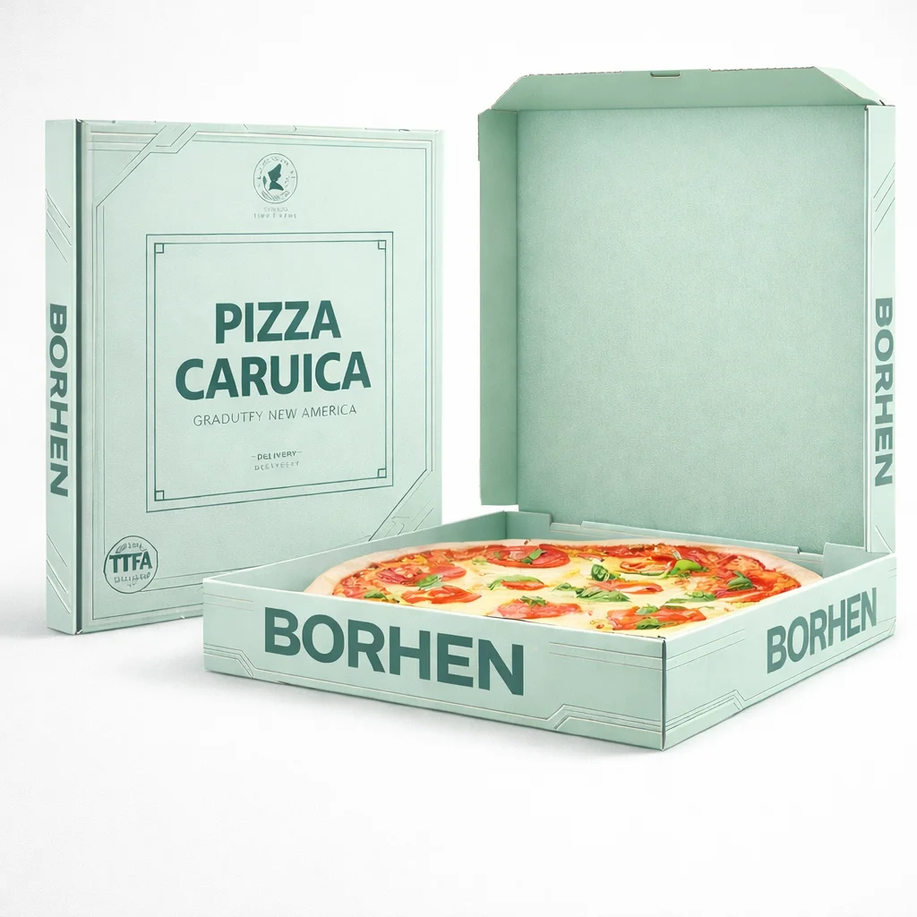
Start With Structure, Not Artwork: A Pizza Box Is a Folded Machine
A pizza box is not a flat printed surface. It’s a folded structure designed to lock, stack, and protect food under heat and moisture. This is why I never start with artwork.
The structure determines where design can live safely. It defines fold zones where ink may crack. It defines overlap zones where content disappears. It defines locking tabs where alignment must be clean. If a designer starts without understanding structure, they will place brand elements in the wrong places. The file may look beautiful on screen but look broken when folded.
That’s why I always confirm the exact structure type and closure mechanism before design begins. It’s the difference between designing a packaging product and designing a poster that will later be forced into a shape.
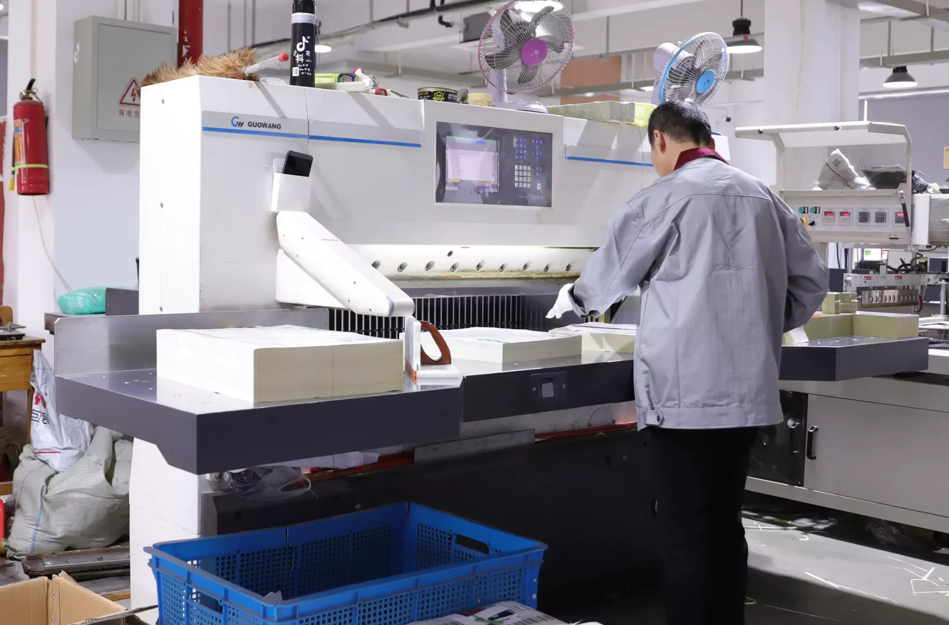
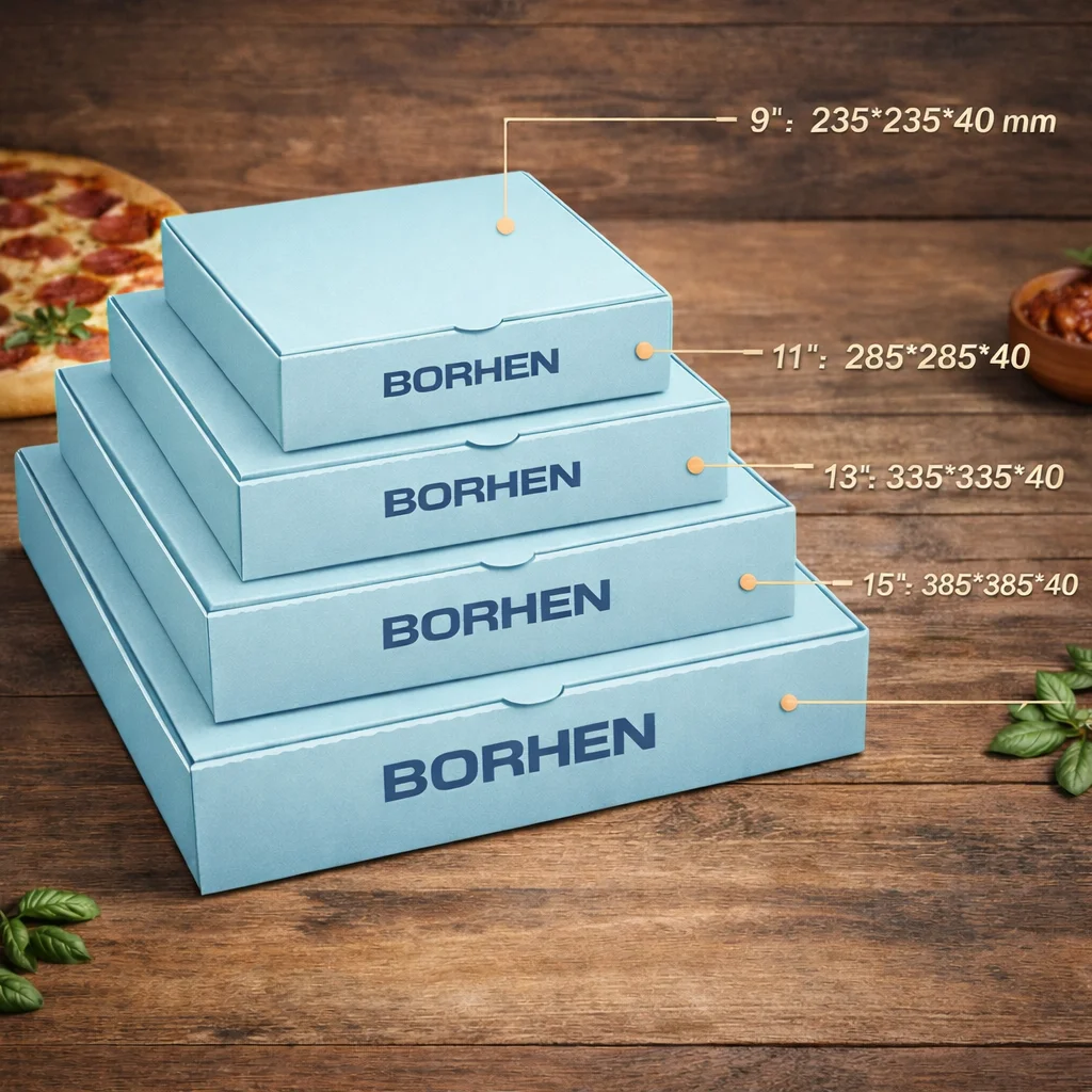
Dielines: This Is the Document That Determines Whether You Can Scale Reorders
In packaging, the dieline is not just a template. It is the blueprint of your product.
A proper dieline defines internal dimensions, external dimensions, wall depth, fold lines, cut lines, bleed boundaries, safe zones, glue zones, and locking structures. Without a correct dieline, you cannot control quality. You cannot standardize reorders. You cannot compare multiple suppliers. And you cannot expect consistency across batches.
When I evaluate pizza box programs, I can usually predict whether a buyer will face problems by looking at how they handle dielines. Buyers who treat dielines casually end up with constant adjustments and inconsistent reorders. Buyers who lock dielines early create stable packaging systems that scale easily.
Standard Size Is Not Standard Tooling: Always Work With Supplier-Specific Dielines
A mistake I see again and again is buyers downloading “12 inch pizza box dieline” from the internet and designing on it. This looks efficient at first, but it creates hidden risk.
Different manufacturers use different die-cut tooling. The locking tabs may be slightly different. The fold lines may be placed differently. The side panels may have different heights. Even small shifts will change how the final box looks and functions.
If you design on a generic dieline and then send it to a supplier, the supplier will either adjust it or ask you to adjust it. That adds time. It also creates miscommunication risk, because adjustments may shift logos and QR codes into dangerous areas.
This is why I always use the manufacturer’s official dieline. If you plan to source from multiple suppliers, you must apply your design concept onto each supplier’s dieline separately. That is the only way to control production reality.
Dieline Discipline: Naming, Version Control, and Who Owns the Final Template
In scalable B2B programs, dielines become assets. I treat them like product specifications, not like design files.
That means dielines must have clear naming systems, version control, and clear ownership. Which dieline is final? Which dieline matches which size? Which dieline is used for mass production? If buyers don’t control this, they will eventually produce the wrong version, especially when multiple team members are involved.
I’ve seen costly mistakes where a buyer approved a sample using one dieline version, then the bulk order was printed on another version because the internal file system was messy. These mistakes are avoidable, but only if dielines are managed like engineering documents.
Design Placement Rules: What NOT to Put on Fold Lines and Locking Tabs
One of the most practical rules I follow is simple: I never place important content where folding will distort it.
Fold lines are danger zones. When paperboard folds, it stresses the surface. Ink may crack. Small text may distort. QR codes may fail. Logos may look broken. Locking tabs are also danger zones because they are often tucked inside or hidden.
That’s why I always map visibility zones before design begins. The top lid center is premium branding territory. Side panels are strong for stacked visibility. The front edge can carry simple brand marks, but not complex content. Corners should be kept clean, because misalignment is common there.
This type of planning makes the final box feel professional because the design looks intentional after folding, not accidental.
Bleed, Trim, and Safe Zone: The Three Boundaries That Prevent Ugly Printing Results
If buyers want one technical concept to remember, it’s this: bleed, trim, and safe zone protect your design from reality.
Bleed prevents white edges after cutting. Trim defines the final cut boundary. Safe zone protects important content from being cut or distorted.
In pizza boxes, safe zones matter more than buyers expect because packaging cutting tolerances can shift slightly. If text is placed too close to the edge, some boxes will look fine, and some will look wrong. That inconsistency makes the whole batch feel low quality.
I always treat safe zone like insurance. It may look like wasted space in design software, but it prevents expensive visual failures in mass production.
Print File Preparation: Your Brand Quality Depends on Technical File Quality
In B2B packaging, print file quality determines whether your box looks premium or cheap.
If a buyer sends low-resolution logos, the print will look blurry. If a buyer sends raster text instead of vector text, the edges will look fuzzy. If a buyer sends incorrect colors, brand identity shifts. And if a buyer uses incorrect file setup, the factory may need to rebuild parts of the artwork, which increases error risk.
That’s why I always advise buyers to treat print files as production files, not marketing files. A file that looks good in PowerPoint is not a production-ready file.
Vector vs Raster: Why Logos Must Be Vector in Packaging
This is a detail that many buyers don’t understand until it’s too late. Packaging printing requires sharpness. Logos and typography must remain crisp even when printed large or small.
Vector files keep edges sharp. Raster files blur. If a buyer uses PNG or JPEG logos, especially those pulled from websites, the final print often looks low quality.
That’s why I always request vector logos, and I always recommend outlining fonts. If fonts are not outlined, missing fonts can cause automatic substitution and layout shifts. Those shifts can ruin the design silently.
In scalable packaging programs, every line must be controlled. Vector control is one of the simplest but most powerful ways to protect brand quality.
Color Management: Why CMYK, Pantone, and Board Surface Change Everything
Color is the most common conflict topic in packaging projects, and the reason is simple: buyers approve colors on screens, but production uses ink on board.
Screens display RGB light. Printing uses CMYK ink. That means colors change. Red becomes less vivid. Deep black may become “dark gray” if not handled correctly. Kraft board absorbs ink and warms the tone. Corrugated texture changes how ink spreads. White board reflects ink differently.
This is why I don’t treat color matching as “preference.” I treat it as a technical system. If a buyer demands strict brand color accuracy, they must specify Pantone matching and approve physical proofs. If a buyer can accept reasonable variation, CMYK printing may be sufficient.
The key is to decide this before design begins. Otherwise, buyers face frustration later when printed output looks different even though the artwork file is correct.
QR Code Preparation: Test It Like a Customer, Not Like a Designer
QR codes are a powerful conversion tool, but they fail easily if not prepared correctly.
I always test QR codes under realistic conditions. A customer might scan in low light. They might scan with a cheap phone camera. They might scan quickly while holding food. That means the QR code must be large enough, high enough contrast, and placed away from distortion zones.
QR codes also should not be placed where grease might stain them. Many buyers put QR codes on corners or edges because it “looks balanced,” but those areas are more likely to absorb oil or be bent. When QR codes fail, you don’t just lose scans. You lose conversion opportunities that packaging should have created.
Proofing Is Not About “Do You Like It?” — It’s About “Will It Work at Scale?”
Proofing is where packaging becomes real. Many buyers treat proofing as a visual approval step. But I treat proofing as a full program test.
A digital proof is useful for checking layout, spelling, and placement. But it cannot simulate how ink behaves on board, how folding affects design, how colors shift, or how the box feels in hand.
A physical proof is where you validate performance. You see the real color. You feel the stiffness. You confirm the fold quality. You check locking behavior. You test stacking. You test QR scanning. You test grease resistance if required.
If proofing is rushed, bulk production becomes risky. A pizza box project is successful not when the artwork looks good on screen, but when the final box works reliably in real operations.
What I Personally Check When the Physical Sample Arrives
When I receive a physical proof, I inspect it like a buyer who wants zero surprises.
I check whether the cut edges are clean and consistent. I examine fold lines for cracking. I check if ink smudges when rubbed. I confirm the lid closes smoothly without bending. I stack multiple boxes to see if the lid stays flat.
I also check printing alignment. If the logo looks slightly off-center on one sample, it may become inconsistent in bulk. I verify the readability of text under normal lighting. I test the QR code repeatedly. If the QR code scans slowly, it will not be used by customers.
This is where many buyers become more professional. They stop approving based on beauty, and they start approving based on performance.
Locking the Final Standard: What Must Be Frozen Before Mass Production
Once the sample is approved, the buyer must freeze the standard. This is where scalable supply programs are built.
If you approve the sample but keep changing details, you introduce instability. If you approve the sample without documenting specifications, you risk inconsistency later. The sample should become the reference standard: dieline, color system, printing method, board grade, grease barrier, carton packing standard, and labeling standard.
This documentation protects reorders. It reduces disputes. It gives procurement teams confidence that future batches will match.
Preparation Turns Packaging Into a Repeatable System, Not a One-Time Order
In my experience, the best pizza packaging programs succeed because buyers treat preparation as engineering.
Dielines are locked early. Print files are prepared professionally. Proofing is done seriously. Standards are documented. Once this is done, everything becomes easier: production timing becomes predictable, quality becomes stable, and reorders become stress-free.
That is what scalable B2B buyers really want. They don’t want to redesign packaging every time they reorder. They want a system that runs smoothly. And that system starts with what you prepare before you begin designing.


