


When I first started working on cosmetic packaging projects for the UK and EU market, I quickly realised something that most people only discover the hard way: labelling is not a “final design step.” It is the foundation that decides whether a product is truly launch-ready, or whether it will get stuck in costly revisions right before production. I have seen beautiful packaging concepts collapse at the last minute because the ingredient list didn’t fit, the Responsible Person details were missing, the batch code had nowhere to go, or the label looked premium on screen but became unreadable after printing. And what makes this even more frustrating is that these problems are not creative problems. They are structural problems. They happen when compliance, packaging format, and print reality are treated as separate tasks instead of one system.
A UK and EU compliant cosmetic label must clearly show the Responsible Person details, country of origin (when required), net quantity, batch/lot code, PAO or best-before date, product function, a full INCI ingredients list in correct order, and any necessary warnings—printed legibly and placed correctly on the primary pack or outer carton.
This guide exists because I believe UK and EU cosmetic packaging should feel clear and manageable, even if the regulations look intimidating at first. In practice, the “rules” are not there to make branding difficult. They exist to protect consumer safety, support traceability, and ensure transparency—especially in a market where customers expect to understand what they are buying, how to use it safely, and who is accountable for the product. Once I started viewing labelling and packaging through that lens, everything became easier. I stopped trying to “fit text on a label,” and started building packaging architecture that naturally supports compliant information without destroying brand aesthetics.
UK and EU Cosmetic Labelling Basics in Plain English
Before I dive into the detailed compliance checklist later in this guide, I want to slow down and explain the UK and EU labelling basics in the simplest way possible. In my experience, most cosmetic packaging mistakes don’t happen because people are careless. They happen because the words “labelling” and “packaging” sound obvious, yet they actually cover a surprisingly wide set of responsibilities. Once you understand what these terms mean in real projects, everything else becomes easier, from artwork layout to printing decisions, and even the way you communicate with your supplier.
What “Labelling” Really Means in the UK and EU
I always define cosmetic labelling as the legally required information that must appear on your product so it can be sold responsibly and safely in the UK and EU market. It is not the same thing as marketing copy, and it is not just a design element that makes your brand look more premium. Labelling is the structured content that helps consumers understand what the product is, how to use it properly, and what to do if they have sensitivities or concerns. It also includes information that helps authorities and supply chain partners trace the product back to the correct batch and the correct responsible company if something goes wrong. When I review a new brand’s artwork, I can often tell within seconds whether they treated labelling as a last-minute detail or as a core part of the product system, because compliant labelling always feels intentional, planned, and readable.
What “Packaging” Means Beyond Just a Pretty Box
I think many brands hear the word “packaging” and instantly picture a box, a jar, or a bottle, but in the UK and EU context, packaging is better understood as the complete physical system that carries your product to the customer and carries your compliance information to the market. Packaging includes the container that holds the formula, the label surface where critical information is printed, and the outer packaging that protects the product and gives you additional space for required details. It also includes how the packaging performs during storage, shipping, retail handling, and daily use. I have seen brands invest heavily into a beautiful label design, only to realize too late that the bottle shape leaves no room for legible text, or that the outer carton was skipped even though it would have solved their compliance layout issues immediately. That is why I always treat packaging as both a branding tool and an operational tool, because a packaging decision is never just aesthetic in a regulated market.
The Difference Between Primary Packaging and Secondary Packaging
Before a brand starts printing anything, I always ask them to separate their packaging into two layers, because this one distinction prevents many of the most common mistakes. Primary packaging is the packaging that directly contains the product, such as a bottle, jar, tube, or pump, and it is the part the customer touches and uses repeatedly. Secondary packaging is the outer packaging, usually a carton or box, that supports the product by protecting it and by carrying additional information that may not fit comfortably on the primary container. In real life, this difference matters because many cosmetic products simply do not have enough space on the primary packaging to include everything in a readable way, especially if the brand wants a clean design and also needs multiple languages or extra safety instructions. When a product has a well-planned carton, I can almost always see that compliance becomes easier, the branding looks more premium, and the production workflow becomes more stable, because the label is no longer forced to carry every detail alone.
Why the UK and EU Are Strict About Cosmetic Labelling and Packaging
I understand why people feel the UK and EU rules are “too strict” at first, but I also believe they follow a logic that makes sense once you see the bigger picture. The first reason is consumer safety, because cosmetics are used on skin, near eyes, and often by people with allergies or sensitivities, so essential warnings and usage guidance need to be clear and accessible. The second reason is traceability, which is the market’s way of ensuring that if there is a complaint, a stability concern, or a quality problem, the product can be traced back to a specific batch and corrected efficiently without confusion. The third reason is transparency, because consumers in the UK and EU increasingly expect to know what they are buying, what they are applying, and who is accountable for it, especially when so many products are sold online without any in-person explanation. When I look at it this way, compliance stops feeling like an annoying checklist and starts feeling like a trust system that separates serious brands from low-quality products that rely on vague labels and unclear responsibility.
What “Compliance-Ready” Packaging Looks Like in Real Life
When I say a product is “compliance-ready,” I do not mean it simply contains the right words somewhere on the packaging. I mean the packaging system is designed so that the required information is present, readable, consistent, and scalable across future batches and future SKUs. In real projects, compliance-ready packaging usually has a clear information hierarchy, where the front panel communicates the brand, the product name, and the function in a clean and confident way, while the side or back panels carry the technical information such as ingredients, warnings, net content, and responsible company details. It also means the brand has planned practical details that are often ignored, like leaving a dedicated space for batch codes, choosing printing finishes that do not reduce legibility, and ensuring the packaging layout still works when the design moves from a digital mockup into real-world printing. The best compliance-ready packaging I have seen always looks effortless to the customer, but I know it is the result of disciplined planning, because it protects the brand from relaunch delays, reduces redesign costs, and gives the business a reliable foundation to scale.
The Minimum Required Information Your Cosmetic Label Must Include
Before I ever comment on box style, paper texture, printing finish, or how “premium” a cosmetic brand looks on shelf, I always start with the same reality: in the UK and EU, your label is not a creative add-on. Your label is the compliance foundation that decides whether your product is launch-ready or stuck in revision mode. This is why I treat the minimum required label information like the backbone of the entire packaging system. When it is planned early, everything feels smooth, from artwork layout to printing approval to production. But when it is treated as an afterthought, I usually see the same pattern: last-minute text changes, shrinking fonts to make things fit, messy back labels, unclear batch coding placement, and expensive reprints that could have been avoided with better structure. In this section, I want to walk you through each mandatory element in a way that is practical and usable, so you can review your own label like a professional would.
Responsible Person Name and Address
If you only remember one concept from UK and EU cosmetic labelling, I want it to be the Responsible Person. In simple terms, the Responsible Person is the legal entity that stands behind your product once it enters the market. This is the name and address that regulators, retailers, platforms, and consumers can rely on if they need clarity, accountability, or corrective action. I often describe it as the “ownership signature” of the product, because it tells the world who is responsible for making sure the product is compliant, safe, and traceable. Many first-time brands assume this line is just a formal detail, but I have seen it become the number one reason for packaging revisions, especially when a brand is working across multiple parties like manufacturers, brand owners, and import partners. In real packaging design, I always recommend giving the Responsible Person a stable, consistent placement on the pack so it is easy to find and easy to verify. When this information is buried in a cramped corner, printed in extremely small fonts, or formatted inconsistently across SKUs, it creates a “low-trust” impression even before a customer opens the box. On the other hand, when it is done correctly, it instantly makes the packaging feel like a serious retail-ready product rather than a temporary small-batch launch.
Country of Origin
Country of origin feels like a simple line, but in cross-border business it carries more meaning than most people expect. I have worked with brands that sell through e-commerce, retail stores, and distributors, and I can tell you that origin clarity makes the supply chain smoother and reduces unnecessary questions from partners. Country of origin becomes especially relevant when products are manufactured outside the UK or EU, because imported goods naturally receive more attention at different checkpoints, from logistics partners to warehouse teams to retailers who want to understand product background. Beyond the operational side, origin information also supports consumer transparency, because shoppers in the UK and EU often care about where products are made, even when they love the brand story. What I advise brands to do is treat origin as part of the trust framework rather than as a compliance detail to squeeze into leftover space. If a product is positioned as premium, the origin statement should look intentional, consistent, and clean. If it feels hidden, consumers may assume you are trying to avoid transparency, and that is never a good signal for long-term brand credibility.
Net Quantity
Net quantity is one of the first things consumers look at, especially online where they compare value quickly. When I review packaging artwork, I always check net quantity early because it affects both compliance and how “premium” the design feels. The quantity should be displayed clearly using the correct measurement type, and it should be positioned in a way that looks designed, not added at the last minute. Volume is typically expressed in millilitres, while weight is typically expressed in grams, and the key is consistency across your product line so customers can compare products without confusion. One of the most common mistakes I see is when brands change their fill size after the design is final. For example, they decide to move from 50 ml to 60 ml because it feels like a better offer, but then the typography no longer fits, the spacing becomes awkward, and suddenly the entire front panel has to be rebalanced. Another mistake is letting net quantity compete visually with the product name or hero message, which weakens the brand identity. In my opinion, the best practice is to treat net quantity like an anchor element that belongs to the design system, so it stays stable even when you add new SKUs, create gift sets, or expand into retail channels.
Batch Code or Lot Number
Batch coding is one of those details that many new brands ignore until a factory asks, “Where should we print the code?” and then the scramble begins. I take batch code planning very seriously because it is directly connected to traceability, and traceability is a key reason the UK and EU labelling framework exists in the first place. A batch code or lot number allows you to identify exactly when and where a product was made, which becomes crucial if a customer reports an issue, if you run stability checks later, or if you need to narrow down a quality investigation to one production run rather than your entire inventory. From a packaging design perspective, batch codes need their own space. If you do not reserve an area with suitable contrast and a stable surface, the code ends up printed on top of artwork, on curved surfaces that smudge easily, or in places that are difficult to scan or read. I have also seen brands choose premium coatings or dark finishes that look beautiful but make batch codes almost invisible, which creates a quality-control headache. In real-world production, brands usually print batch codes efficiently using methods like inkjet coding, laser marking, or stamping, but the key is that the packaging must be designed to support those methods. When batch codes are planned properly, they quietly protect your business. They reduce risk, improve recall control, support retailer requirements, and make your operational system look as professional as your branding.
Date of Minimum Durability or PAO
This section is where I often see brands get confused, because they mix up two different timelines: shelf life before opening and usability after opening. Best Before End, or BBE, is the marker used to show how long a product remains in good condition when it is stored properly and has not been opened. Period After Opening, or PAO, is the marker that tells consumers how long the product can be used safely after it has been opened, and it is typically shown as an open jar symbol followed by a number of months. In the UK and EU market, customers actually recognize these symbols more than people expect, especially skincare customers who keep products in bathrooms for months. The choice between BBE and PAO depends on the product’s characteristics and how it is expected to be used. From a packaging execution standpoint, the most important thing is clarity. A symbol that is printed too small, placed too close to edges, or lost in a busy back panel can make your product feel careless. I also think durability information plays a psychological role. When it is displayed neatly and professionally, it builds trust because it signals the brand understands safety and product integrity. When it is missing or unclear, it creates doubt, even if the formula itself is perfectly stable.
Product Function
Product function sounds basic, but in cosmetic packaging it is one of the easiest places to accidentally create confusion. The UK and EU framework expects the function of a product to be stated unless it is genuinely obvious from the presentation. The tricky part is that what feels obvious to a brand owner may not be obvious to a new customer encountering the product for the first time. I always think about function in the context of real purchasing behaviour. A customer might see a minimalistic label and a premium brand name, but still not know whether the product is a cleanser, a toner, a serum, or a moisturiser, especially if the packaging design is intentionally simple. Clear function wording helps avoid misuse, reduces customer complaints, and supports better product reviews because consumers understand what they are buying. I also recommend function language that stays factual and avoids sounding like medical treatment. The goal is to communicate clearly without creating claim risk. When function is handled well, it supports both compliance and conversion, because clarity creates confidence and confidence is what turns browsing into purchase.
Ingredients List Using INCI Names
If there is one part of UK and EU cosmetic labelling that requires real discipline, it is the ingredients list. The ingredient list is not a marketing section. It is a compliance document printed on your product, and it must use INCI names, which are standardized ingredient names designed to create consistency across markets. INCI matters because it prevents confusion. A marketing ingredient name can change from one brand to another, but an INCI name stays the same, which supports transparency for consumers and clarity for regulators. The ingredients are generally listed in descending order by weight, which is why I always tell brands not to “reorder the list” to highlight hero ingredients. That temptation is understandable, but it leads to compliance issues and damages trust. Ingredients under one percent often create confusion because brands wonder whether they must be strictly ordered the same way as the main phase. This is one area where technical guidance matters, and it is also why I advise brands to lock the formula early before finalizing packaging. Small formula changes can shift the ingredient list, and shifting the ingredient list after printing is one of the fastest ways to waste packaging inventory. Another common issue I see is the mixing of marketing highlights with compliance text. For example, brands promote “with peptides and vitamin C” on the front panel, and then try to mirror the same wording inside the INCI list, which is not the right approach. The most practical label setup, especially for premium designs, is to place the full INCI list on the outer carton where space is available, while keeping the primary container clean and readable. This is also where folding cartons become a strategic advantage, because they allow compliance to be handled properly without compromising aesthetics.
Warnings and Precautions for Safe Use
Warnings and precautions are often treated like an annoying block of small text, but I see them as part of customer care and brand maturity. If your product requires specific directions or has known safety considerations, the UK and EU labelling framework expects that information to be presented clearly. The challenge is balancing completeness with readability. If warnings are too short or vague, they may not protect the consumer. If they are too long and dense, they can overwhelm the label and make the product feel complicated or even risky. The best brands handle this by using simple, direct language that a consumer can understand instantly, while still being specific enough to guide safe use. In real packaging projects, I frequently see warnings related to avoiding contact with eyes, discontinuing use if irritation occurs, keeping products away from children, or usage guidance for sensitive areas. The exact content depends on your product type, but the principle is the same: warnings should be readable, placed logically, and designed as part of the layout rather than squeezed into a leftover corner. When precautions are presented properly, they do more than satisfy compliance. They reduce misuse, prevent negative reviews, and build trust because they show the brand is responsible and transparent. That trust is especially important in the UK and EU market, where customers are highly educated and quick to judge packaging that feels careless or unclear.
Legibility Rules That Brands Often Ignore Until It’s Too Late
Before I ever talk about finishes like soft-touch lamination, foil stamping, embossing, or whether a box looks “luxury enough,” I always look at one thing first: can a real person read the label easily in real life. In the UK and EU, legibility is not a design preference. It is a functional compliance requirement, and it is one of the easiest ways for a beautiful cosmetic packaging project to fail at the last stage. What makes this topic frustrating is that legibility problems rarely show up when you are looking at artwork on a laptop screen. They show up later, after you have approved the dieline, after the supplier has made printing plates, after you have already planned a launch date, and sometimes after you have paid for production. I have seen brands lose weeks because they had to adjust text sizes, rewrite spacing, or even redesign label layouts simply because the information became hard to read once it moved from PDF to physical packaging. This section is my way of helping you avoid that expensive moment by understanding the legibility rules early and designing around them intelligently.
What “Indelible, Easily Legible, and Visible” Actually Means in Real Life
When UK and EU guidance describes label information as “indelible, easily legible, and visible,” I always translate it into real-world use cases because that is where brands either win or struggle. Indelible means the required information should stay on the packaging throughout normal consumer handling. In real life, cosmetics are exposed to moisture, steam, oils, sunscreen residue, and constant friction from hands, towels, and bags. A label that looks perfect on day one but starts smudging after a week in a bathroom is not truly compliant, and it also quietly destroys trust because customers assume the product is low quality. Easily legible means the average person should be able to read the text without effort, without needing special lighting, and without squinting or guessing letters. I always imagine someone reading the ingredient list quickly while standing in a store aisle, or checking a warning with wet hands in a hotel bathroom, because that is the reality of cosmetic usage. Visible means the required information must be placed somewhere accessible and logical. It should not be hidden under a bottle curve where the text breaks apart, placed under a seam where part of the line disappears, or buried under design elements that make it hard to locate. In my experience, the biggest misconception is that if the text exists somewhere technically, the job is done. But if the consumer cannot find it and read it easily, the packaging does not perform its compliance role.
Font Size and Readability Logic That Works for Real Brands
I do not believe legibility should be treated as a cold, technical problem, because brands can absolutely be premium and readable at the same time. The problem starts when a brand designs for aesthetics first and only “fits” the required text afterward. If you are trying to squeeze ingredients, warnings, batch code areas, responsible person details, and durability symbols onto a small bottle or jar, you will almost always be tempted to reduce font size. That is exactly when packaging stops serving the consumer and starts becoming a liability. In practical label systems, readability is not only about font size, but also about spacing, line height, and typography choices. A clean font with balanced spacing can remain readable even at smaller sizes, while a thin decorative font will fail quickly. Another issue I often see is text alignment and line breaks. Poor line breaks create awkward hyphenation, cramped blocks, and uneven margins that make technical text look messy. When technical text looks messy, it feels untrustworthy, even if it is legally correct. This is why I always recommend planning your packaging structure to protect readability, especially by using secondary packaging like folding cartons to carry high-density information. When the outer carton carries the detailed text, your bottle can stay clean and premium, and you do not have to choose between beauty and compliance.
The Contrast Mistakes That Look Premium on Screen but Fail After Printing
Color contrast is one of the most common reasons I see “premium-looking” packaging fail legibility, and it happens because designers naturally think visually, not operationally. On a screen, pale grey text on a white background looks sophisticated and minimal. In printing, that same pale grey can become nearly invisible depending on paper texture, lamination, and lighting. Metallic foil text is another classic example. Foil looks luxurious, but it behaves like a mirror. Under certain angles, the text disappears completely, which means your warning text or ingredient list might be unreadable in normal conditions. I have also seen brands print black text on deep navy, or gold text on beige, and the result looks stylish but becomes difficult to read unless the light is perfect. Even glossy finishes can reduce readability by creating reflections, especially on curved bottles where highlights move as the product is rotated. In my opinion, contrast is not just a design choice. It is part of the consumer safety system. If a customer cannot read the precautions, cannot confirm net content, or cannot check how long the product lasts after opening, the packaging fails in its most basic function. That is why I always suggest testing legibility with physical samples in normal lighting, because compliance does not happen inside design software, it happens in real hands.
Why Beautiful Packaging Can Still Be Non-Compliant
One lesson I have learned from packaging projects is that “beautiful” and “compliant” are two completely different categories. A product can look luxurious, feel expensive, and photograph perfectly for marketing, and still fail compliance because of missing or unclear required information. I have seen stunning designs where the ingredients list was printed too close to the edge and got trimmed during cutting. I have seen minimalist labels where the product function was not stated clearly enough, leaving consumers unsure what the product actually does. I have seen premium jars where the batch code was printed on a curved bottom surface, making it smudge or rub off quickly. I have even seen rigid gift boxes where the outer packaging looked high-end, but the inner product container did not carry enough information and the required elements were not accessible in a consistent way. Compliance does not care if your packaging looks fashionable. Compliance cares if your packaging communicates mandatory information clearly, consistently, and reliably. When brands misunderstand this, they often spend money improving premium finishes while ignoring the structural decisions that make compliance easy, such as adding an outer carton, using a slightly larger label area, or reserving a dedicated space for variable printing like batch codes and dates.
Balancing Branding and Legal Text Without Making Your Packaging Look Crowded
In my experience, the best cosmetic packaging in the UK and EU never feels like a legal document, even though it contains a lot of regulated information. The difference is not that those brands hide the information. The difference is that they build hierarchy and structure. Branding belongs on the front and should communicate product identity in a calm and confident way. Compliance text belongs in logical zones where customers expect to find details, such as a back panel, side panel, or outer carton. When I plan layouts, I treat legal text as a system that needs clean alignment, consistent spacing, and predictable placement across all SKUs. This makes the packaging feel professional and scalable, because each new product follows the same structure rather than reinventing everything. I also think outer packaging is a strategic advantage for brands that want premium minimal aesthetics, because it allows the bottle or jar to remain beautiful and simple while giving you enough space to present ingredients, warnings, responsible person details, and durability marking in a readable way. The brands that struggle are usually trying to force everything onto one small surface, which leads to overcrowding and unreadable text. If you want packaging that looks premium and passes compliance checks, the smartest move is to plan the compliance layout early, decide where technical text will live, and let the design support clarity rather than fight against it. When you get that balance right, your packaging not only meets UK and EU requirements, it also feels like a brand that belongs in serious retail and long-term distribution.
Where the Information Can Go When Space Is Limited
When I work with cosmetic brands launching into the UK and EU, one situation appears again and again: the brand wants clean, minimal packaging, but the label requirements feel like a wall of text that simply does not fit. I completely understand why this becomes stressful, because packaging space is not infinite, and the more premium a brand tries to look, the less “busy” they want the bottle or jar to appear. The problem is that compliance information does not disappear just because the design is minimal. Instead, it must be placed intelligently across the packaging system so it stays readable, accessible, and consistent from a legal and operational point of view. In this section, I want to show you how I approach information placement when space is limited, because the best solution is rarely shrinking fonts until nothing can be read. The best solution is choosing the right structure and assigning the right information to the right layer of packaging.
Outer Box vs Bottle or Jar Label, and Why This Decision Shapes Everything
Whenever I plan a compliant packaging setup, I treat the bottle or jar label as the product’s everyday identity, and I treat the outer box as the product’s compliance framework. The bottle or jar is what the customer touches, sees, and uses every day, which means it should stay visually calm and practical. It needs to show the product name clearly, the brand, and enough key information so the product is still identifiable even if the outer box is thrown away after unboxing. The outer box, however, has a completely different job. It gives you more surface area, more flat panels, and a far better environment for dense text like ingredients and warnings. In my experience, brands often struggle because they design the bottle label first, fall in love with a minimalist layout, and only later realize the full INCI list and mandatory details must exist somewhere in a readable form. At that point, the brand starts compromising, shrinking text, placing paragraphs in awkward corners, or stacking too much information on one panel. When the outer carton is planned properly from the beginning, I can keep the bottle label elegant and “premium,” while the box carries the technical content in a clean and structured way. This is one of the most practical reasons why many serious UK and EU cosmetic brands still use cartons even for small products, because the carton protects both compliance and design quality.
When Moving Details to an Outer Carton Is Not Only Allowed but the Best Move
If a brand tells me they have limited space on a bottle or jar, my first instinct is to solve the problem using an outer carton, because it is the most scalable and least disruptive solution. Outer cartons create predictable text zones, meaning I can plan a dedicated panel for ingredients, a dedicated area for responsible person information, and enough breathing room for warnings without making the packaging feel messy. This matters because compliance text is not just about existing somewhere. It must be readable, and readability often depends on having enough space for proper line spacing and contrast. Another reason I like cartons is that they support brand growth. A startup might launch one SKU today, but in six months they may have three sizes, two variants, or a full set. If the packaging system is carton-based, it becomes much easier to keep consistency across all products without rebuilding the label layout each time. I also see cartons reduce production risk, because factories find it easier to print and control quality on flat paperboard panels than on curved bottles. From a project management perspective, cartons save time because revisions become simpler, proofreading becomes cleaner, and the final packaging tends to look more professional even at a lower budget.
When a Leaflet Makes Sense and How I Think About It Like a Brand Owner
A leaflet is one of the most underrated tools in cosmetic packaging, but it only works when it is planned with intention rather than used as a last-minute emergency fix. I usually see leaflets become valuable when a product needs detailed usage instructions, layered routines, or safety guidance that would overwhelm the packaging if printed directly on the label. For example, a product with complex application steps or a stronger active profile might need clearer directions so customers do not misuse it and then blame the product. In a UK and EU setting, a leaflet can also support brands that want to keep their outer carton visually minimal while still providing consumers with deeper education, especially if the brand story and usage experience are part of the premium positioning. However, leaflets introduce real-world packaging considerations. The box must have enough internal space to include the leaflet without bending it into a messy shape. The assembly workflow must allow the leaflet to be inserted consistently without slowing production. And the customer experience must feel intentional, because if the leaflet feels like a cheap afterthought, it lowers the perceived quality of the entire product. When I plan leaflets, I treat them like part of the brand voice and brand system, not like a piece of technical paperwork, because premium brands win through consistency at every touchpoint.
Peel-Back Labels and Why They Are a Smart Solution for Small Bottles
When a brand strongly prefers not to use an outer carton, or when the product size is extremely small, peel-back labels can become a powerful way to increase compliance space without changing the container. I like peel-back labels because they preserve the clean front-facing look while adding extra “pages” of content inside the label itself. In real life, this is especially useful for travel sizes, miniatures, or any bottle where the circumference simply cannot support a full ingredient list and warnings in a readable format. The key is that peel-back labels are not a magic trick. They require good material choice, stable adhesive, and thoughtful user experience design. If the opening edge is too small, customers cannot peel it easily. If the adhesive is too weak, the label lifts and looks damaged after a few uses. If the printing quality inside is poor, the extra space does not actually solve readability. I also think brands should consider the emotional side of packaging here. A peel-back label can feel clever and premium when it opens smoothly, but it can feel annoying and cheap if it curls up or tears. When it is executed correctly, it becomes one of the most elegant solutions for compliance in a compact packaging format.
How I Keep Packaging Clean While Still Fully Complying with UK and EU Expectations
In my opinion, the most “premium-looking” packaging is not the packaging with the least information. It is the packaging where information is organized with confidence. The brands that succeed in the UK and EU do not try to hide compliance requirements. Instead, they build information hierarchy so that consumers can find what they need without feeling overwhelmed. The front panel stays focused on identity, such as product name, brand name, and function, while the technical information is placed where it naturally belongs. The outer carton becomes the main home for ingredients and warnings, the primary label stays clean and recognizable, and variable information like batch codes and durability markings are planned in dedicated zones. This structure creates a sense of calm, which is a major part of premium branding. It also reduces the risk of mistakes in production, because suppliers know exactly where each element should be printed. From a practical point of view, clean packaging is a result of good planning, not a result of shrinking compliance text until it disappears.
Packaging Structures That Make Compliance Easier Instead of Harder
One of the biggest packaging lessons I have learned is that structure can either solve compliance problems or create them. Brands often choose packaging based on what looks good in a competitor’s photos, without asking whether the structure supports readable compliance information. I always prefer structures that offer flat surfaces, predictable panel space, and flexibility for text placement. Folding cartons are a perfect example because they provide multiple panels that can carry dense information without crowding. Rigid boxes can also work extremely well for sets, because they allow the compliance information to live on the outer packaging while keeping each inner component minimal. Even small structural decisions, like choosing a carton that is slightly taller or wider, can dramatically improve legibility because it allows text blocks to breathe and makes warnings and ingredients readable without squeezing. I also think packaging structure should support manufacturing. A carton is easier to print consistently than a highly curved bottle surface, and it is easier to proofread, easier to revise, and easier to scale. When a brand chooses a compliance-friendly structure early, it protects both design quality and launch timelines. That is the real goal: packaging that looks premium, reads clearly, and stays operationally stable as the brand grows.
Packaging Format Decisions That Affect Compliance and Cost
When I look at cosmetic packaging for the UK and EU market, I never treat format as a purely visual choice. The packaging format you pick will quietly determine how easy compliance feels, how much space you have for mandatory information, how stable your print quality will be, and how many hidden costs appear later. I have seen brands choose a packaging format that looks perfect on a mood board, only to discover it creates constant operational friction, from unreadable ingredient lists to messy batch coding placement. I have also seen the opposite, where a simple format choice makes a brand look more premium while reducing risk at the same time. In my experience, the smartest brands don’t ask, “Which packaging looks best?” They ask, “Which packaging format will stay compliant, stay readable, and still be cost-efficient when I scale?” This section is where I want to connect compliance reality with packaging decisions, because when you get format right, everything else becomes smoother, faster, and more profitable.
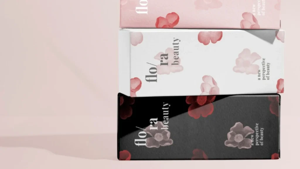
Folding Carton Boxes
If you ask me which packaging format gives cosmetic brands the most compliance stability in the UK and EU, I almost always answer with folding cartons. Folding cartons are compliance-friendly because they give you flat panels, structured layout zones, and predictable printing surfaces. These three factors sound simple, but they solve the biggest legibility problems that come from bottles and jars. A carton lets me place the ingredients list in a clean block with comfortable spacing, which makes it readable for consumers and less risky for compliance. It also lets me separate different types of information in a way that feels professional. Instead of stacking everything into one cramped back label, I can assign one panel for ingredients, one panel for warnings and precautions, and another area for responsible person details, durability marking, and barcode placement. When I see a carton-based packaging system, I usually see fewer last-minute revisions, because text is not fighting for space.
Folding cartons are also ideal for the product formats that naturally have limited label space, like skincare bottles with narrow bodies, small jars with curved edges, or tubes where text can become distorted. In these cases, cartons protect both compliance and aesthetics, because they allow the bottle or tube design to stay clean while still meeting all requirements on the outer packaging. I also like cartons for sets, even for simple two-step routines like cleanser and moisturizer, because they let a brand create a unified “product story” while keeping the compliance information clear and organized. Another benefit I often mention is how cartons reduce the risk of printing issues. Printing on paperboard is typically more consistent than printing on curved containers, and it is easier to proofread, easier to check in sampling, and easier to control for color stability over time. From a cost perspective, cartons can seem like an extra expense at the beginning, but in reality they often save money by preventing reprints and delays. If you ever had to reprint labels because text became too small or because the ingredient list changed, you already understand why I consider cartons a smart investment rather than an optional add-on.
When brands ask me what text they should prioritize on the carton, I always start with the information that is hardest to fit anywhere else without destroying readability. The full ingredient list is usually the most space-demanding element, and it benefits from clean spacing and contrast. Warnings and directions are the next priority because they must stay readable and accessible without becoming overwhelming. Responsible person information also deserves stable placement, because it is a traceability and accountability anchor, not just a line of text. I also encourage brands to think about variable information early, such as batch codes and durability marking, because cartons can be designed to include dedicated areas that make production easier and cleaner. In my experience, the brands that do this feel more confident at launch because their packaging looks calm, professional, and retail-ready, while their compliance system is quietly doing its job in the background.
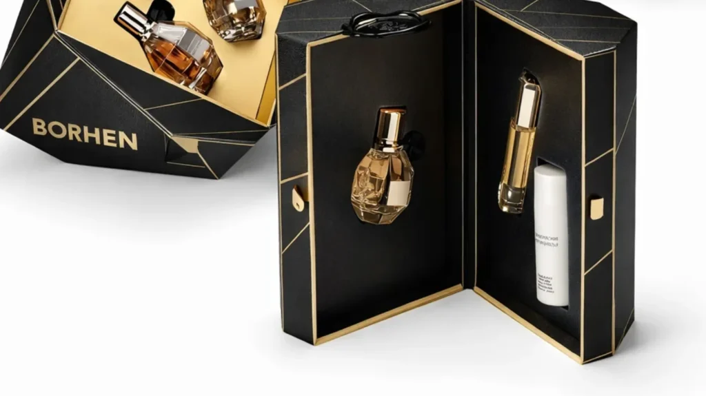
Rigid Gift Boxes and Premium Sets
Rigid gift boxes are one of the most powerful formats for premium positioning, but I always say they should be chosen with intention, not ego. A rigid box can instantly raise perceived value, but it also adds complexity that many new brands underestimate. In my experience, rigid boxes are worth it when a brand is selling bundles that justify a higher price, when the unboxing experience is part of the product identity, or when the brand is building visibility through gifting programs, influencer kits, or seasonal campaigns. If a set is meant to feel like a “complete ritual” rather than just two products in a carton, a rigid box can create that emotional impact. When customers open a rigid box, the experience feels more permanent, more giftable, and more retail-grade, and that is often what supports stronger conversion at a higher price point.
However, rigid boxes bring compliance questions that brands don’t always think about early. The biggest issue is that rigid boxes are usually designed for beauty first, and compliance text can easily look like an ugly disruption if it is added later. The solution is not to avoid legal information, but to build a packaging architecture where compliance and luxury can coexist. In real projects, I often see the best rigid set structures use a sleeve, a printed inner wall, or a controlled panel layout that carries mandatory information in a way that looks deliberate. When that system is planned early, the outer appearance stays premium and minimal, while the required details are still accessible and readable. This is a crucial difference, because in the UK and EU market, “premium” does not mean you can ignore requirements. Premium means you can integrate them elegantly.
Insert design is another area I treat seriously, because inserts are not just decoration. Inserts protect the products during shipping, reduce movement inside the box, and prevent glass breakage or pump damage, which directly affects cost and customer satisfaction. I have seen brands invest heavily in a beautiful rigid box and then use a weak insert, and the result is a premium box with a messy interior and damaged components, which hurts the brand far more than it helps. A strong insert keeps everything aligned, supports a clean unboxing experience, and makes the set feel organized and intentional. It also makes assembly more efficient, because products fit into defined spaces rather than shifting around. When inserts are done well, they reduce returns, reduce complaints, and create an experience that customers remember. That is why I consider rigid set packaging a strategic format that can be powerful, but only when it is engineered properly, not just designed beautifully.
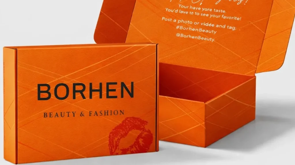
Cosmetic Paper Bags for Retail and Gift Programs
Cosmetic paper bags are often treated as a small detail, but I think they are one of the most overlooked branding tools, especially for UK and EU retail and gifting programs. A bag is not where you place full compliance text, and I do not recommend trying to use it like a legal label. Instead, I see a paper bag as the “outside-of-store brand moment.” It is what customers carry through the street, what they place on a counter at home, and what becomes part of the gifting experience when they hand the product to someone else. In a very real way, the paper bag becomes a piece of mobile branding, and for premium brands, it can do as much perception work as the product itself.
When I advise brands on what to print on bags, I usually focus on simple identity elements that stay clean and timeless. Brand name, logo, and a short message can be enough to make the bag feel intentional and premium. Printing too much information on a bag usually makes it look cluttered and cheap, and it does not provide true compliance value anyway. The biggest value of a bag is consistency. When the box looks premium but the bag looks generic, the brand experience breaks. When the bag matches the packaging system, everything feels cohesive and established, even for smaller brands.
Cost control is especially important for paper bags because brands often assume bags are cheap, and then get surprised by minimum order logic. Bags are priced based on size, paper thickness, handle structure, printing coverage, and finishing choices like lamination or hot foil. If a brand chooses multiple bag sizes for different products, costs increase quickly, and inventory becomes harder to manage. In my experience, the smartest approach is to choose one or two standard sizes that cover most purchases, keep the print layout simple, and invest in finishing only when it clearly increases the perceived value. A well-made bag does not need excessive decoration to feel premium. It needs solid paper, clean printing, strong handles, and a design that feels consistent with the brand’s packaging style.
I also think bags matter because they support sales channels in ways brands don’t always consider. In gifting campaigns, a bag turns a product into a ready-to-gift experience without extra wrapping. In retail environments, it creates a complete premium delivery moment at checkout. For pop-up events, brand activations, and wholesale orders, bags provide an extra layer of professionalism that makes a brand feel “bigger” than its current size. That is why I never treat paper bags as a small accessory. I treat them as part of the packaging ecosystem that connects compliance-ready product packaging with real-world customer perception and brand memory.
Packaging Design Considerations That Still Matter After Compliance
Once a cosmetic label meets UK and EU requirements, many brands feel like the difficult part is over. And in a way, I agree, because compliance is the hardest barrier for first-time founders and new DTC teams. But I also believe compliance is only the starting line, not the finish line. In the UK and EU, consumers are extremely sensitive to packaging cues. They might not know the legal framework behind the label, but they absolutely know what feels premium, what feels careless, and what feels like a product they can trust enough to put on their skin every day. That is why I never stop at compliance. After compliance is secured, packaging design becomes the tool that shapes your brand’s perceived value, protects your repurchase rate, and determines whether your product looks like it belongs in serious retail and long-term distribution. In this section, I want to share the design considerations that still matter after compliance, because these are the decisions that quietly separate brands that look “temporary” from brands that look built for the long run.
Choosing Finishes That Strengthen Brand Identity Instead of Just Decorating the Box
When I see a cosmetic box that feels premium, the first thing I usually notice is not the artwork itself, but the way the packaging feels in the hand. Finishes create that feeling, and I always treat finishes as part of brand identity rather than as decoration. Matte lamination often creates a calm and modern look, and it photographs beautifully without harsh reflections, which is perfect for brands that sell online and rely on product images to convert. Soft-touch lamination adds a tactile layer that feels almost velvety, and it is one of the fastest ways to make even a simple design feel “expensive” because customers immediately sense the difference without needing to be told. Foil stamping is often used to signal luxury, but I always advise brands to use it with discipline, because too much foil can make packaging look loud rather than premium, and it can also create practical issues when it reduces legibility under different lighting angles. Embossing and debossing are two finishes I personally love when a brand wants quiet confidence, because they add depth without shouting. A lightly embossed logo or pattern can make a box feel handcrafted, even at scale. What matters most is that the finish matches the tone of the brand. If the brand is clean and clinical, the finish should feel precise and minimal. If the brand is gift-focused and emotional, the finish can be warmer and more decorative, but it still needs restraint. In my experience, the most premium packaging is not the packaging with the most techniques. It is the packaging where every technique feels consistent with the brand story.
Why Color Consistency Across Batches Is One of the Strongest Signals of a Serious Brand
Color consistency is one of the least glamorous topics in packaging design, but it is one of the most commercially important. I have seen brands build a strong visual identity using a signature color, only to weaken it by allowing batch-to-batch variation that makes the brand look unstable. In the UK and EU, where consumers are highly aware of design and quality cues, inconsistent color can create the feeling that the brand changed suppliers, cut corners, or lost control. Even small differences can matter. A beige that becomes slightly yellow, a navy that shifts toward purple, or a pastel pink that becomes too bright can break the premium feel instantly. The tricky part is that color consistency is not only about choosing a color code once. Color changes when paper changes, when finishes change, and even when the same finish is produced in different seasons or different production conditions. Matte lamination can soften colors, soft-touch can deepen them, glossy finishes can make them appear brighter, and uncoated paper can make colors look more muted. This is why I always treat color as a system that must be controlled through stable printing references and consistent material choices. When a brand controls its color across batches, it sends a message that the entire operation is reliable, and reliability is the kind of premium customers trust, even if they cannot explain it in words.
How I Design Packaging That Looks Retail-Ready Instead of Only “Instagram-Ready”
There is a difference between packaging that looks good in a flat-lay photo and packaging that looks believable in retail. Retail-ready packaging carries a different kind of credibility because it has to survive a more demanding environment. When I describe retail-ready packaging, I am talking about packaging that looks structured, balanced, and confident under real lighting and real handling. It has a clear hierarchy, so the customer can understand the product within seconds without feeling confused or overloaded. It has clean alignment, predictable spacing, and a layout that feels stable rather than experimental. The materials feel firm enough to protect the product and signal quality. The finishing looks intentional rather than random. Even the small details, like sharp folding lines, clean edges, and consistent print placement, make a huge difference because they tell the customer the brand is operationally serious. In my experience, retail-ready packaging also feels complete. It looks like it belongs on a shelf next to established competitors, rather than like a temporary label put on a bottle to test the market. This matters even if the brand sells online, because consumers have learned to associate retail-grade packaging with safety and reliability. When your packaging looks retail-ready, it reduces buyer hesitation, increases perceived value, and makes the product feel like something that deserves repeat purchase.
How I Avoid Cheap-Looking Packaging Even When MOQ Is Low
Low MOQ is not the enemy of premium packaging. Poor packaging decisions are the enemy of premium packaging. I have seen low-MOQ packaging that looks incredibly refined, and I have seen high-volume packaging that still looks cheap. The difference is usually discipline. When MOQ is low, the smartest strategy is to reduce complexity and focus on quality signals that are visible and repeatable. A well-structured folding carton with clean typography, balanced spacing, and one controlled finish can look far more premium than a chaotic design filled with too many elements. I often see packaging look cheap when brands try to compensate for low budget by adding “more design,” such as too many gradients, too many icons, or too many decorative graphics. That approach usually backfires because it makes the package feel noisy and unstable. Another reason packaging looks cheap is poor proportion. If the text is too large, the margins are too tight, or the design feels squeezed, customers subconsciously read it as amateur. I prefer a calm design system where the brand looks confident enough to leave space, and where the layout feels like it was made by a professional team even if the company is still small. Material selection also matters. Choosing the right thickness and the right paper surface can upgrade the feel instantly, even if the print design remains simple. In my experience, premium packaging at low MOQ is achieved through control, consistency, and smart structural decisions, not through expensive tricks.
Sustainability Signals That Build Trust Without Overclaiming or Creating Risk
Sustainability matters deeply in the UK and EU market, but I always encourage brands to approach it with a mindset of credibility, not marketing. Consumers today are not only attracted to sustainability claims, they are also skeptical of them, especially when the claims feel vague or exaggerated. I believe the most trustworthy sustainability signals are the ones that are practical and verifiable. Using responsibly sourced paper materials, avoiding unnecessary layers, and designing packaging that protects products well enough to reduce damage and waste are all meaningful choices that customers can respect. I also think sustainability is often communicated through restraint rather than through slogans. If a box feels oversized, heavily layered, or wasteful, customers will question the brand’s intentions even if the material is technically recyclable. On the other hand, a compact well-engineered carton that feels efficient and premium sends a strong signal that the brand is thoughtful and responsible. I also advise brands to be careful with the language they print on packaging, because sustainability claims can create expectations and scrutiny. In my experience, it is always better to communicate what you actually do, such as using certified paper or reducing unnecessary packaging volume, rather than making broad claims that are difficult to prove. When sustainability is integrated in an honest and practical way, it becomes part of brand trust rather than a marketing risk, and that kind of trust is extremely valuable in regulated markets like the UK and EU.
UK and EU Specific Notes Brands Should Not Miss
When a brand tells me they want to launch in “the UK and Europe,” I always pause for a moment, because this phrase sounds simple, but the details behind it can be surprisingly expensive if they are misunderstood. UK and EU cosmetic packaging often looks nearly identical when you browse shelves or scroll through online listings, which makes it easy to assume the requirements are interchangeable. In reality, they are close enough that brands can build one consistent packaging system, but different enough that skipping the final checks can create painful last-minute revisions, relabelling costs, and delays at the point where the brand is already ready to sell. I have seen founders do everything right with formula development, design, and sourcing, only to lose weeks because they treated the UK and EU as a single regulatory environment. My goal in this section is to help you avoid that trap by explaining the key market-specific notes I personally check whenever a brand is preparing packaging for these regions.
Why UK and EU Labelling Looks Similar but Still Needs Checking
The reason UK and EU cosmetic packaging looks so similar is because both markets share the same basic philosophy: consumers should be protected, products should be traceable, and ingredient information should be transparent. That is why you will see familiar elements in both places, such as ingredient lists using INCI names, net content statements, durability marking like PAO or best-before dates, and batch codes for traceability. These similarities are useful, because they allow brands to build a consistent label structure and keep their visual identity stable across borders. However, I have learned that similarity can create overconfidence. Brands often copy a compliant-looking label from a competitor, assume it is universally correct, and then discover later that their product distribution plan changes, their importer requirements shift, or the way responsibility must be communicated needs to be adapted. After Brexit, UK compliance sits in its own framework, and while many requirements mirror EU practices, I never assume it is safe to treat UK packaging as a direct copy-paste of EU packaging without reviewing the details. In real projects, the difference is rarely dramatic, but it shows up in the small things that influence whether packaging feels properly prepared for the market it is entering. I always recommend treating UK and EU packaging as one family with two versions, rather than one single label that magically works everywhere.
Language Expectations and When English Is Enough and When It Isn’t
Language is one of the areas where packaging can quickly become complicated, especially for brands that start with one country and then expand across the EU. In the UK, English is generally the obvious language choice, and that makes packaging planning more straightforward. In the EU, however, language expectations are connected to where the product is sold, because each EU country expects consumer-facing information to be understandable to local consumers. This is where I see many brands underestimate the EU. They create a beautiful minimal carton, then later realize that additional languages are needed, and suddenly the design becomes crowded and hard to read. The painful part is that language expansion is not simply an editing problem. It is a layout problem, a packaging format problem, and sometimes even a cost problem if the brand needs larger cartons or additional printing panels. When a brand asks me whether English alone is enough, I always bring the conversation back to the distribution plan. If the product is sold in a narrow market and the brand is controlling the channel carefully, the language strategy can be planned with more focus. If the product is intended to scale across multiple EU markets, then language needs to be built into the packaging architecture early, either by allocating more carton space, using a leaflet, or using a format like peel-back labels that can preserve legibility while adding content. In my experience, the brands that succeed long-term are the ones that treat language as a design system choice, not as a last-minute translation task.
Retail Versus E-Commerce and Why the Market Feels Different Even with the Same Rules
Another important point I always share is that compliance rules may be the same, but buyer expectations change significantly depending on whether you sell in retail or e-commerce. In retail, packaging is a silent salesperson. The customer sees the product for a few seconds, compares it with competitors, and decides whether it looks safe, premium, and trustworthy enough to pick up. That is why retail packaging needs strong hierarchy, immediate clarity, and physical quality cues like solid structure, clean printing, and consistent finishing. In e-commerce, the product is judged first through photos and text, but the packaging still matters deeply because it becomes the first physical proof after delivery. In the UK and EU, customers are used to well-designed packaging, and they often interpret packaging quality as a signal of product safety and brand seriousness. If the packaging looks cheap, inconsistent, or confusing, customers do not quietly forgive it. They leave reviews, return products, and sometimes question authenticity. This becomes even more sensitive on marketplaces, where negative reviews and customer complaints can quickly affect your product performance and account stability. In my experience, the smartest brands design packaging that is retail-ready even if their main channel is online, because the same packaging can support both channels without forcing redesigns later. When a brand builds packaging with retail standards in mind, it usually performs better online too, because it photographs well, feels credible, and supports stronger customer satisfaction during unboxing.
Common Pitfalls for Imported Products and How I See Them Create Real Costs
Imported cosmetic products often face extra scrutiny and extra friction, and many of those problems appear not because the product is unsafe, but because the packaging system is not prepared for real-world distribution. One pitfall I see often is unclear responsibility information, where a label does not communicate accountability in a way that aligns with the target market’s expectations. Even when the mandatory details exist, poor placement or poor formatting can create confusion for logistics partners, retailers, or customers who want clarity. Another pitfall is over-minimal packaging. Many brands remove outer cartons to reduce cost and look more modern, but then they have nowhere to place a full INCI list, readable warnings, or durability information without shrinking text beyond practical legibility. This creates a dangerous situation where the packaging looks clean but becomes difficult to defend from a compliance point of view. Batch codes are another area where imported products often fail operationally. When a batch code is not planned properly, it becomes hard to trace shipments, handle customer support issues, or manage inventory by production run, which creates real business risk when you scale. I have also seen imported products suffer because the label quality was not built for transport conditions, especially when products move through humid environments or experience friction inside bulk cartons. Labels can scuff, ink can fade, and finishes can scratch, and the result is a product that arrives looking less premium than it looked at the factory. In the UK and EU market, where consumers judge packaging closely, even small damage can look like poor quality control. This is why I always tell brands that imported packaging needs to be designed not only to look good, but to survive real conditions. When your packaging holds up through shipping, stays readable, and looks consistent batch after batch, it protects your brand reputation and reduces avoidable operational costs.
How I Approach UK and EU Launch Packaging as a Scalable System
Whenever I plan packaging for a brand that wants both UK and EU distribution, I focus on building a scalable system rather than creating a one-time design. I want the core label structure to stay consistent so the brand looks unified, and I want the compliance layout to remain readable even when the business grows into new markets, new languages, and new SKUs. This is why I often recommend packaging formats that give brands flexibility, such as folding cartons with strong panel structure, layouts that reserve dedicated zones for mandatory text, and print planning that ensures batch codes and durability markings can be applied cleanly. The goal is to avoid constantly redesigning packaging every time the brand expands distribution. In my experience, the brands that succeed fastest in the UK and EU are not the ones who find the most creative design trends. They are the ones who build packaging that feels trustworthy, remains compliant, and scales smoothly, so the business can focus on selling and growing rather than fixing packaging problems after production has already begun.
A Practical Pre-Print Checklist Before You Send Artwork to Production
If I could save every cosmetic brand one painful, expensive packaging mistake, I would start right here. In my experience, most packaging problems are not caused by a lack of knowledge or effort. They happen because the brand reaches the “almost finished” stage, everyone is tired of revisions, the launch deadline is close, and the team starts approving files too quickly. That is the moment when a beautiful PDF becomes real inventory that you either sell confidently or regret immediately. Once artwork is printed, you can’t “fix it later” without wasting time, money, and packaging stock. This is why I always follow a strict pre-print routine before I send anything into production, especially for UK and EU cosmetic packaging where compliance details and legibility expectations are taken seriously. This section is designed to be the most practical part of the entire guide, because it reflects what I personally check when I want a packaging project to move smoothly from design approval to final delivery without unpleasant surprises.
Confirm Responsible Person Details Are Correct and Standardised Across All SKUs
Before I approve any packaging artwork, I always check the Responsible Person information with the same seriousness I would use for a legal document. I confirm that the company name is correct, that the full address is complete, and that the formatting is consistent with the brand’s other products. What many brands do not realise is that inconsistency here creates long-term chaos. If one SKU shows the address in one format and another SKU shows it differently, it becomes harder to manage product data, distributor documentation, and customer service questions later. I also check whether the Responsible Person details are placed in a logical zone where they can be found easily, because even if the information exists, it loses value if it is hidden or difficult to locate. In a real retail or distribution environment, buyers and inspectors do not have time to hunt around the package for accountability information. When this line is clean, readable, and stable across products, it gives your brand a level of credibility that customers may not consciously notice, but they absolutely feel.
Confirm Net Content Is Displayed in the Correct Format and Looks Intentional
Net content is one of the most visible parts of your packaging, which is why I treat it as both a compliance checkpoint and a branding checkpoint. I confirm whether the product should be listed by volume or by weight, and I make sure it matches how similar products are presented in the UK and EU market. I also look at how it sits within the design hierarchy, because net content should not feel like it was forced into the layout at the end. When net content is cramped, poorly aligned, or placed too close to other elements, the product instantly looks less professional. Another detail I always check is whether the net content matches the actual packaging decision. If the team is still debating whether the bottle will be 30 ml or 50 ml, I insist they lock it before printing, because changing volume late causes more problems than most brands expect. A small change in size often triggers a full redesign of spacing, typography, and sometimes even the carton dimensions. When net content is final, consistent, and visually balanced, it supports both compliance and premium positioning without adding cost.
Confirm Your INCI Ingredients List Is Final, Accurate, and Matches the Approved Formula
If I had to pick the single most important pre-print check, it would be the INCI ingredient list. I always confirm the ingredient list is based on the final approved formula, not an earlier version, not a prototype version, and not a supplier’s suggested draft that was never confirmed by the brand. The reason is simple: once the ingredients are printed, you are publicly committing to that composition. I check that INCI names are written correctly, because ingredient spelling and naming errors are more common than people think, especially when a team is working across multiple documents and different suppliers. I also review the ordering logic carefully, because the ingredients list is not a marketing area where you can rearrange ingredients to make hero ingredients appear first. I always remind teams that the INCI list is a compliance record that supports transparency and consumer trust. Another detail I pay attention to is how the ingredients list fits within the packaging architecture. If the product is very small, I want to ensure the brand has a realistic placement strategy, such as placing the full list on the outer carton or using a structured label solution that keeps readability intact. A packaging system that forces the INCI list into unreadable text is a system that will create long-term problems, even if it looks nice at first glance.
Confirm Warnings and Directions Are Appropriate, Clear, and Built for Real Consumers
Warnings and directions are one of the areas where I see brands either underdo it or overdo it. Before printing, I check whether the product actually needs specific safety precautions, and whether the directions match how the product is intended to be used. I prefer warnings and directions that feel calm, direct, and customer-friendly, because customers in the UK and EU are used to reading labels and they will judge how responsible your brand feels based on how you communicate. At the same time, I avoid wording that feels overly dramatic or confusing, because it can make the product feel risky. I also check whether the warnings are readable. If warnings are printed too small, placed over patterns, or squeezed into a narrow area, they stop doing their job. In real customer behaviour, people do not read what they cannot see. When warnings and directions are structured properly, they reduce misuse, reduce negative reviews, and protect your brand’s credibility, especially in e-commerce where customers often blame the product for mistakes caused by unclear usage guidance.
Confirm Durability Marking Is Correct, Visible, and Consistent with Your Product Type
Durability marking is one of those elements that people treat as a tiny icon, but I treat it as a trust signal. Before production, I confirm whether the product should carry a PAO symbol or a best-before style marking, and I make sure the correct symbol is being used. I also check the placement carefully, because durability information should be easy to locate without breaking the design flow. If it is buried in a crowded corner, customers may assume the brand did not care about safety clarity. Another thing I check is that durability marking feels consistent with the brand’s positioning. A premium skincare product should communicate durability in a professional and confident way, not in a rushed or sloppy way. When durability marking is handled cleanly, it quietly supports credibility and reduces customer concerns, especially for skincare products that people keep and use for months.
Confirm You Have a Real Batch Code Strategy, Not Just a Last-Minute Print Spot
Batch codes sound like a purely technical requirement, but I have seen them ruin premium packaging more times than I can count. Before printing, I always confirm that a dedicated area exists for batch code or lot number printing, and that the area is suitable for the production method being used. If the surface is too glossy, too textured, too dark, or too curved, batch codes can smudge, fade, or become unreadable. That creates operational risk because traceability becomes difficult, and it creates a quality perception issue because customers interpret unclear codes as poor control. I also check that the batch code placement is consistent across products, because consistency makes production more efficient and makes the packaging system feel stable. When batch coding is planned well, it becomes almost invisible in the best way, because it does its job without disturbing the design. When it is not planned, it becomes a messy stamp that looks like an afterthought, and that is exactly what a premium brand must avoid.
Confirm Legibility and Contrast Under Real Conditions, Not Just on a Screen
This is a step I never skip because screens lie. A design that looks clear on a laptop can become unreadable after printing, especially when the brand uses soft-touch lamination, metallic foil, glossy varnish, or textured paper. Before approving artwork, I look at every piece of small text and ask whether it will still be readable in normal bathroom lighting, under reflections, and with the product held at different angles. I pay close attention to light grey text on white backgrounds, gold foil on pale beige, and any situation where contrast depends on perfect lighting. I also review whether important information is printed too close to folds or curves, because distortion can break readability. Legibility is not only a compliance issue. It is a consumer trust issue. If customers cannot easily read the label, they subconsciously feel the product is less safe, less serious, and less worth repurchasing.
Confirm Information Placement Across Primary and Secondary Packaging Is Logical and Complete
One of the most important things I check before printing is whether the packaging system makes sense as a whole. I confirm that primary packaging, such as the bottle or jar, carries enough identity information so the product still makes sense if the outer carton is discarded. At the same time, I confirm that secondary packaging, such as the carton, carries the dense compliance content in a structured way that keeps everything readable. A common mistake I see is brands spreading information randomly across surfaces without a clear hierarchy, which creates confusion for both customers and production teams. I prefer a system where the bottle stays clean and recognisable, while the carton provides the space and structure for ingredients, warnings, responsible person details, and other mandatory information. When the primary and secondary packaging work together naturally, the product feels professionally engineered, not patched together.
Confirm the Final Dieline, Barcode Area, and Safe Margins Are Treated as Non-Negotiable
Even perfect content can be destroyed by poor dieline execution, which is why I always review dielines carefully right before production. I confirm that the artwork file matches the final dieline version, not an older template that was used early in design. I check that text blocks are not placed too close to cut lines, folds, glue areas, or edges where trimming tolerance could remove letters. I also look at the barcode area with special attention, because barcode scanning depends on quiet space and correct placement. A barcode that is too close to a fold, printed on a reflective surface, or placed over a textured area can create scanning problems that slow down warehousing and retail operations. This is one of those mistakes that seems small until the product enters distribution, and then it becomes a constant headache.
Confirm Proof Approval and Physical Sampling Before Mass Production
Finally, I never recommend moving from a digital file to full-scale printing without proof approval and sample confirmation. A physical sample reveals problems that no PDF can show, such as color shift under different finishes, foil readability under different angles, the real feel of the paper, and how the packaging behaves during opening and handling. Sampling also allows the brand to check whether batch codes and durability marking can be applied cleanly in production without damaging the premium look. I have seen brands approve artwork confidently on screen, only to receive finished packaging that feels completely different in hand. That moment is heartbreaking because it is too late to fix without reprinting. When proofs and samples are approved properly, mass production becomes predictable, timelines become stable, and the brand can launch with confidence instead of anxiety.
Common Cosmetic Label and Packaging Mistakes That Cause Delays
If there is one painful truth I have learned from cosmetic packaging projects, it is this: delays usually feel “sudden,” but they are almost always the result of small decisions made too early or too late. A brand might feel confident because the artwork looks perfect on screen, the product photos look premium, and the supplier is ready to print. Then one detail is flagged, and everything slows down. The launch timeline shifts, the team starts rewriting text, the factory has to pause production, and suddenly what seemed like a simple packaging step becomes a stressful bottleneck. In the UK and EU, packaging is not only a visual asset, it is also part of the compliance system that allows your product to exist legally and professionally in the market. That is why a packaging mistake is not just a design mistake. It becomes a business delay. In this section, I want to share the most common cosmetic label and packaging errors that I have seen cause real delays, because when you understand them early, you can build a process that protects both your timeline and your budget.
Missing Responsible Person Details and the Delay It Creates
When the Responsible Person details are missing, the packaging is not simply “incomplete.” It becomes unusable for the UK and EU market because there is no clear legal accountability printed on the product. I have seen brands reach the final proof stage and suddenly realise that the Responsible Person name and address were never included, or that a placeholder company name remained in the file. This mistake almost always triggers a full stop, because you cannot solve it with a quick text insert without changing spacing, hierarchy, and sometimes the entire layout. If the design was minimalist, adding a full legal address can break the balance and force a redesign of the back panel structure. If the packaging has already been printed, the situation becomes even worse because the brand may need relabeling, stickering, or scrapping packaging stock. What makes this mistake frustrating is how easy it is to prevent. In my own workflow, I always lock Responsible Person details early and treat them as a fixed part of the packaging architecture, because that one line determines whether the packaging can stand up to real retail and distribution scrutiny.
Wrong or Incomplete INCI Naming and How It Turns Into a Hidden Risk
INCI naming errors are the kind of mistake that can look harmless at first, but create long-term compliance and brand credibility issues. I have seen teams copy an ingredient list from an early formula sheet, use a shortened version of an ingredient name, or mix marketing ingredient names into the INCI list because it “looks nicer.” The problem is that the INCI list is not a branding element. It is a regulated transparency record, and it must accurately reflect the product composition in a standardised naming format. If a formula changes even slightly during development, the INCI list can change too, and brands often forget to update the packaging artwork to match the final approved version. This is why INCI mistakes often appear at the worst possible time, right before printing, when someone finally reviews the label carefully and realises the list is outdated or incomplete. The delay comes from re-confirming the final formula, rebuilding the ingredient list, reproofing the artwork, and sometimes adjusting layout to fit the corrected text. In my experience, the brands that avoid this delay are the ones who treat INCI as a locked compliance file that is reviewed with the same seriousness as the formula itself.
Text Too Small or Low Contrast and Why Proofs Suddenly Fail
I have seen many brands assume they are safe because all required information is present somewhere on the label. Then they receive a printed proof and realise it is practically unreadable. This is one of the most common reasons projects slow down at the final stage, because readability problems are difficult to fix without touching the design structure. When text is too small, the brand is forced to increase font size, which means the layout needs more space, which means other elements must move, shrink, or be removed. When contrast is too low, such as pale grey on white or metallic text on reflective finishes, the brand might need to change ink colors, change material finishes, or redesign the entire compliance area to protect readability. In real life, readability is affected by things that digital mockups hide, including lamination glare, paper texture, bottle curvature, and lighting conditions in bathrooms and retail environments. I always tell brands that compliance text must be readable in normal conditions, not just when zoomed in on a computer screen. The delay happens because brands often discover this problem after they are emotionally ready to print, and then they have to reopen decisions they thought were final.
Claims That Trigger Compliance Trouble and Why Copywriting Can Delay Production
Packaging claims can create delays that are emotionally exhausting, because they often sit in the most visible part of the design and shape the entire product identity. In the UK and EU, cosmetic claims need to be carefully controlled, and brands can accidentally cross the line into language that suggests medical treatment or guaranteed results. I have seen brands use phrases that feel persuasive in marketing, but become problematic when printed on the packaging because they imply that the product can cure, heal, or treat conditions in a way that cosmetics are not meant to claim. Even less extreme claims can create trouble when they are too absolute, too aggressive, or not supported by evidence. The real reason this causes delays is that claim changes are rarely small edits. If you remove or soften a headline claim, you often need to rebuild the front panel hierarchy, adjust the brand messaging tone, and sometimes even redesign the entire box to maintain balance. I have watched teams spend weeks debating one sentence because it affects branding, compliance comfort, and consumer expectation all at once. In my own approach, I always recommend choosing claims that are clear, factual, and safe from the beginning, because it protects the launch timeline and keeps the packaging message consistent across marketing and product experience.
No Space Reserved for Batch Coding and the Mess It Creates
Batch codes and lot numbers are an operational requirement, but they also directly influence how professional your packaging looks. I have seen premium packaging designs ruined by a random batch code stamped over a decorative pattern or printed on a dark glossy area that makes it unreadable. This happens when brands never reserve a dedicated batch code zone. In production, if the team has no planned space, they will print the code wherever it can physically fit, and that choice is usually based on speed, not aesthetics. The result can look chaotic even if the design itself was beautiful. The delay comes when the brand realises the coding placement will not work consistently across production runs, or when codes smear due to finish choices, or when the factory needs extra trial runs to find a readable method. I always treat batch coding like a planned feature of the packaging layout, because the goal is to keep traceability strong while keeping the packaging clean and controlled. A small reserved area can prevent months of operational frustration later.
Designing First and Thinking About Legal Information Last
This is one of the most common “workflow mistakes,” and it is especially painful for new brands who naturally start with aesthetics. The team chooses a bottle, designs a clean front label, creates a beautiful minimalist look, and feels finished. Then the compliance reality arrives. Net content has to be added. Responsible Person details have to be added. Ingredients, warnings, durability marking, and batch coding space all need to be placed. Slowly, the design becomes crowded and compromised. At this point, the brand often starts shrinking fonts to make everything fit, which creates legibility issues and triggers even more revisions. The delay comes from the fact that every added compliance element breaks something else, forcing the team to redesign parts of the packaging repeatedly. I have learned that the fastest path is to reverse the workflow. I start by building compliance zones first, so the structure is stable. Then I design branding elements within that framework so the packaging still feels minimal and premium. When brands follow this approach, they spend less time redesigning and more time launching.
Packaging Structures That Make Labelling Practically Impossible
Sometimes the biggest delay is not caused by text content, but by the packaging format itself. I have seen brands choose a small bottle with a narrow waist, a highly curved jar, or a tiny travel size container because it looks unique and premium. Then they realise they cannot physically fit required information in a readable way. Ingredients become impossible to print legibly. Warnings become cramped. Responsible Person details get squeezed into unreadable lines. In these cases, the brand must introduce additional packaging layers such as an outer carton, a leaflet, or a peel-back label. The delay happens because these structures were not planned from the beginning, so the packaging system must be rebuilt late in the process. It is always more expensive and slower to add a carton after everything else is final than to design the product as a carton-based system from day one. This is why I always treat packaging structure as part of compliance strategy. A beautiful container that cannot support compliant labelling is not truly premium, because it cannot scale into real retail and distribution without constant redesign.
Why These Mistakes Hurt More in the UK and EU Than Many Brands Expect
The UK and EU market is mature, design-sensitive, and highly regulated, which means packaging is judged quickly and harshly by both authorities and consumers. When packaging mistakes happen, they do not stay hidden. They appear as delayed launches, increased costs, confused buyers, and lower customer trust. The brands that avoid these delays are not necessarily the most experienced brands. They are the brands that treat packaging as a structured system, lock compliance content early, and test readability in the real world before committing to printing. In my experience, packaging delays are avoidable when you build a repeatable pre-print routine and choose packaging formats that support compliance instead of fighting against it.
Recommended Workflow for New Brands Launching in the UK and EU
When I work with new cosmetic founders and small DTC teams, I can almost always tell who will launch smoothly and who will end up stuck in packaging revisions. The difference is rarely talent or budget. It is workflow. Packaging becomes stressful when the steps are done in the wrong order, because one decision will quietly force five other decisions later. A bottle choice changes your label space. Your label space changes your legibility. Your legibility changes your compliance confidence. Your compliance confidence changes whether you can send artwork to print without fear. That is why I believe the most valuable skill a new brand can learn is not “how to design packaging.” It is how to build a packaging workflow that protects you from expensive mistakes while still allowing you to create something beautiful and retail-ready. In this section, I am going to walk you through the exact workflow I recommend for UK and EU launches, based on what I see working repeatedly in real projects.
Step 1: Decide Your Product Format and Selling Channel Before You Touch Design
Before I approve any packaging artwork direction, I always ask the brand what the product format is and where it will be sold. This sounds obvious, but it is the step many founders skip because they want to move fast and start designing immediately. In reality, the product format controls your entire packaging reality. A cream jar creates different compliance and print challenges than a pump bottle. A tube has different space limits than a glass dropper. A set kit needs a completely different structural approach compared to a single SKU. I also always ask about the selling channel because packaging is judged differently depending on where the customer meets the product. If you are selling in retail, packaging must communicate instantly and look credible under harsh store lighting and shelf competition. If you are selling DTC, packaging must photograph cleanly, feel premium during unboxing, and still look “real” enough that customers trust it after delivery. If you are selling on marketplaces, packaging must support customer expectations while reducing misunderstanding and complaints. Once I know the format and channel, I can make smarter packaging decisions early, like whether you need an outer carton, how much compliance text you can realistically fit, and what kind of structure protects both product and brand perception.
Step 2: Build Your Label Content Checklist Like You Build Your Formula
The moment format and channel are decided, I build the label content checklist. I treat it almost the same way I treat a formula checklist, because this list decides whether your packaging can legally and professionally exist in the UK and EU market. Many new brands wait until the design feels “almost finished” before they start collecting compliance text. That approach creates chaos because legal information is not optional, and you cannot simply squeeze it into leftover space without destroying readability. When I build the checklist early, I can see how much space is truly required and what the packaging system needs to support. This is also where I push brands to confirm things that sound small but are critical, such as the final Responsible Person details, the product function wording, the durability marking approach, and whether warnings or directions are required. I also treat this step as a reality check for scaling. If you plan to launch one product now and add five more later, your checklist should still work as a template, so you are not rebuilding everything for every new SKU.
Step 3: Confirm Packaging Structure and Final Dieline Before You Commit to Layout
Once the label checklist is clear, I move to structure and dieline confirmation. I always tell brands that structure is not just a container. Structure is your compliance space. If you choose a small container and skip an outer carton, you are forcing the label to carry everything, and that creates legibility stress immediately. If you choose a folding carton, you gain multiple panels, which makes compliance content placement smoother and your design system more scalable. The dieline is equally important because it is the physical map that determines where text can safely live without being cut off, folded, or hidden by glue areas. I have seen brands design on an outdated dieline template, and the artwork looked perfect until production revealed that the trimming tolerance removed key text or pushed important information into a fold. That is where delays begin, because now the team has to redo layout work at the worst possible time. I treat dielines as non-negotiable, and I want them final before I build any serious design layout decisions.
Step 4: Design With Compliance Blocks First so the Packaging Stays Clean
This is where I see the biggest difference between brands that launch smoothly and brands that struggle. I do not design the packaging “front panel first” like a mood board. I design the packaging system first. I place compliance blocks early, such as where ingredients will go, where warnings will live, where Responsible Person details will sit, and where durability marking will be placed. This protects the design from collapsing later. Once compliance blocks are stable, I build branding on top using hierarchy. I keep the front panel focused on identity, like brand name, product name, and function, and I keep the technical content structured in predictable areas. When you design this way, the packaging feels calm and premium because nothing looks forced. When brands design without compliance blocks, they often fall in love with a layout and then spend weeks trying to “fit” the compliance text into it, which results in tiny fonts, cramped spacing, and a final look that feels less premium than it should.
Step 5: Review Legibility and Print Reality Before You Fall in Love With the Artwork
This step exists to protect you from the most common heartbreak in packaging. A design that looks perfect on screen can fail completely after printing. Before final approval, I check legibility under normal conditions and I treat this like a real customer experience test, not a designer test. I look at the smallest text and ask if it can be read quickly in a bathroom environment, not under perfect studio lighting. I check contrast carefully because premium color palettes often create risk, especially with light text on light backgrounds or metallic finishes that disappear at certain angles. I also consider print limitations, because paper texture, lamination, and even folding angles can affect how sharp text looks. If the packaging uses soft-touch lamination, matte coatings, foil stamping, or darker brand colors, I plan extra carefully because these finishes change how readable technical text becomes. In my experience, legibility issues are a major cause of delays because they often only become obvious when physical proofs arrive. If you catch them earlier, you save weeks.
Step 6: Approve Samples Like a Consumer, Not Like a Founder
I consider sample approval one of the most important stages in the entire workflow because it reveals the truth. A physical sample shows you what the product actually feels like in hand, how strong the box structure is, how premium the finish looks under real lighting, and whether the typography remains clear in normal use. This is also the stage where I confirm operational details, such as whether batch coding can be applied cleanly and whether durability symbols remain visible without disrupting the design. I always encourage brands to open the package the way a consumer would. I look at how easy it is to find key information, whether any text feels crowded, and whether the packaging looks stable and intentional. If something looks slightly off at sample stage, it becomes a bigger problem at full production stage, so I would rather correct early. In my experience, brands that take sample approval seriously launch with confidence because they have already seen the product as customers will see it.
Step 7: Plan Production and Batch Coding Like You Will Scale, Even If You Start Small
The final step is where packaging becomes operational, and this is where I see many new brands miss opportunities to protect their future. Even if your first order is small, you should plan batch coding and production flow as if you will scale. Batch coding needs a dedicated area with correct contrast and a stable surface so codes remain readable and consistent across batches. Production planning also includes thinking about how packaging will be assembled, how it will be packed inside shipping cartons, and how well it will survive real logistics conditions without scuffing or crushing. I also consider consistency across repeat orders, because in the UK and EU, customers notice when packaging changes. If batch two looks different from batch one, it quietly damages trust. When production and coding are planned properly, the packaging system becomes stable, repeatable, and scalable. That stability is what allows new brands to stop worrying about packaging and focus on what really builds the business: sales, customer experience, repurchase, and long-term brand growth.
If there’s one thing I hope this guide has made clear, it’s that UK and EU cosmetic labelling is not something you “add at the end.” It’s the framework that holds your entire product launch together. Every time I see a brand struggle with packaging delays, it usually comes down to the same root cause: the team treated compliance as a finishing step, and the packaging system was never built to carry the required information in a clean, readable, scalable way.
When the foundations are planned early, everything becomes smoother. The label layout stops feeling like a cramped puzzle. The outer carton becomes a structured space instead of a last-minute compromise. Batch coding becomes clean and intentional instead of messy and random. And most importantly, the final packaging feels like it belongs in a serious market—because in the UK and EU, customers can sense whether a brand is “launch-ready” or still experimenting.
I also want to highlight something that doesn’t get said enough: compliance and premium design are not enemies. The best cosmetic packaging I’ve worked on is compliant and beautiful at the same time. It’s clean because the information hierarchy is organised. It’s premium because the finishes are chosen with discipline, not decoration. It’s retail-ready because the structure supports legibility and stability, not just aesthetics. And it’s scalable because the brand isn’t redesigning everything every time they introduce a new SKU or adjust a format.
If you’re building a brand for the UK and EU, your packaging needs to do three jobs at once. It needs to communicate trust in seconds. It needs to carry compliance information clearly enough that you never fear inspections, relabeling, or platform issues. And it needs to hold up operationally—through shipping, storage, repeat batches, and real customer use—without looking inconsistent or fragile.
That’s why my final advice is simple: treat packaging as a system, not a single design file. Decide your format early. Build your mandatory label checklist before artwork begins. Choose structures that give you room to stay readable. Protect legibility like it’s part of your product safety, because it is. Then sample, test, and only print when you can confidently say: this pack works in real life.
And when you’re ready to move from “designing” to actually producing compliant, retail-ready packaging, I’m always happy to help.
At BorhenPack, we specialise in custom folding carton boxes and paper packaging for brands that want packaging that looks premium, prints cleanly, and stays practical for UK and EU launches. If you want a supplier who understands how compliance text, dielines, printing finishes, and batch coding all come together in real production, you can talk to us about your product format, your target market, and your MOQ goals. I’ll help you evaluate the most realistic carton structure, the best way to keep your packaging clean while still compliant, and a production approach that supports long-term scaling—not just a one-time launch.